
Search results for "Enhances problem solving" in Home Design Ideas
 O'Connor Contracting LLC
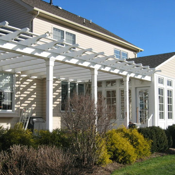
The homeowners approached us with a problem - the sun was so brutally hot over their patio that they could not use the space during the summer months. We solved the problem by building a sunroom addition off the existing kitchen/dining room area, which opened up more space for entertaining, and adding a pergola as a shade element. The sunroom has all WeatherShield casement windows with upper awning windows. The pergola is 100% Azek, so it is maintanence-free.
 Tile Doctor Ltd
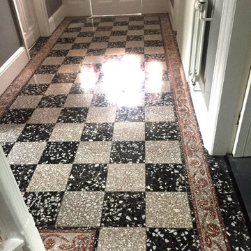
For this job, I paid a visit to the bustling town of Windermere in South Cumbria. My client asked me to refinish a black and white Terrazzo tiled entrance and hallway floor. Terrazzo if you’re not familiar is a very interesting and beautiful stone of Italian origin, which has been used for flooring in houses for centuries.
We had previously quoted to do the work on this floor however the customer has also received a quote from another firm in Glasgow and had chosen to go with them solely because they were more expensive. However, it stands to reason that the most expensive companies are not always the best quality and Tile Doctor prides itself on the amount of customer feedback we display on our websites which we believe is a far better indicator.
On the arranged day no one from the Glasgow firm showed up and after following up with the firm a young man in his early 20s arrived five hours late and began work on the floor. According to the customer he spent three days attempting to complete the job, but ran out of time and asked the client to apply the sealer themselves. The client applied the sealer, but as she had never done it before the floor turned out blotchy in appearance and she was far from happy.
To cut a long story short, my client complained to the Glaswegian company, after all she had paid for a full service and not received it. Unable to get a satisfactory conclusion from them she decided to call in Tile Doctor to put the matter right. I must point out that although I have included before and after photos one this post it’s really difficult to appreciate the extent of the problem without seeing the floor in real life.
To resolve the sealer, and to provide my client with the polished finish she had originally wanted, I burnished the floor using a set of four Tile Doctor Diamond encrusted burnishing pads. Each of the four pads has a different grit: I first applied the coarse pad and worked my way through medium, fine and eventually very fine using a little water to lubricate and rinsing the floor between each pad to remove any residue; after the burnishing process was complete I gave the entire floor a final, thorough wash.
I then used a wet-vac machine to extract the water and get the floor as dry as possible before leaving for the day and allowing it to fully dry completely overnight, it’s very important that the floor is as moisture free as possible before being sealed as it can affect the final result.
The next day I returned to the house and sealed the floor with two coats of Tile Doctor Colour Grow, an impregnating, colour-enhancing sealer that really accentuates the look of the black and white tiles.
Now that the problem has been resolved, my client is very happy with the condition of her Terrazzo tiled entrance and hallway floor.
Heidi Taylor
South Cumbria Tile Doctor
 Drury Design
THE SETUP
The original primary bathroom was characterized by a disjointed and segmented layout. The shower featured a bulky glass-block enclosure that overwhelmed the space visually. There was a considerable amount of open, unused space, and despite having a his and hers vanity, the arrangement lacked personal space for each user, as they shared the conjoined space between the sinks. The toilet was inconveniently located right by the door, with a half-wall partition meant to provide privacy but instead contributing to a cramped and unbalanced feel. Overall, the bathroom’s layout and design were fragmented, failing to make the most of the available space and lacking adequate storage solutions.
Design objectives:
- Reconfigure the layout to enhance functionality and flow.
- Create an elegant, upscale aesthetic that is light and bright.
- Incorporate specialized storage solutions for female hair care needs.
- Increase overall storage capacity.
- Develop a spa-like shower experience.
- Provide a significant wow factor to the space.
THE REMODEL
Design challenges to be solved:
- Repositioning the toilet to a more suitable location.
- Designing hair care storage solutions without cluttering the elegant space.
- Balancing an upscale, elegant design with a feminine touch in the color palette.
- Increasing the brightness of the room without adding windows.
- Completely replacing the existing shower to create a spa-like experience.
- Planning new storage solutions without adding bulkiness or clutter to the cabinetry.
THE RENEWED SPACE
Design solutions:
Toilet Relocation: Moved the toilet by the window, creating a better overall layout that also opened up two full walls for cabinetry and storage solutions.
Specialized Vanity Storage: The left side of the left vanity is the wife’s. Open shelves facing across the vanity can be used for decorative or daily needs items. Pull-out docking drawers with power outlets and metal basins handle hot hair appliances.
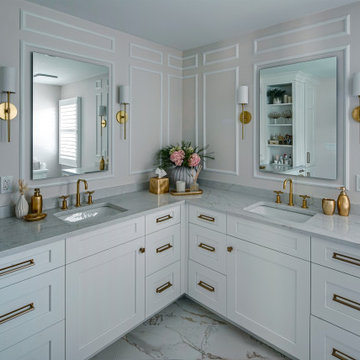
Bright and Elegant Color Scheme: White cabinets, countertops, floors, and shower walls keep the space bright. The just-off-white wall color with a hint of pink adds a feminine touch. Thin wainscoting with white trim offers traditional-leaning elegance.
Layered Lighting Strategy: Ceiling can lights, sconces, lighted mirrors, and toe-kick lighting were installed. Natural light-rated bulbs keep the space bright and natural-feeling.
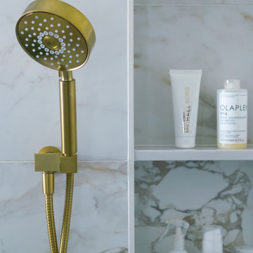
Spa-Like Shower: An extra-large shower was created using the same floor tile materials for continuity. Equipped with a Kohler Anthem system with a shower head, hand-held, and four body sprays. His and Hers niches for separate body care product storage.
Enhanced Storage Solutions: Added a linen cabinet within the vanity area for efficient storage of towels and bathroom essentials.
This elegant bathroom feels incredibly spacious now. The color palette and lights keep the room bright and cheery. Gold fixtures, the herringbone pattern on the floor, and exquisite trim work add an elegant touch. With the husband and wife having their own vanity wall sections joined at the corner, each user truly has their own space within the space. The clients are very happy with the final result.
Find the right local pro for your project
 TaylorPro Design and Remodeling, Inc.
"TaylorPro completely remodeled our master bathroom. We had our outdated shower transformed into a modern walk-in shower, new custom cabinets installed with a beautiful quartz counter top, a giant framed vanity mirror which makes the bathroom look so much bigger and brighter, and a wood ceramic tile floor including under floor heating. Kerry Taylor also solved a hot water problem we had by installing a recirculating hot water system which allows us to have instant hot water in the shower rather than waiting forever for the water to heat up.
From start to finish TaylorPro did a professional, quality job. Kerry Taylor was always quick to respond to any question or problem and made sure all work was done properly. Bonnie, the resident designer, did a great job of creating a beautiful, functional bathroom design combining our ideas with her own. Every member of the TaylorPro team was professional, hard-working, considerate, and competent. Any remodeling project is going to be somewhat disruptive, but the TaylorPro crew made the process as painless as possible by being respectful of our home environment and always cleaning up their mess at the end of the day. I would recommend TaylorPro Design to anyone who wants a quality project done by a great team of professionals. You won't be disappointed!"
~ Judy and Stuart C, Clients
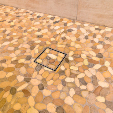
Carlsbad home with Caribbean Blue mosaic glass tile, NuHeat radiant floor heating, grey weathered plank floor tile, pebble shower pan and custom "Whale Tail" towel hooks. Classic white painted vanity with quartz counter tops.
Bathroom Design - Bonnie Bagley Catlin, Signature Designs Kitchen Bath.
Contractor - TaylorPro Design and Remodeling
Photos by: Kerry W. Taylor
 Ogle Construction & Maintenance Service, Inc.
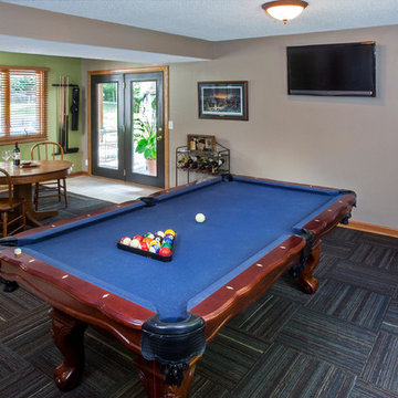
Problem: After we solved this client’s first problem of adding new doors and trim, he decided he wanted do renovate his lower level walkout family room to accommodate his pool table.
Solution: Our designer suggested removing the existing fake brick wall to open up the space. We added new carpet and updated the look with fresh paint and new colors. By using the customer’s existing furniture and wall art (some rescued from long term storage), we created this great pool room. There’s plenty of space for entertaining, playing pool, games or watching the game on TV.
 Schulte Design Build
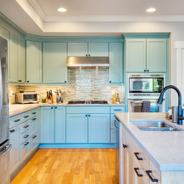
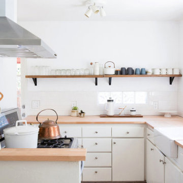
This kitchen project is in a newer build home (2007). The family liked everything about the space except for the island layout and location. Both ends of it were pinch points which made it cumbersome for multiple people to be in the space at a time. They liked the granite countertops but the one on the island was damaged and needed to be replaced to accommodate the new island configuration. Due to this, it made sense to replace all the countertops with quartz. The perimeter cabinets were in good shape but were a dark color which made the space dark and uninviting. We solved this by painting them a bright green/blue color with a two-part water-based paint. We added a couple of other cabinets in the adjacent spaces to provide them with more needed storage which did not impact the kitchen space. We relocated the existing 3 recessed lights over the island which saved them from the landfill. We replaced the old under cabinet fluorescent light fixtures with new energy efficient LED channel fixtures that provide much better counter task lighting. We painted both the ceiling and walls to freshen up the space. As you can see, we were able to solve this family’s kitchen problems in both an environmentally and budget conscious way with creative solutions.
 Drury Design
THE SETUP
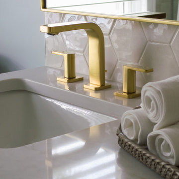
Sam’s clients wanted to update their hall bathroom used by their three children. The goal was to create a space that is both kid-friendly and elegant, ensuring it remains functional and stylish as the children grow. The original bathroom felt confined due to dark materials and a single-sink vanity. The challenge was to find a design that looks great now and in the future.
Design objectives:
Create a sense of spaciousness
Increase storage for bathroom necessities and daily routines
Enhance lighting
THE REMODEL
Design challenges to be solved:
No structural changes – must keep the tub and wall structure
Transforming a small, dark space into a bright, open one without adding a new window
Multi-user-minded – Improving functionality for multiple users simultaneously
Timeless & kid-friendly – create a comfy kid-friendly look that won’t appear dated as the kids grow older
THE RENEWED SPACE
Design solutions:
Slimmer Tub and Sliding Shower Door installed to free up functional space, making the bathroom feel larger.
Lighter Materials used to reflect more light and add a vibrant feel. Open shelves above the toilet provide storage without making the space feel cramped, while allowing light from the existing window to permeate.
Dual Sink Vanity added, and split the mirror into two, creating individual stations for the kids and enhancing usability during busy routines.
Kid-Friendly Features – Incorporated toe-kick lighting that works as a nightlight, a lower-mounted shower handheld, and a large, accessible shower niche. The geometric shapes and blue color palette contribute to a fun yet sophisticated look.
The clients are thrilled with the transformation. The bathroom is now fun and elegant, providing a timeless look that will grow with the kids. They appreciate the increased functionality and the bright, open feel of the space.
This remodel successfully blends practical solutions with stylish design, ensuring the hall bathroom meets the needs of a busy family while maintaining a sophisticated look.
 Drury Design
The Setup
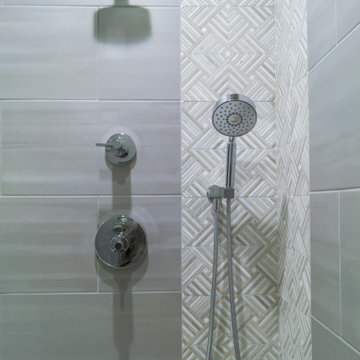
When our clients decided to remodel their primary bathroom, the goal was to transform the space into a brighter, more open retreat tailored to their needs. The previous layout, with its enclosed zones and limited functionality, no longer met their needs. By reimagining the layout and introducing thoughtful design choices, we created a modern, elegant bathroom that serves their current and future lifestyle.
Design objectives:
- Create a brighter, more open bathroom while maintaining privacy.
- Provide functional storage solutions without relying on the old linen closet.
- Incorporate a freestanding tub, large shower, and a makeup area for added versatility.
- Retain natural light from existing windows.
- Introduce elegant finishes and accents for a timeless aesthetic.
The Remodel
Design challenges to be solved:
- Reconfiguring the layout while keeping the existing plumbing for the toilet.
- Creating storage that houses everything that resided within the linen closet.
- Designing clearance and functionality for a freestanding tub, shower, and makeup area within the limited space.
- Accommodating the client’s desire for a pocket door in the commode room despite spatial constraints.
Introducing accent tile and cabinetry colors that align with the client’s vision yet maintain a cohesive look with the rest of the home.
The Renewed Space
Design solutions:
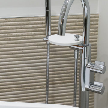
- Reimagined Layout: Moved the shower from the back of the room, creating a more open feel with additional glass while preserving privacy with a wing wall and bench. The freestanding tub was angled to optimize space and enhance circulation, with textured tile behind it adding visual interest.
- Efficient Storage: Eliminated the original linen closet and incorporated functional base cabinet storage and a designated makeup area for added utility.
- Optimized Access: Adjusted the depth of the makeup vanity to provide sufficient walkway clearance, ensuring a comfortable flow around the tub.
- Tailored Features: Installed a smaller pocket door in the commode room to resolve framing and plumbing limitations.
- Elegant Accents: Introduced a subtle marble herringbone mosaic tile in the shower and textured tile behind the tub to enhance the monochromatic palette. Painted cabinetry in a dark gray finish provided a bold yet refined contrast to the light countertops.
Final Thoughts:
The reimagined primary bathroom is a true reflection of the client’s needs and style preferences. By thoughtfully reworking the layout and incorporating functional yet elegant design elements, we created a serene and practical space that serves as a personal retreat. The result is a timeless bathroom that supports their busy lifestyle while providing moments of tranquility.
 Sandpiper
Sandpiper came to life to solve a problem faced by many homeowners trying to sell their empty home. On average, it takes 2 to 6 months to sell a house. While the house is on the market, homeowners are left with a problem of paying the mortgage, tax, insurance, and utility bills every month.
 Bridgewater
The new owners were looking forward to living in their new home with an open floor plan, tall vaulted ceilings, and great views. It featured a large Great Room with two big French Doors separating the Dining Room from the Master Bedroom.
But after only a few months they identified a major design flaw: Each of the French Doors had ten glass windows with two large windows above each door. (Check out our before and after designs, traffic flow diagrams and photos of this project.) Glass windows and doors allowed sound and light from guests or the TV in the great room to easily sneak into the bedroom. With unique work and sleep schedules (he’s a pilot, she’s a registered nurse) this design wasn’t working.
Then there was a traffic flow design flaw: The Master Bedroom had a second entrance from a hallway. To get into the bedroom from the hallway you needed to walk down another claustrophobic hallway.
To get from the Master Bedroom to the Master Bath begin at the most remote corner of the bedroom and down a hallway between two closets. Once inside the bath, a huge triangular Jacuzzi dominating the space.
So, from a privacy and traffic flow perspective, this home had some major design issues.
When Craig Weber first met with the owners, he listened to their ideas and concerns. The owners trusted Craig to come up with the most efficient and most effective solution to this design dilemma. He offered a solution that resolved the bed-bath traffic flow problem, offered some bedroom room privacy, and updated the bath.
First, the two French Doors and windows were removed. A new wall was built with sound-absorbing materials, making the Great Room and Dining Room more comfortable spaces for entertaining while creating the bedroom privacy the owners craved.
Solving the Bedroom/Bath traffic flow problem began with removing the two existing closets. The bath door was relocated next to the hall entrance, and then a new walk-in closet was added adjacent to the hallway entrance. The solution offered easy access to and from the bath, closet and hallway without a hint of claustrophobia.
The Master Bath underwent a major transformation designed for convenience and comfort – especially during long, cold Minnesota winters.
Most everything from the former bath was torn out, beginning with the giant Jacuzzi.
A new bathtub that is wider and deeper than the standard size was installed with brushed Nickel fixtures. It’s the perfect place to relax with a glass of wine and candles.
Warm floors are a Minnesota “must have.” The bath’s new ceramic floor features in-floor electric heat. Getting in and out of the tub is easy and comfortable.
The new walk-in shower again features in-floor heating and a place to sit. The most interesting feature of this shower may the custom ceramic tile installed with unique patterns.
A new vanity Cambria Bradshaw countertops features two under-hung ceramic sinks with matching brushed Nickel fixtures.
Tall ceilings and three glass windows near the ceiling flood the room with natural light. A new energy-efficient window frames an ornamental stained glass window created by the owner’s father – a great personal touch.
A quiet place to sleep. A private dining room for entertaining. A Master Bath to die for. And easy traffic flow. The owners couldn’t have been more delighted with the outcome. And Lilly, their cat, loves it too.
 Designs Daly
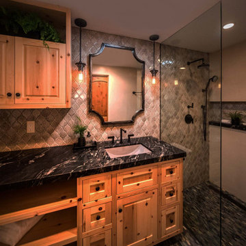
The first goal of this project was to address challenges with the home’s flooring and plumbing system. Additionally, the renovation of the guest and master bathrooms was required to meet the client’s preferences and enhance functionality. Ensuring that the new flooring and foundation repair solved the existing crack issue was a crucial aspect of the project. The remodel of the guest bathroom was aimed at making it more suitable for children’s use, while the overhaul of the master bathroom considered the overall style and functionality preferred by the client. Ultimately, the project aimed to enhance the aesthetic appeal and value of the client’s home while addressing the various renovation requirements.
 Drury Design
THE SETUP
The original primary bathroom was characterized by a disjointed and segmented layout. The shower featured a bulky glass-block enclosure that overwhelmed the space visually. There was a considerable amount of open, unused space, and despite having a his and hers vanity, the arrangement lacked personal space for each user, as they shared the conjoined space between the sinks. The toilet was inconveniently located right by the door, with a half-wall partition meant to provide privacy but instead contributing to a cramped and unbalanced feel. Overall, the bathroom’s layout and design were fragmented, failing to make the most of the available space and lacking adequate storage solutions.
Design objectives:
- Reconfigure the layout to enhance functionality and flow.
- Create an elegant, upscale aesthetic that is light and bright.
- Incorporate specialized storage solutions for female hair care needs.
- Increase overall storage capacity.
- Develop a spa-like shower experience.
- Provide a significant wow factor to the space.
THE REMODEL
Design challenges to be solved:
- Repositioning the toilet to a more suitable location.
- Designing hair care storage solutions without cluttering the elegant space.
- Balancing an upscale, elegant design with a feminine touch in the color palette.
- Increasing the brightness of the room without adding windows.
- Completely replacing the existing shower to create a spa-like experience.
- Planning new storage solutions without adding bulkiness or clutter to the cabinetry.
THE RENEWED SPACE
Design solutions:
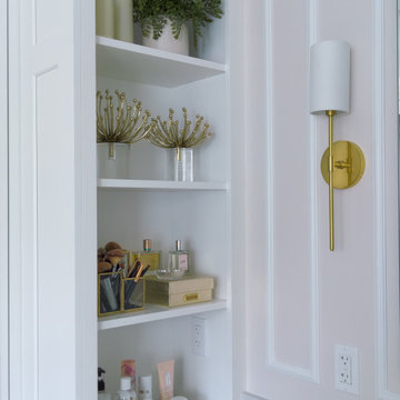
Toilet Relocation: Moved the toilet by the window, creating a better overall layout that also opened up two full walls for cabinetry and storage solutions.
Specialized Vanity Storage: The left side of the left vanity is the wife’s. Open shelves facing across the vanity can be used for decorative or daily needs items. Pull-out docking drawers with power outlets and metal basins handle hot hair appliances.
Bright and Elegant Color Scheme: White cabinets, countertops, floors, and shower walls keep the space bright. The just-off-white wall color with a hint of pink adds a feminine touch. Thin wainscoting with white trim offers traditional-leaning elegance.
Layered Lighting Strategy: Ceiling can lights, sconces, lighted mirrors, and toe-kick lighting were installed. Natural light-rated bulbs keep the space bright and natural-feeling.
Spa-Like Shower: An extra-large shower was created using the same floor tile materials for continuity. Equipped with a Kohler Anthem system with a shower head, hand-held, and four body sprays. His and Hers niches for separate body care product storage.
Enhanced Storage Solutions: Added a linen cabinet within the vanity area for efficient storage of towels and bathroom essentials.
This elegant bathroom feels incredibly spacious now. The color palette and lights keep the room bright and cheery. Gold fixtures, the herringbone pattern on the floor, and exquisite trim work add an elegant touch. With the husband and wife having their own vanity wall sections joined at the corner, each user truly has their own space within the space. The clients are very happy with the final result.
 Drury Design
The Setup
When our clients decided to remodel their primary bathroom, the goal was to transform the space into a brighter, more open retreat tailored to their needs. The previous layout, with its enclosed zones and limited functionality, no longer met their needs. By reimagining the layout and introducing thoughtful design choices, we created a modern, elegant bathroom that serves their current and future lifestyle.
Design objectives:
- Create a brighter, more open bathroom while maintaining privacy.
- Provide functional storage solutions without relying on the old linen closet.
- Incorporate a freestanding tub, large shower, and a makeup area for added versatility.
- Retain natural light from existing windows.
- Introduce elegant finishes and accents for a timeless aesthetic.
The Remodel
Design challenges to be solved:
- Reconfiguring the layout while keeping the existing plumbing for the toilet.
- Creating storage that houses everything that resided within the linen closet.
- Designing clearance and functionality for a freestanding tub, shower, and makeup area within the limited space.
- Accommodating the client’s desire for a pocket door in the commode room despite spatial constraints.
Introducing accent tile and cabinetry colors that align with the client’s vision yet maintain a cohesive look with the rest of the home.
The Renewed Space
Design solutions:
- Reimagined Layout: Moved the shower from the back of the room, creating a more open feel with additional glass while preserving privacy with a wing wall and bench. The freestanding tub was angled to optimize space and enhance circulation, with textured tile behind it adding visual interest.
- Efficient Storage: Eliminated the original linen closet and incorporated functional base cabinet storage and a designated makeup area for added utility.
- Optimized Access: Adjusted the depth of the makeup vanity to provide sufficient walkway clearance, ensuring a comfortable flow around the tub.
- Tailored Features: Installed a smaller pocket door in the commode room to resolve framing and plumbing limitations.
- Elegant Accents: Introduced a subtle marble herringbone mosaic tile in the shower and textured tile behind the tub to enhance the monochromatic palette. Painted cabinetry in a dark gray finish provided a bold yet refined contrast to the light countertops.
Final Thoughts:
The reimagined primary bathroom is a true reflection of the client’s needs and style preferences. By thoughtfully reworking the layout and incorporating functional yet elegant design elements, we created a serene and practical space that serves as a personal retreat. The result is a timeless bathroom that supports their busy lifestyle while providing moments of tranquility.
 Drury Design
THE SETUP
The original primary bathroom was characterized by a disjointed and segmented layout. The shower featured a bulky glass-block enclosure that overwhelmed the space visually. There was a considerable amount of open, unused space, and despite having a his and hers vanity, the arrangement lacked personal space for each user, as they shared the conjoined space between the sinks. The toilet was inconveniently located right by the door, with a half-wall partition meant to provide privacy but instead contributing to a cramped and unbalanced feel. Overall, the bathroom’s layout and design were fragmented, failing to make the most of the available space and lacking adequate storage solutions.
Design objectives:
- Reconfigure the layout to enhance functionality and flow.
- Create an elegant, upscale aesthetic that is light and bright.
- Incorporate specialized storage solutions for female hair care needs.
- Increase overall storage capacity.
- Develop a spa-like shower experience.
- Provide a significant wow factor to the space.
THE REMODEL
Design challenges to be solved:
- Repositioning the toilet to a more suitable location.
- Designing hair care storage solutions without cluttering the elegant space.
- Balancing an upscale, elegant design with a feminine touch in the color palette.
- Increasing the brightness of the room without adding windows.
- Completely replacing the existing shower to create a spa-like experience.
- Planning new storage solutions without adding bulkiness or clutter to the cabinetry.
THE RENEWED SPACE
Design solutions:
Toilet Relocation: Moved the toilet by the window, creating a better overall layout that also opened up two full walls for cabinetry and storage solutions.
Specialized Vanity Storage: The left side of the left vanity is the wife’s. Open shelves facing across the vanity can be used for decorative or daily needs items. Pull-out docking drawers with power outlets and metal basins handle hot hair appliances.
Bright and Elegant Color Scheme: White cabinets, countertops, floors, and shower walls keep the space bright. The just-off-white wall color with a hint of pink adds a feminine touch. Thin wainscoting with white trim offers traditional-leaning elegance.
Layered Lighting Strategy: Ceiling can lights, sconces, lighted mirrors, and toe-kick lighting were installed. Natural light-rated bulbs keep the space bright and natural-feeling.
Spa-Like Shower: An extra-large shower was created using the same floor tile materials for continuity. Equipped with a Kohler Anthem system with a shower head, hand-held, and four body sprays. His and Hers niches for separate body care product storage.
Enhanced Storage Solutions: Added a linen cabinet within the vanity area for efficient storage of towels and bathroom essentials.
This elegant bathroom feels incredibly spacious now. The color palette and lights keep the room bright and cheery. Gold fixtures, the herringbone pattern on the floor, and exquisite trim work add an elegant touch. With the husband and wife having their own vanity wall sections joined at the corner, each user truly has their own space within the space. The clients are very happy with the final result.
 Advance Design Studio, Ltd.
After six years of living in their Huntley IL home, Chris and Meghan were tired of their dark, dingy, outdated kitchen and it was finally time for a long-anticipated change. “The kitchen is the place where we live, it’s where we do everything,” Meghan said. “It was important that it be a space where we wanted to be.” Meghan loves cooking and enjoys including their girls in healthy meal prepping, this led them to want a brighter, more enjoyable kitchen with increased functionality and improved storage.
For Chris especially, the laundry room was an entirely dysfunctional eyesore. “We had a washer and a dryer, but it was all kind-of cobbled together!” Chris said. “There were always laundry piles everywhere, we weren’t really sure what we wanted to do in there, but it was time for us to make a change.” The mess of the space was stressful every time they walked in the door from the garage each day. Kids’ backpacks and shoes piled up haphazardly in the makeshift boot-bench closet left the family feeling disorganized and stressed. They needed space for folding clothes and locker cubbies to help keep the family organized.
Having known Christine and Todd in the Huntley community for years, Chris and Meghan were familiar with their work. “We already trusted them personally and having seen their projects for years we knew they did top notch work. After we reviewed the initial round of designs, we knew that hiring them was definitely the right choice,” Meghan and Chris said. Although Chris had done a lot of work in their home himself, the kitchen and laundry room renovation was such a large undertaking that he didn’t want to steal time away from his family to spend what would surely be many long weekends doing the job himself. “That would not have been a wise choice for us,” Chris laughed.
“Our designer, Michelle was very, very, easy to work with; anything we wanted to see or weren’t sure about, she went above and beyond to make this easy for us. She was easy to get hold of and always quick to respond,” the couple said. Michelle pulled ideas that mirrored the couple’s taste and style and was adept at directing the couple to limited choices that didn’t overwhelm them and kept the process moving. “I have a hard time making decisions. Michelle made the decision-making process so easy. I loved how she listened to what I liked and then presented three great options for me to choose from,” Meghan said.
The main objectives for the kitchen were better storage solutions, they wanted the space to reflect their lifestyle and taste, and they wanted it to last for years with low maintenance. One of the first steps in creating a more functional kitchen was relocating the refrigerator, creating an improved workflow for the busy family.
“We didn’t know that we could even move the refrigerator to a new location where it is now, that was something that we never would have thought of,” Chris said. “The new refrigerator location makes the kitchen feel so much bigger. We didn’t add any space, but our whole kitchen with the new design just seems like it’s so much larger than before!” Meghan said.
The perimeter mist colored cabinets helped warm and brighten the entire room, while the graphite colored cabinets on the island added contrast. Using this fresh, clean color palette satisfied the couple’s desire for a bright space that was the exact opposite of what they had before. Organization accessories were also added to the cabinets such as a spice drawer tray and roll outs to create hidden convenience.
“I absolutely love the hidden spices – it makes cooking so much more enjoyable!” Chris said. “And all the pull outs, and the double trash bin, who would think you could get so excited about organization!” the couple said in unison.
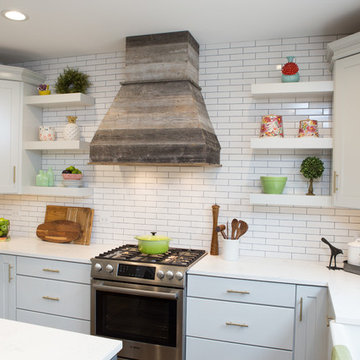
One thing they hated in their original kitchen was how dark the space felt. Added lighting on the ceiling with the new light fixtures combined with the lighter cabinetry colors throughout solved this problem. “Our new kitchen has this warm, almost cozy feeling that our old kitchen never had, it’s just a space that I love spending my time in now,” Meghan said. The light airy feeling was accentuated with the use of floating white shelves on either side of the decorative range hood. “We have so much cabinetry space, the new design is amazing we actually have more storage space than we will ever need,” Meghan said.
The island was extended to create more work surface and added space for stool seating. “The new island changes how we live. Now the kids can be in the kitchen with us, doing homework, eating breakfast, and the three of us have special dinners there when Chris is working late,” Meghan said.
The Carrara Marmi Quartz countertops were chosen because they are, not only beautiful, but are made from hard-working material that doesn’t require maintenance. The white subway tile backsplash that wraps to the ceiling behind the focal point cooktop range/hood compliments the crisp white countertops perfectly, while brushed brass hardware and light fixtures keep the design fresh and new.
The couple had a few fears at the beginning of the project, as most homeowners do. Their biggest fear was being out of their kitchen and laundry room for an extended time. The crew made it very easy for the family to work in a limited space keeping the washer and dryer hooked up the majority of the time, and also getting appliances working with minimal downtime.
“They above and beyond accommodated us to get us through the process,” Meghan said. “They did a great job making sure we were as comfortable as possible throughout the process,” Chris added.
“Our project manager DJ did a great job. He was very good at updating us on schedule changes, getting guys in as quickly as possible. Everyone that stepped in the house was nice and did great work,” said Chris. They thought Advance’s carpenter was phenomenal and were impressed when he took a conceptual idea from a photograph and worked with designer Michelle to create a one of a kind range/hood that has become the topic of conversation with friends and family who visit the new kitchen. “He was in our house literally every day for several weeks. He was easy to work with and good at what he did,” Meghan and Chris said.
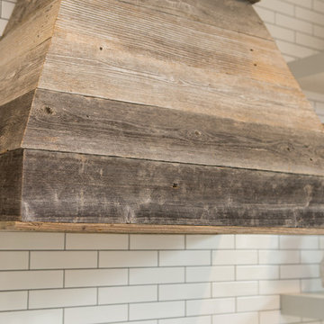
The focal point of the kitchen; a hand-crafted, custom-built ventilation hood was clad with handpicked reclaimed barnwood. Advance Design’s carpenter built the framework and the cladding to create a one-of-a-kind design element that the couple loves.
“I think it was especially fun for him to create something unique from scratch, showcasing his talent in this area,” Meghan said. “I love that my kitchen is not like everyone else’s. I got to pick out the wood on my hood and watch it being built and was able to choose what pieces of wood went where on it. It’s totally unique.”
Red Oak flooring was toothed-in throughout the kitchen and the rest of the first floor anywhere changes were made. Then the whole floor was refinished to tone down the orange undertones in the existing floor stain, ultimately changing the color complexion of the entire first floor. The result is a completely new feeling to the entire home.
Renovating the laundry room was extremely important to Meghan and Chris, but they had trouble visualizing what the possibilities were for the seemingly small space. Michelle produced beautiful 3D illustrations that helped them envision the space in a whole new way.
“I must have told Michelle 100 times that I am a visual person, seeing the designs in 3D made it so easy to make decisions and see what we could really do with our space,” Meghan said.
A dividing wall and doorway were removed between the existing laundry room and hallway formerly containing a coat closet, providing space to design specialized graphite colored cabinetry matching the kitchen island to house custom storage cubbies for each family member. Adding the tall utility cabinetry in the new laundry area helped solve the storage issue, tucking away cleaning supplies, household items, and even the cat got its own cubby.
“I love how everything is now hidden in its own space. I can’t tell you how much I hated coming home and seeing everything sitting around on counters,” Chris said.
Electrical outlets were planned for the inside of utility cabinets, so devices could charge in hidden locations. Stacking the washer and dryer allowed for wider countertop space to provide a folding area and a special space for clothes to hang. “The way I do laundry has been completely transformed! I can actually fold clothes and hang them now right out of the washer and dryer,” Meghan said.
“The end result in the kitchen and the laundry/mud room was an updated light and bright space, with a smarter work flow that better meets the needs of this family,” Michelle said.
“I would totally recommend Advance Design,” Meghan said. “Sometimes I sit and just look at my kitchen and laundry room and think ‘Wow, I can’t believe I get to live here!’ It’s an understatement to say we love our new space.”
 Advance Design Studio, Ltd.
After six years of living in their Huntley IL home, Chris and Meghan were tired of their dark, dingy, outdated kitchen and it was finally time for a long-anticipated change. “The kitchen is the place where we live, it’s where we do everything,” Meghan said. “It was important that it be a space where we wanted to be.” Meghan loves cooking and enjoys including their girls in healthy meal prepping, this led them to want a brighter, more enjoyable kitchen with increased functionality and improved storage.
For Chris especially, the laundry room was an entirely dysfunctional eyesore. “We had a washer and a dryer, but it was all kind-of cobbled together!” Chris said. “There were always laundry piles everywhere, we weren’t really sure what we wanted to do in there, but it was time for us to make a change.” The mess of the space was stressful every time they walked in the door from the garage each day. Kids’ backpacks and shoes piled up haphazardly in the makeshift boot-bench closet left the family feeling disorganized and stressed. They needed space for folding clothes and locker cubbies to help keep the family organized.
Having known Christine and Todd in the Huntley community for years, Chris and Meghan were familiar with their work. “We already trusted them personally and having seen their projects for years we knew they did top notch work. After we reviewed the initial round of designs, we knew that hiring them was definitely the right choice,” Meghan and Chris said. Although Chris had done a lot of work in their home himself, the kitchen and laundry room renovation was such a large undertaking that he didn’t want to steal time away from his family to spend what would surely be many long weekends doing the job himself. “That would not have been a wise choice for us,” Chris laughed.
“Our designer, Michelle was very, very, easy to work with; anything we wanted to see or weren’t sure about, she went above and beyond to make this easy for us. She was easy to get hold of and always quick to respond,” the couple said. Michelle pulled ideas that mirrored the couple’s taste and style and was adept at directing the couple to limited choices that didn’t overwhelm them and kept the process moving. “I have a hard time making decisions. Michelle made the decision-making process so easy. I loved how she listened to what I liked and then presented three great options for me to choose from,” Meghan said.
The main objectives for the kitchen were better storage solutions, they wanted the space to reflect their lifestyle and taste, and they wanted it to last for years with low maintenance. One of the first steps in creating a more functional kitchen was relocating the refrigerator, creating an improved workflow for the busy family.
“We didn’t know that we could even move the refrigerator to a new location where it is now, that was something that we never would have thought of,” Chris said. “The new refrigerator location makes the kitchen feel so much bigger. We didn’t add any space, but our whole kitchen with the new design just seems like it’s so much larger than before!” Meghan said.
The perimeter mist colored cabinets helped warm and brighten the entire room, while the graphite colored cabinets on the island added contrast. Using this fresh, clean color palette satisfied the couple’s desire for a bright space that was the exact opposite of what they had before. Organization accessories were also added to the cabinets such as a spice drawer tray and roll outs to create hidden convenience.
“I absolutely love the hidden spices – it makes cooking so much more enjoyable!” Chris said. “And all the pull outs, and the double trash bin, who would think you could get so excited about organization!” the couple said in unison.
One thing they hated in their original kitchen was how dark the space felt. Added lighting on the ceiling with the new light fixtures combined with the lighter cabinetry colors throughout solved this problem. “Our new kitchen has this warm, almost cozy feeling that our old kitchen never had, it’s just a space that I love spending my time in now,” Meghan said. The light airy feeling was accentuated with the use of floating white shelves on either side of the decorative range hood. “We have so much cabinetry space, the new design is amazing we actually have more storage space than we will ever need,” Meghan said.
The island was extended to create more work surface and added space for stool seating. “The new island changes how we live. Now the kids can be in the kitchen with us, doing homework, eating breakfast, and the three of us have special dinners there when Chris is working late,” Meghan said.
The Carrara Marmi Quartz countertops were chosen because they are, not only beautiful, but are made from hard-working material that doesn’t require maintenance. The white subway tile backsplash that wraps to the ceiling behind the focal point cooktop range/hood compliments the crisp white countertops perfectly, while brushed brass hardware and light fixtures keep the design fresh and new.
The couple had a few fears at the beginning of the project, as most homeowners do. Their biggest fear was being out of their kitchen and laundry room for an extended time. The crew made it very easy for the family to work in a limited space keeping the washer and dryer hooked up the majority of the time, and also getting appliances working with minimal downtime.
“They above and beyond accommodated us to get us through the process,” Meghan said. “They did a great job making sure we were as comfortable as possible throughout the process,” Chris added.
“Our project manager DJ did a great job. He was very good at updating us on schedule changes, getting guys in as quickly as possible. Everyone that stepped in the house was nice and did great work,” said Chris. They thought Advance’s carpenter was phenomenal and were impressed when he took a conceptual idea from a photograph and worked with designer Michelle to create a one of a kind range/hood that has become the topic of conversation with friends and family who visit the new kitchen. “He was in our house literally every day for several weeks. He was easy to work with and good at what he did,” Meghan and Chris said.
The focal point of the kitchen; a hand-crafted, custom-built ventilation hood was clad with handpicked reclaimed barnwood. Advance Design’s carpenter built the framework and the cladding to create a one-of-a-kind design element that the couple loves.
“I think it was especially fun for him to create something unique from scratch, showcasing his talent in this area,” Meghan said. “I love that my kitchen is not like everyone else’s. I got to pick out the wood on my hood and watch it being built and was able to choose what pieces of wood went where on it. It’s totally unique.”
Red Oak flooring was toothed-in throughout the kitchen and the rest of the first floor anywhere changes were made. Then the whole floor was refinished to tone down the orange undertones in the existing floor stain, ultimately changing the color complexion of the entire first floor. The result is a completely new feeling to the entire home.
Renovating the laundry room was extremely important to Meghan and Chris, but they had trouble visualizing what the possibilities were for the seemingly small space. Michelle produced beautiful 3D illustrations that helped them envision the space in a whole new way.
“I must have told Michelle 100 times that I am a visual person, seeing the designs in 3D made it so easy to make decisions and see what we could really do with our space,” Meghan said.
A dividing wall and doorway were removed between the existing laundry room and hallway formerly containing a coat closet, providing space to design specialized graphite colored cabinetry matching the kitchen island to house custom storage cubbies for each family member. Adding the tall utility cabinetry in the new laundry area helped solve the storage issue, tucking away cleaning supplies, household items, and even the cat got its own cubby.
“I love how everything is now hidden in its own space. I can’t tell you how much I hated coming home and seeing everything sitting around on counters,” Chris said.
Electrical outlets were planned for the inside of utility cabinets, so devices could charge in hidden locations. Stacking the washer and dryer allowed for wider countertop space to provide a folding area and a special space for clothes to hang. “The way I do laundry has been completely transformed! I can actually fold clothes and hang them now right out of the washer and dryer,” Meghan said.
“The end result in the kitchen and the laundry/mud room was an updated light and bright space, with a smarter work flow that better meets the needs of this family,” Michelle said.
“I would totally recommend Advance Design,” Meghan said. “Sometimes I sit and just look at my kitchen and laundry room and think ‘Wow, I can’t believe I get to live here!’ It’s an understatement to say we love our new space.”
 Drury Design
The Setup
When our clients decided to remodel their primary bathroom, the goal was to transform the space into a brighter, more open retreat tailored to their needs. The previous layout, with its enclosed zones and limited functionality, no longer met their needs. By reimagining the layout and introducing thoughtful design choices, we created a modern, elegant bathroom that serves their current and future lifestyle.
Design objectives:
- Create a brighter, more open bathroom while maintaining privacy.
- Provide functional storage solutions without relying on the old linen closet.
- Incorporate a freestanding tub, large shower, and a makeup area for added versatility.
- Retain natural light from existing windows.
- Introduce elegant finishes and accents for a timeless aesthetic.
The Remodel
Design challenges to be solved:
- Reconfiguring the layout while keeping the existing plumbing for the toilet.
- Creating storage that houses everything that resided within the linen closet.
- Designing clearance and functionality for a freestanding tub, shower, and makeup area within the limited space.
- Accommodating the client’s desire for a pocket door in the commode room despite spatial constraints.
Introducing accent tile and cabinetry colors that align with the client’s vision yet maintain a cohesive look with the rest of the home.
The Renewed Space
Design solutions:
- Reimagined Layout: Moved the shower from the back of the room, creating a more open feel with additional glass while preserving privacy with a wing wall and bench. The freestanding tub was angled to optimize space and enhance circulation, with textured tile behind it adding visual interest.
- Efficient Storage: Eliminated the original linen closet and incorporated functional base cabinet storage and a designated makeup area for added utility.
- Optimized Access: Adjusted the depth of the makeup vanity to provide sufficient walkway clearance, ensuring a comfortable flow around the tub.
- Tailored Features: Installed a smaller pocket door in the commode room to resolve framing and plumbing limitations.
- Elegant Accents: Introduced a subtle marble herringbone mosaic tile in the shower and textured tile behind the tub to enhance the monochromatic palette. Painted cabinetry in a dark gray finish provided a bold yet refined contrast to the light countertops.
Final Thoughts:
The reimagined primary bathroom is a true reflection of the client’s needs and style preferences. By thoughtfully reworking the layout and incorporating functional yet elegant design elements, we created a serene and practical space that serves as a personal retreat. The result is a timeless bathroom that supports their busy lifestyle while providing moments of tranquility.
 Tile Doctor Ltd
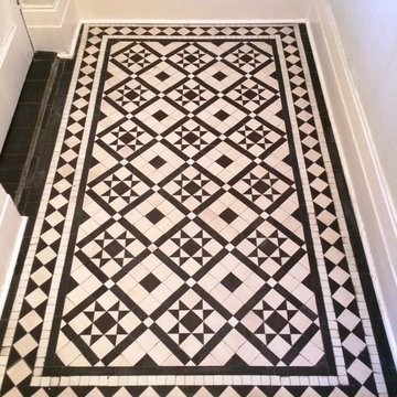
This job was at a house in near Windermere in South Cumbria, a place which is very popular amongst tourists to the Lake District. My client had a Black and White Victorian tiled floor in dire need of a clean and re-seal.
Prior to the application of any cleaning products, my first task was to run damp tests to make sure there were no inherent damp problems. With old floors of this type it’s good to know if there is a damp problem as this will affect the choice of sealer and also the length of time the floor requires to dry.
Fortunately, there were no damp issues present, and I was able to proceed however had the floor been damp and being December I would have offered to carry out the clean and seal in the Summer, when the water tables were lower and the damp levels would be more settled, thus creating a better environment for the sealer to operate in.
I started cleaning the Victorian tiles with Tile Doctor Remove & Go, a product which breaks down old sealers in preparation for a fresh seal to be applied. The product is diluted with water and then scrubbed into the floor with a scrubbing pad fitted to rotary machine; the resulting slurry is then removed using a wet vacuum.
Next step was to apply Tile Doctor Pro-Clean which was applied liberally to the floor, left to dwell for a short period and then agitated with a black scrubbing pad to lift out the ingrained dirt. I also paid special attention to cleaning the grout lines with a stiff scrubbing brush. The floor was then rinsed with clean water, and the resulting residue was extracted using a wet-vac machine.
After the cleaning was completed, the tiles were left for a couple of days to allow them ample time to dry. Upon my return to the house I checked the damp levels again and then applied two coats of the impregnating, colour enhancing sealer Tile Doctor Colour Grow which gives the black tiles more depth of colour, along with the robust surface seal and Matt finish my client had requested.
My client was exceptionally pleased the results – but really, the photographs speak for themselves.
Heidi Taylor
South Cumbria
 Drury Design
THE SETUP
Sam’s clients wanted to update their hall bathroom used by their three children. The goal was to create a space that is both kid-friendly and elegant, ensuring it remains functional and stylish as the children grow. The original bathroom felt confined due to dark materials and a single-sink vanity. The challenge was to find a design that looks great now and in the future.
Design objectives:
Create a sense of spaciousness
Increase storage for bathroom necessities and daily routines
Enhance lighting
THE REMODEL
Design challenges to be solved:
No structural changes – must keep the tub and wall structure
Transforming a small, dark space into a bright, open one without adding a new window
Multi-user-minded – Improving functionality for multiple users simultaneously
Timeless & kid-friendly – create a comfy kid-friendly look that won’t appear dated as the kids grow older
THE RENEWED SPACE
Design solutions:
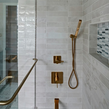
Slimmer Tub and Sliding Shower Door installed to free up functional space, making the bathroom feel larger.
Lighter Materials used to reflect more light and add a vibrant feel. Open shelves above the toilet provide storage without making the space feel cramped, while allowing light from the existing window to permeate.
Dual Sink Vanity added, and split the mirror into two, creating individual stations for the kids and enhancing usability during busy routines.
Kid-Friendly Features – Incorporated toe-kick lighting that works as a nightlight, a lower-mounted shower handheld, and a large, accessible shower niche. The geometric shapes and blue color palette contribute to a fun yet sophisticated look.
The clients are thrilled with the transformation. The bathroom is now fun and elegant, providing a timeless look that will grow with the kids. They appreciate the increased functionality and the bright, open feel of the space.
This remodel successfully blends practical solutions with stylish design, ensuring the hall bathroom meets the needs of a busy family while maintaining a sophisticated look.
 TOC design & construction inc.
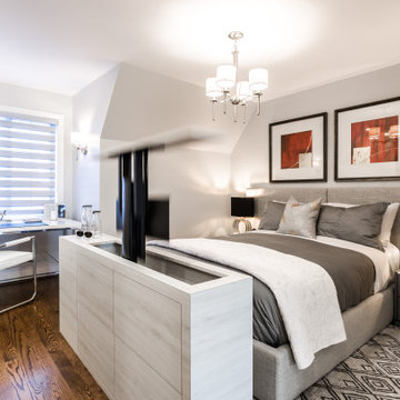
6. No space for a TV, No problem this custom cabinet with a TV lift integrated from Nexus is a life saver.
7. Separate entrance: If possible, create a separate entrance to your attic master suite. This will further enhance privacy and minimize disruptions from other parts of the house.
8. Technology integration: Incorporate modern technology into your master suite. Install smart home features, such as automated lighting, temperature control, and audio systems, to enhance convenience and comfort.
26