
Search results for "Enhances problem solving" in Home Design Ideas
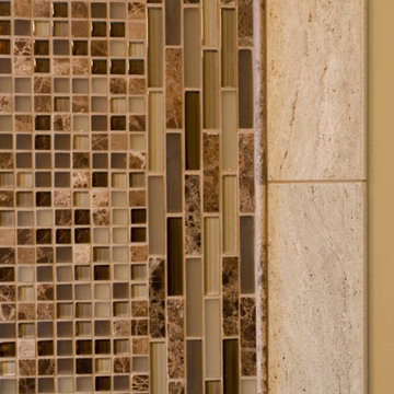
 Bridgewater
The new owners were looking forward to living in their new home with an open floor plan, tall vaulted ceilings, and great views. It featured a large Great Room with two big French Doors separating the Dining Room from the Master Bedroom.
But after only a few months they identified a major design flaw: Each of the French Doors had ten glass windows with two large windows above each door. (Check out our before and after designs, traffic flow diagrams and photos of this project.) Glass windows and doors allowed sound and light from guests or the TV in the great room to easily sneak into the bedroom. With unique work and sleep schedules (he’s a pilot, she’s a registered nurse) this design wasn’t working.
Then there was a traffic flow design flaw: The Master Bedroom had a second entrance from a hallway. To get into the bedroom from the hallway you needed to walk down another claustrophobic hallway.
To get from the Master Bedroom to the Master Bath begin at the most remote corner of the bedroom and down a hallway between two closets. Once inside the bath, a huge triangular Jacuzzi dominating the space.
So, from a privacy and traffic flow perspective, this home had some major design issues.
When Craig Weber first met with the owners, he listened to their ideas and concerns. The owners trusted Craig to come up with the most efficient and most effective solution to this design dilemma. He offered a solution that resolved the bed-bath traffic flow problem, offered some bedroom room privacy, and updated the bath.
First, the two French Doors and windows were removed. A new wall was built with sound-absorbing materials, making the Great Room and Dining Room more comfortable spaces for entertaining while creating the bedroom privacy the owners craved.
Solving the Bedroom/Bath traffic flow problem began with removing the two existing closets. The bath door was relocated next to the hall entrance, and then a new walk-in closet was added adjacent to the hallway entrance. The solution offered easy access to and from the bath, closet and hallway without a hint of claustrophobia.
The Master Bath underwent a major transformation designed for convenience and comfort – especially during long, cold Minnesota winters.
Most everything from the former bath was torn out, beginning with the giant Jacuzzi.
A new bathtub that is wider and deeper than the standard size was installed with brushed Nickel fixtures. It’s the perfect place to relax with a glass of wine and candles.
Warm floors are a Minnesota “must have.” The bath’s new ceramic floor features in-floor electric heat. Getting in and out of the tub is easy and comfortable.
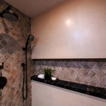
The new walk-in shower again features in-floor heating and a place to sit. The most interesting feature of this shower may the custom ceramic tile installed with unique patterns.
A new vanity Cambria Bradshaw countertops features two under-hung ceramic sinks with matching brushed Nickel fixtures.
Tall ceilings and three glass windows near the ceiling flood the room with natural light. A new energy-efficient window frames an ornamental stained glass window created by the owner’s father – a great personal touch.
A quiet place to sleep. A private dining room for entertaining. A Master Bath to die for. And easy traffic flow. The owners couldn’t have been more delighted with the outcome. And Lilly, their cat, loves it too.
 Designs Daly
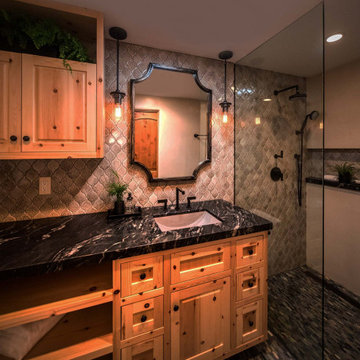
The first goal of this project was to address challenges with the home’s flooring and plumbing system. Additionally, the renovation of the guest and master bathrooms was required to meet the client’s preferences and enhance functionality. Ensuring that the new flooring and foundation repair solved the existing crack issue was a crucial aspect of the project. The remodel of the guest bathroom was aimed at making it more suitable for children’s use, while the overhaul of the master bathroom considered the overall style and functionality preferred by the client. Ultimately, the project aimed to enhance the aesthetic appeal and value of the client’s home while addressing the various renovation requirements.
 Drury Design
THE SETUP
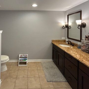
The original primary bathroom was characterized by a disjointed and segmented layout. The shower featured a bulky glass-block enclosure that overwhelmed the space visually. There was a considerable amount of open, unused space, and despite having a his and hers vanity, the arrangement lacked personal space for each user, as they shared the conjoined space between the sinks. The toilet was inconveniently located right by the door, with a half-wall partition meant to provide privacy but instead contributing to a cramped and unbalanced feel. Overall, the bathroom’s layout and design were fragmented, failing to make the most of the available space and lacking adequate storage solutions.
Design objectives:
- Reconfigure the layout to enhance functionality and flow.
- Create an elegant, upscale aesthetic that is light and bright.
- Incorporate specialized storage solutions for female hair care needs.
- Increase overall storage capacity.
- Develop a spa-like shower experience.
- Provide a significant wow factor to the space.
THE REMODEL
Design challenges to be solved:
- Repositioning the toilet to a more suitable location.
- Designing hair care storage solutions without cluttering the elegant space.
- Balancing an upscale, elegant design with a feminine touch in the color palette.
- Increasing the brightness of the room without adding windows.
- Completely replacing the existing shower to create a spa-like experience.
- Planning new storage solutions without adding bulkiness or clutter to the cabinetry.
THE RENEWED SPACE
Design solutions:
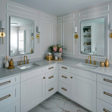
Toilet Relocation: Moved the toilet by the window, creating a better overall layout that also opened up two full walls for cabinetry and storage solutions.
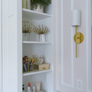
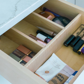
Specialized Vanity Storage: The left side of the left vanity is the wife’s. Open shelves facing across the vanity can be used for decorative or daily needs items. Pull-out docking drawers with power outlets and metal basins handle hot hair appliances.
Bright and Elegant Color Scheme: White cabinets, countertops, floors, and shower walls keep the space bright. The just-off-white wall color with a hint of pink adds a feminine touch. Thin wainscoting with white trim offers traditional-leaning elegance.
Layered Lighting Strategy: Ceiling can lights, sconces, lighted mirrors, and toe-kick lighting were installed. Natural light-rated bulbs keep the space bright and natural-feeling.
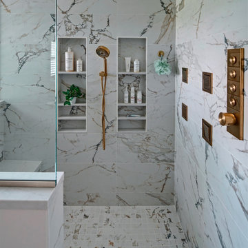
Spa-Like Shower: An extra-large shower was created using the same floor tile materials for continuity. Equipped with a Kohler Anthem system with a shower head, hand-held, and four body sprays. His and Hers niches for separate body care product storage.
Enhanced Storage Solutions: Added a linen cabinet within the vanity area for efficient storage of towels and bathroom essentials.
This elegant bathroom feels incredibly spacious now. The color palette and lights keep the room bright and cheery. Gold fixtures, the herringbone pattern on the floor, and exquisite trim work add an elegant touch. With the husband and wife having their own vanity wall sections joined at the corner, each user truly has their own space within the space. The clients are very happy with the final result.
Find the right local pro for your project
 Drury Design
The Setup
When our clients decided to remodel their primary bathroom, the goal was to transform the space into a brighter, more open retreat tailored to their needs. The previous layout, with its enclosed zones and limited functionality, no longer met their needs. By reimagining the layout and introducing thoughtful design choices, we created a modern, elegant bathroom that serves their current and future lifestyle.
Design objectives:
- Create a brighter, more open bathroom while maintaining privacy.
- Provide functional storage solutions without relying on the old linen closet.
- Incorporate a freestanding tub, large shower, and a makeup area for added versatility.
- Retain natural light from existing windows.
- Introduce elegant finishes and accents for a timeless aesthetic.
The Remodel
Design challenges to be solved:
- Reconfiguring the layout while keeping the existing plumbing for the toilet.
- Creating storage that houses everything that resided within the linen closet.
- Designing clearance and functionality for a freestanding tub, shower, and makeup area within the limited space.
- Accommodating the client’s desire for a pocket door in the commode room despite spatial constraints.
Introducing accent tile and cabinetry colors that align with the client’s vision yet maintain a cohesive look with the rest of the home.
The Renewed Space
Design solutions:
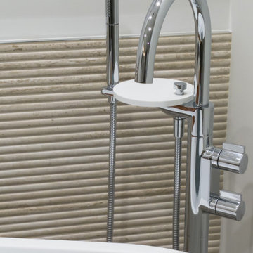
- Reimagined Layout: Moved the shower from the back of the room, creating a more open feel with additional glass while preserving privacy with a wing wall and bench. The freestanding tub was angled to optimize space and enhance circulation, with textured tile behind it adding visual interest.
- Efficient Storage: Eliminated the original linen closet and incorporated functional base cabinet storage and a designated makeup area for added utility.
- Optimized Access: Adjusted the depth of the makeup vanity to provide sufficient walkway clearance, ensuring a comfortable flow around the tub.
- Tailored Features: Installed a smaller pocket door in the commode room to resolve framing and plumbing limitations.
- Elegant Accents: Introduced a subtle marble herringbone mosaic tile in the shower and textured tile behind the tub to enhance the monochromatic palette. Painted cabinetry in a dark gray finish provided a bold yet refined contrast to the light countertops.
Final Thoughts:
The reimagined primary bathroom is a true reflection of the client’s needs and style preferences. By thoughtfully reworking the layout and incorporating functional yet elegant design elements, we created a serene and practical space that serves as a personal retreat. The result is a timeless bathroom that supports their busy lifestyle while providing moments of tranquility.
 Drury Design
THE SETUP
The original primary bathroom was characterized by a disjointed and segmented layout. The shower featured a bulky glass-block enclosure that overwhelmed the space visually. There was a considerable amount of open, unused space, and despite having a his and hers vanity, the arrangement lacked personal space for each user, as they shared the conjoined space between the sinks. The toilet was inconveniently located right by the door, with a half-wall partition meant to provide privacy but instead contributing to a cramped and unbalanced feel. Overall, the bathroom’s layout and design were fragmented, failing to make the most of the available space and lacking adequate storage solutions.
Design objectives:
- Reconfigure the layout to enhance functionality and flow.
- Create an elegant, upscale aesthetic that is light and bright.
- Incorporate specialized storage solutions for female hair care needs.
- Increase overall storage capacity.
- Develop a spa-like shower experience.
- Provide a significant wow factor to the space.
THE REMODEL
Design challenges to be solved:
- Repositioning the toilet to a more suitable location.
- Designing hair care storage solutions without cluttering the elegant space.
- Balancing an upscale, elegant design with a feminine touch in the color palette.
- Increasing the brightness of the room without adding windows.
- Completely replacing the existing shower to create a spa-like experience.
- Planning new storage solutions without adding bulkiness or clutter to the cabinetry.
THE RENEWED SPACE
Design solutions:
Toilet Relocation: Moved the toilet by the window, creating a better overall layout that also opened up two full walls for cabinetry and storage solutions.
Specialized Vanity Storage: The left side of the left vanity is the wife’s. Open shelves facing across the vanity can be used for decorative or daily needs items. Pull-out docking drawers with power outlets and metal basins handle hot hair appliances.
Bright and Elegant Color Scheme: White cabinets, countertops, floors, and shower walls keep the space bright. The just-off-white wall color with a hint of pink adds a feminine touch. Thin wainscoting with white trim offers traditional-leaning elegance.
Layered Lighting Strategy: Ceiling can lights, sconces, lighted mirrors, and toe-kick lighting were installed. Natural light-rated bulbs keep the space bright and natural-feeling.
Spa-Like Shower: An extra-large shower was created using the same floor tile materials for continuity. Equipped with a Kohler Anthem system with a shower head, hand-held, and four body sprays. His and Hers niches for separate body care product storage.
Enhanced Storage Solutions: Added a linen cabinet within the vanity area for efficient storage of towels and bathroom essentials.
This elegant bathroom feels incredibly spacious now. The color palette and lights keep the room bright and cheery. Gold fixtures, the herringbone pattern on the floor, and exquisite trim work add an elegant touch. With the husband and wife having their own vanity wall sections joined at the corner, each user truly has their own space within the space. The clients are very happy with the final result.
 Advance Design Studio, Ltd.
After six years of living in their Huntley IL home, Chris and Meghan were tired of their dark, dingy, outdated kitchen and it was finally time for a long-anticipated change. “The kitchen is the place where we live, it’s where we do everything,” Meghan said. “It was important that it be a space where we wanted to be.” Meghan loves cooking and enjoys including their girls in healthy meal prepping, this led them to want a brighter, more enjoyable kitchen with increased functionality and improved storage.
For Chris especially, the laundry room was an entirely dysfunctional eyesore. “We had a washer and a dryer, but it was all kind-of cobbled together!” Chris said. “There were always laundry piles everywhere, we weren’t really sure what we wanted to do in there, but it was time for us to make a change.” The mess of the space was stressful every time they walked in the door from the garage each day. Kids’ backpacks and shoes piled up haphazardly in the makeshift boot-bench closet left the family feeling disorganized and stressed. They needed space for folding clothes and locker cubbies to help keep the family organized.
Having known Christine and Todd in the Huntley community for years, Chris and Meghan were familiar with their work. “We already trusted them personally and having seen their projects for years we knew they did top notch work. After we reviewed the initial round of designs, we knew that hiring them was definitely the right choice,” Meghan and Chris said. Although Chris had done a lot of work in their home himself, the kitchen and laundry room renovation was such a large undertaking that he didn’t want to steal time away from his family to spend what would surely be many long weekends doing the job himself. “That would not have been a wise choice for us,” Chris laughed.
“Our designer, Michelle was very, very, easy to work with; anything we wanted to see or weren’t sure about, she went above and beyond to make this easy for us. She was easy to get hold of and always quick to respond,” the couple said. Michelle pulled ideas that mirrored the couple’s taste and style and was adept at directing the couple to limited choices that didn’t overwhelm them and kept the process moving. “I have a hard time making decisions. Michelle made the decision-making process so easy. I loved how she listened to what I liked and then presented three great options for me to choose from,” Meghan said.
The main objectives for the kitchen were better storage solutions, they wanted the space to reflect their lifestyle and taste, and they wanted it to last for years with low maintenance. One of the first steps in creating a more functional kitchen was relocating the refrigerator, creating an improved workflow for the busy family.
“We didn’t know that we could even move the refrigerator to a new location where it is now, that was something that we never would have thought of,” Chris said. “The new refrigerator location makes the kitchen feel so much bigger. We didn’t add any space, but our whole kitchen with the new design just seems like it’s so much larger than before!” Meghan said.
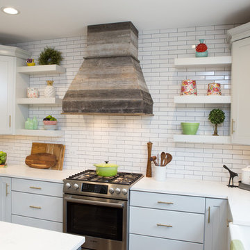
The perimeter mist colored cabinets helped warm and brighten the entire room, while the graphite colored cabinets on the island added contrast. Using this fresh, clean color palette satisfied the couple’s desire for a bright space that was the exact opposite of what they had before. Organization accessories were also added to the cabinets such as a spice drawer tray and roll outs to create hidden convenience.
“I absolutely love the hidden spices – it makes cooking so much more enjoyable!” Chris said. “And all the pull outs, and the double trash bin, who would think you could get so excited about organization!” the couple said in unison.
One thing they hated in their original kitchen was how dark the space felt. Added lighting on the ceiling with the new light fixtures combined with the lighter cabinetry colors throughout solved this problem. “Our new kitchen has this warm, almost cozy feeling that our old kitchen never had, it’s just a space that I love spending my time in now,” Meghan said. The light airy feeling was accentuated with the use of floating white shelves on either side of the decorative range hood. “We have so much cabinetry space, the new design is amazing we actually have more storage space than we will ever need,” Meghan said.
The island was extended to create more work surface and added space for stool seating. “The new island changes how we live. Now the kids can be in the kitchen with us, doing homework, eating breakfast, and the three of us have special dinners there when Chris is working late,” Meghan said.
The Carrara Marmi Quartz countertops were chosen because they are, not only beautiful, but are made from hard-working material that doesn’t require maintenance. The white subway tile backsplash that wraps to the ceiling behind the focal point cooktop range/hood compliments the crisp white countertops perfectly, while brushed brass hardware and light fixtures keep the design fresh and new.
The couple had a few fears at the beginning of the project, as most homeowners do. Their biggest fear was being out of their kitchen and laundry room for an extended time. The crew made it very easy for the family to work in a limited space keeping the washer and dryer hooked up the majority of the time, and also getting appliances working with minimal downtime.
“They above and beyond accommodated us to get us through the process,” Meghan said. “They did a great job making sure we were as comfortable as possible throughout the process,” Chris added.
“Our project manager DJ did a great job. He was very good at updating us on schedule changes, getting guys in as quickly as possible. Everyone that stepped in the house was nice and did great work,” said Chris. They thought Advance’s carpenter was phenomenal and were impressed when he took a conceptual idea from a photograph and worked with designer Michelle to create a one of a kind range/hood that has become the topic of conversation with friends and family who visit the new kitchen. “He was in our house literally every day for several weeks. He was easy to work with and good at what he did,” Meghan and Chris said.
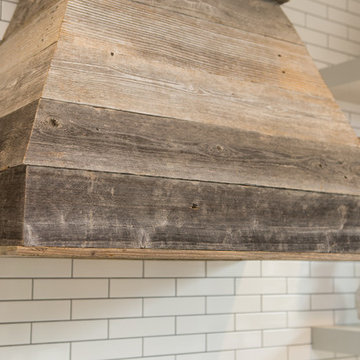
The focal point of the kitchen; a hand-crafted, custom-built ventilation hood was clad with handpicked reclaimed barnwood. Advance Design’s carpenter built the framework and the cladding to create a one-of-a-kind design element that the couple loves.
“I think it was especially fun for him to create something unique from scratch, showcasing his talent in this area,” Meghan said. “I love that my kitchen is not like everyone else’s. I got to pick out the wood on my hood and watch it being built and was able to choose what pieces of wood went where on it. It’s totally unique.”
Red Oak flooring was toothed-in throughout the kitchen and the rest of the first floor anywhere changes were made. Then the whole floor was refinished to tone down the orange undertones in the existing floor stain, ultimately changing the color complexion of the entire first floor. The result is a completely new feeling to the entire home.
Renovating the laundry room was extremely important to Meghan and Chris, but they had trouble visualizing what the possibilities were for the seemingly small space. Michelle produced beautiful 3D illustrations that helped them envision the space in a whole new way.
“I must have told Michelle 100 times that I am a visual person, seeing the designs in 3D made it so easy to make decisions and see what we could really do with our space,” Meghan said.
A dividing wall and doorway were removed between the existing laundry room and hallway formerly containing a coat closet, providing space to design specialized graphite colored cabinetry matching the kitchen island to house custom storage cubbies for each family member. Adding the tall utility cabinetry in the new laundry area helped solve the storage issue, tucking away cleaning supplies, household items, and even the cat got its own cubby.
“I love how everything is now hidden in its own space. I can’t tell you how much I hated coming home and seeing everything sitting around on counters,” Chris said.
Electrical outlets were planned for the inside of utility cabinets, so devices could charge in hidden locations. Stacking the washer and dryer allowed for wider countertop space to provide a folding area and a special space for clothes to hang. “The way I do laundry has been completely transformed! I can actually fold clothes and hang them now right out of the washer and dryer,” Meghan said.
“The end result in the kitchen and the laundry/mud room was an updated light and bright space, with a smarter work flow that better meets the needs of this family,” Michelle said.
“I would totally recommend Advance Design,” Meghan said. “Sometimes I sit and just look at my kitchen and laundry room and think ‘Wow, I can’t believe I get to live here!’ It’s an understatement to say we love our new space.”
 Advance Design Studio, Ltd.
After six years of living in their Huntley IL home, Chris and Meghan were tired of their dark, dingy, outdated kitchen and it was finally time for a long-anticipated change. “The kitchen is the place where we live, it’s where we do everything,” Meghan said. “It was important that it be a space where we wanted to be.” Meghan loves cooking and enjoys including their girls in healthy meal prepping, this led them to want a brighter, more enjoyable kitchen with increased functionality and improved storage.
For Chris especially, the laundry room was an entirely dysfunctional eyesore. “We had a washer and a dryer, but it was all kind-of cobbled together!” Chris said. “There were always laundry piles everywhere, we weren’t really sure what we wanted to do in there, but it was time for us to make a change.” The mess of the space was stressful every time they walked in the door from the garage each day. Kids’ backpacks and shoes piled up haphazardly in the makeshift boot-bench closet left the family feeling disorganized and stressed. They needed space for folding clothes and locker cubbies to help keep the family organized.
Having known Christine and Todd in the Huntley community for years, Chris and Meghan were familiar with their work. “We already trusted them personally and having seen their projects for years we knew they did top notch work. After we reviewed the initial round of designs, we knew that hiring them was definitely the right choice,” Meghan and Chris said. Although Chris had done a lot of work in their home himself, the kitchen and laundry room renovation was such a large undertaking that he didn’t want to steal time away from his family to spend what would surely be many long weekends doing the job himself. “That would not have been a wise choice for us,” Chris laughed.
“Our designer, Michelle was very, very, easy to work with; anything we wanted to see or weren’t sure about, she went above and beyond to make this easy for us. She was easy to get hold of and always quick to respond,” the couple said. Michelle pulled ideas that mirrored the couple’s taste and style and was adept at directing the couple to limited choices that didn’t overwhelm them and kept the process moving. “I have a hard time making decisions. Michelle made the decision-making process so easy. I loved how she listened to what I liked and then presented three great options for me to choose from,” Meghan said.
The main objectives for the kitchen were better storage solutions, they wanted the space to reflect their lifestyle and taste, and they wanted it to last for years with low maintenance. One of the first steps in creating a more functional kitchen was relocating the refrigerator, creating an improved workflow for the busy family.
“We didn’t know that we could even move the refrigerator to a new location where it is now, that was something that we never would have thought of,” Chris said. “The new refrigerator location makes the kitchen feel so much bigger. We didn’t add any space, but our whole kitchen with the new design just seems like it’s so much larger than before!” Meghan said.
The perimeter mist colored cabinets helped warm and brighten the entire room, while the graphite colored cabinets on the island added contrast. Using this fresh, clean color palette satisfied the couple’s desire for a bright space that was the exact opposite of what they had before. Organization accessories were also added to the cabinets such as a spice drawer tray and roll outs to create hidden convenience.
“I absolutely love the hidden spices – it makes cooking so much more enjoyable!” Chris said. “And all the pull outs, and the double trash bin, who would think you could get so excited about organization!” the couple said in unison.
One thing they hated in their original kitchen was how dark the space felt. Added lighting on the ceiling with the new light fixtures combined with the lighter cabinetry colors throughout solved this problem. “Our new kitchen has this warm, almost cozy feeling that our old kitchen never had, it’s just a space that I love spending my time in now,” Meghan said. The light airy feeling was accentuated with the use of floating white shelves on either side of the decorative range hood. “We have so much cabinetry space, the new design is amazing we actually have more storage space than we will ever need,” Meghan said.
The island was extended to create more work surface and added space for stool seating. “The new island changes how we live. Now the kids can be in the kitchen with us, doing homework, eating breakfast, and the three of us have special dinners there when Chris is working late,” Meghan said.
The Carrara Marmi Quartz countertops were chosen because they are, not only beautiful, but are made from hard-working material that doesn’t require maintenance. The white subway tile backsplash that wraps to the ceiling behind the focal point cooktop range/hood compliments the crisp white countertops perfectly, while brushed brass hardware and light fixtures keep the design fresh and new.
The couple had a few fears at the beginning of the project, as most homeowners do. Their biggest fear was being out of their kitchen and laundry room for an extended time. The crew made it very easy for the family to work in a limited space keeping the washer and dryer hooked up the majority of the time, and also getting appliances working with minimal downtime.
“They above and beyond accommodated us to get us through the process,” Meghan said. “They did a great job making sure we were as comfortable as possible throughout the process,” Chris added.
“Our project manager DJ did a great job. He was very good at updating us on schedule changes, getting guys in as quickly as possible. Everyone that stepped in the house was nice and did great work,” said Chris. They thought Advance’s carpenter was phenomenal and were impressed when he took a conceptual idea from a photograph and worked with designer Michelle to create a one of a kind range/hood that has become the topic of conversation with friends and family who visit the new kitchen. “He was in our house literally every day for several weeks. He was easy to work with and good at what he did,” Meghan and Chris said.
The focal point of the kitchen; a hand-crafted, custom-built ventilation hood was clad with handpicked reclaimed barnwood. Advance Design’s carpenter built the framework and the cladding to create a one-of-a-kind design element that the couple loves.
“I think it was especially fun for him to create something unique from scratch, showcasing his talent in this area,” Meghan said. “I love that my kitchen is not like everyone else’s. I got to pick out the wood on my hood and watch it being built and was able to choose what pieces of wood went where on it. It’s totally unique.”
Red Oak flooring was toothed-in throughout the kitchen and the rest of the first floor anywhere changes were made. Then the whole floor was refinished to tone down the orange undertones in the existing floor stain, ultimately changing the color complexion of the entire first floor. The result is a completely new feeling to the entire home.
Renovating the laundry room was extremely important to Meghan and Chris, but they had trouble visualizing what the possibilities were for the seemingly small space. Michelle produced beautiful 3D illustrations that helped them envision the space in a whole new way.
“I must have told Michelle 100 times that I am a visual person, seeing the designs in 3D made it so easy to make decisions and see what we could really do with our space,” Meghan said.
A dividing wall and doorway were removed between the existing laundry room and hallway formerly containing a coat closet, providing space to design specialized graphite colored cabinetry matching the kitchen island to house custom storage cubbies for each family member. Adding the tall utility cabinetry in the new laundry area helped solve the storage issue, tucking away cleaning supplies, household items, and even the cat got its own cubby.
“I love how everything is now hidden in its own space. I can’t tell you how much I hated coming home and seeing everything sitting around on counters,” Chris said.
Electrical outlets were planned for the inside of utility cabinets, so devices could charge in hidden locations. Stacking the washer and dryer allowed for wider countertop space to provide a folding area and a special space for clothes to hang. “The way I do laundry has been completely transformed! I can actually fold clothes and hang them now right out of the washer and dryer,” Meghan said.
“The end result in the kitchen and the laundry/mud room was an updated light and bright space, with a smarter work flow that better meets the needs of this family,” Michelle said.
“I would totally recommend Advance Design,” Meghan said. “Sometimes I sit and just look at my kitchen and laundry room and think ‘Wow, I can’t believe I get to live here!’ It’s an understatement to say we love our new space.”
 Designs Daly
The first goal of this project was to address challenges with the home’s flooring and plumbing system. Additionally, the renovation of the guest and master bathrooms was required to meet the client’s preferences and enhance functionality. Ensuring that the new flooring and foundation repair solved the existing crack issue was a crucial aspect of the project. The remodel of the guest bathroom was aimed at making it more suitable for children’s use, while the overhaul of the master bathroom considered the overall style and functionality preferred by the client. Ultimately, the project aimed to enhance the aesthetic appeal and value of the client’s home while addressing the various renovation requirements.
 Tile Doctor Ltd
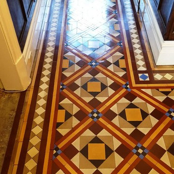
The colourful and diverse geometric patterns of a Victorian tiled floor can give a property a regal, elegant and timeless feel, making it a popular choice even in the 21st century. However, as time passes without regular care and maintenance, Victorian tiles can quickly lose their colour and appear deadened by the buildup of dirt and dust over several months (and sometimes years).
This property owner in Hebden a very small village in North Yorkshire of less than 300 people, had this common problem. Her Victorian tiled hallway had not been adequately maintained and was now more difficult to keep clean than ever. To add to the problem, most of the tiles along the edges were either broken, cracked, or filled with holes, probably I suspect from the installation of carpet grippers at some point in the past.
At this point, the property owner turned to Tile Doctor to see what could be done.
Before beginning a deep clean of the entire length of the hallway, it was first necessary to source and install replacement tiles for those that had been broken and damaged. I also relaid any that were loose.
When finished, I left the tiles to set and returned the next day to start the clean. My choice of cleaner in this situation was Tile Doctor Pro Clean, which was scrubbed into the floor with a special pad fitted to a rotary machine to break down ingrained dirt and stains. Pro Clean does this very effectively on all types of tile, including natural stone and of course Victorian tiles.
The floor was then rinsed with water and the soiled cleaning solution extracted from the floor using a vet vacuum. Stubborn areas were re-treated with more Pro Clean, and when I was satisfied with the condition of the tiles the floor was given a final but thorough rinse to remove any trace of cleaning product.
The floor was then left to dry completely overnight to ensure all excess moisture had disappeared, leaving it fresh to be sealed. I returned in the morning for a third day of work to seal the Victorian tiles with four coats of Tile Doctor Seal and Go, a topical sealer which provides a rich satin finish to really add depth to the colours in the tile while protecting it against dirt and stains.
The customer was delighted with the restoration and couldn’t quite believe the huge improvement in the appearance of the tiles, especially in regards to the enhancement in the different colours. Another satisfied customer!
Nigel Stoker
North West Yorkshire Tile Doctor
 Designs Daly
The first goal of this project was to address challenges with the home’s flooring and plumbing system. Additionally, the renovation of the guest and master bathrooms was required to meet the client’s preferences and enhance functionality. Ensuring that the new flooring and foundation repair solved the existing crack issue was a crucial aspect of the project. The remodel of the guest bathroom was aimed at making it more suitable for children’s use, while the overhaul of the master bathroom considered the overall style and functionality preferred by the client. Ultimately, the project aimed to enhance the aesthetic appeal and value of the client’s home while addressing the various renovation requirements.
 Paver House
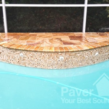
This Tampa Bay homeowner was looking into complete change his backyard. Most pools in Tampa are built with a connected spa. To increase his pool size, he ended up deciding for not to build spa, however, he still wanted an appealing focal point to his pool. To contrast with the beautiful green landscape around the backyard, our customer wanted to add color and movement to his outdoor area.
For the main pool deck area, our customer felt in love with the french pattern autumn blend tumbled travertine pavers. French Pattern Tumbled Autumn Blend Travertine Pavers contain a mixture of mostly red and gold, with some white, dark and light brown tones. Autumn Blend added the perfect amount of color and movement our customer wanted.
Travertine pavers offer a few unique color mixtures that make any outdoor space pops up from others.
A great accent color solution for the coping was the Desert Gold color on the 4×9 tumbled travertine copings. The beautifully blended Desert Gold may be bright and striking but does not lack for warmth and richness as well. To not compete with the strong colors of the pool deck, we advised our customer to add a lighter and more neutral pool tile: 2×2 autumn blend tumbled travertine tiles brought the perfect combination of contrast and harmony we were looking to achieve.
CREATIVITY ON YOUR POOL REMODEL WITH TRAVERTINE PAVER.
Pool remodel with travertine paver does not need to represent neutral colors only. Different than what most people believe, travertine pavers offer a few unique color mixtures that make any outdoor space pop up from others. Don’t be afraid of mixing different patterns, colors and textures to add more character to your outdoor space. Remember that, travertine pavers will display better their color when sealed, like the pictures from this pool remodel. If you are not sure if you would like your paver with the enhanced color, spray the sample with water first.
PREMIUM TRAVERTINE FRENCH PATTERN PAVERS
Pool remodel with travertine paver
POOL REMODEL WITH TRAVERTINE PAVERS
This Tampa Bay homeowner was looking into complete change his backyard. Most pools in Tampa are built with a connected spa. To increase his pool size, he ended up deciding for not to build spa, however, he still wanted an appealing focal point to his pool. To contrast with the beautiful green landscape around the backyard, our customer wanted to add color and movement to his outdoor area.
For the main pool deck area, our customer felt in love with the french pattern autumn blend tumbled travertine pavers. French Pattern Tumbled Autumn Blend Travertine Pavers contain a mixture of mostly red and gold, with some white, dark and light brown tones. Autumn Blend added the perfect amount of color and movement our customer wanted.
pool remodel with travertine paverpool remodel with travertine paverpool remodel with travertine paverpool remodel with travertine paverpool remodel with travertine paver
Previous
Next
Travertine pavers offer a few unique color mixtures that make any outdoor space pops up from others.
A great accent color solution for the coping was the Desert Gold color on the 4×9 tumbled travertine copings. The beautifully blended Desert Gold may be bright and striking but does not lack for warmth and richness as well. To not compete with the strong colors of the pool deck, we advised our customer to add a lighter and more neutral pool tile: 2×2 autumn blend tumbled travertine tiles brought the perfect combination of contrast and harmony we were looking to achieve.
CREATIVITY ON YOUR POOL REMODEL WITH TRAVERTINE PAVER.
Pool remodel with travertine paver does not need to represent neutral colors only. Different than what most people believe, travertine pavers offer a few unique color mixtures that make any outdoor space pop up from others. Don’t be afraid of mixing different patterns, colors and textures to add more character to your outdoor space. Remember that, travertine pavers will display better their color when sealed, like the pictures from this pool remodel. If you are not sure if you would like your paver with the enhanced color, spray the sample with water first.
PREMIUM TRAVERTINE FRENCH PATTERN PAVERS
On this pool remodel project, our customer preferred to use the French Pattern design, which is a good way to break up the monotony of the typical geometric or square appearance of large areas. Just like this outstanding pool deck remodel, patios and walkways will appear more fluid and mosaic by eliminating grout lines and the usual linear effect as well as the need for constant maintenance of the typical square or rectangular paver.
A French Pattern or a Versailles pattern is a paver pattern made up of four different sized tiles. Most French patterns are laid in stone, and nearly all are sold in “bundles” of tile that will cover 16 square feet.
Travertine pavers on your pool deck will reflect heat on hot days, remaining cool to the touch, unlike concrete surface options. Travertine does not discolor or become chalky after installation. The texture of travertine ensures that the stone remains slip resistant for wet feet, while its cool feel prevents burns. Another great advantage of travertine pavers is that there will be no visible grout lines; grout can be a source of both installation problems and added cost for future removal / replacement or up-keep.
 Tile Doctor Ltd
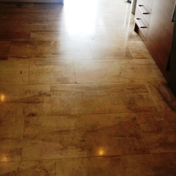
This customer from the historic city of Cardiff was keen to see what Tile Doctor could do to put some life back into their treasured Limestone kitchen floor that was laid in 2008. My first observations were mainly centred on the horrific condition of the surface which although adequately sealed initially the floor had not received any subsequent maintenance and its condition had deteriorated over time. The light shining in from the patio doors highlighted all the imperfections in the floor caused by surface wear and tear commonly seen in high traffic areas such as a kitchen.
Upon closer inspection, there were further problems: the floor was stained and scuffed, and in most places the sealer had worn off completely allowing the dirt to become ingrained into the pores of the Limestone. Additionally the grout was recessed but was now flush with the tile surface due to dirt build-up. There were also areas contaminated with grease and kitchen cooking oil.
The Limestone floor tiles were 20mm thick French Limestone, and had been laid very well so there was no requirement to do any tile or grout repairs however to get this floor back to its original condition the surface would need to be reconditioned using the Tile Doctor four stage burnishing system.
I started by giving the floor a wash with a medium dilution of Tile Doctor Pro-Clean, focusing mainly on the grout lines in order to remove the muck that had built-up there. I used a special stiff grout brush for this activity; it’s quite narrow and ideal for grout scrubbing.
This worked well, but the significant build-up of dirt along some of the grout lines meant more work was required. I tackled this problem with a hand scraper assisted with steam. At the end of this process, the whole floor was then rinsed down with water to remove any soil and the resulting slurry was then extracted using a wet vacuum.
The next step was to start the burnishing process, which basically involves applying four diamond encrusted floor pads in sequence over the floor. Each pad is a different grade, starting with the most abrasive coarse pad and moving through to the finer grades using a little water to lubricate and rinsing away any slurry between each pad.
I eventually finished with the extra fine pad which builds up shine and lustre on the tile; it had taken two days to clean the grout and burnish the Limestone but the floor was much improved and so after a final rinse down I left the floor to dry off overnight with the aid of the underfloor heating.
During this time, I also addressed the stained Limestone in the area of the kitchen where the dustbin was situated. This had been a major upset for the customer and I’m happy to report I managed to deal with it. However, it was quite an involved process, so I’ll write about this in a separate post.
On the third day I came back to seal the floor, checking first that it had dried sufficiently with a damp meter. Fortunately, the underfloor heating had done a great job of drying the stone and I was able to seal the floor using three coats of Tile Doctor Colour Grow sealant. This sealant not only provides a durable seal but also penetrates deep into the pores of the stone protecting it from within and enhancing the natural colours of the Limestone in the process.
After the final layer of sealant, I worked over the floor again with the extra fine burnishing pad both to add shine again following sealing, and to ensure that no smear marks were visible as the lighting conditions were unforgiving and highlighted any imperfections.
The customer was delighted with the results: so much so, in fact, that they booked me in to restore their Victorian hallway floor as well but that’s a story for another time!
Julian Iancono
SE Wales Tile Doctor
 Drury Design
THE SETUP
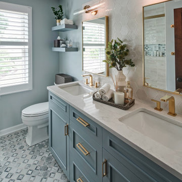
Sam’s clients wanted to update their hall bathroom used by their three children. The goal was to create a space that is both kid-friendly and elegant, ensuring it remains functional and stylish as the children grow. The original bathroom felt confined due to dark materials and a single-sink vanity. The challenge was to find a design that looks great now and in the future.
Design objectives:
Create a sense of spaciousness
Increase storage for bathroom necessities and daily routines
Enhance lighting
THE REMODEL
Design challenges to be solved:
No structural changes – must keep the tub and wall structure
Transforming a small, dark space into a bright, open one without adding a new window
Multi-user-minded – Improving functionality for multiple users simultaneously
Timeless & kid-friendly – create a comfy kid-friendly look that won’t appear dated as the kids grow older
THE RENEWED SPACE
Design solutions:
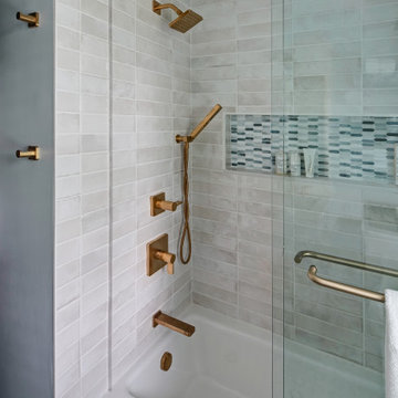
Slimmer Tub and Sliding Shower Door installed to free up functional space, making the bathroom feel larger.
Lighter Materials used to reflect more light and add a vibrant feel. Open shelves above the toilet provide storage without making the space feel cramped, while allowing light from the existing window to permeate.
Dual Sink Vanity added, and split the mirror into two, creating individual stations for the kids and enhancing usability during busy routines.
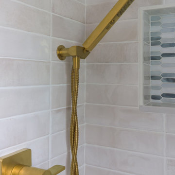
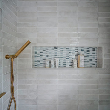
Kid-Friendly Features – Incorporated toe-kick lighting that works as a nightlight, a lower-mounted shower handheld, and a large, accessible shower niche. The geometric shapes and blue color palette contribute to a fun yet sophisticated look.
The clients are thrilled with the transformation. The bathroom is now fun and elegant, providing a timeless look that will grow with the kids. They appreciate the increased functionality and the bright, open feel of the space.
This remodel successfully blends practical solutions with stylish design, ensuring the hall bathroom meets the needs of a busy family while maintaining a sophisticated look.
 Drury Design
THE SETUP
Sam’s clients wanted to update their hall bathroom used by their three children. The goal was to create a space that is both kid-friendly and elegant, ensuring it remains functional and stylish as the children grow. The original bathroom felt confined due to dark materials and a single-sink vanity. The challenge was to find a design that looks great now and in the future.
Design objectives:
Create a sense of spaciousness
Increase storage for bathroom necessities and daily routines
Enhance lighting
THE REMODEL
Design challenges to be solved:
No structural changes – must keep the tub and wall structure
Transforming a small, dark space into a bright, open one without adding a new window
Multi-user-minded – Improving functionality for multiple users simultaneously
Timeless & kid-friendly – create a comfy kid-friendly look that won’t appear dated as the kids grow older
THE RENEWED SPACE
Design solutions:
Slimmer Tub and Sliding Shower Door installed to free up functional space, making the bathroom feel larger.
Lighter Materials used to reflect more light and add a vibrant feel. Open shelves above the toilet provide storage without making the space feel cramped, while allowing light from the existing window to permeate.
Dual Sink Vanity added, and split the mirror into two, creating individual stations for the kids and enhancing usability during busy routines.
Kid-Friendly Features – Incorporated toe-kick lighting that works as a nightlight, a lower-mounted shower handheld, and a large, accessible shower niche. The geometric shapes and blue color palette contribute to a fun yet sophisticated look.
The clients are thrilled with the transformation. The bathroom is now fun and elegant, providing a timeless look that will grow with the kids. They appreciate the increased functionality and the bright, open feel of the space.
This remodel successfully blends practical solutions with stylish design, ensuring the hall bathroom meets the needs of a busy family while maintaining a sophisticated look.
 Drury Design
THE SETUP
Sam’s clients wanted to update their hall bathroom used by their three children. The goal was to create a space that is both kid-friendly and elegant, ensuring it remains functional and stylish as the children grow. The original bathroom felt confined due to dark materials and a single-sink vanity. The challenge was to find a design that looks great now and in the future.
Design objectives:
Create a sense of spaciousness
Increase storage for bathroom necessities and daily routines
Enhance lighting
THE REMODEL
Design challenges to be solved:
No structural changes – must keep the tub and wall structure
Transforming a small, dark space into a bright, open one without adding a new window
Multi-user-minded – Improving functionality for multiple users simultaneously
Timeless & kid-friendly – create a comfy kid-friendly look that won’t appear dated as the kids grow older
THE RENEWED SPACE
Design solutions:
Slimmer Tub and Sliding Shower Door installed to free up functional space, making the bathroom feel larger.
Lighter Materials used to reflect more light and add a vibrant feel. Open shelves above the toilet provide storage without making the space feel cramped, while allowing light from the existing window to permeate.
Dual Sink Vanity added, and split the mirror into two, creating individual stations for the kids and enhancing usability during busy routines.
Kid-Friendly Features – Incorporated toe-kick lighting that works as a nightlight, a lower-mounted shower handheld, and a large, accessible shower niche. The geometric shapes and blue color palette contribute to a fun yet sophisticated look.
The clients are thrilled with the transformation. The bathroom is now fun and elegant, providing a timeless look that will grow with the kids. They appreciate the increased functionality and the bright, open feel of the space.
This remodel successfully blends practical solutions with stylish design, ensuring the hall bathroom meets the needs of a busy family while maintaining a sophisticated look.
 Drury Design
THE SETUP
Sam’s clients wanted to update their hall bathroom used by their three children. The goal was to create a space that is both kid-friendly and elegant, ensuring it remains functional and stylish as the children grow. The original bathroom felt confined due to dark materials and a single-sink vanity. The challenge was to find a design that looks great now and in the future.
Design objectives:
Create a sense of spaciousness
Increase storage for bathroom necessities and daily routines
Enhance lighting
THE REMODEL
Design challenges to be solved:
No structural changes – must keep the tub and wall structure
Transforming a small, dark space into a bright, open one without adding a new window
Multi-user-minded – Improving functionality for multiple users simultaneously
Timeless & kid-friendly – create a comfy kid-friendly look that won’t appear dated as the kids grow older
THE RENEWED SPACE
Design solutions:
Slimmer Tub and Sliding Shower Door installed to free up functional space, making the bathroom feel larger.
Lighter Materials used to reflect more light and add a vibrant feel. Open shelves above the toilet provide storage without making the space feel cramped, while allowing light from the existing window to permeate.
Dual Sink Vanity added, and split the mirror into two, creating individual stations for the kids and enhancing usability during busy routines.
Kid-Friendly Features – Incorporated toe-kick lighting that works as a nightlight, a lower-mounted shower handheld, and a large, accessible shower niche. The geometric shapes and blue color palette contribute to a fun yet sophisticated look.
The clients are thrilled with the transformation. The bathroom is now fun and elegant, providing a timeless look that will grow with the kids. They appreciate the increased functionality and the bright, open feel of the space.
This remodel successfully blends practical solutions with stylish design, ensuring the hall bathroom meets the needs of a busy family while maintaining a sophisticated look.
 Designs Daly
The first goal of this project was to address challenges with the home’s flooring and plumbing system. Additionally, the renovation of the guest and master bathrooms was required to meet the client’s preferences and enhance functionality. Ensuring that the new flooring and foundation repair solved the existing crack issue was a crucial aspect of the project. The remodel of the guest bathroom was aimed at making it more suitable for children’s use, while the overhaul of the master bathroom considered the overall style and functionality preferred by the client. Ultimately, the project aimed to enhance the aesthetic appeal and value of the client’s home while addressing the various renovation requirements.
 Drury Design
THE SETUP
The original primary bathroom was characterized by a disjointed and segmented layout. The shower featured a bulky glass-block enclosure that overwhelmed the space visually. There was a considerable amount of open, unused space, and despite having a his and hers vanity, the arrangement lacked personal space for each user, as they shared the conjoined space between the sinks. The toilet was inconveniently located right by the door, with a half-wall partition meant to provide privacy but instead contributing to a cramped and unbalanced feel. Overall, the bathroom’s layout and design were fragmented, failing to make the most of the available space and lacking adequate storage solutions.
Design objectives:
- Reconfigure the layout to enhance functionality and flow.
- Create an elegant, upscale aesthetic that is light and bright.
- Incorporate specialized storage solutions for female hair care needs.
- Increase overall storage capacity.
- Develop a spa-like shower experience.
- Provide a significant wow factor to the space.
THE REMODEL
Design challenges to be solved:
- Repositioning the toilet to a more suitable location.
- Designing hair care storage solutions without cluttering the elegant space.
- Balancing an upscale, elegant design with a feminine touch in the color palette.
- Increasing the brightness of the room without adding windows.
- Completely replacing the existing shower to create a spa-like experience.
- Planning new storage solutions without adding bulkiness or clutter to the cabinetry.
THE RENEWED SPACE
Design solutions:
Toilet Relocation: Moved the toilet by the window, creating a better overall layout that also opened up two full walls for cabinetry and storage solutions.
Specialized Vanity Storage: The left side of the left vanity is the wife’s. Open shelves facing across the vanity can be used for decorative or daily needs items. Pull-out docking drawers with power outlets and metal basins handle hot hair appliances.
Bright and Elegant Color Scheme: White cabinets, countertops, floors, and shower walls keep the space bright. The just-off-white wall color with a hint of pink adds a feminine touch. Thin wainscoting with white trim offers traditional-leaning elegance.
Layered Lighting Strategy: Ceiling can lights, sconces, lighted mirrors, and toe-kick lighting were installed. Natural light-rated bulbs keep the space bright and natural-feeling.
Spa-Like Shower: An extra-large shower was created using the same floor tile materials for continuity. Equipped with a Kohler Anthem system with a shower head, hand-held, and four body sprays. His and Hers niches for separate body care product storage.
Enhanced Storage Solutions: Added a linen cabinet within the vanity area for efficient storage of towels and bathroom essentials.
This elegant bathroom feels incredibly spacious now. The color palette and lights keep the room bright and cheery. Gold fixtures, the herringbone pattern on the floor, and exquisite trim work add an elegant touch. With the husband and wife having their own vanity wall sections joined at the corner, each user truly has their own space within the space. The clients are very happy with the final result.
 Drury Design
THE SETUP
The original primary bathroom was characterized by a disjointed and segmented layout. The shower featured a bulky glass-block enclosure that overwhelmed the space visually. There was a considerable amount of open, unused space, and despite having a his and hers vanity, the arrangement lacked personal space for each user, as they shared the conjoined space between the sinks. The toilet was inconveniently located right by the door, with a half-wall partition meant to provide privacy but instead contributing to a cramped and unbalanced feel. Overall, the bathroom’s layout and design were fragmented, failing to make the most of the available space and lacking adequate storage solutions.
Design objectives:
- Reconfigure the layout to enhance functionality and flow.
- Create an elegant, upscale aesthetic that is light and bright.
- Incorporate specialized storage solutions for female hair care needs.
- Increase overall storage capacity.
- Develop a spa-like shower experience.
- Provide a significant wow factor to the space.
THE REMODEL
Design challenges to be solved:
- Repositioning the toilet to a more suitable location.
- Designing hair care storage solutions without cluttering the elegant space.
- Balancing an upscale, elegant design with a feminine touch in the color palette.
- Increasing the brightness of the room without adding windows.
- Completely replacing the existing shower to create a spa-like experience.
- Planning new storage solutions without adding bulkiness or clutter to the cabinetry.
THE RENEWED SPACE
Design solutions:
Toilet Relocation: Moved the toilet by the window, creating a better overall layout that also opened up two full walls for cabinetry and storage solutions.
Specialized Vanity Storage: The left side of the left vanity is the wife’s. Open shelves facing across the vanity can be used for decorative or daily needs items. Pull-out docking drawers with power outlets and metal basins handle hot hair appliances.
Bright and Elegant Color Scheme: White cabinets, countertops, floors, and shower walls keep the space bright. The just-off-white wall color with a hint of pink adds a feminine touch. Thin wainscoting with white trim offers traditional-leaning elegance.
Layered Lighting Strategy: Ceiling can lights, sconces, lighted mirrors, and toe-kick lighting were installed. Natural light-rated bulbs keep the space bright and natural-feeling.
Spa-Like Shower: An extra-large shower was created using the same floor tile materials for continuity. Equipped with a Kohler Anthem system with a shower head, hand-held, and four body sprays. His and Hers niches for separate body care product storage.
Enhanced Storage Solutions: Added a linen cabinet within the vanity area for efficient storage of towels and bathroom essentials.
This elegant bathroom feels incredibly spacious now. The color palette and lights keep the room bright and cheery. Gold fixtures, the herringbone pattern on the floor, and exquisite trim work add an elegant touch. With the husband and wife having their own vanity wall sections joined at the corner, each user truly has their own space within the space. The clients are very happy with the final result.
 Drury Design
THE SETUP
The original primary bathroom was characterized by a disjointed and segmented layout. The shower featured a bulky glass-block enclosure that overwhelmed the space visually. There was a considerable amount of open, unused space, and despite having a his and hers vanity, the arrangement lacked personal space for each user, as they shared the conjoined space between the sinks. The toilet was inconveniently located right by the door, with a half-wall partition meant to provide privacy but instead contributing to a cramped and unbalanced feel. Overall, the bathroom’s layout and design were fragmented, failing to make the most of the available space and lacking adequate storage solutions.
Design objectives:
- Reconfigure the layout to enhance functionality and flow.
- Create an elegant, upscale aesthetic that is light and bright.
- Incorporate specialized storage solutions for female hair care needs.
- Increase overall storage capacity.
- Develop a spa-like shower experience.
- Provide a significant wow factor to the space.
THE REMODEL
Design challenges to be solved:
- Repositioning the toilet to a more suitable location.
- Designing hair care storage solutions without cluttering the elegant space.
- Balancing an upscale, elegant design with a feminine touch in the color palette.
- Increasing the brightness of the room without adding windows.
- Completely replacing the existing shower to create a spa-like experience.
- Planning new storage solutions without adding bulkiness or clutter to the cabinetry.
THE RENEWED SPACE
Design solutions:
Toilet Relocation: Moved the toilet by the window, creating a better overall layout that also opened up two full walls for cabinetry and storage solutions.
Specialized Vanity Storage: The left side of the left vanity is the wife’s. Open shelves facing across the vanity can be used for decorative or daily needs items. Pull-out docking drawers with power outlets and metal basins handle hot hair appliances.
Bright and Elegant Color Scheme: White cabinets, countertops, floors, and shower walls keep the space bright. The just-off-white wall color with a hint of pink adds a feminine touch. Thin wainscoting with white trim offers traditional-leaning elegance.
Layered Lighting Strategy: Ceiling can lights, sconces, lighted mirrors, and toe-kick lighting were installed. Natural light-rated bulbs keep the space bright and natural-feeling.
Spa-Like Shower: An extra-large shower was created using the same floor tile materials for continuity. Equipped with a Kohler Anthem system with a shower head, hand-held, and four body sprays. His and Hers niches for separate body care product storage.
Enhanced Storage Solutions: Added a linen cabinet within the vanity area for efficient storage of towels and bathroom essentials.
This elegant bathroom feels incredibly spacious now. The color palette and lights keep the room bright and cheery. Gold fixtures, the herringbone pattern on the floor, and exquisite trim work add an elegant touch. With the husband and wife having their own vanity wall sections joined at the corner, each user truly has their own space within the space. The clients are very happy with the final result.
30