
Search results for "Enhances problem solving" in Home Design Ideas
 emily lauderback stewart design and renovation
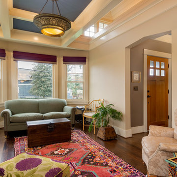
New box beam ceiling and newly exposed gable windows at peak of house. Transition of molding and drywall remedied through the application of shiplap on the exposed peak ceiling and walls. Boxbeams needed to be problem-solved from original architectural design once under construction. Super gratifying to be part of the team to remedy the design!
 Rebecca Reynolds
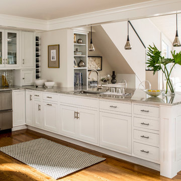
Challenge: To update this 1980's kitchen without adding space and within a budget that felt comfortable for the clients. Many restrictions and limitations existing making this one of the most challenging and problem solving task I had ever undertaken. These include the integrity of the carrying beam which had to remain that held up the second story, a transition to a vaulted ceiling in the adjacent Family Room, a support wall and column that need to be designed around as well as many unseen restrictions inside walls that presented interesting issues to the desired design and some very creative problem solving. Photographed by one of the countries best John Bessler and styled by the very talented Karin Lidbeck- Brent.
 Temescal Sustainable Interior Design
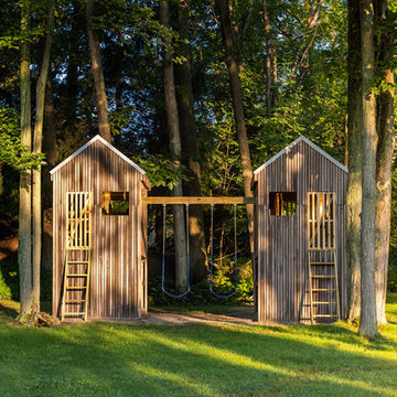
Set inside a circle of 100-year-old maple and oak trees, while complimenting the main home’s architecture, these ‘tree houses’ give shelter, space for imagination & safe play outdoors for twins. Mimicking the trees’ height and scale, and mirrored in each of their designs, these two 6 foot square base by 14 foot tall twin play structures allow for each child to have its own personal space, yet are connected at the center swings.
These unique treehouses have been built with sustainable sourcing and upcycled construction methods. When Martine Ilana, Principal designer of Temescal, considered what a ‘treehouse’ would look like for her twins, immediately it’s ideation was focused on keeping the integrity of the forest and problem solving how to use as many repurposed and sustainable materials as possible.
Accessing the incredible selection of salvage materials from a salvage yard in Detroit, Temescal was able to source non-toxic, and structurally sound woods to build the structure itself.
Healthy building materials include: Metal Roofing and Water based Low VOC paints. A slatted exterior structure was designed to create a rain screen and in addition complement the Main home’s exterior design. Designed with an end of life intention for longevity and a easy means to pull apart these structures apart once the children are older, the foundations can be used for a future ADU.
The slide posed the largest problem to source as recycled plastic slides are not made available to residential projects by US based manufactures and repurposed from Facebook marketplace hit many dead ends. Ultimately, she chose to use a HDPE high density polyurethane plastic slide that would allow for its material to be recycled once at the end of this life.
Every detail, both in their exterior and interior, of these upcycled treehouses was considered with care and an artistic touch that enhances the landscape and forest surrounding them.
Find the right local pro for your project
 Home & Garden Design, Atlanta - Danna Cain, ASLA
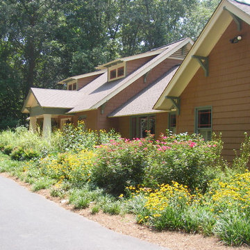
This style landscape isn't for everyone, however it suits this owner perfectly. The awesome, colorful garden in the only sunny area on this several acre site is planted on a high mound that diverts all water either to the huge french drains that run along the house or the driveway that drains into the rain garden. The drainage problems are solved and the owner has the style of garden she desired: a very full, colorful, drought tolerant, easy maintenance cottage garden that attracts birds and butterflies. It's also dog friendly. Plants were chosen to be either something that the does can walk on or walk thru without causing damage. They also LOVE napping on the wide shady path along the house which doubles as the french drain.
Reference also: Native plants, pollinator gardens
THIS PHOTO IS FEATURED IN TWO HOUZZ EDITORIALS! Here's the link!
GET YOUR GARDEN READY FOR THE RAINY SEASON -
https://www.houzz.com/ideabooks/75934975/list/get-your-garden-ready-for-the-rainy-season
Photographer: Danna Cain, Home & Garden Design, Inc.
 Fidelity General Contractors Inc.
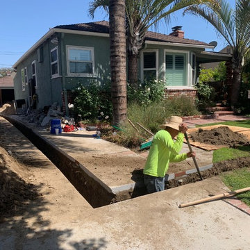
What is an ADU: Accessory Dwelling Units:
An accessory dwelling unit, usually just called an ADU, is a secondary housing unit on a single-family residential lot. The term “accessory dwelling unit” is a institutional-sounding name, but it’s the most commonly-used term across the country to describe this type of housing. While the full name is a mouthful, the shorthand “ADU” is better.
ADUs vary in their physical form quite a bit, as there are detached ADU, attached ADU, second story ADU (above garage or work shop), addition ADU, internal ADU.
IMPORTANT:
There’s simply too few permitted ADUs to make a real difference in the housing stock. But, even if they aren’t going to solve all a city’s problems, they may help homeowners solve some of their problems. The most common motivation for ADU development is rental income potential, followed by the prospect of flexible living space for multigenerational households.
We at FIDELITY GENERAL CONTRACTORS, providing a single point of contact to homeowners interested in this product, from conceptual stage including plans, city legwork, project managing of the construction stage including assistance with material purchase and other coordination, all the way to completion.
(this project showcases a detached ADU, 400 SQ.)
 Pennsylvania Landscape & Nursery Association
Terren Landscapes http://www.terrenlandscapes.com
Project Entry: Pembrooke Estate Rain Garden
2014 PLNA Awards for Landscape Excellence Winner
Category: Sustainable Landscape &60,000-$120,000
Award Level: Silver
Project Description:
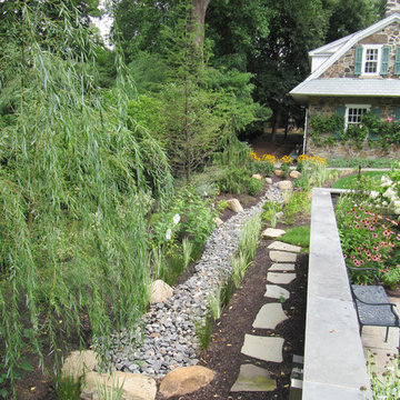
The client contracted our company to solve multiple existing drainage problems. In a heavy rain event the existing French drain system would overflow, causing water to pool in the driveway. After investigating the system we found that the capacity of the French drain was undersized for the amount of storm water from the large rain events received in recent years. As a result of our findings and at the request of the homeowner, we designed a storm water management system to capture all storm water from the structures on the property and regenerate the underground aquifers for the volume of a 5.8” rainstorm. In addition to the new drain system, the homeowners wanted a rain garden to provide a backdrop for an existing formal garden, provide a habitat for wildlife, and provide screening from an adjacent neighbor.
Throughout the design process many challenges were presented, including an existing gas line, which ran directly through the area that best suited the bioswale. The existence of the gas line caused us to alter the shape and depth of the bioswale in some areas. We also inspected the existing downspouts to make sure there were no obstructions that would impede the system’s efficiency, and then conducted a test pit dig to make sure we had sufficient percolation rates for disposal of storm water.
To effectively capture the storm water runoff, the existing downspouts were piped from the main house and the large detached garage to a large catch basin located at the low point in the driveway. The driveway catch basin contains two outlet pipes at different elevations within the basin allowing water from smaller rain events to enter the bioswale and rain garden area to percolate into the soil before excess water overflows into a sediment trap which filters out any debris and is then piped to an underground StormTech® pit to slowly percolate into the ground. The other outlet pipe in the driveway catch basin is used for larger storm water events, taking the water directly to the StormTech® pit.
Accepting and slowing the velocity of the storm water, mitigation of erosion, and filtering out pollutants contained in the “first flush” of rainfall are the primary functions of the bioswale and rain garden. Planting these areas with mostly native plant species helps carry out these functions while attracting and providing shelter for wildlife.
The ‘Niobe’ weeping willow is the centerpiece of the rain garden, connecting with the axis of the existing formal garden. To screen the neighboring property we chose Chamaecyparis nootkatensis ‘Pendula’ for its graceful evergreen habit and tolerance of wet sites. ‘Ivory Halo’ dogwood and Panicum ‘Cloud Nine’ were used for screening as well as winter interest. To provide deciduous structure to the garden Taxodium distichum and Magnolia virginiana were used in conjunction with witch hazel. Mostly native wetland perennials were used due to their tolerance of wet conditions and occasional drought.
The area above the StormTech® pit provides space for the client’s family to relax. The rain garden and bioswale provide screening, storm water management, a habitat for wildlife, and plants that enhance the adjacent formal garden.
Photo Credit: Terren Landscapes
 Anthony J. Vallée
The client was excited to purchase a home in the beautiful resort of Sandestin, but was not pleased with the dark interiors, heavy mouldings, tile floors, dated fixtures and heavy feel of the interior of the home. We solved their problems by completely renovating the interiors. Ceilings were raised, floors were replaced, cabinetry and fixtures were replaced and a problem area in the living room was solved. They now have the open, clean, airy beach home of their dreams and I couldn't be more pleased with how this home turned out for them.
anthony vallee
 Anthony J. Vallée
The client was excited to purchase a home in the beautiful resort of Sandestin, but was not pleased with the dark interiors, heavy mouldings, tile floors, dated fixtures and heavy feel of the interior of the home. We solved their problems by completely renovating the interiors. Ceilings were raised, floors were replaced, cabinetry and fixtures were replaced and a problem area in the living room was solved. They now have the open, clean, airy beach home of their dreams and I couldn't be more pleased with how this home turned out for them.
anthony vallee
 Dream Kitchens
CONTACT
These home owners initially contacted their Designer to identify the reason that the floor in their upstairs bedroom suffered from a noticeable slant. The floor problem actually impacted a small bathroom and adjoining study also.
Early on, the decision was made to re-design the footprint for the 3 rooms in conjunction with repairing the uneven floor. The approach was to gut all three spaces of walls and floors and start from scratch. The new spaces were designed with the clients needs for accessibility in mind.
DESIGN
The design effort included identifying the products to be used throughout the spaces. This included everything from the flooring to the wall paint. Kohler plumbing fixtures and Adelphi cabinetry were decided on first. A radiant heat grid was included for the bathroom floor. Lighting, paint and tile soon followed. Wood flooring was installed throughout the adjoining spaces.
The master bedroom was redesigned to allow for entry from the study or the master bath via pocket doors. The study was given an access to the master bath also. The hardwood flooring ties the bedroom and study together and gives each room a very spacious feel. The original master bedroom was changed to incorporate a large walk-in closet that features custom storage throughout. The study that also doubles as the IT center for the home was updated with custom book cases and cabinetry from Adelphi Cabinets.
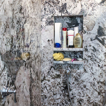
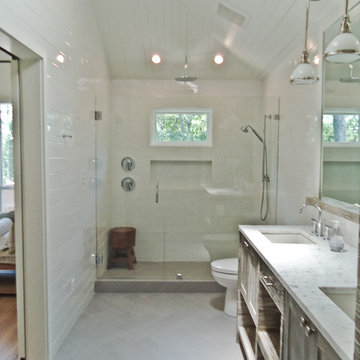
When discussing the reapportioning of the entire space for the individual rooms the bathroom was given priority. The previous small bathroom did not include a window for natural light. The new design corrected that in a big way by incorporating an existing bedroom window into the new space. The decision was made early on to allow for the inclusion of a large shower with full granite walls and custom plate glass surround. The shower system includes both fixed and hand held shower heads. A thermostatic control system was included to eliminate scalding. A large bench seat of matching granite allows for relaxing while getting squeaky clean. A separate air massage tub from Kohler centered under the new windows allows for a relaxed moment while being caressed by all those tiny bubbles. His and her side by side vanity sinks allows for efficient use of the space. The Caxton sinks and coordinated toilet were selected to match the color of the tub and do so beautifully!
CONSTRUCTION
We started the project not knowing what we were going to find. The slanting floor upstairs was not evident in the ceiling of the first floor
Once the demolition had been completed it was evident that the floor joists were at the heart of the problem. The home had been framed with floor joists that had been strung together to increase their length. Over time and with the house settling, the strung together joists started to droop from their connection point. This was concealed on the first floor by a large HVAC duct running through the garage. This was corrected by the addition of two laminated beams in the ceiling of the first floor (luckily in the garage) that re-supported the offending joists.
THE END
The project was a huge success in terms of problem solving and designing with budget and time frame in mind. The overall impact of the new space is impressive both visually and from a practicality point of view. The new master suite with upscale bathroom and study adds significant value to the home and the home owners quality of life!
 Anthony J. Vallée
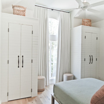
The client was excited to purchase a home in the beautiful resort of Sandestin, but was not pleased with the dark interiors, heavy mouldings, tile floors, dated fixtures and heavy feel of the interior of the home. We solved their problems by completely renovating the interiors. Ceilings were raised, floors were replaced, cabinetry and fixtures were replaced and a problem area in the living room was solved. They now have the open, clean, airy beach home of their dreams and I couldn't be more pleased with how this home turned out for them.
anthony vallee
 Advance Design Studio, Ltd.
Richard and Monica of Huntley, IL, needed to make better use of their kitchen as well as more storage for pots, pans, and countertop appliances. Their space was laid out unconventionally, making cooking a challenge. A triangular nook held their refrigerator, hard-to-reach cabinets, and a cramped pantry. They needed to find a solution, so they searched Facebook for home remodeling companies in their area. Soon they found Advance Design Studio’s profile and were immediately impressed.
“Advance Design was the first and last studio I contacted,” Richard said.
Richard called Advance Design and felt an immediate connection with Project Designer Nicole. She was knowledgeable and thorough and offered many unique solutions to their kitchen layout problem.
A week later, Nicole came out to their home to meet the couple. They talked about their kitchen remodeling project and told Nicole what they wanted in their dream kitchen. Nicole saw that the kitchen had weird angles that hindered the cabinets you could use. She knew that designing a space that met both the client’s needs and dreams would be challenging.
Nicole worked with Richard and Monica to create an innovative design. When the couple came out to Advance Design Studio in Gilberts, they were blown away by the 3D illustrations Nicole showed them.
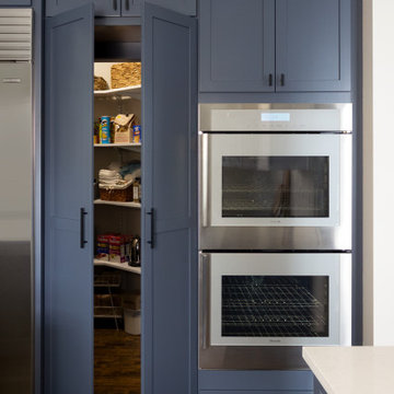
“I incorporated a hidden pantry cabinet to not only be a cool feature but also allowed me to square off the walls to gain more cabinet space,” Nicole said.
The hidden pantry added storage and squared off the strange triangular nook, creating a more traditional and functional kitchen layout. With the layout problems solved, they worked together to select materials. Richard and Monica wanted something brighter than their previous dark brown kitchen. They chose a combination of blue and white cabinetry with a white subway tile backsplash and white quartz countertops. The design was finalized, the materials were selected. It was time to begin construction.
One fear most homeowners have when beginning a home remodel is dust. Advance Design uses BuildClean HEPA filters to eliminate dust throughout the house while construction is going on. Project Manager Jason and his crew created temporary walls and cleaned up after every day of work.
“We were very impressed with how clean and organized the crew kept things while the remodeling process was underway,” Richard said.
The result is just what Richard and Monica envisioned when they began the process. Richard’s love for cooking can be explored through all-new Thermador appliances, featuring an easy-to-use induction cooktop, built-in double oven, and spacious refrigerator. Matte black hardware contrasts the bright white backsplash, countertops, and cabinets, while the stunning blue cabinets complement the dark hardwood floor and stainless-steel appliances. The dual pendant light fixtures over the reconfigured island are eye-catching and add necessary lighting.
This Huntley kitchen renovation turned out better than Richard and Monica hoped. Their experience with Advance Design’s Common Sense Remodeling process has them thinking about other projects they could do in the future.
Our award-winning design team would love to create a beautiful, functional, and spacious place for you and your family. With our “Common Sense Remodeling” approach, the process of renovating your home has never been easier. Contact us today at 847-665-1711 or schedule an appointment.
 Anthony J. Vallée
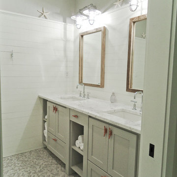
The client was excited to purchase a home in the beautiful resort of Sandestin, but was not pleased with the dark interiors, heavy mouldings, tile floors, dated fixtures and heavy feel of the interior of the home. We solved their problems by completely renovating the interiors. Ceilings were raised, floors were replaced, cabinetry and fixtures were replaced and a problem area in the living room was solved. They now have the open, clean, airy beach home of their dreams and I couldn't be more pleased with how this home turned out for them.
anthony vallee
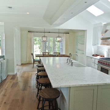 Anthony J. Vallée
The client was excited to purchase a home in the beautiful resort of Sandestin, but was not pleased with the dark interiors, heavy mouldings, tile floors, dated fixtures and heavy feel of the interior of the home. We solved their problems by completely renovating the interiors. Ceilings were raised, floors were replaced, cabinetry and fixtures were replaced and a problem area in the living room was solved. They now have the open, clean, airy beach home of their dreams and I couldn't be more pleased with how this home turned out for them.
anthony vallee
 Sheila Rich Interiors, LLC
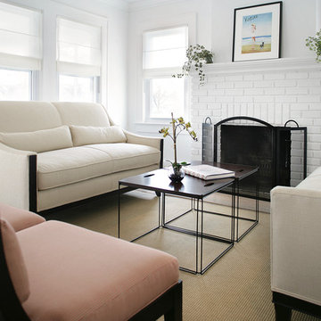
A crisp and consistent color scheme and composition creates an airy, unified mood throughout the diminutive 13' x 13' living room. Dark hardwood floors add warmth and contrast. We added thick moldings to architecturally enhance the house.
Gauzy cotton Roman shades dress new hurricane-proof windows and coax additional natural light into the home. Because of their versatility, pairs of furniture instead of single larger pieces are used throughout the home. This helps solve the space problem because these smaller pieces can be moved and stored easily.
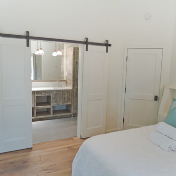 Anthony J. Vallée
The client was excited to purchase a home in the beautiful resort of Sandestin, but was not pleased with the dark interiors, heavy mouldings, tile floors, dated fixtures and heavy feel of the interior of the home. We solved their problems by completely renovating the interiors. Ceilings were raised, floors were replaced, cabinetry and fixtures were replaced and a problem area in the living room was solved. They now have the open, clean, airy beach home of their dreams and I couldn't be more pleased with how this home turned out for them.
anthony vallee
 Klopf Architecture
Malibu Glass Box House by Klopf Architecture
Following the devastating Woolsey Fire of 2018, the site in Malibu offered a unique opportunity to rebuild not just a home, but a new architectural composition that highlighted the property’s potential while navigating strict fire-rebuild codes in the area. Designed by Klopf Architecture, this project embraced a set of limitations and translated them into an architectural asset.
The city’s fire-rebuild process required the new structure to remain close to the original footprint, size and bulk, a constraint that ultimately clarified the architectural direction. Perched near the front of a long, narrow lot, the new home frames and overlooks a private, park-like rear expanse, an uncommon luxury especially in this part of Malibu .
Without a fixed program, the design process allowed for a different kind of creative focus allowing Klopf Architecture the opportunity to explore how a modernist home could best respond to this site. The team approached the project not with a list of requirements, but with a question: How might a modernist live here? What spatial qualities would inspire calm, connection, and a sense of wonder in this setting? The process became less about problem-solving and more about architectural storytelling—letting the site, the light, and the principles of modern design guide the form and flow of the home.
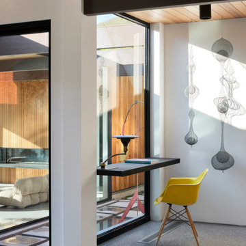
The response emerged in the form of a glass-box pavilion, an open, Mid-Century Modern inspired living, dining, and kitchen space that floats at the edge of the property’s natural descent. Connected to the more enclosed, private areas of the home by a glass-walled hallway, the living pavilion becomes a distinct centerpiece of the design. It opens on all four sides to the landscape with decks and patios on the flanks, an internal garden and water feature to the north, and a dramatic unguarded view of the expansive backyard and ocean horizon to the south.
Because of the mandated footprint, careful planning was required to ensure every space could still engage with light, landscape, or both. Strategic voids in the form of atriums and courtyards allow daylight to filter deep into the home’s core, while offering moments of surprise and retreat. These design gestures allow natural light to filter deep into the interior, creating a sense of brightness and openness throughout the day. At the same time, they expand the perceptual boundaries between inside and out, making the home feel more expansive while anchoring its connection to the surrounding landscape.
The siting of the house is what gives it its unique character. Rather than receding into the backyard like the neighboring homes, the house holds a slight prominence. From the central living pavilion, stepping down into the landscape feels more like entering a secluded park where a separate existing accessory structure, trail, and recreational areas await. The home’s modest street presence gives way to this unfolding drama of space, view, and nature.
Fire-resilient materials and assemblies are integrated seamlessly throughout including triple-pane glazing, under-slab and roof insulation, and locally sourced fire-rated cladding ensure the house not only meets Calfornia’s rigorous wildland-urban interface (WUI) standards, but feels effortlessly aligned with them. While technical decisions like fire-hardening and mechanical systems presented some construction challenges, particularly around the cantilevered glass box, the team found a functional compromise that preserved the integrity of the design.
Inside, a restrained palette and exposed post and beam design celebrate the ethos of mid-century modernism. A central circulation spine extends from the entry to the rear glass wall, offering a continuous visual link from street to ocean. Spaces such as the library and office, though more intimate in scale, are never cut off from nature as each opens to its own unique courtyard or garden view.
Though born out of a strict regulatory framework and developed without a specific client, the rebuild design unfolded with remarkable clarity. Grounded in site logic, refined by limitations and an emphasis on timeless spatial relationships – light, proportion, and a strong connection to nature, the resulting design feels both effortless and uplifting. The home lives lightly on the land, opens generously to its surroundings, and strikes a careful balance between privacy, openness, and calm. For Klopf Architecture, it stands as a compelling case study in how site, code, and circumstantial constraints can inspire enduring, modernist architecture. With years of experience reimagining mid-century modern design for how people live today, the firm took the project’s limitations as an opportunity. The result is a home shaped by open, flowing spaces, strong indoor-outdoor connections, and a calm, clear sense of structure. It’s a good reminder that even with strict constraints, there’s still room for architecture to breathe—and for modernism to keep moving forward.
Klopf Architecture project team: Geoff Campen, John Klopf, AIA, and Sherry Tan
Structural Engineer: ZFA
Contractor: Maison D’Artiste
Photography: ©2025 Mariko Reed
Year Completed: 2023
 Drury Design
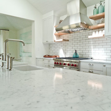
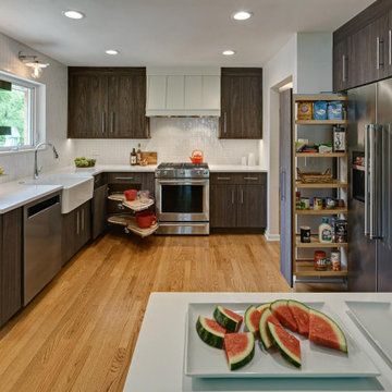
The owners of this true mid-century ranch in Wheaton were ready for a kitchen update. The home’s main living room area is decorated in a very cool, sparse way with plenty of nods to mid-century design. A new kitchen would need to bridge classic and modern notions of Mid-Century expression through the style’s characteristic clean lines and artistic notions of simplicity and straightforward functionality.
The idea was to keep a hint of mid-century influence in a modern design that could somehow be more open while accommodating more storage
The objectives were:
• Stay within the existing space while creating an open feel and winning more storage room
• Make the space brighter while using a darker cabinet finish
• Create proper ventilation for the range
Design challenges we solved for:
• Open the kitchen to the adjacent dining room without sacrificing storage
• Remove multiple layers of flooring to make the kitchen floor level with the rest of the house
• Match the new kitchen flooring to the flooring in nearby dining and living spaces
Problems solved. Here’s what we did:
• Took out soffits around the kitchen to allow for taller cabinets with more storage
• Added cabinet pull-outs that maximize under-cabinet storage space
• Used large cabinets in standard sizes
• Skipped cabinets on the window wall, opting for space- and light-friendly floating shelves
• Enhanced overall brightness with bright, white counters and textured white tile that offered a connecting contrast to the darker woodgrain cabinets
• Took out a post between the kitchen and dining room to make the space feel more open
• Added under-cabinet lights – unobtrusive and handy for task lighting
The owners love the look, feel and functionality of their new kitchen. Its sleek, modern character and notions of mid-century spirit add new excitement to the home’s original 1958 personality.
 Anthony J. Vallée
The client was excited to purchase a home in the beautiful resort of Sandestin, but was not pleased with the dark interiors, heavy mouldings, tile floors, dated fixtures and heavy feel of the interior of the home. We solved their problems by completely renovating the interiors. Ceilings were raised, floors were replaced, cabinetry and fixtures were replaced and a problem area in the living room was solved. They now have the open, clean, airy beach home of their dreams and I couldn't be more pleased with how this home turned out for them.
anthony vallee
 Klopf Architecture
Malibu Glass Box House by Klopf Architecture
Following the devastating Woolsey Fire of 2018, the site in Malibu offered a unique opportunity to rebuild not just a home, but a new architectural composition that highlighted the property’s potential while navigating strict fire-rebuild codes in the area. Designed by Klopf Architecture, this project embraced a set of limitations and translated them into an architectural asset.
The city’s fire-rebuild process required the new structure to remain close to the original footprint, size and bulk, a constraint that ultimately clarified the architectural direction. Perched near the front of a long, narrow lot, the new home frames and overlooks a private, park-like rear expanse, an uncommon luxury especially in this part of Malibu .
Without a fixed program, the design process allowed for a different kind of creative focus allowing Klopf Architecture the opportunity to explore how a modernist home could best respond to this site. The team approached the project not with a list of requirements, but with a question: How might a modernist live here? What spatial qualities would inspire calm, connection, and a sense of wonder in this setting? The process became less about problem-solving and more about architectural storytelling—letting the site, the light, and the principles of modern design guide the form and flow of the home.
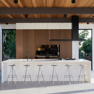
The response emerged in the form of a glass-box pavilion, an open, Mid-Century Modern inspired living, dining, and kitchen space that floats at the edge of the property’s natural descent. Connected to the more enclosed, private areas of the home by a glass-walled hallway, the living pavilion becomes a distinct centerpiece of the design. It opens on all four sides to the landscape with decks and patios on the flanks, an internal garden and water feature to the north, and a dramatic unguarded view of the expansive backyard and ocean horizon to the south.
Because of the mandated footprint, careful planning was required to ensure every space could still engage with light, landscape, or both. Strategic voids in the form of atriums and courtyards allow daylight to filter deep into the home’s core, while offering moments of surprise and retreat. These design gestures allow natural light to filter deep into the interior, creating a sense of brightness and openness throughout the day. At the same time, they expand the perceptual boundaries between inside and out, making the home feel more expansive while anchoring its connection to the surrounding landscape.
The siting of the house is what gives it its unique character. Rather than receding into the backyard like the neighboring homes, the house holds a slight prominence. From the central living pavilion, stepping down into the landscape feels more like entering a secluded park where a separate existing accessory structure, trail, and recreational areas await. The home’s modest street presence gives way to this unfolding drama of space, view, and nature.
Fire-resilient materials and assemblies are integrated seamlessly throughout including triple-pane glazing, under-slab and roof insulation, and locally sourced fire-rated cladding ensure the house not only meets Calfornia’s rigorous wildland-urban interface (WUI) standards, but feels effortlessly aligned with them. While technical decisions like fire-hardening and mechanical systems presented some construction challenges, particularly around the cantilevered glass box, the team found a functional compromise that preserved the integrity of the design.
Inside, a restrained palette and exposed post and beam design celebrate the ethos of mid-century modernism. A central circulation spine extends from the entry to the rear glass wall, offering a continuous visual link from street to ocean. Spaces such as the library and office, though more intimate in scale, are never cut off from nature as each opens to its own unique courtyard or garden view.
Though born out of a strict regulatory framework and developed without a specific client, the rebuild design unfolded with remarkable clarity. Grounded in site logic, refined by limitations and an emphasis on timeless spatial relationships – light, proportion, and a strong connection to nature, the resulting design feels both effortless and uplifting. The home lives lightly on the land, opens generously to its surroundings, and strikes a careful balance between privacy, openness, and calm. For Klopf Architecture, it stands as a compelling case study in how site, code, and circumstantial constraints can inspire enduring, modernist architecture. With years of experience reimagining mid-century modern design for how people live today, the firm took the project’s limitations as an opportunity. The result is a home shaped by open, flowing spaces, strong indoor-outdoor connections, and a calm, clear sense of structure. It’s a good reminder that even with strict constraints, there’s still room for architecture to breathe—and for modernism to keep moving forward.
Klopf Architecture project team: Geoff Campen, John Klopf, AIA, and Sherry Tan
Structural Engineer: ZFA
Contractor: Maison D’Artiste
Photography: ©2025 Mariko Reed
Year Completed: 2023
 Decorating Den Interiors-Barbara Tabak
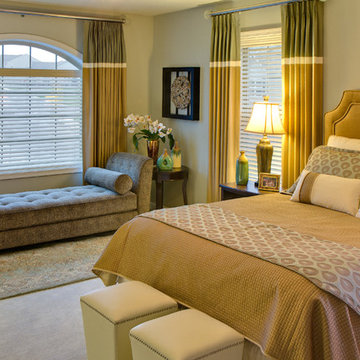
The client’s goal for this makeover was to create a clean style with a contemporary vibe in her cold empty bedroom. The client’s main focus for the design was to block the morning sun that woke her up long before she wanted to begin her day.
Problem(s) addressed:
The room was void of furnishings, bedding and accessories. The décor consisted of a mattress, box spring, jewelry chest and an old comforter, and therefore had no inspirational piece from which to begin the design. We were literally starting from scratch. As for the morning sun dilemma, I was excited to come up with a better solution to the sun challenge than her temporary solution of stacking towels in the arch window.
Solution provided:
Furnishings were the first priority. Rich espresso-stained contemporary dresser, gentleman’s chest and nightstands began the design. Next, a leopard print upholstered chaise was selected to sit in front of the double arched window providing a place to read, work on a laptop, and listen to music or just lounge. Two faux leather ottomans were selected to perch at the end of the bed.
Custom bedding and color scheme was next on the list. The client had requested a restful color palette, which fell into place when we found the perfect heather-gray, gold and cream hued bed ensemble. With the bedding selected, a coordinating wall paint and gold velvet fabric was chosen for the upholstered headboard.
To solve the clients early morning wake up call, traversing draperies that are installed above the window arch were designed to shut out the morning sun. The inverted French pleat draperies, with their color block design, enhance the room’s clean contemporary style. Brushed silver hardware with cracked crystal finials coordinated the furniture hardware and added a touch of sophistication.
Finally, a combination of elegant lighting, mixed media art, an area rug and accessories finish the room’s contemporary design.
4