
Search results for "Enhances problem solving" in Home Design Ideas

 Twelve Stones Designs, LLC
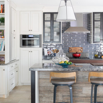
The owners of this kitchen had spent the money to upgrade the finishes in their kitchen upon building the home 12 years ago, but after living in the space for several years they realized how nonfunctional the layout really was. The (then) two preschool aged children had grown into busy, hungry teenagers with many friends who also liked to hang out at the house. So the family needed a more functional kitchen with better traffic flow, space for daily activities revolving around the kitchen at different times of day, and a kitchen that could accommodate cooking for and serving large groups. Furthermore, the dark, traditional finishes no longer reflected the homeowners’ style. They requested a brighter, more relaxed, coastal style that reflected their love of the seaside cities they like to visit.
Originally, the kitchen was U-shaped with a narrow island in the middle. The island created narrow aisles that bottle-necked at the dishwasher, refrigerator, and cooktop areas. There was a pass-through from the foyer into the kitchen, but the owners never liked that the pass-through was also located so close to the powder room. The awkward proximity was unappealing and made guests feel uncomfortable.
The kitchen’s storage was made up of lots of narrow cabinets, apothecary drawers, clipped corner units, and very few drawers. It lacked useful storage for the larger items the family used on a daily basis. And the kitchen’s only pantry was small closet that had only builder-grade, narrow shelving with no illumination to be able to see the contents inside.
Overall, the kitchen’s lighting plan was poorly executed. Only six recessed cans illuminated the entire kitchen and nook areas. The under cabinet lighting was not evenly distributed either. In fact, the builder had mis-placed the under cabinet lighting around the decorative pilasters which made for choppy, dark cubbies. Further, the builder didn’t include any lighting over the sink or the bar area, which meant whoever was doing the dishes was always in their own shadow. That, coupled with the steep overhang of the game room above made the bar area feel like a dim, cavernous space that wasn’t inviting or task oriented. The kitchen looked out into the main living space, but the raised bar and a narrow wall (which held the only large cabinet in the kitchen) created more of a barrier than a relationship to the living room or breakfast nook. In fact, one couldn’t even see the breakfast nook from the cooktop or sink areas due to its orientation. The raised bar top was too narrow to comfortably sit to either dine at or chat from due to the lack of knee space. The the homeowners confided that the kitchen felt more like a dark, dirty prison than place where the family, or their guests, wanted to gather and commune.
The clients' needs and desires were:
➢ to create a kitchen that would be a space the family loved to be in; to relate to the adjacent spaces all around, and to have better flow for entertaining large groups
➢ to remove the walls between the breakfast nook and living area and to be able to utilize the natural light from the windows in both those areas
➢ to incorporate a functional chopping block for prepping fresh food for home cooked meals, an island with a large sink and drain board, 2 pull out trash cans, and seating for at least the 2 teens to eat or do homework
➢ to design a kitchen and breakfast nook with an airy, coastal, relaxed vibe that blended with the rest of the house's coastal theme
➢ to integrate a layered lighting plan which would include ample general illumination, specific task lighting, decorative lighting, and lots of illuminated storage
➢ to design a kitchen with not only more storage for all the husband’s kitchen gadgets and collection of oils and spices, but smart storage, including a coffee/breakfast bar and a place to store and conceal the toaster oven and microwave
➢ to find a way to utilize the large open space between the kitchen, pantry area, and breakfast nook
Twelve Stones Designs achieved the owner's goals by:
➢ removing the walls between the kitchen and living room to allow the natural light to filter in from the adjacent rooms and to create a connection between the kitchen, nook, and living spaces for a sense of unity and communion
➢ removing the existing pantry and designing 3 large pantry style cabinets with LED tape lights and rollout drawers to house lots of kitchen appliances, gadgets, and tons of groceries. We also took the cabinets all the way up to the 9’ ceiling for additional storage for seasonal items and bulk storage.
➢ designing 2 islands - 1 with a gorgeous black walnut chopping block that houses a drawer for chopping and carving knives and a custom double pull out trash unit for point of use utilization - and 1 that houses the dishwasher, a large Blanco Gourmet sink with integrated drain board, woven baskets for fresh root vegetables and kitchen towels, plenty of drawer storage for kitchen items, and bar seating for up to 4 diners.
➢ closing off the space between the kitchen and the powder room to create a beautiful new private alcove for the powder room as well as adding some decorative storage. This also gave us space to include more tall storage near the new range for precision placement of the husband’s extensive oil and spice collection as well as a location for a combo-steam oven the wife wanted for baking and cooking healthy meals.
The project is enhanced functionally by:
➢ incorporated USB and standard receptacles for the kids’ laptops and phone charging in the large island
➢ designing the small island to include additional open shelving for items used on a daily basis such as a variety of bowls, plates, and colanders. This set up also works well for the husband who prefers to “plate” his dinners in restaurant-style fashion before presenting them to the table.
➢ the integration of specific storage units, such as double stacked cutlery drawers, a custom spice pull-out, a Kuerig coffee and tea pod drawer, and custom double stacked utensil drawers
➢ moving the refrigerator to the old oven location - this eliminated the bottle neck as well as created a better relationship to the eating table. It also utilizes the floor space between the pantry, nook, and kitchen
➢ creating a banquet style breakfast nook - this banquette seating not only doubles the amount of seating for large gatherings but it better utilizes the odd space between the kitchen and the previous nook area. It also helps to create a distinct pathway from the mudroom room through the pantry area, kitchen, nook, and living room.
➢ the coffee/breakfast bar area which includes the perfect location for the concealed microwave and toaster oven, convenient storage for the coffee pods and tea accoutrements. Roll-out drawers below also house the smoothie maker, hot water kettle, and a plethora of smoothie-making ingredients such as protein powders, smoothie additives, etc. Furthermore, the drawers below the Keurig house measuring utensil, cutlery, baking supplies and tupperware storage.
➢ incorporating lots of wide drawers and pullouts to accommodate large cookware.
➢ utilizing as much vertical space as possible by building storage to the ceiling which accommodates the family’s abundant amount of serving platters, baking sheets, bakeware, casserole dishes, and additional cutting boards.
The project is enhanced aesthetically by:
➢ new 5-piece Versailles pattern porcelain tile that now seamlessly joins the entire down stairs area together creating a bright, cohesiveness feeling instead of choppy separated spaces - it also adds a coastal feeling
➢ designing a cabinet to conceal the microwave and toaster oven
➢ the coastal influenced light fixtures over the nook table and island
➢ the sandy colors of the Langdon Cambria countertops. The swirling pattern and sparkling quartz pieces remind the homeowner of black-and-tan sandy beaches
➢ the striped banquet seating whose creamy white background and blue-green stripes were the inspiration for the cabinet and wall colors.
➢ All the interior doors were painted black to coordinate with the blacks and grays in the backsplash tile and countertop. This also adds a hint of tailored formality to an otherwise casual space.
➢ the use of WAC's Oculux small aperture LED units for the overhead lighting complimented with Diode LED strips for task lighting under the cabinets and inside the pantry and glass wall cabinets. All of the lighting applications are on separate dimmer switches.
Innovative uses of materials or construction methods by Realty Restoration LLC:
➢ Each 1-1/2” x 3” block of reclaimed end-grain black walnut that makes up the center island chopping block was hand milled and built in the shop. It was designed to look substantial and proportional to the surrounding elements, executed by creating the 4 inch tall top with a solid wood chamfered edge band.
➢ The metal doors on either side of the vent hood were also custom designed for this project and built in the Realty Restoration LLC shop. They are made 1x2, 11-gauge mild steel with ribbed glass. Weighing 60 lbs a piece, heavy duty cabinet hinges were added to support the weight of the door and keep them from sagging.
➢ Under-cabinet receptacles were added along the range wall in order to have a clean, uninterrupted backsplash.
Design obstacles to overcome:
➢ Because we were removing the demising walls between the kitchen and living room, we had to find a way to plumb and vent the new island. We did this by tunneling through the slab (the slab had post tension cables which prevented us from just trenching) to run a new wet vent through a nearby structural wall. We pulled the existing hot and cold lines between upper floor joists and ran them down the structural wall as well and up through a conduit in the tunnel.
➢ Since we were converting from wall overs to a gas range it allowed us to utilize the 220 feed for the wall ovens to provide a new sub panel for all the new kitchen circuits
➢ Due to framing deficiencies inherited from the original build there was a 1-1/2” differential in the floor-to-ceiling height over a 20 foot span; by utilizing the process of cutting and furring coupled with the crown moulding details on the cabinet elevations we were able to mask the problem and provide seamless transitions between the cabinet components.
Evidence of superior craftsmanship:
➢ uniquely designed, one-of-a-kind metal “X” end panels on the large island. The end panels were custom made in the Realty Restoration LLC shop and fitted to the exact dimensions of the island. The welding seams are completely indistinguishable - the posts look like they are cut from a single sheet of metal
➢ square metal posts on the small island were also custom made and designed to compliment and carry through the metal element s throughout the kitchen
➢ the beautiful, oversized end panels on the pantry cabinets which give the breakfast nook a tailored look
➢ integrating a large format 5 piece Versailles tile pattern to seamlessly flow from the existing spaces into the new kitchen space
➢ By constructing a custom cabinet that jogged around a corner we could not remodel (housing the entry way coat closet) we were able to camouflage the adjacent wall offset within the upper and lower cabinets. By designing around the existing jog in the structural walls we accomplished a few things: we were able to find the space to house, and hide, the microwave and toaster oven yet still have a clean cohesive appearance from the kitchen side. Additionally, the owners were able to keep their much needed coat closet and we didn’t have to increase the budget with unnecessary structural work.
 Twelve Stones Designs, LLC
The owners of this kitchen had spent the money to upgrade the finishes in their kitchen upon building the home 12 years ago, but after living in the space for several years they realized how nonfunctional the layout really was. The (then) two preschool aged children had grown into busy, hungry teenagers with many friends who also liked to hang out at the house. So the family needed a more functional kitchen with better traffic flow, space for daily activities revolving around the kitchen at different times of day, and a kitchen that could accommodate cooking for and serving large groups. Furthermore, the dark, traditional finishes no longer reflected the homeowners’ style. They requested a brighter, more relaxed, coastal style that reflected their love of the seaside cities they like to visit.
Originally, the kitchen was U-shaped with a narrow island in the middle. The island created narrow aisles that bottle-necked at the dishwasher, refrigerator, and cooktop areas. There was a pass-through from the foyer into the kitchen, but the owners never liked that the pass-through was also located so close to the powder room. The awkward proximity was unappealing and made guests feel uncomfortable.
The kitchen’s storage was made up of lots of narrow cabinets, apothecary drawers, clipped corner units, and very few drawers. It lacked useful storage for the larger items the family used on a daily basis. And the kitchen’s only pantry was small closet that had only builder-grade, narrow shelving with no illumination to be able to see the contents inside.
Overall, the kitchen’s lighting plan was poorly executed. Only six recessed cans illuminated the entire kitchen and nook areas. The under cabinet lighting was not evenly distributed either. In fact, the builder had mis-placed the under cabinet lighting around the decorative pilasters which made for choppy, dark cubbies. Further, the builder didn’t include any lighting over the sink or the bar area, which meant whoever was doing the dishes was always in their own shadow. That, coupled with the steep overhang of the game room above made the bar area feel like a dim, cavernous space that wasn’t inviting or task oriented. The kitchen looked out into the main living space, but the raised bar and a narrow wall (which held the only large cabinet in the kitchen) created more of a barrier than a relationship to the living room or breakfast nook. In fact, one couldn’t even see the breakfast nook from the cooktop or sink areas due to its orientation. The raised bar top was too narrow to comfortably sit to either dine at or chat from due to the lack of knee space. The the homeowners confided that the kitchen felt more like a dark, dirty prison than place where the family, or their guests, wanted to gather and commune.
The clients' needs and desires were:
➢ to create a kitchen that would be a space the family loved to be in; to relate to the adjacent spaces all around, and to have better flow for entertaining large groups
➢ to remove the walls between the breakfast nook and living area and to be able to utilize the natural light from the windows in both those areas
➢ to incorporate a functional chopping block for prepping fresh food for home cooked meals, an island with a large sink and drain board, 2 pull out trash cans, and seating for at least the 2 teens to eat or do homework
➢ to design a kitchen and breakfast nook with an airy, coastal, relaxed vibe that blended with the rest of the house's coastal theme
➢ to integrate a layered lighting plan which would include ample general illumination, specific task lighting, decorative lighting, and lots of illuminated storage
➢ to design a kitchen with not only more storage for all the husband’s kitchen gadgets and collection of oils and spices, but smart storage, including a coffee/breakfast bar and a place to store and conceal the toaster oven and microwave
➢ to find a way to utilize the large open space between the kitchen, pantry area, and breakfast nook
Twelve Stones Designs achieved the owner's goals by:
➢ removing the walls between the kitchen and living room to allow the natural light to filter in from the adjacent rooms and to create a connection between the kitchen, nook, and living spaces for a sense of unity and communion
➢ removing the existing pantry and designing 3 large pantry style cabinets with LED tape lights and rollout drawers to house lots of kitchen appliances, gadgets, and tons of groceries. We also took the cabinets all the way up to the 9’ ceiling for additional storage for seasonal items and bulk storage.
➢ designing 2 islands - 1 with a gorgeous black walnut chopping block that houses a drawer for chopping and carving knives and a custom double pull out trash unit for point of use utilization - and 1 that houses the dishwasher, a large Blanco Gourmet sink with integrated drain board, woven baskets for fresh root vegetables and kitchen towels, plenty of drawer storage for kitchen items, and bar seating for up to 4 diners.
➢ closing off the space between the kitchen and the powder room to create a beautiful new private alcove for the powder room as well as adding some decorative storage. This also gave us space to include more tall storage near the new range for precision placement of the husband’s extensive oil and spice collection as well as a location for a combo-steam oven the wife wanted for baking and cooking healthy meals.
The project is enhanced functionally by:
➢ incorporated USB and standard receptacles for the kids’ laptops and phone charging in the large island
➢ designing the small island to include additional open shelving for items used on a daily basis such as a variety of bowls, plates, and colanders. This set up also works well for the husband who prefers to “plate” his dinners in restaurant-style fashion before presenting them to the table.
➢ the integration of specific storage units, such as double stacked cutlery drawers, a custom spice pull-out, a Kuerig coffee and tea pod drawer, and custom double stacked utensil drawers
➢ moving the refrigerator to the old oven location - this eliminated the bottle neck as well as created a better relationship to the eating table. It also utilizes the floor space between the pantry, nook, and kitchen
➢ creating a banquet style breakfast nook - this banquette seating not only doubles the amount of seating for large gatherings but it better utilizes the odd space between the kitchen and the previous nook area. It also helps to create a distinct pathway from the mudroom room through the pantry area, kitchen, nook, and living room.
➢ the coffee/breakfast bar area which includes the perfect location for the concealed microwave and toaster oven, convenient storage for the coffee pods and tea accoutrements. Roll-out drawers below also house the smoothie maker, hot water kettle, and a plethora of smoothie-making ingredients such as protein powders, smoothie additives, etc. Furthermore, the drawers below the Keurig house measuring utensil, cutlery, baking supplies and tupperware storage.
➢ incorporating lots of wide drawers and pullouts to accommodate large cookware.
➢ utilizing as much vertical space as possible by building storage to the ceiling which accommodates the family’s abundant amount of serving platters, baking sheets, bakeware, casserole dishes, and additional cutting boards.
The project is enhanced aesthetically by:
➢ new 5-piece Versailles pattern porcelain tile that now seamlessly joins the entire down stairs area together creating a bright, cohesiveness feeling instead of choppy separated spaces - it also adds a coastal feeling
➢ designing a cabinet to conceal the microwave and toaster oven
➢ the coastal influenced light fixtures over the nook table and island
➢ the sandy colors of the Langdon Cambria countertops. The swirling pattern and sparkling quartz pieces remind the homeowner of black-and-tan sandy beaches
➢ the striped banquet seating whose creamy white background and blue-green stripes were the inspiration for the cabinet and wall colors.
➢ All the interior doors were painted black to coordinate with the blacks and grays in the backsplash tile and countertop. This also adds a hint of tailored formality to an otherwise casual space.
➢ the use of WAC's Oculux small aperture LED units for the overhead lighting complimented with Diode LED strips for task lighting under the cabinets and inside the pantry and glass wall cabinets. All of the lighting applications are on separate dimmer switches.
Innovative uses of materials or construction methods by Realty Restoration LLC:
➢ Each 1-1/2” x 3” block of reclaimed end-grain black walnut that makes up the center island chopping block was hand milled and built in the shop. It was designed to look substantial and proportional to the surrounding elements, executed by creating the 4 inch tall top with a solid wood chamfered edge band.
➢ The metal doors on either side of the vent hood were also custom designed for this project and built in the Realty Restoration LLC shop. They are made 1x2, 11-gauge mild steel with ribbed glass. Weighing 60 lbs a piece, heavy duty cabinet hinges were added to support the weight of the door and keep them from sagging.
➢ Under-cabinet receptacles were added along the range wall in order to have a clean, uninterrupted backsplash.
Design obstacles to overcome:
➢ Because we were removing the demising walls between the kitchen and living room, we had to find a way to plumb and vent the new island. We did this by tunneling through the slab (the slab had post tension cables which prevented us from just trenching) to run a new wet vent through a nearby structural wall. We pulled the existing hot and cold lines between upper floor joists and ran them down the structural wall as well and up through a conduit in the tunnel.
➢ Since we were converting from wall overs to a gas range it allowed us to utilize the 220 feed for the wall ovens to provide a new sub panel for all the new kitchen circuits
➢ Due to framing deficiencies inherited from the original build there was a 1-1/2” differential in the floor-to-ceiling height over a 20 foot span; by utilizing the process of cutting and furring coupled with the crown moulding details on the cabinet elevations we were able to mask the problem and provide seamless transitions between the cabinet components.
Evidence of superior craftsmanship:
➢ uniquely designed, one-of-a-kind metal “X” end panels on the large island. The end panels were custom made in the Realty Restoration LLC shop and fitted to the exact dimensions of the island. The welding seams are completely indistinguishable - the posts look like they are cut from a single sheet of metal
➢ square metal posts on the small island were also custom made and designed to compliment and carry through the metal element s throughout the kitchen
➢ the beautiful, oversized end panels on the pantry cabinets which give the breakfast nook a tailored look
➢ integrating a large format 5 piece Versailles tile pattern to seamlessly flow from the existing spaces into the new kitchen space
➢ By constructing a custom cabinet that jogged around a corner we could not remodel (housing the entry way coat closet) we were able to camouflage the adjacent wall offset within the upper and lower cabinets. By designing around the existing jog in the structural walls we accomplished a few things: we were able to find the space to house, and hide, the microwave and toaster oven yet still have a clean cohesive appearance from the kitchen side. Additionally, the owners were able to keep their much needed coat closet and we didn’t have to increase the budget with unnecessary structural work.
 J Design Group - Interior Designers Miami - Modern
Ocean front, Luxury home in Miami Beach
Projects by J Design Group, Your friendly Interior designers firm in Miami, FL. at your service.
AVENTURA MAGAZINE selected our client’s luxury 5000 Sf ocean front apartment in Miami Beach, to publish it in their issue and they Said:
Story by Linda Marx, Photography by Daniel Newcomb
Light & Bright
New York snowbirds redesigned their Miami Beach apartment to take advantage of the tropical lifestyle.
New York snowbirds redesigned their Miami Beach apartment to take advantage of the tropical lifestyle.
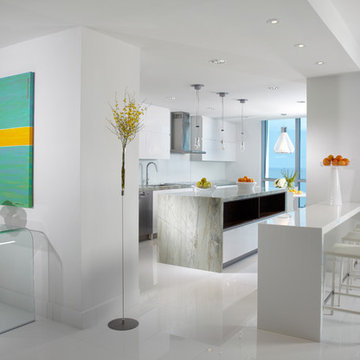
WHEN INTERIOR DESIGNER JENNIFER CORREDOR was asked to recreate a four-bedroom, six-bath condominium at The Bath Club in Miami Beach, she seized the opportunity to open the rooms and better utilize the vast ocean views.
In five months last year, the designer transformed a dark and closed 5,000-square-foot unit located on a high floor into a series of sweeping waterfront spaces and updated the well located apartment into a light and airy retreat for a sports-loving family of five.
“They come down from New York every other weekend and wanted to make their waterfront home a series of grand open spaces,” says Jennifer Corrredor, of the J. Design Group in Miami, a firm specializing in modern and contemporary interiors. “Since many of the rooms face the ocean, it made sense to open and lighten up the home, taking advantage of the awesome views of the sea and the bay.”
The designer used 40 x 40 all white tile throughout the apartment as a clean base. This way, her sophisticated use of color would stand out and bring the outdoors in.
The close-knit family members—two parents and three boys in college—like to do things together. But there were situations to overcome in the process of modernizing and opening the space. When Jennifer Corredor was briefed on their desires, nothing seemed too daunting. The confident designer was ready to delve in. For example, she fixed an area at the front door
that was curved. “The wood was concave so I straightened it out,” she explains of a request from the clients. “It was an obstacle that I overcame as part of what I do in a redesign. I don’t consider it a difficult challenge. Improving what I see is part of the process.”
She also tackled the kitchen with gusto by demolishing a wall. The kitchen had formerly been enclosed, which was a waste of space and poor use of available waterfront ambience. To create a grand space linking the kitchen to the living room and dining room area, something had to go. Once the wall was yesterday’s news, she relocated the refrigerator and freezer (two separate appliances) to the other side of the room. This change was a natural functionality in the new open space. “By tearing out the wall, the family has a better view of the kitchen from the living and dining rooms,” says Jennifer Corredor, who also made it easier to walk in and out of one area and into the other. “The views of the larger public space and the surrounding water are breathtaking.
Opening it up changed everything.”
They clients can now see the kitchen from the living and dining areas, and at the same time, dwell in an airy and open space instead of feeling stuck in a dark enclosed series of rooms. In fact, the high-top bar stools that Jennifer Corredor selected for the kitchen can be twirled around to use for watching TV in the living room.
In keeping with the theme of moving seamlessly from one room to the other, Corredor designed a subtle wall of glass in the living room along with lots of comfortable seating. This way, all family members feel at ease while relaxing, talking, or watching sporting events on the large flat screen television. “For this room, I wanted more open space, light and a supreme airy feeling,” she says. “With the glass design making a statement, it quickly became the star of the show.”…….
….. To add texture and depth, Jennifer Corredor custom created wood doors here, and in other areas of the home. They provide a nice contrast to the open Florida tropical feel. “I added character to the openness by using exotic cherry wood,” she says. “I repeated this throughout the home and it works well.”
Known for capturing the client’s vision while adding her own innovative twists, Jennifer Corredor lightened the family room, giving it a contemporary and modern edge with colorful art and matching throw pillows on the sofas. She added a large beige leather ottoman as the center coffee table in the room. This round piece was punctuated with a bold-toned flowering plant atop. It effortlessly matches the pillows and colors of the contemporary canvas.
Jennifer Corredor also gutted all of the bathrooms, resulting in a major redesign of the master. She jettisoned the whirlpool and created the dazzling illusion of a floating tub. From an area where there were two toilets, she eliminated one to make a grand rectangular shower, which became an overall showpiece. The master bath went from being just a functional water closet to a sophisticated spa-like space. “The client said I was ‘delicious’ after seeing the change,” laughed Jennifer Corredor, who emphasized that her clients love their part-time life in South Florida more each time they come down. Even when the husband has to work from their Miami Beach digs, he is surrounded by tropical beauty. For instance, there are times when the master bedroom must double as the husband’s home office.
The room had to be large enough to accommodate a working space for this purpose. So Jennifer Corredor placed an appropriate table near the window and across from the king-size bed. “No blocking of the amazing water view was necessary,” she says. “I kept an open space with a lot of white so It functions well and the work space fits right in.” She repeated the bold modern art in the room as well as in the guest bedroom, which also has a workspace for the sons when they are home from school and need to study.
The designer is still happy and glowing with the results of her toil in this apartment. She gets a “spiritual feeling” when she walks inside. “It is so peaceful and serene, with subtle hints of explosive statements,” she says. “The entire space is open, yet anchored by the warmth of the exotic woods.” The client wrote Jennifer Corredor a letter at the end of the project congratulating her on a
job well done. She revealed that owning a Miami Beach home was her husband’s dream 30 years ago. “Now we have a quality perfect yet practical home,” she wrote to the designer. “You solved the challenges, and the end
result far exceeds our expectations. We love it.”
Thanks for your interest in our Contemporary Interior Design projects and if you have any question please do not hesitate to ask us.
http://www.JDesignGroup.com
305.444.4611
Modern Interior designer Miami. Contemporary
Miami
Miami Interior Designers
Miami Interior Designer
Interior Designers Miami
Interior Designer Miami
Modern Interior Designers
Modern Interior Designer
Modern interior decorators
Modern interior decorator
Contemporary Interior Designers
Contemporary Interior Designer
Interior design decorators
Interior design decorator
Interior Decoration and Design
Black Interior Designers
Black Interior Designer
Interior designer
Interior designers
Interior design decorators
Interior design decorator
Home interior designers
Home interior designer
Interior design companies
Interior decorators
Interior decorator
Decorators
Decorator
Miami Decorators
Miami Decorator
Decorators Miami
Decorator Miami
Interior Design Firm
Interior Design Firms
Interior Designer Firm
Interior Designer Firms
Interior design
Interior designs
home decorators
Interior decorating Miami
Best Interior Designers.
225 Malaga Ave.
Coral Gable, FL 33134
http://www.JDesignGroup.com
305.444.4611
Find the right local pro for your project
 Anthony J. Vallée
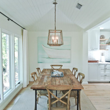
The client was excited to purchase a home in the beautiful resort of Sandestin, but was not pleased with the dark interiors, heavy mouldings, tile floors, dated fixtures and heavy feel of the interior of the home. We solved their problems by completely renovating the interiors. Ceilings were raised, floors were replaced, cabinetry and fixtures were replaced and a problem area in the living room was solved. They now have the open, clean, airy beach home of their dreams and I couldn't be more pleased with how this home turned out for them.
anthony vallee
 Studio Dearborn
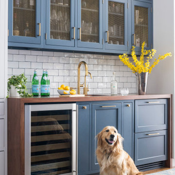
Designer Sarah Robertson of Studio Dearborn helped a neighbor and friend to update a “builder grade” kitchen into a personal, family space that feels luxurious and inviting.
The homeowner wanted to solve a number of storage and flow problems in the kitchen, including a wasted area dedicated to a desk, too-little pantry storage, and her wish for a kitchen bar. The all white builder kitchen lacked character, and the client wanted to inject color, texture and personality into the kitchen while keeping it classic.
 Lars Remodeling & Design
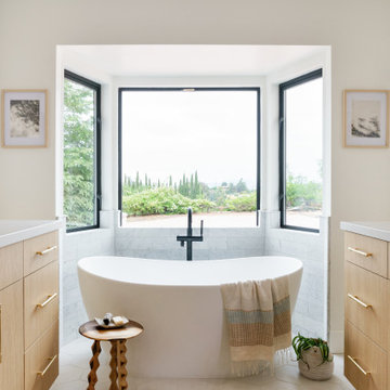
This spectacular family home situated above Lake Hodges in San Diego with sweeping views, was a complete interior and partial exterior remodel. Having gone untouched for decades, the home presented a unique challenge in that it was comprised of many cramped, unpermitted rooms and spaces that had been added over the years, stifling the home's true potential. Our team gutted the home down to the studs and started nearly from scratch.
The goal was to dramatically open up the living space and modernize the home, while capitalizing on the stunning views the property had to offer. With the existing floor plan, only bedrooms had partial views, with common living areas relegated to the back portion, preventing residents from enjoying the expansive sightlines available to the home.
The completely reimagined floorplan included relocating the kitchen and Master Suite to the opposite side of the home to take better advantage of the views and natural light. All bathrooms and the laundry room were completely remodeled along with installing new doors, windows, and flooring throughout the home and completely upgrading all electrical and plumbing.
The end result is simply stunning. Light, bright, and modern, the new version of this home demonstrates the power of thoughtful architectural planning, creative problem solving, and expert design details.
 Pennsylvania Landscape & Nursery Association
Terren Landscapes http://www.terrenlandscapes.com
Project Entry: Pembrooke Estate Rain Garden
2014 PLNA Awards for Landscape Excellence Winner
Category: Sustainable Landscape &60,000-$120,000
Award Level: Silver
Project Description:
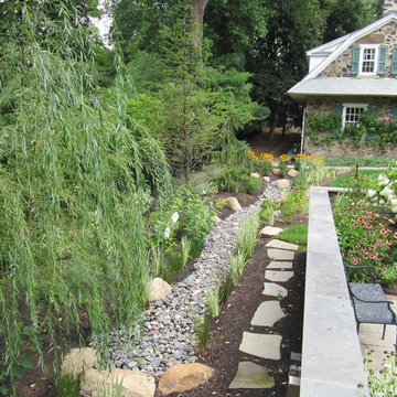
The client contracted our company to solve multiple existing drainage problems. In a heavy rain event the existing French drain system would overflow, causing water to pool in the driveway. After investigating the system we found that the capacity of the French drain was undersized for the amount of storm water from the large rain events received in recent years. As a result of our findings and at the request of the homeowner, we designed a storm water management system to capture all storm water from the structures on the property and regenerate the underground aquifers for the volume of a 5.8” rainstorm. In addition to the new drain system, the homeowners wanted a rain garden to provide a backdrop for an existing formal garden, provide a habitat for wildlife, and provide screening from an adjacent neighbor.
Throughout the design process many challenges were presented, including an existing gas line, which ran directly through the area that best suited the bioswale. The existence of the gas line caused us to alter the shape and depth of the bioswale in some areas. We also inspected the existing downspouts to make sure there were no obstructions that would impede the system’s efficiency, and then conducted a test pit dig to make sure we had sufficient percolation rates for disposal of storm water.
To effectively capture the storm water runoff, the existing downspouts were piped from the main house and the large detached garage to a large catch basin located at the low point in the driveway. The driveway catch basin contains two outlet pipes at different elevations within the basin allowing water from smaller rain events to enter the bioswale and rain garden area to percolate into the soil before excess water overflows into a sediment trap which filters out any debris and is then piped to an underground StormTech® pit to slowly percolate into the ground. The other outlet pipe in the driveway catch basin is used for larger storm water events, taking the water directly to the StormTech® pit.
Accepting and slowing the velocity of the storm water, mitigation of erosion, and filtering out pollutants contained in the “first flush” of rainfall are the primary functions of the bioswale and rain garden. Planting these areas with mostly native plant species helps carry out these functions while attracting and providing shelter for wildlife.
The ‘Niobe’ weeping willow is the centerpiece of the rain garden, connecting with the axis of the existing formal garden. To screen the neighboring property we chose Chamaecyparis nootkatensis ‘Pendula’ for its graceful evergreen habit and tolerance of wet sites. ‘Ivory Halo’ dogwood and Panicum ‘Cloud Nine’ were used for screening as well as winter interest. To provide deciduous structure to the garden Taxodium distichum and Magnolia virginiana were used in conjunction with witch hazel. Mostly native wetland perennials were used due to their tolerance of wet conditions and occasional drought.
The area above the StormTech® pit provides space for the client’s family to relax. The rain garden and bioswale provide screening, storm water management, a habitat for wildlife, and plants that enhance the adjacent formal garden.
Photo Credit: Terren Landscapes
 CARNEMARK design + build
Photo by Anice Hoachlander
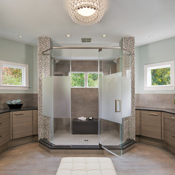
Bathroom - contemporary bathroom idea in DC Metro with a vessel sink
Bathroom - contemporary bathroom idea in DC Metro with a vessel sink
 Lars Remodeling & Design
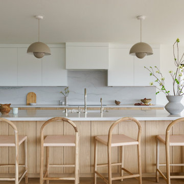
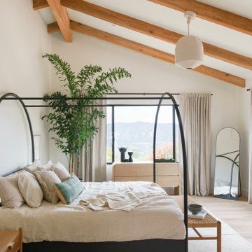
The completely reimagined floorplan included relocating the kitchen and Master Suite to the opposite side of the home to take better advantage of the views and natural light. All bathrooms and the laundry room were completely remodeled along with installing new doors, windows, and flooring throughout the home and completely upgrading all electrical and plumbing.
The end result is simply stunning. Light, bright, and modern, the new version of this home demonstrates the power of thoughtful architectural planning, creative problem solving, and expert design details.
 Lars Remodeling & Design
This spectacular family home situated above Lake Hodges in San Diego with sweeping views, was a complete interior and partial exterior remodel. Having gone untouched for decades, the home presented a unique challenge in that it was comprised of many cramped, unpermitted rooms and spaces that had been added over the years, stifling the home's true potential. Our team gutted the home down to the studs and started nearly from scratch.
The goal was to dramatically open up the living space and modernize the home, while capitalizing on the stunning views the property had to offer. With the existing floor plan, only bedrooms had partial views, with common living areas relegated to the back portion, preventing residents from enjoying the expansive sightlines available to the home.
The completely reimagined floorplan included relocating the kitchen and Master Suite to the opposite side of the home to take better advantage of the views and natural light. All bathrooms and the laundry room were completely remodeled along with installing new doors, windows, and flooring throughout the home and completely upgrading all electrical and plumbing.
The end result is simply stunning. Light, bright, and modern, the new version of this home demonstrates the power of thoughtful architectural planning, creative problem solving, and expert design details.
 OMZ architects
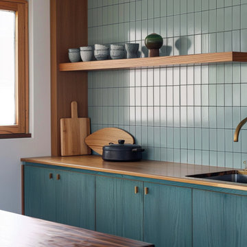
As a Flagstaff custom home architect, our approach to every project is to balance innovative solutions with bold design aesthetics. The Micro Mini, a compact and modern accessory dwelling unit (ADU) nestled in the heart of Flagstaff, is the perfect example of how thoughtful design can solve space constraints while offering a stylish, functional, and delightful living environment.
Our client came to us with a unique challenge: to create an additional living space on their property that was efficient, visually striking, and flexible in its function. They wanted to maximize a small footprint while incorporating pops of vibrant, monochrome color throughout the ADU to give it personality and make it feel like an extension of their larger home. The solution we provided, as your trusted Flagstaff custom home architect, was Micro Mini—a design that offers both efficiency and fun while making a big impact in a small space.
The first challenge we tackled was how to make the most of the limited square footage. Our approach, rooted in the principles of modern architecture, was to keep the floor plan as open and flexible as possible. By eliminating unnecessary walls and creating multifunctional spaces, we were able to design an interior that feels spacious and airy, despite the small footprint.
The living area, kitchen, and bedroom all flow seamlessly into each other, using strategic cabinetry, sliding doors, and built-in storage to keep the space uncluttered. The use of glass for windows and doors amplifies the sense of space, bringing in abundant natural light and connecting the interior to the outdoor landscape—a key consideration in any Flagstaff custom home architect project.
One of the most striking elements of the Micro Mini is its creative use of color. The client wanted each space to feel distinct, while still maintaining a cohesive design language. To achieve this, we incorporated monochrome color schemes in various sections of the ADU, starting with the kitchen.
The kitchen is a bold statement in shades of blue, with blue-stained cabinets, blue backsplash tile, and even blue fixtures. This color immersion gives the kitchen a distinctive identity while still blending harmoniously with the rest of the space. In other areas of the ADU, we played with pops of other fun colors—each carefully chosen to complement the modern aesthetic of the home while adding a personalized touch.
As your Flagstaff custom home architect, we believe that color is an integral part of design, and Micro Mini is a testament to how thoughtful color application can elevate a space. The bold monochrome interiors are a fun, creative twist that make this ADU stand out while ensuring it remains functional and inviting.
Beyond the bold use of color, the interior of Micro Mini is designed with simplicity and function in mind. We utilized clean lines, minimal ornamentation, and carefully selected materials to keep the overall look sleek and modern. Light wood floors contrast with the bold color accents and add warmth to the otherwise minimalistic design.
Attention to detail is paramount in all of our projects, and as a Flagstaff custom home architect, we take pride in the craftsmanship and quality materials used throughout the Micro Mini. From the custom-built cabinetry to the thoughtfully designed storage solutions, every inch of the ADU was considered for both aesthetics and practicality.
A key problem we solved for the client was how to make the ADU feel spacious and functional despite its small footprint. As your trusted Flagstaff custom home architect, we used a range of design solutions to achieve this.
First, we incorporated high ceilings to enhance the sense of volume and space, creating an airy feel throughout the ADU. The placement of windows and the strategic use of sliding glass doors allow light to flood in, further opening up the interior and blurring the lines between inside and out. These elements not only make the ADU feel larger but also create a strong connection to the surrounding landscape.
Another key element was the use of built-in furniture and storage solutions to keep the space clutter-free. From hidden storage under the bed to custom cabinetry in the kitchen, every corner of the Micro Mini was designed with functionality in mind. This approach ensured that the ADU met the client’s needs for both comfort and practicality, while still adhering to the modern design aesthetic they desired.
Being based in Northern Arizona, we are acutely aware of how important it is for our designs to harmonize with the surrounding landscape. As a Flagstaff custom home architect, we carefully consider the site’s natural beauty and how our projects can integrate with it.
With Micro Mini, we focused on making sure that the ADU feels like a natural extension of the client’s existing property. The large windows and sliding glass doors bring in views of the surrounding landscape, while the outdoor deck extends the living space, creating a seamless indoor-outdoor experience. Whether you’re standing in the living room or on the deck, you are always connected to the beautiful Flagstaff setting.
In line with our commitment to responsible design, sustainability was a key consideration for Micro Mini. As your Flagstaff custom home architect, we prioritize energy-efficient building methods and materials. The ADU was designed to be energy-efficient, with high-performance windows and insulation that keep it cool in the summer and warm in the winter.
Additionally, the color choices and materials used in the interior were chosen not just for their aesthetic appeal, but also for their durability and sustainability. Low-VOC paints and finishes were used throughout the ADU to ensure good indoor air quality, while the energy-efficient lighting and appliances help minimize the ADU’s overall environmental impact.
At HEY! designs, we believe in a collaborative approach to architecture that puts the client’s needs and vision at the forefront. Whether designing a large custom home or a compact ADU like Micro Mini, we bring the same level of dedication, creativity, and attention to detail to every project.
Our work is rooted in modern design principles but always infused with personality and a sense of fun. Micro Mini exemplifies this approach—a bold, colorful, and efficient ADU that meets the client’s needs while also reflecting their unique style.
If you’re considering a custom home or ADU in Flagstaff, HEY! designs is here to help bring your vision to life. As a Flagstaff custom home architect, we specialize in creating spaces that are not only beautiful and functional but also responsive to the unique qualities of the site and the needs of the client.
Micro Mini is a testament to how small spaces can still be big on style and function. By incorporating bold color schemes, maximizing space efficiency, and maintaining a strong connection to the outdoors, this ADU achieves everything the client wanted—a modern, fun, and functional space.
As your Flagstaff custom home architect, we would be thrilled to help you create a unique and personalized space that meets your needs, no matter the size or scope of your project. Contact us today to learn more about how we can bring your vision to life.
 Rhodes Architecture + Light
Cost : Withheld at Owner’s Request
6880 Square Feet New and Renovated
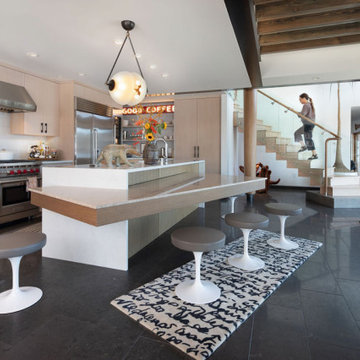
The renovation of an extensive linear residence and site facing Port Orchard waterway embraces water, greenspace and forested hillside. The home, completed this fall, serves as an artist’s studio, galleries, family space, game room, outdoor living areas and peaceful retreat.
New interiors and exterior spaces and finishes, cabinetry, lighting, paving, landscape and courtyards become settings for the owner’s art + collections, three-generations of family and the wonderful colors and textures of the land + water.
Inside, a monumental central stair and tapered two-story tall red cedar and steel column was designed as the residence’s entry focal point and internal landmarks, guiding the visitor’s eye to the main atrium…. and upward. Heavy wide-flange steel moment frames support the house and enable whole walls of glass. Rough, mill-finished steel contrasts refined cabinetry, stone, wood structure and defining dropped ceilings, reflecting the opener’s love of the tension between highly polished and detailed + rough, found art.
Outside, A new southern “dining room” was designed for warm summer evening gatherings under a heavy-timber trellis. The focus, opposite water and island views, is a metal perforated screen. The final screen is composed of the lyrics from a Joe Cocker song of great meaning to the owners, cut from ½” marine bronze, set into dark-fired brick. “Oh My Darling, Be Home Soon….”
Natural daylight and high-efficiency lighting are central players as in any gallery. From a high clerestory and extensive southern and eastern window-walls to carefully selected up-lighting, pendants, and accent fixtures, Rhodes Architecture + Light worked closely with the owner to ensure that their dark existing house would become one filled with light…. night and day.
The owners, Ken and Jane, allowed us to interview them about their experience working with Rhodes Architecture + Light, and how they are feeling about living with the architecture today.
What was your experience like, working with Rhodes Architecture + Light?
“They worked with us because it was a remodel, an existing thing, and we had to try to make it work for all of our interests and how our family operated. They listened, and we listened, and it was a great communication back and forth.”–Jane
How has the renovation changed the way you live and enjoy your home?
“I remember saying to them that I want the whole floor heated because it gets so chilly down here. And we had the wood burning stove, but it was over there and now we just turn the floor heat on and we can come down. It’s cozy and nice. So we’re looking forward to winter now.”–Ken
“We have 5 kids together and now a bunch of grandchildren. I wanted a marble countertop, but there’s just no way. I didn’t want it to be a place where I had to say, ‘No, no, no. Wipe up your drink, do this, do that.’ I wanted it to be a place where everybody can come with all the kids, and we make a big mess, and I can clean it up. And we can enjoy ourselves here, because that room upstairs, we almost never went in. And now we’re in there eating pizza and watching the game.” –Jane
As an artist, Jane enjoyed the collaborative process.
“I can’t believe it was as positive as it was. I went into it thinking it would be a great, creative, fun, collaborative thing, and I have to say, with our architects, it was. I like that creative process. I always say when I am doing a painting, it’s a series of problem solving so it wasn’t unusual for me. I am completely blown away by them and had fun with that part of it.” –Jane
Architect: Tim James Rhodes RA AIA, Rhodes Architecture + Light
Builder: Fairbank Construction Company
Structural: Swensen Say Faget
 CARNEMARK design + build
Photo by Anice Hoachlander
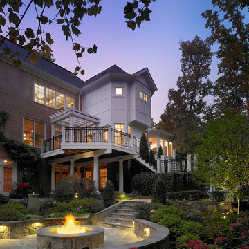
Inspiration for a contemporary three-story mixed siding exterior home remodel in DC Metro
Inspiration for a contemporary three-story mixed siding exterior home remodel in DC Metro
 Sarah Barnard Design LLC
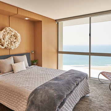
A tiny guest bedroom suffering from inadequate floor space, required some serious problem solving! The bed and nightstands were custom made to make the tight quarters feel light and livable.
 Distinctive Kitchens
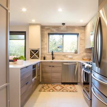
We had a few problems to solve during the gut remodel of this Midcentury kitchen. First, in order to put the dishwasher next to the sink, we had to move the peninsula to the left a bit. Then we hid the microwave by placing it under the peninsula--no one needs to see a big microwave on the counter! We chose a subtle light fixture with black accents to balance the volume of the larger fixture in the dining room, and to match with the faucet. We kept the pulls modern and simple.
Kitchen accessories from West Elm, World Market and Nickey Kehoe, rug by Target.
Kitchen and dining room staging by Allison Scheff of Distinctive Kitchens.
Photos by Wynne H Earle
 Rhodes Architecture + Light
The renovation of an extensive linear residence and site facing Port Orchard waterway embraces water, greenspace and forested hillside. The home, completed this fall, serves as an artist’s studio, galleries, family space, game room, outdoor living areas and peaceful retreat.
New interiors and exterior spaces and finishes, cabinetry, lighting, paving, landscape and courtyards become settings for the owner’s art + collections, three-generations of family and the wonderful colors and textures of the land + water.
Inside, a monumental central stair and tapered two-story tall red cedar and steel column was designed as the residence’s entry focal point and internal landmarks, guiding the visitor’s eye to the main atrium…. and upward. Heavy wide-flange steel moment frames support the house and enable whole walls of glass. Rough, mill-finished steel contrasts refined cabinetry, stone, wood structure and defining dropped ceilings, reflecting the opener’s love of the tension between highly polished and detailed + rough, found art.
Outside, A new southern “dining room” was designed for warm summer evening gatherings under a heavy-timber trellis. The focus, opposite water and island views, is a metal perforated screen. The final screen is composed of the lyrics from a Joe Cocker song of great meaning to the owners, cut from ½” marine bronze, set into dark-fired brick. “Oh My Darling, Be Home Soon….”
Natural daylight and high-efficiency lighting are central players as in any gallery. From a high clerestory and extensive southern and eastern window-walls to carefully selected up-lighting, pendants, and accent fixtures, Rhodes Architecture + Light worked closely with the owner to ensure that their dark existing house would become one filled with light…. night and day.
The owners, Ken and Jane, allowed us to interview them about their experience working with Rhodes Architecture + Light, and how they are feeling about living with the architecture today.
What was your experience like, working with Rhodes Architecture + Light?
“They worked with us because it was a remodel, an existing thing, and we had to try to make it work for all of our interests and how our family operated. They listened, and we listened, and it was a great communication back and forth.”–Jane
How has the renovation changed the way you live and enjoy your home?
“I remember saying to them that I want the whole floor heated because it gets so chilly down here. And we had the wood burning stove, but it was over there and now we just turn the floor heat on and we can come down. It’s cozy and nice. So we’re looking forward to winter now.”–Ken
“We have 5 kids together and now a bunch of grandchildren. I wanted a marble countertop, but there’s just no way. I didn’t want it to be a place where I had to say, ‘No, no, no. Wipe up your drink, do this, do that.’ I wanted it to be a place where everybody can come with all the kids, and we make a big mess, and I can clean it up. And we can enjoy ourselves here, because that room upstairs, we almost never went in. And now we’re in there eating pizza and watching the game.” –Jane
As an artist, Jane enjoyed the collaborative process.
“I can’t believe it was as positive as it was. I went into it thinking it would be a great, creative, fun, collaborative thing, and I have to say, with our architects, it was. I like that creative process. I always say when I am doing a painting, it’s a series of problem solving so it wasn’t unusual for me. I am completely blown away by them and had fun with that part of it.” –Jane
Architect: Tim James Rhodes RA AIA, Rhodes Architecture + Light
Builder: Fairbank Construction Company
Structural: Swensen Say Faget
 Lars Remodeling & Design
This spectacular family home situated above Lake Hodges in San Diego with sweeping views, was a complete interior and partial exterior remodel. Having gone untouched for decades, the home presented a unique challenge in that it was comprised of many cramped, unpermitted rooms and spaces that had been added over the years, stifling the home's true potential. Our team gutted the home down to the studs and started nearly from scratch.
The end result is simply stunning. Light, bright, and modern, the new version of this home demonstrates the power of thoughtful architectural planning, creative problem solving, and expert design details.
 Ogle Construction & Maintenance Service, Inc.
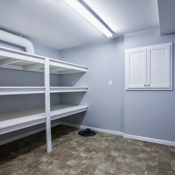
Problem: Homeowners had a leak in their smelly, damp basement
Solution: Problem solved... and fresh, beautiful living spaces were created!
"The homeowners called us to fix a leak in their basement... which turned out to be a backed up drain, caused by a crack in an obsolete drain tile, and two leaks in their foundation... it sort of snowballed," says Bryan Ogle, owner of Ogle Construction and Maintenance Services.
With small children in the home, the couple decided to invest in solving the problem with a long-
term solution. They wanted to make the basement safe and comfortable for their young family.
After the drain tile was fixed, the entire area was reinsulated, and finished with new sheetrock, trim, carpet and lighting. The electrical system was updated and a new laundry room (with loads of storage), bedroom and family room were created in the space. What was once a damp, smelly basement (with a dehumidifier running constantly) is now a fresh, clean living space for the family to enjoy.
 TaylorPro Design and Remodeling, Inc.
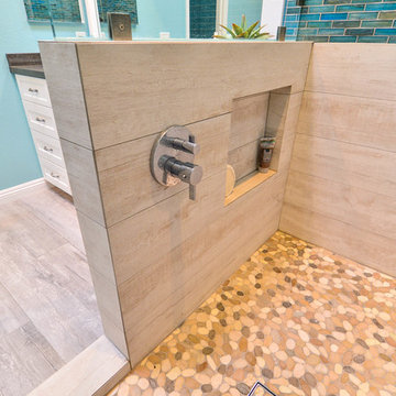
"TaylorPro completely remodeled our master bathroom. We had our outdated shower transformed into a modern walk-in shower, new custom cabinets installed with a beautiful quartz counter top, a giant framed vanity mirror which makes the bathroom look so much bigger and brighter, and a wood ceramic tile floor including under floor heating. Kerry Taylor also solved a hot water problem we had by installing a recirculating hot water system which allows us to have instant hot water in the shower rather than waiting forever for the water to heat up.
From start to finish TaylorPro did a professional, quality job. Kerry Taylor was always quick to respond to any question or problem and made sure all work was done properly. Bonnie, the resident designer, did a great job of creating a beautiful, functional bathroom design combining our ideas with her own. Every member of the TaylorPro team was professional, hard-working, considerate, and competent. Any remodeling project is going to be somewhat disruptive, but the TaylorPro crew made the process as painless as possible by being respectful of our home environment and always cleaning up their mess at the end of the day. I would recommend TaylorPro Design to anyone who wants a quality project done by a great team of professionals. You won't be disappointed!"
~ Judy and Stuart C, Clients
Carlsbad home with Caribbean Blue mosaic glass tile, NuHeat radiant floor heating, grey weathered plank floor tile, pebble shower pan and custom "Whale Tail" towel hooks. Classic white painted vanity with quartz counter tops.
Bathroom Design - Bonnie Bagley Catlin, Signature Designs Kitchen Bath.
Contractor - TaylorPro Design and Remodeling
Photos by: Kerry W. Taylor
 Anthony J. Vallée
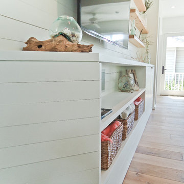
The client was excited to purchase a home in the beautiful resort of Sandestin, but was not pleased with the dark interiors, heavy mouldings, tile floors, dated fixtures and heavy feel of the interior of the home. We solved their problems by completely renovating the interiors. Ceilings were raised, floors were replaced, cabinetry and fixtures were replaced and a problem area in the living room was solved. They now have the open, clean, airy beach home of their dreams and I couldn't be more pleased with how this home turned out for them.
anthony vallee
3