
Search results for "Enhances problem solving" in Home Design Ideas
 Rhodes Architecture + Light
The renovation of an extensive linear residence and site facing Port Orchard waterway embraces water, greenspace and forested hillside. The home, completed this fall, serves as an artist’s studio, galleries, family space, game room, outdoor living areas and peaceful retreat.
New interiors and exterior spaces and finishes, cabinetry, lighting, paving, landscape and courtyards become settings for the owner’s art + collections, three-generations of family and the wonderful colors and textures of the land + water.
Inside, a monumental central stair and tapered two-story tall red cedar and steel column was designed as the residence’s entry focal point and internal landmarks, guiding the visitor’s eye to the main atrium…. and upward. Heavy wide-flange steel moment frames support the house and enable whole walls of glass. Rough, mill-finished steel contrasts refined cabinetry, stone, wood structure and defining dropped ceilings, reflecting the opener’s love of the tension between highly polished and detailed + rough, found art.
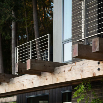
Outside, A new southern “dining room” was designed for warm summer evening gatherings under a heavy-timber trellis. The focus, opposite water and island views, is a metal perforated screen. The final screen is composed of the lyrics from a Joe Cocker song of great meaning to the owners, cut from ½” marine bronze, set into dark-fired brick. “Oh My Darling, Be Home Soon….”
Natural daylight and high-efficiency lighting are central players as in any gallery. From a high clerestory and extensive southern and eastern window-walls to carefully selected up-lighting, pendants, and accent fixtures, Rhodes Architecture + Light worked closely with the owner to ensure that their dark existing house would become one filled with light…. night and day.
The owners, Ken and Jane, allowed us to interview them about their experience working with Rhodes Architecture + Light, and how they are feeling about living with the architecture today.
What was your experience like, working with Rhodes Architecture + Light?
“They worked with us because it was a remodel, an existing thing, and we had to try to make it work for all of our interests and how our family operated. They listened, and we listened, and it was a great communication back and forth.”–Jane
How has the renovation changed the way you live and enjoy your home?
“I remember saying to them that I want the whole floor heated because it gets so chilly down here. And we had the wood burning stove, but it was over there and now we just turn the floor heat on and we can come down. It’s cozy and nice. So we’re looking forward to winter now.”–Ken
“We have 5 kids together and now a bunch of grandchildren. I wanted a marble countertop, but there’s just no way. I didn’t want it to be a place where I had to say, ‘No, no, no. Wipe up your drink, do this, do that.’ I wanted it to be a place where everybody can come with all the kids, and we make a big mess, and I can clean it up. And we can enjoy ourselves here, because that room upstairs, we almost never went in. And now we’re in there eating pizza and watching the game.” –Jane
As an artist, Jane enjoyed the collaborative process.
“I can’t believe it was as positive as it was. I went into it thinking it would be a great, creative, fun, collaborative thing, and I have to say, with our architects, it was. I like that creative process. I always say when I am doing a painting, it’s a series of problem solving so it wasn’t unusual for me. I am completely blown away by them and had fun with that part of it.” –Jane
Architect: Tim James Rhodes RA AIA, Rhodes Architecture + Light
Builder: Fairbank Construction Company
Structural: Swensen Say Faget
 NanaWall
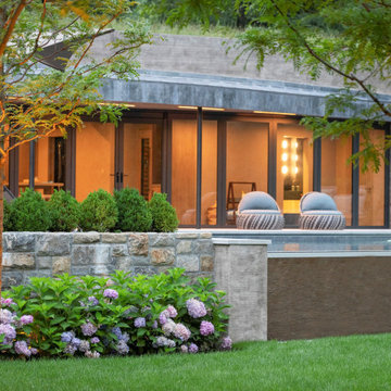
The original spark was from esteemed Landscape Architect John R. Conte, known for designing with the land, rather than over it. The architecture wraps around and disappears into the hillside, while a green roof and ivy cladding visually absorb the structure into the slope. At the heart of the design are NanaWall single track stacking and sliding glass doors, engineered to mirror the sinuous organic form of the building while providing a fully retractable indoor-outdoor connection. The stacking and sliding glass doors follow the topography’s curve, opening the cabana fully to the lush landscape and disappearing into remote storage closets when not in use. The client had long envisioned a pool house, but the property was already beyond its Floor Area Ratio (FAR). Conte, known for his problem-solving rooted in nature, identified a clever solution: embed the structure into the hillside far enough to stay within FAR limits. It made the entire project possible.
 Fusion Home
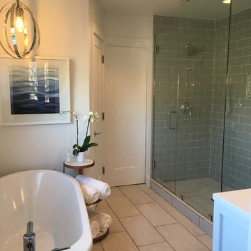
Amazing bathroom transformation! Check out the before & afters...ripped down to the studs and moved some walls to create a clean, crisp transitional bathroom retreat complete with freestanding tub and large shower. Even added a window to bring in some great natural light. Problem solving makes for great unique solutions and a thoughtful space.
Find the right local pro for your project
 The Homeowners Helper LLC
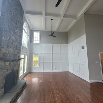
Client wanted their great room to truly be “great” by adding a coffered ceiling with crown molding and beadboard panels on the walls. Additionally, we took down old ceiling fans we added fresh coats of paint to the great room. We worked with the homeowner who wanted to be involved at every step. We problem solved on the spot to come up with the best structural and aesthetic solutions.
Not pictured was additional work in the breakfast nook with a wainscoting ceiling, we completed a brick accent wall, and crown molding to the entire top floor. We also added a wall and a door to frame in a movie theater area including drywall work, crown molding and creating a bulkhead to hide speaker wires and lighting effects. And a laundry cabinet.
 Kristen Elizabeth Design
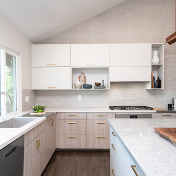
This home remodel was all about creating a modern oasis for easy entertaining and family life while accentuating the existing architecture of the home. It was critical to harmonize the kitchen with the remainder of the home and we achieved that by bringing a fresh and clean palette throughout the entry, living and kitchen areas. Every aspect of this design was thoughtfully curated in the best interest of the structure of the home and the desires of our clients.
We highlighted the negative wall space by adding a textured three dimensional tile to the entire back wall. To balance, we added an asymmetric lower bank of storage with open pockets for easy access. We blended a fine linen veneer that provides a soft contrast to the back wall cabinets and the island. For additional visual interest we added a grey wood veneer to complete the remainder of the space.
To continue the theme of harmony we needed to open up the divider wall between the living and kitchen, without removing it- as it was a critical structural shear wall. To problem solve, we mirrored the vaulted architecture of the kitchen in the opening to add consistency throughout the space.
The result: A crisp and contemporary aesthetic guests are sure to be WOW’d by.
 Savoye Interiors
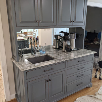
This kitchen is still in the works but is too lovely not to share at this moment. I will be adding the completed project once the dust settles. Designed with a flare for Scandinavian Style. Coffee bar was a must for my customers because they fell in love with one while visiting a Bed & Breakfast in Maine. I paid strict attention to detail with undercabinet lighting as we did not want to see it in the mirror. Problem solved by putting a piece of shoe molding, the same color as the cabinet, in front of the light so we did not see the reflection.
 Ameriside
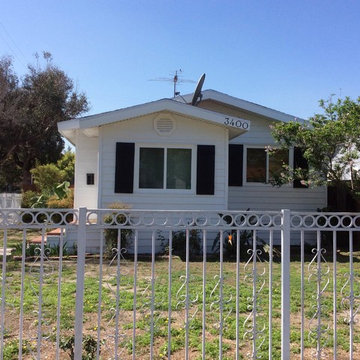
This homeowner wanted to update the look of the property, save energy and have no maintenance. Problem solved, with insulated vinyl siding by cedar ridge in Aspen white combined with black shutters. The fascia and eaves were also updated. We installed vinyl clad aluminum over the fascia and vinyl soffit for the eaves to encapsulate them from the elements. Now this homeowner will save thousands in energy, painting, and maintenance cost. Plus with a lifetime warranty comes peace of mind.
Jeremy Sharrock

 Klopf Architecture
Malibu Glass Box House by Klopf Architecture
Following the devastating Woolsey Fire of 2018, the site in Malibu offered a unique opportunity to rebuild not just a home, but a new architectural composition that highlighted the property’s potential while navigating strict fire-rebuild codes in the area. Designed by Klopf Architecture, this project embraced a set of limitations and translated them into an architectural asset.
The city’s fire-rebuild process required the new structure to remain close to the original footprint, size and bulk, a constraint that ultimately clarified the architectural direction. Perched near the front of a long, narrow lot, the new home frames and overlooks a private, park-like rear expanse, an uncommon luxury especially in this part of Malibu .
Without a fixed program, the design process allowed for a different kind of creative focus allowing Klopf Architecture the opportunity to explore how a modernist home could best respond to this site. The team approached the project not with a list of requirements, but with a question: How might a modernist live here? What spatial qualities would inspire calm, connection, and a sense of wonder in this setting? The process became less about problem-solving and more about architectural storytelling—letting the site, the light, and the principles of modern design guide the form and flow of the home.
The response emerged in the form of a glass-box pavilion, an open, Mid-Century Modern inspired living, dining, and kitchen space that floats at the edge of the property’s natural descent. Connected to the more enclosed, private areas of the home by a glass-walled hallway, the living pavilion becomes a distinct centerpiece of the design. It opens on all four sides to the landscape with decks and patios on the flanks, an internal garden and water feature to the north, and a dramatic unguarded view of the expansive backyard and ocean horizon to the south.
Because of the mandated footprint, careful planning was required to ensure every space could still engage with light, landscape, or both. Strategic voids in the form of atriums and courtyards allow daylight to filter deep into the home’s core, while offering moments of surprise and retreat. These design gestures allow natural light to filter deep into the interior, creating a sense of brightness and openness throughout the day. At the same time, they expand the perceptual boundaries between inside and out, making the home feel more expansive while anchoring its connection to the surrounding landscape.
The siting of the house is what gives it its unique character. Rather than receding into the backyard like the neighboring homes, the house holds a slight prominence. From the central living pavilion, stepping down into the landscape feels more like entering a secluded park where a separate existing accessory structure, trail, and recreational areas await. The home’s modest street presence gives way to this unfolding drama of space, view, and nature.
Fire-resilient materials and assemblies are integrated seamlessly throughout including triple-pane glazing, under-slab and roof insulation, and locally sourced fire-rated cladding ensure the house not only meets Calfornia’s rigorous wildland-urban interface (WUI) standards, but feels effortlessly aligned with them. While technical decisions like fire-hardening and mechanical systems presented some construction challenges, particularly around the cantilevered glass box, the team found a functional compromise that preserved the integrity of the design.
Inside, a restrained palette and exposed post and beam design celebrate the ethos of mid-century modernism. A central circulation spine extends from the entry to the rear glass wall, offering a continuous visual link from street to ocean. Spaces such as the library and office, though more intimate in scale, are never cut off from nature as each opens to its own unique courtyard or garden view.
Though born out of a strict regulatory framework and developed without a specific client, the rebuild design unfolded with remarkable clarity. Grounded in site logic, refined by limitations and an emphasis on timeless spatial relationships – light, proportion, and a strong connection to nature, the resulting design feels both effortless and uplifting. The home lives lightly on the land, opens generously to its surroundings, and strikes a careful balance between privacy, openness, and calm. For Klopf Architecture, it stands as a compelling case study in how site, code, and circumstantial constraints can inspire enduring, modernist architecture. With years of experience reimagining mid-century modern design for how people live today, the firm took the project’s limitations as an opportunity. The result is a home shaped by open, flowing spaces, strong indoor-outdoor connections, and a calm, clear sense of structure. It’s a good reminder that even with strict constraints, there’s still room for architecture to breathe—and for modernism to keep moving forward.
Klopf Architecture project team: Geoff Campen, John Klopf, AIA, and Sherry Tan
Structural Engineer: ZFA
Contractor: Maison D’Artiste
Photography: ©2025 Mariko Reed
Year Completed: 2023
 Kristen Elizabeth Design
This home remodel was all about creating a modern oasis for easy entertaining and family life while accentuating the existing architecture of the home. It was critical to harmonize the kitchen with the remainder of the home and we achieved that by bringing a fresh and clean palette throughout the entry, living and kitchen areas. Every aspect of this design was thoughtfully curated in the best interest of the structure of the home and the desires of our clients.
We highlighted the negative wall space by adding a textured three dimensional tile to the entire back wall. To balance, we added an asymmetric lower bank of storage with open pockets for easy access. We blended a fine linen veneer that provides a soft contrast to the back wall cabinets and the island. For additional visual interest we added a grey wood veneer to complete the remainder of the space.
To continue the theme of harmony we needed to open up the divider wall between the living and kitchen, without removing it- as it was a critical structural shear wall. To problem solve, we mirrored the vaulted architecture of the kitchen in the opening to add consistency throughout the space.
The result: A crisp and contemporary aesthetic guests are sure to be WOW’d by.
 Bullseye Wood Specialties, L.L.C
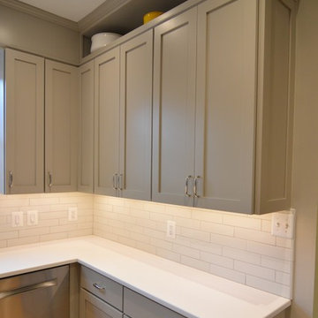
This compact DC kitchen was in dire need of space saving tricks and we used several. The kitchen features two tip-on toe kick drawers, sink tilt out, lazy susan, blind corner cabinet and custom vertical wood dividers over the frig. The original kitchen layout was L shaped because space did not allow for full depth base cabinets on the right wall. Problem solved -- we simply built cabinets that were 18" deep which still provide loads of storage as well as much needed counter top space.
 Kanika Design
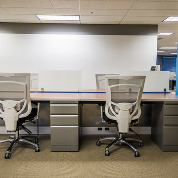
Open office workstations are designed for conversation to encourage impromptu problem-solving sessions.
PC: MJ Cohen Photography
Example of a large minimalist home design design in San Francisco
Example of a large minimalist home design design in San Francisco
 The Homeowners Helper LLC
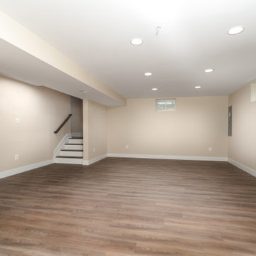
We transformed an unfinished basement into a functional oasis, our recent project encompassed the creation of a recreation room, bedroom, and a jack and jill bathroom with a tile look vinyl surround. We also completed the staircase, addressing plumbing issues that emerged during the process with expert problem-solving. Customizing the layout to work around structural beams, we optimized every inch of space, resulting in a harmonious and spacious living area.
 Rhodes Architecture + Light
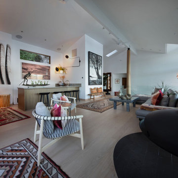
The renovation of an extensive linear residence and site facing Port Orchard waterway embraces water, greenspace and forested hillside. The home, completed this fall, serves as an artist’s studio, galleries, family space, game room, outdoor living areas and peaceful retreat.
New interiors and exterior spaces and finishes, cabinetry, lighting, paving, landscape and courtyards become settings for the owner’s art + collections, three-generations of family and the wonderful colors and textures of the land + water.
Inside, a monumental central stair and tapered two-story tall red cedar and steel column was designed as the residence’s entry focal point and internal landmarks, guiding the visitor’s eye to the main atrium…. and upward. Heavy wide-flange steel moment frames support the house and enable whole walls of glass. Rough, mill-finished steel contrasts refined cabinetry, stone, wood structure and defining dropped ceilings, reflecting the opener’s love of the tension between highly polished and detailed + rough, found art.
Outside, A new southern “dining room” was designed for warm summer evening gatherings under a heavy-timber trellis. The focus, opposite water and island views, is a metal perforated screen. The final screen is composed of the lyrics from a Joe Cocker song of great meaning to the owners, cut from ½” marine bronze, set into dark-fired brick. “Oh My Darling, Be Home Soon….”
Natural daylight and high-efficiency lighting are central players as in any gallery. From a high clerestory and extensive southern and eastern window-walls to carefully selected up-lighting, pendants, and accent fixtures, Rhodes Architecture + Light worked closely with the owner to ensure that their dark existing house would become one filled with light…. night and day.
The owners, Ken and Jane, allowed us to interview them about their experience working with Rhodes Architecture + Light, and how they are feeling about living with the architecture today.
What was your experience like, working with Rhodes Architecture + Light?
“They worked with us because it was a remodel, an existing thing, and we had to try to make it work for all of our interests and how our family operated. They listened, and we listened, and it was a great communication back and forth.”–Jane
How has the renovation changed the way you live and enjoy your home?
“I remember saying to them that I want the whole floor heated because it gets so chilly down here. And we had the wood burning stove, but it was over there and now we just turn the floor heat on and we can come down. It’s cozy and nice. So we’re looking forward to winter now.”–Ken
“We have 5 kids together and now a bunch of grandchildren. I wanted a marble countertop, but there’s just no way. I didn’t want it to be a place where I had to say, ‘No, no, no. Wipe up your drink, do this, do that.’ I wanted it to be a place where everybody can come with all the kids, and we make a big mess, and I can clean it up. And we can enjoy ourselves here, because that room upstairs, we almost never went in. And now we’re in there eating pizza and watching the game.” –Jane
As an artist, Jane enjoyed the collaborative process.
“I can’t believe it was as positive as it was. I went into it thinking it would be a great, creative, fun, collaborative thing, and I have to say, with our architects, it was. I like that creative process. I always say when I am doing a painting, it’s a series of problem solving so it wasn’t unusual for me. I am completely blown away by them and had fun with that part of it.” –Jane
Architect: Tim James Rhodes RA AIA, Rhodes Architecture + Light
Builder: Fairbank Construction Company
Structural: Swensen Say Faget

 Kitchen Inspiration Inc.
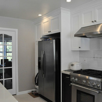
Project highlight – We are in the mission to improve the sage green galley kitchen in a cozy house in SF bay area.
Homeowners’ wish list for the new kitchen-
1. Improve lighting
2. More storage
3. More countertop space
4. Light maintenance countertop
5. Refrigerator door conflicts with wall.
6. Better flow
7. Add a mini Fridge
How did we transform the kitchen?
1. Added recessed light to ceiling & pendant light above the sink. Lighter color cabinet, back splash & countertop will bright up the space as well.
2. Adding a tall pantry with pull out shelves to the kitchen takes care the food storage. We also add 15 linear feet of base storage space under banquette seating.
3. Designating food storage in pantry clear out plenty of countertop space for food prep.
4. No more grout line on countertop. The engineer quartz countertop not only gives a beautiful touch to the kitchen but easy maintenance at the same time.
5. Common problem solved by adding a pantry between refrigerator & returning wall. Now the Ref door can be wide open with easy access to food.
6. The small peninsula in existing kitchen interrupts the flow and make kitchen feel smaller. It’s an item being removed.
7. Mini beverage fridge adds value to the kitchen for sure. Now, all drinks have a new home!
 Klopf Architecture
Malibu Glass Box House by Klopf Architecture
Following the devastating Woolsey Fire of 2018, the site in Malibu offered a unique opportunity to rebuild not just a home, but a new architectural composition that highlighted the property’s potential while navigating strict fire-rebuild codes in the area. Designed by Klopf Architecture, this project embraced a set of limitations and translated them into an architectural asset.
The city’s fire-rebuild process required the new structure to remain close to the original footprint, size and bulk, a constraint that ultimately clarified the architectural direction. Perched near the front of a long, narrow lot, the new home frames and overlooks a private, park-like rear expanse, an uncommon luxury especially in this part of Malibu .
Without a fixed program, the design process allowed for a different kind of creative focus allowing Klopf Architecture the opportunity to explore how a modernist home could best respond to this site. The team approached the project not with a list of requirements, but with a question: How might a modernist live here? What spatial qualities would inspire calm, connection, and a sense of wonder in this setting? The process became less about problem-solving and more about architectural storytelling—letting the site, the light, and the principles of modern design guide the form and flow of the home.
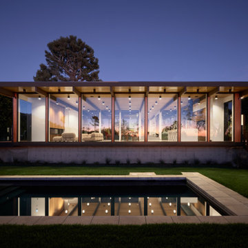
The response emerged in the form of a glass-box pavilion, an open, Mid-Century Modern inspired living, dining, and kitchen space that floats at the edge of the property’s natural descent. Connected to the more enclosed, private areas of the home by a glass-walled hallway, the living pavilion becomes a distinct centerpiece of the design. It opens on all four sides to the landscape with decks and patios on the flanks, an internal garden and water feature to the north, and a dramatic unguarded view of the expansive backyard and ocean horizon to the south.
Because of the mandated footprint, careful planning was required to ensure every space could still engage with light, landscape, or both. Strategic voids in the form of atriums and courtyards allow daylight to filter deep into the home’s core, while offering moments of surprise and retreat. These design gestures allow natural light to filter deep into the interior, creating a sense of brightness and openness throughout the day. At the same time, they expand the perceptual boundaries between inside and out, making the home feel more expansive while anchoring its connection to the surrounding landscape.
The siting of the house is what gives it its unique character. Rather than receding into the backyard like the neighboring homes, the house holds a slight prominence. From the central living pavilion, stepping down into the landscape feels more like entering a secluded park where a separate existing accessory structure, trail, and recreational areas await. The home’s modest street presence gives way to this unfolding drama of space, view, and nature.
Fire-resilient materials and assemblies are integrated seamlessly throughout including triple-pane glazing, under-slab and roof insulation, and locally sourced fire-rated cladding ensure the house not only meets Calfornia’s rigorous wildland-urban interface (WUI) standards, but feels effortlessly aligned with them. While technical decisions like fire-hardening and mechanical systems presented some construction challenges, particularly around the cantilevered glass box, the team found a functional compromise that preserved the integrity of the design.
Inside, a restrained palette and exposed post and beam design celebrate the ethos of mid-century modernism. A central circulation spine extends from the entry to the rear glass wall, offering a continuous visual link from street to ocean. Spaces such as the library and office, though more intimate in scale, are never cut off from nature as each opens to its own unique courtyard or garden view.
Though born out of a strict regulatory framework and developed without a specific client, the rebuild design unfolded with remarkable clarity. Grounded in site logic, refined by limitations and an emphasis on timeless spatial relationships – light, proportion, and a strong connection to nature, the resulting design feels both effortless and uplifting. The home lives lightly on the land, opens generously to its surroundings, and strikes a careful balance between privacy, openness, and calm. For Klopf Architecture, it stands as a compelling case study in how site, code, and circumstantial constraints can inspire enduring, modernist architecture. With years of experience reimagining mid-century modern design for how people live today, the firm took the project’s limitations as an opportunity. The result is a home shaped by open, flowing spaces, strong indoor-outdoor connections, and a calm, clear sense of structure. It’s a good reminder that even with strict constraints, there’s still room for architecture to breathe—and for modernism to keep moving forward.
Klopf Architecture project team: Geoff Campen, John Klopf, AIA, and Sherry Tan
Structural Engineer: ZFA
Contractor: Maison D’Artiste
Photography: ©2025 Mariko Reed
Year Completed: 2023
 Lars Remodeling & Design
The completely reimagined floorplan included relocating the kitchen and Master Suite to the opposite side of the home to take better advantage of the views and natural light. All bathrooms and the laundry room were completely remodeled along with installing new doors, windows, and flooring throughout the home and completely upgrading all electrical and plumbing.
The end result is simply stunning. Light, bright, and modern, the new version of this home demonstrates the power of thoughtful architectural planning, creative problem solving, and expert design details.
 Terra Verde Landscape Solutions
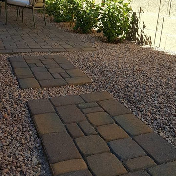
Solved a drainage problem by regrading the corner and installing overlay pavers to match the paver steppers that bridge the main yard with this patio corner. Hibiscus, the home owner's favorite flower, will give great color to his speical spot. Photo by Kari Petterson
 International Stoneworks, Inc.
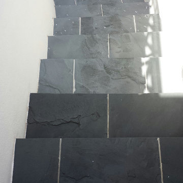
Scrubbed clean and enhanced textured stone exterior staircase
Staircase photo in Houston
Staircase photo in Houston
 Kustom Home Design
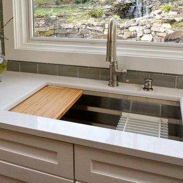
This amazing renovation focused on solving a series of problems that a previous kitchen expansion had created. By rearranging the appliance placement, updating the cabinetry, designing all new storage solutions and maximizing the amazing outdoor views; we cured the spit personality disorder plaguing the existing kitchen. The home now has a beautifully redesigned kitchen and living space perfect for entertaining, relaxing and enjoying the outside views. Vaulted ceilings with bright skylights, reflective glass wall tiles, sleek sophisticated Cambria quartz counter tops, fingerprint-free faucet, multi-functional Prolific kitchen sink by Kohler, stainless steel appliances, creative storage solutions, all new lighting and timeless shaker cabinets by Wellborn lend to the now bright, open, vivacious and flawless function of this newly renovated galley style kitchen. White base cabinets along the outside walls contrast perfectly with the dark grey island cabinets. Linear satin nickel door and drawer pulls coordinate with the stainless steel appliances and sink. An eclectic blend of vintage and modern furnishings, artwork and rugs create a comfortable balance that feels and looks timeless. Breathtaking backyard views are artfully framed by new Pella windows and doors with integral blinds between the glass. Calm, inviting neutral tones provide the perfect backdrop for this refined design.
Photos by: Kimberly Kerl
48