
Search results for "Enhances problem solving" in Home Design Ideas
 Murphy Bros. Design | Build | Remodel
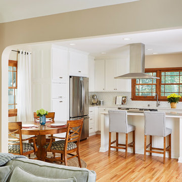
Typical of early 1900s St. Paul homes, this cramped, dark kitchen offered limited functionality and views—all solved by this 5x18-foot addition. The remodel includes a large kitchen island with seating, Cambria countertops, custom shaker cabinets, a wine/beverage center, ten new recessed lights, and stunning Marvin windows, which showcase the dramatic backyard landscaping. The design respects the original architecture while enhancing every aspect of the kitchen & dining area—from aesthetics to functionality.
Design/Build Consultant—Jonah Smith
Photography—Alyssa Lee
 Art & Smart Inc
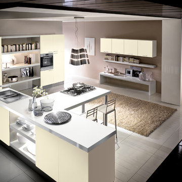
MELA is available in the WHITE, LIGHT OAK, LIGHT WALNUT, BROWN, EGGPLANT, GREY OAK, RED, LARIX, BUTTER, COFFEE and CREAM versions. A young kitchen in performing, suitable even for the most demanding clientele for it was created to solve any problems in use and composition. There are various functional wall hung Accessories and internal equipment. A wide range of tables and chairs is also available to personalised your own kitchen.
 JUMA architects
JUMA architects were contacted for the interior design of a shell-state apartment on the coast. The structural construction, the plastering, the floor screed and the technical fittings (heating ducts, plumbing, electricity and ventilation) of the apartment had already been realised.
It soon became apparent, however, that the assignment could not be limited to the interior decoration only, as the placement of kitchen, bathroom and dressing room in the existing plan turned out to be entirely impractical. More extensive renovation work was needed to meet the needs of the customer. The structure of the unit was therefore slightly adjusted to make the bathroom and dressing larger and more functional.
Also, the living room was dominated by a huge radiator that drew all the attention. To solve this problem, new pipes were laid to accommodate an integrated heating element in the sideboard. Gas pipes were fitted in the kitchen for the gas cooker which JUMA included in the design as a real eye-catcher. The sinks, in contrast, were given a more discreet placement.
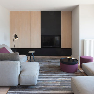
Light oak parquet was selected for the floors throughout the apartment. The natural appearance of the wood gives all the rooms a warm feel. The built-in furniture was custom made and is finished in black satin lacquer to contrast the light-coloured wood. The dominant colour palette is deliberately kept very simple and neutral and is complemented with light grey tones and colour accents. The colour choice was in fact inspired by a beautiful picture of the coast.
The freestanding furniture and overall decorations were also selected or designed by JUMA architects. The arrangement of the seating area is very playful and atypical. JUMA did not want to put in a couch that would divide the space in two. The composition is meant to create a very open ambiance. A round table was chosen for the same reason. The round shape does not divide the space but allows fluid circulation.
Pictures © Liesbet Goetschalckx
Find the right local pro for your project
 Drury Design
THE SETUP
Sam’s client had lived in her downtown townhome home for less than a year when she decided to remodel the spacious second level. This open area consisted of three sections: a TV and fireplace zone, a sparsely furnished dining area, and a dominant central kitchen. The kitchen featured a long back wall with three segmented sections and a massive island housing the cooktop. She found the kitchen’s functionality lacking and its presence overwhelming – it dominated the entire floor, regardless of where you stood.
Design objectives:
- Reconfigure key kitchen elements (sink, cooktop, oven) while minimizing the kitchen’s visual impact
- Optimize the kitchen’s back wall, eliminating existing dead space
- Create a purposeful, well-defined dining area
- Establish a distinct, comfortable living area
- Reuse existing appliances and flooring
- Maintain an overall modern design aesthetic
THE REMODEL
Design challenges to be solved:
- Redesign the island to reduce its overwhelming presence
- Create a comfortable, dedicated living room within the available space
- Establish a distinct, inviting dining area within spatial constraints
- Enhance kitchen functionality and style without dominating the entire floor
THE RENEWED SPACE
Design solutions:
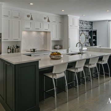
- Sam created raised end caps for the island. This separated the kitchen from adjacent living and dining areas while focusing the kitchen’s functionality. The new sink location offers ample workspace, allowing the cook to interact with guests seated at the island. The redesigned island also provides additional storage.
- For the living area, Sam opted for a functional-yet-minimalist approach. Large-format tile creates a natural stone look for the fireplace and TV wall. The recessed TV and extended fireplace shelf maintain a sleek profile. - Artistic wallpaper adds depth and texture, while the intentional lack of extensive shelving keeps the space open and distinct.
- Sam transformed the dining area’s blank wall into a feature, adding a unique dry bar with counter space, open shelves, cabinet storage and a beverage fridge. - - - Wallpaper behind and above the bar contributes to the area’s personality. A mirror adds depth while pendant lights add style and visual interest.
Relocating the cooktop to the back wall facilitates hidden ventilation, reducing visual clutter. Sam balanced transitional and modern elements for a contemporary yet comfortable feel. The digital control panel on the convection cooktop maintains a sleek look, while the wall oven is now at an easy-to-use height. ----- Mirrored base cabinet fronts and a paneled fridge prevent cabinetry monotony.
The redesign has delighted Sam’s client, achieving her main goal of creating a more inviting and visually appealing space. Each section now has its own visual personality and functionality while harmonizing within a monochromatic palette. The entire floor offers wow-factor pop upon first glance, with each area maintaining its distinct character while contributing to a cohesive, modern aesthetic.
 F9 Productions Inc.
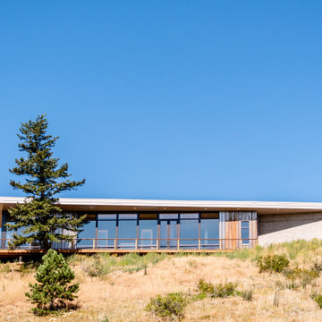
Imagine a home nestled in Colorado’s mountains that feels as enduring as the landscape itself. East Watch is that place – efficient, tough, and thoughtfully designed to make mountain living effortless and enjoyable. It’s where modern ideas meet nature’s demands, creating a space that’s both beautiful and practical.
Our clients wanted a mountain retreat that saved energy, stood strong against the elements, and stayed functional as life changes. High up at 8,200 feet, efficiency was key to cut heating costs, while durability meant handling winds up to 100mph and heavy snow. They also planned for the future with easy access – no stairs, wide doors, and spots for handrails if needed.
Mountain homes can rack up bills and wear down fast from weather and fires. We solved that with smart solar heating that covers most warmth needs naturally, using big windows and heavy walls to store heat. For strength, steel framing and fire-safe materials keep everything secure. And for everyday ease, the layout follows “form follows function,” making spaces like the kitchen intuitive and the whole home barrier-free.
The core idea? Work with the sun and the site. Windows face southeast for passive heat gain, with overhangs to block summer sun and shed snow. Inside, sloped ceilings let hot air escape, and thermal masses like the concrete floor hold warmth overnight. It’s a design that flows naturally, promoting comfort without extra effort.
Built on steel posts and beams for unshakeable support, the exterior uses corten steel, stone, and glass – all local, low-maintenance, and fire-resistant. The roof is top-rated for fires, and the deck withstands the elements year after year. Efficient floor heating kicks in only when necessary, keeping things cozy and costs low.
Simple and serene, with soft colors and clean shapes that let the views shine. Wide hallways and no steps make navigation easy, with thoughtful prep for any future needs. It’s a home that feels open, peaceful, and perfectly in tune with the outdoors.
Since 2019, East Watch has been a haven of sustainability and strength. It reduces energy use, withstands the mountains’ challenges, and adapts to life’s stages – all while offering stunning views and daily comfort. A true example of design that enhances how you live, built for lasting joy and resilience.
 HomeComing Woodworks
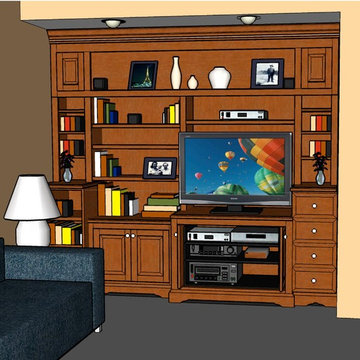
Design drawing to solve a problem of an off-center viewing position. Sometimes a space requires an asymmetrical design. If done well, that can work very nicely.
Design drawing by Will Eick, HomeComing Woodworks.
 Gallery KBNY
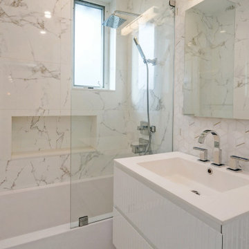
Bathroom from renovation in Upper West Side, Manhattan.
ABOUT THE RENOVATION
Very often, getting what you want is simply about timing. After years of owning her Upper West Side co-op in Lincoln Square and making various small renovations along the way, our client decided to go all-out and advance with her dream renovation after being eased into the significant decision by our full-service design-build approach, extensive pre-planning process, out of the box design strategy, and thorough estimate. The results of this stunning renovation speak for themselves.
SPACIOUS CENTERPIECE KITCHEN
With many condos in Manhattan, the kitchen is the home’s focal point. In this case, the client’s goal was to reinvigorate this critical space via a classic interior design style with modern and contemporary touches. Beyond introducing updated appliances and pendant lighting, we added immaculate natural stone countertops and backsplash, along with opaque Tribeca shaker cabinets throughout the space.
TWO BATHROOMS, TWICE AS NICE
When the opportunity to add a bathroom to your Manhattan condo presents itself, you take advantage. Part of our renovation of this USW condo included an additional bathroom, in addition to a total overhaul of the ensuite bathroom. For the main bath, we turned the dreary old space into a soft and elegant sanctuary that’s warming as the sunlight beaming in, thanks to the sleek nickel-finish fixtures and custom marble tile. In the newly-created guest bathroom, we delivered an upscale, timeless design incorporating gleaming subway tiles, bold brass fixtures, and exquisite deco hexagon flooring.
PERMA-WFH OFFICE WITH CUSTOM MURPHY BED & STORAGE
After being thrust into a permanent work from home schedule due to the pandemic, our client decided to incorporate more of a formal home office space into her guest bedroom - a space where she also required additional storage. The problem was she didn't want to give up the practicality of a spare bedroom. To maintain the added bedroom availability and also provide a proper office space, we created a custom Murphy bed and desk area with custom millwork for enhanced organization with a perfectly narrow personal desk area nestled to the left of the large built-in.
ADDITIONAL HIGHLIGHTS
- We Incorporated Various Square/hexagon Features Throughout The Space, Per Client Preference
- Laundry Relocation For Added Space And Preference
 Kitchen Solvers of Columbus
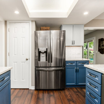
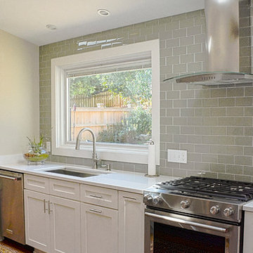
This small kitchen was updated by refacing the cabinets with two tone colors that gave enough contrast to bring the kitchen from an outdated space to a beautiful inviting space. To solve the storage problem, we installed a new pantry. The bead-board backing on the peninsula gave an added interest to the space. The upper cabinets were done in a mist color, while the lower cabinets were done in a midnight color. To finish the new look, we installed an Aria quartz countertop and an igloo ceramic subway tile backsplash. Now this kitchen is ready to be shared with their family and friends.
 Kustom Home Design
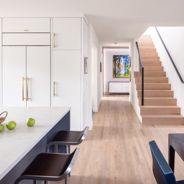
This amazing renovation focused on solving a series of problems that a previous kitchen expansion had created. By rearranging the appliance placement, updating the cabinetry, designing all new storage solutions and maximizing the amazing outdoor views; we cured the spit personality disorder plaguing the existing kitchen. The home now has a beautifully redesigned kitchen and living space perfect for entertaining, relaxing and enjoying the outside views. Vaulted ceilings with bright skylights, reflective glass wall tiles, sleek sophisticated Cambria quartz counter tops, fingerprint-free faucet, multi-functional Prolific kitchen sink by Kohler, stainless steel appliances, creative storage solutions, all new lighting and timeless shaker cabinets by Wellborn lend to the now bright, open, vivacious and flawless function of this newly renovated galley style kitchen. White base cabinets along the outside walls contrast perfectly with the dark grey island cabinets. Linear satin nickel door and drawer pulls coordinate with the stainless steel appliances and sink. An eclectic blend of vintage and modern furnishings, artwork and rugs create a comfortable balance that feels and looks timeless. Breathtaking backyard views are artfully framed by new Pella windows and doors with integral blinds between the glass. Calm, inviting neutral tones provide the perfect backdrop for this refined design.
Photos by: Kimberly Kerl
 Joy Martin Architecture
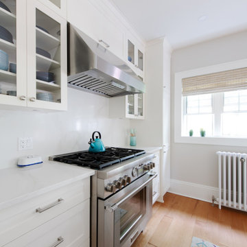
This major renovation and addition in Edina solved numerous problems of functionality and lifestyle for our client. By rearranging the main level plan, adding some space to the back of the home, as well as a large double sliding door, we were able to create a modern, light-filled common space that showcases the client’s beautiful backyard and extensive art collection. The second level included removing the half-story and adding a full second floor and new roof. A spa-like retreat is nestled in the Owner’s suite with custom millwork and tile mosaic throughout.
 Lagois Design Build Renovate
New windows, floors, powder room and basement:
We gave the home new windows, new hardwood floors, and paint throughout. We created a new main floor powder room and a new finished basement containing a living area, three-piece bathroom and new bedroom with egress (tilt and turn) windows.
Flipped around and redesigned kitchen:
We created a new kitchen. The footprint of the kitchen stayed the same, but we flipped it around and redesigned it. Now it has a walk-in pantry area and more floorspace going in and out, which optimized the flow of traffic. We replaced the old non-functioning mudroom with a new one.
Disappearing balcony and drafty door:
To create a new space using a balcony in a bedroom, we extended the second storey out to line up with the first floor, and this increased the square footage. In that room we turned a drafty door into a window.
We reinstated the rear deck, using as many of the original pieces as we could:
There was a leaking roof problem because the original roof pitches were causing ice damming. We designed a new roof to prevent that in the future.
New windows, stucco, and the challenge of asbestos:
Another challenge was installing new windows in the original stucco finish, which contained asbestos. We waterproofed those properly, future proofing them from leaks.
We solved the situation by installing a 5-inch trim around the perimeter of the window. Specialists cut the asbestos back (we had to set up a containment perimeter around each window), and then we placed windows that are five inches wider than the window frames. We used special flashing tapes and sealed them all up behind the stucco.
 FOI Designs
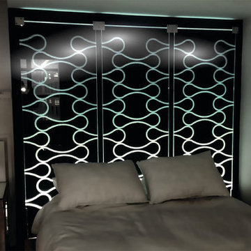
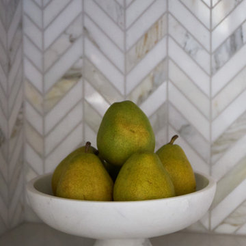
This product was designed and manufactured in house at FOI Designs to solve the problem of space. This downtown Toronto condo bedroom simply didn't have the space to have end tables and lamps so we created an illuminated glass head board that elegantly provided the only source of light for the entire room.
 TKS Design Group
Download our free ebook, Creating the Ideal Kitchen. DOWNLOAD NOW
Like many families with older children, this local Glen Ellyn couple wanted to expand the size of their kitchen while also creating a more open, airy feel for their main level. The home had plenty of space that included a formal living room, formal dining room, family room with eat-in area and kitchen with butler’s pantry. What it didn’t have, was an effortless flow between the areas used daily for cooking, eating and gathering.
Additionally, the kitchen had become outdated, feeling dark and dismal, despite the abundance of natural light. Our clients wanted a bright, cheerful interior that would inspire the family to congregate in this part of the house. No easy feat with teenagers.
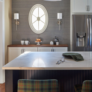
An open floor plan design solved the issues with functionality and circulation, removing the walls that restricted flow and opening up the entry to the dining room. We also eliminated the rarely used butler’s pantry allowing us to expand the kitchen and add a large island for food prep and gathering. To create a sense of symmetry and consistency in the space, a clerestory window was added below the header and framed to match the existing adjacent entry from the living room.
Inspired by the owner’s Scottish ancestry, the island cabinetry boasts a beautiful blue hue, paired with stools upholstered in a sprightly plaid. The built-in buffet area provides additional storage, topped with a beautiful wooden top stained to coordinate with the stunning tones of the flooring.
The owner’s opted for stainless steel appliances, inspiring the selection of brushed silver light fixtures and polished chrome hardware. Marble-look quartz offered a durable, lightly colored surface to reflect sunlight and enhance the cheer factor. According to this happy family, this uplifting space is now everyone’s favorite place to gather.
Designed by: Susan Klimala, CKBD
Photography by: Michael Kaskel
For more design inspiration go to: www.kitchenstudio-ge.com
 NextGen Home Builders
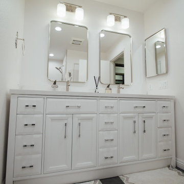
A custom double vanity built for two, with twelve drawers and two cabinets to solve the storage problem the homeowners had in their old bathroom. Quartz counters and brushed nickel fixtures keep the look bright and modern.
This is remodel done by Nextgen Home Builders
 Jacob Lilley Architects
Jacob Lilley Architects
Location: Lexington, MA, USA
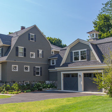
A new garage, kids play room above and a mudroom met the need for more space. A renovated kitchen, bedroom and other living spaces created a refreshed sense of home.
The strategic location of the mudroom as an intermediary connector solved problems with this 19th-century home siting seven feet above the ground with limited access to the rear yard.
The connector between the garage and existing house is a stair that unifies the various levels and develops a strong connection to the yard.
Photographed by: Eric Roth
 TKS Design Group
Download our free ebook, Creating the Ideal Kitchen. DOWNLOAD NOW
Like many families with older children, this local Glen Ellyn couple wanted to expand the size of their kitchen while also creating a more open, airy feel for their main level. The home had plenty of space that included a formal living room, formal dining room, family room with eat-in area and kitchen with butler’s pantry. What it didn’t have, was an effortless flow between the areas used daily for cooking, eating and gathering.
Additionally, the kitchen had become outdated, feeling dark and dismal, despite the abundance of natural light. Our clients wanted a bright, cheerful interior that would inspire the family to congregate in this part of the house. No easy feat with teenagers.
An open floor plan design solved the issues with functionality and circulation, removing the walls that restricted flow and opening up the entry to the dining room. We also eliminated the rarely used butler’s pantry allowing us to expand the kitchen and add a large island for food prep and gathering. To create a sense of symmetry and consistency in the space, a clerestory window was added below the header and framed to match the existing adjacent entry from the living room.
Inspired by the owner’s Scottish ancestry, the island cabinetry boasts a beautiful blue hue, paired with stools upholstered in a sprightly plaid. The built-in buffet area provides additional storage, topped with a beautiful wooden top stained to coordinate with the stunning tones of the flooring.
The owner’s opted for stainless steel appliances, inspiring the selection of brushed silver light fixtures and polished chrome hardware. Marble-look quartz offered a durable, lightly colored surface to reflect sunlight and enhance the cheer factor. According to this happy family, this uplifting space is now everyone’s favorite place to gather.
Designed by: Susan Klimala, CKBD
Photography by: Michael Kaskel
For more design inspiration go to: www.kitchenstudio-ge.com

 Roof MD
The wrong application was installed on this almost flat roof. Asphalt shingles are not designed to hold water and the roof was leaking. We installed a proper flat application self adhered rolled composition roofing material instead and solved their problem.

 Peter Jackson
Challenge: sometimes second time’s a charm
Solved: Most remodels are baby steps. Upgrades. Not, this one. This was clearly a giant step. The deck, made of architectural concrete and Ipe wood—twice as dense as most woods and five times harder—features a cantilevered fire pit and floating barbeque. While these provide ample touches of wow factor, some of the most game-changing and appreciated enhancements are hidden from view: like the re-engineered, energy-efficient power plant and pipes that keep crystal clear water flowing silently and effortlessly space to space. In this case, it would seem, the second time’s a charm.
 KURV Architecture DPC (Alex Hughes Architects)
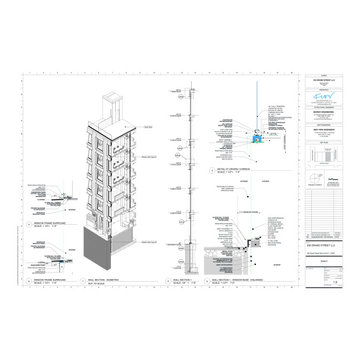
Located in the heart of Manhattan’s Lower East Side, the building was erected on a shallow commercial lot between two 120 year old masonry buildings and a new residential rental building. 330 Grand Street is a mix of 725 SF 1BRs and 1050 SF 2BR apartments. It also contains a 1100 SF two story duplex as well as private and public rooftop space, large private balconies for most units and two large private terraces for the ground floor units.
330 Grand Street was originally designed and approved at the NYC DOB as a prefabricated modular building. During the pandemic, as shipping costs skyrocketed putting the project at risk, we suggested redesigning the building as a reinforced cast-in-place concrete structure. Concrete was readily available and prices had not been affected by the demand increase that many other materials suffered in the pandemic. We took this opportunity to raise floor to ceiling heights, enlarge high performance windows and redistribute the buildings MEPFS and Structural Systems to create very open floor plans.
The challenge was to create a luxurious sensorial living experience with very limited means. In a city with very high construction costs, low cost residential buildings in the area are usually devoid of good quality, design and character. Our approach was to aim high for the end user, prioritizing natural light, open space with long visual perspectives, high ceilings and as always, rejecting the use of predefined building templates.
Our biggest challenge was to ensure that the small spaces feel as clean cut, large and bright as possible. Several unique design decisions were made to ensure low cost and high quality;
Floor plans were laid out so that spaces were wide open and free of clutter from mechanical or structural interruptions. Therefore all infrastructure was placed in lateral demising walls, which in turn act as the unit’s storage and kitchen. The apartments feel wide open, are super quiet and have more storage space than any other comparable apartment in the city.
To solve the problem of the site’s shallow commercial lot which is typically prone to dark interior spaces we focused our attention on the building’s envelope. Instead of the usual small punched window openings, oversized high performance windows were designed to ensure that light penetrated as far as possible into the units. In the smaller 1BR units, the full 50’ depth of the lot is perceived by partitioning spaces with sliding pocket doors that can be retracted to allow deep visual perspectives, making the sight lines in the space feel longer, larger, more ample than normal. In addition to the full height glazing, each unit above the 2nd floor receives a 7 foot covered balcony, adding 120 to 240 sf to each apartment, something unusual in New York City buildings. The space is large enough for a full size dining table, when the weather permits being outside.
We also worked hard to ensure modularity. For example, all kitchen units are all identical throughout the building. The idea of modularity and the economy of the repetitive unit is exercised to the maximum through the building.
Hardware, appliances, flooring, wall coverings and material finishes are all carefully selected to feel bespoke, high quality and unique.
It was important to KURV that the result of this work manifest into something that would deeply connect with the end user and sustain relationships with the consumers of this space.
All images by KURV Architecture ©
 Remodeling Contractors
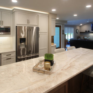
West Des Moines two story homes create challenges for homeowners with layouts including small rooms that don’t seem to flow together. The family that lives in this home found that entertaining and gathering in the kitchen was almost impossible with the current layout and asked for an addition to solve the problem. After listening to the challenges of that they faced and working with the homeowners, a new solution emerged without an addition, reducing the overall budget and allowing the whole main floor to be updated.
By removing the wall between the kitchen and dinning room, the team was able to design an island for family and friends to congregate around. Then by flanking the island with a large commercial range surrounded by a custom backsplash and custom hood a picture perfect kitchen was born. Lastly by repeating elements within the range hood, island and fireplace, the team was able to create unity throughout the space. This visually makes the space feel larger and feels like the addition was built
63