
Search results for "Enhances problem solving" in Home Design Ideas
 INSPIRED KITCHEN DESIGN
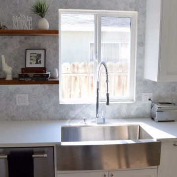
IKD also customized their sink and cooktop cabinets. The SEKTION cabinets that fit the IKEA farmhouse sink can’t accommodate non-IKEA apron sinks. And IKEA offers neither a rangetop (front-controlled cooktop) nor the base cabinet to accommodate this kind of cooktop. Luckily, we designed a kitchen hack for IKEA cabinets that solves both of these problems. (Yes, it’s a two-in-one IKEA kitchen hack that works for both appliances!)
 KURV Architecture DPC (Alex Hughes Architects)
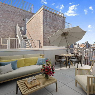
Located in the heart of Manhattan’s Lower East Side, the building was erected on a shallow commercial lot between two 120 year old masonry buildings and a new residential rental building. 330 Grand Street is a mix of 725 SF 1BRs and 1050 SF 2BR apartments. It also contains a 1100 SF two story duplex as well as private and public rooftop space, large private balconies for most units and two large private terraces for the ground floor units.
330 Grand Street was originally designed and approved at the NYC DOB as a prefabricated modular building. During the pandemic, as shipping costs skyrocketed putting the project at risk, we suggested redesigning the building as a reinforced cast-in-place concrete structure. Concrete was readily available and prices had not been affected by the demand increase that many other materials suffered in the pandemic. We took this opportunity to raise floor to ceiling heights, enlarge high performance windows and redistribute the buildings MEPFS and Structural Systems to create very open floor plans.
The challenge was to create a luxurious sensorial living experience with very limited means. In a city with very high construction costs, low cost residential buildings in the area are usually devoid of good quality, design and character. Our approach was to aim high for the end user, prioritizing natural light, open space with long visual perspectives, high ceilings and as always, rejecting the use of predefined building templates.
Our biggest challenge was to ensure that the small spaces feel as clean cut, large and bright as possible. Several unique design decisions were made to ensure low cost and high quality;
Floor plans were laid out so that spaces were wide open and free of clutter from mechanical or structural interruptions. Therefore all infrastructure was placed in lateral demising walls, which in turn act as the unit’s storage and kitchen. The apartments feel wide open, are super quiet and have more storage space than any other comparable apartment in the city.
To solve the problem of the site’s shallow commercial lot which is typically prone to dark interior spaces we focused our attention on the building’s envelope. Instead of the usual small punched window openings, oversized high performance windows were designed to ensure that light penetrated as far as possible into the units. In the smaller 1BR units, the full 50’ depth of the lot is perceived by partitioning spaces with sliding pocket doors that can be retracted to allow deep visual perspectives, making the sight lines in the space feel longer, larger, more ample than normal. In addition to the full height glazing, each unit above the 2nd floor receives a 7 foot covered balcony, adding 120 to 240 sf to each apartment, something unusual in New York City buildings. The space is large enough for a full size dining table, when the weather permits being outside.
We also worked hard to ensure modularity. For example, all kitchen units are all identical throughout the building. The idea of modularity and the economy of the repetitive unit is exercised to the maximum through the building.
Hardware, appliances, flooring, wall coverings and material finishes are all carefully selected to feel bespoke, high quality and unique.
It was important to KURV that the result of this work manifest into something that would deeply connect with the end user and sustain relationships with the consumers of this space.
All images by KURV Architecture ©
 User
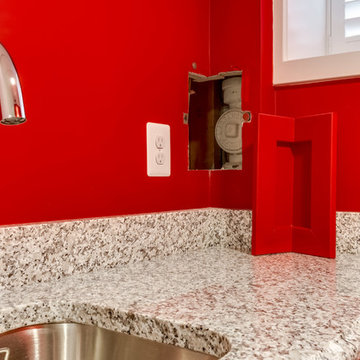
UserThe main waste stack in the corner was unattractive, but had to remain accessible. The access panel with a magnetic latch solves this problem.
Example of a classic laundry room design in DC Metro
Example of a classic laundry room design in DC Metro
Find the right local pro for your project
 Kitchen Solvers of Columbus
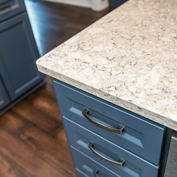
This small kitchen was updated by refacing the cabinets with two tone colors that gave enough contrast to bring the kitchen from an outdated space to a beautiful inviting space. To solve the storage problem, we installed a new pantry. The bead-board backing on the peninsula gave an added interest to the space. The upper cabinets were done in a mist color, while the lower cabinets were done in a midnight color. To finish the new look, we installed an Aria quartz countertop and an igloo ceramic subway tile backsplash. Now this kitchen is ready to be shared with their family and friends.
 Drury Design
THE SETUP
Sam’s client had lived in her downtown townhome home for less than a year when she decided to remodel the spacious second level. This open area consisted of three sections: a TV and fireplace zone, a sparsely furnished dining area, and a dominant central kitchen. The kitchen featured a long back wall with three segmented sections and a massive island housing the cooktop. She found the kitchen’s functionality lacking and its presence overwhelming – it dominated the entire floor, regardless of where you stood.
Design objectives:
- Reconfigure key kitchen elements (sink, cooktop, oven) while minimizing the kitchen’s visual impact
- Optimize the kitchen’s back wall, eliminating existing dead space
- Create a purposeful, well-defined dining area
- Establish a distinct, comfortable living area
- Reuse existing appliances and flooring
- Maintain an overall modern design aesthetic
THE REMODEL
Design challenges to be solved:
- Redesign the island to reduce its overwhelming presence
- Create a comfortable, dedicated living room within the available space
- Establish a distinct, inviting dining area within spatial constraints
- Enhance kitchen functionality and style without dominating the entire floor
THE RENEWED SPACE
Design solutions:
- Sam created raised end caps for the island. This separated the kitchen from adjacent living and dining areas while focusing the kitchen’s functionality. The new sink location offers ample workspace, allowing the cook to interact with guests seated at the island. The redesigned island also provides additional storage.
- For the living area, Sam opted for a functional-yet-minimalist approach. Large-format tile creates a natural stone look for the fireplace and TV wall. The recessed TV and extended fireplace shelf maintain a sleek profile. - Artistic wallpaper adds depth and texture, while the intentional lack of extensive shelving keeps the space open and distinct.
- Sam transformed the dining area’s blank wall into a feature, adding a unique dry bar with counter space, open shelves, cabinet storage and a beverage fridge. - - - Wallpaper behind and above the bar contributes to the area’s personality. A mirror adds depth while pendant lights add style and visual interest.
Relocating the cooktop to the back wall facilitates hidden ventilation, reducing visual clutter. Sam balanced transitional and modern elements for a contemporary yet comfortable feel. The digital control panel on the convection cooktop maintains a sleek look, while the wall oven is now at an easy-to-use height. ----- Mirrored base cabinet fronts and a paneled fridge prevent cabinetry monotony.
The redesign has delighted Sam’s client, achieving her main goal of creating a more inviting and visually appealing space. Each section now has its own visual personality and functionality while harmonizing within a monochromatic palette. The entire floor offers wow-factor pop upon first glance, with each area maintaining its distinct character while contributing to a cohesive, modern aesthetic.
 Gallery KBNY
Kitchen from condo renovation in Upper West Side, Manhattan.
ABOUT THE RENOVATION
Very often, getting what you want is simply about timing. After years of owning her Upper West Side co-op in Lincoln Square and making various small renovations along the way, our client decided to go all-out and advance with her dream renovation after being eased into the significant decision by our full-service design-build approach, extensive pre-planning process, out of the box design strategy, and thorough estimate. The results of this stunning renovation speak for themselves.
SPACIOUS CENTERPIECE KITCHEN
With many condos in Manhattan, the kitchen is the home’s focal point. In this case, the client’s goal was to reinvigorate this critical space via a classic interior design style with modern and contemporary touches. Beyond introducing updated appliances and pendant lighting, we added immaculate natural stone countertops and backsplash, along with opaque Tribeca shaker cabinets throughout the space.
TWO BATHROOMS, TWICE AS NICE
When the opportunity to add a bathroom to your Manhattan condo presents itself, you take advantage. Part of our renovation of this USW condo included an additional bathroom, in addition to a total overhaul of the ensuite bathroom. For the main bath, we turned the dreary old space into a soft and elegant sanctuary that’s warming as the sunlight beaming in, thanks to the sleek nickel-finish fixtures and custom marble tile. In the newly-created guest bathroom, we delivered an upscale, timeless design incorporating gleaming subway tiles, bold brass fixtures, and exquisite deco hexagon flooring.
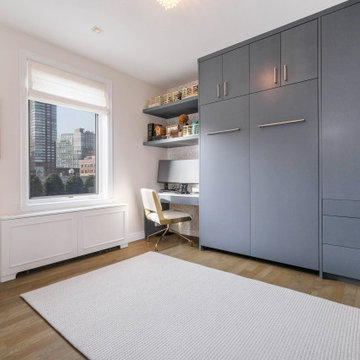
PERMA-WFH OFFICE WITH CUSTOM MURPHY BED & STORAGE
After being thrust into a permanent work from home schedule due to the pandemic, our client decided to incorporate more of a formal home office space into her guest bedroom - a space where she also required additional storage. The problem was she didn't want to give up the practicality of a spare bedroom. To maintain the added bedroom availability and also provide a proper office space, we created a custom Murphy bed and desk area with custom millwork for enhanced organization with a perfectly narrow personal desk area nestled to the left of the large built-in.
ADDITIONAL HIGHLIGHTS
- We Incorporated Various Square/hexagon Features Throughout The Space, Per Client Preference
- Laundry Relocation For Added Space And Preference
 Gravel To Gold, Inc.
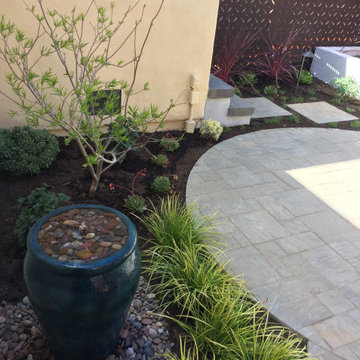
A captivating design that unites three distinct outdoor living levels into a seamless, usable garden. Succulents and rare plants enhance the space as living ornaments, while expert construction solves space and safety challenges with precision and efficiency. A true blend of beauty and functionality.
 Alan D. Holt, A.S.L.A., Landscape Architect
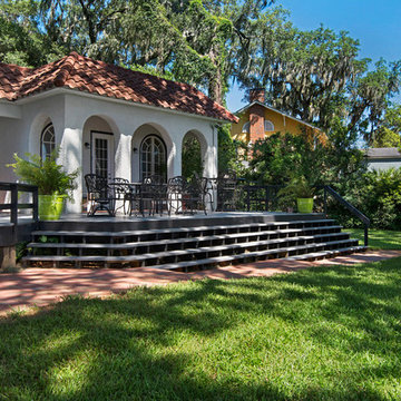
This is a simple addition to the back deck to create an outdoor kitchen and outdoor dining area. A fire pit by the water creates another seating area out in the lawn and gives a perfect place to watch the sun set. The steps and walls improve the access to the boat dock and solve an erosion problem.
Photographed by: Emerald Coast Real Estate Photography
 Truitt and White Window and Door Showroom
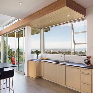
This hillside home in Piedmont, CA was remodeled to change the style from a 1940's rancher with eight foot ceilings and dark interiors, into a modern geometric composition with vast white interiors for casual living and generous daylighting for displaying the artist-owner's works.
In a city known for rigorous and difficult design review, an addition, two variances, and a full stylistic change were unanimously approved on the first round. All sloped roofs and attics were eliminated and replaced by a series of stacked and overlapping flat roofs. This made the house taller on the inside and shorter on the outside, which helped earn design review cooperation in the community. Windows were concentrated toward the rear yard views or moved up high on the side walls for daylight and privacy, benefitting the owners as well as the neighbors.
At the start, the owner husband was so enthusiastic and engaged in transforming his house into something modern that he presented the architect with a scaled foamcore model, rather than the usual magazine clippings and wish list. He participated in the design decisions throughout the process. The owner wife is the artist who did all the artwork in the house. She had been craving a display space with large walls and good natural light. Both of them loved the location and great views.
The project was an opportunity to transform the style of an older traditional home into a modern one, while solving numerous problems. By rebuilding the 1800 ft2 top of the 3-story home it was possible to change the style of the whole building, since the lower floors were a neutral base, and also to change the lifestyle of the owners, who wanted to move their master suite upstairs and live primarily on the top floor as empty nesters.
Going into the project, the architect knew there were multiple encroachments into the setbacks and potential privacy issues with close by neighbors. He approached this as a complex puzzle made up of architectural and political pieces which all had to fit together elegantly. It took many careful moves, small and large, to arrive at a serene and cohesive result that tied old and new together seamlessly.
The design-build contractor worked closely with the owners and handled all of the construction phase documents and design adjustments, adding ideas of their own to make the project really sing.
The project was a collaboration in three acts. The owner had a strong design concept from the start. The architect developed it into a realistic project and garnered the design approvals. Then the contractor executed brilliantly
 KURV Architecture DPC (Alex Hughes Architects)
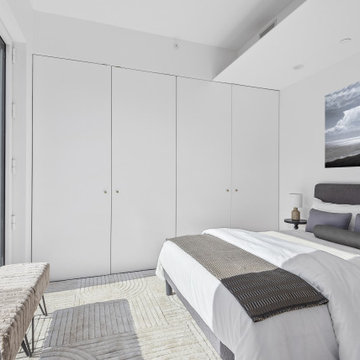
Located in the heart of Manhattan’s Lower East Side, the building was erected on a shallow commercial lot between two 120 year old masonry buildings and a new residential rental building. 330 Grand Street is a mix of 725 SF 1BRs and 1050 SF 2BR apartments. It also contains a 1100 SF two story duplex as well as private and public rooftop space, large private balconies for most units and two large private terraces for the ground floor units.
330 Grand Street was originally designed and approved at the NYC DOB as a prefabricated modular building. During the pandemic, as shipping costs skyrocketed putting the project at risk, we suggested redesigning the building as a reinforced cast-in-place concrete structure. Concrete was readily available and prices had not been affected by the demand increase that many other materials suffered in the pandemic. We took this opportunity to raise floor to ceiling heights, enlarge high performance windows and redistribute the buildings MEPFS and Structural Systems to create very open floor plans.
The challenge was to create a luxurious sensorial living experience with very limited means. In a city with very high construction costs, low cost residential buildings in the area are usually devoid of good quality, design and character. Our approach was to aim high for the end user, prioritizing natural light, open space with long visual perspectives, high ceilings and as always, rejecting the use of predefined building templates.
Our biggest challenge was to ensure that the small spaces feel as clean cut, large and bright as possible. Several unique design decisions were made to ensure low cost and high quality;
Floor plans were laid out so that spaces were wide open and free of clutter from mechanical or structural interruptions. Therefore all infrastructure was placed in lateral demising walls, which in turn act as the unit’s storage and kitchen. The apartments feel wide open, are super quiet and have more storage space than any other comparable apartment in the city.
To solve the problem of the site’s shallow commercial lot which is typically prone to dark interior spaces we focused our attention on the building’s envelope. Instead of the usual small punched window openings, oversized high performance windows were designed to ensure that light penetrated as far as possible into the units. In the smaller 1BR units, the full 50’ depth of the lot is perceived by partitioning spaces with sliding pocket doors that can be retracted to allow deep visual perspectives, making the sight lines in the space feel longer, larger, more ample than normal. In addition to the full height glazing, each unit above the 2nd floor receives a 7 foot covered balcony, adding 120 to 240 sf to each apartment, something unusual in New York City buildings. The space is large enough for a full size dining table, when the weather permits being outside.
We also worked hard to ensure modularity. For example, all kitchen units are all identical throughout the building. The idea of modularity and the economy of the repetitive unit is exercised to the maximum through the building.
Hardware, appliances, flooring, wall coverings and material finishes are all carefully selected to feel bespoke, high quality and unique.
It was important to KURV that the result of this work manifest into something that would deeply connect with the end user and sustain relationships with the consumers of this space.
All images by KURV Architecture ©
 Rodwin Architecture & Skycastle Construction
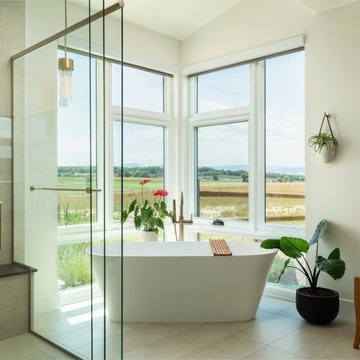
Wild View Farm includes a new “Forever home” (we deconstructed an existing house with a 90% landfill diversion rate), and enhancements to several working barns. The 80 acre site was an original homestead farm from the 1890’s. Both its buildings and soil had become severely degraded. The owners are working to holistically restore this property and make it a model of modern regenerative farming. They are planting hundreds of trees, re-introducing livestock and working with Dryland Agroecology Research and High Plains Permaculture to restore the soil.
The -51 HERS rated home is not just energy-efficient - it’s a model of “Regenerative design”. The deep green house design included multiple challenges – foremost was how to create a Passive Solar design that also took full advantage of the massive views to the West. We solved it with an L shaped building that optimized passive and active solar strategies on the south face, then actively protected the western facade with a giant covered porch and tuned glazing. The home’s leading-edge energy package includes a Ground source heat pump, a large roof-mounted solar PV array, battery back-up, EV chargers, and Energy Recovery Ventilator (ERV), Energy Star Appliances and windows, a robust foam insulation shell and LED lighting.
We also endeavored to craft a modern day interpretation of the farmhouse typology, with a low-slung simple gable-roofed form that would feel like it’s always been there. The exterior material palette of limestone, cementitious stucco and heavy timber gives it a rich Colorado Modern Farmhouse feel. The home is full of custom details like walls of vaulted glass to capture the sweeping mountain views, an AI Smart Home control system, a sleeping loft for kids and guests, a hard-working Butler’s Pantry, a gourmet outdoor kitchen, a pool & spa, a cozy office nook for reading, and a lovely built-in bench for morning coffee. Phase 2 of this project will include a Farmworker ADU and a full renovation of the existing historic barn.
Built by Skycastle Construction. Interior Design by Kimball Modern and Rodwin Architecture. Landscaping by EDI. Photography by Dane Cronin Photo
 ARK DESIGN
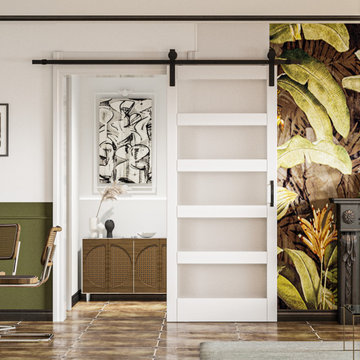
【High Quality Material】The door is made of MDF (medium-density fibreboard) and covered with PVC film. This finished surface improves the durability of the door and extends its service life.
【Upgraded Glass】 This door is made of 4mm tempered frosted glass, which is safe (SGCC certified) and can protect your privacy. The glass is designed to filter light and brighten your home.
【Durable Hardware】Our barn door hardware has passed 100,000 open & close tests, ensuring lifelong usage. We have strong confidence in our hardware quality and provide a 5-year full warranty on all hardware.
【Easy to Assemble】All door panels are pre-drilled/curved to ensure a tight fit. The package includes detailed installation instructions and tools, so you can easily install the panels yourself and enjoy a fun DIY project with your family.
【Widely Applicable】This barn door is perfect for classic American home decor. It's suitable for use in the living room, kitchen, bathroom, dining room, and more. The stylish design will blend in seamlessly with your home's aesthetic.
【Dedicated Service】We are dedicated to providing you with quality products and services. If you have any questions regarding your purchase, please feel free to contact us and we will do our best to help you solve the problem.
 Spring Creek Design
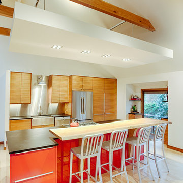
Removing the kitchen walls required a structural alternative to the existing load-bearing ridge beam. Installation of eight 4x8 Douglas Fir rafter ties solved the problem and provided an aesthetic windfall.
The new rafter ties also provided mounting surface for the extensive LED Up and Down lighting.
We designed a large floating soffit to anchor the kitchen without walls.
Suspended from the rafter ties above the island, the soffit also provides a surface to mount unique LED task lighting in this otherwise high-ceilinged space.
 Bennett Design Co.
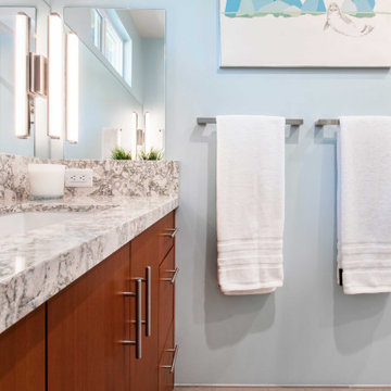
This couple's long-term water leak left their downstairs guest bathroom in disarray. It had gotten so bad that the toilet would actually rock due to the sub-floor deterioration. After the remodel, this small but mighty bathroom leaves a memorable impression on its guests, primarily because of its efficient footprint and bold use of color.
This project became necessary after a long- term water leak left the floor tile broken and the subfloor deteriorating.
Once underway, we set out to determine what other problems we could help solve in this guest bathroom. We explored several different floorplans for this space, but we ultimately decided that the general location of the fixtures worked well for these homeowners.
One of the primary concerns was to determine how we could include as much vanity storage as possible. Their old vanity included a shallow section next to the toilet, but it only had two shallow top drawers, making the bulk of the storage awkward and hard to access.
Although they liked the size of their old shower stall, the plastic insert was corroding. They also didn't have anywhere to place their shower products, and there was no place to hang a towel. We opted for a tiled shower and included a shampoo niche for their bath products. We also included a horizontal shower door handle, which doubles as a towel bar.
 Kitchen Solvers of Columbus
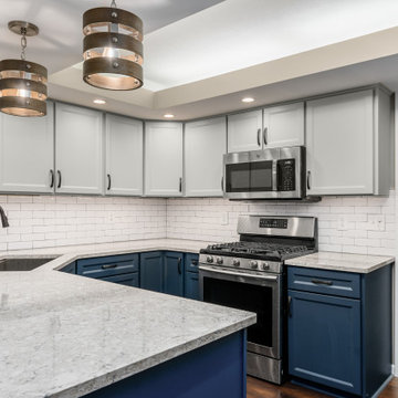
This small kitchen was updated by refacing the cabinets with two tone colors that gave enough contrast to bring the kitchen from an outdated space to a beautiful inviting space. To solve the storage problem, we installed a new pantry. The bead-board backing on the peninsula gave an added interest to the space. The upper cabinets were done in a mist color, while the lower cabinets were done in a midnight color. To finish the new look, we installed an Aria quartz countertop and an igloo ceramic subway tile backsplash. Now this kitchen is ready to be shared with their family and friends.
 McDermott Landscape Design
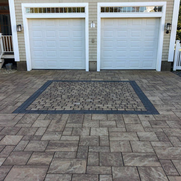
The existing pool deck, driveway, and all plantings were completely renovated at this beachside home. A permeable pool patio and driveway solved drainage issues and modernized the feel of the landscape. Trees were added to to enhance privacy and the gardens were completely re-done with perennials that thrive near the salt air.
 Bloomin Blinds of North Charlotte
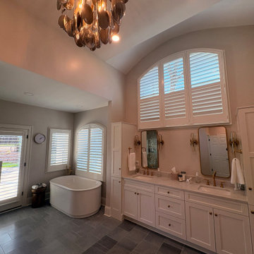
Wide shot of motorized plantation shutters over vanity and soaking tub for privacy and light control in a hard-to-reach bathroom window.
This custom home in The Peninsula community of Cornelius, NC features a full-home installation of motorized plantation shutters designed for both style and function.
Many of the windows in the home were oversized, located at significant heights, and difficult or impossible to reach manually. Motorization was the ideal solution, allowing the homeowner to control light and privacy throughout the home with ease while maintaining a clean, cohesive design aesthetic.
The shutters were custom-fitted to each opening, enhancing the architectural lines of the home while providing durability, energy efficiency, and precise light control in every room. This project highlights how motorized window treatments can solve accessibility challenges in high-end custom homes without compromising design.

 Noelle Johnson Landscape Consulting
Garden travels. Golden barrel cactuses thrive in a narrow planting area.
 Ven Studio Architects
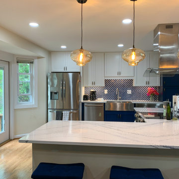
The kitchen, while spacious, was completely enclosed from the living and dining room spaces and did not utilize the space efficiently. Traffic flow between the indoors and outdoors was disjointed, and the new kitchen layout solves those problems. The new design eliminates the walls in the kitchen to create an open space for entertaining, and an exterior door was added off the kitchen to facilitate a better traffic flow to the outdoor entertaining space. New cabinets, countertops, flooring, appliances, light fixtures, and finishes help to brighten and modernize the space.
 As You Like It Interior Decorating & Home Staging
As You Like It Interior Decorating
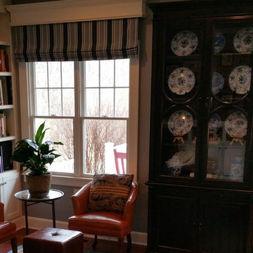
I designed these stationary Roman Shades to solve a problem. The French doors (not seen) were much taller than the top of the windows. The cornices were installed as high as the door and now look in proportion.
59