
Search results for "Enhances problem solving" in Home Design Ideas
 Sunhill Properties LLC
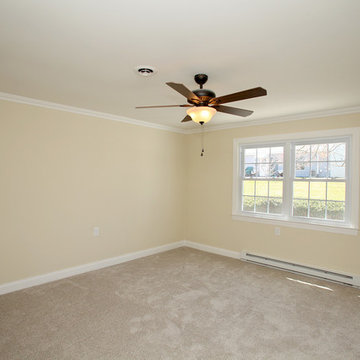
This room was a mess. We solved that problem, on a budget, with new carpet, paint and moldings. There were unsightly and dated closet sliders that were removed and replaced with a framed double 24" closet door.
 Flourish Interiors by Vanessa C Smith
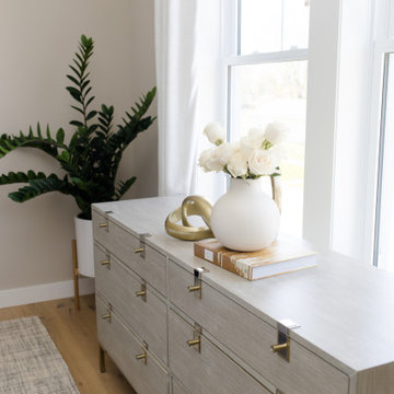
At our design firm, we frequently cater to Notre Dame football enthusiasts and homeowners along the picturesque shores of Lake Michigan. Our clients often require homes capable of accommodating large gatherings, as they prepare to host their families for football games and reunions. In this world, sleep count becomes a significant consideration. As a result, requests for bunk beds, murphy beds, and sleeper sofas are common needs for our clientele.
⠀⠀⠀⠀⠀⠀⠀⠀⠀
However, while bunk beds serve a functional purpose, they sometimes lack aesthetic appeal. However, our team of designers is here to solve this concern. We understand the importance of ensuring functional items not only serve their purpose but also enhance the overall beauty of our clients' homes. In the case of bunk beds, such as in this bedroom from our Harters Heights Home, we expertly blended transitional style with practical design to fashion a tranquil bunk room that exudes style while sleeping at least three people
 Peter Rose Architecture + Interiors Inc.
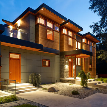
Located at the University Endowment Lands, the ”Gravity House” utilizes an inverted roof design to playfully express ideas of flight and reaching skyward.
One of the primary challenges faced by Peter Rose Architecture + Interiors Inc. was making optimal use of the site, an odd triangular shaped lot. This problem was overcome by the introduction of an “openable corner” from the main Family Room along with a spacious wrap around patio, providing the client with an elegant space to entertain and have full use of the backyard.
The sense of lightness and space is felt throughout the home, enhanced by the introduction of other unique features including the large central skylight that draws light to the middle of the house, and the strategic use of the terrace to act as the roof of the basement. A delightful case of modern expression in flight!
Find the right local pro for your project
 Gravel To Gold, Inc.
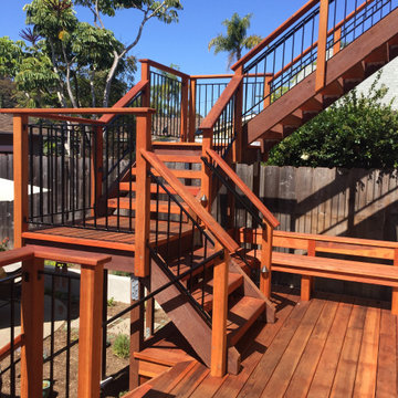
A captivating design that unites three distinct outdoor living levels into a seamless, usable garden. Succulents and rare plants enhance the space as living ornaments, while expert construction solves space and safety challenges with precision and efficiency. A true blend of beauty and functionality.
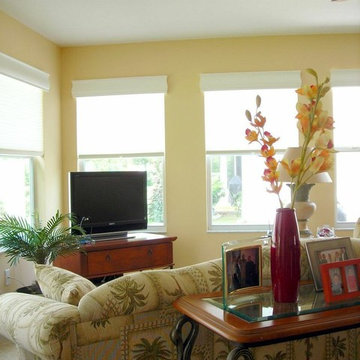
 Exceptions Blinds and Shutters - Design and Repair
Solar heat gain accounts for up to 20% of your utility bill -- but keeping out the sun is only half of the energy equation. Let our knowledgeable staff help you solve your climate control problems without darkening your room!
Call 352-217-7556 to schedule your FREE in-home estimate.
 Drury Design
THE SETUP
Sam’s client had lived in her downtown townhome home for less than a year when she decided to remodel the spacious second level. This open area consisted of three sections: a TV and fireplace zone, a sparsely furnished dining area, and a dominant central kitchen. The kitchen featured a long back wall with three segmented sections and a massive island housing the cooktop. She found the kitchen’s functionality lacking and its presence overwhelming – it dominated the entire floor, regardless of where you stood.
Design objectives:
- Reconfigure key kitchen elements (sink, cooktop, oven) while minimizing the kitchen’s visual impact
- Optimize the kitchen’s back wall, eliminating existing dead space
- Create a purposeful, well-defined dining area
- Establish a distinct, comfortable living area
- Reuse existing appliances and flooring
- Maintain an overall modern design aesthetic
THE REMODEL
Design challenges to be solved:
- Redesign the island to reduce its overwhelming presence
- Create a comfortable, dedicated living room within the available space
- Establish a distinct, inviting dining area within spatial constraints
- Enhance kitchen functionality and style without dominating the entire floor
THE RENEWED SPACE
Design solutions:
- Sam created raised end caps for the island. This separated the kitchen from adjacent living and dining areas while focusing the kitchen’s functionality. The new sink location offers ample workspace, allowing the cook to interact with guests seated at the island. The redesigned island also provides additional storage.
- For the living area, Sam opted for a functional-yet-minimalist approach. Large-format tile creates a natural stone look for the fireplace and TV wall. The recessed TV and extended fireplace shelf maintain a sleek profile. - Artistic wallpaper adds depth and texture, while the intentional lack of extensive shelving keeps the space open and distinct.
- Sam transformed the dining area’s blank wall into a feature, adding a unique dry bar with counter space, open shelves, cabinet storage and a beverage fridge. - - - Wallpaper behind and above the bar contributes to the area’s personality. A mirror adds depth while pendant lights add style and visual interest.
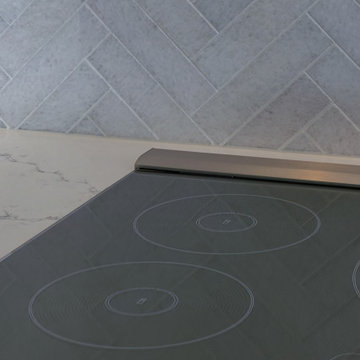
Relocating the cooktop to the back wall facilitates hidden ventilation, reducing visual clutter. Sam balanced transitional and modern elements for a contemporary yet comfortable feel. The digital control panel on the convection cooktop maintains a sleek look, while the wall oven is now at an easy-to-use height. ----- Mirrored base cabinet fronts and a paneled fridge prevent cabinetry monotony.
The redesign has delighted Sam’s client, achieving her main goal of creating a more inviting and visually appealing space. Each section now has its own visual personality and functionality while harmonizing within a monochromatic palette. The entire floor offers wow-factor pop upon first glance, with each area maintaining its distinct character while contributing to a cohesive, modern aesthetic.
 Kitchen Solvers of Columbus
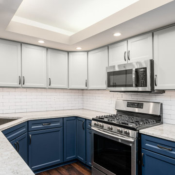
This small kitchen was updated by refacing the cabinets with two tone colors that gave enough contrast to bring the kitchen from an outdated space to a beautiful inviting space. To solve the storage problem, we installed a new pantry. The bead-board backing on the peninsula gave an added interest to the space. The upper cabinets were done in a mist color, while the lower cabinets were done in a midnight color. To finish the new look, we installed an Aria quartz countertop and an igloo ceramic subway tile backsplash. Now this kitchen is ready to be shared with their family and friends.
 Galaxy Homes
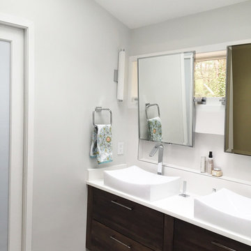
This is a 2-room luxury master bath designed and built by Galaxy Homes. The open and airy shower flows seamlessly from the vanity room with the help of a curb-less shower floor. The vanity is Ikea Godmorgon with custom reclaimed wood drawer fronts. A niche above the vanity solves the problem of needing extra counter space with vessel sinks.
 Coast to Coast Imports, LLC
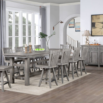
Do you have a large family? Do you struggle fitting everyone around your dining table during the holidays? Well, we have the perfect dining table to solve your problem! Our Keystone II counter height dining table is a whopping 109 inches long and 36 inches wide which is enough room to fit your large family with space to spare. Not only is it huge; it is also beautifully finished in our distressed Keystone Grey with a key and mortise style base with tenon crossbars.
 Royal Forge, Inc.
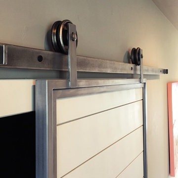
Sliding barn door for hallway in track home. Solved problem of small laundry/mudroom. Swing door was removed and replaced with this modern-looking and compact sliding door.
 Drury Design
THE SETUP
Sam’s client had lived in her downtown townhome home for less than a year when she decided to remodel the spacious second level. This open area consisted of three sections: a TV and fireplace zone, a sparsely furnished dining area, and a dominant central kitchen. The kitchen featured a long back wall with three segmented sections and a massive island housing the cooktop. She found the kitchen’s functionality lacking and its presence overwhelming – it dominated the entire floor, regardless of where you stood.
Design objectives:
- Reconfigure key kitchen elements (sink, cooktop, oven) while minimizing the kitchen’s visual impact
- Optimize the kitchen’s back wall, eliminating existing dead space
- Create a purposeful, well-defined dining area
- Establish a distinct, comfortable living area
- Reuse existing appliances and flooring
- Maintain an overall modern design aesthetic
THE REMODEL
Design challenges to be solved:
- Redesign the island to reduce its overwhelming presence
- Create a comfortable, dedicated living room within the available space
- Establish a distinct, inviting dining area within spatial constraints
- Enhance kitchen functionality and style without dominating the entire floor
THE RENEWED SPACE
Design solutions:
- Sam created raised end caps for the island. This separated the kitchen from adjacent living and dining areas while focusing the kitchen’s functionality. The new sink location offers ample workspace, allowing the cook to interact with guests seated at the island. The redesigned island also provides additional storage.
- For the living area, Sam opted for a functional-yet-minimalist approach. Large-format tile creates a natural stone look for the fireplace and TV wall. The recessed TV and extended fireplace shelf maintain a sleek profile. - Artistic wallpaper adds depth and texture, while the intentional lack of extensive shelving keeps the space open and distinct.
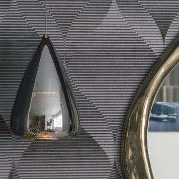
- Sam transformed the dining area’s blank wall into a feature, adding a unique dry bar with counter space, open shelves, cabinet storage and a beverage fridge. - - - Wallpaper behind and above the bar contributes to the area’s personality. A mirror adds depth while pendant lights add style and visual interest.
Relocating the cooktop to the back wall facilitates hidden ventilation, reducing visual clutter. Sam balanced transitional and modern elements for a contemporary yet comfortable feel. The digital control panel on the convection cooktop maintains a sleek look, while the wall oven is now at an easy-to-use height. ----- Mirrored base cabinet fronts and a paneled fridge prevent cabinetry monotony.
The redesign has delighted Sam’s client, achieving her main goal of creating a more inviting and visually appealing space. Each section now has its own visual personality and functionality while harmonizing within a monochromatic palette. The entire floor offers wow-factor pop upon first glance, with each area maintaining its distinct character while contributing to a cohesive, modern aesthetic.
 Tile Doctor Ltd
Bridgwater is known to be one of Somerset’s liveliest towns. With a history dating back over 1000 years, it has many traditions, including a carnival which happens every November, and is hailed as the world’s largest illumination procession.
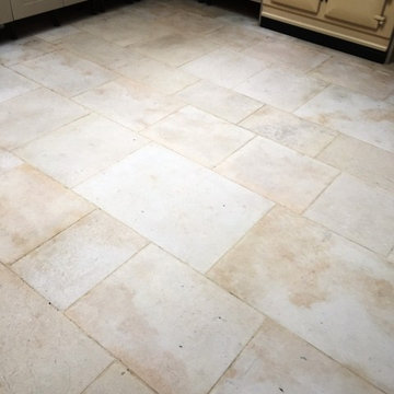
What wasn’t looking lively, however, was this Limestone tiled kitchen floor at a house in the town. It had been laid five years previously but at the time of laying hadn’t been sealed with adequate amounts of sealer.
As a result, the Limestone had absorbed a lot of wet footprints and other dirty stains. The sealer simply broke down after a while, leaving the homeowner with a floor that never looked clean no matter how much they cleaned it – using all kinds of products. In fact, the tiles looked blackened and mouldy, as you can see in the photos below.
It was time for the homeowner to seek out professional assistance, so she decided to contact her local Tile Doctor. I was asked to completely restore the look of the floor – something the homeowner had deemed impossible at this point.
In practice, I knew the floor could be restored using the right products and methods including a really deep clean and resealing with the right type of sealer for these tiles.
I scrubbed in Tile Doctor Remove and Go, which is a powerful coatings remover which draws out ingrained stains and strips away any old sealer remaining on the tiles. The floor was then rinsed thoroughly with plain water to neutralise it, and the resulting soiled solution was extracted using a wet vacuum. I repeated the process on stubborn areas, eventually transforming the floor back to its natural and clean state.
I allowed the Limestone to dry out completely overnight before returning to the property to seal the tiles. This is important as the slightest amount of excess moisture can damage the performance of the sealer, and we would’ve been back to square one!
After checking with a damp meter, I could see everything was fine, so I proceeded to seal the floor with Tile Doctor Colour Grow, which is not only a robust impregnating sealer that will protect the floor going forward but also enhancing the natural colours in the stone at the same time.
In the space of two days, the Limestone tiles had been completely transformed. Now it had been properly sealed, the floor will be much easier to clean and therefore should stay looking great for a long time to come. The customer was very happy to have finally resolved the problem with some assistance from the Somerset Tile Doctor!
Dave Hurst
Somerset Tile Doctor
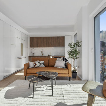
 KURV Architecture DPC (Alex Hughes Architects)
Located in the heart of Manhattan’s Lower East Side, the building was erected on a shallow commercial lot between two 120 year old masonry buildings and a new residential rental building. 330 Grand Street is a mix of 725 SF 1BRs and 1050 SF 2BR apartments. It also contains a 1100 SF two story duplex as well as private and public rooftop space, large private balconies for most units and two large private terraces for the ground floor units.
330 Grand Street was originally designed and approved at the NYC DOB as a prefabricated modular building. During the pandemic, as shipping costs skyrocketed putting the project at risk, we suggested redesigning the building as a reinforced cast-in-place concrete structure. Concrete was readily available and prices had not been affected by the demand increase that many other materials suffered in the pandemic. We took this opportunity to raise floor to ceiling heights, enlarge high performance windows and redistribute the buildings MEPFS and Structural Systems to create very open floor plans.
The challenge was to create a luxurious sensorial living experience with very limited means. In a city with very high construction costs, low cost residential buildings in the area are usually devoid of good quality, design and character. Our approach was to aim high for the end user, prioritizing natural light, open space with long visual perspectives, high ceilings and as always, rejecting the use of predefined building templates.
Our biggest challenge was to ensure that the small spaces feel as clean cut, large and bright as possible. Several unique design decisions were made to ensure low cost and high quality;
Floor plans were laid out so that spaces were wide open and free of clutter from mechanical or structural interruptions. Therefore all infrastructure was placed in lateral demising walls, which in turn act as the unit’s storage and kitchen. The apartments feel wide open, are super quiet and have more storage space than any other comparable apartment in the city.
To solve the problem of the site’s shallow commercial lot which is typically prone to dark interior spaces we focused our attention on the building’s envelope. Instead of the usual small punched window openings, oversized high performance windows were designed to ensure that light penetrated as far as possible into the units. In the smaller 1BR units, the full 50’ depth of the lot is perceived by partitioning spaces with sliding pocket doors that can be retracted to allow deep visual perspectives, making the sight lines in the space feel longer, larger, more ample than normal. In addition to the full height glazing, each unit above the 2nd floor receives a 7 foot covered balcony, adding 120 to 240 sf to each apartment, something unusual in New York City buildings. The space is large enough for a full size dining table, when the weather permits being outside.
We also worked hard to ensure modularity. For example, all kitchen units are all identical throughout the building. The idea of modularity and the economy of the repetitive unit is exercised to the maximum through the building.
Hardware, appliances, flooring, wall coverings and material finishes are all carefully selected to feel bespoke, high quality and unique.
It was important to KURV that the result of this work manifest into something that would deeply connect with the end user and sustain relationships with the consumers of this space.
All images by KURV Architecture ©
 KURV Architecture DPC (Alex Hughes Architects)
Located in the heart of Manhattan’s Lower East Side, the building was erected on a shallow commercial lot between two 120 year old masonry buildings and a new residential rental building. 330 Grand Street is a mix of 725 SF 1BRs and 1050 SF 2BR apartments. It also contains a 1100 SF two story duplex as well as private and public rooftop space, large private balconies for most units and two large private terraces for the ground floor units.
330 Grand Street was originally designed and approved at the NYC DOB as a prefabricated modular building. During the pandemic, as shipping costs skyrocketed putting the project at risk, we suggested redesigning the building as a reinforced cast-in-place concrete structure. Concrete was readily available and prices had not been affected by the demand increase that many other materials suffered in the pandemic. We took this opportunity to raise floor to ceiling heights, enlarge high performance windows and redistribute the buildings MEPFS and Structural Systems to create very open floor plans.
The challenge was to create a luxurious sensorial living experience with very limited means. In a city with very high construction costs, low cost residential buildings in the area are usually devoid of good quality, design and character. Our approach was to aim high for the end user, prioritizing natural light, open space with long visual perspectives, high ceilings and as always, rejecting the use of predefined building templates.
Our biggest challenge was to ensure that the small spaces feel as clean cut, large and bright as possible. Several unique design decisions were made to ensure low cost and high quality;
Floor plans were laid out so that spaces were wide open and free of clutter from mechanical or structural interruptions. Therefore all infrastructure was placed in lateral demising walls, which in turn act as the unit’s storage and kitchen. The apartments feel wide open, are super quiet and have more storage space than any other comparable apartment in the city.
To solve the problem of the site’s shallow commercial lot which is typically prone to dark interior spaces we focused our attention on the building’s envelope. Instead of the usual small punched window openings, oversized high performance windows were designed to ensure that light penetrated as far as possible into the units. In the smaller 1BR units, the full 50’ depth of the lot is perceived by partitioning spaces with sliding pocket doors that can be retracted to allow deep visual perspectives, making the sight lines in the space feel longer, larger, more ample than normal. In addition to the full height glazing, each unit above the 2nd floor receives a 7 foot covered balcony, adding 120 to 240 sf to each apartment, something unusual in New York City buildings. The space is large enough for a full size dining table, when the weather permits being outside.
We also worked hard to ensure modularity. For example, all kitchen units are all identical throughout the building. The idea of modularity and the economy of the repetitive unit is exercised to the maximum through the building.
Hardware, appliances, flooring, wall coverings and material finishes are all carefully selected to feel bespoke, high quality and unique.
It was important to KURV that the result of this work manifest into something that would deeply connect with the end user and sustain relationships with the consumers of this space.
All images by KURV Architecture ©
 Pennsylvania Landscape & Nursery Association
Terren Landscapes http://www.terrenlandscapes.com
2014 PLNA Awards for Landscape Excellence Winner
Category: Residential $30,000-$60,000
Award Level: Silver
Project Description:
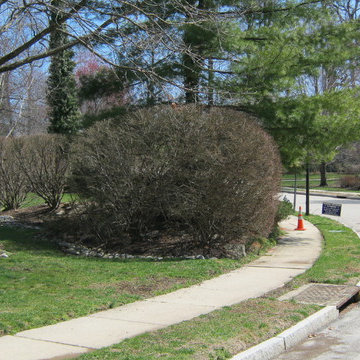
Our company was contracted to do a master plan for the family who was in desperate need of a rear yard renovation. The existing lawn area remained saturated throughout most of the year and the runoff from the neighboring property ran across their back yard, down the side of their property and all the way to the sidewalk in front of their house. The water was so intense that it had begun to cut through the back yard and erode the soil across the sidewalk and into the nearby storm drain.
By identifying these drainage problems and discussing solutions with the homeowner, we were able to design and create the aesthetically pleasing and sustainable solution of a rain garden. The goal was to slow down storm water runoff, and catch pollution and sediment by creating a rain garden that acts as a filter prior to entering the storm drain, while enhancing the aesthetics of the property.
The rain garden created was a shallow depression, 12 - 16" deep that collects rainfall runoff from all downspouts of the home and water collected into perforated pipes underneath the lawn area. The perforated pipe begins at the highest elevation in the yard and ends in the rain garden, the new lowest elevation that has been excavated down to an 8" depth. The perforated pipe captures the runoff water and allows the water to seep slowly back into the
ground as it runs across the property and into the garden. The garden was lined with a geotextile filter fabric to aide in removing contaminants from the water, prevent migration of the stone in to the soil, and minimalize maintenance.
A large variety of plant material was chosen, focusing mainly on native wetland species for their tolerance of our local soil types, moisture conditions and
the habitat they provide for wildlife. The garden was abundant with native wildlife and was a sustainable ecosystem for birds and butterflies upon completion of the project.
After planting, we arranged decorative stone throughout the garden to slow the flow of water and help prevent erosion. The combination of vegetative and stone surfaces provides temporary storage for runoff before the water either evaporates or infiltrates the soil.
The surrounding beds throughout the property were also all amended with compost and replanted with plants that work in harmony with the rain garden. The front, side, and rear yards are a beautiful display of colors that bloom throughout the seasons and the plants throughout the entire property provide food and shelter for native wildlife.
The rear yard that was once a muddy play space for the kids is now a dry lawn space that can be utilized by the family and their neighbors. This multi functional garden has become the focal point of the residence.
Photo Credit:
Terren Landscapes
 Shuler Architecture
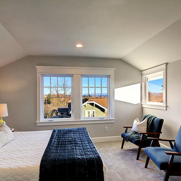
This urban infill project is a make-over of a decrepit structure that had been used as a student rental for close to 50 years. Situated on an elevated, 3300 sf lot, nothing in the original house was salvageable and the entire house was stripped down to the studs. Our challenge with this project was to then open up the original interiors, flood them with natural light while creating a design that appealed to the broadest buyer pool possible.
We solved this problem by organizing a compact floor plan that resulted in a 4 bedroom, 4 bath residence organized around a great room on the main level, a family room on the basement level and an additional 2 bedrooms with city views on the upper. By minimizing circulation space, we were able to re-purpose every square foot of floor area while creating a dramatic, light-filled staircase that tied all 3 levels of the house together into a unified living scheme. Clean lines and clean details, this is another of our attempts at a 'Not So Big House.'
Marketing of the final product lasted less than 10 days and resulted in 3 full priced offers that netted the developer a tidy profit.
 Rodwin Architecture & Skycastle Construction
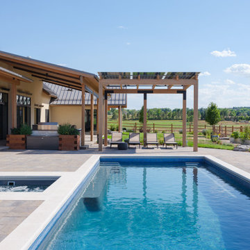
Wild View Farm includes a new “Forever home” (we deconstructed an existing house with a 90% landfill diversion rate), and enhancements to several working barns. The 80 acre site was an original homestead farm from the 1890’s. Both its buildings and soil had become severely degraded. The owners are working to holistically restore this property and make it a model of modern regenerative farming. They are planting hundreds of trees, re-introducing livestock and working with Dryland Agroecology Research and High Plains Permaculture to restore the soil.
The -51 HERS rated home is not just energy-efficient - it’s a model of “Regenerative design”. The deep green house design included multiple challenges – foremost was how to create a Passive Solar design that also took full advantage of the massive views to the West. We solved it with an L shaped building that optimized passive and active solar strategies on the south face, then actively protected the western facade with a giant covered porch and tuned glazing. The home’s leading-edge energy package includes a Ground source heat pump, a large roof-mounted solar PV array, battery back-up, EV chargers, and Energy Recovery Ventilator (ERV), Energy Star Appliances and windows, a robust foam insulation shell and LED lighting.
We also endeavored to craft a modern day interpretation of the farmhouse typology, with a low-slung simple gable-roofed form that would feel like it’s always been there. The exterior material palette of limestone, cementitious stucco and heavy timber gives it a rich Colorado Modern Farmhouse feel. The home is full of custom details like walls of vaulted glass to capture the sweeping mountain views, an AI Smart Home control system, a sleeping loft for kids and guests, a hard-working Butler’s Pantry, a gourmet outdoor kitchen, a pool & spa, a cozy office nook for reading, and a lovely built-in bench for morning coffee. Phase 2 of this project will include a Farmworker ADU and a full renovation of the existing historic barn.
Built by Skycastle Construction. Interior Design by Kimball Modern and Rodwin Architecture. Landscaping by EDI. Photography by Dane Cronin Photo
 Lagois Design Build Renovate
New windows, floors, powder room and basement:
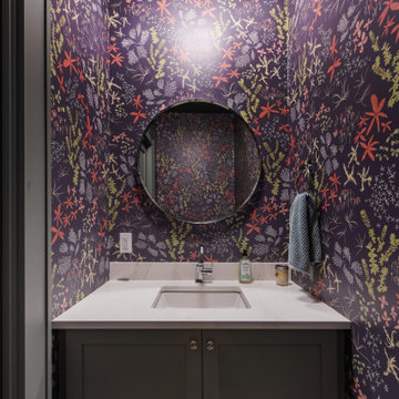
We gave the home new windows, new hardwood floors, and paint throughout. We created a new main floor powder room and a new finished basement containing a living area, three-piece bathroom and new bedroom with egress (tilt and turn) windows.
Flipped around and redesigned kitchen:
We created a new kitchen. The footprint of the kitchen stayed the same, but we flipped it around and redesigned it. Now it has a walk-in pantry area and more floorspace going in and out, which optimized the flow of traffic. We replaced the old non-functioning mudroom with a new one.
Disappearing balcony and drafty door:
To create a new space using a balcony in a bedroom, we extended the second storey out to line up with the first floor, and this increased the square footage. In that room we turned a drafty door into a window.
We reinstated the rear deck, using as many of the original pieces as we could:
There was a leaking roof problem because the original roof pitches were causing ice damming. We designed a new roof to prevent that in the future.
New windows, stucco, and the challenge of asbestos:
Another challenge was installing new windows in the original stucco finish, which contained asbestos. We waterproofed those properly, future proofing them from leaks.
We solved the situation by installing a 5-inch trim around the perimeter of the window. Specialists cut the asbestos back (we had to set up a containment perimeter around each window), and then we placed windows that are five inches wider than the window frames. We used special flashing tapes and sealed them all up behind the stucco.
 R.S. Walsh Landscaping, Inc.
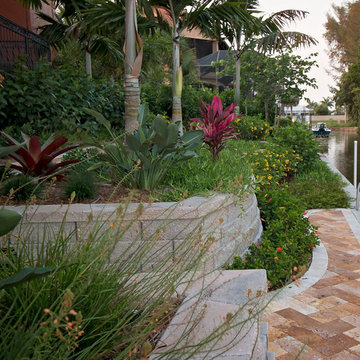
One feature palm was salvaged when this seven year old Mediterranean style residence on the Caloosahatchee River underwent a complete landscape and hardscape remodel in the beginning of 2015. The landscape had not been properly maintained for a few years prior to when the new owners purchased in 2014, was overgrown and unhealthy and therefore was in need of a complete evaluation and landscape overhall.
The original red brick concrete pavers were removed and replaced with a gold travertine blend with ivory travertine border for accent. The front entry stair was expanded and redesigned for a more significant and welcoming front door. The side yard had a significant slope from the foundation of the house to the seawall and had significant erosion damage. This space was re-graded, grading and drainage was repaired and re-routed and a 70 foot long retaining wall was installed. The retaining wall not only solved the stormwater washout problem, but also provided a level space for a private side yard tropical palm garden and pathway to access both the pool deck and the walk along the seawall. The stairs to the pool deck, dock and landing were all completely modified for ease of use.
Aside from the tropical and beautiful landscape that was installed, the most significant visual and aesthetic improvement to this property was the addition of three 9 foot tall by 5 foot wide natural stone water walls with stone basins that were designed to fit within the archways at the driveway entry and designed to complement the architecture of the residence. These water walls offer ambient noise, visual interest and have completely improved the use and entry experience for the homeowner and visitors. Tropical shade bromeliads, alocasias, cordylines and ferns dress up the new landscape beds at the entry and along the front foundation where previously red brick intersected the foundation walls for a mundane solution.
Other elements of interest include the cable wire espalier that was installed in front of the archway on both sides of the entry way for colorful bougainvillea trellis vine to climb and soften the tall walls and eventually connect over the arch. Confederate jasmine vine will soften the garage corner on the cable wire trellis installed and there is also a 4 foot wide by 18 foot tall cable wire espalier on a tall, once stark, wall on the pool deck. Three pool planters were reconfigured and planted with large triple princess palms and bold blue-tone pottery was selected to add interest and color to the pool deck. Micro-drip irrigation was connected to the pool planters and pottery for a low maintenance solution.
This project was a collaborative effort with an ideal client who was open to all design ideas, who worked closely with the design team, and was a great success for both the client and R.S. Walsh Landscaping.
 Alan D. Holt, A.S.L.A., Landscape Architect
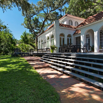
This is a simple addition to the back deck to create an outdoor kitchen and outdoor dining area. A fire pit by the water creates another seating area out in the lawn and gives a perfect place to watch the sun set. The steps and walls improve the access to the boat dock and solve an erosion problem.
Photographed by: Emerald Coast Real Estate Photography
60