
Search results for "Event's rules" in Home Design Ideas
 KWU Studio
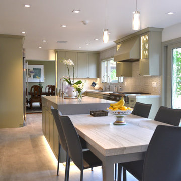
With a limited existing floor area in the kitchen, one of the main goals of the client from the initial schematic design phase was to maximize the open floor area while avoiding any addition or structural redesign. To partially accomplish this, a full-height storage cabinet is recessed into the wall eliminating any projection into the kitchen and creating circulation around the island. Stacked wall appliances optimize the kitchen’s utility while simplifying exhaust and electrical runs for a cleaner layout. Large under-mount workstation sinks provide extra prep space, doubling as a countertop or cutting board when not in use. The remodel also features new multi-sliding doors that bring in much more natural light and allow the clients to use the patio as an overflow flex space when hosting parties or events. The end result is a warm, open, and highly personalized kitchen that blends beauty with practicality.

 Nar Design Group
This home remodel is a celebration of curves and light. Starting from humble beginnings as a basic builder ranch style house, the design challenge was maximizing natural light throughout and providing the unique contemporary style the client’s craved.
The Entry offers a spectacular first impression and sets the tone with a large skylight and an illuminated curved wall covered in a wavy pattern Porcelanosa tile.
The chic entertaining kitchen was designed to celebrate a public lifestyle and plenty of entertaining. Celebrating height with a robust amount of interior architectural details, this dynamic kitchen still gives one that cozy feeling of home sweet home. The large “L” shaped island accommodates 7 for seating. Large pendants over the kitchen table and sink provide additional task lighting and whimsy. The Dekton “puzzle” countertop connection was designed to aid the transition between the two color countertops and is one of the homeowner’s favorite details. The built-in bistro table provides additional seating and flows easily into the Living Room.
A curved wall in the Living Room showcases a contemporary linear fireplace and tv which is tucked away in a niche. Placing the fireplace and furniture arrangement at an angle allowed for more natural walkway areas that communicated with the exterior doors and the kitchen working areas.
The dining room’s open plan is perfect for small groups and expands easily for larger events. Raising the ceiling created visual interest and bringing the pop of teal from the Kitchen cabinets ties the space together. A built-in buffet provides ample storage and display.
The Sitting Room (also called the Piano room for its previous life as such) is adjacent to the Kitchen and allows for easy conversation between chef and guests. It captures the homeowner’s chic sense of style and joie de vivre.

 River Valley Landscapes
The property is one of the original farm houses located on the main street of a small town. It has been in the family for many years and our client just inherited the property. They were trying to have balance of preserving the old while realizing modern day living has its benefits too. The house had a large addition added using mostly old style materials, but designed with function and modern day luxuries. Our goal was to carry that theme to the outside.
Our first problem we had to address was how to transition between the first floor elevation changes. The lower room was the husband’s office. He stated in the future he may have clients over and it would be nice to have an area to sit outside. The wife’s main concern was to renew the four corner garden. She also felt it was very important to be able to see it from the kitchen area. Finally there was an old wishing well stuck right outside the kitchen. They both felt it would be neat to be able to incorporate this in some how. They wanted a patio area with a built in grill to accommodate there family and friends. They also wanted to keep a large play area for the kids.
We were able to pull this off successfully. We addressed the first issue by having a small lower level flagstone area. This area is large enough for 1 to 2 people to sit comfortably. It also provides a transition from his office to the larger patio area. We installed a simple small gravel sitting area opposite of the main patio. This provides our client a secluded place to relax or do business. Mrs.... told me she is amazed how much her and her husband enjoys this area. It is so peaceful looking at the small creek over a glass of wine.
We built a natural limestone retaining wall to create the patio terrace. The stone was chosen to extend the houses architectural elements into the landscape. Irregular broken flagstone was used to give it a more casual feel. We installed three Serviceberries into the patio terrace to replace some trees that were taken down during the remodeling. She was very concern that they would block the view of the four corner garden. We new they were crucial to nestle in the terrace, so we placed them for a couple days for her to decide. Fortunately she agreed they not only kept the view open, but helped frame the garden.
The four corner garden was designed to be viewed from afar and experienced up close. We wanted the space to have some formal structure while keeping with the casual farm house feel. Another natural limestone retaining wall was created. This leveled the garden terrace and helped associate it with the rest of the property. The four corner garden is nestled into the existing woods edge. This provides three distinct experiences to entering the garden; a more formal from the driveway, an open feel from the lower lawn, and a more natural / casual experience from the wooded area. The Plymouth brown gravel was used for the center of the garden. This helped highlight the stone post that was found during construction. The gravel also brings the sense of sound into the garden space. Lamb’s ear was chosen as a fun way to get kids interest in horticulture.
The balance of using the new to create the old feel is what makes this project a success. The property has already hosted a local historical society event and won an award for its preservation efforts. When Mrs.... can’t find her husband, she knows he is either reading the newspaper by the grill or resting in the hammock along the wood’s path.
Find the right local pro for your project

 Thomas Roszak Architecture, LLC
Photo credit: Scott McDonald @ Hedrich Blessing
7RR-Ecohome:
The design objective was to build a house for a couple recently married who both had kids from previous marriages. How to bridge two families together?
The design looks forward in terms of how people live today. The home is an experiment in transparency and solid form; removing borders and edges from outside to inside the house, and to really depict “flowing and endless space”. The house floor plan is derived by pushing and pulling the house’s form to maximize the backyard and minimize the public front yard while welcoming the sun in key rooms by rotating the house 45-degrees to true north. The angular form of the house is a result of the family’s program, the zoning rules, the lot’s attributes, and the sun’s path. We wanted to construct a house that is smart and efficient in terms of construction and energy, both in terms of the building and the user. We could tell a story of how the house is built in terms of the constructability, structure and enclosure, with a nod to Japanese wood construction in the method in which the siding is installed and the exposed interior beams are placed in the double height space. We engineered the house to be smart which not only looks modern but acts modern; every aspect of user control is simplified to a digital touch button, whether lights, shades, blinds, HVAC, communication, audio, video, or security. We developed a planning module based on a 6-foot square room size and a 6-foot wide connector called an interstitial space for hallways, bathrooms, stairs and mechanical, which keeps the rooms pure and uncluttered. The house is 6,200 SF of livable space, plus garage and basement gallery for a total of 9,200 SF. A large formal foyer celebrates the entry and opens up to the living, dining, kitchen and family rooms all focused on the rear garden. The east side of the second floor is the Master wing and a center bridge connects it to the kid’s wing on the west. Second floor terraces and sunscreens provide views and shade in this suburban setting. The playful mathematical grid of the house in the x, y and z axis also extends into the layout of the trees and hard-scapes, all centered on a suburban one-acre lot.
Many green attributes were designed into the home; Ipe wood sunscreens and window shades block out unwanted solar gain in summer, but allow winter sun in. Patio door and operable windows provide ample opportunity for natural ventilation throughout the open floor plan. Minimal windows on east and west sides to reduce heat loss in winter and unwanted gains in summer. Open floor plan and large window expanse reduces lighting demands and maximizes available daylight. Skylights provide natural light to the basement rooms. Durable, low-maintenance exterior materials include stone, ipe wood siding and decking, and concrete roof pavers. Design is based on a 2' planning grid to minimize construction waste. Basement foundation walls and slab are highly insulated. FSC-certified walnut wood flooring was used. Light colored concrete roof pavers to reduce cooling loads by as much as 15%. 2x6 framing allows for more insulation and energy savings. Super efficient windows have low-E argon gas filled units, and thermally insulated aluminum frames. Permeable brick and stone pavers reduce the site’s storm-water runoff. Countertops use recycled composite materials. Energy-Star rated furnaces and smart thermostats are located throughout the house to minimize duct runs and avoid energy loss. Energy-Star rated boiler that heats up both radiant floors and domestic hot water. Low-flow toilets and plumbing fixtures are used to conserve water usage. No VOC finish options and direct venting fireplaces maintain a high interior air quality. Smart home system controls lighting, HVAC, and shades to better manage energy use. Plumbing runs through interior walls reducing possibilities of heat loss and freezing problems. A large food pantry was placed next to kitchen to reduce trips to the grocery store. Home office reduces need for automobile transit and associated CO2 footprint. Plan allows for aging in place, with guest suite than can become the master suite, with no need to move as family members mature.

 Thomas Roszak Architecture, LLC
Photo credit: Scott McDonald @ Hedrich Blessing
7RR-Ecohome:
The design objective was to build a house for a couple recently married who both had kids from previous marriages. How to bridge two families together?
The design looks forward in terms of how people live today. The home is an experiment in transparency and solid form; removing borders and edges from outside to inside the house, and to really depict “flowing and endless space”. The house floor plan is derived by pushing and pulling the house’s form to maximize the backyard and minimize the public front yard while welcoming the sun in key rooms by rotating the house 45-degrees to true north. The angular form of the house is a result of the family’s program, the zoning rules, the lot’s attributes, and the sun’s path. We wanted to construct a house that is smart and efficient in terms of construction and energy, both in terms of the building and the user. We could tell a story of how the house is built in terms of the constructability, structure and enclosure, with a nod to Japanese wood construction in the method in which the siding is installed and the exposed interior beams are placed in the double height space. We engineered the house to be smart which not only looks modern but acts modern; every aspect of user control is simplified to a digital touch button, whether lights, shades, blinds, HVAC, communication, audio, video, or security. We developed a planning module based on a 6-foot square room size and a 6-foot wide connector called an interstitial space for hallways, bathrooms, stairs and mechanical, which keeps the rooms pure and uncluttered. The house is 6,200 SF of livable space, plus garage and basement gallery for a total of 9,200 SF. A large formal foyer celebrates the entry and opens up to the living, dining, kitchen and family rooms all focused on the rear garden. The east side of the second floor is the Master wing and a center bridge connects it to the kid’s wing on the west. Second floor terraces and sunscreens provide views and shade in this suburban setting. The playful mathematical grid of the house in the x, y and z axis also extends into the layout of the trees and hard-scapes, all centered on a suburban one-acre lot.
Many green attributes were designed into the home; Ipe wood sunscreens and window shades block out unwanted solar gain in summer, but allow winter sun in. Patio door and operable windows provide ample opportunity for natural ventilation throughout the open floor plan. Minimal windows on east and west sides to reduce heat loss in winter and unwanted gains in summer. Open floor plan and large window expanse reduces lighting demands and maximizes available daylight. Skylights provide natural light to the basement rooms. Durable, low-maintenance exterior materials include stone, ipe wood siding and decking, and concrete roof pavers. Design is based on a 2' planning grid to minimize construction waste. Basement foundation walls and slab are highly insulated. FSC-certified walnut wood flooring was used. Light colored concrete roof pavers to reduce cooling loads by as much as 15%. 2x6 framing allows for more insulation and energy savings. Super efficient windows have low-E argon gas filled units, and thermally insulated aluminum frames. Permeable brick and stone pavers reduce the site’s storm-water runoff. Countertops use recycled composite materials. Energy-Star rated furnaces and smart thermostats are located throughout the house to minimize duct runs and avoid energy loss. Energy-Star rated boiler that heats up both radiant floors and domestic hot water. Low-flow toilets and plumbing fixtures are used to conserve water usage. No VOC finish options and direct venting fireplaces maintain a high interior air quality. Smart home system controls lighting, HVAC, and shades to better manage energy use. Plumbing runs through interior walls reducing possibilities of heat loss and freezing problems. A large food pantry was placed next to kitchen to reduce trips to the grocery store. Home office reduces need for automobile transit and associated CO2 footprint. Plan allows for aging in place, with guest suite than can become the master suite, with no need to move as family members mature.
 Coco Atelier
TER won an honorary mention as a part of the YAC’s Calamity Atelier Competition, in addition to the prestigious A' Design Award for Interior Space & Exhibition Design 2019-2020.
The Calamity Atelier competition was based in the art forest of Arte Sella in northern Italy that was in recent years destroyed by a storm. The focus was to bring back life to the forest through the design of a number of spaces.
Design concept description:
Stability is a universal value one seeks to reach in their lifetime.
Given the recent events that shook the core of Art Sella, the basis of its recovery should be in the form of a stable foundation.
The design concept of TER, Malga Costa’s new restaurant expansion, derives from 3 main ideas:
1. What does a “stable” space feel like? Psychologically and physically.
2. The connection between the forest land and the food that is served at the restaurant.
3. How to integrate this space harmoniously into the forest in a way in which it will live cohesively with the neighboring artwork, nature, and people.
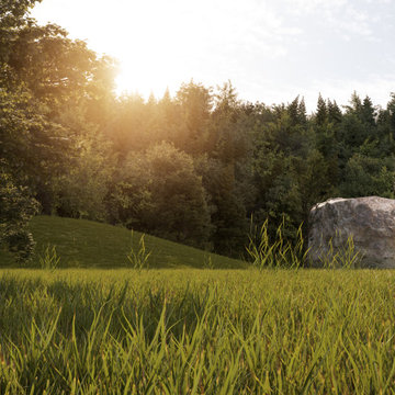
The idea of stability is translated through mass, shape, and materials. Different from most of the forest’s artwork, TER looks like a massive boulder rearing in the forest. The stone exterior makes up the majority of the interior as well, acting as its base material.
With the materials, there is a clear balance of old and new. The old acts as the foundation and pays homage to the area’s roots whereas the new alludes to a burgeoning future. Together, they play a game of layering and develop throughout the space.
The connection between the land and the food comes through the method of cooking in the restaurant- which is campfire cooking. In the center of the plan, there is an open outdoor space that is used to cook foods on an open fire. The plan is designed in a circular motion around the open space in order to fully commit to this concept. Everyone in the four areas of the restaurant can view and enjoy the chefs at work, creating a seemingly interactive dining experience.
The restaurant blends into its surroundings by acting as another rock in the landscape. It is differentiated by the smoke arising from its center, which creates a sense of allure and intrigue. It’s a sight that draws people in toward the center – reestablishing the core essence of Art Sella.

 Marwood Design
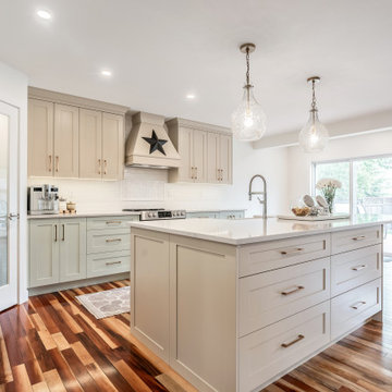
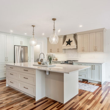
The goal of this project was to have a modern kitchen with a country home elegance. In this example, we mix three essential ingredients for creating a country homestyle cooking space: modern features, rustic elements, and industrial-inspired accents. When blended just right, the result is a sophisticated kitchen that's also warm and inviting keeping the charm of an old country kitchen. There are no hard-set rules for modern farmhouse colors. However, a winning palette seen in many spaces combines pastels, black, and natural wood tones. We loved the original walnut floor and worked with earthy colours of light greens and coffee hues to make the kitchen inviting to an old farmhouse with all the functions of modern appliances.
We were able to accomplish all the needs of the client’s project that started out as kitchen renovation. The project scope refocused to renovating the main floor living area, a new kitchen, updated laundry room and new powder room. The main floor kitchen space felt cramped due to a small dining room near the sliding doors. To gain space we started with a smaller foot print of the kitchen island and moved the dining area to the right of the island opening up the kitchen, gaining space with natural light flowing through the sliding doors. We removed the old dated popcorn ceilings and relocated the pot lights to give better lighting in areas that needed it and removed lights that didn’t need it. The end result is a country kitchen with character and charm.
 Marwood Design
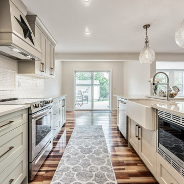
The goal of this project was to have a modern kitchen with a country home elegance. In this example, we mix three essential ingredients for creating a country homestyle cooking space: modern features, rustic elements, and industrial-inspired accents. When blended just right, the result is a sophisticated kitchen that's also warm and inviting keeping the charm of an old country kitchen. There are no hard-set rules for modern farmhouse colors. However, a winning palette seen in many spaces combines pastels, black, and natural wood tones. We loved the original walnut floor and worked with earthy colours of light greens and coffee hues to make the kitchen inviting to an old farmhouse with all the functions of modern appliances.
We were able to accomplish all the needs of the client’s project that started out as kitchen renovation. The project scope refocused to renovating the main floor living area, a new kitchen, updated laundry room and new powder room. The main floor kitchen space felt cramped due to a small dining room near the sliding doors. To gain space we started with a smaller foot print of the kitchen island and moved the dining area to the right of the island opening up the kitchen, gaining space with natural light flowing through the sliding doors. We removed the old dated popcorn ceilings and relocated the pot lights to give better lighting in areas that needed it and removed lights that didn’t need it. The end result is a country kitchen with character and charm.

 Finesse, Inc.
Our client reached out to Finesse, Inc. looking for a pet sanctuary for their two cats. A design was created to allow the fur-babies to enter and exit without the assistance of their humans. A cat door was placed an the exterior wall and a 30" x 80" door was added so that family can enjoy the beautiful outdoors together. A pet friendly turf, designed especially with paw consideration, was selected and installed. The enclosure was built as a "stand alone" structure and can be easily dismantled and transferred in the event of a move in the future.
Rob Kramig, Los Angeles

 Deviate Design Inc.
We designed the BSB Laneway House to fit a narrow (7.6m / 25’) lot and achieve 3 goals:
1. Maximize interior living space;
2. Preserve privacy between the suite and its existing neighbours; and
3. Meet all bylaws without relaxations.
The massing follows the side and height chamfering setback rules, leaving us with some creative solutions to fit everything in.
We stacked 2 of the 3 parking stalls within a single-wide garage using a lift & pit system for any-time access to either vehicle. Next to the garage is the third stall, which recesses the entry away from the lane and can double as a patio.
The main floor hosts the front entry and master suite, both filled with natural light from the perimeter transom windows that are high enough to limit sight lines to/from neighbours. Linear millwork closets provide ample storage and concealed utilities.
The upper level is a wide-open floor plan, perfect for entertaining. Skylights and large windows at either end flood the space with light throughout the day. The raised kitchen and dining space leads out to the rooftop terrace above the garage. There’s even an optional basement for even more usable space and storage!

 Safferstone Interiors
Meet Kim: a partner in a downtown law firm. To say that she is short on time is a giant understatement. In the rare event she has a free moment, she wants to spend it with her kids, not fussing over home decor.
That’s my cue!
Kim is my favorite type of client. She didn’t know where to go or what to do. She leaned on me to explain and articulate design and style.
She looked to me to make her home a mirror of her best self. Easy peasy lemon squeezy. Fantastic human giving me a blank slate? Yes please!
While Kim’s traditional home had a great layout and good bones, it needed updating to make it contemporary and fresh. It needed fixtures and knobs from this century. It needed a Lulu DK roman shade in the powder room. It needed a durable, snuggle-ready sofa with tufting and little patterns of texture. It needed drapery with small-scale drama. Throw in a Thomas O’ Brian cocktail table, and now there’s no shortage of conversation pieces.
Little spaces make me happy – they are the most intimate snapshot of your entire home’s aesthetic – and this house has some good ones.
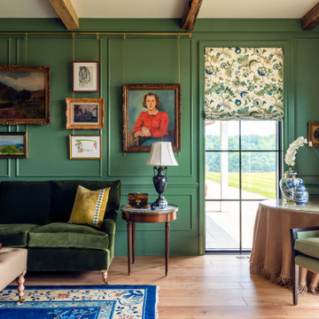
I couldn’t wait to work with the nooks and crannies of this house. Kim’s sitting room, a small den off of the master bedroom, morphed into a craveable cozy space, a quiet adult respite from the occasional chaos of raising a family. The kitchen evolved into something quite unique: playful yet modest, dressed-up but centered. We used a favorite Lucy Rose fabric and Galbraith & Paul pillows to work perfectly with a fresh color palette selected during a prior-to-me renovation. A locally made kitchen farm table fit right in with the high-fashioned quirky blend of color, texture, and pattern.
High-End + Color = Fun + Functional
This is how we articulated Kim’s style and personality. She trusted me with her inner self, allowing me to get to know her and her real, everyday life. I built her a special space to reflect the beautiful life she made for herself. Nothing too fancy or off-limits to little hands, nothing too stuffy (snore!). Everything 100% HER. #nailedit See more Safferstone stuff at www.safferstone.com. Connect with us on Facebook, get inspired on Pinterest, and share modern musings on life & design on Instagram. Or, send us a love note at hello@safferstone.com.
Photo: Angie Seckinger

 Jennifer Taylor Home
's Elise is a woven sky blue 2-seater bench which makes it the perfect addition to any living space looking to add a bit of a modern or contemporary flair. Upholstered with a cotton and linen blend, this simple yet elegant roll arm design with hand applied nail head trims is lovely placed in your living room or office. Regardless of anywhere you place this bench in your home or office; the Elise’s soft colored eye catching design will draw attention the room. This bench will help liven up your room or any living space and give that refreshing and clean look that’ll be sure to please anyone who walks in. The cushioned top is perfect for providing extra seating for you and your guests during the holidays or any event gatherings.
Features:
- Strong and sturdy steam dried hardwood frame is solidly made with plywood and Birchwood to ensure maximum support and longevity
- Quality hand built, painted, and rubbed by experienced furniture craftsmen and women to guarantee this piece lasts a lifetime
- Made with fire retardant foam
- Some assembly required
- Dry clean or spot clean only
- Dimensions: 60"W x 16 1/2"D x 26"H
- Weight: 30LBS
Sponsored
Sunbury, OH

J.Holderby - Renovations
Franklin County's Leading General Contractors - 2X Best of Houzz!
 Marwood Design
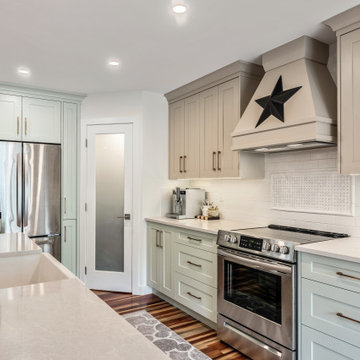
The goal of this project was to have a modern kitchen with a country home elegance. In this example, we mix three essential ingredients for creating a country homestyle cooking space: modern features, rustic elements, and industrial-inspired accents. When blended just right, the result is a sophisticated kitchen that's also warm and inviting keeping the charm of an old country kitchen. There are no hard-set rules for modern farmhouse colors. However, a winning palette seen in many spaces combines pastels, black, and natural wood tones. We loved the original walnut floor and worked with earthy colours of light greens and coffee hues to make the kitchen inviting to an old farmhouse with all the functions of modern appliances.
We were able to accomplish all the needs of the client’s project that started out as kitchen renovation. The project scope refocused to renovating the main floor living area, a new kitchen, updated laundry room and new powder room. The main floor kitchen space felt cramped due to a small dining room near the sliding doors. To gain space we started with a smaller foot print of the kitchen island and moved the dining area to the right of the island opening up the kitchen, gaining space with natural light flowing through the sliding doors. We removed the old dated popcorn ceilings and relocated the pot lights to give better lighting in areas that needed it and removed lights that didn’t need it. The end result is a country kitchen with character and charm.
 Marwood Design
The goal of this project was to have a modern kitchen with a country home elegance. In this example, we mix three essential ingredients for creating a country homestyle cooking space: modern features, rustic elements, and industrial-inspired accents. When blended just right, the result is a sophisticated kitchen that's also warm and inviting keeping the charm of an old country kitchen. There are no hard-set rules for modern farmhouse colors. However, a winning palette seen in many spaces combines pastels, black, and natural wood tones. We loved the original walnut floor and worked with earthy colours of light greens and coffee hues to make the kitchen inviting to an old farmhouse with all the functions of modern appliances.
We were able to accomplish all the needs of the client’s project that started out as kitchen renovation. The project scope refocused to renovating the main floor living area, a new kitchen, updated laundry room and new powder room. The main floor kitchen space felt cramped due to a small dining room near the sliding doors. To gain space we started with a smaller foot print of the kitchen island and moved the dining area to the right of the island opening up the kitchen, gaining space with natural light flowing through the sliding doors. We removed the old dated popcorn ceilings and relocated the pot lights to give better lighting in areas that needed it and removed lights that didn’t need it. The end result is a country kitchen with character and charm.
 Jennifer Taylor Home
's Elise is a yarn dyed putty beige bench which makes it the perfect addition to any living space looking to add a bit of a modern or contemporary flair. Upholstered with a cotton and linen 2-seater blend, this simple yet elegant roll arm design with hand applied nail head trims is lovely placed in your living room or office. Regardless of anywhere you place this bench in your home or office; the Elise’s soft colored eye catching design will draw attention the room. This bench will help liven up your room or any living space and give that refreshing and clean look that’ll be sure to please anyone who walks in. The cushioned top is perfect for providing extra seating for you and your guests during the holidays or any event gatherings.
Features:
- Strong and sturdy steam dried hardwood frame is solidly made with plywood and Birchwood to ensure maximum support and longevity
- Quality hand built, painted, and rubbed by experienced furniture craftsmen and women to guarantee this piece lasts a lifetime
- Made with fire retardant foam
- Some assembly required
- Dry clean or spot clean only
- Dimensions: 60"W x 16 1/2"D x 26"H
- Weight: 30LBS

 Creo Concepts Inc.
Creo Concepts is a landscape construction company based in Elora, Ontario. We seek to be leaders in innovative, European landscape designs to enhance properties for generations to come. We are proud to be the first company in Ontario to make hand-crafted Cruck Marquee Tents available for purchase.
Whether it’s used for a corporate event or in a private back yard, the Cruck Marquee Tent combines function and design. “Cruck” refers to the pair of curved timbers that defines the structure. Originating in Medieval Europe, the cruck frame epitomizes old-world craftsmanship. The cruck frame is exceptionally strong and can support a heavy load, that, combined with traditional mortise and tenon joinery produces a structure that will stand the test of time.
The Cruck Marquee comes with a 9 oz. canvas that will not only provide shade from the sun but will also protect from the rain. Optional side canvases and hardwood tent poles are also available to extend coverage and allow spaces for side tables and other furnishings. The structure can be placed on a patio or even on the lawn on its timber “feet.” Set up and take down is easy with wood pegs fastening the mortise and tenon joinery of the frame.
Sponsored
Westerville, OH

Custom Home Works
Franklin County's Award-Winning Design, Build and Remodeling Expert
 Marwood Design
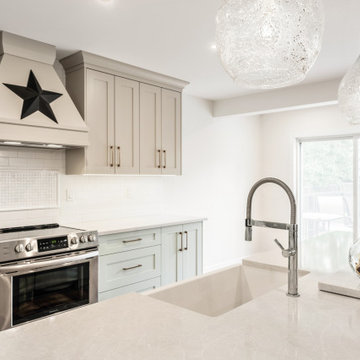
The goal of this project was to have a modern kitchen with a country home elegance. In this example, we mix three essential ingredients for creating a country homestyle cooking space: modern features, rustic elements, and industrial-inspired accents. When blended just right, the result is a sophisticated kitchen that's also warm and inviting keeping the charm of an old country kitchen. There are no hard-set rules for modern farmhouse colors. However, a winning palette seen in many spaces combines pastels, black, and natural wood tones. We loved the original walnut floor and worked with earthy colours of light greens and coffee hues to make the kitchen inviting to an old farmhouse with all the functions of modern appliances.
We were able to accomplish all the needs of the client’s project that started out as kitchen renovation. The project scope refocused to renovating the main floor living area, a new kitchen, updated laundry room and new powder room. The main floor kitchen space felt cramped due to a small dining room near the sliding doors. To gain space we started with a smaller foot print of the kitchen island and moved the dining area to the right of the island opening up the kitchen, gaining space with natural light flowing through the sliding doors. We removed the old dated popcorn ceilings and relocated the pot lights to give better lighting in areas that needed it and removed lights that didn’t need it. The end result is a country kitchen with character and charm.
 Marwood Design
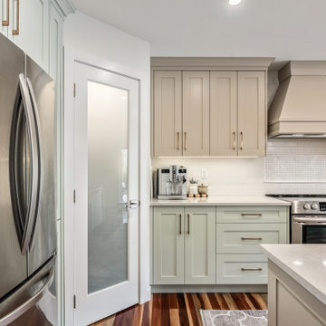
The goal of this project was to have a modern kitchen with a country home elegance. In this example, we mix three essential ingredients for creating a country homestyle cooking space: modern features, rustic elements, and industrial-inspired accents. When blended just right, the result is a sophisticated kitchen that's also warm and inviting keeping the charm of an old country kitchen. There are no hard-set rules for modern farmhouse colors. However, a winning palette seen in many spaces combines pastels, black, and natural wood tones. We loved the original walnut floor and worked with earthy colours of light greens and coffee hues to make the kitchen inviting to an old farmhouse with all the functions of modern appliances.
We were able to accomplish all the needs of the client’s project that started out as kitchen renovation. The project scope refocused to renovating the main floor living area, a new kitchen, updated laundry room and new powder room. The main floor kitchen space felt cramped due to a small dining room near the sliding doors. To gain space we started with a smaller foot print of the kitchen island and moved the dining area to the right of the island opening up the kitchen, gaining space with natural light flowing through the sliding doors. We removed the old dated popcorn ceilings and relocated the pot lights to give better lighting in areas that needed it and removed lights that didn’t need it. The end result is a country kitchen with character and charm.
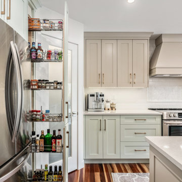 Marwood Design
The goal of this project was to have a modern kitchen with a country home elegance. In this example, we mix three essential ingredients for creating a country homestyle cooking space: modern features, rustic elements, and industrial-inspired accents. When blended just right, the result is a sophisticated kitchen that's also warm and inviting keeping the charm of an old country kitchen. There are no hard-set rules for modern farmhouse colors. However, a winning palette seen in many spaces combines pastels, black, and natural wood tones. We loved the original walnut floor and worked with earthy colours of light greens and coffee hues to make the kitchen inviting to an old farmhouse with all the functions of modern appliances.
We were able to accomplish all the needs of the client’s project that started out as kitchen renovation. The project scope refocused to renovating the main floor living area, a new kitchen, updated laundry room and new powder room. The main floor kitchen space felt cramped due to a small dining room near the sliding doors. To gain space we started with a smaller foot print of the kitchen island and moved the dining area to the right of the island opening up the kitchen, gaining space with natural light flowing through the sliding doors. We removed the old dated popcorn ceilings and relocated the pot lights to give better lighting in areas that needed it and removed lights that didn’t need it. The end result is a country kitchen with character and charm.
85