
Search results for "Exaggeration" in Home Design Ideas
 Sovereign
THE SHADOW HOUSE IS A PRODUCT OF THE CONTEXT IT SITS WITHIN, YET IT SUBVERTS IT AT THE SAME TIME. IT’S IMPOSSIBLE TO IGNORE IT UP CLOSE, YET FROM AFAR IT DISAPPEARS INTO THE ETHER. A TINY LOT, A LARGE PROGRAM, RESTRICTIVE ZONING REGULATIONS AND AN INVOLVED NEIGHBORHOOD INTEREST GROUP WERE THE CONSTANT AND UNRELENTING PRESSURES THAT CREATED THIS HOUSE — AND THE RESULT IS BETTER OFF FOR IT.
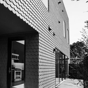
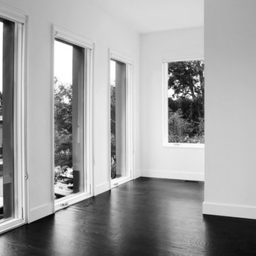
THE SCALLOPED SHINGLES ARE A COMMON ELEMENT ACROSS THE NEIGHBORHOOD, BUT ARE OFTEN RESERVED FOR DETAIL AREAS UNDER EAVES, AS THE MATERIAL WAS VERY EXPENSIVE ONE HUNDRED YEARS AGO. WE TOOK THAT HIGHLY-SPECIALIZED, VERY EXCLUSIVE MATERIAL AND APPLIED IT AS A BROAD, MASS-PRODUCED TEXTURE ACROSS THE ENTIRE RESIDENCE — TAKING SOMETHING FROM HIGHLIGHT TO BACKGROUND TEXTURE. THE SILHOUETTE DIRECTLY ECHOES THE ITALIANATE HOMES IN THE LARGER NEIGHBORHOOD — BUT WE STRIPPED THE TYPICAL ORNATE, DECORATED FAÇADE BACK TO UTTER MINIMALISM. WE ENLARGED THE TYPICAL WINDOW SIZE TO EXAGGERATE THE RIGID SYMMETRY OF THE STYLE, AND BROUGHT THEM TO THE FLOOR AND THE CEILING TO PROVIDE AS MUCH LIGHT AS POSSIBLE — AND THEN RECESSED THEM DEEP INTO THE FAÇADE TO MIMIC THE HEAVY BRICK AND STONE LINTELS OF THE PAST.
THE HOUSE IS BLACK — THE ONLY COLOR IT COULD BE. IF WE’D PAINTED IT UP LIKE ITS VICTORIAN SISTERS, IT WOULD’VE COMPETED FOR ATTENTION. BLACK CAUSES THE HOUSE TO SIMULTANEOUSLY DISAPPEAR AND STAND OUT — IT IS IMPOSSIBLE TO IGNORE WHILE YOU’RE WALKING PAST, BUT A FEW BLOCKS AWAY IT BECOMES IMPOSSIBLE TO DISCERN AGAINST THE BACKGROUND.
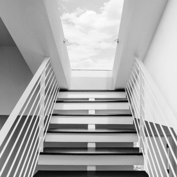
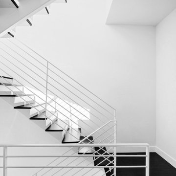
TWO BEDROOMS WITH EN-SUITE BATHS, FLOOR-TO-CEILING WINDOWS, AN AIRY AND OPEN STAIRCASE AND A MASSIVE GLASS ROOF DOOR MAKE THE SHADOW HOUSE IMPOSSIBLY LIGHT AND OPEN — YET IT’S ONLY 1,400 SQUARE FEET ON A 30’ X 50’ LOT.
 Sovereign
THE SHADOW HOUSE IS A PRODUCT OF THE CONTEXT IT SITS WITHIN, YET IT SUBVERTS IT AT THE SAME TIME. IT’S IMPOSSIBLE TO IGNORE IT UP CLOSE, YET FROM AFAR IT DISAPPEARS INTO THE ETHER. A TINY LOT, A LARGE PROGRAM, RESTRICTIVE ZONING REGULATIONS AND AN INVOLVED NEIGHBORHOOD INTEREST GROUP WERE THE CONSTANT AND UNRELENTING PRESSURES THAT CREATED THIS HOUSE — AND THE RESULT IS BETTER OFF FOR IT.
THE SCALLOPED SHINGLES ARE A COMMON ELEMENT ACROSS THE NEIGHBORHOOD, BUT ARE OFTEN RESERVED FOR DETAIL AREAS UNDER EAVES, AS THE MATERIAL WAS VERY EXPENSIVE ONE HUNDRED YEARS AGO. WE TOOK THAT HIGHLY-SPECIALIZED, VERY EXCLUSIVE MATERIAL AND APPLIED IT AS A BROAD, MASS-PRODUCED TEXTURE ACROSS THE ENTIRE RESIDENCE — TAKING SOMETHING FROM HIGHLIGHT TO BACKGROUND TEXTURE. THE SILHOUETTE DIRECTLY ECHOES THE ITALIANATE HOMES IN THE LARGER NEIGHBORHOOD — BUT WE STRIPPED THE TYPICAL ORNATE, DECORATED FAÇADE BACK TO UTTER MINIMALISM. WE ENLARGED THE TYPICAL WINDOW SIZE TO EXAGGERATE THE RIGID SYMMETRY OF THE STYLE, AND BROUGHT THEM TO THE FLOOR AND THE CEILING TO PROVIDE AS MUCH LIGHT AS POSSIBLE — AND THEN RECESSED THEM DEEP INTO THE FAÇADE TO MIMIC THE HEAVY BRICK AND STONE LINTELS OF THE PAST.
THE HOUSE IS BLACK — THE ONLY COLOR IT COULD BE. IF WE’D PAINTED IT UP LIKE ITS VICTORIAN SISTERS, IT WOULD’VE COMPETED FOR ATTENTION. BLACK CAUSES THE HOUSE TO SIMULTANEOUSLY DISAPPEAR AND STAND OUT — IT IS IMPOSSIBLE TO IGNORE WHILE YOU’RE WALKING PAST, BUT A FEW BLOCKS AWAY IT BECOMES IMPOSSIBLE TO DISCERN AGAINST THE BACKGROUND.
TWO BEDROOMS WITH EN-SUITE BATHS, FLOOR-TO-CEILING WINDOWS, AN AIRY AND OPEN STAIRCASE AND A MASSIVE GLASS ROOF DOOR MAKE THE SHADOW HOUSE IMPOSSIBLY LIGHT AND OPEN — YET IT’S ONLY 1,400 SQUARE FEET ON A 30’ X 50’ LOT.
 Sovereign
THE SHADOW HOUSE IS A PRODUCT OF THE CONTEXT IT SITS WITHIN, YET IT SUBVERTS IT AT THE SAME TIME. IT’S IMPOSSIBLE TO IGNORE IT UP CLOSE, YET FROM AFAR IT DISAPPEARS INTO THE ETHER. A TINY LOT, A LARGE PROGRAM, RESTRICTIVE ZONING REGULATIONS AND AN INVOLVED NEIGHBORHOOD INTEREST GROUP WERE THE CONSTANT AND UNRELENTING PRESSURES THAT CREATED THIS HOUSE — AND THE RESULT IS BETTER OFF FOR IT.
THE SCALLOPED SHINGLES ARE A COMMON ELEMENT ACROSS THE NEIGHBORHOOD, BUT ARE OFTEN RESERVED FOR DETAIL AREAS UNDER EAVES, AS THE MATERIAL WAS VERY EXPENSIVE ONE HUNDRED YEARS AGO. WE TOOK THAT HIGHLY-SPECIALIZED, VERY EXCLUSIVE MATERIAL AND APPLIED IT AS A BROAD, MASS-PRODUCED TEXTURE ACROSS THE ENTIRE RESIDENCE — TAKING SOMETHING FROM HIGHLIGHT TO BACKGROUND TEXTURE. THE SILHOUETTE DIRECTLY ECHOES THE ITALIANATE HOMES IN THE LARGER NEIGHBORHOOD — BUT WE STRIPPED THE TYPICAL ORNATE, DECORATED FAÇADE BACK TO UTTER MINIMALISM. WE ENLARGED THE TYPICAL WINDOW SIZE TO EXAGGERATE THE RIGID SYMMETRY OF THE STYLE, AND BROUGHT THEM TO THE FLOOR AND THE CEILING TO PROVIDE AS MUCH LIGHT AS POSSIBLE — AND THEN RECESSED THEM DEEP INTO THE FAÇADE TO MIMIC THE HEAVY BRICK AND STONE LINTELS OF THE PAST.
THE HOUSE IS BLACK — THE ONLY COLOR IT COULD BE. IF WE’D PAINTED IT UP LIKE ITS VICTORIAN SISTERS, IT WOULD’VE COMPETED FOR ATTENTION. BLACK CAUSES THE HOUSE TO SIMULTANEOUSLY DISAPPEAR AND STAND OUT — IT IS IMPOSSIBLE TO IGNORE WHILE YOU’RE WALKING PAST, BUT A FEW BLOCKS AWAY IT BECOMES IMPOSSIBLE TO DISCERN AGAINST THE BACKGROUND.
TWO BEDROOMS WITH EN-SUITE BATHS, FLOOR-TO-CEILING WINDOWS, AN AIRY AND OPEN STAIRCASE AND A MASSIVE GLASS ROOF DOOR MAKE THE SHADOW HOUSE IMPOSSIBLY LIGHT AND OPEN — YET IT’S ONLY 1,400 SQUARE FEET ON A 30’ X 50’ LOT.
Find the right local pro for your project
 Sovereign
THE SHADOW HOUSE IS A PRODUCT OF THE CONTEXT IT SITS WITHIN, YET IT SUBVERTS IT AT THE SAME TIME. IT’S IMPOSSIBLE TO IGNORE IT UP CLOSE, YET FROM AFAR IT DISAPPEARS INTO THE ETHER. A TINY LOT, A LARGE PROGRAM, RESTRICTIVE ZONING REGULATIONS AND AN INVOLVED NEIGHBORHOOD INTEREST GROUP WERE THE CONSTANT AND UNRELENTING PRESSURES THAT CREATED THIS HOUSE — AND THE RESULT IS BETTER OFF FOR IT.
THE SCALLOPED SHINGLES ARE A COMMON ELEMENT ACROSS THE NEIGHBORHOOD, BUT ARE OFTEN RESERVED FOR DETAIL AREAS UNDER EAVES, AS THE MATERIAL WAS VERY EXPENSIVE ONE HUNDRED YEARS AGO. WE TOOK THAT HIGHLY-SPECIALIZED, VERY EXCLUSIVE MATERIAL AND APPLIED IT AS A BROAD, MASS-PRODUCED TEXTURE ACROSS THE ENTIRE RESIDENCE — TAKING SOMETHING FROM HIGHLIGHT TO BACKGROUND TEXTURE. THE SILHOUETTE DIRECTLY ECHOES THE ITALIANATE HOMES IN THE LARGER NEIGHBORHOOD — BUT WE STRIPPED THE TYPICAL ORNATE, DECORATED FAÇADE BACK TO UTTER MINIMALISM. WE ENLARGED THE TYPICAL WINDOW SIZE TO EXAGGERATE THE RIGID SYMMETRY OF THE STYLE, AND BROUGHT THEM TO THE FLOOR AND THE CEILING TO PROVIDE AS MUCH LIGHT AS POSSIBLE — AND THEN RECESSED THEM DEEP INTO THE FAÇADE TO MIMIC THE HEAVY BRICK AND STONE LINTELS OF THE PAST.
THE HOUSE IS BLACK — THE ONLY COLOR IT COULD BE. IF WE’D PAINTED IT UP LIKE ITS VICTORIAN SISTERS, IT WOULD’VE COMPETED FOR ATTENTION. BLACK CAUSES THE HOUSE TO SIMULTANEOUSLY DISAPPEAR AND STAND OUT — IT IS IMPOSSIBLE TO IGNORE WHILE YOU’RE WALKING PAST, BUT A FEW BLOCKS AWAY IT BECOMES IMPOSSIBLE TO DISCERN AGAINST THE BACKGROUND.
TWO BEDROOMS WITH EN-SUITE BATHS, FLOOR-TO-CEILING WINDOWS, AN AIRY AND OPEN STAIRCASE AND A MASSIVE GLASS ROOF DOOR MAKE THE SHADOW HOUSE IMPOSSIBLY LIGHT AND OPEN — YET IT’S ONLY 1,400 SQUARE FEET ON A 30’ X 50’ LOT.

 Sarahliz Lawson Design
Photography: David Duncan Livingston
Inspiration for a large contemporary bedroom remodel in San Francisco
Inspiration for a large contemporary bedroom remodel in San Francisco
 Sovereign
THE SHADOW HOUSE IS A PRODUCT OF THE CONTEXT IT SITS WITHIN, YET IT SUBVERTS IT AT THE SAME TIME. IT’S IMPOSSIBLE TO IGNORE IT UP CLOSE, YET FROM AFAR IT DISAPPEARS INTO THE ETHER. A TINY LOT, A LARGE PROGRAM, RESTRICTIVE ZONING REGULATIONS AND AN INVOLVED NEIGHBORHOOD INTEREST GROUP WERE THE CONSTANT AND UNRELENTING PRESSURES THAT CREATED THIS HOUSE — AND THE RESULT IS BETTER OFF FOR IT.
THE SCALLOPED SHINGLES ARE A COMMON ELEMENT ACROSS THE NEIGHBORHOOD, BUT ARE OFTEN RESERVED FOR DETAIL AREAS UNDER EAVES, AS THE MATERIAL WAS VERY EXPENSIVE ONE HUNDRED YEARS AGO. WE TOOK THAT HIGHLY-SPECIALIZED, VERY EXCLUSIVE MATERIAL AND APPLIED IT AS A BROAD, MASS-PRODUCED TEXTURE ACROSS THE ENTIRE RESIDENCE — TAKING SOMETHING FROM HIGHLIGHT TO BACKGROUND TEXTURE. THE SILHOUETTE DIRECTLY ECHOES THE ITALIANATE HOMES IN THE LARGER NEIGHBORHOOD — BUT WE STRIPPED THE TYPICAL ORNATE, DECORATED FAÇADE BACK TO UTTER MINIMALISM. WE ENLARGED THE TYPICAL WINDOW SIZE TO EXAGGERATE THE RIGID SYMMETRY OF THE STYLE, AND BROUGHT THEM TO THE FLOOR AND THE CEILING TO PROVIDE AS MUCH LIGHT AS POSSIBLE — AND THEN RECESSED THEM DEEP INTO THE FAÇADE TO MIMIC THE HEAVY BRICK AND STONE LINTELS OF THE PAST.
THE HOUSE IS BLACK — THE ONLY COLOR IT COULD BE. IF WE’D PAINTED IT UP LIKE ITS VICTORIAN SISTERS, IT WOULD’VE COMPETED FOR ATTENTION. BLACK CAUSES THE HOUSE TO SIMULTANEOUSLY DISAPPEAR AND STAND OUT — IT IS IMPOSSIBLE TO IGNORE WHILE YOU’RE WALKING PAST, BUT A FEW BLOCKS AWAY IT BECOMES IMPOSSIBLE TO DISCERN AGAINST THE BACKGROUND.
TWO BEDROOMS WITH EN-SUITE BATHS, FLOOR-TO-CEILING WINDOWS, AN AIRY AND OPEN STAIRCASE AND A MASSIVE GLASS ROOF DOOR MAKE THE SHADOW HOUSE IMPOSSIBLY LIGHT AND OPEN — YET IT’S ONLY 1,400 SQUARE FEET ON A 30’ X 50’ LOT.
 Sovereign
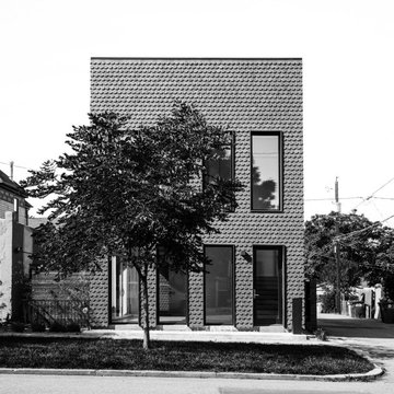
THE SHADOW HOUSE IS A PRODUCT OF THE CONTEXT IT SITS WITHIN, YET IT SUBVERTS IT AT THE SAME TIME. IT’S IMPOSSIBLE TO IGNORE IT UP CLOSE, YET FROM AFAR IT DISAPPEARS INTO THE ETHER. A TINY LOT, A LARGE PROGRAM, RESTRICTIVE ZONING REGULATIONS AND AN INVOLVED NEIGHBORHOOD INTEREST GROUP WERE THE CONSTANT AND UNRELENTING PRESSURES THAT CREATED THIS HOUSE — AND THE RESULT IS BETTER OFF FOR IT.
THE SCALLOPED SHINGLES ARE A COMMON ELEMENT ACROSS THE NEIGHBORHOOD, BUT ARE OFTEN RESERVED FOR DETAIL AREAS UNDER EAVES, AS THE MATERIAL WAS VERY EXPENSIVE ONE HUNDRED YEARS AGO. WE TOOK THAT HIGHLY-SPECIALIZED, VERY EXCLUSIVE MATERIAL AND APPLIED IT AS A BROAD, MASS-PRODUCED TEXTURE ACROSS THE ENTIRE RESIDENCE — TAKING SOMETHING FROM HIGHLIGHT TO BACKGROUND TEXTURE. THE SILHOUETTE DIRECTLY ECHOES THE ITALIANATE HOMES IN THE LARGER NEIGHBORHOOD — BUT WE STRIPPED THE TYPICAL ORNATE, DECORATED FAÇADE BACK TO UTTER MINIMALISM. WE ENLARGED THE TYPICAL WINDOW SIZE TO EXAGGERATE THE RIGID SYMMETRY OF THE STYLE, AND BROUGHT THEM TO THE FLOOR AND THE CEILING TO PROVIDE AS MUCH LIGHT AS POSSIBLE — AND THEN RECESSED THEM DEEP INTO THE FAÇADE TO MIMIC THE HEAVY BRICK AND STONE LINTELS OF THE PAST.
THE HOUSE IS BLACK — THE ONLY COLOR IT COULD BE. IF WE’D PAINTED IT UP LIKE ITS VICTORIAN SISTERS, IT WOULD’VE COMPETED FOR ATTENTION. BLACK CAUSES THE HOUSE TO SIMULTANEOUSLY DISAPPEAR AND STAND OUT — IT IS IMPOSSIBLE TO IGNORE WHILE YOU’RE WALKING PAST, BUT A FEW BLOCKS AWAY IT BECOMES IMPOSSIBLE TO DISCERN AGAINST THE BACKGROUND.
TWO BEDROOMS WITH EN-SUITE BATHS, FLOOR-TO-CEILING WINDOWS, AN AIRY AND OPEN STAIRCASE AND A MASSIVE GLASS ROOF DOOR MAKE THE SHADOW HOUSE IMPOSSIBLY LIGHT AND OPEN — YET IT’S ONLY 1,400 SQUARE FEET ON A 30’ X 50’ LOT.

 Taylor Design
This prairie-style 2-story home features a colored sand finish concrete porch, custom 3-panel front door, and wood tongue & groove entry soffit. The bronze window frames go well with the SW Black Fox trim.
 Sovereign
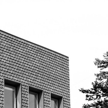
THE SHADOW HOUSE IS A PRODUCT OF THE CONTEXT IT SITS WITHIN, YET IT SUBVERTS IT AT THE SAME TIME. IT’S IMPOSSIBLE TO IGNORE IT UP CLOSE, YET FROM AFAR IT DISAPPEARS INTO THE ETHER. A TINY LOT, A LARGE PROGRAM, RESTRICTIVE ZONING REGULATIONS AND AN INVOLVED NEIGHBORHOOD INTEREST GROUP WERE THE CONSTANT AND UNRELENTING PRESSURES THAT CREATED THIS HOUSE — AND THE RESULT IS BETTER OFF FOR IT.
THE SCALLOPED SHINGLES ARE A COMMON ELEMENT ACROSS THE NEIGHBORHOOD, BUT ARE OFTEN RESERVED FOR DETAIL AREAS UNDER EAVES, AS THE MATERIAL WAS VERY EXPENSIVE ONE HUNDRED YEARS AGO. WE TOOK THAT HIGHLY-SPECIALIZED, VERY EXCLUSIVE MATERIAL AND APPLIED IT AS A BROAD, MASS-PRODUCED TEXTURE ACROSS THE ENTIRE RESIDENCE — TAKING SOMETHING FROM HIGHLIGHT TO BACKGROUND TEXTURE. THE SILHOUETTE DIRECTLY ECHOES THE ITALIANATE HOMES IN THE LARGER NEIGHBORHOOD — BUT WE STRIPPED THE TYPICAL ORNATE, DECORATED FAÇADE BACK TO UTTER MINIMALISM. WE ENLARGED THE TYPICAL WINDOW SIZE TO EXAGGERATE THE RIGID SYMMETRY OF THE STYLE, AND BROUGHT THEM TO THE FLOOR AND THE CEILING TO PROVIDE AS MUCH LIGHT AS POSSIBLE — AND THEN RECESSED THEM DEEP INTO THE FAÇADE TO MIMIC THE HEAVY BRICK AND STONE LINTELS OF THE PAST.
THE HOUSE IS BLACK — THE ONLY COLOR IT COULD BE. IF WE’D PAINTED IT UP LIKE ITS VICTORIAN SISTERS, IT WOULD’VE COMPETED FOR ATTENTION. BLACK CAUSES THE HOUSE TO SIMULTANEOUSLY DISAPPEAR AND STAND OUT — IT IS IMPOSSIBLE TO IGNORE WHILE YOU’RE WALKING PAST, BUT A FEW BLOCKS AWAY IT BECOMES IMPOSSIBLE TO DISCERN AGAINST THE BACKGROUND.
TWO BEDROOMS WITH EN-SUITE BATHS, FLOOR-TO-CEILING WINDOWS, AN AIRY AND OPEN STAIRCASE AND A MASSIVE GLASS ROOF DOOR MAKE THE SHADOW HOUSE IMPOSSIBLY LIGHT AND OPEN — YET IT’S ONLY 1,400 SQUARE FEET ON A 30’ X 50’ LOT.

 TVL Creative Ltd.
This remodel took a dated and cramped bathroom and transformed it into a classy oasis for our Lowry clients. The clients had a limited budget and wanted to leave the space as in-place as possible. However, the large drop in tub ate valuable floor space and a half wall between the shower and tub had become a holding place for random items without a home. The thick frame on the shower glass made the shower feel extremely small, and the dated lighting and fixtures further depressed the space. We proposed a traditional and elegant design that consider the client's budgetary and spatial constraints. We removed the existing drop-in tub and replaced it with a lovely free-standing soaker. The length of this tub is short, but the depth is exaggerated, making it an ideal replacement in this tiny footprint. The shower glass was swapped for framless glass that boldly expands space. We tore out the existing carpet and installed gorgeous wood-look tile that adds depth and warmth to the room. The clients opted to keep their existing vanity to save cost, so a new top was added to bring the aesthetic up to the level of the new additions. The wall paint was taken from a buttery yellow to a soft gray-green, accented by a darker version of this same color on the siding barn door and toilet room door. New vanity lights, faucets, and storage shelves were installed to help our clients organize and keep things off the counter tops. Finally, new custom up-down window shades were curated for the bathroom to add to the final touch. This space is a simple scope with a dramatic transformation that introduces a timeless look for years to come.
 TVL Creative Ltd.
This remodel took a dated and cramped bathroom and transformed it into a classy oasis for our Lowry clients. The clients had a limited budget and wanted to leave the space as in-place as possible. However, the large drop in tub ate valuable floor space and a half wall between the shower and tub had become a holding place for random items without a home. The thick frame on the shower glass made the shower feel extremely small, and the dated lighting and fixtures further depressed the space. We proposed a traditional and elegant design that consider the client's budgetary and spatial constraints. We removed the existing drop-in tub and replaced it with a lovely free-standing soaker. The length of this tub is short, but the depth is exaggerated, making it an ideal replacement in this tiny footprint. The shower glass was swapped for framless glass that boldly expands space. We tore out the existing carpet and installed gorgeous wood-look tile that adds depth and warmth to the room. The clients opted to keep their existing vanity to save cost, so a new top was added to bring the aesthetic up to the level of the new additions. The wall paint was taken from a buttery yellow to a soft gray-green, accented by a darker version of this same color on the siding barn door and toilet room door. New vanity lights, faucets, and storage shelves were installed to help our clients organize and keep things off the counter tops. Finally, new custom up-down window shades were curated for the bathroom to add to the final touch. This space is a simple scope with a dramatic transformation that introduces a timeless look for years to come.
 TVL Creative Ltd.
This remodel took a dated and cramped bathroom and transformed it into a classy oasis for our Lowry clients. The clients had a limited budget and wanted to leave the space as in-place as possible. However, the large drop in tub ate valuable floor space and a half wall between the shower and tub had become a holding place for random items without a home. The thick frame on the shower glass made the shower feel extremely small, and the dated lighting and fixtures further depressed the space. We proposed a traditional and elegant design that consider the client's budgetary and spatial constraints. We removed the existing drop-in tub and replaced it with a lovely free-standing soaker. The length of this tub is short, but the depth is exaggerated, making it an ideal replacement in this tiny footprint. The shower glass was swapped for framless glass that boldly expands space. We tore out the existing carpet and installed gorgeous wood-look tile that adds depth and warmth to the room. The clients opted to keep their existing vanity to save cost, so a new top was added to bring the aesthetic up to the level of the new additions. The wall paint was taken from a buttery yellow to a soft gray-green, accented by a darker version of this same color on the siding barn door and toilet room door. New vanity lights, faucets, and storage shelves were installed to help our clients organize and keep things off the counter tops. Finally, new custom up-down window shades were curated for the bathroom to add to the final touch. This space is a simple scope with a dramatic transformation that introduces a timeless look for years to come.

 Cano Eixo Construction
Amazing Bathroom Transformation we worked with The Bath Studio for this Master Bathroom Retreat.
Example of a mid-sized trendy master multicolored tile gray floor double shower design in San Francisco with recessed-panel cabinets, blue cabinets, a two-piece toilet, beige walls, an undermount sink, a hinged shower door and multicolored countertops
Example of a mid-sized trendy master multicolored tile gray floor double shower design in San Francisco with recessed-panel cabinets, blue cabinets, a two-piece toilet, beige walls, an undermount sink, a hinged shower door and multicolored countertops
 TVL Creative Ltd.
This remodel took a dated and cramped bathroom and transformed it into a classy oasis for our Lowry clients. The clients had a limited budget and wanted to leave the space as in-place as possible. However, the large drop in tub ate valuable floor space and a half wall between the shower and tub had become a holding place for random items without a home. The thick frame on the shower glass made the shower feel extremely small, and the dated lighting and fixtures further depressed the space. We proposed a traditional and elegant design that consider the client's budgetary and spatial constraints. We removed the existing drop-in tub and replaced it with a lovely free-standing soaker. The length of this tub is short, but the depth is exaggerated, making it an ideal replacement in this tiny footprint. The shower glass was swapped for framless glass that boldly expands space. We tore out the existing carpet and installed gorgeous wood-look tile that adds depth and warmth to the room. The clients opted to keep their existing vanity to save cost, so a new top was added to bring the aesthetic up to the level of the new additions. The wall paint was taken from a buttery yellow to a soft gray-green, accented by a darker version of this same color on the siding barn door and toilet room door. New vanity lights, faucets, and storage shelves were installed to help our clients organize and keep things off the counter tops. Finally, new custom up-down window shades were curated for the bathroom to add to the final touch. This space is a simple scope with a dramatic transformation that introduces a timeless look for years to come.

 Barley|Pfeiffer Architecture
FourWallsPhotography.com
Screened-In porch, Austin luxury home, Austin custom home, BarleyPfeiffer Architecture, wood floors, sustainable design, sleek design, modern, low voc paint, interiors and consulting, house ideas, home planning, 5 star energy, high performance, green building, fun design, 5 star appliance, find a pro, family home, elegance, efficient, custom-made, comprehensive sustainable architects, natural lighting, Austin TX, Barley & Pfeiffer Architects, professional services, green design, curb appeal, LEED, AIA,
 TVL Creative Ltd.
This remodel took a dated and cramped bathroom and transformed it into a classy oasis for our Lowry clients. The clients had a limited budget and wanted to leave the space as in-place as possible. However, the large drop in tub ate valuable floor space and a half wall between the shower and tub had become a holding place for random items without a home. The thick frame on the shower glass made the shower feel extremely small, and the dated lighting and fixtures further depressed the space. We proposed a traditional and elegant design that consider the client's budgetary and spatial constraints. We removed the existing drop-in tub and replaced it with a lovely free-standing soaker. The length of this tub is short, but the depth is exaggerated, making it an ideal replacement in this tiny footprint. The shower glass was swapped for framless glass that boldly expands space. We tore out the existing carpet and installed gorgeous wood-look tile that adds depth and warmth to the room. The clients opted to keep their existing vanity to save cost, so a new top was added to bring the aesthetic up to the level of the new additions. The wall paint was taken from a buttery yellow to a soft gray-green, accented by a darker version of this same color on the siding barn door and toilet room door. New vanity lights, faucets, and storage shelves were installed to help our clients organize and keep things off the counter tops. Finally, new custom up-down window shades were curated for the bathroom to add to the final touch. This space is a simple scope with a dramatic transformation that introduces a timeless look for years to come.
 TVL Creative Ltd.
This remodel took a dated and cramped bathroom and transformed it into a classy oasis for our Lowry clients. The clients had a limited budget and wanted to leave the space as in-place as possible. However, the large drop in tub ate valuable floor space and a half wall between the shower and tub had become a holding place for random items without a home. The thick frame on the shower glass made the shower feel extremely small, and the dated lighting and fixtures further depressed the space. We proposed a traditional and elegant design that consider the client's budgetary and spatial constraints. We removed the existing drop-in tub and replaced it with a lovely free-standing soaker. The length of this tub is short, but the depth is exaggerated, making it an ideal replacement in this tiny footprint. The shower glass was swapped for framless glass that boldly expands space. We tore out the existing carpet and installed gorgeous wood-look tile that adds depth and warmth to the room. The clients opted to keep their existing vanity to save cost, so a new top was added to bring the aesthetic up to the level of the new additions. The wall paint was taken from a buttery yellow to a soft gray-green, accented by a darker version of this same color on the siding barn door and toilet room door. New vanity lights, faucets, and storage shelves were installed to help our clients organize and keep things off the counter tops. Finally, new custom up-down window shades were curated for the bathroom to add to the final touch. This space is a simple scope with a dramatic transformation that introduces a timeless look for years to come.

 Natural Stone Institute
No greater compliment of a material is possible than when stone is selected for a historic property renovation within a home rich in tradition and with a celebrated past. This new feature stair addition to a private residence in Toronto, Canada, has an equally compelling story to tell.
Originally envisioned as a wall-supported, cantilevered stone stair, the owner boldly accepted a unique solution for their showpiece element. The 19-tread stair would be designed with 550 lb. solid stone treads, and fully
liberated from traditional supports and the adjacent rubble wall. To say, “it would float” is not an exaggeration. The stair would be designed as a monolithic beam spanning 16.5 feet, 10 feet high and 41 inches wide. Aesthetically bold, with a reduced tone from
pure black, the basalt stone was the perfect contrast for the white modern interior of the home. The 3-1/2" tension cables played the most important role by resisting the large bending moment generated by the stone load and stair geometry. Fabrication required precise coordination and care to ensure perfect alignment of the interlocking key, and the corresponding cable holes.
The fabrication challenge was achieving the highest level of accuracy in notching, coring, and replicating each tread identically. Expert precision and skill were key to nesting each tread in sequence and simultaneously with the strands. Meticulous alignment and exacting tolerance assured the true performance and aesthetics were delivered. Hydraulic post-tensioning pulled each cable to 120 kiloNewtons or 27,000 lbs, infusing strength and structural integrity. Removing the temporary support and testing was the last critical step—it was the first time the stone stair would be self-supporting.
The “floating” stair is an ultimate achievement and example of innovation, material strength, fabrication quality, installation precision, and expert coordination. A perfect final chapter to a historical journey and modern ode to stone as structure.
 TVL Creative Ltd.
This remodel took a dated and cramped bathroom and transformed it into a classy oasis for our Lowry clients. The clients had a limited budget and wanted to leave the space as in-place as possible. However, the large drop in tub ate valuable floor space and a half wall between the shower and tub had become a holding place for random items without a home. The thick frame on the shower glass made the shower feel extremely small, and the dated lighting and fixtures further depressed the space. We proposed a traditional and elegant design that consider the client's budgetary and spatial constraints. We removed the existing drop-in tub and replaced it with a lovely free-standing soaker. The length of this tub is short, but the depth is exaggerated, making it an ideal replacement in this tiny footprint. The shower glass was swapped for framless glass that boldly expands space. We tore out the existing carpet and installed gorgeous wood-look tile that adds depth and warmth to the room. The clients opted to keep their existing vanity to save cost, so a new top was added to bring the aesthetic up to the level of the new additions. The wall paint was taken from a buttery yellow to a soft gray-green, accented by a darker version of this same color on the siding barn door and toilet room door. New vanity lights, faucets, and storage shelves were installed to help our clients organize and keep things off the counter tops. Finally, new custom up-down window shades were curated for the bathroom to add to the final touch. This space is a simple scope with a dramatic transformation that introduces a timeless look for years to come.
 TVL Creative Ltd.
This remodel took a dated and cramped bathroom and transformed it into a classy oasis for our Lowry clients. The clients had a limited budget and wanted to leave the space as in-place as possible. However, the large drop in tub ate valuable floor space and a half wall between the shower and tub had become a holding place for random items without a home. The thick frame on the shower glass made the shower feel extremely small, and the dated lighting and fixtures further depressed the space. We proposed a traditional and elegant design that consider the client's budgetary and spatial constraints. We removed the existing drop-in tub and replaced it with a lovely free-standing soaker. The length of this tub is short, but the depth is exaggerated, making it an ideal replacement in this tiny footprint. The shower glass was swapped for framless glass that boldly expands space. We tore out the existing carpet and installed gorgeous wood-look tile that adds depth and warmth to the room. The clients opted to keep their existing vanity to save cost, so a new top was added to bring the aesthetic up to the level of the new additions. The wall paint was taken from a buttery yellow to a soft gray-green, accented by a darker version of this same color on the siding barn door and toilet room door. New vanity lights, faucets, and storage shelves were installed to help our clients organize and keep things off the counter tops. Finally, new custom up-down window shades were curated for the bathroom to add to the final touch. This space is a simple scope with a dramatic transformation that introduces a timeless look for years to come.
26