
Search results for "Exaggeration" in Home Design Ideas
 Natural Stone Institute
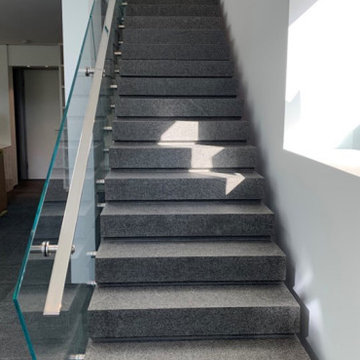
No greater compliment of a material is possible than when stone is selected for a historic property renovation within a home rich in tradition and with a celebrated past. This new feature stair addition to a private residence in Toronto, Canada, has an equally compelling story to tell.
Originally envisioned as a wall-supported, cantilevered stone stair, the owner boldly accepted a unique solution for their showpiece element. The 19-tread stair would be designed with 550 lb. solid stone treads, and fully
liberated from traditional supports and the adjacent rubble wall. To say, “it would float” is not an exaggeration. The stair would be designed as a monolithic beam spanning 16.5 feet, 10 feet high and 41 inches wide. Aesthetically bold, with a reduced tone from
pure black, the basalt stone was the perfect contrast for the white modern interior of the home. The 3-1/2" tension cables played the most important role by resisting the large bending moment generated by the stone load and stair geometry. Fabrication required precise coordination and care to ensure perfect alignment of the interlocking key, and the corresponding cable holes.
The fabrication challenge was achieving the highest level of accuracy in notching, coring, and replicating each tread identically. Expert precision and skill were key to nesting each tread in sequence and simultaneously with the strands. Meticulous alignment and exacting tolerance assured the true performance and aesthetics were delivered. Hydraulic post-tensioning pulled each cable to 120 kiloNewtons or 27,000 lbs, infusing strength and structural integrity. Removing the temporary support and testing was the last critical step—it was the first time the stone stair would be self-supporting.
The “floating” stair is an ultimate achievement and example of innovation, material strength, fabrication quality, installation precision, and expert coordination. A perfect final chapter to a historical journey and modern ode to stone as structure.
 TVL Creative Ltd.
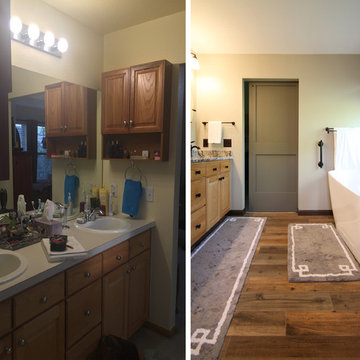
This remodel took a dated and cramped bathroom and transformed it into a classy oasis for our Lowry clients. The clients had a limited budget and wanted to leave the space as in-place as possible. However, the large drop in tub ate valuable floor space and a half wall between the shower and tub had become a holding place for random items without a home. The thick frame on the shower glass made the shower feel extremely small, and the dated lighting and fixtures further depressed the space. We proposed a traditional and elegant design that consider the client's budgetary and spatial constraints. We removed the existing drop-in tub and replaced it with a lovely free-standing soaker. The length of this tub is short, but the depth is exaggerated, making it an ideal replacement in this tiny footprint. The shower glass was swapped for framless glass that boldly expands space. We tore out the existing carpet and installed gorgeous wood-look tile that adds depth and warmth to the room. The clients opted to keep their existing vanity to save cost, so a new top was added to bring the aesthetic up to the level of the new additions. The wall paint was taken from a buttery yellow to a soft gray-green, accented by a darker version of this same color on the siding barn door and toilet room door. New vanity lights, faucets, and storage shelves were installed to help our clients organize and keep things off the counter tops. Finally, new custom up-down window shades were curated for the bathroom to add to the final touch. This space is a simple scope with a dramatic transformation that introduces a timeless look for years to come.
 TVL Creative Ltd.
This remodel took a dated and cramped bathroom and transformed it into a classy oasis for our Lowry clients. The clients had a limited budget and wanted to leave the space as in-place as possible. However, the large drop in tub ate valuable floor space and a half wall between the shower and tub had become a holding place for random items without a home. The thick frame on the shower glass made the shower feel extremely small, and the dated lighting and fixtures further depressed the space. We proposed a traditional and elegant design that consider the client's budgetary and spatial constraints. We removed the existing drop-in tub and replaced it with a lovely free-standing soaker. The length of this tub is short, but the depth is exaggerated, making it an ideal replacement in this tiny footprint. The shower glass was swapped for framless glass that boldly expands space. We tore out the existing carpet and installed gorgeous wood-look tile that adds depth and warmth to the room. The clients opted to keep their existing vanity to save cost, so a new top was added to bring the aesthetic up to the level of the new additions. The wall paint was taken from a buttery yellow to a soft gray-green, accented by a darker version of this same color on the siding barn door and toilet room door. New vanity lights, faucets, and storage shelves were installed to help our clients organize and keep things off the counter tops. Finally, new custom up-down window shades were curated for the bathroom to add to the final touch. This space is a simple scope with a dramatic transformation that introduces a timeless look for years to come.
Find the right local pro for your project


 TVL Creative Ltd.
This project is an incredible transformation and the perfect example of successful style mixing! This client, and now a good friend of TVL (as they all become), is a wonderfully eclectic and adventurous one with immense interest in texture play, pops of color, and unique applications. Our scope in this home included a full kitchen renovation, main level powder room renovation, and a master bathroom overhaul. Taking just over a year to complete from the first design phases to final photos, this project was so insanely fun and packs an amazing amount of fun details and lively surprises. The original kitchen was large and fairly functional. However, the cabinetry was dated, the lighting was inefficient and frankly ugly, and the space was lacking personality in general. Our client desired maximized storage and a more personalized aesthetic. The existing cabinets were short and left the nice height of the space under-utilized. We integrated new gray shaker cabinets from Waypoint Living Spaces and ran them to the ceiling to really exaggerate the height of the space and to maximize usable storage as much as possible. The upper cabinets are glass and lit from within, offering display space or functional storage as the client needs. The central feature of this space is the large cobalt blue range from Viking as well as the custom made reclaimed wood range hood floating above. The backsplash along this entire wall is vertical slab of marble look quartz from Pental Surfaces. This matches the expanse of the same countertop that wraps the room. Flanking the range, we installed cobalt blue lantern penny tile from Merola Tile for a playful texture that adds visual interest and class to the entire room. We upgraded the lighting in the ceiling, under the cabinets, and within cabinets--we also installed accent sconces over each window on the sink wall to create cozy and functional illumination. The deep, textured front Whitehaven apron sink is a dramatic nod to the farmhouse aesthetic from KOHLER, and it's paired with the bold and industrial inspired Tournant faucet, also from Kohler. We finalized this space with other gorgeous appliances, a super sexy dining table and chair set from Room & Board, the Paxton dining light from Pottery Barn and a small bar area and pantry on the far end of the space. In the small powder room on the main level, we converted a drab builder-grade space into a super cute, rustic-inspired washroom. We utilized the Bonner vanity from Signature Hardware and paired this with the cute Ashfield faucet from Pfister. The most unique statements in this room include the water-drop light over the vanity from Shades Of Light, the copper-look porcelain floor tile from Pental Surfaces and the gorgeous Cashmere colored Tresham toilet from Kohler. Up in the master bathroom, elegance abounds. Using the same footprint, we upgraded everything in this space to reflect the client's desire for a more bright, patterned and pretty space. Starting at the entry, we installed a custom reclaimed plank barn door with bold large format hardware from Rustica Hardware. In the bathroom, the custom slate blue vanity from Tharp Cabinet Company is an eye catching statement piece. This is paired with gorgeous hardware from Amerock, vessel sinks from Kohler, and Purist faucets also from Kohler. We replaced the old built-in bathtub with a new freestanding soaker from Signature Hardware. The floor tile is a bold, graphic porcelain tile with a classic color scheme. The shower was upgraded with new tile and fixtures throughout: new clear glass, gorgeous distressed subway tile from the Castle line from TileBar, and a sophisticated shower panel from Vigo. We finalized the space with a small crystal chandelier and soft gray paint. This project is a stunning conversion and we are so thrilled that our client can enjoy these personalized spaces for years to come. Special thanks to the amazing Ian Burks of Burks Wurks Construction for bringing this to life!
 TVL Creative Ltd.
This project is an incredible transformation and the perfect example of successful style mixing! This client, and now a good friend of TVL (as they all become), is a wonderfully eclectic and adventurous one with immense interest in texture play, pops of color, and unique applications. Our scope in this home included a full kitchen renovation, main level powder room renovation, and a master bathroom overhaul. Taking just over a year to complete from the first design phases to final photos, this project was so insanely fun and packs an amazing amount of fun details and lively surprises. The original kitchen was large and fairly functional. However, the cabinetry was dated, the lighting was inefficient and frankly ugly, and the space was lacking personality in general. Our client desired maximized storage and a more personalized aesthetic. The existing cabinets were short and left the nice height of the space under-utilized. We integrated new gray shaker cabinets from Waypoint Living Spaces and ran them to the ceiling to really exaggerate the height of the space and to maximize usable storage as much as possible. The upper cabinets are glass and lit from within, offering display space or functional storage as the client needs. The central feature of this space is the large cobalt blue range from Viking as well as the custom made reclaimed wood range hood floating above. The backsplash along this entire wall is vertical slab of marble look quartz from Pental Surfaces. This matches the expanse of the same countertop that wraps the room. Flanking the range, we installed cobalt blue lantern penny tile from Merola Tile for a playful texture that adds visual interest and class to the entire room. We upgraded the lighting in the ceiling, under the cabinets, and within cabinets--we also installed accent sconces over each window on the sink wall to create cozy and functional illumination. The deep, textured front Whitehaven apron sink is a dramatic nod to the farmhouse aesthetic from KOHLER, and it's paired with the bold and industrial inspired Tournant faucet, also from Kohler. We finalized this space with other gorgeous appliances, a super sexy dining table and chair set from Room & Board, the Paxton dining light from Pottery Barn and a small bar area and pantry on the far end of the space. In the small powder room on the main level, we converted a drab builder-grade space into a super cute, rustic-inspired washroom. We utilized the Bonner vanity from Signature Hardware and paired this with the cute Ashfield faucet from Pfister. The most unique statements in this room include the water-drop light over the vanity from Shades Of Light, the copper-look porcelain floor tile from Pental Surfaces and the gorgeous Cashmere colored Tresham toilet from Kohler. Up in the master bathroom, elegance abounds. Using the same footprint, we upgraded everything in this space to reflect the client's desire for a more bright, patterned and pretty space. Starting at the entry, we installed a custom reclaimed plank barn door with bold large format hardware from Rustica Hardware. In the bathroom, the custom slate blue vanity from Tharp Cabinet Company is an eye catching statement piece. This is paired with gorgeous hardware from Amerock, vessel sinks from Kohler, and Purist faucets also from Kohler. We replaced the old built-in bathtub with a new freestanding soaker from Signature Hardware. The floor tile is a bold, graphic porcelain tile with a classic color scheme. The shower was upgraded with new tile and fixtures throughout: new clear glass, gorgeous distressed subway tile from the Castle line from TileBar, and a sophisticated shower panel from Vigo. We finalized the space with a small crystal chandelier and soft gray paint. This project is a stunning conversion and we are so thrilled that our client can enjoy these personalized spaces for years to come. Special thanks to the amazing Ian Burks of Burks Wurks Construction for bringing this to life!
 Natural Stone Institute
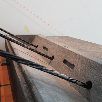
No greater compliment of a material is possible than when stone is selected for a historic property renovation within a home rich in tradition and with a celebrated past. This new feature stair addition to a private residence in Toronto, Canada, has an equally compelling story to tell.
Originally envisioned as a wall-supported, cantilevered stone stair, the owner boldly accepted a unique solution for their showpiece element. The 19-tread stair would be designed with 550 lb. solid stone treads, and fully
liberated from traditional supports and the adjacent rubble wall. To say, “it would float” is not an exaggeration. The stair would be designed as a monolithic beam spanning 16.5 feet, 10 feet high and 41 inches wide. Aesthetically bold, with a reduced tone from
pure black, the basalt stone was the perfect contrast for the white modern interior of the home. The 3-1/2" tension cables played the most important role by resisting the large bending moment generated by the stone load and stair geometry. Fabrication required precise coordination and care to ensure perfect alignment of the interlocking key, and the corresponding cable holes.
The fabrication challenge was achieving the highest level of accuracy in notching, coring, and replicating each tread identically. Expert precision and skill were key to nesting each tread in sequence and simultaneously with the strands. Meticulous alignment and exacting tolerance assured the true performance and aesthetics were delivered. Hydraulic post-tensioning pulled each cable to 120 kiloNewtons or 27,000 lbs, infusing strength and structural integrity. Removing the temporary support and testing was the last critical step—it was the first time the stone stair would be self-supporting.
The “floating” stair is an ultimate achievement and example of innovation, material strength, fabrication quality, installation precision, and expert coordination. A perfect final chapter to a historical journey and modern ode to stone as structure.
 TVL Creative Ltd.
This remodel took a dated and cramped bathroom and transformed it into a classy oasis for our Lowry clients. The clients had a limited budget and wanted to leave the space as in-place as possible. However, the large drop in tub ate valuable floor space and a half wall between the shower and tub had become a holding place for random items without a home. The thick frame on the shower glass made the shower feel extremely small, and the dated lighting and fixtures further depressed the space. We proposed a traditional and elegant design that consider the client's budgetary and spatial constraints. We removed the existing drop-in tub and replaced it with a lovely free-standing soaker. The length of this tub is short, but the depth is exaggerated, making it an ideal replacement in this tiny footprint. The shower glass was swapped for framless glass that boldly expands space. We tore out the existing carpet and installed gorgeous wood-look tile that adds depth and warmth to the room. The clients opted to keep their existing vanity to save cost, so a new top was added to bring the aesthetic up to the level of the new additions. The wall paint was taken from a buttery yellow to a soft gray-green, accented by a darker version of this same color on the siding barn door and toilet room door. New vanity lights, faucets, and storage shelves were installed to help our clients organize and keep things off the counter tops. Finally, new custom up-down window shades were curated for the bathroom to add to the final touch. This space is a simple scope with a dramatic transformation that introduces a timeless look for years to come.

 Bilotta Kitchen & Home
The homeowners wanted a sleek, contemporary kitchen that didn't feel cold, and still worked with the style of their classic, red brick colonial home. The design team, consisting of Bilotta senior designer, RitaLuisa Garcés and Billy Ceglia of Billy Ceglia Designs, opted for the warmth of traditional walnut cabinetry done in an exaggerated shaker style with ultra-thin stiles and rails and light textured laminate cabinets with distinct horizontal graining. The cabinetry they selected is Bilotta’s contemporary Artcraft line – European style cabinets manufactured in Canada. This combination of colors and textures helped solve another design issue: a long narrow space that opened directly into the family room. Cabinet colors and finishes helped to create the illusion of width in the space by situating the light cabinetry in an “L” across the rear wall and window wall of the space and “bookending” it with the full height walnut units that read more as paneling than cabinetry when viewed from the adjoining family room. The large simple island outfitted with Donghia counter stools, allows for an uninterrupted work space, storage of tabletop items, and also houses a “snack zone” for the client’s children with cabinetry and roll-outs for snacks, a microwave, and a beverage center all within easy reach, but outside of the main work area.
The custom stainless steel exhaust hood and handcrafted tile backsplash also add subtle visual interest to the space, reinforcing the idea that the back walls of the kitchen recede into the background creating the illusion of more space.
The centerpiece of the breakfast room is the multi light, hand blown chandelier from Niche Modern hanging above a blue lacquered breakfast table with stainless steel detailing and vintage Saarinen dining chairs. Together the components create a comfortable spot to dine, or just hang out.
Designers: RitaLuisa Garcés in collaboration with Billy Ceglia of Billy Ceglia Designs; Photo Credit: Peter Krupenye

 Fredman Design Group
Jill Buckner Photography
Seeking a comfortable and casual weekend home for their family, our clients ask for the design team to create a system sophisticated yet "unbuttoned” space to complement their Harbor Country lakeside retreat. Every detail of the space – from the custom cabinetry and millwork to the exaggerated curved legs of the oversized island – was redesigned to add a touch of style and character. The repurposed barn wood throughout incorporates a rustic element, paying homage to the home's natural surroundings. The final redesign pulls together layers of natural elements to blur the line between indoor and outdoor living.
For more than 40 years, Fredman Design Group has been in the business of Interior Design. Throughout the years, we’ve built long-lasting relationships with our clients through our client-centric approach. When creating designs, our decisions depend on the personality of our clients—their dreams and their aspirations. We manifest their lifestyle by incorporating elements of design with those of our clients to create a unique environment, down to the details of the upholstery and accessories. We love it when a home feels finished and lived in, with various layers and textures.
While each of our clients and their stories has varied over the years, they’ve come to trust us with their projects—whether it’s a single room to the larger complete renovation, addition, or new construction.
They value the collaborative team that is behind each project, embracing the diversity that each designer is able to bring to their project through their love of art, travel, fashion, nature, history, architecture or film—ultimately falling in love with the nurturing environments we create for them.
We are grateful for the opportunity to tell each of clients’ stories through design. What story can we help you tell?
Call us today to schedule your complimentary consultation - 312-587-9184

 DANE AUSTIN INTERIOR DESIGN Boston & Cambridge
This chic couple from Manhattan requested for a fashion-forward focus for their new Boston condominium. Textiles by Christian Lacroix, Faberge eggs, and locally designed stilettos once owned by Lady Gaga are just a few of the inspirations they offered.
Project designed by Boston interior design studio Dane Austin Design. They serve Boston, Cambridge, Hingham, Cohasset, Newton, Weston, Lexington, Concord, Dover, Andover, Gloucester, as well as surrounding areas.
For more about Dane Austin Design, click here: https://daneaustindesign.com/
To learn more about this project, click here:
https://daneaustindesign.com/seaport-high-rise
 Bilotta Kitchen & Home
The homeowners wanted a sleek, contemporary kitchen that didn't feel cold, and still worked with the style of their classic, red brick colonial home. The design team, consisting of Bilotta senior designer, RitaLuisa Garcés and Billy Ceglia of Billy Ceglia Designs, opted for the warmth of traditional walnut cabinetry done in an exaggerated shaker style with ultra-thin stiles and rails and light textured laminate cabinets with distinct horizontal graining. The cabinetry they selected is Bilotta’s contemporary Artcraft line – European style cabinets manufactured in Canada. This combination of colors and textures helped solve another design issue: a long narrow space that opened directly into the family room. Cabinet colors and finishes helped to create the illusion of width in the space by situating the light cabinetry in an “L” across the rear wall and window wall of the space and “bookending” it with the full height walnut units that read more as paneling than cabinetry when viewed from the adjoining family room. The large simple island outfitted with Donghia counter stools, allows for an uninterrupted work space, storage of tabletop items, and also houses a “snack zone” for the client’s children with cabinetry and roll-outs for snacks, a microwave, and a beverage center all within easy reach, but outside of the main work area.
The custom stainless steel exhaust hood and handcrafted tile backsplash also add subtle visual interest to the space, reinforcing the idea that the back walls of the kitchen recede into the background creating the illusion of more space.
The centerpiece of the breakfast room is the multi light, hand blown chandelier from Niche Modern hanging above a blue lacquered breakfast table with stainless steel detailing and vintage Saarinen dining chairs. Together the components create a comfortable spot to dine, or just hang out.
Designers: RitaLuisa Garcés in collaboration with Billy Ceglia of Billy Ceglia Designs; Photo Credit: Peter Krupenye

 Clopay
The design build team selected Clopay Canyon Ridge Collection Limited Edition Series insulated faux wood carriage house garage doors with built-in WindCode reinforcement for the home’s two-car attached garage. The cladding looks like real wood, but it won’t rot, warp or crack, which is an important benefit for exterior products installed in a damp, four-season coastal environment. The boards are molded from real wood pieces to replicate the grain pattern and natural texture, and they can be painted or stained. Photo credit: Nat Rea.

 Landry & Arcari Rugs and Carpeting
Michael J. Lee Photography. Custom binding and area rug installation by Landry & Arcari Rugs and Carpeting.
Bedroom - traditional bedroom idea in Boston
Bedroom - traditional bedroom idea in Boston
 Bilotta Kitchen & Home
The homeowners wanted a sleek, contemporary kitchen that didn't feel cold, and still worked with the style of their classic, red brick colonial home. The design team, consisting of Bilotta senior designer, RitaLuisa Garcés and Billy Ceglia of Billy Ceglia Designs, opted for the warmth of traditional walnut cabinetry done in an exaggerated shaker style with ultra-thin stiles and rails and light textured laminate cabinets with distinct horizontal graining. The cabinetry they selected is Bilotta’s contemporary Artcraft line – European style cabinets manufactured in Canada. This combination of colors and textures helped solve another design issue: a long narrow space that opened directly into the family room. Cabinet colors and finishes helped to create the illusion of width in the space by situating the light cabinetry in an “L” across the rear wall and window wall of the space and “bookending” it with the full height walnut units that read more as paneling than cabinetry when viewed from the adjoining family room. The large simple island outfitted with Donghia counter stools, allows for an uninterrupted work space, storage of tabletop items, and also houses a “snack zone” for the client’s children with cabinetry and roll-outs for snacks, a microwave, and a beverage center all within easy reach, but outside of the main work area.
The custom stainless steel exhaust hood and handcrafted tile backsplash also add subtle visual interest to the space, reinforcing the idea that the back walls of the kitchen recede into the background creating the illusion of more space.
The centerpiece of the breakfast room is the multi light, hand blown chandelier from Niche Modern hanging above a blue lacquered breakfast table with stainless steel detailing and vintage Saarinen dining chairs. Together the components create a comfortable spot to dine, or just hang out.
Designers: RitaLuisa Garcés in collaboration with Billy Ceglia of Billy Ceglia Designs; Photo Credit: Peter Krupenye
 Bilotta Kitchen & Home
The homeowners wanted a sleek, contemporary kitchen that didn't feel cold, and still worked with the style of their classic, red brick colonial home. The design team, consisting of Bilotta senior designer, RitaLuisa Garcés and Billy Ceglia of Billy Ceglia Designs, opted for the warmth of traditional walnut cabinetry done in an exaggerated shaker style with ultra-thin stiles and rails and light textured laminate cabinets with distinct horizontal graining. The cabinetry they selected is Bilotta’s contemporary Artcraft line – European style cabinets manufactured in Canada. This combination of colors and textures helped solve another design issue: a long narrow space that opened directly into the family room. Cabinet colors and finishes helped to create the illusion of width in the space by situating the light cabinetry in an “L” across the rear wall and window wall of the space and “bookending” it with the full height walnut units that read more as paneling than cabinetry when viewed from the adjoining family room. The large simple island outfitted with Donghia counter stools, allows for an uninterrupted work space, storage of tabletop items, and also houses a “snack zone” for the client’s children with cabinetry and roll-outs for snacks, a microwave, and a beverage center all within easy reach, but outside of the main work area.
The custom stainless steel exhaust hood and handcrafted tile backsplash also add subtle visual interest to the space, reinforcing the idea that the back walls of the kitchen recede into the background creating the illusion of more space.
The centerpiece of the breakfast room is the multi light, hand blown chandelier from Niche Modern hanging above a blue lacquered breakfast table with stainless steel detailing and vintage Saarinen dining chairs. Together the components create a comfortable spot to dine, or just hang out.
Designers: RitaLuisa Garcés in collaboration with Billy Ceglia of Billy Ceglia Designs; Photo Credit: Peter Krupenye

 Visbeen Architects
Inspired by the surrounding landscape, the Craftsman/Prairie style is one of the few truly American architectural styles. It was developed around the turn of the century by a group of Midwestern architects and continues to be among the most comfortable of all American-designed architecture more than a century later, one of the main reasons it continues to attract architects and homeowners today. Oxbridge builds on that solid reputation, drawing from Craftsman/Prairie and classic Farmhouse styles. Its handsome Shingle-clad exterior includes interesting pitched rooflines, alternating rows of cedar shake siding, stone accents in the foundation and chimney and distinctive decorative brackets. Repeating triple windows add interest to the exterior while keeping interior spaces open and bright. Inside, the floor plan is equally impressive. Columns on the porch and a custom entry door with sidelights and decorative glass leads into a spacious 2,900-square-foot main floor, including a 19 by 24-foot living room with a period-inspired built-ins and a natural fireplace. While inspired by the past, the home lives for the present, with open rooms and plenty of storage throughout. Also included is a 27-foot-wide family-style kitchen with a large island and eat-in dining and a nearby dining room with a beadboard ceiling that leads out onto a relaxing 240-square-foot screen porch that takes full advantage of the nearby outdoors and a private 16 by 20-foot master suite with a sloped ceiling and relaxing personal sitting area. The first floor also includes a large walk-in closet, a home management area and pantry to help you stay organized and a first-floor laundry area. Upstairs, another 1,500 square feet awaits, with a built-ins and a window seat at the top of the stairs that nod to the home’s historic inspiration. Opt for three family bedrooms or use one of the three as a yoga room; the upper level also includes attic access, which offers another 500 square feet, perfect for crafts or a playroom. More space awaits in the lower level, where another 1,500 square feet (and an additional 1,000) include a recreation/family room with nine-foot ceilings, a wine cellar and home office.
Photographer: Jeff Garland
 Bilotta Kitchen & Home
The homeowners wanted a sleek, contemporary kitchen that didn't feel cold, and still worked with the style of their classic, red brick colonial home. The design team, consisting of Bilotta senior designer, RitaLuisa Garcés and Billy Ceglia of Billy Ceglia Designs, opted for the warmth of traditional walnut cabinetry done in an exaggerated shaker style with ultra-thin stiles and rails and light textured laminate cabinets with distinct horizontal graining. The cabinetry they selected is Bilotta’s contemporary Artcraft line – European style cabinets manufactured in Canada. This combination of colors and textures helped solve another design issue: a long narrow space that opened directly into the family room. Cabinet colors and finishes helped to create the illusion of width in the space by situating the light cabinetry in an “L” across the rear wall and window wall of the space and “bookending” it with the full height walnut units that read more as paneling than cabinetry when viewed from the adjoining family room. The large simple island outfitted with Donghia counter stools, allows for an uninterrupted work space, storage of tabletop items, and also houses a “snack zone” for the client’s children with cabinetry and roll-outs for snacks, a microwave, and a beverage center all within easy reach, but outside of the main work area.
The custom stainless steel exhaust hood and handcrafted tile backsplash also add subtle visual interest to the space, reinforcing the idea that the back walls of the kitchen recede into the background creating the illusion of more space.
The centerpiece of the breakfast room is the multi light, hand blown chandelier from Niche Modern hanging above a blue lacquered breakfast table with stainless steel detailing and vintage Saarinen dining chairs. Together the components create a comfortable spot to dine, or just hang out.
Designers: RitaLuisa Garcés in collaboration with Billy Ceglia of Billy Ceglia Designs; Photo Credit: Peter Krupenye
 Bilotta Kitchen & Home
The homeowners wanted a sleek, contemporary kitchen that didn't feel cold, and still worked with the style of their classic, red brick colonial home. The design team, consisting of Bilotta senior designer, RitaLuisa Garcés and Billy Ceglia of Billy Ceglia Designs, opted for the warmth of traditional walnut cabinetry done in an exaggerated shaker style with ultra-thin stiles and rails and light textured laminate cabinets with distinct horizontal graining. The cabinetry they selected is Bilotta’s contemporary Artcraft line – European style cabinets manufactured in Canada. This combination of colors and textures helped solve another design issue: a long narrow space that opened directly into the family room. Cabinet colors and finishes helped to create the illusion of width in the space by situating the light cabinetry in an “L” across the rear wall and window wall of the space and “bookending” it with the full height walnut units that read more as paneling than cabinetry when viewed from the adjoining family room. The large simple island outfitted with Donghia counter stools, allows for an uninterrupted work space, storage of tabletop items, and also houses a “snack zone” for the client’s children with cabinetry and roll-outs for snacks, a microwave, and a beverage center all within easy reach, but outside of the main work area.
The custom stainless steel exhaust hood and handcrafted tile backsplash also add subtle visual interest to the space, reinforcing the idea that the back walls of the kitchen recede into the background creating the illusion of more space.
The centerpiece of the breakfast room is the multi light, hand blown chandelier from Niche Modern hanging above a blue lacquered breakfast table with stainless steel detailing and vintage Saarinen dining chairs. Together the components create a comfortable spot to dine, or just hang out.
Designers: RitaLuisa Garcés in collaboration with Billy Ceglia of Billy Ceglia Designs; Photo Credit: Peter Krupenye
 Bilotta Kitchen & Home
The homeowners wanted a sleek, contemporary kitchen that didn't feel cold, and still worked with the style of their classic, red brick colonial home. The design team, consisting of Bilotta senior designer, RitaLuisa Garcés and Billy Ceglia of Billy Ceglia Designs, opted for the warmth of traditional walnut cabinetry done in an exaggerated shaker style with ultra-thin stiles and rails and light textured laminate cabinets with distinct horizontal graining. The cabinetry they selected is Bilotta’s contemporary Artcraft line – European style cabinets manufactured in Canada. This combination of colors and textures helped solve another design issue: a long narrow space that opened directly into the family room. Cabinet colors and finishes helped to create the illusion of width in the space by situating the light cabinetry in an “L” across the rear wall and window wall of the space and “bookending” it with the full height walnut units that read more as paneling than cabinetry when viewed from the adjoining family room. The large simple island outfitted with Donghia counter stools, allows for an uninterrupted work space, storage of tabletop items, and also houses a “snack zone” for the client’s children with cabinetry and roll-outs for snacks, a microwave, and a beverage center all within easy reach, but outside of the main work area.
The custom stainless steel exhaust hood and handcrafted tile backsplash also add subtle visual interest to the space, reinforcing the idea that the back walls of the kitchen recede into the background creating the illusion of more space.
The centerpiece of the breakfast room is the multi light, hand blown chandelier from Niche Modern hanging above a blue lacquered breakfast table with stainless steel detailing and vintage Saarinen dining chairs. Together the components create a comfortable spot to dine, or just hang out.
Designers: RitaLuisa Garcés in collaboration with Billy Ceglia of Billy Ceglia Designs; Photo Credit: Peter Krupenye
28