
Search results for "Exploit" in Home Design Ideas
 User
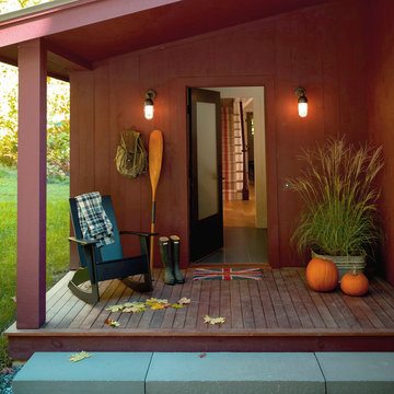
UserDesigned as a country retreat for a young couple from New York City, this compact project plays with the idea of a modern cabin. Containing 3 bedrooms and 2 full bathrooms in under 2,000 sqft, the house exploits the use of glass and outdoors rooms to expand its virtual space and connection to nature.
The aesthetics of the house reflect the nature of its owners; while very modest and private on the outside, it is full of light and openness on the inside.
The project's interior design creates a youthful and relaxed atmosphere, while maintaining a timelessness and simplicity appropriate to its New England heritage.
http://chattmanphotography.com/
 Ward+Blake Architects
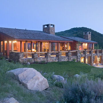
This custom residence exploits its southern exposure with a daylight basement that opens out to unencumbered mountain views. Interior finishes such as inlaid wood ceilings, Oklahoma sandstone masonry, and log wrapped steel columns, carry the ubiquitous natural tones of the site into the interior with a refined touch. Designed by Ward+Blake Architects in Jackson, Wyoming.
Photo Credit: Douglas Kahn
 User
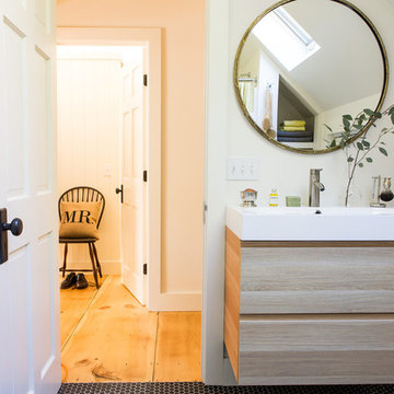
UserDesigned as a country retreat for a young couple from New York City, this compact project plays with the idea of a modern cabin. Containing 3 bedrooms and 2 full bathrooms in under 2,000 sqft, the house exploits the use of glass and outdoors rooms to expand its virtual space and connection to nature.
The aesthetics of the house reflect the nature of its owners; while very modest and private on the outside, it is full of light and openness on the inside.
The project's interior design creates a youthful and relaxed atmosphere, while maintaining a timelessness and simplicity appropriate to its New England heritage.
http://chattmanphotography.com/
Find the right local pro for your project
 User
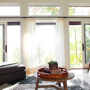
UserDesigned as a country retreat for a young couple from New York City, this compact project plays with the idea of a modern cabin. Containing 3 bedrooms and 2 full bathrooms in under 2,000 sqft, the house exploits the use of glass and outdoors rooms to expand its virtual space and connection to nature.
The aesthetics of the house reflect the nature of its owners; while very modest and private on the outside, it is full of light and openness on the inside.
The project's interior design creates a youthful and relaxed atmosphere, while maintaining a timelessness and simplicity appropriate to its New England heritage.
http://chattmanphotography.com/
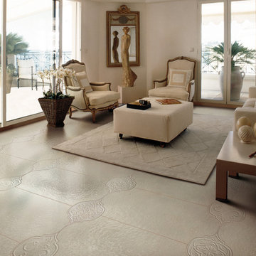
 Exclusive Home Interiors
Make a dream of your world
Unico is an amazing new collection reborn from the traditional Provençal Tile.
Angelo Marchesi’s idea was to re-propose the antique size exploiting the most modern technologies used for the biggest sizes in ceramic. The result is a collection of unbelievable aesthetical innovation. The echo of the ancient style becomes wider and wider and finds a new strong expression, and becomes almost honiric suggestion.
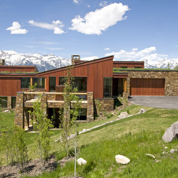 Ward+Blake Architects
This custom residence exploits its southern exposure with a daylight basement that opens out to unencumbered mountain views. Interior finishes such as inlaid wood ceilings, Oklahoma sandstone masonry, and log wrapped steel columns, carry the ubiquitous natural tones of the site into the interior with a refined touch. Designed by Ward+Blake Architects in Jackson, Wyoming.
Photo Credit: Douglas Kahn
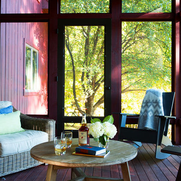 User
UserDesigned as a country retreat for a young couple from New York City, this compact project plays with the idea of a modern cabin. Containing 3 bedrooms and 2 full bathrooms in under 2,000 sqft, the house exploits the use of glass and outdoors rooms to expand its virtual space and connection to nature.
The aesthetics of the house reflect the nature of its owners; while very modest and private on the outside, it is full of light and openness on the inside.
The project's interior design creates a youthful and relaxed atmosphere, while maintaining a timelessness and simplicity appropriate to its New England heritage.
http://chattmanphotography.com/
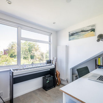
 Number 39: Architectural Design
Dalston revamp: Hackney, London: 1000sqft
Flat renovation and new dormer loft conversion.
Beautiful materials, bespoke detailing and clever use of space exploit the maximum potential of this compact 1960’s 1st floor flat and roof space.
Approval for the layout was achieved with the introduction of a sprinkler system allowing a new staircase to rise from the living room and form an under-stairs wardrobe space in the bedroom below, further allowing two new bedrooms, an en-suite, walk-in wardrobe and eves storage areas to be created in the loft space.
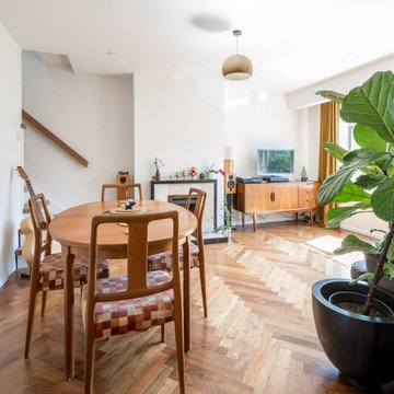 Number 39: Architectural Design
Dalston revamp: Hackney, London: 1000sqft
Flat renovation and new dormer loft conversion.
Beautiful materials, bespoke detailing and clever use of space exploit the maximum potential of this compact 1960’s 1st floor flat and roof space.
Approval for the layout was achieved with the introduction of a sprinkler system allowing a new staircase to rise from the living room and form an under-stairs wardrobe space in the bedroom below, further allowing two new bedrooms, an en-suite, walk-in wardrobe and eves storage areas to be created in the loft space.
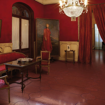 Exclusive Home Interiors
Make a dream of your world
Unico is an amazing new collection reborn from the traditional Provençal Tile.
Angelo Marchesi’s idea was to re-propose the antique size exploiting the most modern technologies used for the biggest sizes in ceramic. The result is a collection of unbelievable aesthetical innovation. The echo of the ancient style becomes wider and wider and finds a new strong expression, and becomes almost honiric suggestion.
 Groupe 3R
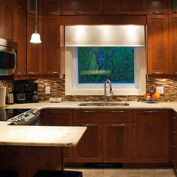
Cuisine traditionnelle avec ses portes de bois « shaker » plus contemporaines amène une touche actuelle à ce design. La teinte brun caramel des armoires est bien complétée avec le granit clair du comptoir et le dosseret. D’ailleurs, monter les cabinets jusqu’au plafond ajoute beaucoup de rangement et exploite bien la hauteur de la pièce. Pour éviter un effet massif, faire une rangée de portes dans le haut est une excellente idée, en plus de l’ajout de portes vitrées à certains endroits.
 Tammara Stroud Design
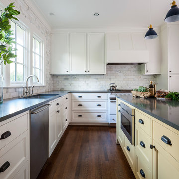
Nestled on a corner lot in the Madrona neighborhood, we chose to exploit the abundance of natural light in this 1905 home. We worked with Board & Vellum to remodel this residence from the dining and living rooms to the kitchen and powder room. Our client loved bold rich colors, perfect in combination with the natural lighting of the home. We used blue hues throughout, mirroring the palette in the details of the accessories and artwork. We balanced the deep shades in the kitchen with coastal grey quartz and honed Calacatta Marble backsplash, extending from the countertop to the ceiling. Filling the main space with comfortable furniture married with a collection of colors, textures, and patterns proved for cohesive balanced style.
DATE COMPLETED – 2016
LOCATION – SEATTLE, WA
PHOTOGRAPHY – JOHN GRANEN PHOTOGRAPHY
 Tammara Stroud Design
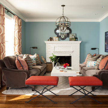
Nestled on a corner lot in the Madrona neighborhood, we chose to exploit the abundance of natural light in this 1905 home. We worked with Board & Vellum to remodel this residence from the dining and living rooms to the kitchen and powder room. Our client loved bold rich colors, perfect in combination with the natural lighting of the home. We used blue hues throughout, mirroring the palette in the details of the accessories and artwork. We balanced the deep shades in the kitchen with coastal grey quartz and honed Calacatta Marble backsplash, extending from the countertop to the ceiling. Filling the main space with comfortable furniture married with a collection of colors, textures, and patterns proved for cohesive balanced style.
DATE COMPLETED – 2016
LOCATION – SEATTLE, WA
PHOTOGRAPHY – JOHN GRANEN PHOTOGRAPHY
 Ward+Blake Architects
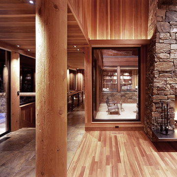
This custom residence exploits its southern exposure with a daylight basement that opens out to unencumbered mountain views. Interior finishes such as inlaid wood ceilings, Oklahoma sandstone masonry, and log wrapped steel columns, carry the ubiquitous natural tones of the site into the interior with a refined touch. Designed by Ward+Blake Architects in Jackson, Wyoming.
Photo Credit: Douglas Kahn
 Ward+Blake Architects
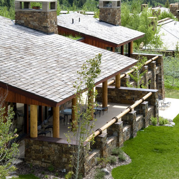
This custom residence exploits its southern exposure with a daylight basement that opens out to unencumbered mountain views. Interior finishes such as inlaid wood ceilings, Oklahoma sandstone masonry, and log wrapped steel columns, carry the ubiquitous natural tones of the site into the interior with a refined touch. Designed by Ward+Blake Architects in Jackson, Wyoming.
Photo Credit: Douglas Kahn
 Michael Nash Design, Build & Homes
2010 NATIONAL NARI REGIONAL AWARD WINNER
Project Scope
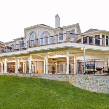
The owners of this 7,000 square foot colonial in Oakton, Virginia, were seeking a multi-level Mediterranean-style indoor/outdoor living space off the back of their home. They turned to Michael Nash Design, Build & Homes for a design solution that would include a stone patio, a second-story deck, a screened-in porch and linking staircases.
While the structure was designed primarily for family dining and entertaining, it also had to accommodate periodic social gatherings of one hundred guests or more. To meet these needs, the project would include a fully-equipped outdoor kitchen, several serving counters with permanent refrigeration, and well-delineated socializing and dining zones.
The existing home’s setting offered several impressive assets the new outdoor living area was designed to exploit. The sprawling acreage features old stand trees, wooded paths and a private lake. Beautifully landscaped, it unfolds as an idyllic panorama that naturally draws people to the outdoors.
Challenges
Since the rear elevation was situated on a slope that drops away from the house, the Michael Nash team had to raise the grade two feet within in a 2,000 square foot area extending out from the back of the house. Infrastructure plans also called for a sophisticated drainage system that had to accommodate a whole series of water “runoff” considerations to be integrated into the decking itself. Excavation included constructing retaining walls to bolster the elevated grade—which also had to support a concrete slab, the primary foundation for the entire complex.
Solutions
The ground level decking consists of a 2,000 square foot flagstone patio level with the home’s lower level doors. There is a decorative water fountain mid-patio—an ornate collectible acquired in Florida. Food preparation is concentrated within a specially designed semi-circular wall that creates an “outdoor kitchen” equipped with a 60” Viking barbecue grill, a prep sink, a warming drawer, refrigerator and appropriate storage. There is a granite surfaced dining counter with seating for eight.
Wrought iron railing and approximately 20 decorative columns (some encasing steel vertical supports) are incorporated into the design scheme. Many of the columns house accent lights.
The top level—supported by horizontal steel beams– is a 2,500 square foot deck constructed entirely of Trex decking. The open air decking is, again, directly accessible from rooms on the second level of the house including the kitchen, sunroom and family room.
The platform’s most prominent feature is a U-shaped “kitchenette” with cedar shake shingle roofing. Like its counterpart one level below, the facility is equipped with grill, refrigerator and stainless steel cabinetry.
One portion of the deck has been allocated for a 16’ x 16’ octagonal screened-in porch crowned by a pair of 2’ x 4’ skylights. The porch can be accessed from the home’s conservatory via a set of French doors. With its mosaic tile flooring, stained cedar panel ceiling and honed granite counters, the interior is elegant and calming. Hand-painted stenciling and a wall-mounted water feature provide distinctive detailing.
Finally, the design introduced elements to highlight and reinforce an awareness of the lovely bucolic setting. Fountains and water features combined with textured surfaces and mosaic tiling and backsplashes to present a villa-like ambiance well-suited to the Virginia countryside.
 Exclusive Home Interiors
Make a dream of your world
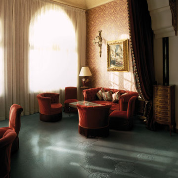
Unico is an amazing new collection reborn from the traditional Provençal Tile.
Angelo Marchesi’s idea was to re-propose the antique size exploiting the most modern technologies used for the biggest sizes in ceramic. The result is a collection of unbelievable aesthetical innovation. The echo of the ancient style becomes wider and wider and finds a new strong expression, and becomes almost honiric suggestion.
 Exclusive Home Interiors
Make a dream of your world
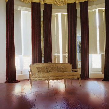
Unico is an amazing new collection reborn from the traditional Provençal Tile.
Angelo Marchesi’s idea was to re-propose the antique size exploiting the most modern technologies used for the biggest sizes in ceramic. The result is a collection of unbelievable aesthetical innovation. The echo of the ancient style becomes wider and wider and finds a new strong expression, and becomes almost honiric suggestion.
 Exclusive Home Interiors
Make a dream of your world
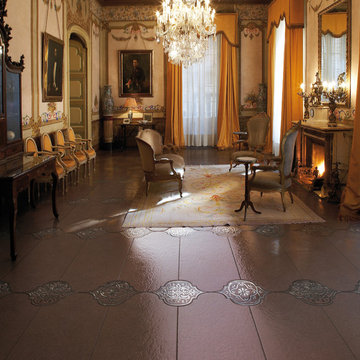
Unico is an amazing new collection reborn from the traditional Provençal Tile.
Angelo Marchesi’s idea was to re-propose the antique size exploiting the most modern technologies used for the biggest sizes in ceramic. The result is a collection of unbelievable aesthetical innovation. The echo of the ancient style becomes wider and wider and finds a new strong expression, and becomes almost honiric suggestion.
 Exclusive Home Interiors
Make a dream of your world
Unico is an amazing new collection reborn from the traditional Provençal Tile.
Angelo Marchesi’s idea was to re-propose the antique size exploiting the most modern technologies used for the biggest sizes in ceramic. The result is a collection of unbelievable aesthetical innovation. The echo of the ancient style becomes wider and wider and finds a new strong expression, and becomes almost honiric suggestion.
7