Search results for "Exploit" in Home Design Ideas
Located on a marsh in the upper reaches of the Lieutenant River in Old Lyme, the existing house was well-sited and well-built, but the design failed to exploit the views and more importantly was a confused combination of contemporary and traditional elements. The new homeowners, a successful businesswoman and an accomplished artist and photographer, were interested in creating a fully-contemporary environment to open up space, connect indoors with outdoors, display artwork and showcase the husband’s distinctive photographs.
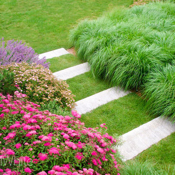
One glaring deficiency was the curb appeal and approach sequence: the grade sloped down and the path to the house followed, but this led to an uncomfortable dip and abrupt rise to the front door. By creating a virtual “moat,” occupied by a grid of raised-bed grasses contained in aluminum-clad boxes, and spanning the moat with an ipe bridge, the approach becomes level and engaging. The façade of the existing house was blank and bland, and with no cover. Adding a deep overhang with a wide porch creates a welcoming, covered condition, accentuated by a 6’ wide pivoting front door that feels more like a moving piece of wall.
Another deficiency was the connection to the outdoors. By adding glass to the front and back of the house, and removing interior walls selectively, the house takes on a diaphanous quality that allows one to see through to the marsh beyond, even when in the driveway. The raised-bed grasses act as abstract, geometric versions of the marsh beyond. A large, pyramidal skylight establishes a spatial hierarchy around which the rooms revolve.
The house featured several tray-ceilinged spaces – living room, kitchen, and master bedroom – that were poorly-proportioned and with panels at the top that resembled inset flat panel doors. The solution was to use a different strategy for each: the bedroom turns the ceiling into an eggshell through the use of a creative trim detail; the living room has an oversized sculptural, backlit lighting element; and the kitchen has a collage of painted rectangular forms that support or include lighting pieces.
A palette of concrete, blackened steel, stainless steel and colors carefully chosen by homeowner and architect create an interior and exterior environment punctuated by moments that are as artistic as the featured works in the black-ceilinged gallery.

Make a dream of your world
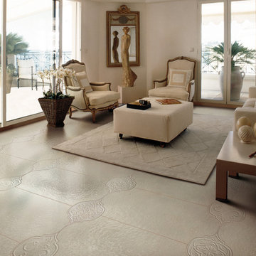
Unico is an amazing new collection reborn from the traditional Provençal Tile.
Angelo Marchesi’s idea was to re-propose the antique size exploiting the most modern technologies used for the biggest sizes in ceramic. The result is a collection of unbelievable aesthetical innovation. The echo of the ancient style becomes wider and wider and finds a new strong expression, and becomes almost honiric suggestion.
Find the right local pro for your project
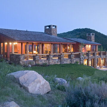
Perfectly poised to exploit zen-like lake views, this modern family home is a convergence of Frank Lloyd Wright’s signature Western architectural notes and 21st-century luxury. A dramatic interplay of a variety of stone, metal and glass, the L-shaped, 2-story, 4,300-square-foot structure proudly takes its place at water's edge in the lush and beautiful country club setting of Bentwater on Lake Conroe in Montgomery, TX.

Confronted with the problem of replacing a deteriorated exterior staircase and porch, the Owners of this Pittsburgh Ranch Home asked Dunn and Associates what they recommend. Instead of replacing the Porch in kind, we recommended creating a new Atrium Entry that relocates the entry door at ground level rather than a story above. This not only made for easier and safe access to the home, but created a naturally-lighted volume that exploits a magnificent view of the river valley. The Atrium breathed new life into an otherwise tight and disjointed living area. Once the Owner stains the existing house brick and replaces the gable siding (Phase II), the house will have a totally new and cohesive appearance. The deep overhang provides summer shading and the iron-spot brick lends a rich modern appearance to the stereotypical ranch design

Make a dream of your world
Unico is an amazing new collection reborn from the traditional Provençal Tile.
Angelo Marchesi’s idea was to re-propose the antique size exploiting the most modern technologies used for the biggest sizes in ceramic. The result is a collection of unbelievable aesthetical innovation. The echo of the ancient style becomes wider and wider and finds a new strong expression, and becomes almost honiric suggestion.
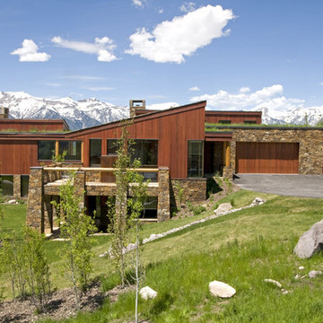
Located on a marsh in the upper reaches of the Lieutenant River in Old Lyme, the existing house was well-sited and well-built, but the design failed to exploit the views and more importantly was a confused combination of contemporary and traditional elements. The new homeowners, a successful businesswoman and an accomplished artist and photographer, were interested in creating a fully-contemporary environment to open up space, connect indoors with outdoors, display artwork and showcase the husband’s distinctive photographs.
One glaring deficiency was the curb appeal and approach sequence: the grade sloped down and the path to the house followed, but this led to an uncomfortable dip and abrupt rise to the front door. By creating a virtual “moat,” occupied by a grid of raised-bed grasses contained in aluminum-clad boxes, and spanning the moat with an ipe bridge, the approach becomes level and engaging. The façade of the existing house was blank and bland, and with no cover. Adding a deep overhang with a wide porch creates a welcoming, covered condition, accentuated by a 6’ wide pivoting front door that feels more like a moving piece of wall.
Another deficiency was the connection to the outdoors. By adding glass to the front and back of the house, and removing interior walls selectively, the house takes on a diaphanous quality that allows one to see through to the marsh beyond, even when in the driveway. The raised-bed grasses act as abstract, geometric versions of the marsh beyond. A large, pyramidal skylight establishes a spatial hierarchy around which the rooms revolve.
The house featured several tray-ceilinged spaces – living room, kitchen, and master bedroom – that were poorly-proportioned and with panels at the top that resembled inset flat panel doors. The solution was to use a different strategy for each: the bedroom turns the ceiling into an eggshell through the use of a creative trim detail; the living room has an oversized sculptural, backlit lighting element; and the kitchen has a collage of painted rectangular forms that support or include lighting pieces.
A palette of concrete, blackened steel, stainless steel and colors carefully chosen by homeowner and architect create an interior and exterior environment punctuated by moments that are as artistic as the featured works in the black-ceilinged gallery.

Located on a marsh in the upper reaches of the Lieutenant River in Old Lyme, the existing house was well-sited and well-built, but the design failed to exploit the views and more importantly was a confused combination of contemporary and traditional elements. The new homeowners, a successful businesswoman and an accomplished artist and photographer, were interested in creating a fully-contemporary environment to open up space, connect indoors with outdoors, display artwork and showcase the husband’s distinctive photographs.
One glaring deficiency was the curb appeal and approach sequence: the grade sloped down and the path to the house followed, but this led to an uncomfortable dip and abrupt rise to the front door. By creating a virtual “moat,” occupied by a grid of raised-bed grasses contained in aluminum-clad boxes, and spanning the moat with an ipe bridge, the approach becomes level and engaging. The façade of the existing house was blank and bland, and with no cover. Adding a deep overhang with a wide porch creates a welcoming, covered condition, accentuated by a 6’ wide pivoting front door that feels more like a moving piece of wall.
Another deficiency was the connection to the outdoors. By adding glass to the front and back of the house, and removing interior walls selectively, the house takes on a diaphanous quality that allows one to see through to the marsh beyond, even when in the driveway. The raised-bed grasses act as abstract, geometric versions of the marsh beyond. A large, pyramidal skylight establishes a spatial hierarchy around which the rooms revolve.
The house featured several tray-ceilinged spaces – living room, kitchen, and master bedroom – that were poorly-proportioned and with panels at the top that resembled inset flat panel doors. The solution was to use a different strategy for each: the bedroom turns the ceiling into an eggshell through the use of a creative trim detail; the living room has an oversized sculptural, backlit lighting element; and the kitchen has a collage of painted rectangular forms that support or include lighting pieces.
A palette of concrete, blackened steel, stainless steel and colors carefully chosen by homeowner and architect create an interior and exterior environment punctuated by moments that are as artistic as the featured works in the black-ceilinged gallery.

Vitality contemporary wardrobes and walk in wardrobes with new finishes and colours created to make each project unique and perfect, starting from the customization of the interior.
The accessories offer a new way of containing and exploiting space, giving the wardrobe a new look.
Let us design your wardrobes today by booking your appointment on www.the-design.gallery
We are located on 09 Parklands road, at Victoria courts on 2nd floor.
#colombinicasa #vitalitywardrobes #thedesigngalleryea #madeinitaly #availableinkenya #interiordesign #italianluxuryliving

A dysfunctional layout on the main floor included a tiny kitchen and dining room, both of which were disproportionate with other rooms in this sprawling five bedroom home. The spatial constraints didn’t allow for large gatherings nor was the kitchen remotely functional.
The removal of several interior walls, along with opening door entries to their maximum heights and widths provide greater flow and a more inviting atmosphere. Views to the garden were exploited by replacing one small window with a thirteen foot linear window in the kitchen.
Other windows were transformed into exterior doors for easy access to the large terrace leading to a swimming pool during summer months.
The kitchen is a luminous sanctuary, combining a serene palette of muted grey cabinetry and marbled quartz counters. Panels of white oak maintain minimal lines while concealing an abundance of storage. The former dining room gave way to a more casual experience, with a custom built-in banquette spanning the width of the kitchen.
Continuing the oak floors from the living room into the kitchen, creates a visual flow that was integral to the open concept of the main floor.

The decision to either renovate the upper and lower units of a duplex or convert them into a single-family home was a no-brainer. Situated on a quiet street in Montreal, the home was the childhood residence of the homeowner, where many memories were made and relationships formed within the neighbourhood. The prospect of living elsewhere wasn’t an option.
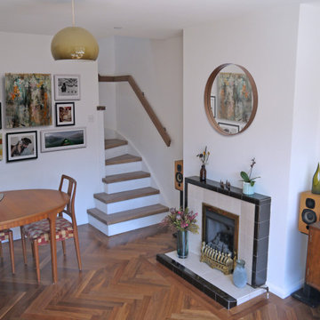
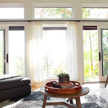
A complete overhaul included the re-configuration of three levels to accommodate the dynamic lifestyle of the empty nesters. The potential to create a luminous volume was evident from the onset. With the home backing onto a park, westerly views were exploited by oversized windows and doors. A massive window in the stairwell allows morning sunlight to filter in and create stunning reflections in the open concept living area below.
The staircase is an architectural statement combining two styles of steps, with the extended width of the lower staircase creating a destination to read, while making use of an otherwise awkward space.
White oak dominates the entire home to create a cohesive and natural context. Clean lines, minimal furnishings and white walls allow the small space to breathe.

S.J interior Solutions Rawalpindi & Islamabad.
There was a surge of requests for us to feature an dedicated to Kitchen Design. Due to the immense demand from all of you as promised today's write let us bring you through our Top 10 Best Kitchen Design compilation. But before that if you are new to this. Number 10 - Pellucid Oenophile A stylish kitchen design with a combination of black and solid veneer finish. .Number 9 - The Edge Pushing boundaries of the kitchen design a white sintered stone top by Cosentino slices across the dry kitchen making it an impactful statement yet subtly presenting the matte black kitchen cabinet at the foreground. .Number 8 – Celestial Beauty A sleek and modern kitchen which comes in a premium silver-flash lacquer finish. Equipped with multiple storage cabinets with built in organizers built-in wine chiller and a large 2 tier kitchen island paired with a stunning full height glass display cabinet on the side. Number 7 – The Vantage A mystique and opulent kitchen design that is furnished in black with highlighted glimpse of brass finishing. Number 6 – Altitude An interesting solution in space planning where the dining table is made adjacent to the kitchen island.Number 5 – Mangata A pleasantly designed modern kitchen fully integrated with grey aluminum carcass and doors. Number 4 – Earl of East A bar table amalgamates stylishly into a black quartz kitchen island. The kitchen space is highlighted with a timber feature ceiling which stages the kitchen as a powerful statement. Number 3 – Break of Dawn Unlike the rest of the kitchen design this project brings retro clashing with modernization. Number 2 - Villa 14 A subtle contrast of black and white cabinets laid on top of a majestic selection of granite floorings turns this kitchen design into a remarkable masterpiece. Number 1 – The Ascent A prominent kitchen design that depicts a class above all. A kitchen island that is substantially large complete with matching grains of a grey Saint Laurent marble top. This enormous island could be exploited in many ways be it for baking, roasting, chopping or mingling perfectly sized for entertainment. I hope you enjoyed today’s my name is Sunny Johnson and I am from S.J Interior Design Rawalpindi & Islamabad. Thank you for Read.

Vitality contemporary wardrobes and walk in wardrobes with new finishes and colours created to make each project unique and perfect, starting from the customization of the interior.
The accessories offer a new way of containing and exploiting space, giving the wardrobe a new look.
Let us design your wardrobes today by booking your appointment on www.the-design.gallery
We are located on 09 Parklands road, at Victoria courts on 2nd floor.
#colombinicasa #vitalitywardrobes #thedesigngalleryea #madeinitaly #availableinkenya #interiordesign #italianluxuryliving

The decision to either renovate the upper and lower units of a duplex or convert them into a single-family home was a no-brainer. Situated on a quiet street in Montreal, the home was the childhood residence of the homeowner, where many memories were made and relationships formed within the neighbourhood. The prospect of living elsewhere wasn’t an option.
A complete overhaul included the re-configuration of three levels to accommodate the dynamic lifestyle of the empty nesters. The potential to create a luminous volume was evident from the onset. With the home backing onto a park, westerly views were exploited by oversized windows and doors. A massive window in the stairwell allows morning sunlight to filter in and create stunning reflections in the open concept living area below.
The staircase is an architectural statement combining two styles of steps, with the extended width of the lower staircase creating a destination to read, while making use of an otherwise awkward space.
White oak dominates the entire home to create a cohesive and natural context. Clean lines, minimal furnishings and white walls allow the small space to breathe.

A dysfunctional layout on the main floor included a tiny kitchen and dining room, both of which were disproportionate with other rooms in this sprawling five bedroom home. The spatial constraints didn’t allow for large gatherings nor was the kitchen remotely functional.
The removal of several interior walls, along with opening door entries to their maximum heights and widths provide greater flow and a more inviting atmosphere. Views to the garden were exploited by replacing one small window with a thirteen foot linear window in the kitchen.
Other windows were transformed into exterior doors for easy access to the large terrace leading to a swimming pool during summer months.
The kitchen is a luminous sanctuary, combining a serene palette of muted grey cabinetry and marbled quartz counters. Panels of white oak maintain minimal lines while concealing an abundance of storage. The former dining room gave way to a more casual experience, with a custom built-in banquette spanning the width of the kitchen.
Continuing the oak floors from the living room into the kitchen, creates a visual flow that was integral to the open concept of the main floor.

A dysfunctional layout on the main floor included a tiny kitchen and dining room, both of which were disproportionate with other rooms in this sprawling five bedroom home. The spatial constraints didn’t allow for large gatherings nor was the kitchen remotely functional.
The removal of several interior walls, along with opening door entries to their maximum heights and widths provide greater flow and a more inviting atmosphere. Views to the garden were exploited by replacing one small window with a thirteen foot linear window in the kitchen.
Other windows were transformed into exterior doors for easy access to the large terrace leading to a swimming pool during summer months.
The kitchen is a luminous sanctuary, combining a serene palette of muted grey cabinetry and marbled quartz counters. Panels of white oak maintain minimal lines while concealing an abundance of storage. The former dining room gave way to a more casual experience, with a custom built-in banquette spanning the width of the kitchen.
Continuing the oak floors from the living room into the kitchen, creates a visual flow that was integral to the open concept of the main floor.

The decision to either renovate the upper and lower units of a duplex or convert them into a single-family home was a no-brainer. Situated on a quiet street in Montreal, the home was the childhood residence of the homeowner, where many memories were made and relationships formed within the neighbourhood. The prospect of living elsewhere wasn’t an option.
A complete overhaul included the re-configuration of three levels to accommodate the dynamic lifestyle of the empty nesters. The potential to create a luminous volume was evident from the onset. With the home backing onto a park, westerly views were exploited by oversized windows and doors. A massive window in the stairwell allows morning sunlight to filter in and create stunning reflections in the open concept living area below.
The staircase is an architectural statement combining two styles of steps, with the extended width of the lower staircase creating a destination to read, while making use of an otherwise awkward space.
White oak dominates the entire home to create a cohesive and natural context. Clean lines, minimal furnishings and white walls allow the small space to breathe.

The decision to either renovate the upper and lower units of a duplex or convert them into a single-family home was a no-brainer. Situated on a quiet street in Montreal, the home was the childhood residence of the homeowner, where many memories were made and relationships formed within the neighbourhood. The prospect of living elsewhere wasn’t an option.
A complete overhaul included the re-configuration of three levels to accommodate the dynamic lifestyle of the empty nesters. The potential to create a luminous volume was evident from the onset. With the home backing onto a park, westerly views were exploited by oversized windows and doors. A massive window in the stairwell allows morning sunlight to filter in and create stunning reflections in the open concept living area below.
The staircase is an architectural statement combining two styles of steps, with the extended width of the lower staircase creating a destination to read, while making use of an otherwise awkward space.
White oak dominates the entire home to create a cohesive and natural context. Clean lines, minimal furnishings and white walls allow the small space to breathe.

A dysfunctional layout on the main floor included a tiny kitchen and dining room, both of which were disproportionate with other rooms in this sprawling five bedroom home. The spatial constraints didn’t allow for large gatherings nor was the kitchen remotely functional.
The removal of several interior walls, along with opening door entries to their maximum heights and widths provide greater flow and a more inviting atmosphere. Views to the garden were exploited by replacing one small window with a thirteen foot linear window in the kitchen.
Other windows were transformed into exterior doors for easy access to the large terrace leading to a swimming pool during summer months.
The kitchen is a luminous sanctuary, combining a serene palette of muted grey cabinetry and marbled quartz counters. Panels of white oak maintain minimal lines while concealing an abundance of storage. The former dining room gave way to a more casual experience, with a custom built-in banquette spanning the width of the kitchen.
Continuing the oak floors from the living room into the kitchen, creates a visual flow that was integral to the open concept of the main floor.

The decision to either renovate the upper and lower units of a duplex or convert them into a single-family home was a no-brainer. Situated on a quiet street in Montreal, the home was the childhood residence of the homeowner, where many memories were made and relationships formed within the neighbourhood. The prospect of living elsewhere wasn’t an option.
A complete overhaul included the re-configuration of three levels to accommodate the dynamic lifestyle of the empty nesters. The potential to create a luminous volume was evident from the onset. With the home backing onto a park, westerly views were exploited by oversized windows and doors. A massive window in the stairwell allows morning sunlight to filter in and create stunning reflections in the open concept living area below.
The staircase is an architectural statement combining two styles of steps, with the extended width of the lower staircase creating a destination to read, while making use of an otherwise awkward space.
White oak dominates the entire home to create a cohesive and natural context. Clean lines, minimal furnishings and white walls allow the small space to breathe.
6