
Search results for "Extends" in Home Design Ideas
 KCBR Design | Remodel
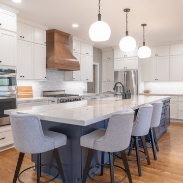
This full kitchen remodel was designed to bring in more light, improve functionality, and create a seamless flow for everyday living.
At the center of the space is a striking porcelain island, serving as both a visual focal point and a highly functional gathering area. A hooded range adds architectural presence, anchoring the kitchen and tying the overall design together. Cabinetry was extended to the ceiling to maximize storage and create a more refined, built-in look, while thoughtful storage solutions were integrated throughout for everyday ease.
To further enhance connection and flow, the back door was reworked to better link the kitchen to the outdoor deck, bringing in additional natural light and improving accessibility.
Beyond the kitchen, the project extended into the adjacent living room, where the fireplace was reimagined with custom built-in shelving and layered ambient lighting. This creates a cohesive transition between spaces, designed for both relaxation and entertaining.
The result is a home that feels elevated, functional, and thoughtfully connected, tailored to how the family lives day to day.
 MANDARINA STUDIO interior design
LOCATION: MILTON, MASSACHUSETTS
The renovation of this midcentury home centers on a complete transformation of the kitchen, which reshaped how the house functions and connects to its surroundings. The original layout relied on low cabinetry that failed to take advantage of the room’s generous volume. Mandarina Studio reworked the plan to improve circulation and take full advantage of the home’s soaring height and natural light.
The redesigned kitchen replaces a dated peninsula with a generously scaled island that supports both everyday use and entertaining. Cabinetry was reimagined vertically as well as horizontally, allowing storage and display to extend upward and reinforce the room’s proportions. A custom china cabinet with tall glass doors framed in blackened iron and finished in white oak adds presence and refinement.
At one end of the kitchen, a dedicated bar introduces a more intimate moment. Art, layered lighting, and wall-mounted sconces give this area its own identity, offering contrast to the openness of the main kitchen while supporting entertaining. Clerestory windows introduce shifting daylight throughout the day, bringing depth and movement to the quartzite focal wall at the range. Pendant lights reference midcentury forms in a refined, contemporary way. The completed kitchen was featured on the cover of Modern Luxury Interiors.
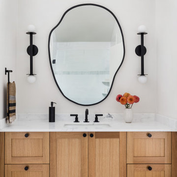
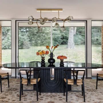
The renovation extended beyond the kitchen to include a new primary bath, a refreshed guest bath, and updated furnishings throughout the living and dining rooms. In the primary bath, marble with expressive veining is paired with a custom floating white oak vanity, balancing warmth and restraint. In the living room, a new picture window frames wooded views, while the furniture plan grounds the space. A turquoise Murano glass chandelier introduces color and artistry, adding a distinctive, personal note to the interior.
 MANDARINA STUDIO interior design
LOCATION: MILTON, MASSACHUSETTS
The renovation of this midcentury home centers on a complete transformation of the kitchen, which reshaped how the house functions and connects to its surroundings. The original layout relied on low cabinetry that failed to take advantage of the room’s generous volume. Mandarina Studio reworked the plan to improve circulation and take full advantage of the home’s soaring height and natural light.
The redesigned kitchen replaces a dated peninsula with a generously scaled island that supports both everyday use and entertaining. Cabinetry was reimagined vertically as well as horizontally, allowing storage and display to extend upward and reinforce the room’s proportions. A custom china cabinet with tall glass doors framed in blackened iron and finished in white oak adds presence and refinement.
At one end of the kitchen, a dedicated bar introduces a more intimate moment. Art, layered lighting, and wall-mounted sconces give this area its own identity, offering contrast to the openness of the main kitchen while supporting entertaining. Clerestory windows introduce shifting daylight throughout the day, bringing depth and movement to the quartzite focal wall at the range. Pendant lights reference midcentury forms in a refined, contemporary way. The completed kitchen was featured on the cover of Modern Luxury Interiors.
The renovation extended beyond the kitchen to include a new primary bath, a refreshed guest bath, and updated furnishings throughout the living and dining rooms. In the primary bath, marble with expressive veining is paired with a custom floating white oak vanity, balancing warmth and restraint. In the living room, a new picture window frames wooded views, while the furniture plan grounds the space. A turquoise Murano glass chandelier introduces color and artistry, adding a distinctive, personal note to the interior.
Find the right local pro for your project
 EAG Studio
Refined Continuity: Bridging Classical Architecture and Modern Living
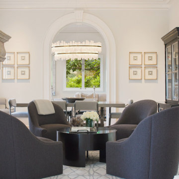
This comprehensive remodel of a grand Cow Hollow residence reimagines a historically expressive envelope through a lens of contemporary livability, precision detailing, and material restraint. The design approach carefully balances the home’s classical proportions and ornamental heritage with a refined, modern sensibility—evident in the disciplined palette of warm neutrals, soft plasters, pale oak flooring, and tailored millwork. Circulation has been clarified and subtly expanded to enhance spatial flow, while openings are leveraged to capture light, garden outlooks, and distant water views. Throughout, architectural interventions are executed with a high level of craft, ensuring that new insertions—whether cabinetry, railings, or apertures—read as seamless continuations of the original structure rather than applied elements.
The kitchen serves as the operational and visual anchor of the home, conceived as a sculptural yet highly functional environment. Custom rift-cut cabinetry, softened through a desaturated finish, is paired with honed stone surfaces and integrated brass hardware to create a quiet, tactile richness. A monolithic island establishes a central gathering point, while perimeter work zones are carefully layered with concealed storage, integrated appliances, and open, backlit shelving that elevates everyday objects into curated displays. The adjacent bar and entertaining areas extend this language, reinforcing a cohesive hospitality-driven program. In parallel, the primary bathroom is designed as a serene, spa-like retreat, where bookmatched stone, frameless glass enclosures, and finely detailed metalwork converge. The composition prioritizes symmetry, clarity, and light—balancing generous volumes with intimate moments through integrated lighting, custom vanities, and a restrained material hierarchy.
The library and ancillary living spaces introduce a more intimate scale, anchored by bespoke built-ins that combine closed storage with illuminated display niches, creating depth and rhythm along the walls. Here, material transitions and furniture integration are handled with particular nuance, allowing the architecture to support both quiet retreat and social gathering. A continuous language of custom railings—executed in refined metal profiles—threads through the interior and extends outward, where the exterior gate and garden elements have been reinterpreted to align with the home’s renewed identity. The entry sequence is now defined by a calibrated interplay of solidity and transparency, with sculptural metalwork and landscape integration establishing a sense of arrival that is both secure and elegant. Collectively, the project reflects a holistic transformation—one that elevates performance, livability, and aesthetic clarity while preserving the inherent dignity of the original architecture.
 StudioLAB
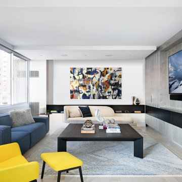
Close to Lincoln Center Plaza, two existing apartments were combined into a single custom tailored 4-bedroom residence. Characteristic with other buildings from the same post-war era, the existing apartments suffered greatly from a low, monotonous ceiling slab. To break up the ceiling, floating planes containing low-profile LED recessed lighting were incorporated throughout. Grey-washed birch veneer millwork is seen as you enter into the new foyer space. A blackened steel inlaid panel serves as a datum that continues throughout the apartment, wrapping the entry unit and extending around the corner to then transform into a floating bookshelf. The unit not only divides the entry area from the Living room, but also serves its utilitarian purpose on the foyer side as coat and storage closets, and then an entertaining function on the opposing side with a TV niche and custom liquor bar. Whitewashed rift and quartered white oak floors were used to brighten the space. In the kitchen, marble counters extend up the wall and onto the ceiling marking the separation of the kitchen/dining area from the living room/entry area. The kid’s room contains a custom curved desk area built beneath the bay windows to take advantage of the views. In the master bedroom, the blackened steel inlay reappears inset into the wardrobe wall unit.
 EAG Studio
Refined Continuity: Bridging Classical Architecture and Modern Living
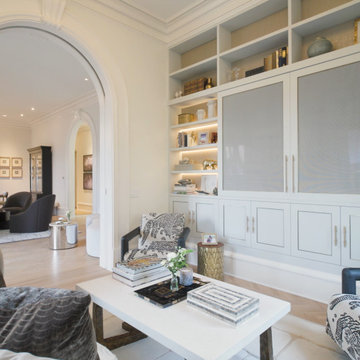
This comprehensive remodel of a grand Cow Hollow residence reimagines a historically expressive envelope through a lens of contemporary livability, precision detailing, and material restraint. The design approach carefully balances the home’s classical proportions and ornamental heritage with a refined, modern sensibility—evident in the disciplined palette of warm neutrals, soft plasters, pale oak flooring, and tailored millwork. Circulation has been clarified and subtly expanded to enhance spatial flow, while openings are leveraged to capture light, garden outlooks, and distant water views. Throughout, architectural interventions are executed with a high level of craft, ensuring that new insertions—whether cabinetry, railings, or apertures—read as seamless continuations of the original structure rather than applied elements.
The kitchen serves as the operational and visual anchor of the home, conceived as a sculptural yet highly functional environment. Custom rift-cut cabinetry, softened through a desaturated finish, is paired with honed stone surfaces and integrated brass hardware to create a quiet, tactile richness. A monolithic island establishes a central gathering point, while perimeter work zones are carefully layered with concealed storage, integrated appliances, and open, backlit shelving that elevates everyday objects into curated displays. The adjacent bar and entertaining areas extend this language, reinforcing a cohesive hospitality-driven program. In parallel, the primary bathroom is designed as a serene, spa-like retreat, where bookmatched stone, frameless glass enclosures, and finely detailed metalwork converge. The composition prioritizes symmetry, clarity, and light—balancing generous volumes with intimate moments through integrated lighting, custom vanities, and a restrained material hierarchy.
The library and ancillary living spaces introduce a more intimate scale, anchored by bespoke built-ins that combine closed storage with illuminated display niches, creating depth and rhythm along the walls. Here, material transitions and furniture integration are handled with particular nuance, allowing the architecture to support both quiet retreat and social gathering. A continuous language of custom railings—executed in refined metal profiles—threads through the interior and extends outward, where the exterior gate and garden elements have been reinterpreted to align with the home’s renewed identity. The entry sequence is now defined by a calibrated interplay of solidity and transparency, with sculptural metalwork and landscape integration establishing a sense of arrival that is both secure and elegant. Collectively, the project reflects a holistic transformation—one that elevates performance, livability, and aesthetic clarity while preserving the inherent dignity of the original architecture.
 Billdr Renovation
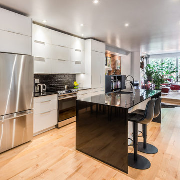
This kitchen was part of a project that consisted of transforming a duplex into a bi-generational house. The whole extension project includes two floors, a basement, and a new concrete foundation.
Underpinning work was required between the existing foundation and the new walls. We added masonry wall openings on the first and second floors to create a large open space on each level, extending to the new back-facing windows.
Underpinning work was required between the existing foundation and the new walls. We added masonry wall openings on the first and second floors to create a large open space on each level, extending to the new back-facing windows.


 EAG Studio
Refined Continuity: Bridging Classical Architecture and Modern Living
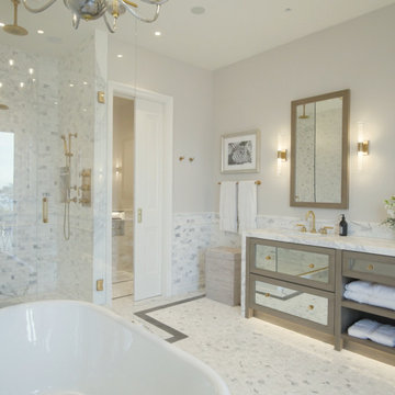
This comprehensive remodel of a grand Cow Hollow residence reimagines a historically expressive envelope through a lens of contemporary livability, precision detailing, and material restraint. The design approach carefully balances the home’s classical proportions and ornamental heritage with a refined, modern sensibility—evident in the disciplined palette of warm neutrals, soft plasters, pale oak flooring, and tailored millwork. Circulation has been clarified and subtly expanded to enhance spatial flow, while openings are leveraged to capture light, garden outlooks, and distant water views. Throughout, architectural interventions are executed with a high level of craft, ensuring that new insertions—whether cabinetry, railings, or apertures—read as seamless continuations of the original structure rather than applied elements.
The kitchen serves as the operational and visual anchor of the home, conceived as a sculptural yet highly functional environment. Custom rift-cut cabinetry, softened through a desaturated finish, is paired with honed stone surfaces and integrated brass hardware to create a quiet, tactile richness. A monolithic island establishes a central gathering point, while perimeter work zones are carefully layered with concealed storage, integrated appliances, and open, backlit shelving that elevates everyday objects into curated displays. The adjacent bar and entertaining areas extend this language, reinforcing a cohesive hospitality-driven program. In parallel, the primary bathroom is designed as a serene, spa-like retreat, where bookmatched stone, frameless glass enclosures, and finely detailed metalwork converge. The composition prioritizes symmetry, clarity, and light—balancing generous volumes with intimate moments through integrated lighting, custom vanities, and a restrained material hierarchy.
The library and ancillary living spaces introduce a more intimate scale, anchored by bespoke built-ins that combine closed storage with illuminated display niches, creating depth and rhythm along the walls. Here, material transitions and furniture integration are handled with particular nuance, allowing the architecture to support both quiet retreat and social gathering. A continuous language of custom railings—executed in refined metal profiles—threads through the interior and extends outward, where the exterior gate and garden elements have been reinterpreted to align with the home’s renewed identity. The entry sequence is now defined by a calibrated interplay of solidity and transparency, with sculptural metalwork and landscape integration establishing a sense of arrival that is both secure and elegant. Collectively, the project reflects a holistic transformation—one that elevates performance, livability, and aesthetic clarity while preserving the inherent dignity of the original architecture.

 Kitchen Intuitions
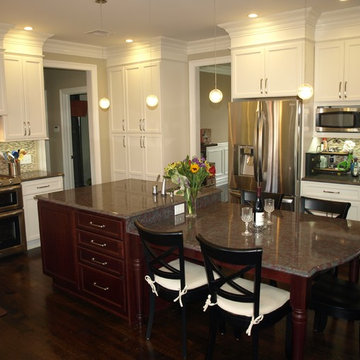
Open two-toned kitchen with white perimeter and a dark colored island that extends into a kitchen table. Dark granite countertops that contrast with the white and pair nicely with the dark island.
 Studio Industrielle
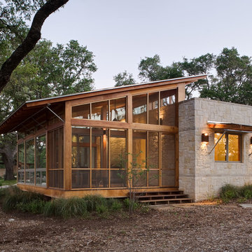
The program consists of a detached Guest House with full Kitchen, Living and Dining amenities, Carport and Office Building with attached Main house and Master Bedroom wing. The arrangement of buildings was dictated by the numerous majestic oaks and organized as a procession of spaces leading from the Entry arbor up to the front door. Large covered terraces and arbors were used to extend the interior living spaces out onto the site.
All the buildings are clad in Texas limestone with accent bands of Leuders limestone to mimic the local limestone cliffs in the area. Steel was used on the arbors and fences and left to rust. Vertical grain Douglas fir was used on the interior while flagstone and stained concrete floors were used throughout. The flagstone floors extend from the exterior entry arbors into the interior of the Main Living space and out onto the Main house terraces.
 Andrew Mikhael Architect
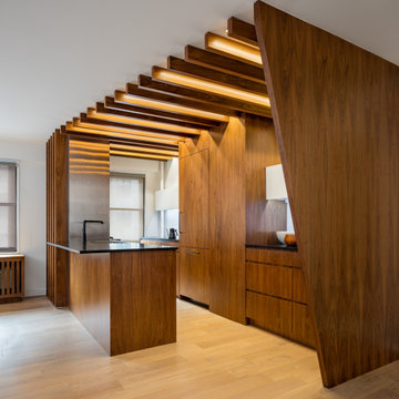
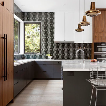
Inspiration for a galley medium tone wood floor and brown floor open concept kitchen remodel in New York with an undermount sink, flat-panel cabinets, medium tone wood cabinets, quartz countertops, white backsplash, glass sheet backsplash, paneled appliances, an island and black countertops
 David Coulson Design Ltd.
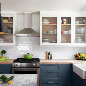
Example of a 1960s l-shaped light wood floor eat-in kitchen design in Other with a farmhouse sink, shaker cabinets, blue cabinets, wood countertops, white backsplash, subway tile backsplash, stainless steel appliances and an island

 Rostrata Builders, Inc.
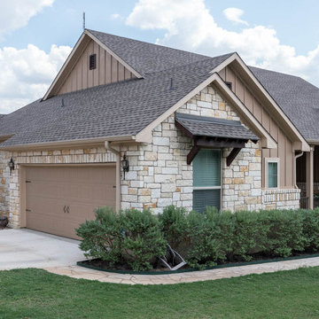
Example of a mid-sized classic beige one-story mixed siding gable roof design in Austin
 Design Builders, Inc.
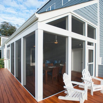
Large transitional screened-in back porch idea in DC Metro with decking and a roof extension
 Advance Design Studio, Ltd.
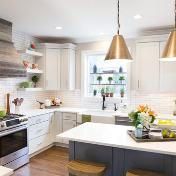
After six years of living in their Huntley IL home, Chris and Meghan were tired of their dark, dingy, outdated kitchen and it was finally time for a long-anticipated change. “The kitchen is the place where we live, it’s where we do everything,” Meghan said. “It was important that it be a space where we wanted to be.” Meghan loves cooking and enjoys including their girls in healthy meal prepping, this led them to want a brighter, more enjoyable kitchen with increased functionality and improved storage.
For Chris especially, the laundry room was an entirely dysfunctional eyesore. “We had a washer and a dryer, but it was all kind-of cobbled together!” Chris said. “There were always laundry piles everywhere, we weren’t really sure what we wanted to do in there, but it was time for us to make a change.” The mess of the space was stressful every time they walked in the door from the garage each day. Kids’ backpacks and shoes piled up haphazardly in the makeshift boot-bench closet left the family feeling disorganized and stressed. They needed space for folding clothes and locker cubbies to help keep the family organized.
Having known Christine and Todd in the Huntley community for years, Chris and Meghan were familiar with their work. “We already trusted them personally and having seen their projects for years we knew they did top notch work. After we reviewed the initial round of designs, we knew that hiring them was definitely the right choice,” Meghan and Chris said. Although Chris had done a lot of work in their home himself, the kitchen and laundry room renovation was such a large undertaking that he didn’t want to steal time away from his family to spend what would surely be many long weekends doing the job himself. “That would not have been a wise choice for us,” Chris laughed.
“Our designer, Michelle was very, very, easy to work with; anything we wanted to see or weren’t sure about, she went above and beyond to make this easy for us. She was easy to get hold of and always quick to respond,” the couple said. Michelle pulled ideas that mirrored the couple’s taste and style and was adept at directing the couple to limited choices that didn’t overwhelm them and kept the process moving. “I have a hard time making decisions. Michelle made the decision-making process so easy. I loved how she listened to what I liked and then presented three great options for me to choose from,” Meghan said.
The main objectives for the kitchen were better storage solutions, they wanted the space to reflect their lifestyle and taste, and they wanted it to last for years with low maintenance. One of the first steps in creating a more functional kitchen was relocating the refrigerator, creating an improved workflow for the busy family.
“We didn’t know that we could even move the refrigerator to a new location where it is now, that was something that we never would have thought of,” Chris said. “The new refrigerator location makes the kitchen feel so much bigger. We didn’t add any space, but our whole kitchen with the new design just seems like it’s so much larger than before!” Meghan said.
The perimeter mist colored cabinets helped warm and brighten the entire room, while the graphite colored cabinets on the island added contrast. Using this fresh, clean color palette satisfied the couple’s desire for a bright space that was the exact opposite of what they had before. Organization accessories were also added to the cabinets such as a spice drawer tray and roll outs to create hidden convenience.
“I absolutely love the hidden spices – it makes cooking so much more enjoyable!” Chris said. “And all the pull outs, and the double trash bin, who would think you could get so excited about organization!” the couple said in unison.
One thing they hated in their original kitchen was how dark the space felt. Added lighting on the ceiling with the new light fixtures combined with the lighter cabinetry colors throughout solved this problem. “Our new kitchen has this warm, almost cozy feeling that our old kitchen never had, it’s just a space that I love spending my time in now,” Meghan said. The light airy feeling was accentuated with the use of floating white shelves on either side of the decorative range hood. “We have so much cabinetry space, the new design is amazing we actually have more storage space than we will ever need,” Meghan said.
The island was extended to create more work surface and added space for stool seating. “The new island changes how we live. Now the kids can be in the kitchen with us, doing homework, eating breakfast, and the three of us have special dinners there when Chris is working late,” Meghan said.
The Carrara Marmi Quartz countertops were chosen because they are, not only beautiful, but are made from hard-working material that doesn’t require maintenance. The white subway tile backsplash that wraps to the ceiling behind the focal point cooktop range/hood compliments the crisp white countertops perfectly, while brushed brass hardware and light fixtures keep the design fresh and new.
The couple had a few fears at the beginning of the project, as most homeowners do. Their biggest fear was being out of their kitchen and laundry room for an extended time. The crew made it very easy for the family to work in a limited space keeping the washer and dryer hooked up the majority of the time, and also getting appliances working with minimal downtime.
“They above and beyond accommodated us to get us through the process,” Meghan said. “They did a great job making sure we were as comfortable as possible throughout the process,” Chris added.
“Our project manager DJ did a great job. He was very good at updating us on schedule changes, getting guys in as quickly as possible. Everyone that stepped in the house was nice and did great work,” said Chris. They thought Advance’s carpenter was phenomenal and were impressed when he took a conceptual idea from a photograph and worked with designer Michelle to create a one of a kind range/hood that has become the topic of conversation with friends and family who visit the new kitchen. “He was in our house literally every day for several weeks. He was easy to work with and good at what he did,” Meghan and Chris said.
The focal point of the kitchen; a hand-crafted, custom-built ventilation hood was clad with handpicked reclaimed barnwood. Advance Design’s carpenter built the framework and the cladding to create a one-of-a-kind design element that the couple loves.
“I think it was especially fun for him to create something unique from scratch, showcasing his talent in this area,” Meghan said. “I love that my kitchen is not like everyone else’s. I got to pick out the wood on my hood and watch it being built and was able to choose what pieces of wood went where on it. It’s totally unique.”
Red Oak flooring was toothed-in throughout the kitchen and the rest of the first floor anywhere changes were made. Then the whole floor was refinished to tone down the orange undertones in the existing floor stain, ultimately changing the color complexion of the entire first floor. The result is a completely new feeling to the entire home.
Renovating the laundry room was extremely important to Meghan and Chris, but they had trouble visualizing what the possibilities were for the seemingly small space. Michelle produced beautiful 3D illustrations that helped them envision the space in a whole new way.
“I must have told Michelle 100 times that I am a visual person, seeing the designs in 3D made it so easy to make decisions and see what we could really do with our space,” Meghan said.
A dividing wall and doorway were removed between the existing laundry room and hallway formerly containing a coat closet, providing space to design specialized graphite colored cabinetry matching the kitchen island to house custom storage cubbies for each family member. Adding the tall utility cabinetry in the new laundry area helped solve the storage issue, tucking away cleaning supplies, household items, and even the cat got its own cubby.
“I love how everything is now hidden in its own space. I can’t tell you how much I hated coming home and seeing everything sitting around on counters,” Chris said.
Electrical outlets were planned for the inside of utility cabinets, so devices could charge in hidden locations. Stacking the washer and dryer allowed for wider countertop space to provide a folding area and a special space for clothes to hang. “The way I do laundry has been completely transformed! I can actually fold clothes and hang them now right out of the washer and dryer,” Meghan said.
“The end result in the kitchen and the laundry/mud room was an updated light and bright space, with a smarter work flow that better meets the needs of this family,” Michelle said.
“I would totally recommend Advance Design,” Meghan said. “Sometimes I sit and just look at my kitchen and laundry room and think ‘Wow, I can’t believe I get to live here!’ It’s an understatement to say we love our new space.”
 Sweetlake Interior Design LLC
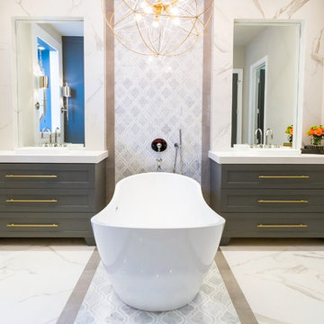
Master bathroom design & build in Houston Texas. This master bathroom was custom designed specifically for our client. She wanted a luxurious bathroom with lots of detail, down to the last finish. Our original design had satin brass sink and shower fixtures. The client loved the satin brass plumbing fixtures, but was a bit apprehensive going with the satin brass plumbing fixtures. Feeling it would lock her down for a long commitment. So we worked a design out that allowed us to mix metal finishes. This way our client could have the satin brass look without the commitment of the plumbing fixtures. We started mixing metals by presenting a chandelier made by Curry & Company, the "Zenda Orb Chandelier" that has a mix of silver and gold. From there we added the satin brass, large round bar pulls, by "Lewis Dolin" and the satin brass door knobs from Emtek. We also suspended a gold mirror in the window of the makeup station. We used a waterjet marble from Tilebar, called "Abernethy Marble." The cobalt blue interior doors leading into the Master Bath set the gold fixtures just right.
 CubeDepot
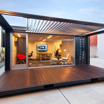
Structurally sound and aesthetically pleasing, this modular office space offers a rare blend of style, security, and simplicity. This modular office space is self- contained, contemporary, and cost- efficient. Installed with sliding glass windows and glass door for a clean and modern look.

43