
Search results for "Eye level" in Home Design Ideas
 Edgewater Design Group
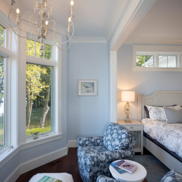
Our clients were relocating from the upper peninsula to the lower peninsula and wanted to design a retirement home on their Lake Michigan property. The topography of their lot allowed for a walk out basement which is practically unheard of with how close they are to the water. Their view is fantastic, and the goal was of course to take advantage of the view from all three levels. The positioning of the windows on the main and upper levels is such that you feel as if you are on a boat, water as far as the eye can see. They were striving for a Hamptons / Coastal, casual, architectural style. The finished product is just over 6,200 square feet and includes 2 master suites, 2 guest bedrooms, 5 bathrooms, sunroom, home bar, home gym, dedicated seasonal gear / equipment storage, table tennis game room, sauna, and bonus room above the attached garage. All the exterior finishes are low maintenance, vinyl, and composite materials to withstand the blowing sands from the Lake Michigan shoreline.
 Urban Oasis Design & Construction LLC
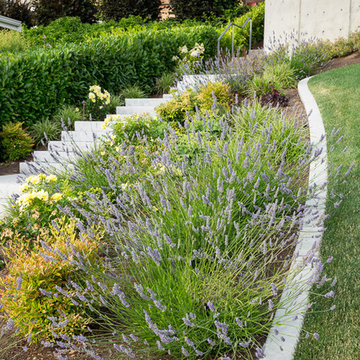
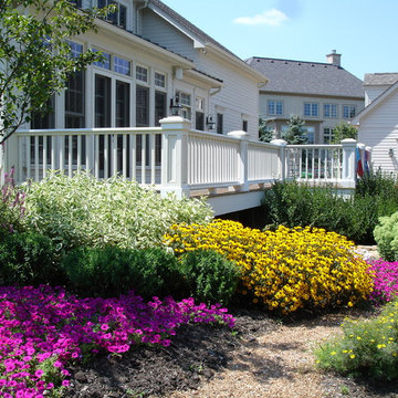
This new construction home was in need of a complete landscape design and installation. All details were considered to create intimate spaces as well as a sweeping backyard landscape to compliment the views from the home.
The home sits on two lots which allowed it to be built at the desired size.
The front yard includes a modern entry courtyard featuring bluestone, decorative gravel and granite sculpture - as well as decorative concrete planters.
The backyard has several levels. The upper level is an expanse of lawn with hedging. The middle tier planting softens the poured concrete wall. A steep slope descends to the street below. The homeowners wanted to create access from parking below to the home above, so a series of pavers and granite risers was designed to create a comfortable pathway that also forms the focal point of the backyard. Ecoturf lawn was installed on the slope to minimize the need for water and mowing. Concrete edging deliniates the lawn from the beds where a mixture of evergreen and deciduous plants create year-round interest.
The overall result includes modern details and some sweeping curves that draw the eye up to the home from the street below
Wiilam Wright Photography
 Alair Homes Plano
This house was built in 1994 and our clients have been there since day one. They wanted a complete refresh in their kitchen and living areas and a few other changes here and there; now that the kids were all off to college! They wanted to replace some things, redesign some things and just repaint others. They didn’t like the heavy textured walls, so those were sanded down, re-textured and painted throughout all of the remodeled areas.
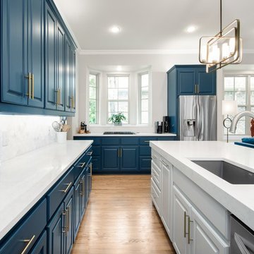
The kitchen change was the most dramatic by painting the original cabinets a beautiful bluish-gray color; which is Benjamin Moore Gentleman’s Gray. The ends and cook side of the island are painted SW Reflection but on the front is a gorgeous Merola “Arte’ white accent tile. Two Island Pendant Lights ‘Aideen 8-light Geometric Pendant’ in a bronze gold finish hung above the island. White Carrara Quartz countertops were installed below the Viviano Marmo Dolomite Arabesque Honed Marble Mosaic tile backsplash. Our clients wanted to be able to watch TV from the kitchen as well as from the family room but since the door to the powder bath was on the wall of breakfast area (no to mention opening up into the room), it took up good wall space. Our designers rearranged the powder bath, moving the door into the laundry room and closing off the laundry room with a pocket door, so they can now hang their TV/artwork on the wall facing the kitchen, as well as another one in the family room!
We squared off the arch in the doorway between the kitchen and bar/pantry area, giving them a more updated look. The bar was also painted the same blue as the kitchen but a cool Moondrop Water Jet Cut Glass Mosaic tile was installed on the backsplash, which added a beautiful accent! All kitchen cabinet hardware is ‘Amerock’ in a champagne finish.
In the family room, we redesigned the cabinets to the right of the fireplace to match the other side. The homeowners had invested in two new TV’s that would hang on the wall and display artwork when not in use, so the TV cabinet wasn’t needed. The cabinets were painted a crisp white which made all of their decor really stand out. The fireplace in the family room was originally red brick with a hearth for seating. The brick was removed and the hearth was lowered to the floor and replaced with E-Stone White 12x24” tile and the fireplace surround is tiled with Heirloom Pewter 6x6” tile.
The formal living room used to be closed off on one side of the fireplace, which was a desk area in the kitchen. The homeowners felt that it was an eye sore and it was unnecessary, so we removed that wall, opening up both sides of the fireplace into the formal living room. Pietra Tiles Aria Crystals Beach Sand tiles were installed on the kitchen side of the fireplace and the hearth was leveled with the floor and tiled with E-Stone White 12x24” tile.
The laundry room was redesigned, adding the powder bath door but also creating more storage space. Waypoint flat front maple cabinets in painted linen were installed above the appliances, with Top Knobs “Hopewell” polished chrome pulls. Elements Carrara Quartz countertops were installed above the appliances, creating that added space. 3x6” white ceramic subway tile was used as the backsplash, creating a clean and crisp laundry room! The same tile on the hearths of both fireplaces (E-Stone White 12x24”) was installed on the floor.
The powder bath was painted and 12x36” Ash Fiber Ceramic tile was installed vertically on the wall behind the sink. All hardware was updated with the Signature Hardware “Ultra”Collection and Shades of Light “Sleekly Modern” new vanity lights were installed.
All new wood flooring was installed throughout all of the remodeled rooms making all of the rooms seamlessly flow into each other. The homeowners love their updated home!
Design/Remodel by Hatfield Builders & Remodelers | Photography by Versatile Imaging
Find the right local pro for your project
 DCAM HOMES INC.
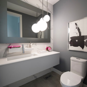
Custom built by DCAM HOMES, one of Oakville’s most reputable builders. South of Lakeshore and steps to the lake, this newly built modern custom home features over 3,200 square feet of stylish living space in a prime location!
This stunning home provides large principal rooms that flow seamlessly from one another. The open concept design features soaring 24-foot ceilings with floor to ceiling windows flooding the space with natural light. A home office is located off the entrance foyer creating a private oasis away from the main living area. The double storey ceiling in the family room automatically draws your eyes towards the open riser wood staircase, an architectural delight. This space also features an extra wide, 74” fireplace for everyone to enjoy.
The thoughtfully designed chef’s kitchen was imported from Italy. An oversized island is the center focus of this room. Other highlights include top of the line built-in Miele appliances and gorgeous two-toned touch latch custom cabinetry.
With everyday convenience in mind - the mudroom, with access from the garage, is the perfect place for your family to “drop everything”. This space has built-in cabinets galore – providing endless storage.
Upstairs the master bedroom features a modern layout with open concept spa-like master ensuite features shower with body jets and steam shower stand-alone tub and stunning master vanity. This master suite also features beautiful corner windows and custom built-in wardrobes. The second and third bedroom also feature custom wardrobes and share a convenient jack-and-jill bathroom. Laundry is also found on this level.
Beautiful outdoor areas expand your living space – surrounded by mature trees and a private fence, this will be the perfect end of day retreat!
This home was designed with both style and function in mind to create both a warm and inviting living space.
 Sunspace Design, Inc.
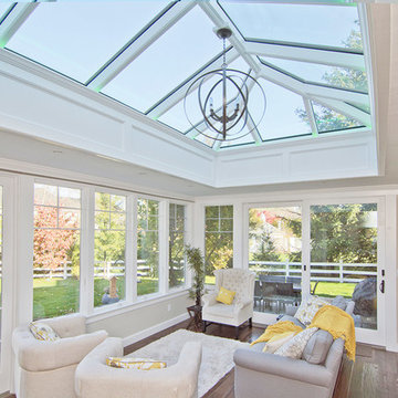
In 2014, these clients came to Sunspace with a sketch and a dream of enlarging their kitchen. The goal was to create a much larger, open room flooded with natural light. Sunspace worked with the clients to design a space that would meet their goals, and the results are presented here.
The most important facet of this project was the design and inclusion of a large double hip skylight centered in the ceiling of the new space. The size of the skylight required a concealed steel frame to carry the long spans and provide the desired levels of natural lighting.
Sunspace coordinated the entire project from design to kitchen renovation to completion. The space is open and light. Because the kitchen work area became part of the unified space, the client was left with a great place for family and friends to gather. Additional customization throughout the kitchen and the introduction of elegant wood flooring added to the appeal and warmth of this truly magnificent family space.
 Visbeen Architects
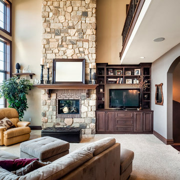
To the manor born… or at least it will feel like it in this elegant yet easygoing French Country home designed by Visbeen Architects with a busy family who wants the best of the past and the present in mind. Drawn from both French and English traditional architecture, this two-story 5,463-square-foot home is a pleasing and timeless blend of two perennially popular styles.
Driving up the circular driveway, the home’s front façade impresses with its distinctive details, including a covered porch, iron and stone accents, a roofline with multiple peaks, large windows and its central turret capping two bay windows. The back is no less eye-catching, with a series of large central windows on all three floors overlooking the backyard, two private balconies and both a covered second-floor screen porch and an open-air main-level patio perfect for al fresco entertaining.
There’s magic on the inside too. The expansive 2,900-square-foot main level revolves around a welcoming two-story foyer with a grand curved staircase that leads into the rest of the luxurious yet not excessive floor plan. Highlights of the public spaces on the left include a spacious two-story light-filled living room with a wall of windows overlooking the backyard and a fireplace, an adjacent dining room perfect for entertaining with its own deck, and a open-plan kitchen with central island, convenient home management area and walk-in pantry. A nearby screened porch is the perfect place for enjoying outdoors meals bug-free. Private rooms are concentrated on the first-floor’s right side, with a secluded master suite that includes spa-like bath with his and her vanities and a large tub as well as a private balcony, large walk-in closet and secluded nearby study/office.
Upstairs, another 1,100 square feet of living space is designed with family living in mind, including two bedrooms, each with private bath and large closet, and a convenient kids study with peaked ceiling overlooking the street. The central circular staircase leads to another 1,800 square-feet in the lower level, with a large family room with kitchen /bar, a guest bedroom suite, a handy exercise area and access to a nearby covered patio.
Photographer: Brad Gillette
 Urban Oasis Design & Construction LLC
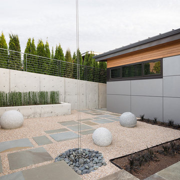
This new construction home was in need of a complete landscape design and installation. All details were considered to create intimate spaces as well as a sweeping backyard landscape to compliment the views from the home.
The home sits on two lots which allowed it to be built at the desired size.
The front yard includes a modern entry courtyard featuring bluestone, decorative gravel and granite sculpture - as well as decorative concrete planters.
The backyard has several levels. The upper level is an expanse of lawn with hedging. The middle tier planting softens the poured concrete wall. A steep slope descends to the street below. The homeowners wanted to create access from parking below to the home above, so a series of pavers and granite risers was designed to create a comfortable pathway that also forms the focal point of the backyard. Ecoturf lawn was installed on the slope to minimize the need for water and mowing. Concrete edging deliniates the lawn from the beds where a mixture of evergreen and deciduous plants create year-round interest.
The overall result includes modern details and some sweeping curves that draw the eye up to the home from the street below
Wiilam Wright Photography
Sponsored
Columbus, OH
Free consultation for landscape design!

Peabody Landscape Group
Columbus' Reliable Landscape Design & Contracting
 Stalburg Design
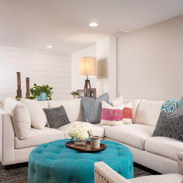
This Huntington Woods lower level renovation was recently finished in September of 2019. Created for a busy family of four, we designed the perfect getaway complete with custom millwork throughout, a complete gym, spa bathroom, craft room, laundry room, and most importantly, entertaining and living space.
From the main floor, a single pane glass door and decorative wall sconce invites us down. The patterned carpet runner and custom metal railing leads to handmade shiplap and millwork to create texture and depth. The reclaimed wood entertainment center allows for the perfect amount of storage and display. Constructed of wire brushed white oak, it becomes the focal point of the living space.
It’s easy to come downstairs and relax at the eye catching reclaimed wood countertop and island, with undercounter refrigerator and wine cooler to serve guests. Our gym contains a full length wall of glass, complete with rubber flooring, reclaimed wall paneling, and custom metalwork for shelving.
The office/craft room is concealed behind custom sliding barn doors, a perfect spot for our homeowner to write while the kids can use the Dekton countertops for crafts. The spa bathroom has heated floors, a steam shower, full surround lighting and a custom shower frame system to relax in total luxury. Our laundry room is whimsical and fresh, with rustic plank herringbone tile.
With this space layout and renovation, the finished basement is designed to be a perfect spot to entertain guests, watch a movie with the kids or even date night!
 Murphy Bros. Design | Build | Remodel
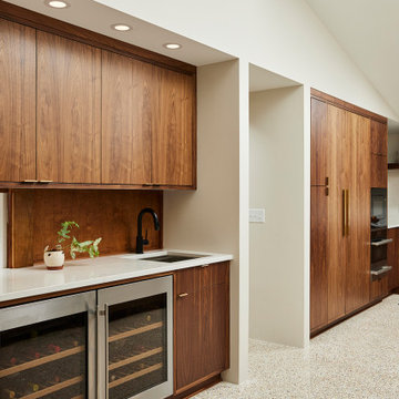
Our homeowners wanted to make this walk-out rambler their own while staying faithful to the character of this architect-designed, mid-century modern, Brooklyn Center residence.
We started with a full-scale kitchen remodel. Lots of quartz countertops, floating shelving, and cabinets in black walnut. The master and guest bathrooms were also reconfigured as was the lower-level bathroom.
On the lower level, we created a sauna, originally planned but never built. We also relocated the laundry out of the mechanical room and into an unused niche in the lower level and added a workout room. The ceilings were retextured, and the flooring was replaced.
To honor the mid-century style, we refinished some of the lower cabinets from the kitchen and designed them into a new wet bar now overlooking the river. As the final design element of ultimate cool, we added an eye-popping custom terrazzo floor in the kitchen and the entryway.
Overall, a remodel worthy of an architect's creation.
 Che Bella Interiors Design + Remodeling
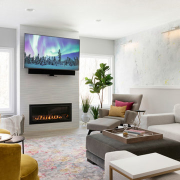
The clients lower level was in need of a bright and fresh perspective, with a twist of inspiration from a recent stay in Amsterdam. The previous space was dark, cold, somewhat rustic and featured a fireplace that too up way to much of the space. They wanted a new space where their teenagers could hang out with their friends and where family nights could be filled with colorful expression.
The pops of color are purposeful and not overwhelming, allowing your eye to travel around the room and take in all of the visual interest. A colorful rug and wallpaper mural were the jumping off point for colorful accessories. The fireplace tile adds a soft modern, yet artistic twist.
Check out the before photos for a true look at what was changed in the space.
Photography by Spacecrafting Photography
 TVL Creative Ltd.
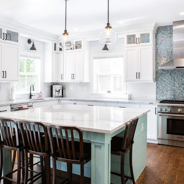
This project has been a labor of love for quite some time! The design ideas started flowing for this space back in 2016, and we are so excited to have recently completed the build-out process after our lengthy planning time frame. These wonderful clients completed a bathroom renovation with us last year, and we absolutely loved the charming, clean-lined farmhouse aesthetic we produced there. Wanting to carry that similar aesthetic into the kitchen, our clients hired us to transform their dated 90's builder-grade kitchen into a stunning showpiece for their home. While no major fixtures or appliances were relocated, nor were there major architectural changes, this space's transformation is a jaw-dropper. We began by removing the existing yellowed oak wood cabinets and replaced them with gorgeous custom cabinets from Tharp Cabinet Company. These cabinets are a very simple shaker style in a bright white paint color. We paired these fresh and bright cabinet with black hardware for a dramatic pop. We utilized the Blackrock pulls from Amerock and adore the playful contrast these pieces provide. On the backsplash, we used a very simple and understated white subway tile for a classic and timeless look that doesn't draw the eye away from the focal island or surrounding features. Over the range, we used a stunning mini-glass mosaic tile from TileBar that shimmers and showcases a variety of colors based on the time of day and light entry. The island is our favorite piece in this kitchen: a custom-built focal point from Tharp, painted in a gorgeous custom blue from Benjamin Moore. The island is topped with a dramatic slab of Arabescato from Pental Surfaces. On the perimeter cabinets, we've utilized the stunning White Fusion quartz, also from Pental. For final touches, we've utilized matte black wall sconces over the windows from Rejuvenation, and have a gorgeous sink faucet from Delta Faucet. Throughout the main level, we refinished the hardwood floors to bring them to a more soft, neutral brown color. New paint is carried throughout the house as well. We adore the bright simplicity of this space, and are so excited that our clients can enjoy this family friendly stunner for years to come!
 TVL Creative Ltd.
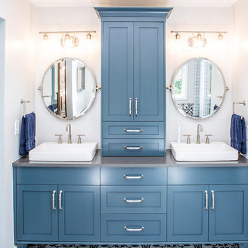
This project is an incredible transformation and the perfect example of successful style mixing! This client, and now a good friend of TVL (as they all become), is a wonderfully eclectic and adventurous one with immense interest in texture play, pops of color, and unique applications. Our scope in this home included a full kitchen renovation, main level powder room renovation, and a master bathroom overhaul. Taking just over a year to complete from the first design phases to final photos, this project was so insanely fun and packs an amazing amount of fun details and lively surprises. The original kitchen was large and fairly functional. However, the cabinetry was dated, the lighting was inefficient and frankly ugly, and the space was lacking personality in general. Our client desired maximized storage and a more personalized aesthetic. The existing cabinets were short and left the nice height of the space under-utilized. We integrated new gray shaker cabinets from Waypoint Living Spaces and ran them to the ceiling to really exaggerate the height of the space and to maximize usable storage as much as possible. The upper cabinets are glass and lit from within, offering display space or functional storage as the client needs. The central feature of this space is the large cobalt blue range from Viking as well as the custom made reclaimed wood range hood floating above. The backsplash along this entire wall is vertical slab of marble look quartz from Pental Surfaces. This matches the expanse of the same countertop that wraps the room. Flanking the range, we installed cobalt blue lantern penny tile from Merola Tile for a playful texture that adds visual interest and class to the entire room. We upgraded the lighting in the ceiling, under the cabinets, and within cabinets--we also installed accent sconces over each window on the sink wall to create cozy and functional illumination. The deep, textured front Whitehaven apron sink is a dramatic nod to the farmhouse aesthetic from KOHLER, and it's paired with the bold and industrial inspired Tournant faucet, also from Kohler. We finalized this space with other gorgeous appliances, a super sexy dining table and chair set from Room & Board, the Paxton dining light from Pottery Barn and a small bar area and pantry on the far end of the space. In the small powder room on the main level, we converted a drab builder-grade space into a super cute, rustic-inspired washroom. We utilized the Bonner vanity from Signature Hardware and paired this with the cute Ashfield faucet from Pfister. The most unique statements in this room include the water-drop light over the vanity from Shades Of Light, the copper-look porcelain floor tile from Pental Surfaces and the gorgeous Cashmere colored Tresham toilet from Kohler. Up in the master bathroom, elegance abounds. Using the same footprint, we upgraded everything in this space to reflect the client's desire for a more bright, patterned and pretty space. Starting at the entry, we installed a custom reclaimed plank barn door with bold large format hardware from Rustica Hardware. In the bathroom, the custom slate blue vanity from Tharp Cabinet Company is an eye catching statement piece. This is paired with gorgeous hardware from Amerock, vessel sinks from Kohler, and Purist faucets also from Kohler. We replaced the old built-in bathtub with a new freestanding soaker from Signature Hardware. The floor tile is a bold, graphic porcelain tile with a classic color scheme. The shower was upgraded with new tile and fixtures throughout: new clear glass, gorgeous distressed subway tile from the Castle line from TileBar, and a sophisticated shower panel from Vigo. We finalized the space with a small crystal chandelier and soft gray paint. This project is a stunning conversion and we are so thrilled that our client can enjoy these personalized spaces for years to come. Special thanks to the amazing Ian Burks of Burks Wurks Construction for bringing this to life!
 Banker Wire
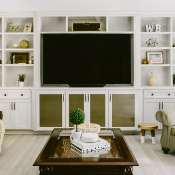
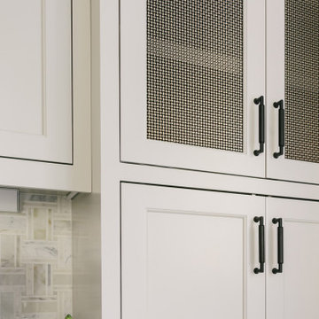
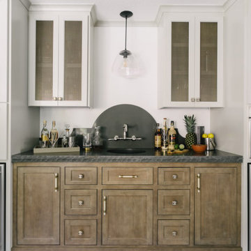
This California residence went from dark and dull to modern and bright with the help of Woodcliff Builders designer Jessica Peters. Remodeled with the thought of entertaining guests in mind, form and functionality played equal roles in the design process. Light cream tones wash over the home, punctuated by the bold statement that Banker Wire’s S-12 makes in it’s Antique Brass plated finish. This woven wire mesh pattern catches the eye throughout the kitchen, living room, and bar as various cabinet door infills.
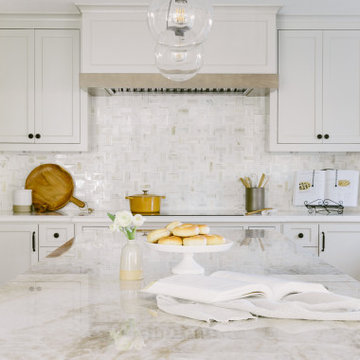
The unique texture of S-12 brings balance to the stark contrasting color scheme throughout the kitchen. While the open-concept room boasts predominantly pale features, the highlights of the Antique Brass finish draw out the deeper rich tones in the white marble backsplash and counter tops. The shadows created by the weave of the wire mesh help tie in the dark accents in the kitchen, including the black light fixtures and the oil-rubbed bronze cabinet and drawer hardware.
Across from the kitchen, the eye is drawn to the main focal point of the living room, the built-in bookshelves. Banker Wire’s S-12 clads the four central cabinet doors, creating a unique hideaway for television components and other electronics. The Antique Brass finish brings warmth into the otherwise neutral structure, complimented by the displayed curios and the cozy furniture surrounding it. Both the wire mesh and the oil-rubbed bronze hardware are carried over from the kitchen, making for a cohesive home design.
In the home’s custom bar, S-12 adorns the front of the ceiling-high white cabinets. For this area, the former cabinet and drawer pulls have been replaced with brass and ivory colored hardware, underscoring the brass of the cabinet’s panel. Emphasized by the dark stone counter-top, the lowlights of the pattern accentuate the texture of the mesh, while the Antique Brass face coordinates with the wood of the lower cabinets, bringing a consistent appearance to the space.
“I just love that extra level of detail that this wire mesh provides for cabinets,” states Peters. “It really takes the design to the next level.”
The low open area of woven wire mesh pattern S-12 lends itself well to surfacing, cladding, and other applications where partial coverage is key. At 21.6%, only subtle glimpses will be perceptible through the mesh. Embossed and highly faceted, the highs and lows of this distinctive weave are more defined in plated and powder coat finishes, making Antique Brass plating the perfect choice for this residential cabinetry project.
Sponsored
Columbus, OH
Free consultation for landscape design!
Peabody Landscape Group
Columbus' Reliable Landscape Design & Contracting
 Banker Wire
This California residence went from dark and dull to modern and bright with the help of Woodcliff Builders designer Jessica Peters. Remodeled with the thought of entertaining guests in mind, form and functionality played equal roles in the design process. Light cream tones wash over the home, punctuated by the bold statement that Banker Wire’s S-12 makes in it’s Antique Brass plated finish. This woven wire mesh pattern catches the eye throughout the kitchen, living room, and bar as various cabinet door infills.
The unique texture of S-12 brings balance to the stark contrasting color scheme throughout the kitchen. While the open-concept room boasts predominantly pale features, the highlights of the Antique Brass finish draw out the deeper rich tones in the white marble backsplash and counter tops. The shadows created by the weave of the wire mesh help tie in the dark accents in the kitchen, including the black light fixtures and the oil-rubbed bronze cabinet and drawer hardware.
Across from the kitchen, the eye is drawn to the main focal point of the living room, the built-in bookshelves. Banker Wire’s S-12 clads the four central cabinet doors, creating a unique hideaway for television components and other electronics. The Antique Brass finish brings warmth into the otherwise neutral structure, complimented by the displayed curios and the cozy furniture surrounding it. Both the wire mesh and the oil-rubbed bronze hardware are carried over from the kitchen, making for a cohesive home design.
In the home’s custom bar, S-12 adorns the front of the ceiling-high white cabinets. For this area, the former cabinet and drawer pulls have been replaced with brass and ivory colored hardware, underscoring the brass of the cabinet’s panel. Emphasized by the dark stone counter-top, the lowlights of the pattern accentuate the texture of the mesh, while the Antique Brass face coordinates with the wood of the lower cabinets, bringing a consistent appearance to the space.
“I just love that extra level of detail that this wire mesh provides for cabinets,” states Peters. “It really takes the design to the next level.”
The low open area of woven wire mesh pattern S-12 lends itself well to surfacing, cladding, and other applications where partial coverage is key. At 21.6%, only subtle glimpses will be perceptible through the mesh. Embossed and highly faceted, the highs and lows of this distinctive weave are more defined in plated and powder coat finishes, making Antique Brass plating the perfect choice for this residential cabinetry project.
 Almesedoors
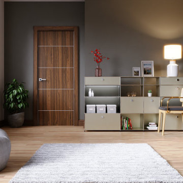
THE DOOR NAME ORIGIN - "ALLUMINIO ELIVIA VERTICAL WOOD GRAIN 4HS"
Of all the interior door models in the Elivia collection, this one is perhaps the most unapologetically elegant. Why? Hmm … That which is self-evident can be the most difficult to explain.
Is it because it is built using the latest breakthroughs in interior door making technology? Look at the finish: the process of applying it utilizes something called “stretching” by professionals, which is to say that instead of simply slapping the finish on top of the interior door’s surface, our company fuses (for lack of a better word) the materials (on molecular level, no less), the result being that the finished product is more warp-resistant, scratch-resistant, and fade-proof than any interior door put together in the past. This is especially important in climates known for their high humidity levels. Yes, but this has more to do with engineering than aesthetics, right?
Okay, so, is this interior door super-elegant because it features all the wonderful state-of-the-art hardware, specifically, the 3D adjustable, self-lubricating concealed hinges (made in Italy, by the way – a country which is, arguably, the birthplace of elegance as a concept)? Self-lubricating means your interior door will never creak. 3D-adjustable means that the installation is quick and precise (far more so than what you’d expect from ordinary hinges). Concealed means, of course, that the pin will not be visible from either side of the interior door when it’s closed. Actually, there is no pin. Neat, isn’t it? Would that be it?
Perhaps. Elegance in interior doors is a tricky concept. It combines (well, at least in the case of this particular interior door model it does) the “wow!” effect with the long-term agreeability. How so, you might ask. Well. It gets your favorable attention the first time you set eyes on it (the “wow” part); after which, you’ll never get tired of looking at it. For as long as you own it, it’ll always be easy on the eyes.
That must be it.
Maybe. Maybe not. There’s more.
This interior door is almost certainly Italian in spirit. Italian culture is rooted in Greco-Roman (Italian designers are very proud of that fact). Look at the vertical latitudinal orientation (which is to say the direction) of the wood grain. Pointing upward means creating additional visual space, pushing the ceiling higher (because your ceilings can never be too high). This is a time-proven architectural trick which ancient Greeks, with their characteristic tongue-in-cheek humor, referred to as “optical correction.” (By the way, if you’d sooner increase, the visual horizontal space of your room, you should look into this interior door’s sister – with the appropriate direction of the wood grain).
And then there’s the 4HS part, which stands for four horizontal stripes – resembling the four strings on the violin: the ultimate elegant musical instrument if there ever was one.
In its present form, the violin appeared in early Sixteenth Century in (guess …) northern Italy. Of course. To be fair, it quickly gained popularity throughout Europe, and the rest of the world soon after.
It’s elegance (the appearance as well as the sound) agreed with both street musicians and the nobility. The French king Charles IX ordered an Italian master to construct twenty-four violins for him in the year 1560.
Was the violin the source of inspiration for our designers?
Let’s move on to the finish.
 Banker Wire
This California residence went from dark and dull to modern and bright with the help of Woodcliff Builders designer Jessica Peters. Remodeled with the thought of entertaining guests in mind, form and functionality played equal roles in the design process. Light cream tones wash over the home, punctuated by the bold statement that Banker Wire’s S-12 makes in it’s Antique Brass plated finish. This woven wire mesh pattern catches the eye throughout the kitchen, living room, and bar as various cabinet door infills.
The unique texture of S-12 brings balance to the stark contrasting color scheme throughout the kitchen. While the open-concept room boasts predominantly pale features, the highlights of the Antique Brass finish draw out the deeper rich tones in the white marble backsplash and counter tops. The shadows created by the weave of the wire mesh help tie in the dark accents in the kitchen, including the black light fixtures and the oil-rubbed bronze cabinet and drawer hardware.
Across from the kitchen, the eye is drawn to the main focal point of the living room, the built-in bookshelves. Banker Wire’s S-12 clads the four central cabinet doors, creating a unique hideaway for television components and other electronics. The Antique Brass finish brings warmth into the otherwise neutral structure, complimented by the displayed curios and the cozy furniture surrounding it. Both the wire mesh and the oil-rubbed bronze hardware are carried over from the kitchen, making for a cohesive home design.
In the home’s custom bar, S-12 adorns the front of the ceiling-high white cabinets. For this area, the former cabinet and drawer pulls have been replaced with brass and ivory colored hardware, underscoring the brass of the cabinet’s panel. Emphasized by the dark stone counter-top, the lowlights of the pattern accentuate the texture of the mesh, while the Antique Brass face coordinates with the wood of the lower cabinets, bringing a consistent appearance to the space.
“I just love that extra level of detail that this wire mesh provides for cabinets,” states Peters. “It really takes the design to the next level.”
The low open area of woven wire mesh pattern S-12 lends itself well to surfacing, cladding, and other applications where partial coverage is key. At 21.6%, only subtle glimpses will be perceptible through the mesh. Embossed and highly faceted, the highs and lows of this distinctive weave are more defined in plated and powder coat finishes, making Antique Brass plating the perfect choice for this residential cabinetry project.
 Banker Wire
This California residence went from dark and dull to modern and bright with the help of Woodcliff Builders designer Jessica Peters. Remodeled with the thought of entertaining guests in mind, form and functionality played equal roles in the design process. Light cream tones wash over the home, punctuated by the bold statement that Banker Wire’s S-12 makes in it’s Antique Brass plated finish. This woven wire mesh pattern catches the eye throughout the kitchen, living room, and bar as various cabinet door infills.
The unique texture of S-12 brings balance to the stark contrasting color scheme throughout the kitchen. While the open-concept room boasts predominantly pale features, the highlights of the Antique Brass finish draw out the deeper rich tones in the white marble backsplash and counter tops. The shadows created by the weave of the wire mesh help tie in the dark accents in the kitchen, including the black light fixtures and the oil-rubbed bronze cabinet and drawer hardware.
Across from the kitchen, the eye is drawn to the main focal point of the living room, the built-in bookshelves. Banker Wire’s S-12 clads the four central cabinet doors, creating a unique hideaway for television components and other electronics. The Antique Brass finish brings warmth into the otherwise neutral structure, complimented by the displayed curios and the cozy furniture surrounding it. Both the wire mesh and the oil-rubbed bronze hardware are carried over from the kitchen, making for a cohesive home design.
In the home’s custom bar, S-12 adorns the front of the ceiling-high white cabinets. For this area, the former cabinet and drawer pulls have been replaced with brass and ivory colored hardware, underscoring the brass of the cabinet’s panel. Emphasized by the dark stone counter-top, the lowlights of the pattern accentuate the texture of the mesh, while the Antique Brass face coordinates with the wood of the lower cabinets, bringing a consistent appearance to the space.
“I just love that extra level of detail that this wire mesh provides for cabinets,” states Peters. “It really takes the design to the next level.”
The low open area of woven wire mesh pattern S-12 lends itself well to surfacing, cladding, and other applications where partial coverage is key. At 21.6%, only subtle glimpses will be perceptible through the mesh. Embossed and highly faceted, the highs and lows of this distinctive weave are more defined in plated and powder coat finishes, making Antique Brass plating the perfect choice for this residential cabinetry project.
Sponsored
Columbus, OH
Free consultation for landscape design!
Peabody Landscape Group
Columbus' Reliable Landscape Design & Contracting
 LU Design Build
Before their move, the family had always lived in subdivisions. “Our previous homes were a great place to raise our kids, and we always loved getting to know our neighbors,” she notes. However, she and her husband began looking for a home with a little extra outdoor space and a more manageable interior that would accommodate them as they grew older.
Though they’d toured many houses and even put contracts on a few, this Westwood ranch-style home spoke to them as soon as they stepped foot through the front door. “The house and the property just had the feeling I was looking for, even though it wasn’t in the best condition yet. It was just so peaceful.”
Peacefulness and a connection to nature were the main focuses for the renovation. The homeowners sought the help of Rochelle McAvin of LU Design Build to make their vision come to life.
“I needed a designer who understood my love for gently-used furniture, which I find more personal and interesting. They also needed to get the look I was going for; Mid-century modern with a twist. I felt that LU Design Build was creating the kind of projects I was looking for.”
Designer Rochelle McAvin has worked in the design build industry for over six years, and she focuses mainly on residential remodeling. For all projects, she believes in letting the clients’ priorities fuel the design. “Form follows function, and we wanted to make this house as efficient and comfortable as possible for the homeowners.”
The goal of the project was to create a personal oasis for the pair they could enjoy for years to come while leaving a minimal environmental footprint. They aimed to make the space feel calm, serene and interesting without making the entire house white.
The home is interesting from the moment you enter. To the right of the front door is a sunken living room that the homeowners lovingly call “The Pit.” Built in 1967, the sunken living room was original to the home, but the previous owners leveled the space in a 1980s remodel. Both the new owners and Rochelle agreed that restoring the sunken floor plan gave the home character, though they made it smaller to increase coziness and intimacy.
Primarily used as a family gathering place and game room, “The Pit” needed ample seating and enough space for visitors to pull up a chair and enjoy each other’s company. The large couch was a find from Stash Home, and the gray swivel chair and roomy coffee table came from Pottery Barn. The homeowner finished off the space with vintage ottomans from an estate sale to act as side tables. Large windows at the front of the room give a perfect view of the pond just outside and let in plenty of natural light during the day. Dimmable light fixtures from West Elm give the room a warm glow once the sun sets.
Because the homeowners don’t always require a lot of seating, they opted for a table in their dining room with many removable leaves, allowing it to shrink down to the size of a desk. A Napoleon electric fireplace adds to the warm ambience at dinners, gently lighting the striking wallpaper.
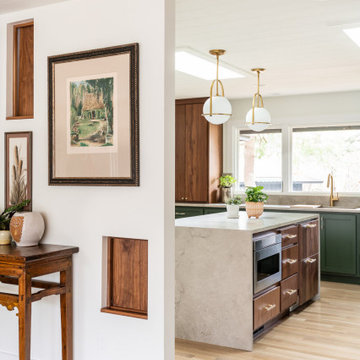
White oak floors and tongue-and-groove white ceilings lead from the front of the home back into the main living space. The living room has vaulted ceilings and an original brick fireplace. The homeowners wanted to find a perfect balance between bright and cozy; the windows and the added skylights gave the room great natural light, but the team added an oiled plywood wall to warm up the color scheme. The fireplace, painted beige in a previous remodel, received a fresh coat of gray paint to act as the room’s anchor.
The homeowner found the majority of the home’s furniture from Facebook marketplace. Buying furniture second-hand is a great way to recycle interesting pieces and minimize one’s environmental footprint in the remodeling process. “She has such a good eye bringing in earthy, vintage pieces that made every space more personal and cozy,” says Rochelle. “I think she nailed it!”
In the kitchen, the homeowner desired a space that “felt like any other room. I didn’t want it to scream ‘kitchen.’” To achieve this look, the team chose natural Missouri limestone from SFI for the island and countertops. The walnut cabinets are custom-made from Hulls Cabinetry; the bottom cabinets are painted evergreen to match the lush trees shown through the large windows. Lucite hardware with brass accents from CB2 add interest and ease. The Facebook marketplace table keeps the space light and fun.
To avoid clutter, the team created a butler’s pantry off the kitchen to house the family’s odds and ends, as well as the wife’s house plant collection. “We created a bright, functional space for her off the main living area for her to stow all her keepsakes," comments Rochelle. "She’s a collector, and we wanted to give all her things a home without affecting the rest of the home’s design.”
Rochelle knew the main bedroom needed a calming, relaxing vibe for both homeowners to enjoy. “I don’t spend much time in my bedroom, but I wanted it to feel like a getaway, almost like our own personal hotel room,” the wife notes. She and Rochelle chose the softest carpet they could find. A Harlequin “Foxley” wallpaper accent wall elevates the suite, complemented by walls painted in a custom gray/taupe. A tree trunk headboard in gray adds a final natural element.
“Our last bathroom was very large, and it was always cold,” the wife says. “We wanted this bathroom to be as warm as possible.” They kept the bathroom’s layout relatively small, but it allowed enough space for all the wife’s requests, including a matte eco-friendly Perlato Vittoria tub in lapis stone, zero-entry shower and Missouri limestone vanity. Heated porcelain floors designed to mimic slate paired with high-gloss, straight stacked tile on the walls keep the bathroom both natural and eye-catching.
“This project was so organic from beginning to end,” says Rochelle. “The homeowner and I made changes to the design as we went along. Our constant collaboration is what made this home so customized for them. It really fits their personality."
“We don’t intend to move again, so with this house, we really went for it,” the wife says. “It’s everything we wanted from the start: easy to live in, peaceful, beautiful. I’m so happy every time I come home because I know this space made for us.”
 Karv One Design
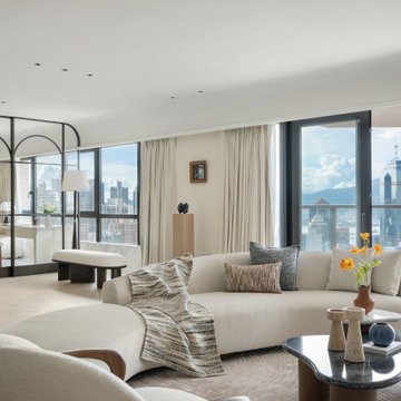
The Mid-Levels of Hong Kong Island is one of the most prominent luxury residential areas. This project - Estoril Court in Mid-Levels Central is one of the rare heritage mansions in Hong Kong with a "thousand-year lease," comprising a total of 240 units.
The young couple, with their two daughters, have settled here. For the wide experience husband, the most important aspect of a home is that it carries the "depth of love." His wife's preferences and the children's interests were frequently mentioned during this project. "I hope the design can break through conventions and avoid falling into the trap of popular but clichéd styles. Kyle and I resonate deeply on this point; we both pursue a 'more personal expression.' Family life should be relaxing, natural, and bringing joy to my family members."
This residence features a square layout and excellent natural lighting, with a practicality rate of nearly 90%. However, its over 40-year-old structure poses numerous constraints on renovations. Adhering to the existing structure and the wisdom of geomancy, Karv One Design has re-examined the relationship among the landscape, windows, and functional flow within the home. They have integrated practicality, beauty, and self-expression into every corner, enhancing the happiness of living.
Once stepping into the living room, you are greeted by Hong Kong's most spectacular vistas. The ever-changing scenery of Victoria Harbour, both day and night, the immense skyscrapers of different banks and commercial buildings and the panoramic views of the Peak are all within sight. The expansive dimensions of the living room are a response to the surrounding environment, providing ample space for family bonding and companionship, while also allowing the breathtaking skyline views to seamlessly integrate into daily life.
Unlike traditional whole-house decoration, the design of Hong Kong homes emphasizes collage and customization. The minimalist aesthetic of the space corresponds to the luxurious craftsmanship and time costs involved. Elements such as natural stone, artistic paint, parquet flooring, wood veneer, and leather have all been meticulously coordinated in terms of color and proportion, while a significant amount of storage space has been cleverly concealed within the walls.
The study room is deliberately positioned to one side of the living room, embracing the gentle stretch of sunlight. The arched iron partition, exuding a vintage flavor and traces of time, not only serves as a natural divider of space but also becomes a highlight of the interior decoration with its unique artistic form, creating a serene yet stylish atmosphere. It ensures privacy without compromising on openness, allowing the home owner to work in the study room while still keeping an eye on the children playing in the living room.
Custom-made artisanal furniture offers a whole new expression of comfort and practicality to the space. The Giorgetti HUG armchair combines a sculptural sense of form with a flowing sense of shape. When natural light filters in, a rich artistic atmosphere permeates and grows within, making the home a place of tranquility and peace of mind.
The original open-plan layout of the master bedroom has been reconfigured and divided. The ultimate goal of the enclosed space is to provide comfort and ease of sleep. The pale green color is also carefully coordinated, focusing on creating a serene and pleasant atmosphere. The combination of "green," "wood," and "metal elements" is based on Feng Shui considerations, serving to stabilize and concentrate the energy flow.
The children's room is simple yet cozy, where sunlight awakens the space and transparent glass windows bring in the ocean view. The palette of pale blue and white adds warmth and vitality to the space, inspiring children's boundless imagination about the unknown world and giving them the courage to see mountains, seas, and the world beyond.
The moment when the door is open, the magic of lighting begins. What greets the eye is an elegant and tastefully designed artistic foyer. The pace of work in Hong Kong is fast and efficient, often causing people to overlook family time. Therefore, the entrance is adorned with a large area of gentle ivory white, featuring sculptural-like display stands and flowers and vignettes that can be arranged according to the owner's mood. As night falls, the panoramic view of the Victoria Harbour's night scene comes into view, elevating the enjoyment to the utmost.
The lighting system in the space brings more enjoyable experiences to "living as you desire." The smart system caters to various states of living scenarios at different times, as well as to the subtle needs of ambient temperature, brightness, and tactile atmosphere. Whether it's solo time or family moments, day or night, everyone has a comfortable place to be.
The "Estoril Court" project is a full-service case that last for 12 months. We had hundreds of communications and exchanges with the home owner, and continuously coordinated and collaborated with the property management, on-site construction and installation workers, manufacturers, and various suppliers, striving for perfection in craftsmanship and meticulous attention to detail in execution. Finally, seeing the satisfied expressions of the home owner and their family, we felt that it was an ideal conveyance.
 Top Tread Stairways
Custom Curved Wooden Slides by Top Tread Stairways ~
Transform Your Home Into Something Extraordinary
Custom Curved Wooden Slides
When was the Last Time Someone Walked Into Your Home and Their Jaw Literally Dropped?
When was the last time someone walked into your home and their jaw literally dropped?
Picture this: Your guests arrive for dinner. They step into your foyer, and suddenly—silence. Wide eyes. A moment of pure disbelief. Then, inevitably, the question: “Is that really what I think it is?”
Welcome to the world of custom curved wooden slides, where Top Tread Stairways turns childhood dreams into sophisticated architectural statements.
The Secret is Out
For years, Clyde Martin and his team at Top Tread Stairways in Sierra Vista, Arizona, have been quietly building something extraordinary. While most stair companies focus on traditional projects, TopTread Stairways has been perfecting the art of custom hardwood slides—creating installations so remarkable that we joke about renaming the business “Chutes and Ladders.”
The truth? These aren’t just slides. They’re conversation pieces. Works of functional art. The kind of architectural element that sets your home apart from every other one on the planet.
And we build so many of them that we’ve shipped custom slides all over North America and beyond.
Four Ways to Make Your Home Unforgettable
Every slide project we undertake is unique, but they generally fall into four categories:
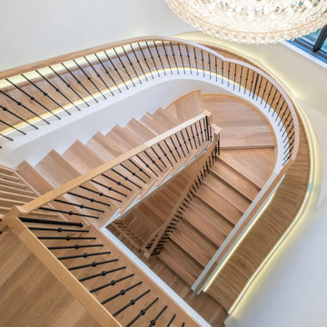
1. Curved Stair-Slide Combinations – The ultimate space-efficient solution, where stairs and slide spiral together in a stunning combination of form and function.
2. Curved Slides Separate from Stairways – For those who want the drama of a standalone curved slide that makes its own architectural statement.
3. Straight Stair-Slide Combinations – Perfect for modern, linear spaces where clean lines meet playful innovation.
4. Straight Slides Separate from Stairways – Sometimes simplicity creates the most powerful impact.
But here’s where it gets interesting: Some slides feature flat seat areas with vertical sides. Others embrace a barrel shape for enhanced comfort. We’ve built slides wide enough for several people to descend shoulder-to-shoulder, laughing all the way down. And we’ve crafted intimate slides designed for solo adventures, regardless of age or size.
Our clients? They absolutely love them.
Stories That Will Make You Rethink What’s Possible
Take the 11,000-square-foot home in Beverly Hills, overlooking the famous Sunset Strip. In one child’s bedroom, we installed a 12-foot curved slide crafted from white oak. Understated location, extraordinary feature.
Or consider the 35-foot-high round tower room in an 8,500-square-foot custom home bordering the Sacramento River in Northern California. This project has become our most famous installation—a stunning 33-foot curved stair-slide combination built entirely from solid black walnut, featuring 445 layers of cross-laminated hardwood and a spiral newel post that took eight months to construct in our shop.
The homeowners had searched for eight years to find someone “crazy enough” to build their dream. When we completed it, one of Clyde’s trusted business partners—someone who’d seen him tackle countless unique projects—admitted he thought Clyde had lost his mind taking this one on. He genuinely didn’t believe we could pull it off.
We did. And the homeowners? Still thrilled years later.
Where Imagination Meets Reality
But these slides aren’t just for private estates. We’ve installed a 24-foot hickory slide in an elementary school library just east of Dallas, where kids absolutely love it. And here’s something that will make you smile: We built the longest wood slide ever for a children’s hospital in Springfield, Illinois.
Have you ever heard a child beg to go to the doctor?
We’re pretty sure it happens in Springfield. That walnut slide stretches 45 feet long and 3 feet wide—spacious enough for three children to sit side-by-side or for an adult and child to slide together comfortably. We built it in one piece, filling an entire semi-trailer for transport. It lives in the hospital lobby, and no appointment is needed to experience it yourself.
In Raleigh, North Carolina, we installed a 36-foot white oak slide in a custom home. The client loved it so much they ordered a second one—literally 15 minutes after we finished the installation. When Clyde returned to the office, there was already a check in the mailbox for slide number two. This 14,000-square-foot home now features 72 linear feet of curved white oak slide: one connecting the second floor to the main level, another linking the main floor to the finished basement.
What a ride, indeed.
Then there’s the curved stair-slide combination in Visalia, California—32 feet of knotty alder complemented by a hanging netted loft and climbing wall. Creative? Absolutely. Fun? Beyond measure.
The People Behind the Dreams
What inspires us most isn’t the technical challenge of building these slides—though engineering a 33-foot curved slide from 445 layers of cross-laminated hardwood certainly keeps us engaged. It’s working with clients who refuse to think inside the box.
These are creative individuals willing to explore ideas that set their homes and businesses apart. They dream of installations that make people stop and stare. They understand that architecture can—and should—inspire joy.
Listening to them describe their visions, explaining their dreams of a slide design unlike anything else on earth? That’s a privilege. And bringing those dreams to life? That’s what we live for.
My team and I have as much fun designing and building these slides as our clients have riding them. We’d love nothing better than to hear from you!
Custom Curved Wooden Slides
What Sets Top Tread Stairways Apart
Since 2006, Clyde Martin has built Top Tread Stairways on a simple premise: there’s a better way to build stairs. With roots in eastern Pennsylvania and years of experience installing hundreds of pre-built stairways, Clyde brought that expertise west and founded a company dedicated to exceptional craftsmanship.
We stock thousands of stair parts in more than ten wood species—hickory, jatoba, maple, cherry, mahogany, alder, red oak, white oak, poplar, Douglas fir, and walnut. Quality levels are high. Lead times are short. We understand the urgency of your project schedule and deliver accordingly.
But here’s what really matters: When it comes to custom wooden slides, Top Tread Stairways is one of—if not the—premier builders of indoor wooden slides in the United States. This isn’t a side project for us. It’s a specialty we’ve refined through years of experience, countless installations, and an unwavering commitment to turning impossible dreams into breathtaking reality.
Your Home, Reimagined
Whether you’re envisioning a straight wooden stand-alone slide for your office or a jaw-dropping curved wooden slide/stairway combination that will become your home’s signature feature, we’d love to hear from you.
We’re not here to build ordinary. We’re here to build extraordinary.
Ready to set your home apart?
~ Custom Curved Wooden Slides ~ ART YOU RIDE!
62