
Search results for "Facilitation" in Home Design Ideas

 Simply Home Decorating
This beautiful North Vancouver home belongs to a nature-loving and health-conscious couple, Emma and Vince (names changed), their two young children, and their dog, Jasper. When they contacted us about renovating and furnishing their kitchen and family room, we walked in and saw a world of potential waiting to be uncovered.
Before: Larkhall Crescent Home:
Like many original North Vancouver homes, the interior was definitely dated. We encountered late ‘80s finishes in powder pink and teal green, old carpet, and a kitchen that wasn’t maximized to suit this family’s modern-day lifestyle. However, the size of the rooms offered us a ton of space with which to get creative.
Knowing our clients’ love of cooking, need for work spaces (Emma and Vince both work remotely), and growing family, we developed a design concept that would increase usable space, optimize storage, and create intimacy in this large area. As for the style, we were inspired by their European roots, inventing a new and modern take on “Belgian Farmhouse” style. Now, the home is truly one-of-a-kind.
After: Warm & Cozy Family Room:
Fresh, bright, and comfortable, this living area has been transformed! We started with the fireplace as a focal point, selecting aged brick tiles for added texture and a crisp wood mantle. The taupe-coloured sectional infuses the room with visual warmth and serves the added purpose of separating the family room from the kitchen.
Emma and Vince were also keen on using non-toxic materials in their home, and we were happy to oblige. To meet their needs, we sourced natural wood elements and sought out Canadian-made products - that adhere to high health standards - whenever possible.
Look closer at the elements of this space, and you will find this stunning, honeycomb-patterned rug in earthy gold, beige, and charcoal tones. It’s plush to the touch and full of visual texture that brings this room’s colour palette together. We sourced these two-tone chairs with caning, petrified wood side table, black sconces, and botanical prints in greyscale from local artist, Heather Johnston.
We topped off the space with this dark wood and rattan console that offers storage facing the kitchen and presents an opportunity to display cherished items. The result is a cozy lounging space brimming with comfort and functionality. It’s perfect for enjoying quality family time, or Emma can simply slide the coffee table away to make room for her morning yoga practice.
Now, let’s turn around and give some attention to the kitchen. Do you remember what the original kitchen looked like? If not, scroll back up, because the transformation is shocking…
Moody & Welcoming Kitchen for Healthy Living:
This kitchen looks very different from how it started, right? Though we didn’t touch any walls, the kitchen has almost doubled in usable space! We created a long, extended island with storage, an outlet for small appliances, and seating for comfortable prep, after-school snacking, or mingling among friends.
On the other side of the island, the family has even more storage and an integrated dishwasher within easy reach of the sink, perfect for quick clean-up. From this angle, you can also see the expansive custom Shaker cabinetry in white and the integrated double ovens. These facilitate their cooking experience and gave us the opportunity to add an additional surprise…
A coffee garage station and more hidden storage! Keeping these items located along the perimeter allows them to be accessed by the family or their guests without someone getting under the cook’s feet. These are the little details that make everyday life easier and more enjoyable.
Moving deeper into the kitchen, the seamless induction cooktop topped with a freestanding concealed hood fan commands attention in a soft yet prominent way. The natural wood accent mirrors the fireplace mantle, and the choice of off-black wood-grain cabinets not only continues our black-and-white colour palette but adds a sense of depth and contrast. The corner sink is located to the right and perfectly positioned with a view of their thriving backyard.
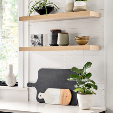
To invite more of this family’s character into the space, we mixed metals for interest — matte black, dark pewter, and warm brass — and created open shelves in white oak for their plants and decor. You can also glimpse the tumbled edge of the backsplash tile, which echoes the rustic brick of the fireplace. It adds that farmhouse charm while still feeling timeless and sophisticated.
Last but not least, we designed this dining banquette in the bay window (with integrated bench storage, of course), where the family can share a meal together, the kids can do homework, or Emma and Vince can work and enjoy a change of scenery from their offices. Like the other spaces in the home, it was designed to be beautiful, multi-functional, and long-lasting.
Praise from Our Clients:
It is clear that we love this home, but what did our clients have to say?
“Lori is a visionary and masters execution to the finest detail all at the same time. When she first met us to know more about who we are and how we live, she could right away envision how we could use the space in our kitchen and living room…The results exceeded our expectations.
Lori and her team were also a delight to work with — coordination with all the trades, fast problem-solving, regular updates, professional and friendly attitude of her entire team — made it the dream team. Thank you SHD for making our space so beautiful!”
In turn, we are so grateful for this family’s trust, their open communication, and for being wonderful people with whom to work. (So, thank you!)
 Tomecek Studio Architecture
Photography by John Gibbons
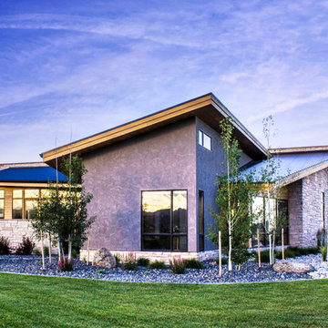
Project by Studio H:T principal in charge Brad Tomecek (now with Tomecek Studio Architecture). This contemporary custom home forms itself based on specific view vectors to Long's Peak and the mountains of the front range combined with the influence of a morning and evening court to facilitate exterior living. Roof forms undulate to allow clerestory light into the space, while providing intimate scale for the exterior areas. A long stone wall provides a reference datum that links public and private and inside and outside into a cohesive whole.
Find the right local pro for your project

 ZeroEnergy Design
This renovated brick rowhome in Boston’s South End offers a modern aesthetic within a historic structure, creative use of space, exceptional thermal comfort, a reduced carbon footprint, and a passive stream of income.
DESIGN PRIORITIES. The goals for the project were clear - design the primary unit to accommodate the family’s modern lifestyle, rework the layout to create a desirable rental unit, improve thermal comfort and introduce a modern aesthetic. We designed the street-level entry as a shared entrance for both the primary and rental unit. The family uses it as their everyday entrance - we planned for bike storage and an open mudroom with bench and shoe storage to facilitate the change from shoes to slippers or bare feet as they enter their home. On the main level, we expanded the kitchen into the dining room to create an eat-in space with generous counter space and storage, as well as a comfortable connection to the living space. The second floor serves as master suite for the couple - a bedroom with a walk-in-closet and ensuite bathroom, and an adjacent study, with refinished original pumpkin pine floors. The upper floor, aside from a guest bedroom, is the child's domain with interconnected spaces for sleeping, work and play. In the play space, which can be separated from the work space with new translucent sliding doors, we incorporated recreational features inspired by adventurous and competitive television shows, at their son’s request.
MODERN MEETS TRADITIONAL. We left the historic front facade of the building largely unchanged - the security bars were removed from the windows and the single pane windows were replaced with higher performing historic replicas. We designed the interior and rear facade with a vision of warm modernism, weaving in the notable period features. Each element was either restored or reinterpreted to blend with the modern aesthetic. The detailed ceiling in the living space, for example, has a new matte monochromatic finish, and the wood stairs are covered in a dark grey floor paint, whereas the mahogany doors were simply refinished. New wide plank wood flooring with a neutral finish, floor-to-ceiling casework, and bold splashes of color in wall paint and tile, and oversized high-performance windows (on the rear facade) round out the modern aesthetic.
RENTAL INCOME. The existing rowhome was zoned for a 2-family dwelling but included an undesirable, single-floor studio apartment at the garden level with low ceiling heights and questionable emergency egress. In order to increase the quality and quantity of space in the rental unit, we reimagined it as a two-floor, 1 or 2 bedroom, 2 bathroom apartment with a modern aesthetic, increased ceiling height on the lowest level and provided an in-unit washer/dryer. The apartment was listed with Jackie O'Connor Real Estate and rented immediately, providing the owners with a source of passive income.
ENCLOSURE WITH BENEFITS. The homeowners sought a minimal carbon footprint, enabled by their urban location and lifestyle decisions, paired with the benefits of a high-performance home. The extent of the renovation allowed us to implement a deep energy retrofit (DER) to address air tightness, insulation, and high-performance windows. The historic front facade is insulated from the interior, while the rear facade is insulated on the exterior. Together with these building enclosure improvements, we designed an HVAC system comprised of continuous fresh air ventilation, and an efficient, all-electric heating and cooling system to decouple the house from natural gas. This strategy provides optimal thermal comfort and indoor air quality, improved acoustic isolation from street noise and neighbors, as well as a further reduced carbon footprint. We also took measures to prepare the roof for future solar panels, for when the South End neighborhood’s aging electrical infrastructure is upgraded to allow them.
URBAN LIVING. The desirable neighborhood location allows the both the homeowners and tenant to walk, bike, and use public transportation to access the city, while each charging their respective plug-in electric cars behind the building to travel greater distances.
OVERALL. The understated rowhouse is now ready for another century of urban living, offering the owners comfort and convenience as they live life as an expression of their values.
Eric Roth Photo
 ZeroEnergy Design
This LEED Platinum certified house reflects the homeowner's desire for an exceptionally healthy and comfortable living environment, within a traditional neighborhood.
INFILL SITE. The family, who moved from another area of Wellesley, sought out this property to be within walking distance of the high school and downtown area. An existing structure on the tight lot was removed to make way for the new home. 84% of the construction waste, from both the previous structure and the new home, was diverted from a landfill. ZED designed to preserve the existing mature trees on the perimeter of the property to minimize site impacts, and to maintain the character of the neighborhood as well as privacy on the site.
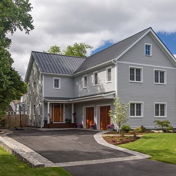
EXTERIOR EXPRESSION. The street facade of the home relates to the local New England vernacular. The rear uses contemporary language, a nod to the family’s Californian roots, to incorporate a roof deck, solar panels, outdoor living space, and the backyard swimming pool. ZED’s careful planning avoided to the need to face the garage doors towards the street, a common syndrome of a narrow lot.
THOUGHTFUL SPACE. Homes with dual entries can often result in duplicate and unused spaces. In this home, the everyday and formal entry areas are one and the same; the front and garage doors share the entry program of coat closets, mudroom storage with bench for removing your shoes, and a laundry room with generous closets for the children's sporting equipment. The entry area leads directly to the living space, encompassing the kitchen, dining and sitting area areas in an L-shaped open plan arrangement. The kitchen is placed at the south-west corner of the space to allow for a strong connection to the dining, sitting and outdoor living spaces. A fire pit on the deck satisfies the family’s desire for an open flame while a sealed gas fireplace is used indoors - ZED’s preference after omitting gas burning appliances completely from an airtight home. A small study, with a window seat, is conveniently located just off of the living space. A first floor guest bedroom includes an accessible bathroom for aging visitors and can be used as a master suite to accommodate aging in place.
HEALTHY LIVING. The client requested a home that was easy to clean and would provide a respite from seasonal allergies and common contaminants that are found in many indoor spaces. ZED selected easy to clean solid surface flooring throughout, provided ample space for cleaning supplies on each floor, and designed a mechanical system with ventilation that provides a constant supply of fresh outdoor air. ZED selected durable materials, finishes, cabinetry, and casework with low or no volatile organic compounds (VOCs) and no added urea formaldehyde.
YEAR-ROUND COMFORT. The home is super insulated and air-tight, paired with high performance triple-paned windows, to ensure it is draft-free throughout the winter (even when in front of the large windows and doors). ZED designed a right-sized heating and cooling system to pair with the thermally improved building enclosure to ensure year-round comfort. The glazing on the home maximizes passive solar gains, and facilitates cross ventilation and daylighting.
ENERGY EFFICIENT. As one of the most energy efficient houses built to date in Wellesley, the home highlights a practical solution for Massachusetts. First, the building enclosure reduces the largest energy requirement for typical houses (heating). Super-insulation, exceptional air sealing, a thermally broken wall assembly, triple pane windows, and passive solar gain combine for a sizable heating load reduction. Second, within the house only efficient systems consume energy. These include an air source heat pump for heating & cooling, a heat pump hot water heater, LED lighting, energy recovery ventilation, and high efficiency appliances. Lastly, photovoltaics provide renewable energy help offset energy consumption. The result is an 89% reduction in energy use compared to a similar brand new home built to code requirements.
RESILIENT. The home will fare well in extreme weather events. During a winter power outage, heat loss will be very slow due to the super-insulated and airtight envelope– taking multiple days to drop to 60 degrees even with no heat source. An engineered drainage system, paired with careful the detailing of the foundation, will help to keep the finished basement dry. A generator will provide full operation of the all-electric house during a power outage.
OVERALL. The home is a reflection of the family goals and an expression of their values, beautifully enabling health, comfort, safety, resilience, and utility, all while respecting the planet.
ZED - Architect & Mechanical Designer
Bevilacqua Builders Inc - Contractor
Creative Land & Water Engineering - Civil Engineering
Barbara Peterson Landscape - Landscape Design
Nest & Company - Interior Furnishings
Eric Roth Photography - Photography
 Drewett Works
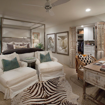
This Paradise Valley stunner was a down-to-the-studs renovation. The owner, a successful business woman and owner of Bungalow Scottsdale -- a fabulous furnishings store, had a very clear vision. DW's mission was to re-imagine the 1970's solid block home into a modern and open place for a family of three. The house initially was very compartmentalized including lots of small rooms and too many doors to count. With a mantra of simplify, simplify, simplify, Architect CP Drewett began to look for the hidden order to craft a space that lived well.
This residence is a Moroccan world of white topped with classic Morrish patterning and finished with the owner's fabulous taste. The kitchen was established as the home's center to facilitate the owner's heart and swagger for entertaining. The public spaces were reimagined with a focus on hospitality. Practicing great restraint with the architecture set the stage for the owner to showcase objects in space. Her fantastic collection includes a glass-top faux elephant tusk table from the set of the infamous 80's television series, Dallas.
It was a joy to create, collaborate, and now celebrate this amazing home.
Project Details:
Architecture: C.P. Drewett, AIA, NCARB; Drewett Works, Scottsdale, AZ
Interior Selections: Linda Criswell, Bungalow Scottsdale, Scottsdale, AZ
Photography: Dino Tonn, Scottsdale, AZ
Featured in: Phoenix Home and Garden, June 2015, "Eclectic Remodel", page 87.
 Potter Construction Inc
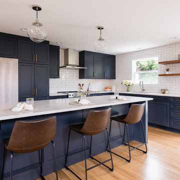
The client wanted a layout that facilitated socializing and provided ample counter space for baking, while ensuring the kitchen didn't appear overly large compared to the cozy family room
 Refined Interiors
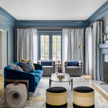
Large transitional open concept light wood floor and beige floor living room library photo in San Francisco with blue walls, a standard fireplace and a stone fireplace
 Liquid Interiors
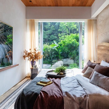
This master bedroom has circadian lighting to mimic nature's cycle of the day to night time through the color temperature of the sun for the most restful sleep.
 Houseplay Renovations LLC
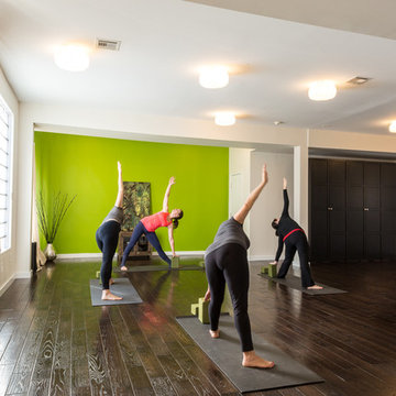
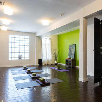
This Jersey City, NJ space was the first permanent ‘home’ for the yoga studio, so it was essential for us to listen well and design a space to serve their needs for years to come. Through our design process, we helped to guide the owners through the fit-out of their new studio location that required minimal demolition and disruption to the existing space.
Together, we converted a space originally used as a preschool into a welcoming, spacious yoga studio for local yogis. We created one main yoga studio by combining four small classrooms into a single larger space with new walls, while all the other program spaces (including designated areas for holistic treatments, massage, and bodywork) were accommodated into pre-existing rooms.
Our team completed all demo, sheetrock, electrical, and painting aspects of the project. (The studio owners did some of the work themselves, and a different company installed the flooring and carpets.) The results speak for themselves: a peaceful, restorative space to facilitate health and healing for the studio’s community.
Looking to renovate your place of business? Contact the Houseplay team; we’ll help make it happen!
Photo Credit: Anne Ruthmann Photography
 Bilotta Kitchen & Home
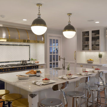
For this project, the entire kitchen was designed around the “must-have” Lacanche range in the stunning French Blue with brass trim. That was the client’s dream and everything had to be built to complement it. Bilotta senior designer, Randy O’Kane, CKD worked with Paul Benowitz and Dipti Shah of Benowitz Shah Architects to contemporize the kitchen while staying true to the original house which was designed in 1928 by regionally noted architect Franklin P. Hammond. The clients purchased the home over two years ago from the original owner. While the house has a magnificent architectural presence from the street, the basic systems, appointments, and most importantly, the layout and flow were inappropriately suited to contemporary living.
The new plan removed an outdated screened porch at the rear which was replaced with the new family room and moved the kitchen from a dark corner in the front of the house to the center. The visual connection from the kitchen through the family room is dramatic and gives direct access to the rear yard and patio. It was important that the island separating the kitchen from the family room have ample space to the left and right to facilitate traffic patterns, and interaction among family members. Hence vertical kitchen elements were placed primarily on existing interior walls. The cabinetry used was Bilotta’s private label, the Bilotta Collection – they selected beautiful, dramatic, yet subdued finishes for the meticulously handcrafted cabinetry. The double islands allow for the busy family to have a space for everything – the island closer to the range has seating and makes a perfect space for doing homework or crafts, or having breakfast or snacks. The second island has ample space for storage and books and acts as a staging area from the kitchen to the dinner table. The kitchen perimeter and both islands are painted in Benjamin Moore’s Paper White. The wall cabinets flanking the sink have wire mesh fronts in a statuary bronze – the insides of these cabinets are painted blue to match the range. The breakfast room cabinetry is Benjamin Moore’s Lampblack with the interiors of the glass cabinets painted in Paper White to match the kitchen. All countertops are Vermont White Quartzite from Eastern Stone. The backsplash is Artistic Tile’s Kyoto White and Kyoto Steel. The fireclay apron-front main sink is from Rohl while the smaller prep sink is from Linkasink. All faucets are from Waterstone in their antique pewter finish. The brass hardware is from Armac Martin and the pendants above the center island are from Circa Lighting. The appliances, aside from the range, are a mix of Sub-Zero, Thermador and Bosch with panels on everything.
 Southwest Boulder & Stone
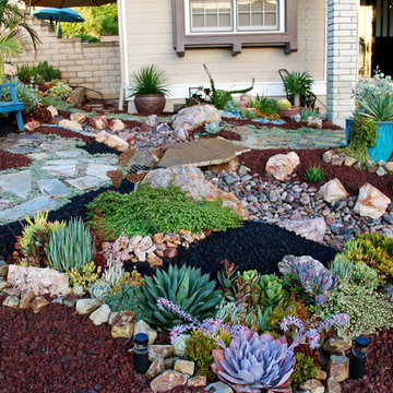
Karen transformed her front yard with 100% drought-tolerant landscaping, using water-wise plants and a wide variety of natural stone materials. Cobble, rubble, pebble, flagstone and crushed rock were combined to create a dry streambed that adds a fluid movement to the yard. A basalt fountain water feature was positioned near the entry.
Since Karen’s home is part of a Homeowner’s Association, speed was essential to the project. She hired Laura Eubanks of Design for Serenity to facilitate the quick turnaround, completing the project in just 5 days. Design for Serenity designed and installed the beautiful landscaping and succulent tapestries, while Karen herself selected the stone.
Karen thinks of landscape rock as a form of art, considering it to be one of the most important elements in her project. She spent several hours with Laura’s team selecting the perfect boulders and materials from our Fallbrook yard. Her hard work paid off: Karen’s guests and HOA neighbors all raved about the impact of natural stone in this total yard transformation.
 Simply Home Decorating
This beautiful North Vancouver home belongs to a nature-loving and health-conscious couple, Emma and Vince (names changed), their two young children, and their dog, Jasper. When they contacted us about renovating and furnishing their kitchen and family room, we walked in and saw a world of potential waiting to be uncovered.
Before: Larkhall Crescent Home:
Like many original North Vancouver homes, the interior was definitely dated. We encountered late ‘80s finishes in powder pink and teal green, old carpet, and a kitchen that wasn’t maximized to suit this family’s modern-day lifestyle. However, the size of the rooms offered us a ton of space with which to get creative.
Knowing our clients’ love of cooking, need for work spaces (Emma and Vince both work remotely), and growing family, we developed a design concept that would increase usable space, optimize storage, and create intimacy in this large area. As for the style, we were inspired by their European roots, inventing a new and modern take on “Belgian Farmhouse” style. Now, the home is truly one-of-a-kind.
After: Warm & Cozy Family Room:
Fresh, bright, and comfortable, this living area has been transformed! We started with the fireplace as a focal point, selecting aged brick tiles for added texture and a crisp wood mantle. The taupe-coloured sectional infuses the room with visual warmth and serves the added purpose of separating the family room from the kitchen.
Emma and Vince were also keen on using non-toxic materials in their home, and we were happy to oblige. To meet their needs, we sourced natural wood elements and sought out Canadian-made products - that adhere to high health standards - whenever possible.
Look closer at the elements of this space, and you will find this stunning, honeycomb-patterned rug in earthy gold, beige, and charcoal tones. It’s plush to the touch and full of visual texture that brings this room’s colour palette together. We sourced these two-tone chairs with caning, petrified wood side table, black sconces, and botanical prints in greyscale from local artist, Heather Johnston.
We topped off the space with this dark wood and rattan console that offers storage facing the kitchen and presents an opportunity to display cherished items. The result is a cozy lounging space brimming with comfort and functionality. It’s perfect for enjoying quality family time, or Emma can simply slide the coffee table away to make room for her morning yoga practice.
Now, let’s turn around and give some attention to the kitchen. Do you remember what the original kitchen looked like? If not, scroll back up, because the transformation is shocking…
Moody & Welcoming Kitchen for Healthy Living:
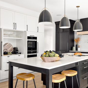
This kitchen looks very different from how it started, right? Though we didn’t touch any walls, the kitchen has almost doubled in usable space! We created a long, extended island with storage, an outlet for small appliances, and seating for comfortable prep, after-school snacking, or mingling among friends.
On the other side of the island, the family has even more storage and an integrated dishwasher within easy reach of the sink, perfect for quick clean-up. From this angle, you can also see the expansive custom Shaker cabinetry in white and the integrated double ovens. These facilitate their cooking experience and gave us the opportunity to add an additional surprise…
A coffee garage station and more hidden storage! Keeping these items located along the perimeter allows them to be accessed by the family or their guests without someone getting under the cook’s feet. These are the little details that make everyday life easier and more enjoyable.
Moving deeper into the kitchen, the seamless induction cooktop topped with a freestanding concealed hood fan commands attention in a soft yet prominent way. The natural wood accent mirrors the fireplace mantle, and the choice of off-black wood-grain cabinets not only continues our black-and-white colour palette but adds a sense of depth and contrast. The corner sink is located to the right and perfectly positioned with a view of their thriving backyard.
To invite more of this family’s character into the space, we mixed metals for interest — matte black, dark pewter, and warm brass — and created open shelves in white oak for their plants and decor. You can also glimpse the tumbled edge of the backsplash tile, which echoes the rustic brick of the fireplace. It adds that farmhouse charm while still feeling timeless and sophisticated.
Last but not least, we designed this dining banquette in the bay window (with integrated bench storage, of course), where the family can share a meal together, the kids can do homework, or Emma and Vince can work and enjoy a change of scenery from their offices. Like the other spaces in the home, it was designed to be beautiful, multi-functional, and long-lasting.
Praise from Our Clients:
It is clear that we love this home, but what did our clients have to say?
“Lori is a visionary and masters execution to the finest detail all at the same time. When she first met us to know more about who we are and how we live, she could right away envision how we could use the space in our kitchen and living room…The results exceeded our expectations.
Lori and her team were also a delight to work with — coordination with all the trades, fast problem-solving, regular updates, professional and friendly attitude of her entire team — made it the dream team. Thank you SHD for making our space so beautiful!”
In turn, we are so grateful for this family’s trust, their open communication, and for being wonderful people with whom to work. (So, thank you!)
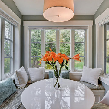
 LAND DEVELOPMENT AND BUILDING, LLC
The Betty at Inglenook’s Pocket Neighborhoods is an open two-bedroom Cottage-style Home that facilitates everyday living on a single level. High ceilings in the kitchen, family room and dining nook make this a bright and enjoyable space for your morning coffee, cooking a gourmet dinner, or entertaining guests. Whether it’s the Betty Sue or a Betty Lou, the Betty plans are tailored to maximize the way we live. This is the dining space which is open to the kitchen and living areas.
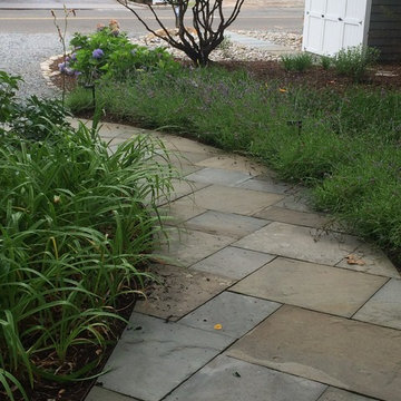
 Barbara Wilson Landscape Architect, LLC
Photo by Barbara Wilson Landscape Architect, LLC
A small residential, seaside property located on Fairfield Beach, Fairfield was renovated by the new owners and adapted for their active family. Barbara was the landscape architect in charge of all of the landscape elements upgrades. She designed new bluestone curving paths to access the front and side doors and designed new landscape lighting to enhance the walks. The existing trees were saved and she designed new shade and salt-tolerant plantings which were added to provide seasonal color and interest while respecting the existing plantings. Along the beach front additional native beach grasses were added to stabilize the dunes while removing some invasive plantings. This work will be phased over the next few years in an effort to keep the sand stable. Beach roses were incorporated into a hollow in the dunes. A small lawn area was renovated and the surrounding Black Pines pruned to provide a small play area and respite from the sun. Beautiful reblooming hydrangeas line the edge of the gravel driveway. Rounded beach stones were used instead of mulch in the island planting along the edge of the adjacent road planted with Miscanthus, Mugo pine and yucca.
Barbara designed a custom kayak rack, custom garbage enclosure, a new layout of the existing wooden deck to facilitate access to the side doors, and detailed how to renovate the front door into only an emergency access with new railings and steps.
She coordinating obtaining bids and then supervised the installation of all elements for the new landscape the project.
The interiors were designed by Jack Montgomery Design of Greenwich, CT and NYC . Tree work was completed by Bartlett Tree Experts. Freddy’s Landscape Company of Fairfield, CT installed the new plantings, installed all the new masonry work and provides landscape maintenance services. JT Low Voltage and Electric installed the landscape lighting.
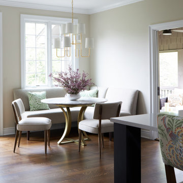
 TKS Design Group
Download our free ebook, Creating the Ideal Kitchen. DOWNLOAD NOW
As with most projects, it all started with the kitchen layout. The home owners came to us wanting to upgrade their kitchen and overall aesthetic in their suburban home, with a combination of fresh paint, updated finishes, and improved flow for more ease when doing everyday activities.
A monochromatic, earth-toned palette left the kitchen feeling uninspired. It lacked the brightness they wanted from their space. An eat-in table underutilized the available square footage. The butler’s pantry was out of the way and hard to access, and the dining room felt detached from the kitchen.
Lead Designer, Stephanie Cole, saw an improved layout for the spaces that were no longer working for this family. By eliminating an existing wall between the kitchen and dining room, and relocating the bar area to the dining room, we opened up the kitchen, providing all the space we needed to create a dreamy and functional layout. A new perimeter configuration promoted circulation while also making space for a large and functional island loaded with seating – a must for any family. Because an island that isn’t big enough for everyone (and a few more) is a recipe for disaster. The light white cabinetry is fresh and contrasts with the deeper tones in the wood flooring, creating a modern aesthetic that is elevated, yet approachable for everyday living.
With better flow as the overarching goal, we made some structural changes too. To remove a bottleneck in the entryway, we angled one of the dining room walls to create more natural separation between rooms and facilitate ease of movement throughout the large space.
At The Kitchen Studio, we believe a well-designed kitchen uses every square inch to the fullest. By starting from scratch, it was possible to rethink the entire kitchen layout and design the space according to how it is used, because the kitchen shouldn’t make it harder to feed the family. A new location for the existing range, flanked by a new column refrigerator and freezer on each side, worked to anchor the space. The very large and very spacious island (a dream island if we do say so ourselves) now houses the primary sink and provides ample space for food prep and family gathering.
The new kitchen table and coordinating banquette seating provide a cozy nook for quick breakfasts before school or work, and evening homework sessions. Elegant gold details catch the natural light, elevating the aesthetic.
The dining room was transformed into one of this client’s favorite spaces and we couldn’t agree more. We saw an opportunity to give the dining room a more distinguished identity by closing off the entrance from the foyer. The relocated wet bar enhances the sophisticated vibe of this gathering space, complete with beautiful antique mirror tiles and open shelving encased by moody built-in cabinets.
Updated furnishings add warmth. A rich walnut table is paired with custom chairs in a muted coral fabric. The large, transitional chandelier grounds the room, pairing beautifully with the gold finishes prevalent in the faucet and cabinet hardware. Linen-inspired wallpaper and cream-toned window treatments add to the glamorous feel of this entertainment space.
There is no way around it. The laundry room was cramped. The large washer and dryer blocked access to the sink and left little room for the space to serve its other essential function – as a mudroom. Because we reworked the kitchen layout to create more space overall, we could rethink the mudroom too – an essential for any busy family. The first step was moving the washer and dryer to an existing area on the second floor, where most of the family’s laundry lives (no one wants to carry laundry up and down the stairs if they don’t have to anyway). This is a more functional solution and opened up the space for all the mudroom necessities – including the existing kitchen refrigerator, loads of built-in cubbies, and a bench.
It’s hard to not fall in love with every detail of a new space, especially when it serves your day-to-day life. But that doesn’t mean the clients didn’t have their favorite features they use on the daily. This remodel was focused largely on function with a new kitchen layout. And it’s the functional features that have the biggest impact. The large island provides much needed workspace in the kitchen and is a spot where everyone gathers together – it grounds the space and the family. And the custom counter stools are the icing on the cake. The nearby mudroom has everything their previous space was lacking – ample storage, space for everyone’s essentials, and the beloved cement floor tiles that are both durable and artistic.
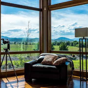 Tomecek Studio Architecture
Photography by John Gibbons
Project by Studio H:T principal in charge Brad Tomecek (now with Tomecek Studio Architecture). This contemporary custom home forms itself based on specific view vectors to Long's Peak and the mountains of the front range combined with the influence of a morning and evening court to facilitate exterior living. Roof forms undulate to allow clerestory light into the space, while providing intimate scale for the exterior areas. A long stone wall provides a reference datum that links public and private and inside and outside into a cohesive whole.


 Houseplay Renovations LLC
This Jersey City, NJ space was the first permanent ‘home’ for the yoga studio, so it was essential for us to listen well and design a space to serve their needs for years to come. Through our design process, we helped to guide the owners through the fit-out of their new studio location that required minimal demolition and disruption to the existing space.
Together, we converted a space originally used as a preschool into a welcoming, spacious yoga studio for local yogis. We created one main yoga studio by combining four small classrooms into a single larger space with new walls, while all the other program spaces (including designated areas for holistic treatments, massage, and bodywork) were accommodated into pre-existing rooms.
Our team completed all demo, sheetrock, electrical, and painting aspects of the project. (The studio owners did some of the work themselves, and a different company installed the flooring and carpets.) The results speak for themselves: a peaceful, restorative space to facilitate health and healing for the studio’s community.
Looking to renovate your place of business? Contact the Houseplay team; we’ll help make it happen!
Photo Credit: Anne Ruthmann Photography

21