
Search results for "Facilitation" in Home Design Ideas

 Houseplay Renovations LLC
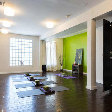
This Jersey City, NJ space was the first permanent ‘home’ for the yoga studio, so it was essential for us to listen well and design a space to serve their needs for years to come. Through our design process, we helped to guide the owners through the fit-out of their new studio location that required minimal demolition and disruption to the existing space.
Together, we converted a space originally used as a preschool into a welcoming, spacious yoga studio for local yogis. We created one main yoga studio by combining four small classrooms into a single larger space with new walls, while all the other program spaces (including designated areas for holistic treatments, massage, and bodywork) were accommodated into pre-existing rooms.
Our team completed all demo, sheetrock, electrical, and painting aspects of the project. (The studio owners did some of the work themselves, and a different company installed the flooring and carpets.) The results speak for themselves: a peaceful, restorative space to facilitate health and healing for the studio’s community.
Looking to renovate your place of business? Contact the Houseplay team; we’ll help make it happen!
Photo Credit: Anne Ruthmann Photography
 Houseplay Renovations LLC
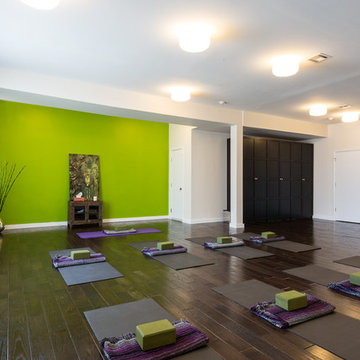
This Jersey City, NJ space was the first permanent ‘home’ for the yoga studio, so it was essential for us to listen well and design a space to serve their needs for years to come. Through our design process, we helped to guide the owners through the fit-out of their new studio location that required minimal demolition and disruption to the existing space.
Together, we converted a space originally used as a preschool into a welcoming, spacious yoga studio for local yogis. We created one main yoga studio by combining four small classrooms into a single larger space with new walls, while all the other program spaces (including designated areas for holistic treatments, massage, and bodywork) were accommodated into pre-existing rooms.
Our team completed all demo, sheetrock, electrical, and painting aspects of the project. (The studio owners did some of the work themselves, and a different company installed the flooring and carpets.) The results speak for themselves: a peaceful, restorative space to facilitate health and healing for the studio’s community.
Looking to renovate your place of business? Contact the Houseplay team; we’ll help make it happen!
Photo Credit: Anne Ruthmann Photography
Find the right local pro for your project
 Bilotta Kitchen & Home
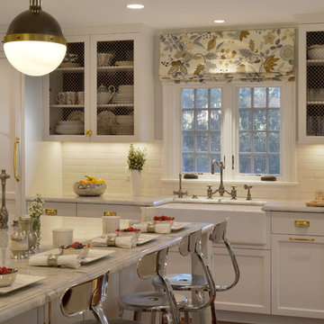
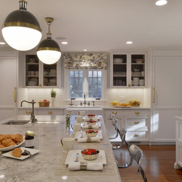
For this project, the entire kitchen was designed around the “must-have” Lacanche range in the stunning French Blue with brass trim. That was the client’s dream and everything had to be built to complement it. Bilotta senior designer, Randy O’Kane, CKD worked with Paul Benowitz and Dipti Shah of Benowitz Shah Architects to contemporize the kitchen while staying true to the original house which was designed in 1928 by regionally noted architect Franklin P. Hammond. The clients purchased the home over two years ago from the original owner. While the house has a magnificent architectural presence from the street, the basic systems, appointments, and most importantly, the layout and flow were inappropriately suited to contemporary living.
The new plan removed an outdated screened porch at the rear which was replaced with the new family room and moved the kitchen from a dark corner in the front of the house to the center. The visual connection from the kitchen through the family room is dramatic and gives direct access to the rear yard and patio. It was important that the island separating the kitchen from the family room have ample space to the left and right to facilitate traffic patterns, and interaction among family members. Hence vertical kitchen elements were placed primarily on existing interior walls. The cabinetry used was Bilotta’s private label, the Bilotta Collection – they selected beautiful, dramatic, yet subdued finishes for the meticulously handcrafted cabinetry. The double islands allow for the busy family to have a space for everything – the island closer to the range has seating and makes a perfect space for doing homework or crafts, or having breakfast or snacks. The second island has ample space for storage and books and acts as a staging area from the kitchen to the dinner table. The kitchen perimeter and both islands are painted in Benjamin Moore’s Paper White. The wall cabinets flanking the sink have wire mesh fronts in a statuary bronze – the insides of these cabinets are painted blue to match the range. The breakfast room cabinetry is Benjamin Moore’s Lampblack with the interiors of the glass cabinets painted in Paper White to match the kitchen. All countertops are Vermont White Quartzite from Eastern Stone. The backsplash is Artistic Tile’s Kyoto White and Kyoto Steel. The fireclay apron-front main sink is from Rohl while the smaller prep sink is from Linkasink. All faucets are from Waterstone in their antique pewter finish. The brass hardware is from Armac Martin and the pendants above the center island are from Circa Lighting. The appliances, aside from the range, are a mix of Sub-Zero, Thermador and Bosch with panels on everything.
 Bilotta Kitchen & Home
For this project, the entire kitchen was designed around the “must-have” Lacanche range in the stunning French Blue with brass trim. That was the client’s dream and everything had to be built to complement it. Bilotta senior designer, Randy O’Kane, CKD worked with Paul Benowitz and Dipti Shah of Benowitz Shah Architects to contemporize the kitchen while staying true to the original house which was designed in 1928 by regionally noted architect Franklin P. Hammond. The clients purchased the home over two years ago from the original owner. While the house has a magnificent architectural presence from the street, the basic systems, appointments, and most importantly, the layout and flow were inappropriately suited to contemporary living.
The new plan removed an outdated screened porch at the rear which was replaced with the new family room and moved the kitchen from a dark corner in the front of the house to the center. The visual connection from the kitchen through the family room is dramatic and gives direct access to the rear yard and patio. It was important that the island separating the kitchen from the family room have ample space to the left and right to facilitate traffic patterns, and interaction among family members. Hence vertical kitchen elements were placed primarily on existing interior walls. The cabinetry used was Bilotta’s private label, the Bilotta Collection – they selected beautiful, dramatic, yet subdued finishes for the meticulously handcrafted cabinetry. The double islands allow for the busy family to have a space for everything – the island closer to the range has seating and makes a perfect space for doing homework or crafts, or having breakfast or snacks. The second island has ample space for storage and books and acts as a staging area from the kitchen to the dinner table. The kitchen perimeter and both islands are painted in Benjamin Moore’s Paper White. The wall cabinets flanking the sink have wire mesh fronts in a statuary bronze – the insides of these cabinets are painted blue to match the range. The breakfast room cabinetry is Benjamin Moore’s Lampblack with the interiors of the glass cabinets painted in Paper White to match the kitchen. All countertops are Vermont White Quartzite from Eastern Stone. The backsplash is Artistic Tile’s Kyoto White and Kyoto Steel. The fireclay apron-front main sink is from Rohl while the smaller prep sink is from Linkasink. All faucets are from Waterstone in their antique pewter finish. The brass hardware is from Armac Martin and the pendants above the center island are from Circa Lighting. The appliances, aside from the range, are a mix of Sub-Zero, Thermador and Bosch with panels on everything.
 Edgewater Design Group
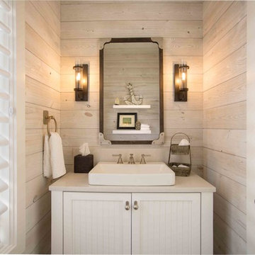
Our clients already had the beautiful lot on Burt Lake, all they needed was the home. We were hired to create an inviting home that had a "craftsman" style of the exterior and a "cottage" style for the interior. They desired to capture a casual, warm, and inviting feeling. The home was to have as much natural light and to take advantage of the amazing lake views. The open concept plan was desired to facilitate lots of family and visitors. The finished design and home is exactly what they hoped for. To quote the owner "Thanks to the expertise and creativity of the design team at Edgewater, we were able to get exactly what we wanted."
-Jacqueline Southby Photography
 Bilotta Kitchen & Home
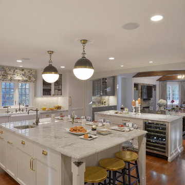
For this project, the entire kitchen was designed around the “must-have” Lacanche range in the stunning French Blue with brass trim. That was the client’s dream and everything had to be built to complement it. Bilotta senior designer, Randy O’Kane, CKD worked with Paul Benowitz and Dipti Shah of Benowitz Shah Architects to contemporize the kitchen while staying true to the original house which was designed in 1928 by regionally noted architect Franklin P. Hammond. The clients purchased the home over two years ago from the original owner. While the house has a magnificent architectural presence from the street, the basic systems, appointments, and most importantly, the layout and flow were inappropriately suited to contemporary living.
The new plan removed an outdated screened porch at the rear which was replaced with the new family room and moved the kitchen from a dark corner in the front of the house to the center. The visual connection from the kitchen through the family room is dramatic and gives direct access to the rear yard and patio. It was important that the island separating the kitchen from the family room have ample space to the left and right to facilitate traffic patterns, and interaction among family members. Hence vertical kitchen elements were placed primarily on existing interior walls. The cabinetry used was Bilotta’s private label, the Bilotta Collection – they selected beautiful, dramatic, yet subdued finishes for the meticulously handcrafted cabinetry. The double islands allow for the busy family to have a space for everything – the island closer to the range has seating and makes a perfect space for doing homework or crafts, or having breakfast or snacks. The second island has ample space for storage and books and acts as a staging area from the kitchen to the dinner table. The kitchen perimeter and both islands are painted in Benjamin Moore’s Paper White. The wall cabinets flanking the sink have wire mesh fronts in a statuary bronze – the insides of these cabinets are painted blue to match the range. The breakfast room cabinetry is Benjamin Moore’s Lampblack with the interiors of the glass cabinets painted in Paper White to match the kitchen. All countertops are Vermont White Quartzite from Eastern Stone. The backsplash is Artistic Tile’s Kyoto White and Kyoto Steel. The fireclay apron-front main sink is from Rohl while the smaller prep sink is from Linkasink. All faucets are from Waterstone in their antique pewter finish. The brass hardware is from Armac Martin and the pendants above the center island are from Circa Lighting. The appliances, aside from the range, are a mix of Sub-Zero, Thermador and Bosch with panels on everything.
 Bilotta Kitchen & Home
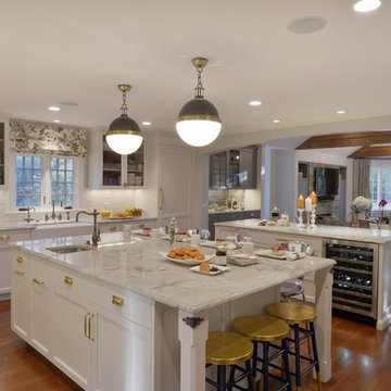
For this project, the entire kitchen was designed around the “must-have” Lacanche range in the stunning French Blue with brass trim. That was the client’s dream and everything had to be built to complement it. Bilotta senior designer, Randy O’Kane, CKD worked with Paul Benowitz and Dipti Shah of Benowitz Shah Architects to contemporize the kitchen while staying true to the original house which was designed in 1928 by regionally noted architect Franklin P. Hammond. The clients purchased the home over two years ago from the original owner. While the house has a magnificent architectural presence from the street, the basic systems, appointments, and most importantly, the layout and flow were inappropriately suited to contemporary living.
The new plan removed an outdated screened porch at the rear which was replaced with the new family room and moved the kitchen from a dark corner in the front of the house to the center. The visual connection from the kitchen through the family room is dramatic and gives direct access to the rear yard and patio. It was important that the island separating the kitchen from the family room have ample space to the left and right to facilitate traffic patterns, and interaction among family members. Hence vertical kitchen elements were placed primarily on existing interior walls. The cabinetry used was Bilotta’s private label, the Bilotta Collection – they selected beautiful, dramatic, yet subdued finishes for the meticulously handcrafted cabinetry. The double islands allow for the busy family to have a space for everything – the island closer to the range has seating and makes a perfect space for doing homework or crafts, or having breakfast or snacks. The second island has ample space for storage and books and acts as a staging area from the kitchen to the dinner table. The kitchen perimeter and both islands are painted in Benjamin Moore’s Paper White. The wall cabinets flanking the sink have wire mesh fronts in a statuary bronze – the insides of these cabinets are painted blue to match the range. The breakfast room cabinetry is Benjamin Moore’s Lampblack with the interiors of the glass cabinets painted in Paper White to match the kitchen. All countertops are Vermont White Quartzite from Eastern Stone. The backsplash is Artistic Tile’s Kyoto White and Kyoto Steel. The fireclay apron-front main sink is from Rohl while the smaller prep sink is from Linkasink. All faucets are from Waterstone in their antique pewter finish. The brass hardware is from Armac Martin and the pendants above the center island are from Circa Lighting. The appliances, aside from the range, are a mix of Sub-Zero, Thermador and Bosch with panels on everything.
 Greg Love Homes
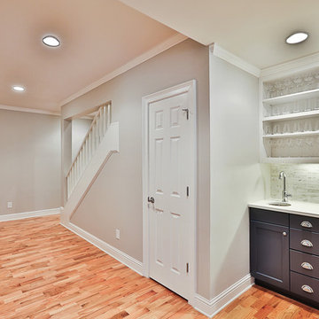
This compact wine bar makes a great place to store a small wine collection and facilitate entertaining in this basement space.
Small transitional home bar photo in Atlanta
Small transitional home bar photo in Atlanta
 Shenton Architects LLP
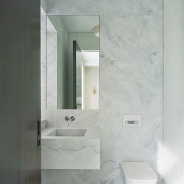
Built in 1925, this 15-story neo-Renaissance cooperative building is located on Fifth Avenue at East 93rd Street in Carnegie Hill. The corner penthouse unit has terraces on four sides, with views directly over Central Park and the city skyline beyond.
The project involved a gut renovation inside and out, down to the building structure, to transform the existing one bedroom/two bathroom layout into a two bedroom/three bathroom configuration which was facilitated by relocating the kitchen into the center of the apartment.
The new floor plan employs layers to organize space from living and lounge areas on the West side, through cooking and dining space in the heart of the layout, to sleeping quarters on the East side. A glazed entry foyer and steel clad “pod”, act as a threshold between the first two layers.
All exterior glazing, windows and doors were replaced with modern units to maximize light and thermal performance. This included erecting three new glass conservatories to create additional conditioned interior space for the Living Room, Dining Room and Master Bedroom respectively.
Materials for the living areas include bronzed steel, dark walnut cabinetry and travertine marble contrasted with whitewashed Oak floor boards, honed concrete tile, white painted walls and floating ceilings. The kitchen and bathrooms are formed from white satin lacquer cabinetry, marble, back-painted glass and Venetian plaster. Exterior terraces are unified with the conservatories by large format concrete paving and a continuous steel handrail at the parapet wall.
Photography by www.petermurdockphoto.com
 LAND DEVELOPMENT AND BUILDING, LLC
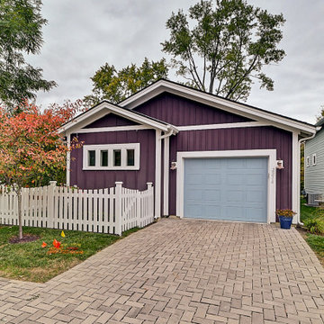
The Betty at Inglenook’s Pocket Neighborhoods is an open two-bedroom Cottage-style Home that facilitates everyday living on a single level. High ceilings in the kitchen, family room and dining nook make this a bright and enjoyable space for your morning coffee, cooking a gourmet dinner, or entertaining guests. Whether it’s the Betty Sue or a Betty Lou, the Betty plans are tailored to maximize the way we live.
 Anthony Michael Interior Design, Ltd.
Aimee Mazzenga Photography
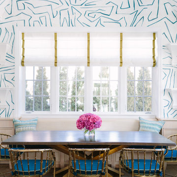
Inspiration for a mid-sized eclectic dark wood floor and brown floor enclosed dining room remodel in Chicago with multicolored walls and no fireplace
Inspiration for a mid-sized eclectic dark wood floor and brown floor enclosed dining room remodel in Chicago with multicolored walls and no fireplace
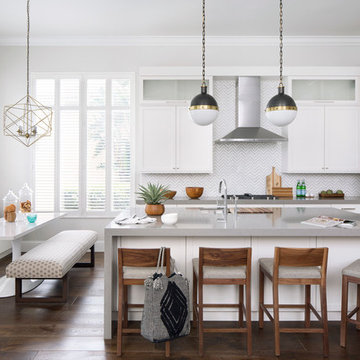

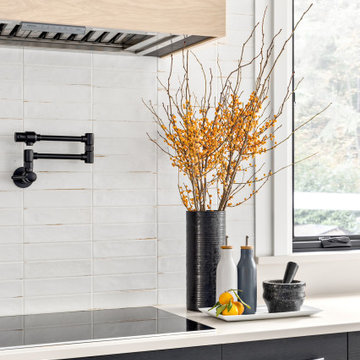
 Simply Home Decorating
This beautiful North Vancouver home belongs to a nature-loving and health-conscious couple, Emma and Vince (names changed), their two young children, and their dog, Jasper. When they contacted us about renovating and furnishing their kitchen and family room, we walked in and saw a world of potential waiting to be uncovered.
Before: Larkhall Crescent Home:
Like many original North Vancouver homes, the interior was definitely dated. We encountered late ‘80s finishes in powder pink and teal green, old carpet, and a kitchen that wasn’t maximized to suit this family’s modern-day lifestyle. However, the size of the rooms offered us a ton of space with which to get creative.
Knowing our clients’ love of cooking, need for work spaces (Emma and Vince both work remotely), and growing family, we developed a design concept that would increase usable space, optimize storage, and create intimacy in this large area. As for the style, we were inspired by their European roots, inventing a new and modern take on “Belgian Farmhouse” style. Now, the home is truly one-of-a-kind.
After: Warm & Cozy Family Room:
Fresh, bright, and comfortable, this living area has been transformed! We started with the fireplace as a focal point, selecting aged brick tiles for added texture and a crisp wood mantle. The taupe-coloured sectional infuses the room with visual warmth and serves the added purpose of separating the family room from the kitchen.
Emma and Vince were also keen on using non-toxic materials in their home, and we were happy to oblige. To meet their needs, we sourced natural wood elements and sought out Canadian-made products - that adhere to high health standards - whenever possible.
Look closer at the elements of this space, and you will find this stunning, honeycomb-patterned rug in earthy gold, beige, and charcoal tones. It’s plush to the touch and full of visual texture that brings this room’s colour palette together. We sourced these two-tone chairs with caning, petrified wood side table, black sconces, and botanical prints in greyscale from local artist, Heather Johnston.
We topped off the space with this dark wood and rattan console that offers storage facing the kitchen and presents an opportunity to display cherished items. The result is a cozy lounging space brimming with comfort and functionality. It’s perfect for enjoying quality family time, or Emma can simply slide the coffee table away to make room for her morning yoga practice.
Now, let’s turn around and give some attention to the kitchen. Do you remember what the original kitchen looked like? If not, scroll back up, because the transformation is shocking…
Moody & Welcoming Kitchen for Healthy Living:
This kitchen looks very different from how it started, right? Though we didn’t touch any walls, the kitchen has almost doubled in usable space! We created a long, extended island with storage, an outlet for small appliances, and seating for comfortable prep, after-school snacking, or mingling among friends.
On the other side of the island, the family has even more storage and an integrated dishwasher within easy reach of the sink, perfect for quick clean-up. From this angle, you can also see the expansive custom Shaker cabinetry in white and the integrated double ovens. These facilitate their cooking experience and gave us the opportunity to add an additional surprise…
A coffee garage station and more hidden storage! Keeping these items located along the perimeter allows them to be accessed by the family or their guests without someone getting under the cook’s feet. These are the little details that make everyday life easier and more enjoyable.
Moving deeper into the kitchen, the seamless induction cooktop topped with a freestanding concealed hood fan commands attention in a soft yet prominent way. The natural wood accent mirrors the fireplace mantle, and the choice of off-black wood-grain cabinets not only continues our black-and-white colour palette but adds a sense of depth and contrast. The corner sink is located to the right and perfectly positioned with a view of their thriving backyard.
To invite more of this family’s character into the space, we mixed metals for interest — matte black, dark pewter, and warm brass — and created open shelves in white oak for their plants and decor. You can also glimpse the tumbled edge of the backsplash tile, which echoes the rustic brick of the fireplace. It adds that farmhouse charm while still feeling timeless and sophisticated.
Last but not least, we designed this dining banquette in the bay window (with integrated bench storage, of course), where the family can share a meal together, the kids can do homework, or Emma and Vince can work and enjoy a change of scenery from their offices. Like the other spaces in the home, it was designed to be beautiful, multi-functional, and long-lasting.
Praise from Our Clients:
It is clear that we love this home, but what did our clients have to say?
“Lori is a visionary and masters execution to the finest detail all at the same time. When she first met us to know more about who we are and how we live, she could right away envision how we could use the space in our kitchen and living room…The results exceeded our expectations.
Lori and her team were also a delight to work with — coordination with all the trades, fast problem-solving, regular updates, professional and friendly attitude of her entire team — made it the dream team. Thank you SHD for making our space so beautiful!”
In turn, we are so grateful for this family’s trust, their open communication, and for being wonderful people with whom to work. (So, thank you!)
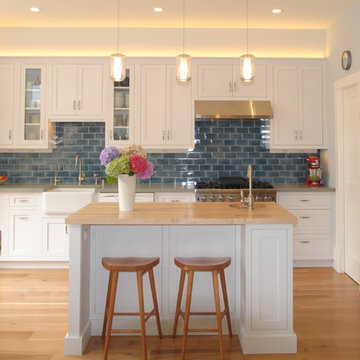
 The Insider Studio
Built in 1909, this 3-story single-family home is in the heart of Noe
Valley. An old addition in the back of the house, which had served as the laundry room and access to the back yard, was in need of repair. So the homeowners decided to open up this area and incorporate it in their kitchen remodel.
Kat Tragos of Timeless Kitchens worked closely with the homeowners, Kim and Max, and their contractor to create a floor plan that would discreetly accommodate their washer/dryer as well as other kitchen appliances.
With two young daughters eager to help in the kitchen, Max and Kim decided a prep sink and island would facilitate more cooks. They also liked the
historic look of a farm sink, so this was a must-have on the list. Other
wants were a cat feeding station, a butcher- block island-top, and open
shelving for cookbooks.
The white inset door style and decorative panels were chosen to mimic the
home's original craftsman-style and beautiful wainscoting.
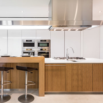
 Equilibrium Interior Design Inc
The sleek design allows you to move around the kitchen without protruding catching handles. The doors and drawers incorporate state of the art technology allowing for simple tap or push on the surface for the cabinetry to open. This is especially useful when your hands have food on them when you’re cooking as you are able to use your knee or thigh to activate doors to open. Even refrigerator and freezer have a fully integrated hidden custom pull handle that looks like a vertical reveal – this allows for good grip to pull the heavy doors with suction, and the white acrylic panels are very easy to keep clean.
Positions of two sinks on the island were specifically placed in the locations to facilitate the steps in food preparation - having them both on a single working surface makes it easier to work between them without dropping food or dripping water on the floors while preparing for cooking. Island incorporates a tall counter to sit at for a quick bite or just to stand around with you friends as you are preparing a meal. . This island truly is the heart of the kitchen and the heart of this home.
Photography: Craig Denis
 Tomecek Studio Architecture
Photography by John Gibbons
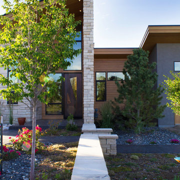
Project by Studio H:T principal in charge Brad Tomecek (now with Tomecek Studio Architecture). This contemporary custom home forms itself based on specific view vectors to Long's Peak and the mountains of the front range combined with the influence of a morning and evening court to facilitate exterior living. Roof forms undulate to allow clerestory light into the space, while providing intimate scale for the exterior areas. A long stone wall provides a reference datum that links public and private and inside and outside into a cohesive whole.
 ZeroEnergy Design
This renovated brick rowhome in Boston’s South End offers a modern aesthetic within a historic structure, creative use of space, exceptional thermal comfort, a reduced carbon footprint, and a passive stream of income.
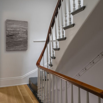
DESIGN PRIORITIES. The goals for the project were clear - design the primary unit to accommodate the family’s modern lifestyle, rework the layout to create a desirable rental unit, improve thermal comfort and introduce a modern aesthetic. We designed the street-level entry as a shared entrance for both the primary and rental unit. The family uses it as their everyday entrance - we planned for bike storage and an open mudroom with bench and shoe storage to facilitate the change from shoes to slippers or bare feet as they enter their home. On the main level, we expanded the kitchen into the dining room to create an eat-in space with generous counter space and storage, as well as a comfortable connection to the living space. The second floor serves as master suite for the couple - a bedroom with a walk-in-closet and ensuite bathroom, and an adjacent study, with refinished original pumpkin pine floors. The upper floor, aside from a guest bedroom, is the child's domain with interconnected spaces for sleeping, work and play. In the play space, which can be separated from the work space with new translucent sliding doors, we incorporated recreational features inspired by adventurous and competitive television shows, at their son’s request.
MODERN MEETS TRADITIONAL. We left the historic front facade of the building largely unchanged - the security bars were removed from the windows and the single pane windows were replaced with higher performing historic replicas. We designed the interior and rear facade with a vision of warm modernism, weaving in the notable period features. Each element was either restored or reinterpreted to blend with the modern aesthetic. The detailed ceiling in the living space, for example, has a new matte monochromatic finish, and the wood stairs are covered in a dark grey floor paint, whereas the mahogany doors were simply refinished. New wide plank wood flooring with a neutral finish, floor-to-ceiling casework, and bold splashes of color in wall paint and tile, and oversized high-performance windows (on the rear facade) round out the modern aesthetic.
RENTAL INCOME. The existing rowhome was zoned for a 2-family dwelling but included an undesirable, single-floor studio apartment at the garden level with low ceiling heights and questionable emergency egress. In order to increase the quality and quantity of space in the rental unit, we reimagined it as a two-floor, 1 or 2 bedroom, 2 bathroom apartment with a modern aesthetic, increased ceiling height on the lowest level and provided an in-unit washer/dryer. The apartment was listed with Jackie O'Connor Real Estate and rented immediately, providing the owners with a source of passive income.
ENCLOSURE WITH BENEFITS. The homeowners sought a minimal carbon footprint, enabled by their urban location and lifestyle decisions, paired with the benefits of a high-performance home. The extent of the renovation allowed us to implement a deep energy retrofit (DER) to address air tightness, insulation, and high-performance windows. The historic front facade is insulated from the interior, while the rear facade is insulated on the exterior. Together with these building enclosure improvements, we designed an HVAC system comprised of continuous fresh air ventilation, and an efficient, all-electric heating and cooling system to decouple the house from natural gas. This strategy provides optimal thermal comfort and indoor air quality, improved acoustic isolation from street noise and neighbors, as well as a further reduced carbon footprint. We also took measures to prepare the roof for future solar panels, for when the South End neighborhood’s aging electrical infrastructure is upgraded to allow them.
URBAN LIVING. The desirable neighborhood location allows the both the homeowners and tenant to walk, bike, and use public transportation to access the city, while each charging their respective plug-in electric cars behind the building to travel greater distances.
OVERALL. The understated rowhouse is now ready for another century of urban living, offering the owners comfort and convenience as they live life as an expression of their values.
Eric Roth Photo
 Sierra Living Concepts Inc
Dimension:
32" L X 17" D X 70" H
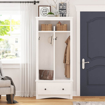
Redefine your typical empty entrance foyers and lifeless hallways by furnishing with our elegant Louviers Solid Mahogany Wood 1 Drawer Entryway White Hall Tree with Coat Rack!
It has a very unique design – almost like an armoire, but with contemporary alterations to keep things interesting. It has been handcrafted from the sturdiest solid wood and is of highest heirloom quality.
The heirloom quality is complemented by the graceful designing. The tall stature starts off with an extended top frame with beveled edges. The portion above the seating takes up around three-quarters of the entire hall tree. It is also symmetrically compartmentalized. There’s a cross-like barrier that divides the large upper portion into 4 quadrants. The top 2 of these are small open cubbies that can be used to organize shoes or even feature a decoration piece or two or hand-woven baskets. The bottom compartments are, however, much taller with four 2 prong hooks installed, designed to hang your clothes and coats upon entering. The bottom part features a large pullout drawer for extra storage right below the platform meant to facilitate seating. The platform base reveals a sleek elliptical arch design.
The simple and sleek styling of this solid wood hallway tree is definitely one-of-a-kind, but can easily be featured in a number of interior design styles like eclectic, contemporary, rustic, etc.
Special Features:
• 100% Handcrafted
• Solid wood craftsmanship
• Modern style
• Sleek designing
• Extended top frame
• 2 small cubbies at the top
• Tall coat-hanging compartments on the main body
• Large pullout drawer below the seating platform
• Stylish arch-platform base
• Trendy hand-wrought metal hardware
• Stunning hand-rubbed finish
• Heirloom quality
• Visually versatile
• Easy maintenance and cleaning
Note: Our furniture is made of solid wood (not wood veneer over plywood). It is handcrafted by Master Artisans. Real wood is a product of nature, and as such, no two pieces are alike. Variations in solid wood grain patterns are to be expected and make each furniture uniquely beautiful, just like us humans.
 LAND DEVELOPMENT AND BUILDING, LLC
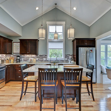
The Betty at Inglenook’s Pocket Neighborhoods is an open two-bedroom Cottage-style Home that facilitates everyday living on a single level. High ceilings in the kitchen, family room and dining nook make this a bright and enjoyable space for your morning coffee, cooking a gourmet dinner, or entertaining guests. Whether it’s the Betty Sue or a Betty Lou, the Betty plans are tailored to maximize the way we live. This is the kitchen which is open to the living and dining areas.
22