
Search results for "Familiar" in Home Design Ideas
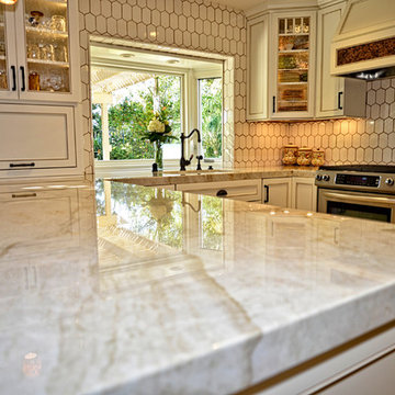
 REHAB Kitchen & Bath
Mid-sized transitional l-shaped travertine floor eat-in kitchen photo in San Diego with a farmhouse sink, shaker cabinets, white cabinets, granite countertops, white backsplash, ceramic backsplash, stainless steel appliances and a peninsula
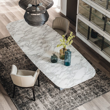
 RoomService 360
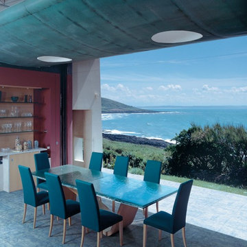
Eliot Keramik Modern Dining Table is a synopsis of original Italian design, offering incredible utility and stylistic dimension. Manufactured in Italy by Cattelan Italia, Eliot Keramik is the latest iteration to the Eliot Dining Collection with familiar edginess and novelty of ceramic surface.
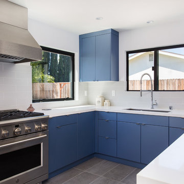
 Metropolis Drafting and Construction Inc
A small enclosed kitchen is very common in many homes such as the home that we remodeled here.
Opening a wall to allow natural light to penetrate the space is a must. When budget is important the solution can be as you see in this project - the wall was opened and removed but a structural post remained and it was incorporated in the design.
The blue modern flat paneled cabinets was a perfect choice to contras the very familiar gray scale color scheme but it’s still compliments it since blue is in the correct cold color spectrum.
Notice the great black windows and the fantastic awning window facing the pool. The awning window is great to be able to serve the exterior sitting area near the pool.
Opening the wall also allowed us to compliment the kitchen with a nice bar/island sitting area without having an actual island in the space.
The best part of this kitchen is the large built-in pantry wall with a tall wine fridge and a lovely coffee area that we built in the sitting area made the kitchen expend into the breakfast nook and doubled the area that is now considered to be the kitchen.
Find the right local pro for your project
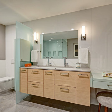
 Nar Design Group
This client grew up in this 1950’s family home and has now become owner in his adult life. Designing and remodeling this childhood home that the client was very bonded and familiar with was a tall order. This modern twist of original mid-century style combined with an eclectic fusion of modern day materials and concepts fills the room with a powerful presence while maintaining its clean lined austerity and elegance. The kitchen was part of a grander complete home re-design and remodel.
A modern version of a mid-century His and Hers grand master bathroom was created to include all the amenities and nothing left behind! This bathroom has so much noticeable and hidden “POW” that commands its peaceful spa feeling with a lot of attitude. Maintaining ultra-clean lines yet delivering ample design interest at every detail, This bathroom is eclectically a one of a kind luxury statement.
The concept in the laundry room was to create a simple, easy to use and clean space with ample storage and a place removed from the central part of the home to house the necessity of the cats and their litter box needs. There was no need for glamour in the laundry room yet we were able to create a simple highly utilitarian space.
If there is one room in the home that requires frequent visitors to thoroughly enjoy with a huge element of surprise, it’s the powder room! This is a room where you know that eventually, every guest will visit. Knowing this, we created a bold statement with layers of intrigue that would leave ample room for fun conversation with your guests upon their prolonged exit. We kept the lights dim here for that intriguing experience of crafted elegance and created ambiance. The walls of peeling metallic rust are the welcoming gesture to a powder room experience of defiance and elegant mystical complexity.
It's a lucky house guest indeed who gets to stay in this newly remodeled home. This on-suite bathroom allows them their own space and privacy. Both Bedroom and Bathroom offer plenty of storage for an extended stay. Rift White Oak cabinets and sleek Silestone counters make a lovely combination in the bathroom while the bedroom showcases textured white cabinets with a dark walnut wrap.
Photo credit: Fred Donham of PhotographerLink
 Matt Fajkus Architecture
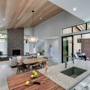
The cabin typology redux came out of the owner’s desire to have a house that is warm and familiar, but also “feels like you are on vacation.” The basis of the “Hewn House” design starts with a cabin’s simple form and materiality: a gable roof, a wood-clad body, a prominent fireplace that acts as the hearth, and integrated indoor-outdoor spaces. However, rather than a rustic style, the scheme proposes a clean-lined and “hewned” form, sculpted, to best fit on its urban infill lot.
The plan and elevation geometries are responsive to the unique site conditions. Existing prominent trees determined the faceted shape of the main house, while providing shade that projecting eaves of a traditional log cabin would otherwise offer. Deferring to the trees also allows the house to more readily tuck into its leafy East Austin neighborhood, and is therefore more quiet and secluded.
Natural light and coziness are key inside the home. Both the common zone and the private quarters extend to sheltered outdoor spaces of varying scales: the front porch, the private patios, and the back porch which acts as a transition to the backyard. Similar to the front of the house, a large cedar elm was preserved in the center of the yard. Sliding glass doors open up the interior living zone to the backyard life while clerestory windows bring in additional ambient light and tree canopy views. The wood ceiling adds warmth and connection to the exterior knotted cedar tongue & groove. The iron spot bricks with an earthy, reddish tone around the fireplace cast a new material interest both inside and outside. The gable roof is clad with standing seam to reinforced the clean-lined and faceted form. Furthermore, a dark gray shade of stucco contrasts and complements the warmth of the cedar with its coolness.
A freestanding guest house both separates from and connects to the main house through a small, private patio with a tall steel planter bed.
Photo by Charles Davis Smith
 McCullough Design Development, Inc.
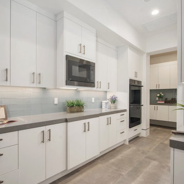
A modern telling of the familiar California-Spanish style with contemporary, chic interiors, dramatized by hues of mineral blues, soft whites, and smokey grays. An open floor plan with a clean feel! Curtained by forest-like surroundings and lush landscaping in the community of Rancho Valencia.
 Home Builders Association of Greater Des Moines
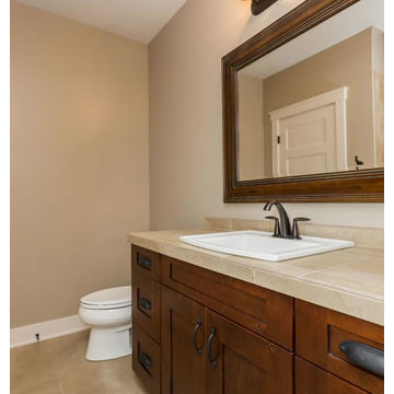
Once again, Tyler Homes has put its distinctive touch on a familiar architectural design, this time a prairie home interpreted for the 21st century. The main level offers a central great room with 12-foot beamed ceiling and a study with sliding barn doors. In the kitchen, commercial grade appliances and a hidden walk-in pantry offer modern convenience. A master suite with luxurious amenities, including a walk-in shower and separate tub, offers a private retreat with separate access to the covered patio as well as the laundry room. On the second floor, you’ll find two bedrooms with a Jack-and-Jill bath; a third bedroom with private bath and loft access; and a raised loft with views of the back yard. The home’s walkout lower level continues the prairie styling but with the best features of contemporary living. A sunken family room with bar, a game room, and a fifth bedroom/exercise room provide plenty of space for relaxing and entertaining. Tyler Homes has even included a dog room with its own little entrance. Wood ceiling beams and unique architectural accents throughout the home enhance the prairie design
 Thayer Cutler Construction
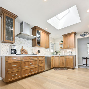
A contemporary twist on dark wood kitchen cabinetry provides a rich and familiar gathering place in the heart of this Santa Cruz home
Inspiration for a large farmhouse u-shaped brown floor eat-in kitchen remodel in San Francisco with recessed-panel cabinets, dark wood cabinets, quartz countertops, multicolored backsplash, glass tile backsplash, stainless steel appliances, an island and white countertops
Inspiration for a large farmhouse u-shaped brown floor eat-in kitchen remodel in San Francisco with recessed-panel cabinets, dark wood cabinets, quartz countertops, multicolored backsplash, glass tile backsplash, stainless steel appliances, an island and white countertops
 TVL Creative Ltd.
This 1910 West Highlands home was so compartmentalized that you couldn't help to notice you were constantly entering a new room every 8-10 feet. There was also a 500 SF addition put on the back of the home to accommodate a living room, 3/4 bath, laundry room and back foyer - 350 SF of that was for the living room. Needless to say, the house needed to be gutted and replanned.
Kitchen+Dining+Laundry-Like most of these early 1900's homes, the kitchen was not the heartbeat of the home like they are today. This kitchen was tucked away in the back and smaller than any other social rooms in the house. We knocked out the walls of the dining room to expand and created an open floor plan suitable for any type of gathering. As a nod to the history of the home, we used butcherblock for all the countertops and shelving which was accented by tones of brass, dusty blues and light-warm greys. This room had no storage before so creating ample storage and a variety of storage types was a critical ask for the client. One of my favorite details is the blue crown that draws from one end of the space to the other, accenting a ceiling that was otherwise forgotten.
Primary Bath-This did not exist prior to the remodel and the client wanted a more neutral space with strong visual details. We split the walls in half with a datum line that transitions from penny gap molding to the tile in the shower. To provide some more visual drama, we did a chevron tile arrangement on the floor, gridded the shower enclosure for some deep contrast an array of brass and quartz to elevate the finishes.
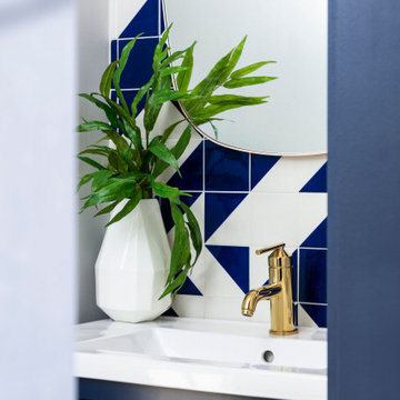
Powder Bath-This is always a fun place to let your vision get out of the box a bit. All the elements were familiar to the space but modernized and more playful. The floor has a wood look tile in a herringbone arrangement, a navy vanity, gold fixtures that are all servants to the star of the room - the blue and white deco wall tile behind the vanity.
Full Bath-This was a quirky little bathroom that you'd always keep the door closed when guests are over. Now we have brought the blue tones into the space and accented it with bronze fixtures and a playful southwestern floor tile.
Living Room & Office-This room was too big for its own good and now serves multiple purposes. We condensed the space to provide a living area for the whole family plus other guests and left enough room to explain the space with floor cushions. The office was a bonus to the project as it provided privacy to a room that otherwise had none before.
 Nar Design Group
This client grew up in this 1950’s family home and has now become owner in his adult life. Designing and remodeling this childhood home that the client was very bonded and familiar with was a tall order. This modern twist of original mid-century style combined with an eclectic fusion of modern day materials and concepts fills the room with a powerful presence while maintaining its clean lined austerity and elegance. The kitchen was part of a grander complete home re-design and remodel.
A modern version of a mid-century His and Hers grand master bathroom was created to include all the amenities and nothing left behind! This bathroom has so much noticeable and hidden “POW” that commands its peaceful spa feeling with a lot of attitude. Maintaining ultra-clean lines yet delivering ample design interest at every detail, This bathroom is eclectically a one of a kind luxury statement.
The concept in the laundry room was to create a simple, easy to use and clean space with ample storage and a place removed from the central part of the home to house the necessity of the cats and their litter box needs. There was no need for glamour in the laundry room yet we were able to create a simple highly utilitarian space.
If there is one room in the home that requires frequent visitors to thoroughly enjoy with a huge element of surprise, it’s the powder room! This is a room where you know that eventually, every guest will visit. Knowing this, we created a bold statement with layers of intrigue that would leave ample room for fun conversation with your guests upon their prolonged exit. We kept the lights dim here for that intriguing experience of crafted elegance and created ambiance. The walls of peeling metallic rust are the welcoming gesture to a powder room experience of defiance and elegant mystical complexity.
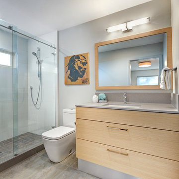
It's a lucky house guest indeed who gets to stay in this newly remodeled home. This on-suite bathroom allows them their own space and privacy. Both Bedroom and Bathroom offer plenty of storage for an extended stay. Rift White Oak cabinets and sleek Silestone counters make a lovely combination in the bathroom while the bedroom showcases textured white cabinets with a dark walnut wrap.
Photo credit: Fred Donham of PhotographerLink
 Berry Design Build
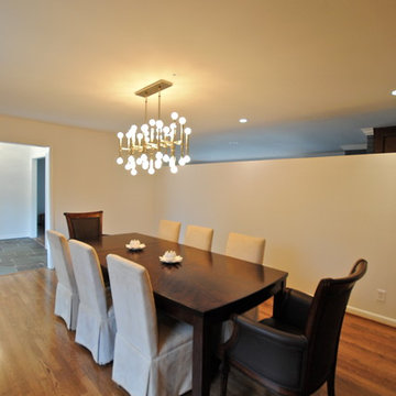
If you are familiar with our work, at Berry Design Build, you know that to us each project is more than just sticks and mortar. Each home, each client, each family we have the privilege to work with becomes part of our team. We believe in the value of excellence, the importance of commitment, and the significance of delivery. This renovation, along with many, is very close to our hearts because it’s one of the few instances where we get to exercise more than just the Design Build division of our company. This particular client had been working with Berry for many years to find that lifetime home. Through many viewings, agent caravans, and lots of offers later she found a house worth calling home. Although not perfectly to her personality (really what home is until you make it yours) she asked our Design Build division to come in and renovate some areas: including the kitchen, hall bathroom, master bathroom, and most other areas of the house; i.e. paint, hardwoods, and lighting. Each project comes with its challenges, but we were able to combine her love of mid-century modern furnishings with the character of the already existing 1962 ranch.
Photos by Nicole Cosentino
 Rodwin Architecture & Skycastle Construction
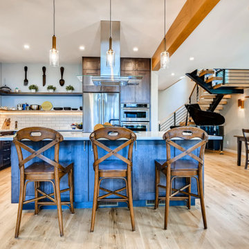
This lovely little modern farmhouse is located at the base of the foothills in one of Boulder’s most prized neighborhoods. Tucked onto a challenging narrow lot, this inviting and sustainably designed 2400 sf., 4 bedroom home lives much larger than its compact form. The open floor plan and vaulted ceilings of the Great room, kitchen and dining room lead to a beautiful covered back patio and lush, private back yard. These rooms are flooded with natural light and blend a warm Colorado material palette and heavy timber accents with a modern sensibility. A lyrical open-riser steel and wood stair floats above the baby grand in the center of the home and takes you to three bedrooms on the second floor. The Master has a covered balcony with exposed beamwork & warm Beetle-kill pine soffits, framing their million-dollar view of the Flatirons.
Its simple and familiar style is a modern twist on a classic farmhouse vernacular. The stone, Hardie board siding and standing seam metal roofing create a resilient and low-maintenance shell. The alley-loaded home has a solar-panel covered garage that was custom designed for the family’s active & athletic lifestyle (aka “lots of toys”). The front yard is a local food & water-wise Master-class, with beautiful rain-chains delivering roof run-off straight to the family garden.
 LiLu Interiors
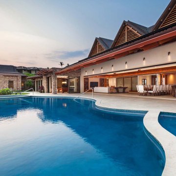
Chris and Marna believe in Ohana Mau Loa which means “family forever.” As return clients, they knew LiLu could help them build a vacation home in Hawaii that would provide a desirable and comfortable gathering place for four adult children and their spouses and 11 grandchildren. A central common space at the heart of the home with separate living quarters surrounding it helps to accommodate everyone with both shared and personal living spaces. Each has its own personality that showcases playful references to Big Island life. And yet the overall design concept weaves together a love of world travel with traditional tastes. Built with mahogany wood that is a staple of island construction, treasured heirlooms and other personal keepsakes are the perfect complement to make this dream home feel welcoming and familiar. Fabrics, finishes and furnishings were selected with the sea in mind and to accommodate wet swim suits, bare feet, and sandy shoes.
-----
Project designed by Minneapolis interior design studio LiLu Interiors. They serve the Minneapolis-St. Paul area including Wayzata, Edina, and Rochester, and they travel to the far-flung destinations that their upscale clientele own second homes in.
----
For more about LiLu Interiors, click here: https://www.liluinteriors.com/
---
To learn more about this project, click here:
https://www.liluinteriors.com/blog/portfolio-items/ohana-mau-loa/
 TVL Creative Ltd.
This 1910 West Highlands home was so compartmentalized that you couldn't help to notice you were constantly entering a new room every 8-10 feet. There was also a 500 SF addition put on the back of the home to accommodate a living room, 3/4 bath, laundry room and back foyer - 350 SF of that was for the living room. Needless to say, the house needed to be gutted and replanned.
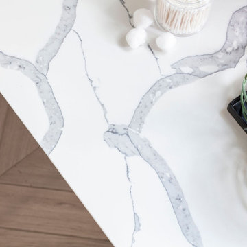
Kitchen+Dining+Laundry-Like most of these early 1900's homes, the kitchen was not the heartbeat of the home like they are today. This kitchen was tucked away in the back and smaller than any other social rooms in the house. We knocked out the walls of the dining room to expand and created an open floor plan suitable for any type of gathering. As a nod to the history of the home, we used butcherblock for all the countertops and shelving which was accented by tones of brass, dusty blues and light-warm greys. This room had no storage before so creating ample storage and a variety of storage types was a critical ask for the client. One of my favorite details is the blue crown that draws from one end of the space to the other, accenting a ceiling that was otherwise forgotten.
Primary Bath-This did not exist prior to the remodel and the client wanted a more neutral space with strong visual details. We split the walls in half with a datum line that transitions from penny gap molding to the tile in the shower. To provide some more visual drama, we did a chevron tile arrangement on the floor, gridded the shower enclosure for some deep contrast an array of brass and quartz to elevate the finishes.
Powder Bath-This is always a fun place to let your vision get out of the box a bit. All the elements were familiar to the space but modernized and more playful. The floor has a wood look tile in a herringbone arrangement, a navy vanity, gold fixtures that are all servants to the star of the room - the blue and white deco wall tile behind the vanity.
Full Bath-This was a quirky little bathroom that you'd always keep the door closed when guests are over. Now we have brought the blue tones into the space and accented it with bronze fixtures and a playful southwestern floor tile.
Living Room & Office-This room was too big for its own good and now serves multiple purposes. We condensed the space to provide a living area for the whole family plus other guests and left enough room to explain the space with floor cushions. The office was a bonus to the project as it provided privacy to a room that otherwise had none before.
 GOAT
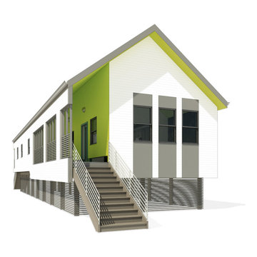
GOATGOAT designed the St. Roch Avenue Shotgun House as an affordable single-family housing prototype. To date, three homes have been constructed in New Orleans by SBP with teams of volunteers.
The houses were designed to continue the evolution of the city’s residential architecture while responding to the concerns of neighborhood residents regarding context, familiarity, and affordability. The resulting three homes, built on the same block in the Milneburg neighborhood of Gentilly, establish a case study in how modern architecture can meet the challenges of neighborhood revitalization with sensitivity. By relating to the scale, rhythm and texture of the traditional New Orleans neighborhood, the St. Roch Avenue Shotgun is reminiscent of a traditional New Orleans home. By incorporating modern materials and construction methods, vaulting interior spaces, adjusting the historic shotgun layout, and adding some contemporary flair, it functions like a modern home.
 User
UserWhat was once an unfinished basement is now a perfect getaway and space to entertain. The main focus is the projection screen and cozy couches for the family to gather and watch movies in surround sound. Just a few feet away, a kitchenette provides some refreshments and food. This space also allows plenty of room to throw a party and this kitchenette can store lots of food and drink.
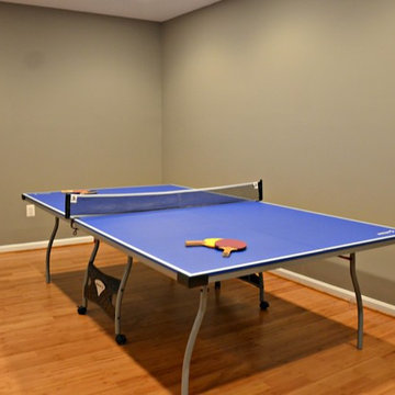
Down the hall we have a rec room with a ping pong table. Across from that is a gym so the homeowners can continue to live a healthy lifestyle.
On the other side of the basement there is a playroom that can easily double as a guest room. It's a great spot for the kids to play and keep their toys all in one place. Next door is a "jack and jill" bathroom that is appropriate for all ages. Walk in the door and you'll be wowed by the mosaic tile accent that greets you from inside the shower.
We're happy to hear the family is enjoying the space and have enjoyed a few parties!
 Zander's Interiors
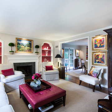
Imbued with color inspiration from the 1930’s, the massive style capacity of this home is demonstrated over 15 years of artful adaptation in the living and dining rooms. An analogous color scheme with prominent aqua and green tones popular in the 1930’s first graces the living room to creatively infuse a traditional French style. Bergère chairs flank the large focal fireplace with its classical use of stone and versatile dentil trim molding. Coordinating colors in boldly-striped silk shantung bring the acanthus leaf chandelier comfortably into the 20thcentury; only to be jettisoned even further with the room’s next iteration. Still with a nod to the 1930’s color palette, bolder tones of orange and rose with smaller stripes later reinvent the saber legged dining room chairs to skillfully incorporate smoky hues on the walls. Sketchy floral print drapery revises the room by bringing a joyful eclecticism, ever expanding the potential of the space to bring in new influences. A curved back chair reminiscent of the 1930’s set beneath decidedly 20th century artwork; further showcasing the room’s latest use of more streamlined forms. The more transitional upholstered chairs and ottoman craftily unify a more diverse portfolio of furnishings and artwork, as does the continuation of deep tones in thought both spaces.
Invigorated once again with a third look, the living and dining areas are dramatically transformed with a backdrop of soft neutral punctuated by juicy pops of color introduce a new sense of depth and character to the space. Articulated beautifully in the artwork, colors keep the eyes dancing and creativity flowing yet they allow the space to also nurture relaxation and calm. A bold statement on the windows maintains the necessary balance in the dining room for its chandelier; miraculously staying right at home with each redesign. The familiar is successfully re-imagined to prove once again that the perennial beauty of a well-crafted home, furnishings and accessories can be made to embody our unique sense of style at every stage of our lives.
 Exclusive Home Interiors
A lovely motif
The decorative pattern of the floor-tile provides rhythm and naturality.
That is a new era in the development of Gres Porcelain as own-element.
The outline of a design that always modifies according to the laying side Whoever takes a look feel the power of something alive. The very first floor-tile styled by Petracer’s . An usual decorative theme. On fabrics, objects and structural home-ware such as banisters and window-sills, as well as building materials, iron, timber, fired-earth and aimed to decorative purposes like badges, frames or backgrounds, something very close and familiar for many cultures. Conceived as core of decoration, this outline had previously never been achieved on a floor. The development of this idea headed to creation of an innovative theme that let combine, while laying it down, a customized pattern free from pre-arranged schemes. In other words, all the tiles can be fixed to each other in any side without distinction and still providing the best coherence of the decorative pattern. Every laying-scheme gets therefore unique through the flexibility of its arrangements just like something alive. An important style concept that brings honour back to ceramic as ancient decorative element and Gres Porcelain that does not imitate any raw material but simply express itself through the harmony of style and shades.
 GMT Home Designs Inc.
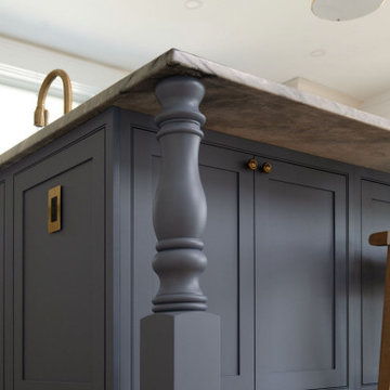
This beloved seaside home received a thoughtful, multi-phase expansion designed around one simple goal: more room for family. The project included a new attached 2-car garage with a finished suite above — featuring a kitchenette and in-unit laundry — plus a structural addition to the right side of the home that opened up the kitchen, dining, and living areas. Exterior decks were updated with modern materials, the landscaping was reimagined from the ground up, and the entire interior was remodeled and refreshed. The result is a home that feels both brand new and deeply familiar.
 Klopf Architecture
From Mid-Century Classic to the Present
An iconic design updated with comfort, function, and flow for today.
A Remodel That Balances Past and Present
What started as a desire to update a classic Eichler soon became an exploration of how Mid-Century Modern design can successfully evolve for today. The client, a tech professional with a passion for scuba diving and underwater photography, wanted a home that would both honor its original character and feel tailored to his daily life. A lifelong technology enthusiast, he still owns the very first Mac desktop he saved up for as a teenager working at Radio Shack, a detail that underscores his appreciation for design that melds function and form.
Honoring Separation While Expanding Possibility
Unlike many contemporary remodels where walls are opened up to create expansive living spaces, this project took a more restrained approach. The client valued the defined rooms of the original plan and wanted to preserve as much wall space as possible for displaying his large-format underwater photography. The emphasis was not on dramatic spatial reinvention, but on thoughtful refinements. Klopf Architecture shaped a gallery-like backdrop while also expanding the primary suite, modernizing materials and fixtures throughout the home, and improving the functionality and layout of the kitchen. The finished home feels at once timeless and renewed, an Eichler that continues to inspire while fully supporting the lifestyle of its present-day owner.
A major turning point came mid-design. The original project brief had not included an addition, but as the reconfiguration of the primary bedroom and bath unfolded, it became clear that an expansion was the best approach to achieve the client’s vision of a more spacious suite. Fortunately, the adjustment came at a stage when revisions were still manageable and was integrated seamlessly, showing how thoughtful course corrections can strengthen a project rather than hinder it.
Navigating Challenges With Precision
The design development included multiple conceptual rounds, balancing preservation with subtle expansion. During construction, an existing post previously thought to be load-bearing turned out not to be. The structural engineer was able to pivot quickly, and both the post and the cross beam that had been intended to replace it could be omitted, allowing the original rhythm of the Eichler beam bays to be preserved.
Sustainability was not just a checklist item, but a way to align the home with the client’s values of simplicity, efficiency, and long-term functionality. R-38 roof insulation reduced energy usage, solar panels with battery storage provided independence and resilience, and passive comfort strategies eliminated the need forenergy-intensive air conditioning. An electric vehicle charger and an on-demand hot water recirculation system (with call buttons as opposed to having constant circulation) add to the home’s long-term efficiency factors. Together, these moves created a home that is quieter, more comfortable, and better equipped for the future, qualities that supported the client’s pragmatic approach to design and living lightly.
Details That Respect the Eichler DNA
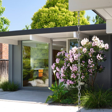
The remodel carries forward the Eichler’s original spirit while introducing new layers of modern livability. Originally, the house was approached along a deep, narrow walk, with the garage on one side and the house on the other, leaving the front door tucked far back within this chasm-like space. By pulling the entry forward, the design reshaped the arrival experience, creating a clearer threshold and a natural drop-off zone for bags, shoes, and keys. This shift also made room for a custom bench at the entry that extends seamlessly through the glass sidelight. The bench and drop-off zone now work together as a single, integrated sequence that supports everyday living while offering a tactile reminder of Eichler’s philosophy of connectedness.
At the client’s request, Klopf reintroduced a classic Eichler gesture by extending the exterior siding into the entry and living room. The detail reinforces a sense of indoor/outdoor continuity while providing a subtle architectural surface that allows the client’s photography to take visual precedence.
The signature concrete masonry wall at the front was reconstructed using blocks sourced to match the originals, now strengthened with rebar for seismic resilience while maintaining a private outdoor courtyard, visually extending the kitchen outward. A decorative trellis element, a detail borrowed from a neighboring Eichler, restores a familiar mid-century modern architectural motif. At the courtyard entry door, a custom etched glass sidelight with an ocean-themed design featuring kelp and jellyfish serves as a subtle homage to the client’s passion for deep-sea diving.
Landscaping became an integral part of the overall transformation. The homeowner engaged landscape architect Randi Johnsen of Third Nature Studio to shape a series of calm, inviting outdoor rooms that read as a natural extension of the interiors. While technically outside of the core construction scope, the landscape design proved central to achieving a sense of completeness and connectedness across the property. Such whole-property considerations often emerge as design ideas take shape, underscoring the importance of flexibility in planning and budgeting, as well as close collaboration among the design team starting early in the process.
The Value of Evolving Scope
As with many custom residential projects, the scope evolved during the design process. What began as a targeted remodel grew to include a new/expanded primary suite, a rebuilt CMU patio wall for strength and longevity, and a solar panel array and battery storage for energy resilience and carbon-reduction. Each thoughtful decision represented a conscious investment in the home’s performance and character, rather than a cost overrun.
The result was a project delivered on schedule, tailored precisely to the client’s lifestyle, and positioned to add long-term value both functionally and aesthetically. By embracing scope evolution as an opportunity rather than a challenge, and relying on good design paired with transparent communication, this remodel demonstrates how Eichler homes can be adapted for contemporary living without erasing their DNA.
Klopf Architecture project team: John Klopf, AIA, and Klara Kevane, Elise Webb and Nicholas LaNasa.
Contractor: Golden Cove Construction
Landscape Design: Third Nature Studio
Structural Engineer: Daniel Bastiao Design
Photography: ©2025 Mariko Reed
Year Completed: 2024
Location: Sunnyvale, CA
55