
Search results for "Familiar" in Home Design Ideas
 Floor Pro South, LLC
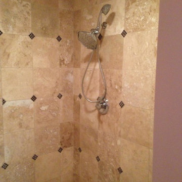
12 " travertine with Bliss Crystal Blends, Purple ( LG4G)
Example of a trendy stone tile alcove shower design in Atlanta
Example of a trendy stone tile alcove shower design in Atlanta
 Jennifer Gustafson Interior Design
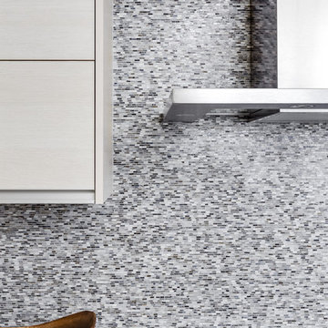
Glass mosaic tile backsplash reflected in the induction cooktop.
Photo Credit - Christopher Stark
Example of a mid-century modern kitchen design in San Francisco
Example of a mid-century modern kitchen design in San Francisco
 Visbeen Architects
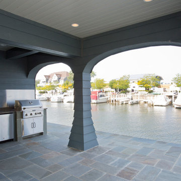
Who needs just one room with a view when you can live with and enjoy breathtaking vistas from three floors in this outstanding and innovative 2,861 square foot design? Narrow waterfront lots are no match for this efficient and easy living floor plan designed by Visbeen Architects, which makes the most of available land and includes the perfect balance of spacious interiors and covered exterior living.
The transitional architectural style combines traditional details with clean, sophisticated lines and references both classic and contemporary waterfront vacation homes across the country, from the coastal south to the New England Oceanside. Both familiar and welcoming in style, the updated exterior features peaks, wood siding and multiple window styles. From the street, the innovative design is full of curb appeal, with the lowest level designed for circulation and outdoor living. Rising from the street level, the home concentrates the majority of living space on the upper two floors, with an efficient floor plan that lives large on all three floors. The lowest level has just 370 well-planned square feet of living space, but features a roomy two-car garage, a foyer and powder room and two patios perfect for both alfresco dining and entertaining, one an exterior covered area and a nearby uncovered open-air alternative.
Find the right local pro for your project
 MCD Studio
Elegant, eclectic, timeless villa interior design for a family with two small children, in cozy - familiar style associations, with artful, contemporary touches and subtly integrated, sophisticated details.
 DesignARC
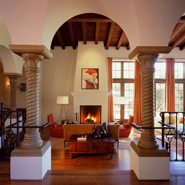
This Spanish Revival takes its place among the graceful and genteel tradition of Santa Barbara architecture. Located in a secreted area of Montecito, the house is tucked amidst a wooded glen along a riparian creek bed. Carefully sited at the top of a rolling green, the building provides a strong form in the natural landscape.
With its reference to historical precedent, the house is both undeniably familiar and tangibly rich. Site sensitivity and pure spatial relationships combine in new ways, showing that what’s old can be new again.
An entry courtyard concealed behind a pair of wooden doors of Moorish design begins the entry sequence. The courtyard, wrapped around an existing mature oak tree, creates an outdoor room, which establishes an interplay between interior and exterior spaces, a theme that recurs throughout the house.
An exercise in scale and proportion, the 5,000-square-foot residence is imbued with classic detail and richness found in the Spanish Colonial architecture characteristic of George Washington Smith and others. Interior spaces are created through pure and varied geometric volumes, and are elaborated by opened beamed ceilings, groin vaults and Moorish arches.
 MCD Studio
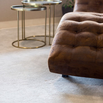
Elegant, eclectic, timeless villa interior design for a family with two small children, in cozy - familiar style associations, with artful, contemporary touches and subtly integrated sophisticated details.
 BBA Architects
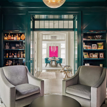
Situated along the perimeter of the property, this unique home creates a continuous street wall, both preserving plenty of open yard space and maintaining privacy from the prominent street corner. A one-story mudroom connects the garage to the house at the rear of the lot which required a local zoning variance. The resulting L-shaped plan and the central location of a glass-enclosed stair allow natural light to enter the home from multiple sides of nearly every room. The Arts & Crafts inspired detailing creates a familiar yet unique facade that is sympathetic to the character and scale of the neighborhood. A chevron pattern is a key design element on the window bays and doors and continues inside throughout the interior of the home.
2022 NAHB Platinum Best in American Living Award
View more of this home through #BBAModernCraftsman on Instagram.
 Katie Hutchison Studio
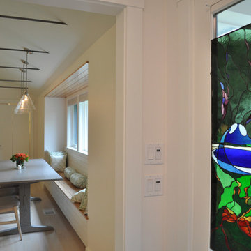
Constructed in two phases, this renovation, with a few small additions, touched nearly every room in this late ‘50’s ranch house. The owners raised their family within the original walls and love the house’s location, which is not far from town and also borders conservation land. But they didn’t love how chopped up the house was and the lack of exposure to natural daylight and views of the lush rear woods. Plus, they were ready to de-clutter for a more stream-lined look. As a result, KHS collaborated with them to create a quiet, clean design to support the lifestyle they aspire to in retirement.
To transform the original ranch house, KHS proposed several significant changes that would make way for a number of related improvements. Proposed changes included the removal of the attached enclosed breezeway (which had included a stair to the basement living space) and the two-car garage it partially wrapped, which had blocked vital eastern daylight from accessing the interior. Together the breezeway and garage had also contributed to a long, flush front façade. In its stead, KHS proposed a new two-car carport, attached storage shed, and exterior basement stair in a new location. The carport is bumped closer to the street to relieve the flush front facade and to allow access behind it to eastern daylight in a relocated rear kitchen. KHS also proposed a new, single, more prominent front entry, closer to the driveway to replace the former secondary entrance into the dark breezeway and a more formal main entrance that had been located much farther down the facade and curiously bordered the bedroom wing.
Inside, low ceilings and soffits in the primary family common areas were removed to create a cathedral ceiling (with rod ties) over a reconfigured semi-open living, dining, and kitchen space. A new gas fireplace serving the relocated dining area -- defined by a new built-in banquette in a new bay window -- was designed to back up on the existing wood-burning fireplace that continues to serve the living area. A shared full bath, serving two guest bedrooms on the main level, was reconfigured, and additional square footage was captured for a reconfigured master bathroom off the existing master bedroom. A new whole-house color palette, including new finishes and new cabinetry, complete the transformation. Today, the owners enjoy a fresh and airy re-imagining of their familiar ranch house.
Photos by Katie Hutchison
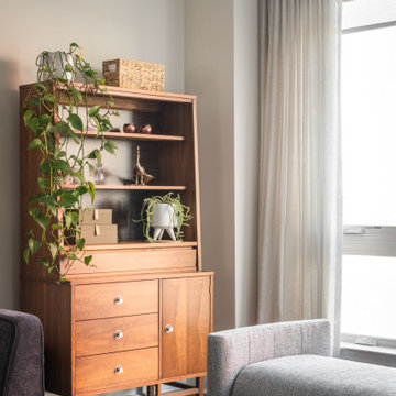
 Rooted By Design
This Fishtown rowhome refresh started with a familiar challenge: a sea of flat, builder-grade finishes in predictable “millennial gray.” Our clients wanted a home that felt layered, lived-in, and full of personality. They desired something that reflected their style, not just a resale checklist.
We reworked two full floors to bring in warmth, character, and thoughtful details. On the main level, we introduced rich textures, vintage accents, and a more intentional palette that made a statement. Powerful punches of wallpaper, uniquely different but graciously coordinating, transformed key moments into standout spaces.
Upstairs, updates to the kitchen and dining area emphasized comfort, functionality, and bold sophistication. Throughout, we layered in materials with soul: natural woods, warm metals, and handcrafted touches, all while keeping the overall footprint and layout intact. Built-ins in the living area brought much-needed storage, style, and a grounded focal point to anchor the space.
The result is a home that feels personal yet timeless. A clear departure from the gray-washed norm.
 Master Edge Homes
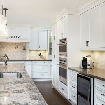
Example of a large transitional l-shaped dark wood floor eat-in kitchen design in Toronto with white cabinets, an island, an undermount sink, beige backsplash, stainless steel appliances, flat-panel cabinets, marble countertops and ceramic backsplash
 Cabinet Joint
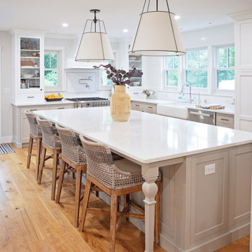
From bare studs to bright and stunning, This customer tore their former kitchen down to its foundation to build this kitchen inspiration. With a soft blend of whites, grays, and Hickory wood throughout the space, the natural light from the windows makes this kitchen glow with warmth. This kitchen is an example of when simplistic elegance is enough. Featuring a custom beverage bar, a charming small desk, a walk-in pantry, as well as an intentional bottom-heavy design with few wall cabinets, this kitchen marries aesthetics and functionality, the familiarity of a farmhouse, and the efficiency of a commercial kitchen.
 Avenue Design
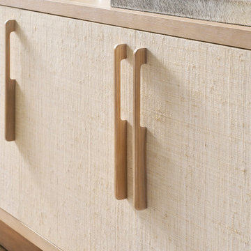
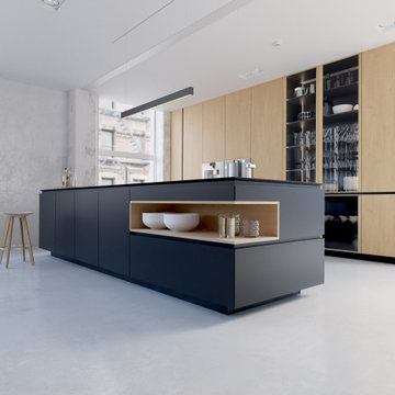
With its seamless layering of visually intriguing elements, the Reveal collection encourages the eye to linger just a bit longer and the hand to reach out and touch. Fresh yet familiar, these inspired designs are innately beautiful and grounded in a palette of raw materials curated with expert sophistication. Smooth wood planes finished in soft, dry finishes merge with exquisite woven textures for true dimensional appeal. Shapely silhouettes and relaxed modern forms are crafted from Ash solids and veneers while the expressive character of raffia elevates drawer faces and creates surface interest with tactile appeal. This whole-hearted embrace of natural elements weaves effortless elegance with modern organic design character.
 Install Kitch
At Install Kitch, we honor the level of consideration that goes into designing the ideal space by making the installation process seamless and the finished product flawless. We specialize in the design and installation of European and American cabinetry, including custom cabinets for kitchens, bathrooms, and other areas of your home. With decades of experience in Europe and the US, we are intimately familiar with high-end brands, models, and styles of cabinets.
 Matt Fajkus Architecture
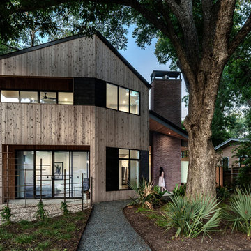
The cabin typology redux came out of the owner’s desire to have a house that is warm and familiar, but also “feels like you are on vacation.” The basis of the “Hewn House” design starts with a cabin’s simple form and materiality: a gable roof, a wood-clad body, a prominent fireplace that acts as the hearth, and integrated indoor-outdoor spaces. However, rather than a rustic style, the scheme proposes a clean-lined and “hewned” form, sculpted, to best fit on its urban infill lot.
The plan and elevation geometries are responsive to the unique site conditions. Existing prominent trees determined the faceted shape of the main house, while providing shade that projecting eaves of a traditional log cabin would otherwise offer. Deferring to the trees also allows the house to more readily tuck into its leafy East Austin neighborhood, and is therefore more quiet and secluded.
Natural light and coziness are key inside the home. Both the common zone and the private quarters extend to sheltered outdoor spaces of varying scales: the front porch, the private patios, and the back porch which acts as a transition to the backyard. Similar to the front of the house, a large cedar elm was preserved in the center of the yard. Sliding glass doors open up the interior living zone to the backyard life while clerestory windows bring in additional ambient light and tree canopy views. The wood ceiling adds warmth and connection to the exterior knotted cedar tongue & groove. The iron spot bricks with an earthy, reddish tone around the fireplace cast a new material interest both inside and outside. The gable roof is clad with standing seam to reinforced the clean-lined and faceted form. Furthermore, a dark gray shade of stucco contrasts and complements the warmth of the cedar with its coolness.
A freestanding guest house both separates from and connects to the main house through a small, private patio with a tall steel planter bed.
Photo by Charles Davis Smith
 K&D Wallcovering
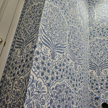
Wallpaper Installation – Basement in Arlington Heights
Transform your underutilized basement into a stunning living space with professional wallpaper installation designed for Arlington Heights homes. As your local wallpaper specialist, I specialize in creating beautiful, functional below-grade spaces with:
✔ Basement-Specific Expertise
Moisture-resistant vinyl wallpaper and fabric-backed options
Specialized adhesives for concrete or paneled walls
Pattern matching that accommodates uneven surfaces
✔ Arlington Heights Solutions
Materials tested for Chicagoland's seasonal humidity changes
Light-enhancing finishes to brighten windowless areas
Sound-absorbing textures for entertainment spaces
✔ Complete Basement Services
Feature walls for home theaters or game rooms
Ceiling treatments to elevate low ceilings
Wallpaper repair for existing installations
Why Arlington Heights Homeowners Choose Us:
✔ Free Moisture Evaluation – Critical for basement installations
✔ HOA Compliance Knowledge – Familiar with local community standards
✔ 1-2 Day Transformations – Efficient project completion
✔ Flexible Scheduling – Work around your family's routine
Popular Arlington Heights Basement Styles:
• Modern Entertainer – Sleek metallics or geometric patterns
• Cozy Library – Rich textures and warm tones
• Sports Den – Team colors and memorabilia displays
• Rustic Retreat – Faux wood or stone appearances
Serving All of Arlington Heights – From downtown condos to suburban family homes.
 Amy Troute Inspired Interior Design
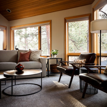
Second homes and vacation homes are such fun projects for us and when Portland residents Leslie and Phil found their dream house on the fairway in central Oregon, they asked us to help them make it feel like home. Updates to carpet and paint refreshed the palette for new furnishings, and the homeowners requested we use their treasured art and accessories to truly create that “homey” feeling. We “shopped” their Portland home for items that would work with the rooms we’d designed throughout the house, and the result was immediately familiar and welcoming. We also collaborated on custom stair railings and new island brackets with local master Downtown Ornamental Iron and redesigned a rustic slab fireplace mantel with a local craftsman. We’ve enjoyed additional projects with Leslie and Phil in their Portland home and returned to Bend to refresh the kitchen with quartz slab countertops, a bold black tile backsplash and new appliances. We aren’t surprised to hear this “vacation home” has become their primary residence much sooner than they’d planned!
 Main Street Custom Homes & Remodeling
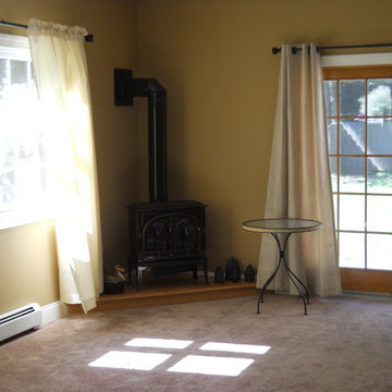
Rather than renovating their own home, this couple decided to remodel and move into the mother's home to keep her in a familiar setting and create a multi-generational home under one roof.
Careful consideration was given to the design of the exterior of the home so that the second floor addition blended with the original home creating a unified façade. In addition, a portico was installed over the front entry, giving a more formal appearance and offering shelter from the elements.
It was necessary to design a single-floor living space for the aging parent who had recently broken a hip. The entire first floor layout was renovated with the focus on ease of mobility while maintaining a coherent, balanced design throughout the house. To allow for a “no-step” main level, the existing sunken family room floor was raised to bring it flush with the adjacent kitchen floor then converted into a spacious dining room. A new great room was constructed which boasts a beautiful corner wood burning stove. This addition created a comfortable and accessible place to relax, at the same time offering a space for larger family gatherings.
 Rooted By Design
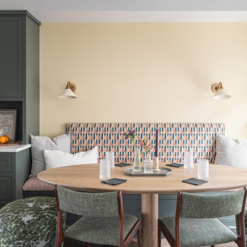
This Fishtown rowhome refresh started with a familiar challenge: a sea of flat, builder-grade finishes in predictable “millennial gray.” Our clients wanted a home that felt layered, lived-in, and full of personality. They desired something that reflected their style, not just a resale checklist.
We reworked two full floors to bring in warmth, character, and thoughtful details. On the main level, we introduced rich textures, vintage accents, and a more intentional palette that made a statement. Powerful punches of wallpaper, uniquely different but graciously coordinating, transformed key moments into standout spaces.
Upstairs, updates to the kitchen and dining area emphasized comfort, functionality, and bold sophistication. Throughout, we layered in materials with soul: natural woods, warm metals, and handcrafted touches, all while keeping the overall footprint and layout intact. Built-ins in the living area brought much-needed storage, style, and a grounded focal point to anchor the space.
The result is a home that feels personal yet timeless. A clear departure from the gray-washed norm.
 DesignARC
MONTECITO, CA / SINGLE FAMILY RESIDENTIAL
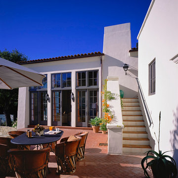
The Casa de Casey takes its place among the graceful and genteel tradition of Santa Barbara architecture. Located in a secreted area of Montecito, the house is tucked amidst a wooded glen along a riparian creek bed. Carefully sited at the top of a rolling green, the building provides a strong form in the natural landscape.
With its reference to historical precedent, the house is both undeniably familiar and tangibly rich. Site sensitivity and pure spatial relationships combine in new ways, showing that what’s old can be new again.
An entry courtyard concealed behind a pair of wooden doors of Moorish design begins the entry sequence. The courtyard, wrapped around an existing mature oak tree, creates an outdoor room, which establishes an interplay between interior and exterior spaces, a theme that recurs throughout the house.
An exercise in scale and proportion, the 5,000-square-foot residence is imbued with classic detail and richness found in the Spanish Colonial architecture characteristic of George Washington Smith and others. Interior spaces are created through pure and varied geometric volumes, and are elaborated by opened beamed ceilings, groin vaults and Moorish arches.
 Advance Design Studio, Ltd.
After six years of living in their Huntley IL home, Chris and Meghan were tired of their dark, dingy, outdated kitchen and it was finally time for a long-anticipated change. “The kitchen is the place where we live, it’s where we do everything,” Meghan said. “It was important that it be a space where we wanted to be.” Meghan loves cooking and enjoys including their girls in healthy meal prepping, this led them to want a brighter, more enjoyable kitchen with increased functionality and improved storage.
For Chris especially, the laundry room was an entirely dysfunctional eyesore. “We had a washer and a dryer, but it was all kind-of cobbled together!” Chris said. “There were always laundry piles everywhere, we weren’t really sure what we wanted to do in there, but it was time for us to make a change.” The mess of the space was stressful every time they walked in the door from the garage each day. Kids’ backpacks and shoes piled up haphazardly in the makeshift boot-bench closet left the family feeling disorganized and stressed. They needed space for folding clothes and locker cubbies to help keep the family organized.
Having known Christine and Todd in the Huntley community for years, Chris and Meghan were familiar with their work. “We already trusted them personally and having seen their projects for years we knew they did top notch work. After we reviewed the initial round of designs, we knew that hiring them was definitely the right choice,” Meghan and Chris said. Although Chris had done a lot of work in their home himself, the kitchen and laundry room renovation was such a large undertaking that he didn’t want to steal time away from his family to spend what would surely be many long weekends doing the job himself. “That would not have been a wise choice for us,” Chris laughed.
“Our designer, Michelle was very, very, easy to work with; anything we wanted to see or weren’t sure about, she went above and beyond to make this easy for us. She was easy to get hold of and always quick to respond,” the couple said. Michelle pulled ideas that mirrored the couple’s taste and style and was adept at directing the couple to limited choices that didn’t overwhelm them and kept the process moving. “I have a hard time making decisions. Michelle made the decision-making process so easy. I loved how she listened to what I liked and then presented three great options for me to choose from,” Meghan said.
The main objectives for the kitchen were better storage solutions, they wanted the space to reflect their lifestyle and taste, and they wanted it to last for years with low maintenance. One of the first steps in creating a more functional kitchen was relocating the refrigerator, creating an improved workflow for the busy family.
“We didn’t know that we could even move the refrigerator to a new location where it is now, that was something that we never would have thought of,” Chris said. “The new refrigerator location makes the kitchen feel so much bigger. We didn’t add any space, but our whole kitchen with the new design just seems like it’s so much larger than before!” Meghan said.
The perimeter mist colored cabinets helped warm and brighten the entire room, while the graphite colored cabinets on the island added contrast. Using this fresh, clean color palette satisfied the couple’s desire for a bright space that was the exact opposite of what they had before. Organization accessories were also added to the cabinets such as a spice drawer tray and roll outs to create hidden convenience.
“I absolutely love the hidden spices – it makes cooking so much more enjoyable!” Chris said. “And all the pull outs, and the double trash bin, who would think you could get so excited about organization!” the couple said in unison.
One thing they hated in their original kitchen was how dark the space felt. Added lighting on the ceiling with the new light fixtures combined with the lighter cabinetry colors throughout solved this problem. “Our new kitchen has this warm, almost cozy feeling that our old kitchen never had, it’s just a space that I love spending my time in now,” Meghan said. The light airy feeling was accentuated with the use of floating white shelves on either side of the decorative range hood. “We have so much cabinetry space, the new design is amazing we actually have more storage space than we will ever need,” Meghan said.
The island was extended to create more work surface and added space for stool seating. “The new island changes how we live. Now the kids can be in the kitchen with us, doing homework, eating breakfast, and the three of us have special dinners there when Chris is working late,” Meghan said.
The Carrara Marmi Quartz countertops were chosen because they are, not only beautiful, but are made from hard-working material that doesn’t require maintenance. The white subway tile backsplash that wraps to the ceiling behind the focal point cooktop range/hood compliments the crisp white countertops perfectly, while brushed brass hardware and light fixtures keep the design fresh and new.
The couple had a few fears at the beginning of the project, as most homeowners do. Their biggest fear was being out of their kitchen and laundry room for an extended time. The crew made it very easy for the family to work in a limited space keeping the washer and dryer hooked up the majority of the time, and also getting appliances working with minimal downtime.
“They above and beyond accommodated us to get us through the process,” Meghan said. “They did a great job making sure we were as comfortable as possible throughout the process,” Chris added.
“Our project manager DJ did a great job. He was very good at updating us on schedule changes, getting guys in as quickly as possible. Everyone that stepped in the house was nice and did great work,” said Chris. They thought Advance’s carpenter was phenomenal and were impressed when he took a conceptual idea from a photograph and worked with designer Michelle to create a one of a kind range/hood that has become the topic of conversation with friends and family who visit the new kitchen. “He was in our house literally every day for several weeks. He was easy to work with and good at what he did,” Meghan and Chris said.
The focal point of the kitchen; a hand-crafted, custom-built ventilation hood was clad with handpicked reclaimed barnwood. Advance Design’s carpenter built the framework and the cladding to create a one-of-a-kind design element that the couple loves.
“I think it was especially fun for him to create something unique from scratch, showcasing his talent in this area,” Meghan said. “I love that my kitchen is not like everyone else’s. I got to pick out the wood on my hood and watch it being built and was able to choose what pieces of wood went where on it. It’s totally unique.”
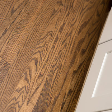
Red Oak flooring was toothed-in throughout the kitchen and the rest of the first floor anywhere changes were made. Then the whole floor was refinished to tone down the orange undertones in the existing floor stain, ultimately changing the color complexion of the entire first floor. The result is a completely new feeling to the entire home.
Renovating the laundry room was extremely important to Meghan and Chris, but they had trouble visualizing what the possibilities were for the seemingly small space. Michelle produced beautiful 3D illustrations that helped them envision the space in a whole new way.
“I must have told Michelle 100 times that I am a visual person, seeing the designs in 3D made it so easy to make decisions and see what we could really do with our space,” Meghan said.
A dividing wall and doorway were removed between the existing laundry room and hallway formerly containing a coat closet, providing space to design specialized graphite colored cabinetry matching the kitchen island to house custom storage cubbies for each family member. Adding the tall utility cabinetry in the new laundry area helped solve the storage issue, tucking away cleaning supplies, household items, and even the cat got its own cubby.
“I love how everything is now hidden in its own space. I can’t tell you how much I hated coming home and seeing everything sitting around on counters,” Chris said.
Electrical outlets were planned for the inside of utility cabinets, so devices could charge in hidden locations. Stacking the washer and dryer allowed for wider countertop space to provide a folding area and a special space for clothes to hang. “The way I do laundry has been completely transformed! I can actually fold clothes and hang them now right out of the washer and dryer,” Meghan said.
“The end result in the kitchen and the laundry/mud room was an updated light and bright space, with a smarter work flow that better meets the needs of this family,” Michelle said.
“I would totally recommend Advance Design,” Meghan said. “Sometimes I sit and just look at my kitchen and laundry room and think ‘Wow, I can’t believe I get to live here!’ It’s an understatement to say we love our new space.”
67