
Search results for "Familiarization" in Home Design Ideas
 ACRE landscape architecture + design studio
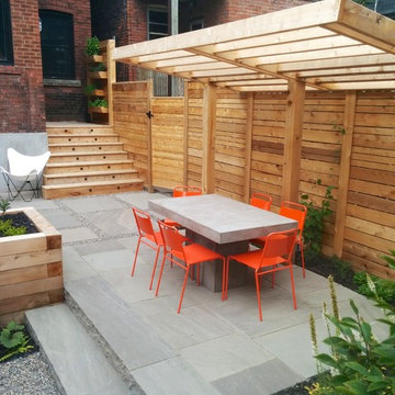
This is an example of a small contemporary full sun backyard landscaping in Toronto.
 Rachel Loewen Photography
Photo: Rachel Loewen © 2019 Houzz
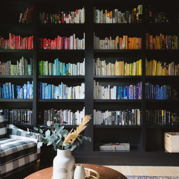
Living room - scandinavian living room idea in Chicago
Living room - scandinavian living room idea in Chicago
 Cutting Edge Design
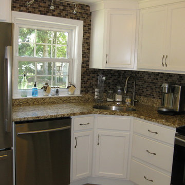
Small transitional l-shaped porcelain tile and brown floor kitchen photo in Boston with an undermount sink, recessed-panel cabinets, white cabinets, granite countertops, brown backsplash, stainless steel appliances, no island, glass tile backsplash and beige countertops
Find the right local pro for your project
 ZODEGA | TIS
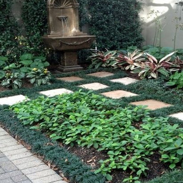
This is a very small space that measures approximately 20x14 feet and gets very little sunlight. The client is from New Orleans where they still maintain a house and wanted something that would remind them of home so we went with a contemporary take on the New Orleans-style courtyard. This space was unused and the landscape died as a result of poor soil conditions, poor drainage and heavy shade long before we took on the project. Our mission was to 1) Invite the homeowner into a space they were familiar and comfortable with, and 2) Involve all of their senses (aesthetics for the eyes, water fountain for the ears, fragrant flowers and herbs for the nose).
This picture is the left side of this outdoor living space which features a refurbished fountain. The client had this fountain laying in the corner of the courtyard, broken and forgotten. We had a specialist restore it and give it the patina that creates the sort of character you would expect from a New Orleans style courtyard.
Again, this is a very small area that was unused and is now a permanent and regular part of this client's daily living.
 Chilton
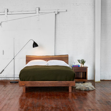
Chilton's Acadia Live Edge Collection is crafted in Maine from solid walnut, cherry or Spalted Maple. Each piece features clean minimalist lines with a contrasting unfinished edge from the bark line of the tree. This raw "live edge" ensures that each piece is both dynamic and unique.
Inspired by George Nakashima, this bed marries a modern aesthetic with a reverence for the tree from which it was hewn. Also available as a stand-alone frame without headboard. Headboard height and shape vary from piece to piece based on the individual characteristics of the wood. This bed is a platform bed that only requires a mattress. A foundation is not necessary.
 Advance Design Studio, Ltd.
After six years of living in their Huntley IL home, Chris and Meghan were tired of their dark, dingy, outdated kitchen and it was finally time for a long-anticipated change. “The kitchen is the place where we live, it’s where we do everything,” Meghan said. “It was important that it be a space where we wanted to be.” Meghan loves cooking and enjoys including their girls in healthy meal prepping, this led them to want a brighter, more enjoyable kitchen with increased functionality and improved storage.
For Chris especially, the laundry room was an entirely dysfunctional eyesore. “We had a washer and a dryer, but it was all kind-of cobbled together!” Chris said. “There were always laundry piles everywhere, we weren’t really sure what we wanted to do in there, but it was time for us to make a change.” The mess of the space was stressful every time they walked in the door from the garage each day. Kids’ backpacks and shoes piled up haphazardly in the makeshift boot-bench closet left the family feeling disorganized and stressed. They needed space for folding clothes and locker cubbies to help keep the family organized.
Having known Christine and Todd in the Huntley community for years, Chris and Meghan were familiar with their work. “We already trusted them personally and having seen their projects for years we knew they did top notch work. After we reviewed the initial round of designs, we knew that hiring them was definitely the right choice,” Meghan and Chris said. Although Chris had done a lot of work in their home himself, the kitchen and laundry room renovation was such a large undertaking that he didn’t want to steal time away from his family to spend what would surely be many long weekends doing the job himself. “That would not have been a wise choice for us,” Chris laughed.
“Our designer, Michelle was very, very, easy to work with; anything we wanted to see or weren’t sure about, she went above and beyond to make this easy for us. She was easy to get hold of and always quick to respond,” the couple said. Michelle pulled ideas that mirrored the couple’s taste and style and was adept at directing the couple to limited choices that didn’t overwhelm them and kept the process moving. “I have a hard time making decisions. Michelle made the decision-making process so easy. I loved how she listened to what I liked and then presented three great options for me to choose from,” Meghan said.
The main objectives for the kitchen were better storage solutions, they wanted the space to reflect their lifestyle and taste, and they wanted it to last for years with low maintenance. One of the first steps in creating a more functional kitchen was relocating the refrigerator, creating an improved workflow for the busy family.
“We didn’t know that we could even move the refrigerator to a new location where it is now, that was something that we never would have thought of,” Chris said. “The new refrigerator location makes the kitchen feel so much bigger. We didn’t add any space, but our whole kitchen with the new design just seems like it’s so much larger than before!” Meghan said.
The perimeter mist colored cabinets helped warm and brighten the entire room, while the graphite colored cabinets on the island added contrast. Using this fresh, clean color palette satisfied the couple’s desire for a bright space that was the exact opposite of what they had before. Organization accessories were also added to the cabinets such as a spice drawer tray and roll outs to create hidden convenience.
“I absolutely love the hidden spices – it makes cooking so much more enjoyable!” Chris said. “And all the pull outs, and the double trash bin, who would think you could get so excited about organization!” the couple said in unison.
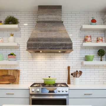
One thing they hated in their original kitchen was how dark the space felt. Added lighting on the ceiling with the new light fixtures combined with the lighter cabinetry colors throughout solved this problem. “Our new kitchen has this warm, almost cozy feeling that our old kitchen never had, it’s just a space that I love spending my time in now,” Meghan said. The light airy feeling was accentuated with the use of floating white shelves on either side of the decorative range hood. “We have so much cabinetry space, the new design is amazing we actually have more storage space than we will ever need,” Meghan said.
The island was extended to create more work surface and added space for stool seating. “The new island changes how we live. Now the kids can be in the kitchen with us, doing homework, eating breakfast, and the three of us have special dinners there when Chris is working late,” Meghan said.
The Carrara Marmi Quartz countertops were chosen because they are, not only beautiful, but are made from hard-working material that doesn’t require maintenance. The white subway tile backsplash that wraps to the ceiling behind the focal point cooktop range/hood compliments the crisp white countertops perfectly, while brushed brass hardware and light fixtures keep the design fresh and new.
The couple had a few fears at the beginning of the project, as most homeowners do. Their biggest fear was being out of their kitchen and laundry room for an extended time. The crew made it very easy for the family to work in a limited space keeping the washer and dryer hooked up the majority of the time, and also getting appliances working with minimal downtime.
“They above and beyond accommodated us to get us through the process,” Meghan said. “They did a great job making sure we were as comfortable as possible throughout the process,” Chris added.
“Our project manager DJ did a great job. He was very good at updating us on schedule changes, getting guys in as quickly as possible. Everyone that stepped in the house was nice and did great work,” said Chris. They thought Advance’s carpenter was phenomenal and were impressed when he took a conceptual idea from a photograph and worked with designer Michelle to create a one of a kind range/hood that has become the topic of conversation with friends and family who visit the new kitchen. “He was in our house literally every day for several weeks. He was easy to work with and good at what he did,” Meghan and Chris said.
The focal point of the kitchen; a hand-crafted, custom-built ventilation hood was clad with handpicked reclaimed barnwood. Advance Design’s carpenter built the framework and the cladding to create a one-of-a-kind design element that the couple loves.
“I think it was especially fun for him to create something unique from scratch, showcasing his talent in this area,” Meghan said. “I love that my kitchen is not like everyone else’s. I got to pick out the wood on my hood and watch it being built and was able to choose what pieces of wood went where on it. It’s totally unique.”
Red Oak flooring was toothed-in throughout the kitchen and the rest of the first floor anywhere changes were made. Then the whole floor was refinished to tone down the orange undertones in the existing floor stain, ultimately changing the color complexion of the entire first floor. The result is a completely new feeling to the entire home.
Renovating the laundry room was extremely important to Meghan and Chris, but they had trouble visualizing what the possibilities were for the seemingly small space. Michelle produced beautiful 3D illustrations that helped them envision the space in a whole new way.
“I must have told Michelle 100 times that I am a visual person, seeing the designs in 3D made it so easy to make decisions and see what we could really do with our space,” Meghan said.
A dividing wall and doorway were removed between the existing laundry room and hallway formerly containing a coat closet, providing space to design specialized graphite colored cabinetry matching the kitchen island to house custom storage cubbies for each family member. Adding the tall utility cabinetry in the new laundry area helped solve the storage issue, tucking away cleaning supplies, household items, and even the cat got its own cubby.
“I love how everything is now hidden in its own space. I can’t tell you how much I hated coming home and seeing everything sitting around on counters,” Chris said.
Electrical outlets were planned for the inside of utility cabinets, so devices could charge in hidden locations. Stacking the washer and dryer allowed for wider countertop space to provide a folding area and a special space for clothes to hang. “The way I do laundry has been completely transformed! I can actually fold clothes and hang them now right out of the washer and dryer,” Meghan said.
“The end result in the kitchen and the laundry/mud room was an updated light and bright space, with a smarter work flow that better meets the needs of this family,” Michelle said.
“I would totally recommend Advance Design,” Meghan said. “Sometimes I sit and just look at my kitchen and laundry room and think ‘Wow, I can’t believe I get to live here!’ It’s an understatement to say we love our new space.”
 TVL Creative Ltd.
This 1910 West Highlands home was so compartmentalized that you couldn't help to notice you were constantly entering a new room every 8-10 feet. There was also a 500 SF addition put on the back of the home to accommodate a living room, 3/4 bath, laundry room and back foyer - 350 SF of that was for the living room. Needless to say, the house needed to be gutted and replanned.
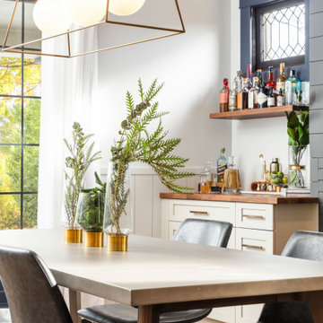
Kitchen+Dining+Laundry-Like most of these early 1900's homes, the kitchen was not the heartbeat of the home like they are today. This kitchen was tucked away in the back and smaller than any other social rooms in the house. We knocked out the walls of the dining room to expand and created an open floor plan suitable for any type of gathering. As a nod to the history of the home, we used butcherblock for all the countertops and shelving which was accented by tones of brass, dusty blues and light-warm greys. This room had no storage before so creating ample storage and a variety of storage types was a critical ask for the client. One of my favorite details is the blue crown that draws from one end of the space to the other, accenting a ceiling that was otherwise forgotten.
Primary Bath-This did not exist prior to the remodel and the client wanted a more neutral space with strong visual details. We split the walls in half with a datum line that transitions from penny gap molding to the tile in the shower. To provide some more visual drama, we did a chevron tile arrangement on the floor, gridded the shower enclosure for some deep contrast an array of brass and quartz to elevate the finishes.
Powder Bath-This is always a fun place to let your vision get out of the box a bit. All the elements were familiar to the space but modernized and more playful. The floor has a wood look tile in a herringbone arrangement, a navy vanity, gold fixtures that are all servants to the star of the room - the blue and white deco wall tile behind the vanity.
Full Bath-This was a quirky little bathroom that you'd always keep the door closed when guests are over. Now we have brought the blue tones into the space and accented it with bronze fixtures and a playful southwestern floor tile.
Living Room & Office-This room was too big for its own good and now serves multiple purposes. We condensed the space to provide a living area for the whole family plus other guests and left enough room to explain the space with floor cushions. The office was a bonus to the project as it provided privacy to a room that otherwise had none before.

 Shuler Architecture
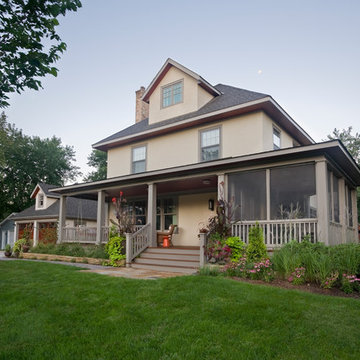
Completed in 2011 this 4 BR, 3 1/2 bath custom home is situated on a very tight urban infill lot in Northern, Virginia. Our clients were relocating to the D.C. area from New England and wanted to retain some of the New England vernacular they were familiar with in their new home. Due to heavy zoning restrictions, stylistic CCR's and a large program of almost 7000 sf, our design response is a modern take on a traditional hipped 4-square.
We intentionally kept the skin and form of the building simple in order to contain cost and allow for a higher level of interior finish. The main level employs our favorite Great Room scheme that merges cooking, eating and entertaining into one seamless space that flows onto an expansive deck overlooking the rear yard. The entry elevation welcomes guests with a traditional front porch and stone path that passes by a small rain garden. The basement accommodates a guest room, media room, exercise area, and full shop while the upper level orients 2 kid's bedrooms, a Jack-n-Jill bath and the master suite toward a territorial view of the rear yard. All of this program is housed beneath a hipped roof that minimizes the scale of the house while presenting a thoughtful appearance toward the street and neighbors.
 Brian-Kyles Landscapes of Distinction
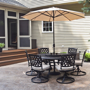
Stamped concrete patio with new Trex enclosed deck and landscaping in background.
We demolished the existing rear deck, installed Trex landing and steps, stamped concrete patio, and landscaping. A Trex staircase was constructed using Trex Transcends, Spiced Rum color. A privacy lattice and fence was constructed from cedar and stained with the color stain selected by the client. We then installed approximately 445 square feet of concrete for a patio and stamped it to resemble the color variation of the three samples of stone veneer left at the residence. The blended stamp pattern is a "skin" designed to resemble the natural look of stone. Additional work included repairing and turf/grass damage resulting from the construction on site (may be seen in photographs as they were taken before new grass had grown), and select landscaping improvements around the patio.
 The Detroit Wallpaper Co.
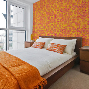
Día de los Muertos is our homage to Mexico. The design is based on a graphic representation of a sugar skull, which has traditionally been used to decorate headstones during Mexico's annual celebration of the dead from Nov. 1-2. The Day of the Dead is a way for the living to commune with ancestor’s who have passed. In this tradition, we offer you a unique way to use this familiar imagery in an attempt to give your walls new life. - See more at: http://detroitwallpaper.com/collections/wanderwalls/diadelosmuertos.html#sthash.uzF6LLm2.dpuf
 Period Architecture Ltd.
Angle Eye Photography
Example of a classic travertine floor hallway design in Philadelphia
Example of a classic travertine floor hallway design in Philadelphia
 Jessica Cain
Photo: Jessica Cain © 2017 Houzz
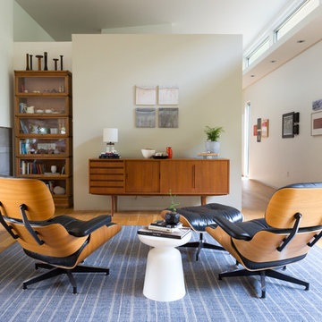
Family room - large contemporary open concept family room idea in Kansas City with white walls
Family room - large contemporary open concept family room idea in Kansas City with white walls

 Lore Patterson
Bainbridge Island Garden | Lore Patterson
Photo of a traditional landscaping in Seattle.
Photo of a traditional landscaping in Seattle.

 Dan Nelson, Designs Northwest Architects
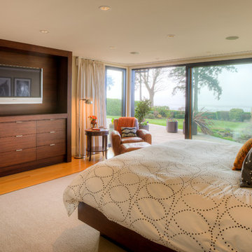
Master bedroom. Photography by Lucas Henning.
Inspiration for a mid-sized modern master painted wood floor and brown floor bedroom remodel in Seattle with yellow walls
Inspiration for a mid-sized modern master painted wood floor and brown floor bedroom remodel in Seattle with yellow walls

 Arjay Builders Inc.
Home Built by Arjay Builders Inc.
Photo by Amoura Productions
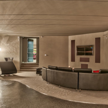
Example of a large trendy carpeted and beige floor living room design in Omaha with beige walls, no fireplace and a wall-mounted tv
Example of a large trendy carpeted and beige floor living room design in Omaha with beige walls, no fireplace and a wall-mounted tv

 Jaclyn Grace Designs
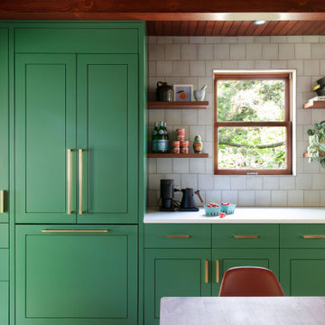
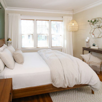
Mid-sized 1950s master medium tone wood floor and brown floor bedroom photo in San Francisco with green walls
47