
Search results for "Feel intentional" in Home Design Ideas
 Tara Fust Design
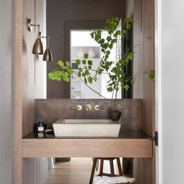
The powder bath was approached as a contained design statement — a space where materiality and proportion take the lead.
Custom millwork frames the vanity niche, creating an architectural envelope rather than a standalone cabinet. A stone vessel sink sits on a dark counter surface, set against a patinated metal backsplash that introduces depth, texture, and contrast. Warm brass plumbing fixtures provide a refined accent, balancing the darker finishes with subtle luminosity.
Layered materials — wood grain, metal, stone, and textured wallcovering — create a tactile composition within a restrained palette. The result is a powder bath that feels intentional and sculptural, designed as a small but highly detailed moment within the larger custom residence.

 Infinite Home
Custom Home Built for Real Life
Our clients came to us with a clear vision: a home that could adapt to their lifestyle and growing family. They needed a home built with intention, designed with the future in mind, and built around the routines they loved and the people they loved more.
Open-Concept Living With Hosting in Mind
Our clients hosted often and lived actively, so the main level had to be flexible for all of life’s moments. The goal was a space that felt grand without losing its warmth.
Cooking together as a family mattered to our clients – the Wolf range, farmhouse sink, integrated appliances, and large island gave them a kitchen that flowed effortlessly while looking beautiful. This space also served as the bridge between other parts of the main level so that they would stay in view of the next. This created the perfect environment for gathering where everyone had their own spot without ever feeling apart from the whole group.
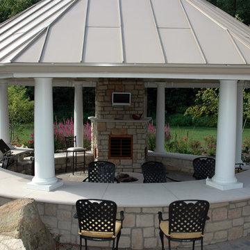
For the living room, our clients wanted space that felt open without losing its warmth. Soaring ceilings created that sense of scale, while warm tones and materials, like the wood coffered ceiling and fireplace wall, kept it grounded. That same warmth carried outside, where an outdoor lounge with a fireplace and dining area made sure guests felt welcomed the moment they stepped out.
A Backyard Built for Real Rest
Every corner of the backyard was designed with one goal: to be the ultimate outdoor retreat. The elevated, white-brick-framed pool and integrated spa hot tub gave them a place to truly exhale. As the sun set, the fire pit lounge next to the pool became the hangout spot when they hosted their youth groups and family gatherings.
Room to Grow
With kids in the house, “custom” had to also mean flexible. Our clients had 2 young sons and needed their rooms to grow with them through the years. The two bedrooms and a full bath sat beside a loft that served as both their hangout-and-homework spot. The guest suite sat on the same level where a four-poster bed, floor-to-ceiling wood-look tile, and a frameless glass shower welcomed their guests from day one.
A Retreat That’s Actually Theirs
Between hosting and raising kids, this couple needed a suite that felt like a true escape. The wood-planked tray ceiling and French doors grounded the room in warmth the moment you walked in, while the ensuite bathroom carried a spa-like feeling with a freestanding soaking tub, custom double vanity, and a glass-enclosed shower.
This Is What Approachable Luxury Looks Like
The approachable luxury experience meant starting with conversations about how they wanted their space to live with them – how they hosted, how their kids played, how they wanted to feel walking through their own front door, and how we took their goals and experience and used it as the foundation of every decision that was made from start to finish. We wanted our clients to feel taken care of through the process and, most importantly, feel heard.

Find the right local pro for your project
 Infinite Home
Custom Home Built for Real Life
Our clients came to us with a clear vision: a home that could adapt to their lifestyle and growing family. They needed a home built with intention, designed with the future in mind, and built around the routines they loved and the people they loved more.
Open-Concept Living With Hosting in Mind
Our clients hosted often and lived actively, so the main level had to be flexible for all of life’s moments. The goal was a space that felt grand without losing its warmth.
Cooking together as a family mattered to our clients – the Wolf range, farmhouse sink, integrated appliances, and large island gave them a kitchen that flowed effortlessly while looking beautiful. This space also served as the bridge between other parts of the main level so that they would stay in view of the next. This created the perfect environment for gathering where everyone had their own spot without ever feeling apart from the whole group.
For the living room, our clients wanted space that felt open without losing its warmth. Soaring ceilings created that sense of scale, while warm tones and materials, like the wood coffered ceiling and fireplace wall, kept it grounded. That same warmth carried outside, where an outdoor lounge with a fireplace and dining area made sure guests felt welcomed the moment they stepped out.
A Backyard Built for Real Rest
Every corner of the backyard was designed with one goal: to be the ultimate outdoor retreat. The elevated, white-brick-framed pool and integrated spa hot tub gave them a place to truly exhale. As the sun set, the fire pit lounge next to the pool became the hangout spot when they hosted their youth groups and family gatherings.
Room to Grow
With kids in the house, “custom” had to also mean flexible. Our clients had 2 young sons and needed their rooms to grow with them through the years. The two bedrooms and a full bath sat beside a loft that served as both their hangout-and-homework spot. The guest suite sat on the same level where a four-poster bed, floor-to-ceiling wood-look tile, and a frameless glass shower welcomed their guests from day one.
A Retreat That’s Actually Theirs
Between hosting and raising kids, this couple needed a suite that felt like a true escape. The wood-planked tray ceiling and French doors grounded the room in warmth the moment you walked in, while the ensuite bathroom carried a spa-like feeling with a freestanding soaking tub, custom double vanity, and a glass-enclosed shower.
This Is What Approachable Luxury Looks Like
The approachable luxury experience meant starting with conversations about how they wanted their space to live with them – how they hosted, how their kids played, how they wanted to feel walking through their own front door, and how we took their goals and experience and used it as the foundation of every decision that was made from start to finish. We wanted our clients to feel taken care of through the process and, most importantly, feel heard.

 Revealing Redesign
This master bathroom is a part of a whole house renovation we tackled starting in 2016, slowly and intentionally recreating each space in the house so that each room could be an updated, lovely space that FELT LIKE HOME to my clients.
In the master bath, we reconfigured the existing footprint of the bathroom, eliminating the large tub they no longer wanted, and relocating the door to the bedroom to allow space for a double vanity in the layout (a must for this professional couple on busy mornings), and so that a larger shower could be incorporated.
Also included in the design is a built-in window seat with drawers, and a linen closet, providing plenty of additional storage.
The finishing touches combine the classic materials such as marble counters and the color combination of blue and white, paired with modern details, such as the herringbone wood-like tile, to give an eclectic, timeless feel to the room.

 Castle Building & Remodeling
These homeowners came to us with an outdated and non functional bathroom space – the tub/shower was a badly installed handicapped tub in a very small bathroom. An adjacent room was so small, they couldn’t even use it for a bedroom, so they asked to take some space from that room to make a walk in shower, and then convert the remaining space to a walk in closet down the line. With a love for the age, history and character of the home, and a sharp eye for detail, the homeowners requested a strictly traditional style for their 1902 home’s new space.Beveled subway tiles, traditional bordered hexagon tile, chrome and porcelain fixtures, and oak millwork were used in order to create the feel that this bathroom has always been there. A boxed window was created to let more light into the space and sits over the new clawfoot tub. The walk-in shower is decked out with chrome fixtures, and a bench for comfort, and was designed with the intention to age gracefully in place. In the end, the black, white and emerald green color scheme are complemented by the warm oak wood and create a traditional oasis for the homeowners to enjoy for years to come.
 USI Design & Remodeling
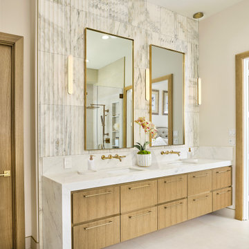
This master bathroom renovation in Frisco was completed for a repeat USI Design & Remodeling client as part of a larger first-floor transformation of the home. The original bathroom reflected a very typical North Texas layout of its era — dark stained cabinetry, granite countertops, compartmentalized vanities, a built-in tub adjoining a framed shower, and separated spaces that no longer aligned with how the homeowners wanted to live. As their aesthetic evolved toward a more transitional and contemporary direction, the goal became less about replacing finishes and more about redefining the experience of the room itself. The project needed to feel calmer, more architectural, and far more intentional in how the space functioned visually and emotionally.
One of the most important changes was removing the original shower curb and pony wall in favor of a fully open curbless shower with ultra-clear ½-inch heavy glass. Achieving that look required recessing the slab, re-floating the shower floor toward a linear drain, and engineering the space so the room would read as visually uninterrupted from end to end. Throughout the project, many of the design decisions were rooted in restraint rather than excess. The oversized 24x48 Porcelanosa flooring carries very little shade variation, creating a quieter visual field, while the cabinetry was executed in rift-sawn white oak specifically because it produces a far more controlled and consistent finish outcome than more common cuts of wood. In luxury projects, consistency itself becomes part of the refinement.
The floating vanity was designed more like custom furniture than traditional cabinetry, utilizing waterfall mitered edges and fully reworked plumbing locations so both homeowners could share in having generous functional countertop space. The original makeup station was repurposed into integrated storage with powered drawers and concealed organization for everyday items such as blow dryers and flat irons. Along the vanity wall, wall-mounted plumbing fixtures were paired with ribbed natural marble surfaces — a detail that required intentional planning long before construction began. Rather than allowing the ribbed material to terminate awkwardly behind the fixtures, the backsplash and stone transitions were specifically designed to resolve those conditions cleanly. Those are the types of details that distinguish highly coordinated design-build work from projects that simply assemble materials together.
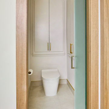
While the room contains a significant amount of luxury detailing — from the freestanding tub and geoprism marble focal wall to the custom rift-sawn white oak closet doors and elongated mirrors that leverage the 11-foot ceiling heights — the project was always guided by quiet luxury rather than visual competition. Even the water closet enclosure was handled with restraint through the use of a satin-etched glass door rather than another heavy solid opening. The intent throughout was to create a bathroom that feels restorative and serene rather than overdesigned. In our view, the best luxury spaces are the ones that feel composed long after the initial impression wears off.
Sponsored
Sunbury, OH

J.Holderby - Renovations
Franklin County's Leading General Contractors - 2X Best of Houzz!
 USI Design & Remodeling
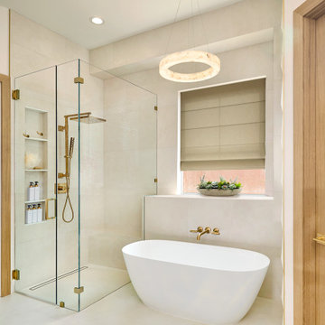
This master bathroom renovation in Frisco was completed for a repeat USI Design & Remodeling client as part of a larger first-floor transformation of the home. The original bathroom reflected a very typical North Texas layout of its era — dark stained cabinetry, granite countertops, compartmentalized vanities, a built-in tub adjoining a framed shower, and separated spaces that no longer aligned with how the homeowners wanted to live. As their aesthetic evolved toward a more transitional and contemporary direction, the goal became less about replacing finishes and more about redefining the experience of the room itself. The project needed to feel calmer, more architectural, and far more intentional in how the space functioned visually and emotionally.
One of the most important changes was removing the original shower curb and pony wall in favor of a fully open curbless shower with ultra-clear ½-inch heavy glass. Achieving that look required recessing the slab, re-floating the shower floor toward a linear drain, and engineering the space so the room would read as visually uninterrupted from end to end. Throughout the project, many of the design decisions were rooted in restraint rather than excess. The oversized 24x48 Porcelanosa flooring carries very little shade variation, creating a quieter visual field, while the cabinetry was executed in rift-sawn white oak specifically because it produces a far more controlled and consistent finish outcome than more common cuts of wood. In luxury projects, consistency itself becomes part of the refinement.
The floating vanity was designed more like custom furniture than traditional cabinetry, utilizing waterfall mitered edges and fully reworked plumbing locations so both homeowners could share in having generous functional countertop space. The original makeup station was repurposed into integrated storage with powered drawers and concealed organization for everyday items such as blow dryers and flat irons. Along the vanity wall, wall-mounted plumbing fixtures were paired with ribbed natural marble surfaces — a detail that required intentional planning long before construction began. Rather than allowing the ribbed material to terminate awkwardly behind the fixtures, the backsplash and stone transitions were specifically designed to resolve those conditions cleanly. Those are the types of details that distinguish highly coordinated design-build work from projects that simply assemble materials together.
While the room contains a significant amount of luxury detailing — from the freestanding tub and geoprism marble focal wall to the custom rift-sawn white oak closet doors and elongated mirrors that leverage the 11-foot ceiling heights — the project was always guided by quiet luxury rather than visual competition. Even the water closet enclosure was handled with restraint through the use of a satin-etched glass door rather than another heavy solid opening. The intent throughout was to create a bathroom that feels restorative and serene rather than overdesigned. In our view, the best luxury spaces are the ones that feel composed long after the initial impression wears off.
 Anura Design | architects+engineers
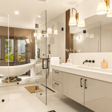
Step inside a completely transformed home at 30 Lincolnshire, where classic structure meets modern sophistication. This full remodel reveals a bright, open, and thoughtfully reimagined interior that blends timeless aesthetics with smart functionality. Natural light flows effortlessly through large updated windows, illuminating every detail—from the elegant finishes and cohesive material palette to the refined layout that maximizes comfort and usability.
A neutral tone foundation anchors the design, while modern lighting, stylish built-ins, and subtle textures elevate the overall atmosphere. The result is a serene, airy, and contemporary living environment that feels both high-end and welcoming.
Designed with intention. Built for modern life.

 User
Detail of Iridescent Venetian plaster finish on all walls in Living Room by Christianson Lee Studios
Example of a transitional home design design in New York
Example of a transitional home design design in New York
 Tosti Design
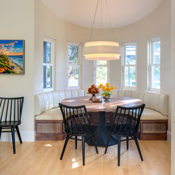
We were inspired to take this grand scale room and make it feel intentionally cozy without closing it off. This was done by creating various zones delineated by strategically placing lighting, furniture, and cabinetry. The grand chandelier made up of dozens of swirled glass balls softens the expanse of the cielo quartzite used on the family sized island, while the softer, textured shade gives off a warm glow and calls out the charm of the built-in breakfast nook. The removal of the upper cabinets in favor of a large picture window, splash detail, and statement sconces leaves the cabinetry feeling more like a piece of furniture than a bank of cabinets flanked by pantry and appliance. A soft, coastal inspired palette becomes exciting through the use of a variety of textures found in the leathered stone, handcrafted clay backsplash, swirled glass lighting, and built in seating. The tufted leather booth with the fluted walnut bench brings a modern flair to the table that transitions seamlessly with the more traditional feel of the flush inset cabinetry. By allowing the 48" chef's range to create its own focal point along the back wall, functionality of the kitchen is maximized and allows enough space for multiple cooks, big and small, to work together.

 Klopf Architecture
 and Outer space Landscape Architects designed a new warm, modern, open, indoor-outdoor home in Los Altos, California. Inspired by mid-century modern homes but looking for something completely new and custom, the owners, a couple with two children, bought an older ranch style home with the intention of replacing it.
Created on a grid, the house is designed to be at rest with differentiated spaces for activities; living, playing, cooking, dining and a piano space. The low-sloping gable roof over the great room brings a grand feeling to the space. The clerestory windows at the high sloping roof make the grand space light and airy.
Upon entering the house, an open atrium entry in the middle of the house provides light and nature to the great room. The Heath tile wall at the back of the atrium blocks direct view of the rear yard from the entry door for privacy.
The bedrooms, bathrooms, play room and the sitting room are under flat wing-like roofs that balance on either side of the low sloping gable roof of the main space. Large sliding glass panels and pocketing glass doors foster openness to the front and back yards. In the front there is a fenced-in play space connected to the play room, creating an indoor-outdoor play space that could change in use over the years. The play room can also be closed off from the great room with a large pocketing door. In the rear, everything opens up to a deck overlooking a pool where the family can come together outdoors.
Wood siding travels from exterior to interior, accentuating the indoor-outdoor nature of the house. Where the exterior siding doesn’t come inside, a palette of white oak floors, white walls, walnut cabinetry, and dark window frames ties all the spaces together to create a uniform feeling and flow throughout the house. The custom cabinetry matches the minimal joinery of the rest of the house, a trim-less, minimal appearance. Wood siding was mitered in the corners, including where siding meets the interior drywall. Wall materials were held up off the floor with a minimal reveal. This tight detailing gives a sense of cleanliness to the house.
The garage door of the house is completely flush and of the same material as the garage wall, de-emphasizing the garage door and making the street presentation of the house kinder to the neighborhood.
The house is akin to a custom, modern-day Eichler home in many ways. Inspired by mid-century modern homes with today’s materials, approaches, standards, and technologies. The goals were to create an indoor-outdoor home that was energy-efficient, light and flexible for young children to grow. This 3,000 square foot, 3 bedroom, 2.5 bathroom new house is located in Los Altos in the heart of the Silicon Valley.
Klopf Architecture Project Team: John Klopf, AIA, and Chuang-Ming Liu
Landscape Architect: Outer space Landscape Architects
Structural Engineer: ZFA Structural Engineers
Staging: Da Lusso Design
Photography ©2018 Mariko Reed
Location: Los Altos, CA
Year completed: 2017
 User
Inspiration for a large timeless carpeted curved staircase remodel in Chicago with carpeted risers

 Klopf Architecture
 and Outer space Landscape Architects designed a new warm, modern, open, indoor-outdoor home in Los Altos, California. Inspired by mid-century modern homes but looking for something completely new and custom, the owners, a couple with two children, bought an older ranch style home with the intention of replacing it.
Created on a grid, the house is designed to be at rest with differentiated spaces for activities; living, playing, cooking, dining and a piano space. The low-sloping gable roof over the great room brings a grand feeling to the space. The clerestory windows at the high sloping roof make the grand space light and airy.
Upon entering the house, an open atrium entry in the middle of the house provides light and nature to the great room. The Heath tile wall at the back of the atrium blocks direct view of the rear yard from the entry door for privacy.
The bedrooms, bathrooms, play room and the sitting room are under flat wing-like roofs that balance on either side of the low sloping gable roof of the main space. Large sliding glass panels and pocketing glass doors foster openness to the front and back yards. In the front there is a fenced-in play space connected to the play room, creating an indoor-outdoor play space that could change in use over the years. The play room can also be closed off from the great room with a large pocketing door. In the rear, everything opens up to a deck overlooking a pool where the family can come together outdoors.
Wood siding travels from exterior to interior, accentuating the indoor-outdoor nature of the house. Where the exterior siding doesn’t come inside, a palette of white oak floors, white walls, walnut cabinetry, and dark window frames ties all the spaces together to create a uniform feeling and flow throughout the house. The custom cabinetry matches the minimal joinery of the rest of the house, a trim-less, minimal appearance. Wood siding was mitered in the corners, including where siding meets the interior drywall. Wall materials were held up off the floor with a minimal reveal. This tight detailing gives a sense of cleanliness to the house.
The garage door of the house is completely flush and of the same material as the garage wall, de-emphasizing the garage door and making the street presentation of the house kinder to the neighborhood.
The house is akin to a custom, modern-day Eichler home in many ways. Inspired by mid-century modern homes with today’s materials, approaches, standards, and technologies. The goals were to create an indoor-outdoor home that was energy-efficient, light and flexible for young children to grow. This 3,000 square foot, 3 bedroom, 2.5 bathroom new house is located in Los Altos in the heart of the Silicon Valley.
Klopf Architecture Project Team: John Klopf, AIA, and Chuang-Ming Liu
Landscape Architect: Outer space Landscape Architects
Structural Engineer: ZFA Structural Engineers
Staging: Da Lusso Design
Photography ©2018 Mariko Reed
Location: Los Altos, CA
Year completed: 2017
 Nar Design Group
A combination of quarter sawn white oak material with kerf cuts creates harmony between the cabinets and the warm, modern architecture of the home. We mirrored the waterfall of the island to the base cabinets on the range wall. This project was unique because the client wanted the same kitchen layout as their previous home but updated with modern lines to fit the architecture. Floating shelves were swapped out for an open tile wall, and we added a double access countertwall cabinet to the right of the range for additional storage. This cabinet has hidden front access storage using an intentionally placed kerf cut and modern handleless design. The kerf cut material at the knee space of the island is extended to the sides, emphasizing a sense of depth. The palette is neutral with warm woods, dark stain, light surfaces, and the pearlescent tone of the backsplash; giving the client’s art collection a beautiful neutral backdrop to be celebrated.
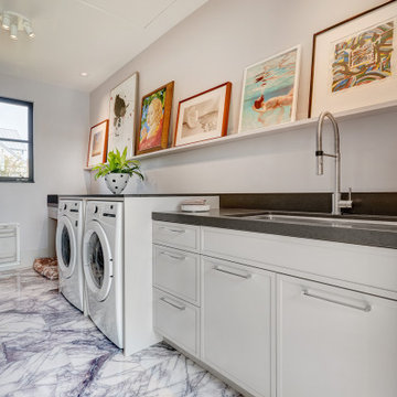
For the laundry we chose a micro shaker style cabinet door for a clean, transitional design. A folding surface over the washer and dryer as well as an intentional space for a dog bed create a space as functional as it is lovely. The color of the wall picks up on the tones of the beautiful marble tile floor and an art wall finishes out the space.
In the master bath warm taupe tones of the wall tile play off the warm tones of the textured laminate cabinets. A tiled base supports the vanity creating a floating feel while also providing accessibility as well as ease of cleaning.
An entry coat closet designed to feel like a furniture piece in the entry flows harmoniously with the warm taupe finishes of the brick on the exterior of the home. We also brought the kerf cut of the kitchen in and used a modern handleless design.
The mudroom provides storage for coats with clothing rods as well as open cubbies for a quick and easy space to drop shoes. Warm taupe was brought in from the entry and paired with the micro shaker of the laundry.
In the guest bath we combined the kerf cut of the kitchen and entry in a stained maple to play off the tones of the shower tile and dynamic Patagonia granite countertops.
 Castle Building & Remodeling
These homeowners came to us with an outdated and non functional bathroom space – the tub/shower was a badly installed handicapped tub in a very small bathroom. An adjacent room was so small, they couldn’t even use it for a bedroom, so they asked to take some space from that room to make a walk in shower, and then convert the remaining space to a walk in closet down the line. With a love for the age, history and character of the home, and a sharp eye for detail, the homeowners requested a strictly traditional style for their 1902 home’s new space.Beveled subway tiles, traditional bordered hexagon tile, chrome and porcelain fixtures, and oak millwork were used in order to create the feel that this bathroom has always been there. A boxed window was created to let more light into the space and sits over the new clawfoot tub. The walk-in shower is decked out with chrome fixtures, and a bench for comfort, and was designed with the intention to age gracefully in place. In the end, the black, white and emerald green color scheme are complemented by the warm oak wood and create a traditional oasis for the homeowners to enjoy for years to come.
 Castle Building & Remodeling
These homeowners came to us with an outdated and non functional bathroom space – the tub/shower was a badly installed handicapped tub in a very small bathroom. An adjacent room was so small, they couldn’t even use it for a bedroom, so they asked to take some space from that room to make a walk in shower, and then convert the remaining space to a walk in closet down the line. With a love for the age, history and character of the home, and a sharp eye for detail, the homeowners requested a strictly traditional style for their 1902 home’s new space.Beveled subway tiles, traditional bordered hexagon tile, chrome and porcelain fixtures, and oak millwork were used in order to create the feel that this bathroom has always been there. A boxed window was created to let more light into the space and sits over the new clawfoot tub. The walk-in shower is decked out with chrome fixtures, and a bench for comfort, and was designed with the intention to age gracefully in place. In the end, the black, white and emerald green color scheme are complemented by the warm oak wood and create a traditional oasis for the homeowners to enjoy for years to come.
Sponsored
Columbus, OH
Free consultation for landscape design!

Peabody Landscape Group
Franklin County's Reliable Landscape Design & Contracting
 USI Design & Remodeling
This master bathroom renovation in Frisco was completed for a repeat USI Design & Remodeling client as part of a larger first-floor transformation of the home. The original bathroom reflected a very typical North Texas layout of its era — dark stained cabinetry, granite countertops, compartmentalized vanities, a built-in tub adjoining a framed shower, and separated spaces that no longer aligned with how the homeowners wanted to live. As their aesthetic evolved toward a more transitional and contemporary direction, the goal became less about replacing finishes and more about redefining the experience of the room itself. The project needed to feel calmer, more architectural, and far more intentional in how the space functioned visually and emotionally.
One of the most important changes was removing the original shower curb and pony wall in favor of a fully open curbless shower with ultra-clear ½-inch heavy glass. Achieving that look required recessing the slab, re-floating the shower floor toward a linear drain, and engineering the space so the room would read as visually uninterrupted from end to end. Throughout the project, many of the design decisions were rooted in restraint rather than excess. The oversized 24x48 Porcelanosa flooring carries very little shade variation, creating a quieter visual field, while the cabinetry was executed in rift-sawn white oak specifically because it produces a far more controlled and consistent finish outcome than more common cuts of wood. In luxury projects, consistency itself becomes part of the refinement.
The floating vanity was designed more like custom furniture than traditional cabinetry, utilizing waterfall mitered edges and fully reworked plumbing locations so both homeowners could share in having generous functional countertop space. The original makeup station was repurposed into integrated storage with powered drawers and concealed organization for everyday items such as blow dryers and flat irons. Along the vanity wall, wall-mounted plumbing fixtures were paired with ribbed natural marble surfaces — a detail that required intentional planning long before construction began. Rather than allowing the ribbed material to terminate awkwardly behind the fixtures, the backsplash and stone transitions were specifically designed to resolve those conditions cleanly. Those are the types of details that distinguish highly coordinated design-build work from projects that simply assemble materials together.
While the room contains a significant amount of luxury detailing — from the freestanding tub and geoprism marble focal wall to the custom rift-sawn white oak closet doors and elongated mirrors that leverage the 11-foot ceiling heights — the project was always guided by quiet luxury rather than visual competition. Even the water closet enclosure was handled with restraint through the use of a satin-etched glass door rather than another heavy solid opening. The intent throughout was to create a bathroom that feels restorative and serene rather than overdesigned. In our view, the best luxury spaces are the ones that feel composed long after the initial impression wears off.

 Century Stair Company
This minimalist staircase embodies the open floor plan aesthetic of modern design. The thick maple treads echo the warm wood tones found throughout the home's floors and ceilings, while striking a contrast against crisp white walls. The open risers amplify the sense of airiness, allowing light and sightlines to flow freely through the space. Matching hardwood handrails and hand-forged steel supports complete the composition. Every detail is intentional, every element essential.
1976-2025 © Century Stair Company
 Lindy Design Build
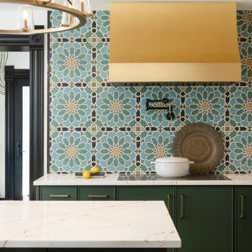
This kitchen is the soul of the home—an artful blend of beauty, warmth, and workhorse practicality. Designed with intention, it had to solve for a tricky layout, with three doorways and plenty of household traffic, all while creating a central gathering space our clients would love for years to come.
We began by reimagining the flow, carving out generous stations for prep, cooking, and casual gathering. A large center island—complete with seating and hidden ovens—acts as the kitchen’s command post. On the range wall, Fireclay’s Perian Star tile brings a jolt of joy and movement, playing perfectly against the stunning brass hood from CopperHoods.
Layered lighting, rich materials, and tonal contrasts keep the space feeling grounded yet special. Tedd Wood custom cabinetry is rendered in both soft Pumice and Sherwin-Williams Rock Garden—a pairing that balances earthy calm with playful personality. Cambria Inverness Gold quartz countertops pull it all together with subtle shimmer and warmth.
It’s a kitchen designed to feel vibrant and lived in, with details that elevate the everyday—like appliance garages, open shelving for cookbooks, and Brizo fixtures that deliver beauty in every function. Finishing touches like Restoration Hardware lighting and Cedar & Moss sconces help define each moment within this layered, luminous space.
152