
Search results for "Feeling tired" in Home Design Ideas
 Krista + Home
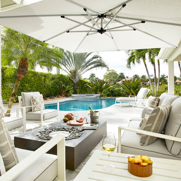
Frenchmen's Club Mod by Krista Watterworth Design Studio in Palm Beach Gardens, Florida. Photography by Mark Roskams. This outdoor space was tired and dated. We brought it into the present with modern luxuries, and an open, contemporary feel.
 RYAN ASSOCIATES GENERAL CONTRACTORS
Matthew Millman
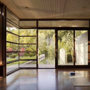
Mid-sized minimalist dark wood floor home yoga studio photo in San Francisco
Mid-sized minimalist dark wood floor home yoga studio photo in San Francisco

Find the right local pro for your project
 Chelsea Kloss Interiors
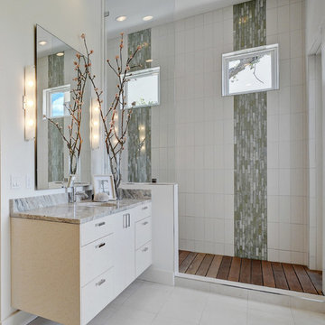
Inspiration for a mid-sized contemporary master green tile and glass tile porcelain tile bathroom remodel in Austin with an undermount sink, flat-panel cabinets, white cabinets, quartzite countertops and white walls
 TKS Design Group
Free ebook, Creating the Ideal Kitchen. DOWNLOAD NOW
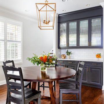
We went with a minimalist, clean, industrial look that feels light, bright and airy. The island is a dark charcoal with cool undertones that coordinates with the cabinetry and transom work in both the neighboring mudroom and breakfast area. White subway tile, quartz countertops, white enamel pendants and gold fixtures complete the update. The ends of the island are shiplap material that is also used on the fireplace in the next room.
In the new mudroom, we used a fun porcelain tile on the floor to get a pop of pattern, and walnut accents add some warmth. Each child has their own cubby, and there is a spot for shoes below a long bench. Open shelving with spots for baskets provides additional storage for the room.
Designed by: Susan Klimala, CKBD
Photography by: LOMA Studios
For more information on kitchen and bath design ideas go to: www.kitchenstudio-ge.com
 SabaRehman Abdulrehman
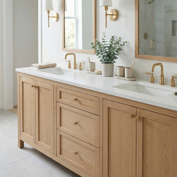
Morning routines shouldn’t involve a traffic jam at the sink. The 2025 Houzz Bathroom Trends Study found that 65 percent of U.S. renovators now choose a double-sink vanity to skip the wait. Designers agree: Titan Builders dubbed 2025 “the year of bigger, storage-packed double vanities,” forecasting dual-basin setups in family, guest, and even powder baths. As KBIS 2025 launches land, prototypes for 2026 layer in spa-grade wood, built-in outlets, and planet-friendly finishes. In this guide, we rank six standout models and show you how to size, install, and enjoy a clutter-free, two-sink future.
Methodology and selection criteria
A well-planned double-sink vanity keeps busy morning routines calm and clutter-free.
Before we crowned any winners, we mapped the entire 2024–2026 double-sink (dual-basin) market. That meant parsing KBIS exhibitor releases, scraping bestseller lists from Home Depot, Lowe’s, and Wayfair, and reviewing designer short lists in trade magazines. The sweep produced 110 candidate vanities, giving us visibility into every style, price tier, and material in play.
We then scored each model against six weighted factors that continue to matter long after installers leave:
- Build quality – 25 percent.Solid hardwood frames, dovetail drawers, and furniture-grade plywood backs, never particleboard in disguise.
- Design versatility – 20 percent.Lines and finishes that suit modern, classic, or farmhouse baths without dating quickly.
- Sustainability – 15 percent.FSC-certified wood, CARB 2 compliance, and low-VOC finishes for healthier air.
- Storage efficiency – 15 percent.Deep drawers, tilt-outs, or power cubbies that corral countertop clutter.
- Value for money – 15 percent.Fair street price for the materials, stone tops, sinks, and soft-close hardware included.
- Brand reputation and warranty – 10 percent.Manufacturers with responsive support and at least a one-year parts guarantee.
- Footprint: 72 W × 22 D × 36 H in. (183 × 56 × 91 cm)
- Crated weight: 506 lb / 230 kg
- Street price: about $2,575 with marble top and basins, Q4 2025
- Footprint: 48 W × 22 D in. (122 × 56 cm)
- Height: 34.8 in. (88 cm) with backsplash
- Sliding barn door plus 3 drawers
- Pre-drilled 8-in. faucet spacing, sinks included
- Footprint: 60 W × 21 D × 34 H in. (152 × 53 × 86 cm)
- Integrated power: 4 AC + 2 USB, UL-listed
- Crated weight: 300 lb / 136 kg
- Street price: about $2,349 at Home Depot, Q4 2025
- Footprint: 72 W × 22 D in. (183 × 56 cm)
- Height: 34 in. (86 cm) plus 4 in. backsplash
- Counter: 1 in. Carrara marble, apron-front sinks included
- Hardware: oil-rubbed bronze, soft-close doors and drawers
- Footprint: 60 W × 22 D × 34 H in. (152 × 56 × 86 cm)
- Construction: solid poplar and plywood, waterfall quartz top
- Integrated slim power bank, soft-close doors and drawers
- Target price: just under $2,300 with top and basins



 Jordan Design Build Group
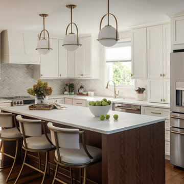
With Craftsman details throughout the rest of the home, our clients wanted their new kitchen to have transitional elements such as Shaker style doors, a farmhouse sink, warm wood tones, and other timeless features such as a custom hood and natural stone counters. The beautiful Glorious White marble counters have a soft honed finish and the stunning marble backsplash ties everything together to complete the look. The two-toned cabinets pair a rich stained cherry island with soft white perimeter cabinets. Brushed brass accents on the appliances pulls, cabinet hardware, lights and plumbing fixtures add another layer of sophistication. An induction range, dishwasher drawers, undercounter microwave, and four-door smart refrigerator amp up the functionality of this cook’s kitchen.
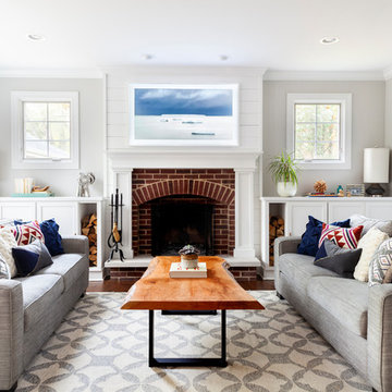 TKS Design Group
Free ebook, Creating the Ideal Kitchen. DOWNLOAD NOW
We went with a minimalist, clean, industrial look that feels light, bright and airy. The island is a dark charcoal with cool undertones that coordinates with the cabinetry and transom work in both the neighboring mudroom and breakfast area. White subway tile, quartz countertops, white enamel pendants and gold fixtures complete the update. The ends of the island are shiplap material that is also used on the fireplace in the next room.
In the new mudroom, we used a fun porcelain tile on the floor to get a pop of pattern, and walnut accents add some warmth. Each child has their own cubby, and there is a spot for shoes below a long bench. Open shelving with spots for baskets provides additional storage for the room.
Designed by: Susan Klimala, CKBD
Photography by: LOMA Studios
For more information on kitchen and bath design ideas go to: www.kitchenstudio-ge.com
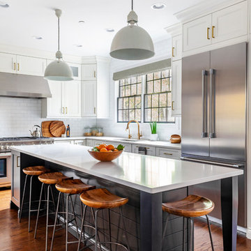 TKS Design Group
Free ebook, Creating the Ideal Kitchen. DOWNLOAD NOW
We went with a minimalist, clean, industrial look that feels light, bright and airy. The island is a dark charcoal with cool undertones that coordinates with the cabinetry and transom work in both the neighboring mudroom and breakfast area. White subway tile, quartz countertops, white enamel pendants and gold fixtures complete the update. The ends of the island are shiplap material that is also used on the fireplace in the next room.
In the new mudroom, we used a fun porcelain tile on the floor to get a pop of pattern, and walnut accents add some warmth. Each child has their own cubby, and there is a spot for shoes below a long bench. Open shelving with spots for baskets provides additional storage for the room.
Designed by: Susan Klimala, CKBD
Photography by: LOMA Studios
For more information on kitchen and bath design ideas go to: www.kitchenstudio-ge.com
 Angela Free Design
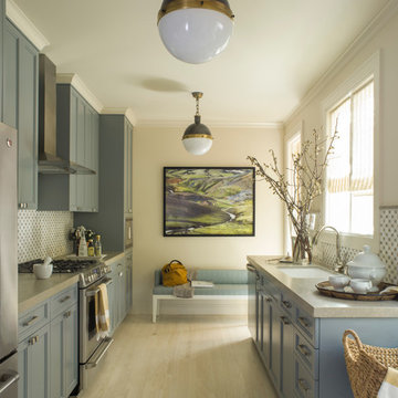
Transitional galley light wood floor kitchen photo in San Francisco with an undermount sink, shaker cabinets, multicolored backsplash, stainless steel appliances, no island and gray cabinets
 Dillon Kyle Architects (DKA)
Casey Dunn Photography
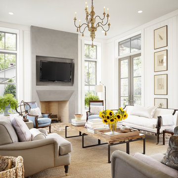
Example of a large farmhouse open concept brick floor living room design in Houston with white walls, a standard fireplace, a wall-mounted tv and a concrete fireplace
Example of a large farmhouse open concept brick floor living room design in Houston with white walls, a standard fireplace, a wall-mounted tv and a concrete fireplace
 TKS Design Group
Download our free ebook, Creating the Ideal Kitchen. DOWNLOAD NOW
This client was referred to us from a past client. They are a busy 2-career household with young children and enjoy entertaining friends and family in their home. They have a beautiful open concept home but unfortunately the kitchen was not fitting for the rest of the home. They were not quite sure what to do with the space. We talked about trying to refresh it or do more of a minor remodel, but in the end they decided a full gut would get them to where they wanted to be.
One problem was there was no place for guests to hang out other than the large and awkward banquette area. The brick wall and tiled hood area were feeling a bit dated and tired. The space was just not functional for their lifestyle. There was no prep space near the cooktop and no landing area for items coming out of the ovens or refrigerator, plus a big dead zone in the center of the room.
Banquettes, like the one they previously had in the space, are great for small spaces, but when they get really large like this one, it makes getting in and out of the seating area awkward and uncomfortable. Plus, there was room for a large table, so we eliminated the awkward built in.
We started by removing the faux brick wall between the kitchen and back entry. We relocated the entry to the garage over a couple feet in order to get every last inch out of the new kitchen. We also made the decision to close up the primary window that faced the pretty ho hum brick wall of the neighbor’s house. There was plenty of light coming in from the seating area, so we just didn’t feel the window was adding much to the room.
Construction went smoothy. There was a bit of rework with electrical, flooring and HVAC, but in the end, we think it was well worth it.
The clients really wanted a sleek contemporary look, and we originally had planned for a full height slab backsplash, but due to it’s size, it was a budget buster. Instead, we got creative and settled on large format porcelain tiles that have a similar feel but were a fraction of the cost. We made sure the wall was plumb and level so that the fit and finish would mimic that of slab material.
The final space was quite a change. A large prep sink sits directly across from the new pro-style range with plenty additional prep space on the large island. The refrigerator and ovens now have miles of landing space, and a nice tight work triangle makes cooking a breeze.
Since we wanted a more contemporary feel, not many wall cabinets were included. Instead, we outfitted some of the drawers for dish storage with a peg system. Two large pantries flanking the refrigerator hold baking supplies and small appliances. Large drawers by the cooktop hold pots and pans, and an appliance garage tucked away to the left of the range hides away miscellaneous items. The large island also houses a microwave drawer and tons of storage, most of which is drawers offering maximum convenience.
The island now seats 5-6 people comfortably along with the new table in the seating area which can seat up to 8. Entertaining will be a breeze in this space. With such a clean backdrop, we knew we would need some drama with the lighting, so we chose two sets of staggered pendants, which we adjusted for the right visual balance above the island.
We also included a small coffee station to the right of the main kitchen, which helps keep the coffee clutter out of the kitchen proper. Two tones of complimentary gray are featured in this kitchen. The perimeter is a light gray that reads almost white. The island is a gray stain that adds some depth and interest with the visible wood texture. The countertops are clean white quartz, and the hardware, barstools and light fixtures add warm brass tones. I see lots of cooking and entertaining with family and friends in the near future in this bright and airy new space.
Designed by: Susan Klimala, CKD, CBD
Photography by: Michael Kaskel
For more information on kitchen and bath design ideas go to: www.kitchenstudio-ge.com


 BRADSHAW DESIGNS LLC
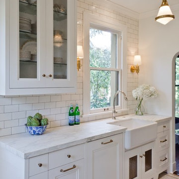
This Award-winning kitchen proves vintage doesn't have to look old and tired. This previously dark kitchen was updated with white, gold, and wood in the historic district of Monte Vista. The challenge is making a new kitchen look and feel like it belongs in a charming older home. The highlight and starting point is the original hex tile flooring in white and gold. It was in excellent condition and merely needed a good cleaning. The addition of white calacatta marble, white subway tile, walnut wood counters, brass and gold accents keep the charm intact. Cabinet panels mimic original door panels found in other areas of the home. Custom coffee storage is a modern bonus! Sub-Zero Refrig, Rohl sink, brass woven wire grill.


 Justin Doyle Homes
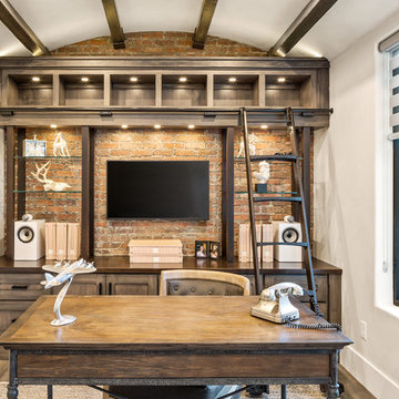
Now you have no excuse but to stay at home and work in this stunning arched ceiling office space. If you're feeling tired, this room leads directly off onto a screened porch area. This study features a sliding ladder with custom finished built-ins and spanning wooden beams.
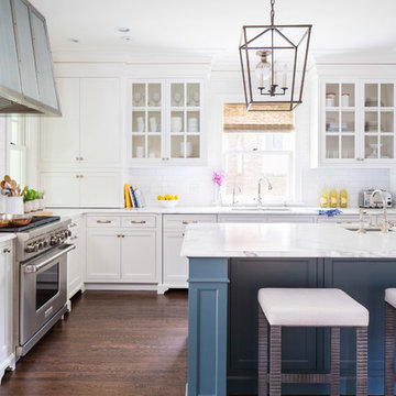
 O’Hara Interiors
Martha O'Hara Interiors, Interior Design & Photo Styling | John Kraemer & Sons, Remodel | Troy Thies, Photography
Please Note: All “related,” “similar,” and “sponsored” products tagged or listed by Houzz are not actual products pictured. They have not been approved by Martha O’Hara Interiors nor any of the professionals credited. For information about our work, please contact design@oharainteriors.com.

 User
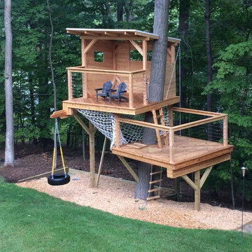
UserA little Frank Loyd Wright styled modern Treehouse situated on the living edge of imagination!
This is an example of a mid-sized modern outdoor playset in Boston.
This is an example of a mid-sized modern outdoor playset in Boston.
 Advance Design Studio, Ltd.
After six years of living in their Huntley IL home, Chris and Meghan were tired of their dark, dingy, outdated kitchen and it was finally time for a long-anticipated change. “The kitchen is the place where we live, it’s where we do everything,” Meghan said. “It was important that it be a space where we wanted to be.” Meghan loves cooking and enjoys including their girls in healthy meal prepping, this led them to want a brighter, more enjoyable kitchen with increased functionality and improved storage.
For Chris especially, the laundry room was an entirely dysfunctional eyesore. “We had a washer and a dryer, but it was all kind-of cobbled together!” Chris said. “There were always laundry piles everywhere, we weren’t really sure what we wanted to do in there, but it was time for us to make a change.” The mess of the space was stressful every time they walked in the door from the garage each day. Kids’ backpacks and shoes piled up haphazardly in the makeshift boot-bench closet left the family feeling disorganized and stressed. They needed space for folding clothes and locker cubbies to help keep the family organized.
Having known Christine and Todd in the Huntley community for years, Chris and Meghan were familiar with their work. “We already trusted them personally and having seen their projects for years we knew they did top notch work. After we reviewed the initial round of designs, we knew that hiring them was definitely the right choice,” Meghan and Chris said. Although Chris had done a lot of work in their home himself, the kitchen and laundry room renovation was such a large undertaking that he didn’t want to steal time away from his family to spend what would surely be many long weekends doing the job himself. “That would not have been a wise choice for us,” Chris laughed.
“Our designer, Michelle was very, very, easy to work with; anything we wanted to see or weren’t sure about, she went above and beyond to make this easy for us. She was easy to get hold of and always quick to respond,” the couple said. Michelle pulled ideas that mirrored the couple’s taste and style and was adept at directing the couple to limited choices that didn’t overwhelm them and kept the process moving. “I have a hard time making decisions. Michelle made the decision-making process so easy. I loved how she listened to what I liked and then presented three great options for me to choose from,” Meghan said.
The main objectives for the kitchen were better storage solutions, they wanted the space to reflect their lifestyle and taste, and they wanted it to last for years with low maintenance. One of the first steps in creating a more functional kitchen was relocating the refrigerator, creating an improved workflow for the busy family.
“We didn’t know that we could even move the refrigerator to a new location where it is now, that was something that we never would have thought of,” Chris said. “The new refrigerator location makes the kitchen feel so much bigger. We didn’t add any space, but our whole kitchen with the new design just seems like it’s so much larger than before!” Meghan said.
The perimeter mist colored cabinets helped warm and brighten the entire room, while the graphite colored cabinets on the island added contrast. Using this fresh, clean color palette satisfied the couple’s desire for a bright space that was the exact opposite of what they had before. Organization accessories were also added to the cabinets such as a spice drawer tray and roll outs to create hidden convenience.
“I absolutely love the hidden spices – it makes cooking so much more enjoyable!” Chris said. “And all the pull outs, and the double trash bin, who would think you could get so excited about organization!” the couple said in unison.
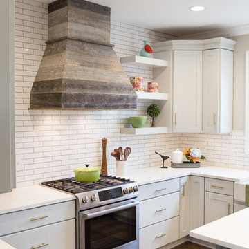
One thing they hated in their original kitchen was how dark the space felt. Added lighting on the ceiling with the new light fixtures combined with the lighter cabinetry colors throughout solved this problem. “Our new kitchen has this warm, almost cozy feeling that our old kitchen never had, it’s just a space that I love spending my time in now,” Meghan said. The light airy feeling was accentuated with the use of floating white shelves on either side of the decorative range hood. “We have so much cabinetry space, the new design is amazing we actually have more storage space than we will ever need,” Meghan said.
The island was extended to create more work surface and added space for stool seating. “The new island changes how we live. Now the kids can be in the kitchen with us, doing homework, eating breakfast, and the three of us have special dinners there when Chris is working late,” Meghan said.
The Carrara Marmi Quartz countertops were chosen because they are, not only beautiful, but are made from hard-working material that doesn’t require maintenance. The white subway tile backsplash that wraps to the ceiling behind the focal point cooktop range/hood compliments the crisp white countertops perfectly, while brushed brass hardware and light fixtures keep the design fresh and new.
The couple had a few fears at the beginning of the project, as most homeowners do. Their biggest fear was being out of their kitchen and laundry room for an extended time. The crew made it very easy for the family to work in a limited space keeping the washer and dryer hooked up the majority of the time, and also getting appliances working with minimal downtime.
“They above and beyond accommodated us to get us through the process,” Meghan said. “They did a great job making sure we were as comfortable as possible throughout the process,” Chris added.
“Our project manager DJ did a great job. He was very good at updating us on schedule changes, getting guys in as quickly as possible. Everyone that stepped in the house was nice and did great work,” said Chris. They thought Advance’s carpenter was phenomenal and were impressed when he took a conceptual idea from a photograph and worked with designer Michelle to create a one of a kind range/hood that has become the topic of conversation with friends and family who visit the new kitchen. “He was in our house literally every day for several weeks. He was easy to work with and good at what he did,” Meghan and Chris said.
The focal point of the kitchen; a hand-crafted, custom-built ventilation hood was clad with handpicked reclaimed barnwood. Advance Design’s carpenter built the framework and the cladding to create a one-of-a-kind design element that the couple loves.
“I think it was especially fun for him to create something unique from scratch, showcasing his talent in this area,” Meghan said. “I love that my kitchen is not like everyone else’s. I got to pick out the wood on my hood and watch it being built and was able to choose what pieces of wood went where on it. It’s totally unique.”
Red Oak flooring was toothed-in throughout the kitchen and the rest of the first floor anywhere changes were made. Then the whole floor was refinished to tone down the orange undertones in the existing floor stain, ultimately changing the color complexion of the entire first floor. The result is a completely new feeling to the entire home.
Renovating the laundry room was extremely important to Meghan and Chris, but they had trouble visualizing what the possibilities were for the seemingly small space. Michelle produced beautiful 3D illustrations that helped them envision the space in a whole new way.
“I must have told Michelle 100 times that I am a visual person, seeing the designs in 3D made it so easy to make decisions and see what we could really do with our space,” Meghan said.
A dividing wall and doorway were removed between the existing laundry room and hallway formerly containing a coat closet, providing space to design specialized graphite colored cabinetry matching the kitchen island to house custom storage cubbies for each family member. Adding the tall utility cabinetry in the new laundry area helped solve the storage issue, tucking away cleaning supplies, household items, and even the cat got its own cubby.
“I love how everything is now hidden in its own space. I can’t tell you how much I hated coming home and seeing everything sitting around on counters,” Chris said.
Electrical outlets were planned for the inside of utility cabinets, so devices could charge in hidden locations. Stacking the washer and dryer allowed for wider countertop space to provide a folding area and a special space for clothes to hang. “The way I do laundry has been completely transformed! I can actually fold clothes and hang them now right out of the washer and dryer,” Meghan said.
“The end result in the kitchen and the laundry/mud room was an updated light and bright space, with a smarter work flow that better meets the needs of this family,” Michelle said.
“I would totally recommend Advance Design,” Meghan said. “Sometimes I sit and just look at my kitchen and laundry room and think ‘Wow, I can’t believe I get to live here!’ It’s an understatement to say we love our new space.”
 DIGSdesign
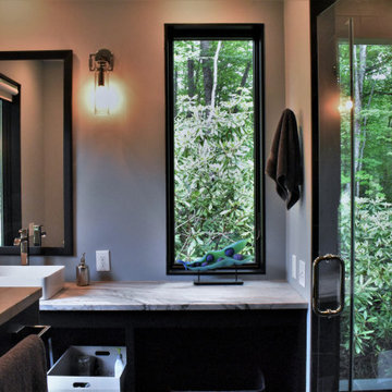
master bath view. single sink on macaubas quartzite counter. shower entry on right. glass shower exterior wall for "showering" in the rhododendron field.
1