
Search results for "Final decision" in Home Design Ideas
 SOIA Design
Project Overview
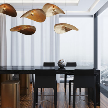
In one of the most iconic skyscrapers of Moscow City "Neva Towers", SOIA DESIGN was commissioned to design a refined, modern apartment that would harmonize with the panoramic skyline while remaining deeply personal and livable. The result is a bespoke 3D interior design project where every square meter was crafted with purpose and elegance.
The Challenge
The client approached us with a stunning high-rise space—but also with a complex brief:
Maximize views while ensuring privacy
Infuse warmth and comfort into a glass and steel environment
Introduce high-end materials and modern finishes without making the space feel cold
Optimize layout for both entertaining and everyday living
Achieve it all remotely
Our Solution
✦ Space Planning with Purpose: We reconfigured the layout to establish a seamless flow between the living, dining, and kitchen areas. Custom-built millwork and integrated storage solutions allowed us to keep the space minimalist without compromising on functionality.
✦ Warm Modernism: To contrast the building’s steel-and-glass architecture, we brought in natural stone, matte wood finishes, and warm lighting. Curated textures and neutral tones created a soft yet sophisticated atmosphere.
✦ 3D Visualization Precision: Leveraging high-end 3D modeling and photorealistic rendering, we presented the design in full detail—allowing the client to walk through the space virtually, make informed decisions, and see exactly how each element would look and feel.
✦ Tailored Detailing: Every aspect was custom—from the furniture selection and lighting scenarios to the precise alignment of veined marble in the bathroom. We collaborated with local artisans and international brands to bring this level of refinement to life.
The Impact
The final design not only honored the prestige of Neva Towers but elevated it into a private sanctuary above the city. What began as a challenging high-rise shell became a warm, modern home tailored to the client’s lifestyle.
 SOIA Design
Project Overview
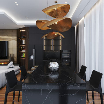
In one of the most iconic skyscrapers of Moscow City "Neva Towers", SOIA DESIGN was commissioned to design a refined, modern apartment that would harmonize with the panoramic skyline while remaining deeply personal and livable. The result is a bespoke 3D interior design project where every square meter was crafted with purpose and elegance.
The Challenge
The client approached us with a stunning high-rise space—but also with a complex brief:
Maximize views while ensuring privacy
Infuse warmth and comfort into a glass and steel environment
Introduce high-end materials and modern finishes without making the space feel cold
Optimize layout for both entertaining and everyday living
Achieve it all remotely
Our Solution
✦ Space Planning with Purpose: We reconfigured the layout to establish a seamless flow between the living, dining, and kitchen areas. Custom-built millwork and integrated storage solutions allowed us to keep the space minimalist without compromising on functionality.
✦ Warm Modernism: To contrast the building’s steel-and-glass architecture, we brought in natural stone, matte wood finishes, and warm lighting. Curated textures and neutral tones created a soft yet sophisticated atmosphere.
✦ 3D Visualization Precision: Leveraging high-end 3D modeling and photorealistic rendering, we presented the design in full detail—allowing the client to walk through the space virtually, make informed decisions, and see exactly how each element would look and feel.
✦ Tailored Detailing: Every aspect was custom—from the furniture selection and lighting scenarios to the precise alignment of veined marble in the bathroom. We collaborated with local artisans and international brands to bring this level of refinement to life.
The Impact
The final design not only honored the prestige of Neva Towers but elevated it into a private sanctuary above the city. What began as a challenging high-rise shell became a warm, modern home tailored to the client’s lifestyle.
 Modern Citi Group: Renovations & Remodeling
We helped Vishal and Ishita renovate their 1,300-square-foot home in the prime Upper West Side location. The original layout included separate living room and dining rooms, and a long narrow hallway throughout the apartment.
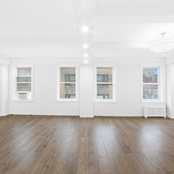
The clients wanted to complete a full apartment renovation and make the layout more functional by combining the living room with a dining room and part of the hallway to create a large open living space.
The design challenge was to deliver a modern yet classic aesthetic for the entire apartment that combined the existing design elements with the proposed upgrades.
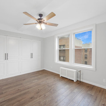
The goal was to combine the dining and living room areas creating a harmonious flow of natural light and air and increase the living space for entertainment. The design solution offered a modernized living room with recessed lighting, custom built-in shelving and an open layout, new flooring, lighting and painting for the entire apartment. The design and architectural teams collaborated to create the best layout to cater to the clients’ preferences. Finally, the choice was made and the clients felt confident in their decision.
Before the building stage began, the architect and project planning teams worked together to create and approve the architectural drawings with the building board and the Department of Buildings.
After the new layout was approved, the construction team completed a full apartment renovation including the removal of walls, refinishing of the entire apartment, including walls, ceilings, doors, and windows, replacement of the floors, and installation of the light fixtures and recessed lighting.
In a matter of several weeks, Ishita and Vishal had a newly-remodeled home that expressed their style, vision and improved functionality.
Find the right local pro for your project
 Modern Citi Group: Renovations & Remodeling
We helped Vishal and Ishita renovate their 1,300-square-foot home in the prime Upper West Side location. The original layout included separate living room and dining rooms, and a long narrow hallway throughout the apartment.
The clients wanted to complete a full apartment renovation and make the layout more functional by combining the living room with a dining room and part of the hallway to create a large open living space.
The design challenge was to deliver a modern yet classic aesthetic for the entire apartment that combined the existing design elements with the proposed upgrades.
The goal was to combine the dining and living room areas creating a harmonious flow of natural light and air and increase the living space for entertainment. The design solution offered a modernized living room with recessed lighting, custom built-in shelving and an open layout, new flooring, lighting and painting for the entire apartment. The design and architectural teams collaborated to create the best layout to cater to the clients’ preferences. Finally, the choice was made and the clients felt confident in their decision.
Before the building stage began, the architect and project planning teams worked together to create and approve the architectural drawings with the building board and the Department of Buildings.
After the new layout was approved, the construction team completed a full apartment renovation including the removal of walls, refinishing of the entire apartment, including walls, ceilings, doors, and windows, replacement of the floors, and installation of the light fixtures and recessed lighting.
In a matter of several weeks, Ishita and Vishal had a newly-remodeled home that expressed their style, vision and improved functionality.
 SOIA Design
Project Overview
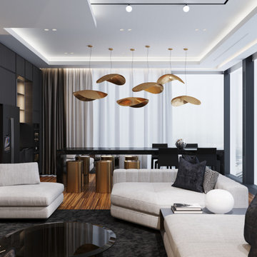
In one of the most iconic skyscrapers of Moscow City "Neva Towers", SOIA DESIGN was commissioned to design a refined, modern apartment that would harmonize with the panoramic skyline while remaining deeply personal and livable. The result is a bespoke 3D interior design project where every square meter was crafted with purpose and elegance.
The Challenge
The client approached us with a stunning high-rise space—but also with a complex brief:
Maximize views while ensuring privacy
Infuse warmth and comfort into a glass and steel environment
Introduce high-end materials and modern finishes without making the space feel cold
Optimize layout for both entertaining and everyday living
Achieve it all remotely
Our Solution
✦ Space Planning with Purpose: We reconfigured the layout to establish a seamless flow between the living, dining, and kitchen areas. Custom-built millwork and integrated storage solutions allowed us to keep the space minimalist without compromising on functionality.
✦ Warm Modernism: To contrast the building’s steel-and-glass architecture, we brought in natural stone, matte wood finishes, and warm lighting. Curated textures and neutral tones created a soft yet sophisticated atmosphere.
✦ 3D Visualization Precision: Leveraging high-end 3D modeling and photorealistic rendering, we presented the design in full detail—allowing the client to walk through the space virtually, make informed decisions, and see exactly how each element would look and feel.
✦ Tailored Detailing: Every aspect was custom—from the furniture selection and lighting scenarios to the precise alignment of veined marble in the bathroom. We collaborated with local artisans and international brands to bring this level of refinement to life.
The Impact
The final design not only honored the prestige of Neva Towers but elevated it into a private sanctuary above the city. What began as a challenging high-rise shell became a warm, modern home tailored to the client’s lifestyle.
 Modern Citi Group: Renovations & Remodeling
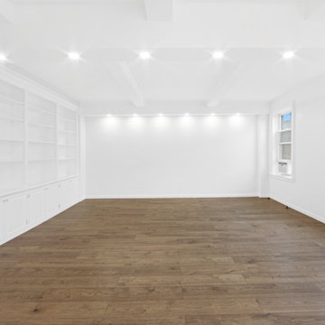
We helped Vishal and Ishita renovate their 1,300-square-foot home in the prime Upper West Side location. The original layout included separate living room and dining rooms, and a long narrow hallway throughout the apartment.
The clients wanted to complete a full apartment renovation and make the layout more functional by combining the living room with a dining room and part of the hallway to create a large open living space.
The design challenge was to deliver a modern yet classic aesthetic for the entire apartment that combined the existing design elements with the proposed upgrades.
The goal was to combine the dining and living room areas creating a harmonious flow of natural light and air and increase the living space for entertainment. The design solution offered a modernized living room with recessed lighting, custom built-in shelving and an open layout, new flooring, lighting and painting for the entire apartment. The design and architectural teams collaborated to create the best layout to cater to the clients’ preferences. Finally, the choice was made and the clients felt confident in their decision.
Before the building stage began, the architect and project planning teams worked together to create and approve the architectural drawings with the building board and the Department of Buildings.
After the new layout was approved, the construction team completed a full apartment renovation including the removal of walls, refinishing of the entire apartment, including walls, ceilings, doors, and windows, replacement of the floors, and installation of the light fixtures and recessed lighting.
In a matter of several weeks, Ishita and Vishal had a newly-remodeled home that expressed their style, vision and improved functionality.
 AZL interiors
With tall ceilings, an impressive stone fireplace, and original wooden beams, this home in Glen Ellyn, a suburb of Chicago, had plenty of character and a style that felt coastal. Six months into the purchase of their home, this family of six contacted Alessia Loffredo and Sarah Coscarelli of ReDesign Home to complete their home’s renovation by tackling the kitchen.
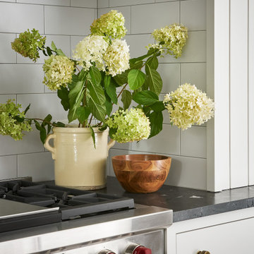
“Surprisingly, the kitchen was the one room in the home that lacked interest due to a challenging layout between kitchen, butler pantry, and pantry,” the designer shared, “the cabinetry was not proportionate to the space’s large footprint and height. None of the house’s architectural features were introduced into kitchen aside from the wooden beams crossing the room throughout the main floor including the family room.” She moved the pantry door closer to the prepping and cooking area while converting the former butler pantry a bar. Alessia designed an oversized hood around the stove to counterbalance the impressive stone fireplace located at the opposite side of the living space.
She then wanted to include functionality, using Trim Tech‘s cabinets, featuring a pair with retractable doors, for easy access, flanking both sides of the range. The client had asked for an island that would be larger than the original in their space – Alessia made the smart decision that if it was to increase in size it shouldn’t increase in visual weight and designed it with legs, raised above the floor. Made out of steel, by Wayward Machine Co., along with a marble-replicating porcelain countertop, it was designed with durability in mind to withstand anything that her client’s four children would throw at it. Finally, she added finishing touches to the space in the form of brass hardware from Katonah Chicago, with similar toned wall lighting and faucet.
 In Detail Interiors
Small coastal condo gets a new life!
This project started as a consultation that really focused on whether or not it was feasible to maximize functionality out of a tight kitchen area in a condo on the beach. The cabinetry was sort of dated but not terrible terrible.
Refresh or total gut of this small kitchen
The client wanted to give it a refresh worked but we had worked with her before…so she could not quite decide how far to go. Maybe just repaint the existing cabinets? She needed some furniture. She wanted a little more ambiance and pizazz. And she wanted the Cheryl magic.
Ok finally, decision made. Kitchen had to go@!
Decision made- a new kitchen to go with the new living!
After further review on site with her during the consult meeting, and pitching a few inquiries around for bids on cabinetry and countertops – she ultimately decided to gut and re-do the whole layout. And man-oh-man what a difference some well executed design makes!!
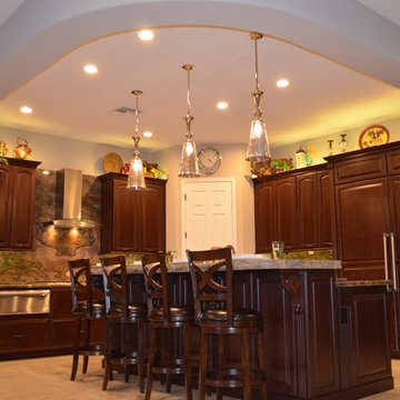
This layout was unique and truly optimized every inch we could muster from the kitchen. (Working around that spiral staircase and navigating the soffit that wrapped the entire kitchen and adjacent living room!!) Colors needed to be bold while still feeling fresh so we paired a deep aubergine and a sort of “matte” Caribbean blue which laid the groundwork for a stunning living area palette.
Tough layout to enlarge much
There were a lot of other “givens” in this space that made the execution of the design a highly strategized process. We knew we had to work around the large wall space that starts the kitchen because it had the laundry room hiding on the other side… the awkward nook with windows on all sides that was a small breakfast area before the remodel… oh, and did we mention that dang spiral staircase?! Multiple site visits to plot the cabinetry and countertop curve paid off all said and done, though!
Living space that work with the open floor plan kitchen
Designing the furnishings then became the fun part! With a smaller living space flanked by windows and sliders – but one that needed to balance the kitchen in substance – we had to break a few preferred design rules to make up the amount of seating desired.
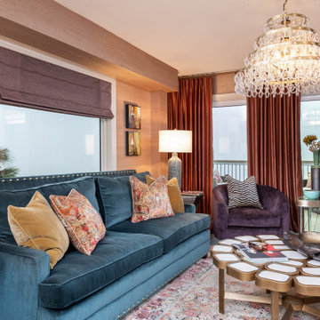
The deep grape-y purple barrel swivels were the perfect “transition” piece by the slider offering access to the views while being versatile enough to still afford safe use of the slider and passage outside. Adding some graphic punch with the droplet shaped, stone and brass cocktail table and bold multicolored rug we love the balance of these weightier aesthetic choices with the adjacent kitchen.
Signature pieces make all the difference
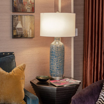
Carrying through little pops of that blue green between the counter stools (I die! Seriously! SO GORGEOUS) and the sofa (with those brass nails!) — these colors really created a sturdy but eclectic tonal feel that the client was just over the moon for. The art and grasscloth on the walls throughout developed the architecture of the space in an overall structure that was really lacking – it feels warm, inviting, comfortable – BEAUTIFUL – but not too priss and pomp.
Now if we could just keep the pup off the sofa!
 In Detail Interiors
Small coastal condo gets a new life!
This project started as a consultation that really focused on whether or not it was feasible to maximize functionality out of a tight kitchen area in a condo on the beach. The cabinetry was sort of dated but not terrible terrible.
Refresh or total gut of this small kitchen
The client wanted to give it a refresh worked but we had worked with her before…so she could not quite decide how far to go. Maybe just repaint the existing cabinets? She needed some furniture. She wanted a little more ambiance and pizazz. And she wanted the Cheryl magic.
Ok finally, decision made. Kitchen had to go@!
Decision made- a new kitchen to go with the new living!
After further review on site with her during the consult meeting, and pitching a few inquiries around for bids on cabinetry and countertops – she ultimately decided to gut and re-do the whole layout. And man-oh-man what a difference some well executed design makes!!
This layout was unique and truly optimized every inch we could muster from the kitchen. (Working around that spiral staircase and navigating the soffit that wrapped the entire kitchen and adjacent living room!!) Colors needed to be bold while still feeling fresh so we paired a deep aubergine and a sort of “matte” Caribbean blue which laid the groundwork for a stunning living area palette.
Tough layout to enlarge much
There were a lot of other “givens” in this space that made the execution of the design a highly strategized process. We knew we had to work around the large wall space that starts the kitchen because it had the laundry room hiding on the other side… the awkward nook with windows on all sides that was a small breakfast area before the remodel… oh, and did we mention that dang spiral staircase?! Multiple site visits to plot the cabinetry and countertop curve paid off all said and done, though!
Living space that work with the open floor plan kitchen
Designing the furnishings then became the fun part! With a smaller living space flanked by windows and sliders – but one that needed to balance the kitchen in substance – we had to break a few preferred design rules to make up the amount of seating desired.
The deep grape-y purple barrel swivels were the perfect “transition” piece by the slider offering access to the views while being versatile enough to still afford safe use of the slider and passage outside. Adding some graphic punch with the droplet shaped, stone and brass cocktail table and bold multicolored rug we love the balance of these weightier aesthetic choices with the adjacent kitchen.
Signature pieces make all the difference
Carrying through little pops of that blue green between the counter stools (I die! Seriously! SO GORGEOUS) and the sofa (with those brass nails!) — these colors really created a sturdy but eclectic tonal feel that the client was just over the moon for. The art and grasscloth on the walls throughout developed the architecture of the space in an overall structure that was really lacking – it feels warm, inviting, comfortable – BEAUTIFUL – but not too priss and pomp.
Now if we could just keep the pup off the sofa!
 Homework Remodels
 With education being key to our remodel process, our designer discussed lighting elements, space planning, cabinet options and finish materials with our homeowners. To begin, she talked about under cabinet and above cabinet lighting options. They also discussed the popularity and functionality of LED lights for task, decorative and ambient lighting scenes. Eavesdropping on our conversation, one of the brothers chimed in on how often they had to change the recessed ceiling fixtures. That comment from the brother led our designer to increase our scope of work to add dimmable LED can lights in the color frequency close to daylight. Now it was time to complete the finish selections.
Product selection had to go quickly, as the homeowner was only able to dedicate one long weekend to shop. With this goal in mind, our designer made choosing plumbing products and decorative lighting an online event. Then they went to an appliance showroom and granite/tile showroom to make the final choices. Our designer made sure they found a gorgeous set of slabs for the granite above the cooktop, since it was a key factor for the client and her mother.
With all the selections made, final space plan drawings and the electrical layout complete, the client met with our designer to sign off on all the paperwork and move forward with their new kitchen. The key improvements incorporated into the final design were:
LED can lights, under cabinet and above cabinet lights all on dimmers.
Accessible items for wheelchair use with a touch-free faucet and microwave drawer .
Extra deep counter space and seating at the island.
Additional storage cabinets under the seating area of the island.
Decreased traffic flow issues by adjusting refrigerator/freezer location and double oven cabinet.
Plug strips under the wall cabinets to eliminate backsplash outlets.
An expansive granite slab backsplash centered on the cooktop area.
Our project manager started the job with rough electrical and rough plumbing, as the homeowner had enlisted the assistance of a family friend to remove the kitchen cabinets and re-install them in her garage. The plumbing was straight forward with the gas line already in place and the sink location staying in the island. The electrician wired for the new under-cabinet and above cabinet LED strip lights. The sconce locations were adjusted for the new bar top location, as were a row of can lights to accommodate for an even pour of ambient light throughout the space. The new LED can lights are a hit, as none have needed to be changed out.
Our project manager specializes in trim carpentry so he did the cabinet install to keep our schedule on time. The cabinets went in smoothly except for the custom refrigerator panel. One of the panels needed to be remade three times, as each time it was produced the manufacturer’s quality control caught a defect. Our project manager worked closely with manufacturer and homeowner to keep everyone in the loop waiting patiently on its arrival.
When it came time for the quartzite installation, we worked closely with our fabricator at cut layout to create the focal point at the hood. His team did an excellent job with the installation. The sink area was a surprise. They went above and beyond in framing the sink with the similar vein to the hood backsplash. Upon installation, the tile backsplash just did not do justice to the amazing quartzite. Discussion with the family and pictures sent to the homeowner lead to a decision to call the fabricator to see how much quartzite might be left. He had just enough to complete the island and beverage center. In the end, the backsplash worked out beautifully in all stone.
We met our schedule for the end date of the project and the wheelchair-bound sister was able to move in. For this large Italian family, big meals with lots of family and friends in the new wonderful hub/kitchen is now a part of their happy life. Mission accomplished.
 SGDI - Sarah Gallop Design Inc.
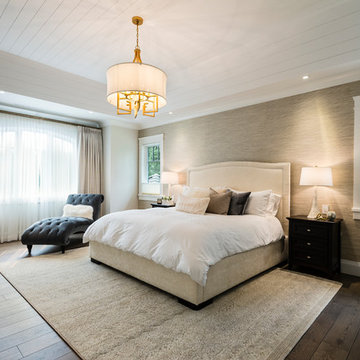
Upstairs a curved upper landing hallway leads to the master suite, creating wing-like privacy for adult escape. Another two-sided fireplace, wrapped in unique designer finishes, separates the bedroom from an ensuite with luxurious steam shower and sunken soaker tub-for-2. Passing through the spa-like suite leads to a dressing room of ample shelving, drawers, and illuminated hang-rods, this master is truly a serene retreat.
photography: Paul Grdina
 Advance Design Studio, Ltd.
After six years of living in their Huntley IL home, Chris and Meghan were tired of their dark, dingy, outdated kitchen and it was finally time for a long-anticipated change. “The kitchen is the place where we live, it’s where we do everything,” Meghan said. “It was important that it be a space where we wanted to be.” Meghan loves cooking and enjoys including their girls in healthy meal prepping, this led them to want a brighter, more enjoyable kitchen with increased functionality and improved storage.
For Chris especially, the laundry room was an entirely dysfunctional eyesore. “We had a washer and a dryer, but it was all kind-of cobbled together!” Chris said. “There were always laundry piles everywhere, we weren’t really sure what we wanted to do in there, but it was time for us to make a change.” The mess of the space was stressful every time they walked in the door from the garage each day. Kids’ backpacks and shoes piled up haphazardly in the makeshift boot-bench closet left the family feeling disorganized and stressed. They needed space for folding clothes and locker cubbies to help keep the family organized.
Having known Christine and Todd in the Huntley community for years, Chris and Meghan were familiar with their work. “We already trusted them personally and having seen their projects for years we knew they did top notch work. After we reviewed the initial round of designs, we knew that hiring them was definitely the right choice,” Meghan and Chris said. Although Chris had done a lot of work in their home himself, the kitchen and laundry room renovation was such a large undertaking that he didn’t want to steal time away from his family to spend what would surely be many long weekends doing the job himself. “That would not have been a wise choice for us,” Chris laughed.
“Our designer, Michelle was very, very, easy to work with; anything we wanted to see or weren’t sure about, she went above and beyond to make this easy for us. She was easy to get hold of and always quick to respond,” the couple said. Michelle pulled ideas that mirrored the couple’s taste and style and was adept at directing the couple to limited choices that didn’t overwhelm them and kept the process moving. “I have a hard time making decisions. Michelle made the decision-making process so easy. I loved how she listened to what I liked and then presented three great options for me to choose from,” Meghan said.
The main objectives for the kitchen were better storage solutions, they wanted the space to reflect their lifestyle and taste, and they wanted it to last for years with low maintenance. One of the first steps in creating a more functional kitchen was relocating the refrigerator, creating an improved workflow for the busy family.
“We didn’t know that we could even move the refrigerator to a new location where it is now, that was something that we never would have thought of,” Chris said. “The new refrigerator location makes the kitchen feel so much bigger. We didn’t add any space, but our whole kitchen with the new design just seems like it’s so much larger than before!” Meghan said.
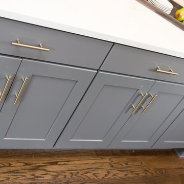
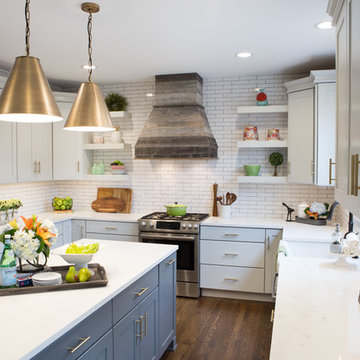
The perimeter mist colored cabinets helped warm and brighten the entire room, while the graphite colored cabinets on the island added contrast. Using this fresh, clean color palette satisfied the couple’s desire for a bright space that was the exact opposite of what they had before. Organization accessories were also added to the cabinets such as a spice drawer tray and roll outs to create hidden convenience.
“I absolutely love the hidden spices – it makes cooking so much more enjoyable!” Chris said. “And all the pull outs, and the double trash bin, who would think you could get so excited about organization!” the couple said in unison.
One thing they hated in their original kitchen was how dark the space felt. Added lighting on the ceiling with the new light fixtures combined with the lighter cabinetry colors throughout solved this problem. “Our new kitchen has this warm, almost cozy feeling that our old kitchen never had, it’s just a space that I love spending my time in now,” Meghan said. The light airy feeling was accentuated with the use of floating white shelves on either side of the decorative range hood. “We have so much cabinetry space, the new design is amazing we actually have more storage space than we will ever need,” Meghan said.
The island was extended to create more work surface and added space for stool seating. “The new island changes how we live. Now the kids can be in the kitchen with us, doing homework, eating breakfast, and the three of us have special dinners there when Chris is working late,” Meghan said.
The Carrara Marmi Quartz countertops were chosen because they are, not only beautiful, but are made from hard-working material that doesn’t require maintenance. The white subway tile backsplash that wraps to the ceiling behind the focal point cooktop range/hood compliments the crisp white countertops perfectly, while brushed brass hardware and light fixtures keep the design fresh and new.
The couple had a few fears at the beginning of the project, as most homeowners do. Their biggest fear was being out of their kitchen and laundry room for an extended time. The crew made it very easy for the family to work in a limited space keeping the washer and dryer hooked up the majority of the time, and also getting appliances working with minimal downtime.
“They above and beyond accommodated us to get us through the process,” Meghan said. “They did a great job making sure we were as comfortable as possible throughout the process,” Chris added.
“Our project manager DJ did a great job. He was very good at updating us on schedule changes, getting guys in as quickly as possible. Everyone that stepped in the house was nice and did great work,” said Chris. They thought Advance’s carpenter was phenomenal and were impressed when he took a conceptual idea from a photograph and worked with designer Michelle to create a one of a kind range/hood that has become the topic of conversation with friends and family who visit the new kitchen. “He was in our house literally every day for several weeks. He was easy to work with and good at what he did,” Meghan and Chris said.
The focal point of the kitchen; a hand-crafted, custom-built ventilation hood was clad with handpicked reclaimed barnwood. Advance Design’s carpenter built the framework and the cladding to create a one-of-a-kind design element that the couple loves.
“I think it was especially fun for him to create something unique from scratch, showcasing his talent in this area,” Meghan said. “I love that my kitchen is not like everyone else’s. I got to pick out the wood on my hood and watch it being built and was able to choose what pieces of wood went where on it. It’s totally unique.”
Red Oak flooring was toothed-in throughout the kitchen and the rest of the first floor anywhere changes were made. Then the whole floor was refinished to tone down the orange undertones in the existing floor stain, ultimately changing the color complexion of the entire first floor. The result is a completely new feeling to the entire home.
Renovating the laundry room was extremely important to Meghan and Chris, but they had trouble visualizing what the possibilities were for the seemingly small space. Michelle produced beautiful 3D illustrations that helped them envision the space in a whole new way.
“I must have told Michelle 100 times that I am a visual person, seeing the designs in 3D made it so easy to make decisions and see what we could really do with our space,” Meghan said.
A dividing wall and doorway were removed between the existing laundry room and hallway formerly containing a coat closet, providing space to design specialized graphite colored cabinetry matching the kitchen island to house custom storage cubbies for each family member. Adding the tall utility cabinetry in the new laundry area helped solve the storage issue, tucking away cleaning supplies, household items, and even the cat got its own cubby.
“I love how everything is now hidden in its own space. I can’t tell you how much I hated coming home and seeing everything sitting around on counters,” Chris said.
Electrical outlets were planned for the inside of utility cabinets, so devices could charge in hidden locations. Stacking the washer and dryer allowed for wider countertop space to provide a folding area and a special space for clothes to hang. “The way I do laundry has been completely transformed! I can actually fold clothes and hang them now right out of the washer and dryer,” Meghan said.
“The end result in the kitchen and the laundry/mud room was an updated light and bright space, with a smarter work flow that better meets the needs of this family,” Michelle said.
“I would totally recommend Advance Design,” Meghan said. “Sometimes I sit and just look at my kitchen and laundry room and think ‘Wow, I can’t believe I get to live here!’ It’s an understatement to say we love our new space.”
 Fredman Design Group
Jill Buckner Photography
Seeking a comfortable and casual weekend home for their family, our clients ask for the design team to create a system sophisticated yet "unbuttoned” space to complement their Harbor Country lakeside retreat. Every detail of the space – from the custom cabinetry and millwork to the exaggerated curved legs of the oversized island – was redesigned to add a touch of style and character. The repurposed barn wood throughout incorporates a rustic element, paying homage to the home's natural surroundings. The final redesign pulls together layers of natural elements to blur the line between indoor and outdoor living.
For more than 40 years, Fredman Design Group has been in the business of Interior Design. Throughout the years, we’ve built long-lasting relationships with our clients through our client-centric approach. When creating designs, our decisions depend on the personality of our clients—their dreams and their aspirations. We manifest their lifestyle by incorporating elements of design with those of our clients to create a unique environment, down to the details of the upholstery and accessories. We love it when a home feels finished and lived in, with various layers and textures.
While each of our clients and their stories has varied over the years, they’ve come to trust us with their projects—whether it’s a single room to the larger complete renovation, addition, or new construction.
They value the collaborative team that is behind each project, embracing the diversity that each designer is able to bring to their project through their love of art, travel, fashion, nature, history, architecture or film—ultimately falling in love with the nurturing environments we create for them.
We are grateful for the opportunity to tell each of clients’ stories through design. What story can we help you tell?
Call us today to schedule your complimentary consultation - 312-587-9184
 TaskRabbit
Recently, TaskRabbit challenged a group of 10 Taskers to build a Tiny House in the middle of Manhattan in just 72 hours – all for a good cause.
Building a fully outfitted tiny house in 3 days was a tall order – a build like this often takes months – but we set out to prove the power of collaboration, showing the kind of progress that can be made when people come together, bringing their best insights, skills and creativity to achieve something that seems impossible.
It was quite a week. New York was wonderful (and quite lovely, despite a bit of rain), our Taskers were incredible, and TaskRabbit’s Tiny House came together in record time, due to the planning, dedication and hard work of all involved.
A Symbol for Change
The TaskRabbit Tiny House was auctioned off with 100% of the proceeds going to our partner, Community Solutions, a national nonprofit helping communities take on complex social challenges – issues like homelessness, unemployment and health inequity – through collaboration and creative problem solving. This Tiny House was envisioned as a small symbol of the change that is possible when people have the right tools and opportunities to work together. Through our three-day build, our Taskers proved that amazing things can happen when we put our hearts into creating substantive change in our communities.
The Winning Bid
We’re proud to report that we were able to raise $26,600 to support Community Solutions’ work. Sarah, a lovely woman from New Hampshire, placed the winning bid – and it’s nice to know our tiny home is in good hands.
#ATinyTask: Behind the Scenes
The Plans
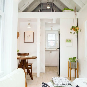
A lot of time and effort went into making sure this Tiny Home was as efficient, cozy and welcoming as possible. Our master planners, designer Lesley Morphy and TaskRabbit Creative Director Scott Smith, maximized every square inch in the little house with comfort and style in mind, utilizing a lofted bed, lofted storage, a floor-to-ceiling tiled shower, a compost toilet, and custom details throughout. There’s a surprising amount of built-in storage in the kitchen, while a conscious decision was made to keep the living space open so you could actually exist comfortably without feeling cramped.
The Build
Our Taskers worked long, hard shifts while our team made sure they were well fed, hydrated and in good spirits. The team brought amazing energy and we couldn’t be prouder of the way they worked together. Stay tuned, as we’ll be highlighting more of our Tiny House Taskers’ stories in coming days – they were so great that we want to make sure all of you get to know them better.
The Final Product
Behold, the completed Tiny House! For more photos, be sure to check out our Facebook page.
This was an incredibly inspiring project, and we really enjoyed watching the Tiny House come to life right in the middle of Manhattan. It was amazing to see what our Taskers are capable of, and we’re so glad we were able to support Community Solutions and help fight homelessness, unemployment and health inequity with #ATinyTask.

 Pathway Design & Construction
Water leaks can be frustrating and happen often unexpectedly… especially when the water is coming from your upstairs neighbor!
Once the leak occurred, the homeowners decided that it was the perfect opportunity to create their dream kitchen and entryway. The decision was made and the homeowners went shopping to purchase materials for their renovation. One problem; they hadn’t hired a contractor yet. They quickly discovered they would need help building their dream kitchen and entryway which is where we came in.
Scope:
Create a versatile space that reflects the homeowners’ vibrant personalities where they could cook, work, relax and entertain.
Desired features include:
Color changing LED tape lighting was essential to help create ambiance.
Smaller can lights with updated trim to modernize the lighting.
Disguising a “workspace” into the island design.
Installing a compost bin that doubles as a wine chiller for entertaining.
Separate wine bar.
Installing an intricate piece of mirror art and lighting in the entryway.
Installing custom waved back splash tile.
Challenges:
Creating a working set of construction plans from cabinet drawings was a challenge. The process entailed continuous communication with the clients including several walkthroughs before final installation of each aspect throughout the project.
Incorporating high-gloss and muted surfaces into the space without creating glare from the natural light coming in from many existing windows.
Wavy tile became difficult to install with the desired layout of backsplash outlet style and locations.
Solutions:
The core design issues were resolved with exceptional communication between our field team and the homeowners.
Satin finish countertops and matte paint offset the high gloss cabinetry and backsplash.
Because of the size of tiles in the space, the outlets needed to be cut in the center of the tile to look uniform. Time and a steady hand made this possible for the best visual result.
Result:
Thoughtful execution helped to create a versatile dream kitchen and entry way that also provides an at-home workspace. This now versatile space is useful and aesthetically pleasing, exceeding the homeowners’ vision. The small details ranging from accent lighting to the compost bin turned wine chiller make this a luxurious statement piece.
 Advance Design Studio, Ltd.
After six years of living in their Huntley IL home, Chris and Meghan were tired of their dark, dingy, outdated kitchen and it was finally time for a long-anticipated change. “The kitchen is the place where we live, it’s where we do everything,” Meghan said. “It was important that it be a space where we wanted to be.” Meghan loves cooking and enjoys including their girls in healthy meal prepping, this led them to want a brighter, more enjoyable kitchen with increased functionality and improved storage.
For Chris especially, the laundry room was an entirely dysfunctional eyesore. “We had a washer and a dryer, but it was all kind-of cobbled together!” Chris said. “There were always laundry piles everywhere, we weren’t really sure what we wanted to do in there, but it was time for us to make a change.” The mess of the space was stressful every time they walked in the door from the garage each day. Kids’ backpacks and shoes piled up haphazardly in the makeshift boot-bench closet left the family feeling disorganized and stressed. They needed space for folding clothes and locker cubbies to help keep the family organized.
Having known Christine and Todd in the Huntley community for years, Chris and Meghan were familiar with their work. “We already trusted them personally and having seen their projects for years we knew they did top notch work. After we reviewed the initial round of designs, we knew that hiring them was definitely the right choice,” Meghan and Chris said. Although Chris had done a lot of work in their home himself, the kitchen and laundry room renovation was such a large undertaking that he didn’t want to steal time away from his family to spend what would surely be many long weekends doing the job himself. “That would not have been a wise choice for us,” Chris laughed.
“Our designer, Michelle was very, very, easy to work with; anything we wanted to see or weren’t sure about, she went above and beyond to make this easy for us. She was easy to get hold of and always quick to respond,” the couple said. Michelle pulled ideas that mirrored the couple’s taste and style and was adept at directing the couple to limited choices that didn’t overwhelm them and kept the process moving. “I have a hard time making decisions. Michelle made the decision-making process so easy. I loved how she listened to what I liked and then presented three great options for me to choose from,” Meghan said.
The main objectives for the kitchen were better storage solutions, they wanted the space to reflect their lifestyle and taste, and they wanted it to last for years with low maintenance. One of the first steps in creating a more functional kitchen was relocating the refrigerator, creating an improved workflow for the busy family.
“We didn’t know that we could even move the refrigerator to a new location where it is now, that was something that we never would have thought of,” Chris said. “The new refrigerator location makes the kitchen feel so much bigger. We didn’t add any space, but our whole kitchen with the new design just seems like it’s so much larger than before!” Meghan said.
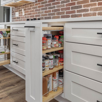
The perimeter mist colored cabinets helped warm and brighten the entire room, while the graphite colored cabinets on the island added contrast. Using this fresh, clean color palette satisfied the couple’s desire for a bright space that was the exact opposite of what they had before. Organization accessories were also added to the cabinets such as a spice drawer tray and roll outs to create hidden convenience.
“I absolutely love the hidden spices – it makes cooking so much more enjoyable!” Chris said. “And all the pull outs, and the double trash bin, who would think you could get so excited about organization!” the couple said in unison.
One thing they hated in their original kitchen was how dark the space felt. Added lighting on the ceiling with the new light fixtures combined with the lighter cabinetry colors throughout solved this problem. “Our new kitchen has this warm, almost cozy feeling that our old kitchen never had, it’s just a space that I love spending my time in now,” Meghan said. The light airy feeling was accentuated with the use of floating white shelves on either side of the decorative range hood. “We have so much cabinetry space, the new design is amazing we actually have more storage space than we will ever need,” Meghan said.
The island was extended to create more work surface and added space for stool seating. “The new island changes how we live. Now the kids can be in the kitchen with us, doing homework, eating breakfast, and the three of us have special dinners there when Chris is working late,” Meghan said.
The Carrara Marmi Quartz countertops were chosen because they are, not only beautiful, but are made from hard-working material that doesn’t require maintenance. The white subway tile backsplash that wraps to the ceiling behind the focal point cooktop range/hood compliments the crisp white countertops perfectly, while brushed brass hardware and light fixtures keep the design fresh and new.
The couple had a few fears at the beginning of the project, as most homeowners do. Their biggest fear was being out of their kitchen and laundry room for an extended time. The crew made it very easy for the family to work in a limited space keeping the washer and dryer hooked up the majority of the time, and also getting appliances working with minimal downtime.
“They above and beyond accommodated us to get us through the process,” Meghan said. “They did a great job making sure we were as comfortable as possible throughout the process,” Chris added.
“Our project manager DJ did a great job. He was very good at updating us on schedule changes, getting guys in as quickly as possible. Everyone that stepped in the house was nice and did great work,” said Chris. They thought Advance’s carpenter was phenomenal and were impressed when he took a conceptual idea from a photograph and worked with designer Michelle to create a one of a kind range/hood that has become the topic of conversation with friends and family who visit the new kitchen. “He was in our house literally every day for several weeks. He was easy to work with and good at what he did,” Meghan and Chris said.
The focal point of the kitchen; a hand-crafted, custom-built ventilation hood was clad with handpicked reclaimed barnwood. Advance Design’s carpenter built the framework and the cladding to create a one-of-a-kind design element that the couple loves.
“I think it was especially fun for him to create something unique from scratch, showcasing his talent in this area,” Meghan said. “I love that my kitchen is not like everyone else’s. I got to pick out the wood on my hood and watch it being built and was able to choose what pieces of wood went where on it. It’s totally unique.”
Red Oak flooring was toothed-in throughout the kitchen and the rest of the first floor anywhere changes were made. Then the whole floor was refinished to tone down the orange undertones in the existing floor stain, ultimately changing the color complexion of the entire first floor. The result is a completely new feeling to the entire home.
Renovating the laundry room was extremely important to Meghan and Chris, but they had trouble visualizing what the possibilities were for the seemingly small space. Michelle produced beautiful 3D illustrations that helped them envision the space in a whole new way.
“I must have told Michelle 100 times that I am a visual person, seeing the designs in 3D made it so easy to make decisions and see what we could really do with our space,” Meghan said.
A dividing wall and doorway were removed between the existing laundry room and hallway formerly containing a coat closet, providing space to design specialized graphite colored cabinetry matching the kitchen island to house custom storage cubbies for each family member. Adding the tall utility cabinetry in the new laundry area helped solve the storage issue, tucking away cleaning supplies, household items, and even the cat got its own cubby.
“I love how everything is now hidden in its own space. I can’t tell you how much I hated coming home and seeing everything sitting around on counters,” Chris said.
Electrical outlets were planned for the inside of utility cabinets, so devices could charge in hidden locations. Stacking the washer and dryer allowed for wider countertop space to provide a folding area and a special space for clothes to hang. “The way I do laundry has been completely transformed! I can actually fold clothes and hang them now right out of the washer and dryer,” Meghan said.
“The end result in the kitchen and the laundry/mud room was an updated light and bright space, with a smarter work flow that better meets the needs of this family,” Michelle said.
“I would totally recommend Advance Design,” Meghan said. “Sometimes I sit and just look at my kitchen and laundry room and think ‘Wow, I can’t believe I get to live here!’ It’s an understatement to say we love our new space.”
 Reico Kitchen & Bath
Gregg Waller of Reico Kitchen and Bath in Wilmington, NC collaborated with JC Hazelton Builders to design a farmhouse inspired kitchen featuring Green Forest and Masterpiece cabinetry.
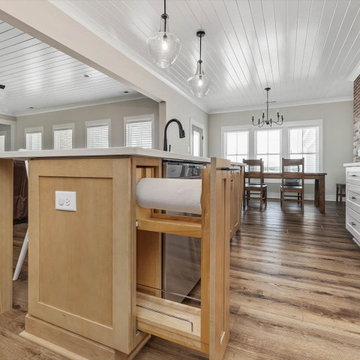
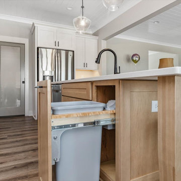
The kitchen features Green Forest cabinets in the Park Place door style with a White finish for the perimeter, complemented with an island in the Masterpiece door style Turner in Maple with a Shortbread finish. Appliances and countertops were provided by others.
The client expressed their appreciation saying, “I literally love every aspect of our kitchen. It is exactly what we wanted. We did not have to sacrifice our vision which was a welcome experience. Gregg was so helpful in hearing what we wanted and then delivering. His knowledge about the products available really helped us achieve our design goals. He created digital examples of our kitchen, laundry and bathrooms which helped us in making our final decision.”
“The biggest challenge that I faced was creating the look the client wanted in their new home while staying within a budget that was set prior to our introduction. I decided that Green Forest Park Place cabinets would be the best choice for the majority of the project. Masterpiece cabinets were needed to get the exact color that the client wanted for the kitchen island,” explained Gregg.
“My favorite part of the design is the range wall. I like the way the warm wood tones of the hood balance the white shaker cabinets and brick backsplash. The clients were an absolute pleasure to work with. The excellent communication that I received from the client throughout definitely helped in the successful completion of the project!”
Photos courtesy of ShowSpaces Photography.
 Reico Kitchen & Bath
Gregg Waller of Reico Kitchen and Bath in Wilmington, NC collaborated with JC Hazelton Builders to design a farmhouse inspired kitchen featuring Green Forest and Masterpiece cabinetry.
The kitchen features Green Forest cabinets in the Park Place door style with a White finish for the perimeter, complemented with an island in the Masterpiece door style Turner in Maple with a Shortbread finish. Appliances and countertops were provided by others.
The client expressed their appreciation saying, “I literally love every aspect of our kitchen. It is exactly what we wanted. We did not have to sacrifice our vision which was a welcome experience. Gregg was so helpful in hearing what we wanted and then delivering. His knowledge about the products available really helped us achieve our design goals. He created digital examples of our kitchen, laundry and bathrooms which helped us in making our final decision.”
“The biggest challenge that I faced was creating the look the client wanted in their new home while staying within a budget that was set prior to our introduction. I decided that Green Forest Park Place cabinets would be the best choice for the majority of the project. Masterpiece cabinets were needed to get the exact color that the client wanted for the kitchen island,” explained Gregg.
“My favorite part of the design is the range wall. I like the way the warm wood tones of the hood balance the white shaker cabinets and brick backsplash. The clients were an absolute pleasure to work with. The excellent communication that I received from the client throughout definitely helped in the successful completion of the project!”
Photos courtesy of ShowSpaces Photography.
 Reico Kitchen & Bath
Gregg Waller of Reico Kitchen and Bath in Wilmington, NC collaborated with JC Hazelton Builders to design a farmhouse inspired kitchen featuring Green Forest and Masterpiece cabinetry.
The kitchen features Green Forest cabinets in the Park Place door style with a White finish for the perimeter, complemented with an island in the Masterpiece door style Turner in Maple with a Shortbread finish. Appliances and countertops were provided by others.
The client expressed their appreciation saying, “I literally love every aspect of our kitchen. It is exactly what we wanted. We did not have to sacrifice our vision which was a welcome experience. Gregg was so helpful in hearing what we wanted and then delivering. His knowledge about the products available really helped us achieve our design goals. He created digital examples of our kitchen, laundry and bathrooms which helped us in making our final decision.”
“The biggest challenge that I faced was creating the look the client wanted in their new home while staying within a budget that was set prior to our introduction. I decided that Green Forest Park Place cabinets would be the best choice for the majority of the project. Masterpiece cabinets were needed to get the exact color that the client wanted for the kitchen island,” explained Gregg.
“My favorite part of the design is the range wall. I like the way the warm wood tones of the hood balance the white shaker cabinets and brick backsplash. The clients were an absolute pleasure to work with. The excellent communication that I received from the client throughout definitely helped in the successful completion of the project!”
Photos courtesy of ShowSpaces Photography.
25