
Search results for "Final decision" in Home Design Ideas
 Fiorito Interior Design
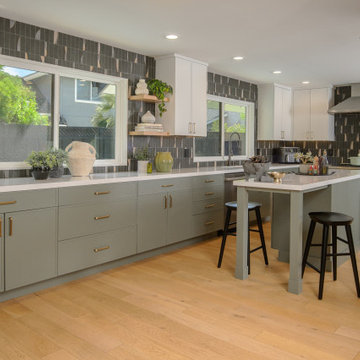
When I began this kitchen project, the space was constrained by an awkward peninsula and a dropped ceiling that compressed the room both physically and visually. Fluorescent fixtures sat behind a plastic diffuser, and the refrigerator was wedged beside the range, leaving the kitchen feeling crowded while also making poor use of the available space. The transformation began by taking things away. The dropped ceiling was removed, the fluorescent tubes went with it, and the room suddenly gained height and light. The peninsula was removed too, opening the floor plan and allowing the cabinetry to continue down an adjacent wall and incorporate a second window. What had been a small, enclosed kitchen became a generous working space with room for a slim, functional L-shaped island, additional cabinetry and, perhaps most importantly, a much more natural relationship between the different parts of the kitchen.
The palette is quiet, but there is a lot happening within it. Soft sage cabinetry grounds the room, while warm white upper cabinets and pantry cabinetry lift the space. A pure white quartz countertop provides a crisp surface against the cabinetry, and soft brass hardware adds just enough warmth. The new Sub Zero refrigerator was given its own wall, beside a full pantry, freeing the range wall to become a strong focal point. A Monogram range now sits centered beneath an angular stainless-steel Zephyr hood, framed by the kitchen's most distinctive element: a graphite backsplash made from WOW Design's Pottery tile. Inspired by Japanese handmade ceramics, the tiles have a wonderfully tactile, imperfect character. Most are deep graphite, but here and there the surface breaks into strokes of camel, dusty peach and deep blue-gunmetal glaze. There is an almost painterly quality to the way those colors move across the wall, giving the kitchen something that is difficult to achieve with a more uniform material—the feeling that someone actually made it.
The rest of the room was designed around that same balance of simplicity and warmth. New pale oak flooring runs throughout the ground floor, bringing a natural material and a soft golden tone beneath the cooler sage and graphite. Floating oak shelves flank the windows and provide a home for plants, ceramics and a few favorite objects, while another pair of shelves beside the refrigerator creates a small landing place for the things that inevitably arrive with you at the end of the day—keys, mail, bags and whatever else happens to be in your hands. The island occupies a surprisingly small footprint, yet its L-shaped form provides both additional work surface and seating without interrupting the flow of the room. A deep sink with an integrated cutting board and roll-up drying rack, a commercial-style faucet and under-cabinet LED lighting bring the practical details up to the same level of thoughtfulness as the larger design decisions. In the end, the renovation did more than just enlarge the kitchen; it created a space that feels calm, contemporary, warm, and a little unexpected … and, most importantly, we created a kitchen that finally makes sense for the way my clients live.
AFTER photos: Bernardo Grijalva
 Fiorito Interior Design
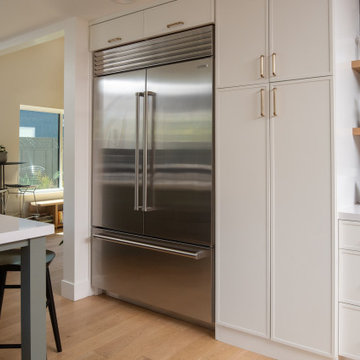
When I began this kitchen project, the space was constrained by an awkward peninsula and a dropped ceiling that compressed the room both physically and visually. Fluorescent fixtures sat behind a plastic diffuser, and the refrigerator was wedged beside the range, leaving the kitchen feeling crowded while also making poor use of the available space. The transformation began by taking things away. The dropped ceiling was removed, the fluorescent tubes went with it, and the room suddenly gained height and light. The peninsula was removed too, opening the floor plan and allowing the cabinetry to continue down an adjacent wall and incorporate a second window. What had been a small, enclosed kitchen became a generous working space with room for a slim, functional L-shaped island, additional cabinetry and, perhaps most importantly, a much more natural relationship between the different parts of the kitchen.
The palette is quiet, but there is a lot happening within it. Soft sage cabinetry grounds the room, while warm white upper cabinets and pantry cabinetry lift the space. A pure white quartz countertop provides a crisp surface against the cabinetry, and soft brass hardware adds just enough warmth. The new Sub Zero refrigerator was given its own wall, beside a full pantry, freeing the range wall to become a strong focal point. A Monogram range now sits centered beneath an angular stainless-steel Zephyr hood, framed by the kitchen's most distinctive element: a graphite backsplash made from WOW Design's Pottery tile. Inspired by Japanese handmade ceramics, the tiles have a wonderfully tactile, imperfect character. Most are deep graphite, but here and there the surface breaks into strokes of camel, dusty peach and deep blue-gunmetal glaze. There is an almost painterly quality to the way those colors move across the wall, giving the kitchen something that is difficult to achieve with a more uniform material—the feeling that someone actually made it.
The rest of the room was designed around that same balance of simplicity and warmth. New pale oak flooring runs throughout the ground floor, bringing a natural material and a soft golden tone beneath the cooler sage and graphite. Floating oak shelves flank the windows and provide a home for plants, ceramics and a few favorite objects, while another pair of shelves beside the refrigerator creates a small landing place for the things that inevitably arrive with you at the end of the day—keys, mail, bags and whatever else happens to be in your hands. The island occupies a surprisingly small footprint, yet its L-shaped form provides both additional work surface and seating without interrupting the flow of the room. A deep sink with an integrated cutting board and roll-up drying rack, a commercial-style faucet and under-cabinet LED lighting bring the practical details up to the same level of thoughtfulness as the larger design decisions. In the end, the renovation did more than just enlarge the kitchen; it created a space that feels calm, contemporary, warm, and a little unexpected … and, most importantly, we created a kitchen that finally makes sense for the way my clients live.
AFTER photos: Bernardo Grijalva
 Fiorito Interior Design
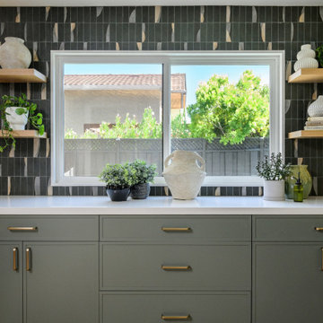
When I began this kitchen project, the space was constrained by an awkward peninsula and a dropped ceiling that compressed the room both physically and visually. Fluorescent fixtures sat behind a plastic diffuser, and the refrigerator was wedged beside the range, leaving the kitchen feeling crowded while also making poor use of the available space. The transformation began by taking things away. The dropped ceiling was removed, the fluorescent tubes went with it, and the room suddenly gained height and light. The peninsula was removed too, opening the floor plan and allowing the cabinetry to continue down an adjacent wall and incorporate a second window. What had been a small, enclosed kitchen became a generous working space with room for a slim, functional L-shaped island, additional cabinetry and, perhaps most importantly, a much more natural relationship between the different parts of the kitchen.
The palette is quiet, but there is a lot happening within it. Soft sage cabinetry grounds the room, while warm white upper cabinets and pantry cabinetry lift the space. A pure white quartz countertop provides a crisp surface against the cabinetry, and soft brass hardware adds just enough warmth. The new Sub Zero refrigerator was given its own wall, beside a full pantry, freeing the range wall to become a strong focal point. A Monogram range now sits centered beneath an angular stainless-steel Zephyr hood, framed by the kitchen's most distinctive element: a graphite backsplash made from WOW Design's Pottery tile. Inspired by Japanese handmade ceramics, the tiles have a wonderfully tactile, imperfect character. Most are deep graphite, but here and there the surface breaks into strokes of camel, dusty peach and deep blue-gunmetal glaze. There is an almost painterly quality to the way those colors move across the wall, giving the kitchen something that is difficult to achieve with a more uniform material—the feeling that someone actually made it.
The rest of the room was designed around that same balance of simplicity and warmth. New pale oak flooring runs throughout the ground floor, bringing a natural material and a soft golden tone beneath the cooler sage and graphite. Floating oak shelves flank the windows and provide a home for plants, ceramics and a few favorite objects, while another pair of shelves beside the refrigerator creates a small landing place for the things that inevitably arrive with you at the end of the day—keys, mail, bags and whatever else happens to be in your hands. The island occupies a surprisingly small footprint, yet its L-shaped form provides both additional work surface and seating without interrupting the flow of the room. A deep sink with an integrated cutting board and roll-up drying rack, a commercial-style faucet and under-cabinet LED lighting bring the practical details up to the same level of thoughtfulness as the larger design decisions. In the end, the renovation did more than just enlarge the kitchen; it created a space that feels calm, contemporary, warm, and a little unexpected … and, most importantly, we created a kitchen that finally makes sense for the way my clients live.
AFTER photos: Bernardo Grijalva
Find the right local pro for your project
 MaestroBath
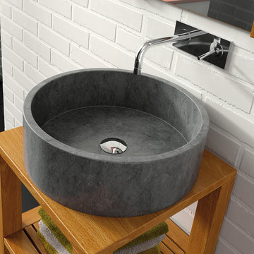
Every stone contains the potential to create a unique piece, it just needs to be formed and led by the natural process. The original material will become precious object.
Maestrobath design provides an added value to the products. It enhances the stone material via combination of handcrafted work and mechanical process with the latest technology.
The marble utilized to produce our pieces is the metamorphic stone, which is a natural combination of sediment submitted to the high pressure and temperature. Produced Marble is used in designing and creating master pieces.
Arrecife modern vessel sink will transform any bathroom to a contemporary bathroom. Luxurious beige sink can fit in any powder room and give your washroom a serene and clean feel. This rectangular modern sink is easy to install and maintain. Arrecife is also available in Black.
 Advance Design Studio, Ltd.
After six years of living in their Huntley IL home, Chris and Meghan were tired of their dark, dingy, outdated kitchen and it was finally time for a long-anticipated change. “The kitchen is the place where we live, it’s where we do everything,” Meghan said. “It was important that it be a space where we wanted to be.” Meghan loves cooking and enjoys including their girls in healthy meal prepping, this led them to want a brighter, more enjoyable kitchen with increased functionality and improved storage.
For Chris especially, the laundry room was an entirely dysfunctional eyesore. “We had a washer and a dryer, but it was all kind-of cobbled together!” Chris said. “There were always laundry piles everywhere, we weren’t really sure what we wanted to do in there, but it was time for us to make a change.” The mess of the space was stressful every time they walked in the door from the garage each day. Kids’ backpacks and shoes piled up haphazardly in the makeshift boot-bench closet left the family feeling disorganized and stressed. They needed space for folding clothes and locker cubbies to help keep the family organized.
Having known Christine and Todd in the Huntley community for years, Chris and Meghan were familiar with their work. “We already trusted them personally and having seen their projects for years we knew they did top notch work. After we reviewed the initial round of designs, we knew that hiring them was definitely the right choice,” Meghan and Chris said. Although Chris had done a lot of work in their home himself, the kitchen and laundry room renovation was such a large undertaking that he didn’t want to steal time away from his family to spend what would surely be many long weekends doing the job himself. “That would not have been a wise choice for us,” Chris laughed.
“Our designer, Michelle was very, very, easy to work with; anything we wanted to see or weren’t sure about, she went above and beyond to make this easy for us. She was easy to get hold of and always quick to respond,” the couple said. Michelle pulled ideas that mirrored the couple’s taste and style and was adept at directing the couple to limited choices that didn’t overwhelm them and kept the process moving. “I have a hard time making decisions. Michelle made the decision-making process so easy. I loved how she listened to what I liked and then presented three great options for me to choose from,” Meghan said.
The main objectives for the kitchen were better storage solutions, they wanted the space to reflect their lifestyle and taste, and they wanted it to last for years with low maintenance. One of the first steps in creating a more functional kitchen was relocating the refrigerator, creating an improved workflow for the busy family.
“We didn’t know that we could even move the refrigerator to a new location where it is now, that was something that we never would have thought of,” Chris said. “The new refrigerator location makes the kitchen feel so much bigger. We didn’t add any space, but our whole kitchen with the new design just seems like it’s so much larger than before!” Meghan said.
The perimeter mist colored cabinets helped warm and brighten the entire room, while the graphite colored cabinets on the island added contrast. Using this fresh, clean color palette satisfied the couple’s desire for a bright space that was the exact opposite of what they had before. Organization accessories were also added to the cabinets such as a spice drawer tray and roll outs to create hidden convenience.
“I absolutely love the hidden spices – it makes cooking so much more enjoyable!” Chris said. “And all the pull outs, and the double trash bin, who would think you could get so excited about organization!” the couple said in unison.
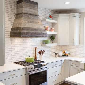
One thing they hated in their original kitchen was how dark the space felt. Added lighting on the ceiling with the new light fixtures combined with the lighter cabinetry colors throughout solved this problem. “Our new kitchen has this warm, almost cozy feeling that our old kitchen never had, it’s just a space that I love spending my time in now,” Meghan said. The light airy feeling was accentuated with the use of floating white shelves on either side of the decorative range hood. “We have so much cabinetry space, the new design is amazing we actually have more storage space than we will ever need,” Meghan said.
The island was extended to create more work surface and added space for stool seating. “The new island changes how we live. Now the kids can be in the kitchen with us, doing homework, eating breakfast, and the three of us have special dinners there when Chris is working late,” Meghan said.
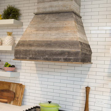
The Carrara Marmi Quartz countertops were chosen because they are, not only beautiful, but are made from hard-working material that doesn’t require maintenance. The white subway tile backsplash that wraps to the ceiling behind the focal point cooktop range/hood compliments the crisp white countertops perfectly, while brushed brass hardware and light fixtures keep the design fresh and new.
The couple had a few fears at the beginning of the project, as most homeowners do. Their biggest fear was being out of their kitchen and laundry room for an extended time. The crew made it very easy for the family to work in a limited space keeping the washer and dryer hooked up the majority of the time, and also getting appliances working with minimal downtime.
“They above and beyond accommodated us to get us through the process,” Meghan said. “They did a great job making sure we were as comfortable as possible throughout the process,” Chris added.
“Our project manager DJ did a great job. He was very good at updating us on schedule changes, getting guys in as quickly as possible. Everyone that stepped in the house was nice and did great work,” said Chris. They thought Advance’s carpenter was phenomenal and were impressed when he took a conceptual idea from a photograph and worked with designer Michelle to create a one of a kind range/hood that has become the topic of conversation with friends and family who visit the new kitchen. “He was in our house literally every day for several weeks. He was easy to work with and good at what he did,” Meghan and Chris said.
The focal point of the kitchen; a hand-crafted, custom-built ventilation hood was clad with handpicked reclaimed barnwood. Advance Design’s carpenter built the framework and the cladding to create a one-of-a-kind design element that the couple loves.
“I think it was especially fun for him to create something unique from scratch, showcasing his talent in this area,” Meghan said. “I love that my kitchen is not like everyone else’s. I got to pick out the wood on my hood and watch it being built and was able to choose what pieces of wood went where on it. It’s totally unique.”
Red Oak flooring was toothed-in throughout the kitchen and the rest of the first floor anywhere changes were made. Then the whole floor was refinished to tone down the orange undertones in the existing floor stain, ultimately changing the color complexion of the entire first floor. The result is a completely new feeling to the entire home.
Renovating the laundry room was extremely important to Meghan and Chris, but they had trouble visualizing what the possibilities were for the seemingly small space. Michelle produced beautiful 3D illustrations that helped them envision the space in a whole new way.
“I must have told Michelle 100 times that I am a visual person, seeing the designs in 3D made it so easy to make decisions and see what we could really do with our space,” Meghan said.
A dividing wall and doorway were removed between the existing laundry room and hallway formerly containing a coat closet, providing space to design specialized graphite colored cabinetry matching the kitchen island to house custom storage cubbies for each family member. Adding the tall utility cabinetry in the new laundry area helped solve the storage issue, tucking away cleaning supplies, household items, and even the cat got its own cubby.
“I love how everything is now hidden in its own space. I can’t tell you how much I hated coming home and seeing everything sitting around on counters,” Chris said.
Electrical outlets were planned for the inside of utility cabinets, so devices could charge in hidden locations. Stacking the washer and dryer allowed for wider countertop space to provide a folding area and a special space for clothes to hang. “The way I do laundry has been completely transformed! I can actually fold clothes and hang them now right out of the washer and dryer,” Meghan said.
“The end result in the kitchen and the laundry/mud room was an updated light and bright space, with a smarter work flow that better meets the needs of this family,” Michelle said.
“I would totally recommend Advance Design,” Meghan said. “Sometimes I sit and just look at my kitchen and laundry room and think ‘Wow, I can’t believe I get to live here!’ It’s an understatement to say we love our new space.”
 Qudsia Fatima
Putting up a sign in the yard and waiting for the right buyer to come along isn't always the easiest way to sell a house. The traditional process of selling your home can be slow, expensive and frustrating for many Springfield, OH homeowners. You may have to fix the house up, clean it out, show it, negotiate with buyers, wait for inspections, and hope the buyer's financing doesn't fall through. That can be a lot to manage, especially if you need to move quickly or work with a property that is no longer working for your situation.
That’s why many homeowners now look for a faster option. If you want to sell your house fast for cash in Springfield, OH, then working with a local cash home buyer like Sell House Now Columbus can be a practical solution. The company works with homeowners in Columbus, Springfield and other parts of Ohio, providing a direct cash-buying process that helps sellers avoid repairs, agent commissions, closing delays and unnecessary stress. They buy houses as-is, and offer a simple selling process and possibly help with closing costs, according to the company’s website.
Why Springfield, OH Homeowners Choose to Sell for Cash
Every homeowner has their own reason for desiring a quick sale. Some are relocating for jobs and don’t have months to wait for a buyer.” Others may have inherited a property they don’t want to keep up. Some houses need a lot of work and the owner may not have the time, money or energy to do it all before listing. There are also situations of divorce, concerns about foreclosure, bad tenants, unpaid taxes, or simply a desire to move on without the hassle of a traditional sale.
It makes sense to do a cash sale because it takes away a lot of the common roadblocks. Rather than waiting for mortgage approvals, appraisals, repair requests and lengthy negotiations, homeowners can receive a direct offer from a buyer who is ready, willing and able to purchase the property. At Sell House Now Columbus, sellers can request a fair cash offer and pick a closing timeline that suits them. The firm says homeowners can sell without agents, fees, repairs or cleaning, which can be a huge relief for anyone going through a stressful property situation.
Selling as is No repairs or cleaning
One of the biggest advantages of selling to a cash home buyer is the fact that you can sell the property as-is. This is good news because you don’t have to spend thousands of dollars on fixing the roof, replacing flooring, repainting walls, updating the kitchen, repairing plumbing or improving kerb appeal to attract buyers. Buyers expect the home to look clean, updated and move-in ready in traditional sales. Issues discovered during the inspection can force the seller to lower the price or pay for repairs prior to closing.
An as-is cash sale is a different process. The purchaser is taking the property “as is” and is offering based on the current condition. Sell House Now, Columbus, states that sellers are spared the hassle of repairs, daily showings and cleaning. They also say that unwanted items can be left behind and dealt with after purchase. This can save time and money for Springfield homeowners confronted with an older house, damaged property, rental cleanup or inherited home full of belongings.
No Real Estate Agent Fees or Hidden Commissions
When you sell your home, conventional real estate agents eat up a huge portion of your final proceeds through commission fees. You might have closing costs, staging costs, repair costs, inspection-related costs, photography fees and other costs that eat into what you actually walk away with. After deducting all expenses the final number is much lower than expected for some sellers.
A direct cash sale makes the numbers simple. “Sell House Now, Columbus says they don’t charge commissions and their process is designed to help homeowners avoid listing fees and agent-related expenses.” This provides sellers more clarity up front. Instead of guessing what the final payout might be after months of negotiations and deductions, you can review a cash offer and decide if it meets your needs.
Faster Closing Timeline for Springfield Homeowners
When you need to sell fast, time is of the essence. A traditional home sale can take weeks or even months, depending on market conditions, buyer financing, inspections, appraisals and negotiations. Once you’ve accepted an offer, there is always the risk that the buyer’s loan may be delayed or denied. Delays can add additional pressure to a homeowner who needs cash fast, who needs to stop paying taxes or utilities, or who needs to relocate soon.
Cash buyers are often faster than traditional buyers because they don’t rely on bank financing. Sell House Now Columbus says their process offers a competitive cash offer, a simple experience and Sellers can pick their closing day. That flexibility can be helpful if you need to close quickly or if you need extra time to make your next move. You don’t have to follow someone else’s schedule but can choose a plan that works better for your circumstances.
Who Can Use Selling For Cash?
Is your property stressing you out? Is it costing you money every month? If so then selling your House for cash in Springfield OH may be a good option. It can help homeowners who are behind on payments, tired of being landlords, dealing with code violations, handling probate property, in need of costly repairs, or just ready for a clean break. It can also be a benefit to those who do not live near the property and do not want to travel back and forth to manage repairs, contractors, cleaning and showings.
And the best part is you don’t need to have a perfect house. Cash buyers often see the property as an investment and are willing to do repairs after the sale. This makes it easier for sellers who are stuck with a dated, vacant, damaged, or otherwise hard-to-list property.
How it works
Generally, the process begins with a call to discuss the property in general terms. After reviewing those details, Sell House Now Columbus can assess the home and make a cash offer. If the offer interests you, you can pick a closing date that suits you. You don’t have to accept and the offer can help you explore your options before making a final decision.
This approach gives control to homeowners. You don’t have to go through months of listings, open houses, questionable buyers or last-minute repair demands. You can look at the cash offer and see if it solves your problem.
Summary
If you need to Sell your House fast for cash in Springfield, OH then a direct cash sale might be the easiest path forward. It gives homeowners a way to avoid repairs, agent commissions, delays and stress. Whether you’re looking to sell an inherited property, a damaged home, a rental you no longer want, or a life change that requires a quick sale, Sell House Now Columbus provides a simple option for homeowners that want speed and convenience.
Selling a house should be no more difficult than dragging a heavy box up hill. A good cash buyer can make the process a lot lighter, faster and easier to manage. If you are a homeowner in Springfield and want to get a fair cash offer and an easy solution, Sell House Now Columbus can make the next step a lot easier.
 Cantoni Irvine
Designed By: Richard Bustos Photos By: Chad Mellon
It is practically unheard of in interior design—that, in a matter of four hours, the majority of furnishings, accessories, lighting and artwork could be selected for an entire 5,000-square-foot home. But that was exactly the story for Cantoni designer Richard Bustos and his clients, Karen and Mike Moran. The couple, who had purchased and were in the midst of gutting a home on the water in Newport Beach, California, knew what they wanted.
Combined with Richard’s design assistance, it was a match made for swift decision-making and the resulting beautifully neutral, modern space. “We went into Cantoni in Irvine and fell in love with it—it was everything we liked,” Karen says. “Richard had the same vision we did, and we told him what we wanted, and he would direct us. He was on the same level.”
Even more surprising: they selected the furnishings before the home’s bones were even complete. They had wanted a more contemporary vibe to capitalize on the expansive bay views and were in the midst of ripping out low ceilings and outdated spaces. “We wanted modern warmth,” Karen says. “Cantoni furniture was the perfect fit.”
After their initial meeting, Richard met with the couple several times to take measurements and ensure pieces would fit. And they did—with elegant cohesion. In the living room, they leaned heavily on the Fashion Affair collection by Malerba, which is exclusive to Cantoni in the U.S. He flanked the Fashion Affair sofa in ivory leather with the Fashion Affair club chairs in taupe leather and the ivory Viera area rug to create a sumptuous textural mix. In the center, he placed the brown-glossed Fashion Affair low cocktail table and Fashion Affair occasional table for ease of entertaining and conversation.
A punch of glamour came by way of a set of Ravi table lamps in gold-glazed porcelain set on special-ordered Fashion Affair side tables. The Harmony floor sculpture in black stone and capiz shell was brought in for added interest. “Because of the grand scale of the living room—with high ceilings and numerous windows overlooking the water—the pieces in the space had to have more substance,” Richard says. “They are heavier-scaled than traditional modern furnishings, and in neutral tones to allow the architectural elements, such as a glass staircase and elevator, to be the main focal point.”
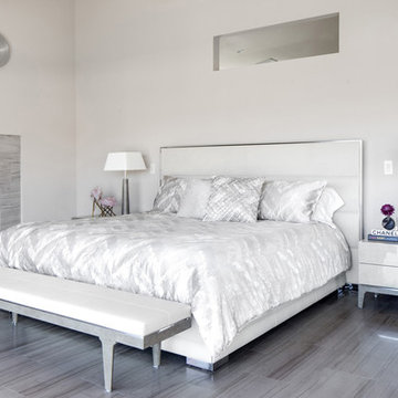
The trio settled on the Fashion Affair extension table in brown gloss with a bronze metal arc base in the formal dining area, and flanked it with eight Arcadia high-back chairs. “We like to have Sunday dinners with our large family, and now we finally have a big dining-room table,” Karen says. The master bedroom also affords bay views, and they again leaned heavily on neutral tones with the M Place California-king bed with chrome accents, the M Place nightstand with M Place table lamps, the M Place bench, Natuzzi’s Anteprima chair and a Scoop accent table. “They were fun, happy, cool people to work with,” Richard says.
One of the couple’s favorite spaces—the family room—features a remote-controlled, drop-down projection screen. For comfortable viewing, Richard paired the Milano sectional (with a power recliner) with the Sushi round cocktail table, the Lambrea accent table, and a Ravi table lamp in a gold metallic snakeskin pattern.
“Richard was wonderful, was on top of it, and was a great asset to our team,” Karen says. Mike agrees. “Richard was a dedicated professional,” he says. “He spent hours walking us through Cantoni making suggestions, measuring, and offering advice on what would and wouldn’t work. Cantoni furniture was a natural fit.”
 CairnsCraft Design & Remodel
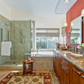
Great spacious bathroom with lot of amenities.
Photographer: Jon Upson
Large elegant master beige tile and porcelain tile drop-in bathtub photo in San Diego with an undermount sink, raised-panel cabinets, medium tone wood cabinets, granite countertops, beige walls and a two-piece toilet
Large elegant master beige tile and porcelain tile drop-in bathtub photo in San Diego with an undermount sink, raised-panel cabinets, medium tone wood cabinets, granite countertops, beige walls and a two-piece toilet
 Tomecek Studio Architecture
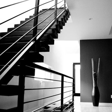
Project by Studio H:T principal in charge Brad Tomecek (now with Tomecek Studio Architecture). This project tests the theory of bringing high quality design to a prefabricated factory setting. Enrolled in the LEED-Home Pilot, this residence completed certification. The modular home was conceived as two boxes that slide above one another to create outdoor living space and a lower covered rear entry. The passive solar design invites large amounts of light from the south while minimizing openings to the east and west. Factory construction saves both time and costs while reducing waste and using a controlled labor force.
Built in a factory north of Denver, the home arrived by flatbed truck in two pieces and was craned into place in about 4 hours providing a fast, sustainable, cost effective alternative to traditional homebuilding techniques. Upgraded lighting fixtures, plumbing fixtures, doors, door hardware, windows, tile and bamboo flooring were incorporated into the design. 80% of the residence was completed in the factory in less than 3 weeks and other items were finished on site including the exterior stucco, garage, metal railing and stair.
Stack-Slide-Stitch describes the conceptual process of how to tie together two distinct modular boxes. Stack refers to setting one modular directly on top of the other. Slide refers to the action that creates an upper southern deck area while simultaneously providing a covered rear entry area. The stitching or interlocking occurs with the upward extension of the lower volume with the front deck walls and with the rear two story vertical.
 Advance Design Studio, Ltd.
After six years of living in their Huntley IL home, Chris and Meghan were tired of their dark, dingy, outdated kitchen and it was finally time for a long-anticipated change. “The kitchen is the place where we live, it’s where we do everything,” Meghan said. “It was important that it be a space where we wanted to be.” Meghan loves cooking and enjoys including their girls in healthy meal prepping, this led them to want a brighter, more enjoyable kitchen with increased functionality and improved storage.
For Chris especially, the laundry room was an entirely dysfunctional eyesore. “We had a washer and a dryer, but it was all kind-of cobbled together!” Chris said. “There were always laundry piles everywhere, we weren’t really sure what we wanted to do in there, but it was time for us to make a change.” The mess of the space was stressful every time they walked in the door from the garage each day. Kids’ backpacks and shoes piled up haphazardly in the makeshift boot-bench closet left the family feeling disorganized and stressed. They needed space for folding clothes and locker cubbies to help keep the family organized.
Having known Christine and Todd in the Huntley community for years, Chris and Meghan were familiar with their work. “We already trusted them personally and having seen their projects for years we knew they did top notch work. After we reviewed the initial round of designs, we knew that hiring them was definitely the right choice,” Meghan and Chris said. Although Chris had done a lot of work in their home himself, the kitchen and laundry room renovation was such a large undertaking that he didn’t want to steal time away from his family to spend what would surely be many long weekends doing the job himself. “That would not have been a wise choice for us,” Chris laughed.
“Our designer, Michelle was very, very, easy to work with; anything we wanted to see or weren’t sure about, she went above and beyond to make this easy for us. She was easy to get hold of and always quick to respond,” the couple said. Michelle pulled ideas that mirrored the couple’s taste and style and was adept at directing the couple to limited choices that didn’t overwhelm them and kept the process moving. “I have a hard time making decisions. Michelle made the decision-making process so easy. I loved how she listened to what I liked and then presented three great options for me to choose from,” Meghan said.
The main objectives for the kitchen were better storage solutions, they wanted the space to reflect their lifestyle and taste, and they wanted it to last for years with low maintenance. One of the first steps in creating a more functional kitchen was relocating the refrigerator, creating an improved workflow for the busy family.
“We didn’t know that we could even move the refrigerator to a new location where it is now, that was something that we never would have thought of,” Chris said. “The new refrigerator location makes the kitchen feel so much bigger. We didn’t add any space, but our whole kitchen with the new design just seems like it’s so much larger than before!” Meghan said.
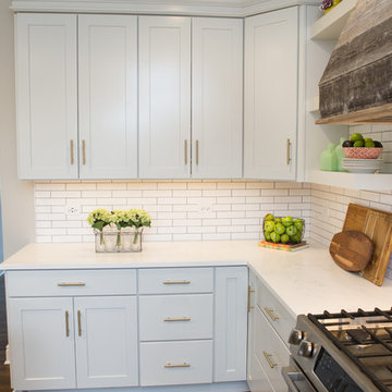
The perimeter mist colored cabinets helped warm and brighten the entire room, while the graphite colored cabinets on the island added contrast. Using this fresh, clean color palette satisfied the couple’s desire for a bright space that was the exact opposite of what they had before. Organization accessories were also added to the cabinets such as a spice drawer tray and roll outs to create hidden convenience.
“I absolutely love the hidden spices – it makes cooking so much more enjoyable!” Chris said. “And all the pull outs, and the double trash bin, who would think you could get so excited about organization!” the couple said in unison.
One thing they hated in their original kitchen was how dark the space felt. Added lighting on the ceiling with the new light fixtures combined with the lighter cabinetry colors throughout solved this problem. “Our new kitchen has this warm, almost cozy feeling that our old kitchen never had, it’s just a space that I love spending my time in now,” Meghan said. The light airy feeling was accentuated with the use of floating white shelves on either side of the decorative range hood. “We have so much cabinetry space, the new design is amazing we actually have more storage space than we will ever need,” Meghan said.
The island was extended to create more work surface and added space for stool seating. “The new island changes how we live. Now the kids can be in the kitchen with us, doing homework, eating breakfast, and the three of us have special dinners there when Chris is working late,” Meghan said.
The Carrara Marmi Quartz countertops were chosen because they are, not only beautiful, but are made from hard-working material that doesn’t require maintenance. The white subway tile backsplash that wraps to the ceiling behind the focal point cooktop range/hood compliments the crisp white countertops perfectly, while brushed brass hardware and light fixtures keep the design fresh and new.
The couple had a few fears at the beginning of the project, as most homeowners do. Their biggest fear was being out of their kitchen and laundry room for an extended time. The crew made it very easy for the family to work in a limited space keeping the washer and dryer hooked up the majority of the time, and also getting appliances working with minimal downtime.
“They above and beyond accommodated us to get us through the process,” Meghan said. “They did a great job making sure we were as comfortable as possible throughout the process,” Chris added.
“Our project manager DJ did a great job. He was very good at updating us on schedule changes, getting guys in as quickly as possible. Everyone that stepped in the house was nice and did great work,” said Chris. They thought Advance’s carpenter was phenomenal and were impressed when he took a conceptual idea from a photograph and worked with designer Michelle to create a one of a kind range/hood that has become the topic of conversation with friends and family who visit the new kitchen. “He was in our house literally every day for several weeks. He was easy to work with and good at what he did,” Meghan and Chris said.
The focal point of the kitchen; a hand-crafted, custom-built ventilation hood was clad with handpicked reclaimed barnwood. Advance Design’s carpenter built the framework and the cladding to create a one-of-a-kind design element that the couple loves.
“I think it was especially fun for him to create something unique from scratch, showcasing his talent in this area,” Meghan said. “I love that my kitchen is not like everyone else’s. I got to pick out the wood on my hood and watch it being built and was able to choose what pieces of wood went where on it. It’s totally unique.”
Red Oak flooring was toothed-in throughout the kitchen and the rest of the first floor anywhere changes were made. Then the whole floor was refinished to tone down the orange undertones in the existing floor stain, ultimately changing the color complexion of the entire first floor. The result is a completely new feeling to the entire home.
Renovating the laundry room was extremely important to Meghan and Chris, but they had trouble visualizing what the possibilities were for the seemingly small space. Michelle produced beautiful 3D illustrations that helped them envision the space in a whole new way.
“I must have told Michelle 100 times that I am a visual person, seeing the designs in 3D made it so easy to make decisions and see what we could really do with our space,” Meghan said.
A dividing wall and doorway were removed between the existing laundry room and hallway formerly containing a coat closet, providing space to design specialized graphite colored cabinetry matching the kitchen island to house custom storage cubbies for each family member. Adding the tall utility cabinetry in the new laundry area helped solve the storage issue, tucking away cleaning supplies, household items, and even the cat got its own cubby.
“I love how everything is now hidden in its own space. I can’t tell you how much I hated coming home and seeing everything sitting around on counters,” Chris said.
Electrical outlets were planned for the inside of utility cabinets, so devices could charge in hidden locations. Stacking the washer and dryer allowed for wider countertop space to provide a folding area and a special space for clothes to hang. “The way I do laundry has been completely transformed! I can actually fold clothes and hang them now right out of the washer and dryer,” Meghan said.
“The end result in the kitchen and the laundry/mud room was an updated light and bright space, with a smarter work flow that better meets the needs of this family,” Michelle said.
“I would totally recommend Advance Design,” Meghan said. “Sometimes I sit and just look at my kitchen and laundry room and think ‘Wow, I can’t believe I get to live here!’ It’s an understatement to say we love our new space.”
 Cantoni Irvine
Designed By: Richard Bustos Photos By: Chad Mellon
It is practically unheard of in interior design—that, in a matter of four hours, the majority of furnishings, accessories, lighting and artwork could be selected for an entire 5,000-square-foot home. But that was exactly the story for Cantoni designer Richard Bustos and his clients, Karen and Mike Moran. The couple, who had purchased and were in the midst of gutting a home on the water in Newport Beach, California, knew what they wanted.
Combined with Richard’s design assistance, it was a match made for swift decision-making and the resulting beautifully neutral, modern space. “We went into Cantoni in Irvine and fell in love with it—it was everything we liked,” Karen says. “Richard had the same vision we did, and we told him what we wanted, and he would direct us. He was on the same level.”
Even more surprising: they selected the furnishings before the home’s bones were even complete. They had wanted a more contemporary vibe to capitalize on the expansive bay views and were in the midst of ripping out low ceilings and outdated spaces. “We wanted modern warmth,” Karen says. “Cantoni furniture was the perfect fit.”
After their initial meeting, Richard met with the couple several times to take measurements and ensure pieces would fit. And they did—with elegant cohesion. In the living room, they leaned heavily on the Fashion Affair collection by Malerba, which is exclusive to Cantoni in the U.S. He flanked the Fashion Affair sofa in ivory leather with the Fashion Affair club chairs in taupe leather and the ivory Viera area rug to create a sumptuous textural mix. In the center, he placed the brown-glossed Fashion Affair low cocktail table and Fashion Affair occasional table for ease of entertaining and conversation.
A punch of glamour came by way of a set of Ravi table lamps in gold-glazed porcelain set on special-ordered Fashion Affair side tables. The Harmony floor sculpture in black stone and capiz shell was brought in for added interest. “Because of the grand scale of the living room—with high ceilings and numerous windows overlooking the water—the pieces in the space had to have more substance,” Richard says. “They are heavier-scaled than traditional modern furnishings, and in neutral tones to allow the architectural elements, such as a glass staircase and elevator, to be the main focal point.”
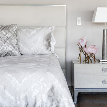
The trio settled on the Fashion Affair extension table in brown gloss with a bronze metal arc base in the formal dining area, and flanked it with eight Arcadia high-back chairs. “We like to have Sunday dinners with our large family, and now we finally have a big dining-room table,” Karen says. The master bedroom also affords bay views, and they again leaned heavily on neutral tones with the M Place California-king bed with chrome accents, the M Place nightstand with M Place table lamps, the M Place bench, Natuzzi’s Anteprima chair and a Scoop accent table. “They were fun, happy, cool people to work with,” Richard says.
One of the couple’s favorite spaces—the family room—features a remote-controlled, drop-down projection screen. For comfortable viewing, Richard paired the Milano sectional (with a power recliner) with the Sushi round cocktail table, the Lambrea accent table, and a Ravi table lamp in a gold metallic snakeskin pattern.
“Richard was wonderful, was on top of it, and was a great asset to our team,” Karen says. Mike agrees. “Richard was a dedicated professional,” he says. “He spent hours walking us through Cantoni making suggestions, measuring, and offering advice on what would and wouldn’t work. Cantoni furniture was a natural fit.”
 Advance Design Studio, Ltd.
After six years of living in their Huntley IL home, Chris and Meghan were tired of their dark, dingy, outdated kitchen and it was finally time for a long-anticipated change. “The kitchen is the place where we live, it’s where we do everything,” Meghan said. “It was important that it be a space where we wanted to be.” Meghan loves cooking and enjoys including their girls in healthy meal prepping, this led them to want a brighter, more enjoyable kitchen with increased functionality and improved storage.
For Chris especially, the laundry room was an entirely dysfunctional eyesore. “We had a washer and a dryer, but it was all kind-of cobbled together!” Chris said. “There were always laundry piles everywhere, we weren’t really sure what we wanted to do in there, but it was time for us to make a change.” The mess of the space was stressful every time they walked in the door from the garage each day. Kids’ backpacks and shoes piled up haphazardly in the makeshift boot-bench closet left the family feeling disorganized and stressed. They needed space for folding clothes and locker cubbies to help keep the family organized.
Having known Christine and Todd in the Huntley community for years, Chris and Meghan were familiar with their work. “We already trusted them personally and having seen their projects for years we knew they did top notch work. After we reviewed the initial round of designs, we knew that hiring them was definitely the right choice,” Meghan and Chris said. Although Chris had done a lot of work in their home himself, the kitchen and laundry room renovation was such a large undertaking that he didn’t want to steal time away from his family to spend what would surely be many long weekends doing the job himself. “That would not have been a wise choice for us,” Chris laughed.
“Our designer, Michelle was very, very, easy to work with; anything we wanted to see or weren’t sure about, she went above and beyond to make this easy for us. She was easy to get hold of and always quick to respond,” the couple said. Michelle pulled ideas that mirrored the couple’s taste and style and was adept at directing the couple to limited choices that didn’t overwhelm them and kept the process moving. “I have a hard time making decisions. Michelle made the decision-making process so easy. I loved how she listened to what I liked and then presented three great options for me to choose from,” Meghan said.
The main objectives for the kitchen were better storage solutions, they wanted the space to reflect their lifestyle and taste, and they wanted it to last for years with low maintenance. One of the first steps in creating a more functional kitchen was relocating the refrigerator, creating an improved workflow for the busy family.
“We didn’t know that we could even move the refrigerator to a new location where it is now, that was something that we never would have thought of,” Chris said. “The new refrigerator location makes the kitchen feel so much bigger. We didn’t add any space, but our whole kitchen with the new design just seems like it’s so much larger than before!” Meghan said.
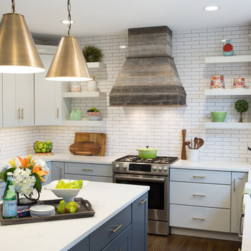
The perimeter mist colored cabinets helped warm and brighten the entire room, while the graphite colored cabinets on the island added contrast. Using this fresh, clean color palette satisfied the couple’s desire for a bright space that was the exact opposite of what they had before. Organization accessories were also added to the cabinets such as a spice drawer tray and roll outs to create hidden convenience.
“I absolutely love the hidden spices – it makes cooking so much more enjoyable!” Chris said. “And all the pull outs, and the double trash bin, who would think you could get so excited about organization!” the couple said in unison.
One thing they hated in their original kitchen was how dark the space felt. Added lighting on the ceiling with the new light fixtures combined with the lighter cabinetry colors throughout solved this problem. “Our new kitchen has this warm, almost cozy feeling that our old kitchen never had, it’s just a space that I love spending my time in now,” Meghan said. The light airy feeling was accentuated with the use of floating white shelves on either side of the decorative range hood. “We have so much cabinetry space, the new design is amazing we actually have more storage space than we will ever need,” Meghan said.
The island was extended to create more work surface and added space for stool seating. “The new island changes how we live. Now the kids can be in the kitchen with us, doing homework, eating breakfast, and the three of us have special dinners there when Chris is working late,” Meghan said.
The Carrara Marmi Quartz countertops were chosen because they are, not only beautiful, but are made from hard-working material that doesn’t require maintenance. The white subway tile backsplash that wraps to the ceiling behind the focal point cooktop range/hood compliments the crisp white countertops perfectly, while brushed brass hardware and light fixtures keep the design fresh and new.
The couple had a few fears at the beginning of the project, as most homeowners do. Their biggest fear was being out of their kitchen and laundry room for an extended time. The crew made it very easy for the family to work in a limited space keeping the washer and dryer hooked up the majority of the time, and also getting appliances working with minimal downtime.
“They above and beyond accommodated us to get us through the process,” Meghan said. “They did a great job making sure we were as comfortable as possible throughout the process,” Chris added.
“Our project manager DJ did a great job. He was very good at updating us on schedule changes, getting guys in as quickly as possible. Everyone that stepped in the house was nice and did great work,” said Chris. They thought Advance’s carpenter was phenomenal and were impressed when he took a conceptual idea from a photograph and worked with designer Michelle to create a one of a kind range/hood that has become the topic of conversation with friends and family who visit the new kitchen. “He was in our house literally every day for several weeks. He was easy to work with and good at what he did,” Meghan and Chris said.
The focal point of the kitchen; a hand-crafted, custom-built ventilation hood was clad with handpicked reclaimed barnwood. Advance Design’s carpenter built the framework and the cladding to create a one-of-a-kind design element that the couple loves.
“I think it was especially fun for him to create something unique from scratch, showcasing his talent in this area,” Meghan said. “I love that my kitchen is not like everyone else’s. I got to pick out the wood on my hood and watch it being built and was able to choose what pieces of wood went where on it. It’s totally unique.”
Red Oak flooring was toothed-in throughout the kitchen and the rest of the first floor anywhere changes were made. Then the whole floor was refinished to tone down the orange undertones in the existing floor stain, ultimately changing the color complexion of the entire first floor. The result is a completely new feeling to the entire home.
Renovating the laundry room was extremely important to Meghan and Chris, but they had trouble visualizing what the possibilities were for the seemingly small space. Michelle produced beautiful 3D illustrations that helped them envision the space in a whole new way.
“I must have told Michelle 100 times that I am a visual person, seeing the designs in 3D made it so easy to make decisions and see what we could really do with our space,” Meghan said.
A dividing wall and doorway were removed between the existing laundry room and hallway formerly containing a coat closet, providing space to design specialized graphite colored cabinetry matching the kitchen island to house custom storage cubbies for each family member. Adding the tall utility cabinetry in the new laundry area helped solve the storage issue, tucking away cleaning supplies, household items, and even the cat got its own cubby.
“I love how everything is now hidden in its own space. I can’t tell you how much I hated coming home and seeing everything sitting around on counters,” Chris said.
Electrical outlets were planned for the inside of utility cabinets, so devices could charge in hidden locations. Stacking the washer and dryer allowed for wider countertop space to provide a folding area and a special space for clothes to hang. “The way I do laundry has been completely transformed! I can actually fold clothes and hang them now right out of the washer and dryer,” Meghan said.
“The end result in the kitchen and the laundry/mud room was an updated light and bright space, with a smarter work flow that better meets the needs of this family,” Michelle said.
“I would totally recommend Advance Design,” Meghan said. “Sometimes I sit and just look at my kitchen and laundry room and think ‘Wow, I can’t believe I get to live here!’ It’s an understatement to say we love our new space.”
 Cantoni Irvine
Designed By: Richard Bustos Photos By: Chad Mellon
It is practically unheard of in interior design—that, in a matter of four hours, the majority of furnishings, accessories, lighting and artwork could be selected for an entire 5,000-square-foot home. But that was exactly the story for Cantoni designer Richard Bustos and his clients, Karen and Mike Moran. The couple, who had purchased and were in the midst of gutting a home on the water in Newport Beach, California, knew what they wanted.
Combined with Richard’s design assistance, it was a match made for swift decision-making and the resulting beautifully neutral, modern space. “We went into Cantoni in Irvine and fell in love with it—it was everything we liked,” Karen says. “Richard had the same vision we did, and we told him what we wanted, and he would direct us. He was on the same level.”
Even more surprising: they selected the furnishings before the home’s bones were even complete. They had wanted a more contemporary vibe to capitalize on the expansive bay views and were in the midst of ripping out low ceilings and outdated spaces. “We wanted modern warmth,” Karen says. “Cantoni furniture was the perfect fit.”
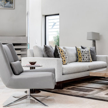
After their initial meeting, Richard met with the couple several times to take measurements and ensure pieces would fit. And they did—with elegant cohesion. In the living room, they leaned heavily on the Fashion Affair collection by Malerba, which is exclusive to Cantoni in the U.S. He flanked the Fashion Affair sofa in ivory leather with the Fashion Affair club chairs in taupe leather and the ivory Viera area rug to create a sumptuous textural mix. In the center, he placed the brown-glossed Fashion Affair low cocktail table and Fashion Affair occasional table for ease of entertaining and conversation.
A punch of glamour came by way of a set of Ravi table lamps in gold-glazed porcelain set on special-ordered Fashion Affair side tables. The Harmony floor sculpture in black stone and capiz shell was brought in for added interest. “Because of the grand scale of the living room—with high ceilings and numerous windows overlooking the water—the pieces in the space had to have more substance,” Richard says. “They are heavier-scaled than traditional modern furnishings, and in neutral tones to allow the architectural elements, such as a glass staircase and elevator, to be the main focal point.”
The trio settled on the Fashion Affair extension table in brown gloss with a bronze metal arc base in the formal dining area, and flanked it with eight Arcadia high-back chairs. “We like to have Sunday dinners with our large family, and now we finally have a big dining-room table,” Karen says. The master bedroom also affords bay views, and they again leaned heavily on neutral tones with the M Place California-king bed with chrome accents, the M Place nightstand with M Place table lamps, the M Place bench, Natuzzi’s Anteprima chair and a Scoop accent table. “They were fun, happy, cool people to work with,” Richard says.
One of the couple’s favorite spaces—the family room—features a remote-controlled, drop-down projection screen. For comfortable viewing, Richard paired the Milano sectional (with a power recliner) with the Sushi round cocktail table, the Lambrea accent table, and a Ravi table lamp in a gold metallic snakeskin pattern.
“Richard was wonderful, was on top of it, and was a great asset to our team,” Karen says. Mike agrees. “Richard was a dedicated professional,” he says. “He spent hours walking us through Cantoni making suggestions, measuring, and offering advice on what would and wouldn’t work. Cantoni furniture was a natural fit.”
 Cantoni Irvine
Designed By: Richard Bustos Photos By: Chad Mellon
It is practically unheard of in interior design—that, in a matter of four hours, the majority of furnishings, accessories, lighting and artwork could be selected for an entire 5,000-square-foot home. But that was exactly the story for Cantoni designer Richard Bustos and his clients, Karen and Mike Moran. The couple, who had purchased and were in the midst of gutting a home on the water in Newport Beach, California, knew what they wanted.
Combined with Richard’s design assistance, it was a match made for swift decision-making and the resulting beautifully neutral, modern space. “We went into Cantoni in Irvine and fell in love with it—it was everything we liked,” Karen says. “Richard had the same vision we did, and we told him what we wanted, and he would direct us. He was on the same level.”
Even more surprising: they selected the furnishings before the home’s bones were even complete. They had wanted a more contemporary vibe to capitalize on the expansive bay views and were in the midst of ripping out low ceilings and outdated spaces. “We wanted modern warmth,” Karen says. “Cantoni furniture was the perfect fit.”
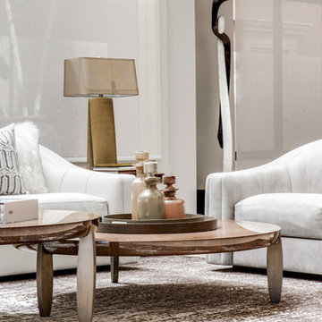
After their initial meeting, Richard met with the couple several times to take measurements and ensure pieces would fit. And they did—with elegant cohesion. In the living room, they leaned heavily on the Fashion Affair collection by Malerba, which is exclusive to Cantoni in the U.S. He flanked the Fashion Affair sofa in ivory leather with the Fashion Affair club chairs in taupe leather and the ivory Viera area rug to create a sumptuous textural mix. In the center, he placed the brown-glossed Fashion Affair low cocktail table and Fashion Affair occasional table for ease of entertaining and conversation.
A punch of glamour came by way of a set of Ravi table lamps in gold-glazed porcelain set on special-ordered Fashion Affair side tables. The Harmony floor sculpture in black stone and capiz shell was brought in for added interest. “Because of the grand scale of the living room—with high ceilings and numerous windows overlooking the water—the pieces in the space had to have more substance,” Richard says. “They are heavier-scaled than traditional modern furnishings, and in neutral tones to allow the architectural elements, such as a glass staircase and elevator, to be the main focal point.”
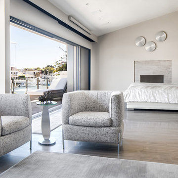
The trio settled on the Fashion Affair extension table in brown gloss with a bronze metal arc base in the formal dining area, and flanked it with eight Arcadia high-back chairs. “We like to have Sunday dinners with our large family, and now we finally have a big dining-room table,” Karen says. The master bedroom also affords bay views, and they again leaned heavily on neutral tones with the M Place California-king bed with chrome accents, the M Place nightstand with M Place table lamps, the M Place bench, Natuzzi’s Anteprima chair and a Scoop accent table. “They were fun, happy, cool people to work with,” Richard says.
One of the couple’s favorite spaces—the family room—features a remote-controlled, drop-down projection screen. For comfortable viewing, Richard paired the Milano sectional (with a power recliner) with the Sushi round cocktail table, the Lambrea accent table, and a Ravi table lamp in a gold metallic snakeskin pattern.
“Richard was wonderful, was on top of it, and was a great asset to our team,” Karen says. Mike agrees. “Richard was a dedicated professional,” he says. “He spent hours walking us through Cantoni making suggestions, measuring, and offering advice on what would and wouldn’t work. Cantoni furniture was a natural fit.”
 Cantoni Irvine
Designed By: Richard Bustos Photos By: Chad Mellon
It is practically unheard of in interior design—that, in a matter of four hours, the majority of furnishings, accessories, lighting and artwork could be selected for an entire 5,000-square-foot home. But that was exactly the story for Cantoni designer Richard Bustos and his clients, Karen and Mike Moran. The couple, who had purchased and were in the midst of gutting a home on the water in Newport Beach, California, knew what they wanted.
Combined with Richard’s design assistance, it was a match made for swift decision-making and the resulting beautifully neutral, modern space. “We went into Cantoni in Irvine and fell in love with it—it was everything we liked,” Karen says. “Richard had the same vision we did, and we told him what we wanted, and he would direct us. He was on the same level.”
Even more surprising: they selected the furnishings before the home’s bones were even complete. They had wanted a more contemporary vibe to capitalize on the expansive bay views and were in the midst of ripping out low ceilings and outdated spaces. “We wanted modern warmth,” Karen says. “Cantoni furniture was the perfect fit.”
After their initial meeting, Richard met with the couple several times to take measurements and ensure pieces would fit. And they did—with elegant cohesion. In the living room, they leaned heavily on the Fashion Affair collection by Malerba, which is exclusive to Cantoni in the U.S. He flanked the Fashion Affair sofa in ivory leather with the Fashion Affair club chairs in taupe leather and the ivory Viera area rug to create a sumptuous textural mix. In the center, he placed the brown-glossed Fashion Affair low cocktail table and Fashion Affair occasional table for ease of entertaining and conversation.
A punch of glamour came by way of a set of Ravi table lamps in gold-glazed porcelain set on special-ordered Fashion Affair side tables. The Harmony floor sculpture in black stone and capiz shell was brought in for added interest. “Because of the grand scale of the living room—with high ceilings and numerous windows overlooking the water—the pieces in the space had to have more substance,” Richard says. “They are heavier-scaled than traditional modern furnishings, and in neutral tones to allow the architectural elements, such as a glass staircase and elevator, to be the main focal point.”
The trio settled on the Fashion Affair extension table in brown gloss with a bronze metal arc base in the formal dining area, and flanked it with eight Arcadia high-back chairs. “We like to have Sunday dinners with our large family, and now we finally have a big dining-room table,” Karen says. The master bedroom also affords bay views, and they again leaned heavily on neutral tones with the M Place California-king bed with chrome accents, the M Place nightstand with M Place table lamps, the M Place bench, Natuzzi’s Anteprima chair and a Scoop accent table. “They were fun, happy, cool people to work with,” Richard says.
One of the couple’s favorite spaces—the family room—features a remote-controlled, drop-down projection screen. For comfortable viewing, Richard paired the Milano sectional (with a power recliner) with the Sushi round cocktail table, the Lambrea accent table, and a Ravi table lamp in a gold metallic snakeskin pattern.
“Richard was wonderful, was on top of it, and was a great asset to our team,” Karen says. Mike agrees. “Richard was a dedicated professional,” he says. “He spent hours walking us through Cantoni making suggestions, measuring, and offering advice on what would and wouldn’t work. Cantoni furniture was a natural fit.”
 Serenity Design
There are few things we enjoy nearly as much as helping a homeowner create a statement that is so exclusively them that it’s all but impossible for another to duplicate what they’re creating in their home. Sure, there can be common colors and sometimes even common themes, but for as many homeowners as there are, there are as many individual tastes, thoughts, and ideas that can inspire creativity and design. Tapping into where each homeowner is coming from is what is what brings us so much joy and excitement.
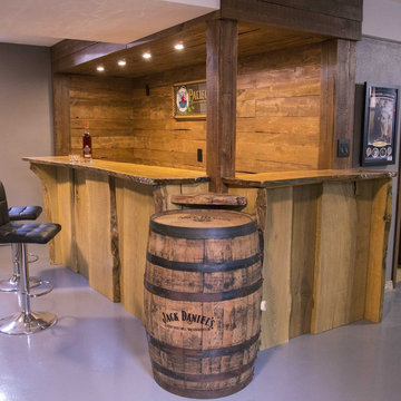
Just imagine the excitement we felt when this homeowner asked us to help him with this unusual project! He received this Jack Daniels barrel as a gift from a close friend and wanted to create a new bar in his basement to entertain family and friends. The initial thought was to have the barrel as a stand alone conversation piece, but after some further discussion we suggested using it as a focal point and thus the project was born.
Jack was known to be a man of refinement and to pay him the appropriate respect it only made sense to approach this project with an equal sense of detail in the crafting of this project, if for no other reason, we hold the same values. To match all of this with our homeowner’s fondness of entertaining friends, the warm and relaxing feeling he was looking for and the aesthetics of the room, the use of reclaimed and live-edge wood made for a natural fit.
In fact aside from a few structural 2x4s beneath the surface, the entire project is built from reused, reclaimed, or re-purposed materials. The most obvious example would be the barrel itself. A bit of research revealed that Jack Daniels only uses their barrels one time before replacing them. Rather than simply destroying them or throwing them away, the barrels are made available to the public to use for other purposes. As a side note we appreciate seeing other companies taking this responsible and earth friendly approach to business.
As a part of our own mission to reduce, reuse, and recycle as often as we can, you’ll note the wall paneling is also re-purposed materials. These particular boards we retrieved from an old building that was being removed and rather than allowing all these materials to be bulldozed with the rest of the old structure, we took as much of the old building materials as we could to use elsewhere. For this project we had the old planks and beams them re-sawn into the wall paneling you see here. Look closely at the picture and you’ll see the original nail holes in the boards that made their new home in this project.
We even incorporated the reclaimed paneling into wrapping the column the previously exposed wood beams above bar area. It adds to the overall feel by incorporating the theme into an otherwise ungainly (and obviously necessary!) part of the house structure.
All the boards in the design of the bar itself come from re-purposed, urban Ash logs. These are either aging and at-risk trees that cities need removed. Ash trees can be subject to assorted infections and diseases and it’s an unfortunate truth that once the disease is discovered, the best way to reduce it’s spreading is to remove the trees in the surrounding area. To further our mission, we take these trees before they end up in a shredder and re-purpose as many of them as we can rather than seeing them simply turned to mulch. We believe this to be a much more responsible use of available materials and just as beautiful.
Each board has so much individual character with their natural knots and swirls. We particularly enjoyed the perfectly sized and shaped piece that became the support at the far end of the bar top. It’s as if nature knew we were going to make this project and grew that board to the perfect dimensions just for this purpose!
We also had a small leftover piece that was extra knotty and so full of character that we incorporated it as a small shelf just above the barrel. Just because it’s small doesn’t mean it can’t make a statement…
Of course no bar would be complete without the top itself. We had a few extra large pieces of Ash with live edges on both sides for the owner to choose from that fit the rough dimensions we needed. His decision made, we added just a very subtle hint of blue and green with our proprietary treatment before the final finishing with epoxy to a mirror finish. We added a few recessed lights to help highlight the natural patterns in the bar top and this bar is ready to serve.
This project was satisfying for several reasons. We were thrilled we were able to complete the project entirely out of reclaimed and re-purposed materials. The homeowner’s desire for a rustic feel made it easier to accomplish this and we appreciate that we can partake in projects like this, particularly one so unique.
Custom doesn’t come out of a catalog. At Serenity Design Studio our number one goal is to see your unique vision come to life.
 Advance Design Studio, Ltd.
After six years of living in their Huntley IL home, Chris and Meghan were tired of their dark, dingy, outdated kitchen and it was finally time for a long-anticipated change. “The kitchen is the place where we live, it’s where we do everything,” Meghan said. “It was important that it be a space where we wanted to be.” Meghan loves cooking and enjoys including their girls in healthy meal prepping, this led them to want a brighter, more enjoyable kitchen with increased functionality and improved storage.
For Chris especially, the laundry room was an entirely dysfunctional eyesore. “We had a washer and a dryer, but it was all kind-of cobbled together!” Chris said. “There were always laundry piles everywhere, we weren’t really sure what we wanted to do in there, but it was time for us to make a change.” The mess of the space was stressful every time they walked in the door from the garage each day. Kids’ backpacks and shoes piled up haphazardly in the makeshift boot-bench closet left the family feeling disorganized and stressed. They needed space for folding clothes and locker cubbies to help keep the family organized.
Having known Christine and Todd in the Huntley community for years, Chris and Meghan were familiar with their work. “We already trusted them personally and having seen their projects for years we knew they did top notch work. After we reviewed the initial round of designs, we knew that hiring them was definitely the right choice,” Meghan and Chris said. Although Chris had done a lot of work in their home himself, the kitchen and laundry room renovation was such a large undertaking that he didn’t want to steal time away from his family to spend what would surely be many long weekends doing the job himself. “That would not have been a wise choice for us,” Chris laughed.
“Our designer, Michelle was very, very, easy to work with; anything we wanted to see or weren’t sure about, she went above and beyond to make this easy for us. She was easy to get hold of and always quick to respond,” the couple said. Michelle pulled ideas that mirrored the couple’s taste and style and was adept at directing the couple to limited choices that didn’t overwhelm them and kept the process moving. “I have a hard time making decisions. Michelle made the decision-making process so easy. I loved how she listened to what I liked and then presented three great options for me to choose from,” Meghan said.
The main objectives for the kitchen were better storage solutions, they wanted the space to reflect their lifestyle and taste, and they wanted it to last for years with low maintenance. One of the first steps in creating a more functional kitchen was relocating the refrigerator, creating an improved workflow for the busy family.
“We didn’t know that we could even move the refrigerator to a new location where it is now, that was something that we never would have thought of,” Chris said. “The new refrigerator location makes the kitchen feel so much bigger. We didn’t add any space, but our whole kitchen with the new design just seems like it’s so much larger than before!” Meghan said.
The perimeter mist colored cabinets helped warm and brighten the entire room, while the graphite colored cabinets on the island added contrast. Using this fresh, clean color palette satisfied the couple’s desire for a bright space that was the exact opposite of what they had before. Organization accessories were also added to the cabinets such as a spice drawer tray and roll outs to create hidden convenience.
“I absolutely love the hidden spices – it makes cooking so much more enjoyable!” Chris said. “And all the pull outs, and the double trash bin, who would think you could get so excited about organization!” the couple said in unison.
One thing they hated in their original kitchen was how dark the space felt. Added lighting on the ceiling with the new light fixtures combined with the lighter cabinetry colors throughout solved this problem. “Our new kitchen has this warm, almost cozy feeling that our old kitchen never had, it’s just a space that I love spending my time in now,” Meghan said. The light airy feeling was accentuated with the use of floating white shelves on either side of the decorative range hood. “We have so much cabinetry space, the new design is amazing we actually have more storage space than we will ever need,” Meghan said.
The island was extended to create more work surface and added space for stool seating. “The new island changes how we live. Now the kids can be in the kitchen with us, doing homework, eating breakfast, and the three of us have special dinners there when Chris is working late,” Meghan said.
The Carrara Marmi Quartz countertops were chosen because they are, not only beautiful, but are made from hard-working material that doesn’t require maintenance. The white subway tile backsplash that wraps to the ceiling behind the focal point cooktop range/hood compliments the crisp white countertops perfectly, while brushed brass hardware and light fixtures keep the design fresh and new.
The couple had a few fears at the beginning of the project, as most homeowners do. Their biggest fear was being out of their kitchen and laundry room for an extended time. The crew made it very easy for the family to work in a limited space keeping the washer and dryer hooked up the majority of the time, and also getting appliances working with minimal downtime.
“They above and beyond accommodated us to get us through the process,” Meghan said. “They did a great job making sure we were as comfortable as possible throughout the process,” Chris added.
“Our project manager DJ did a great job. He was very good at updating us on schedule changes, getting guys in as quickly as possible. Everyone that stepped in the house was nice and did great work,” said Chris. They thought Advance’s carpenter was phenomenal and were impressed when he took a conceptual idea from a photograph and worked with designer Michelle to create a one of a kind range/hood that has become the topic of conversation with friends and family who visit the new kitchen. “He was in our house literally every day for several weeks. He was easy to work with and good at what he did,” Meghan and Chris said.
The focal point of the kitchen; a hand-crafted, custom-built ventilation hood was clad with handpicked reclaimed barnwood. Advance Design’s carpenter built the framework and the cladding to create a one-of-a-kind design element that the couple loves.
“I think it was especially fun for him to create something unique from scratch, showcasing his talent in this area,” Meghan said. “I love that my kitchen is not like everyone else’s. I got to pick out the wood on my hood and watch it being built and was able to choose what pieces of wood went where on it. It’s totally unique.”
Red Oak flooring was toothed-in throughout the kitchen and the rest of the first floor anywhere changes were made. Then the whole floor was refinished to tone down the orange undertones in the existing floor stain, ultimately changing the color complexion of the entire first floor. The result is a completely new feeling to the entire home.
Renovating the laundry room was extremely important to Meghan and Chris, but they had trouble visualizing what the possibilities were for the seemingly small space. Michelle produced beautiful 3D illustrations that helped them envision the space in a whole new way.
“I must have told Michelle 100 times that I am a visual person, seeing the designs in 3D made it so easy to make decisions and see what we could really do with our space,” Meghan said.
A dividing wall and doorway were removed between the existing laundry room and hallway formerly containing a coat closet, providing space to design specialized graphite colored cabinetry matching the kitchen island to house custom storage cubbies for each family member. Adding the tall utility cabinetry in the new laundry area helped solve the storage issue, tucking away cleaning supplies, household items, and even the cat got its own cubby.
“I love how everything is now hidden in its own space. I can’t tell you how much I hated coming home and seeing everything sitting around on counters,” Chris said.
Electrical outlets were planned for the inside of utility cabinets, so devices could charge in hidden locations. Stacking the washer and dryer allowed for wider countertop space to provide a folding area and a special space for clothes to hang. “The way I do laundry has been completely transformed! I can actually fold clothes and hang them now right out of the washer and dryer,” Meghan said.
“The end result in the kitchen and the laundry/mud room was an updated light and bright space, with a smarter work flow that better meets the needs of this family,” Michelle said.
“I would totally recommend Advance Design,” Meghan said. “Sometimes I sit and just look at my kitchen and laundry room and think ‘Wow, I can’t believe I get to live here!’ It’s an understatement to say we love our new space.”
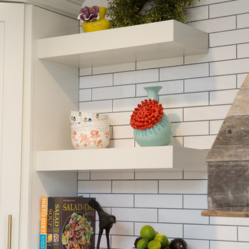 Advance Design Studio, Ltd.
After six years of living in their Huntley IL home, Chris and Meghan were tired of their dark, dingy, outdated kitchen and it was finally time for a long-anticipated change. “The kitchen is the place where we live, it’s where we do everything,” Meghan said. “It was important that it be a space where we wanted to be.” Meghan loves cooking and enjoys including their girls in healthy meal prepping, this led them to want a brighter, more enjoyable kitchen with increased functionality and improved storage.
For Chris especially, the laundry room was an entirely dysfunctional eyesore. “We had a washer and a dryer, but it was all kind-of cobbled together!” Chris said. “There were always laundry piles everywhere, we weren’t really sure what we wanted to do in there, but it was time for us to make a change.” The mess of the space was stressful every time they walked in the door from the garage each day. Kids’ backpacks and shoes piled up haphazardly in the makeshift boot-bench closet left the family feeling disorganized and stressed. They needed space for folding clothes and locker cubbies to help keep the family organized.
Having known Christine and Todd in the Huntley community for years, Chris and Meghan were familiar with their work. “We already trusted them personally and having seen their projects for years we knew they did top notch work. After we reviewed the initial round of designs, we knew that hiring them was definitely the right choice,” Meghan and Chris said. Although Chris had done a lot of work in their home himself, the kitchen and laundry room renovation was such a large undertaking that he didn’t want to steal time away from his family to spend what would surely be many long weekends doing the job himself. “That would not have been a wise choice for us,” Chris laughed.
“Our designer, Michelle was very, very, easy to work with; anything we wanted to see or weren’t sure about, she went above and beyond to make this easy for us. She was easy to get hold of and always quick to respond,” the couple said. Michelle pulled ideas that mirrored the couple’s taste and style and was adept at directing the couple to limited choices that didn’t overwhelm them and kept the process moving. “I have a hard time making decisions. Michelle made the decision-making process so easy. I loved how she listened to what I liked and then presented three great options for me to choose from,” Meghan said.
The main objectives for the kitchen were better storage solutions, they wanted the space to reflect their lifestyle and taste, and they wanted it to last for years with low maintenance. One of the first steps in creating a more functional kitchen was relocating the refrigerator, creating an improved workflow for the busy family.
“We didn’t know that we could even move the refrigerator to a new location where it is now, that was something that we never would have thought of,” Chris said. “The new refrigerator location makes the kitchen feel so much bigger. We didn’t add any space, but our whole kitchen with the new design just seems like it’s so much larger than before!” Meghan said.
The perimeter mist colored cabinets helped warm and brighten the entire room, while the graphite colored cabinets on the island added contrast. Using this fresh, clean color palette satisfied the couple’s desire for a bright space that was the exact opposite of what they had before. Organization accessories were also added to the cabinets such as a spice drawer tray and roll outs to create hidden convenience.
“I absolutely love the hidden spices – it makes cooking so much more enjoyable!” Chris said. “And all the pull outs, and the double trash bin, who would think you could get so excited about organization!” the couple said in unison.
One thing they hated in their original kitchen was how dark the space felt. Added lighting on the ceiling with the new light fixtures combined with the lighter cabinetry colors throughout solved this problem. “Our new kitchen has this warm, almost cozy feeling that our old kitchen never had, it’s just a space that I love spending my time in now,” Meghan said. The light airy feeling was accentuated with the use of floating white shelves on either side of the decorative range hood. “We have so much cabinetry space, the new design is amazing we actually have more storage space than we will ever need,” Meghan said.
The island was extended to create more work surface and added space for stool seating. “The new island changes how we live. Now the kids can be in the kitchen with us, doing homework, eating breakfast, and the three of us have special dinners there when Chris is working late,” Meghan said.
The Carrara Marmi Quartz countertops were chosen because they are, not only beautiful, but are made from hard-working material that doesn’t require maintenance. The white subway tile backsplash that wraps to the ceiling behind the focal point cooktop range/hood compliments the crisp white countertops perfectly, while brushed brass hardware and light fixtures keep the design fresh and new.
The couple had a few fears at the beginning of the project, as most homeowners do. Their biggest fear was being out of their kitchen and laundry room for an extended time. The crew made it very easy for the family to work in a limited space keeping the washer and dryer hooked up the majority of the time, and also getting appliances working with minimal downtime.
“They above and beyond accommodated us to get us through the process,” Meghan said. “They did a great job making sure we were as comfortable as possible throughout the process,” Chris added.
“Our project manager DJ did a great job. He was very good at updating us on schedule changes, getting guys in as quickly as possible. Everyone that stepped in the house was nice and did great work,” said Chris. They thought Advance’s carpenter was phenomenal and were impressed when he took a conceptual idea from a photograph and worked with designer Michelle to create a one of a kind range/hood that has become the topic of conversation with friends and family who visit the new kitchen. “He was in our house literally every day for several weeks. He was easy to work with and good at what he did,” Meghan and Chris said.
The focal point of the kitchen; a hand-crafted, custom-built ventilation hood was clad with handpicked reclaimed barnwood. Advance Design’s carpenter built the framework and the cladding to create a one-of-a-kind design element that the couple loves.
“I think it was especially fun for him to create something unique from scratch, showcasing his talent in this area,” Meghan said. “I love that my kitchen is not like everyone else’s. I got to pick out the wood on my hood and watch it being built and was able to choose what pieces of wood went where on it. It’s totally unique.”
Red Oak flooring was toothed-in throughout the kitchen and the rest of the first floor anywhere changes were made. Then the whole floor was refinished to tone down the orange undertones in the existing floor stain, ultimately changing the color complexion of the entire first floor. The result is a completely new feeling to the entire home.
Renovating the laundry room was extremely important to Meghan and Chris, but they had trouble visualizing what the possibilities were for the seemingly small space. Michelle produced beautiful 3D illustrations that helped them envision the space in a whole new way.
“I must have told Michelle 100 times that I am a visual person, seeing the designs in 3D made it so easy to make decisions and see what we could really do with our space,” Meghan said.
A dividing wall and doorway were removed between the existing laundry room and hallway formerly containing a coat closet, providing space to design specialized graphite colored cabinetry matching the kitchen island to house custom storage cubbies for each family member. Adding the tall utility cabinetry in the new laundry area helped solve the storage issue, tucking away cleaning supplies, household items, and even the cat got its own cubby.
“I love how everything is now hidden in its own space. I can’t tell you how much I hated coming home and seeing everything sitting around on counters,” Chris said.
Electrical outlets were planned for the inside of utility cabinets, so devices could charge in hidden locations. Stacking the washer and dryer allowed for wider countertop space to provide a folding area and a special space for clothes to hang. “The way I do laundry has been completely transformed! I can actually fold clothes and hang them now right out of the washer and dryer,” Meghan said.
“The end result in the kitchen and the laundry/mud room was an updated light and bright space, with a smarter work flow that better meets the needs of this family,” Michelle said.
“I would totally recommend Advance Design,” Meghan said. “Sometimes I sit and just look at my kitchen and laundry room and think ‘Wow, I can’t believe I get to live here!’ It’s an understatement to say we love our new space.”
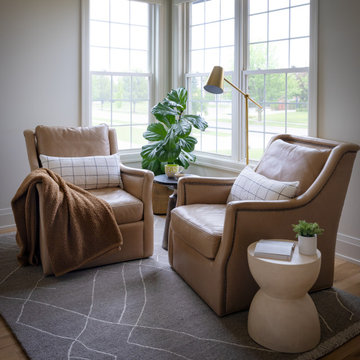
 Swatch Design Group
As a part of a larger transformation, the kitchen served as an anchor for rethinking how the home could feel and function. The goal was to create a space that felt truly integrated, flowed naturally within itself, and connected seamlessly to the outdoors. Storage was a top priority, with an emphasis on keeping countertops clean and the space feeling calm and open. Flow was equally important. What began as a layout optimized for entertaining evolved into a more intentional approach, where every sightline and transition was thoughtfully considered. The clients also needed the kitchen to work hard for their lifestyle, with a commercial-size refrigerator and freezer, generous prep space, and room to gather. The challenge was to bring purpose and polish to a space that didn’t quite feel like it belonged. The result is a kitchen that’s not only highly functional but finally feels like part of the home.
Project challenges:
- Maximizing storage was a primary challenge, especially with the inclusion of a commercial-sized fridge and freezer that occupied valuable cabinetry space.
- The need for clean, uninterrupted lines throughout the kitchen required thoughtful detailing, especially around cabinetry transitions and appliance integration.
- The oversized island design required two stone slabs and waterfall edges on both sides which posed both visual and logistical challenges.
- Incorporating electrical outlets into the island in a way that felt intentional and unobtrusive demanded creative problem-solving.
- The unique rooflines created strong visual angles that required a considered design approach to ensure the space felt cohesive rather than disjointed.
- Balancing symmetry and flow in a kitchen with structural constraints required precise layout planning to maintain a cohesive visual rhythm.
- Creating an intentional indoor/outdoor living flow, especially in the transitional space between the sliding doors to the backyard and the kitchen.
Project solutions:
- To balance the visual weight of the commercial-grade fridge and freezer, we flanked the range and hood with full-height pocket cabinetry, which created symmetry while reclaiming storage space. We also took a look into internal organization and carefully mapped out where every kitchen item would live. This allowed us to make informed decisions about drawer versus door configurations, and when to incorporate features like roll-out shelving to maximize accessibility and function.
- Linear light fixtures above the island were chosen for their low visual impact, allowing sightlines to remain clear and emphasizing the thoughtful spatial layout.
- The oversized island was carefully executed using two coordinated slabs, with a subtle brass inlay detail between them to turn a logistical challenge into a design feature.
- Pop-up electrical outlets were integrated into the island to keep surfaces clutter-free while maintaining easy access, which combined form and function seamlessly.
- With multiple focal points and a peaked vaulted ceiling, layout precision was key. The island, hood, and adjacent staircase were all perfectly centered on the vault, creating a sense of alignment across the open space.
- In the transitional area between kitchen and backyard, we added a wet bar that visually and functionally connects the indoor space with the outdoors. This addition provides extra storage and creates a dedicated entertainment spot for guests, enhancing the overall flow and usability of the home.
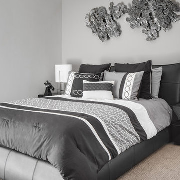 Cantoni Irvine
Designed By: Richard Bustos Photos By: Chad Mellon
It is practically unheard of in interior design—that, in a matter of four hours, the majority of furnishings, accessories, lighting and artwork could be selected for an entire 5,000-square-foot home. But that was exactly the story for Cantoni designer Richard Bustos and his clients, Karen and Mike Moran. The couple, who had purchased and were in the midst of gutting a home on the water in Newport Beach, California, knew what they wanted.
Combined with Richard’s design assistance, it was a match made for swift decision-making and the resulting beautifully neutral, modern space. “We went into Cantoni in Irvine and fell in love with it—it was everything we liked,” Karen says. “Richard had the same vision we did, and we told him what we wanted, and he would direct us. He was on the same level.”
Even more surprising: they selected the furnishings before the home’s bones were even complete. They had wanted a more contemporary vibe to capitalize on the expansive bay views and were in the midst of ripping out low ceilings and outdated spaces. “We wanted modern warmth,” Karen says. “Cantoni furniture was the perfect fit.”
After their initial meeting, Richard met with the couple several times to take measurements and ensure pieces would fit. And they did—with elegant cohesion. In the living room, they leaned heavily on the Fashion Affair collection by Malerba, which is exclusive to Cantoni in the U.S. He flanked the Fashion Affair sofa in ivory leather with the Fashion Affair club chairs in taupe leather and the ivory Viera area rug to create a sumptuous textural mix. In the center, he placed the brown-glossed Fashion Affair low cocktail table and Fashion Affair occasional table for ease of entertaining and conversation.
A punch of glamour came by way of a set of Ravi table lamps in gold-glazed porcelain set on special-ordered Fashion Affair side tables. The Harmony floor sculpture in black stone and capiz shell was brought in for added interest. “Because of the grand scale of the living room—with high ceilings and numerous windows overlooking the water—the pieces in the space had to have more substance,” Richard says. “They are heavier-scaled than traditional modern furnishings, and in neutral tones to allow the architectural elements, such as a glass staircase and elevator, to be the main focal point.”
The trio settled on the Fashion Affair extension table in brown gloss with a bronze metal arc base in the formal dining area, and flanked it with eight Arcadia high-back chairs. “We like to have Sunday dinners with our large family, and now we finally have a big dining-room table,” Karen says. The master bedroom also affords bay views, and they again leaned heavily on neutral tones with the M Place California-king bed with chrome accents, the M Place nightstand with M Place table lamps, the M Place bench, Natuzzi’s Anteprima chair and a Scoop accent table. “They were fun, happy, cool people to work with,” Richard says.
One of the couple’s favorite spaces—the family room—features a remote-controlled, drop-down projection screen. For comfortable viewing, Richard paired the Milano sectional (with a power recliner) with the Sushi round cocktail table, the Lambrea accent table, and a Ravi table lamp in a gold metallic snakeskin pattern.
“Richard was wonderful, was on top of it, and was a great asset to our team,” Karen says. Mike agrees. “Richard was a dedicated professional,” he says. “He spent hours walking us through Cantoni making suggestions, measuring, and offering advice on what would and wouldn’t work. Cantoni furniture was a natural fit.”
36