
Search results for "Flow drops" in Home Design Ideas
 LaMantia Design and Remodeling
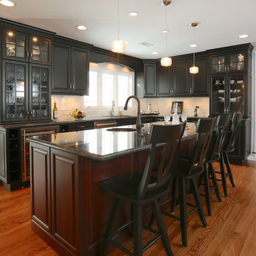
The home began life as an unassuming ranch on a large lot in Palos Heights, a southern suburb of Chicago. And then, several years ago, this quiet little home was purchased for the large property that it sat on by two people that love to garden and envisioned a dream.
Along with the yard, the quiet home was also in for a complete new life with it’s new people. Lifestyles today require homes to function differently than 50 years ago so the clients went about building-in new and repurposing original space. When all the dust settled from the large construction revisions the clients looked at their existing kitchen and decided it was now time to move this room to another level.
LaMantia kitchen designer, James Campbell, CKD, saw many opportunities to open the flow and enlarge the existing kitchen footprint. But, mostly, the drawings Campbell presented to the clients, played mainly into marrying the glorious outdoor space into the interior of the home. The original furnace room, sitting just behind the kitchen and abandoned during a previous construction, offered the possibility of additional kitchen square footage. Enlarging both the Family and Living Room entries into the kitchen played a significant part of the open flow Campbell was looking to achieve;widening these opening allowed clear views of both the front and back outside expanses of the home.
 birdRock Project Studio Inc.
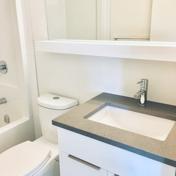
One of our main design goals with this new construction project was to create a comfortable family home with timeless lines that would allow for optimal flow & function for everyday living.
Built as a spec home in the highly desirable Lakeview Heights neighbourhood of West Kelowna, the design needed to be broadly appealing to potential purchasers. We opted for a light and natural colour palette utilizing contemporary lines to create a welcoming and approachable feel throughout the home.
With ample square footage - 3 Bedrooms, 4 Bathrooms on the upper floor, with a fully finished Basement, & Rental Suite, as well as above Garage Bonus Room - we were tasked with making revisions to the Architectural plans as needed to improve flow and function between the spaces.
The Main Floor was specially re-designed to allow for a creation of a chef inspired, gourmet Kitchen with executive appliances, large Island, gas Range, and a very convenient Butler’s Pantry which sits beside the bright, open concept Living Room & Dining Room with floor-to-ceiling Fireplace.
The re-designed outdoor entertaining space includes a spacious deck off the Kitchen, featuring an outdoor BBQ area with bar top counter to seat guests and relaxing conversation area.
The home sold to a young family, and we’re told they love their new home.
 Gail Green
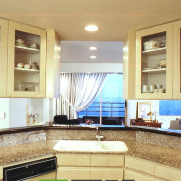
The kitchen is conceived of as a sculptural form at the hub of the apartment. Its openness to the living room area allows for interaction with all guests and majestic views of the city. A clear sense of separation keeps the mess of the kitchen out of view from the more formal areas. The cabinets are custom designed in ash with a warm gray stain , highlighting the warm tones of the granite countertop and backsplash.
Find the right local pro for your project
 LaMantia Design and Remodeling
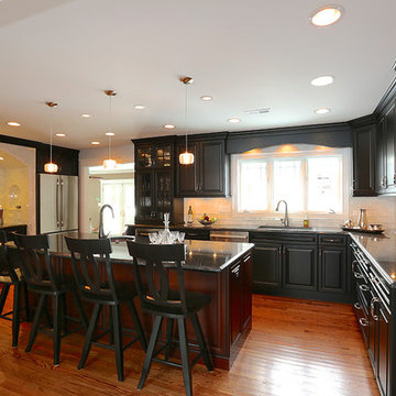
The home began life as an unassuming ranch on a large lot in Palos Heights, a southern suburb of Chicago. And then, several years ago, this quiet little home was purchased for the large property that it sat on by two people that love to garden and envisioned a dream.
Along with the yard, the quiet home was also in for a complete new life with it’s new people. Lifestyles today require homes to function differently than 50 years ago so the clients went about building-in new and repurposing original space. When all the dust settled from the large construction revisions the clients looked at their existing kitchen and decided it was now time to move this room to another level.
LaMantia kitchen designer, James Campbell, CKD, saw many opportunities to open the flow and enlarge the existing kitchen footprint. But, mostly, the drawings Campbell presented to the clients, played mainly into marrying the glorious outdoor space into the interior of the home. The original furnace room, sitting just behind the kitchen and abandoned during a previous construction, offered the possibility of additional kitchen square footage. Enlarging both the Family and Living Room entries into the kitchen played a significant part of the open flow Campbell was looking to achieve;widening these opening allowed clear views of both the front and back outside expanses of the home.
 House of a Different Color
Design consultation and advising for DIY/Budget Renovation.
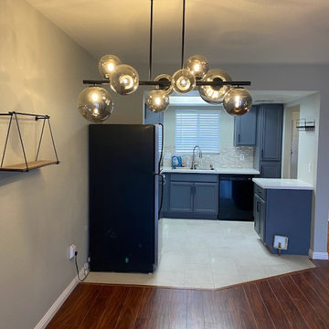
Owner purchased this condo with a very cramped and dated kitchen and light fixtures, and early 2000s-era café paint colors.
Owner did a lot of the work himself or with friends to keep the budget down.
HDC advised on design details and paint colors, chose light fixtures (ceiling lights for kitchen and dining and arch floor lamp in living room). HDC also assisted with creating a new kitchen floor plan, which involved removing one wall, replacing existing tile and modifying flooring transition location, replacing all cabinetry except for the tall pantry cabinet, choosing cabinet paint, installing modern cabinet hardware, replacing laminate counters with a budget white quartz prefab counter, replacing appliances, sink, and faucet, and installing a low-cost peel & stick backsplash.
Due to budget constraints, we could not remove the entire wall between the kitchen and dining space to make the wall completely flush from the kitchen to dining area transition, but decided to relocate the refrigerator to that wall nonetheless, in order to improve sightlines and improve traffic flow and function for refrigerator access. We created a coffee/drinks bar where the original fridge was located. The owner decided to keep the existing water line that had serviced the ice maker in the fridge where it was previously located (and cap it temporarily). He plans to plumb it in the future to support a filtered drinking water line and auto-filling coffee maker to finish out the drink center.
Ultimately, we couldn't stretch the budget for a perfect layout, but we were still able to improve the function and open up the flow of this hub of the condo for better entertaining and more convenient homeowner use of the space.
 Studioteka Design, LLC
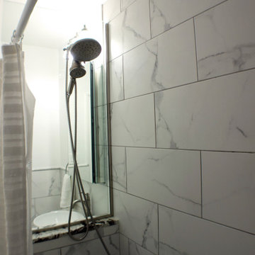
Studioteka was asked to redesign an existing, 1,100 sf two bedroom apartment for a Haitian client with beautiful views overlooking Riverside Drive in Washington Heights. The project was a complete gut renovation, as the apartment had not been touched since the 1970s. Studioteka prepared construction drawings for the building’s coop board and the New York City Department of Buildings as well as coordinating the installation of new kitchen and bathroom fixtures, finishes, and appliances and new flooring throughout. An old dumbwaiter shaft in the kitchen was removed, allowing for a better flow of space and the addition of a small breakfast nook. New French doors were added between the living and dining rooms, and between the dining room and living rooms and the entry foyer, and a door was opened between the kitchen and dining areas, to create a better flow between spaces. The French doors let light pass through from the windows to the hallway, and also allow the living and dining rooms to be used in different ways, including as additional space for guests. The renovated apartment has new decorative moldings throughout, and new transom windows have been installed above the bedroom doors to allow more natural light into the hallway. The kitchen appliances were completely replaced, and a new dishwasher was also added along with a new washing machine. The kitchen’s deep brown wood flooring complements the white cabinetry with its translucent inset glass and the warm neutral tile backsplash that runs the length of the stone countertop. New recessed lighting was added in the passageway that leads to the bedrooms along with new ceiling mounted fixtures in every room, and the electrical and plumbing were fully upgraded throughout.
 design styles architecture
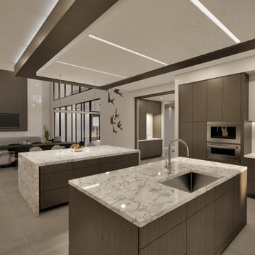
This spec home investor came to DSA with a unique challenge: to create a residence that could be sold for 8-10 million dollars on a 2-3 million dollar construction budget. The investor gave the design team complete creative control on the project, giving way to an opportunity for the team to pursue anything and everything as long as it fit in the construction budget. Out of this challenge was born a stunning modern/contemporary home that carries an atmosphere that is both luxurious and comfortable. The residence features a first floor owners’ suite, study, glass lined wine cellar, entertainment retreat, spacious great room, pool deck & lanai, bonus room, terrace, and five upstairs bedrooms. The lot chosen for the home sits on the beautiful St. Petersburg waterfront, and Designers made sure to take advantage of this at every angle of the home, creating sweeping views that flow between the exterior and interior spaces. The home boasts wide open spaces created by long-span trusses, and floor to ceiling glass and windows that promote natural light throughout the home. The living spaces in the home flow together as part of one contiguous interior space, reflecting a more casual and relaxed way of life.



 Rodwin Architecture & Skycastle Construction
Rodwin Architecture & Skycastle Homes
Location: Boulder, CO, United States
The homeowner wanted something bold and unique for his home. He asked that it be warm in its material palette, strongly connected to its site and deep green in its performance. This 3,000 sf. modern home’s design reflects a carefully crafted balance between capturing mountain views and passive solar design. On the ground floor, interior Travertine tile radiant heated floors flow out through broad sliding doors to the white concrete patio and then dissolves into the landscape. A built-in BBQ and gas fire pit create an outdoor room. The ground floor has a sunny, simple open concept floor plan that joins all the public social spaces and creates a gracious indoor/outdoor flow. The sleek kitchen has an urban cultivator (for fresh veggies) and a quick connection to the raised bed garden and small fruit tree orchard outside. Follow the floating staircase up the board-formed concrete tile wall. At the landing your view continues out over a “live roof”. The second floor’s 14ft tall ceilings open to giant views of the Flatirons and towering trees. Clerestory windows allow in high light, and create a floating roof effect as the Doug Fir ceiling continues out to form the large eaves; we protected the house’s large windows from overheating by creating an enormous cantilevered hat. The upper floor has a bedroom on each end and is centered around the spacious family room, where music is the main activity. The family room has a nook for a mini-home office featuring a floating wood desk. Forming one wall of the family room, a custom-designed pair of laser-cut barn doors inspired by a forest of trees opens to an 18th century Chinese day-bed. The bathrooms sport hand-made glass mosaic tiles; the daughter’s shower is designed to resemble a waterfall. This near-Net-Zero Energy home achieved LEED Gold certification. It has 10kWh of solar panels discretely tucked onto the roof, a ground source heat pump & boiler, foam insulation, an ERV, Energy Star windows and appliances, all LED lights and water conserving plumbing fixtures. Built by Skycastle Construction.
 TKS Design Group
Download our free ebook, Creating the Ideal Kitchen. DOWNLOAD NOW
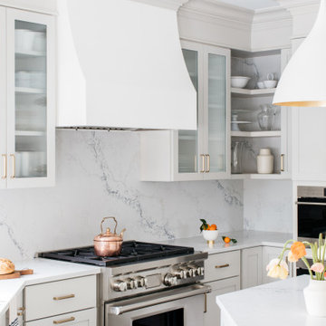
The homeowners built their traditional Colonial style home 17 years’ ago. It was in great shape but needed some updating. Over the years, their taste had drifted into a more contemporary realm, and they wanted our help to bridge the gap between traditional and modern.
We decided the layout of the kitchen worked well in the space and the cabinets were in good shape, so we opted to do a refresh with the kitchen. The original kitchen had blond maple cabinets and granite countertops. This was also a great opportunity to make some updates to the functionality that they were hoping to accomplish.
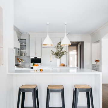
After re-finishing all the first floor wood floors with a gray stain, which helped to remove some of the red tones from the red oak, we painted the cabinetry Benjamin Moore “Repose Gray” a very soft light gray. The new countertops are hardworking quartz, and the waterfall countertop to the left of the sink gives a bit of the contemporary flavor.
We reworked the refrigerator wall to create more pantry storage and eliminated the double oven in favor of a single oven and a steam oven. The existing cooktop was replaced with a new range paired with a Venetian plaster hood above. The glossy finish from the hood is echoed in the pendant lights. A touch of gold in the lighting and hardware adds some contrast to the gray and white. A theme we repeated down to the smallest detail illustrated by the Jason Wu faucet by Brizo with its similar touches of white and gold (the arrival of which we eagerly awaited for months due to ripples in the supply chain – but worth it!).
The original breakfast room was pleasant enough with its windows looking into the backyard. Now with its colorful window treatments, new blue chairs and sculptural light fixture, this space flows seamlessly into the kitchen and gives more of a punch to the space.
The original butler’s pantry was functional but was also starting to show its age. The new space was inspired by a wallpaper selection that our client had set aside as a possibility for a future project. It worked perfectly with our pallet and gave a fun eclectic vibe to this functional space. We eliminated some upper cabinets in favor of open shelving and painted the cabinetry in a high gloss finish, added a beautiful quartzite countertop and some statement lighting. The new room is anything but cookie cutter.
Next the mudroom. You can see a peek of the mudroom across the way from the butler’s pantry which got a facelift with new paint, tile floor, lighting and hardware. Simple updates but a dramatic change! The first floor powder room got the glam treatment with its own update of wainscoting, wallpaper, console sink, fixtures and artwork. A great little introduction to what’s to come in the rest of the home.
The whole first floor now flows together in a cohesive pallet of green and blue, reflects the homeowner’s desire for a more modern aesthetic, and feels like a thoughtful and intentional evolution. Our clients were wonderful to work with! Their style meshed perfectly with our brand aesthetic which created the opportunity for wonderful things to happen. We know they will enjoy their remodel for many years to come!
Photography by Margaret Rajic Photography
 TKS Design Group
Download our free ebook, Creating the Ideal Kitchen. DOWNLOAD NOW
The homeowners built their traditional Colonial style home 17 years’ ago. It was in great shape but needed some updating. Over the years, their taste had drifted into a more contemporary realm, and they wanted our help to bridge the gap between traditional and modern.
We decided the layout of the kitchen worked well in the space and the cabinets were in good shape, so we opted to do a refresh with the kitchen. The original kitchen had blond maple cabinets and granite countertops. This was also a great opportunity to make some updates to the functionality that they were hoping to accomplish.
After re-finishing all the first floor wood floors with a gray stain, which helped to remove some of the red tones from the red oak, we painted the cabinetry Benjamin Moore “Repose Gray” a very soft light gray. The new countertops are hardworking quartz, and the waterfall countertop to the left of the sink gives a bit of the contemporary flavor.
We reworked the refrigerator wall to create more pantry storage and eliminated the double oven in favor of a single oven and a steam oven. The existing cooktop was replaced with a new range paired with a Venetian plaster hood above. The glossy finish from the hood is echoed in the pendant lights. A touch of gold in the lighting and hardware adds some contrast to the gray and white. A theme we repeated down to the smallest detail illustrated by the Jason Wu faucet by Brizo with its similar touches of white and gold (the arrival of which we eagerly awaited for months due to ripples in the supply chain – but worth it!).
The original breakfast room was pleasant enough with its windows looking into the backyard. Now with its colorful window treatments, new blue chairs and sculptural light fixture, this space flows seamlessly into the kitchen and gives more of a punch to the space.
The original butler’s pantry was functional but was also starting to show its age. The new space was inspired by a wallpaper selection that our client had set aside as a possibility for a future project. It worked perfectly with our pallet and gave a fun eclectic vibe to this functional space. We eliminated some upper cabinets in favor of open shelving and painted the cabinetry in a high gloss finish, added a beautiful quartzite countertop and some statement lighting. The new room is anything but cookie cutter.
Next the mudroom. You can see a peek of the mudroom across the way from the butler’s pantry which got a facelift with new paint, tile floor, lighting and hardware. Simple updates but a dramatic change! The first floor powder room got the glam treatment with its own update of wainscoting, wallpaper, console sink, fixtures and artwork. A great little introduction to what’s to come in the rest of the home.
The whole first floor now flows together in a cohesive pallet of green and blue, reflects the homeowner’s desire for a more modern aesthetic, and feels like a thoughtful and intentional evolution. Our clients were wonderful to work with! Their style meshed perfectly with our brand aesthetic which created the opportunity for wonderful things to happen. We know they will enjoy their remodel for many years to come!
Photography by Margaret Rajic Photography
 J Squared Home Designs
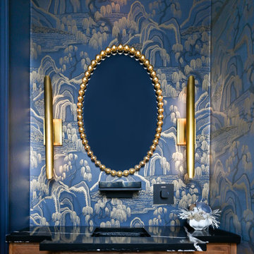
We used a gorgeous wallpaper to pull in the navy accent color into the powder bathroom. Brass accents highlight the gold in the paper and flow with the rest of the home. Custom built vanity was built in to utilize the space that had been a small pedestal- allowing storage for the client. We used the black quartz that was a remnant from the kitchen island to ensure flow
 Studioteka Design, LLC
Studioteka was asked to redesign an existing, 1,100 sf two bedroom apartment for a Haitian client with beautiful views overlooking Riverside Drive in Washington Heights. The project was a complete gut renovation, as the apartment had not been touched since the 1970s. Studioteka prepared construction drawings for the building’s coop board and the New York City Department of Buildings as well as coordinating the installation of new kitchen and bathroom fixtures, finishes, and appliances and new flooring throughout. An old dumbwaiter shaft in the kitchen was removed, allowing for a better flow of space and the addition of a small breakfast nook. New French doors were added between the living and dining rooms, and between the dining room and living rooms and the entry foyer, and a door was opened between the kitchen and dining areas, to create a better flow between spaces. The French doors let light pass through from the windows to the hallway, and also allow the living and dining rooms to be used in different ways, including as additional space for guests. The renovated apartment has new decorative moldings throughout, and new transom windows have been installed above the bedroom doors to allow more natural light into the hallway. The kitchen appliances were completely replaced, and a new dishwasher was also added along with a new washing machine. The kitchen’s deep brown wood flooring complements the white cabinetry with its translucent inset glass and the warm neutral tile backsplash that runs the length of the stone countertop. New recessed lighting was added in the passageway that leads to the bedrooms along with new ceiling mounted fixtures in every room, and the electrical and plumbing were fully upgraded throughout.
 Lustig Custom Cabinets
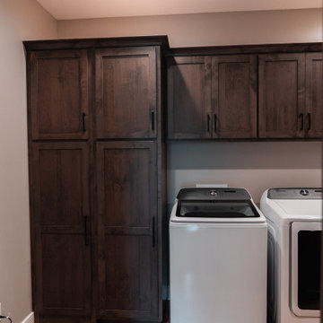
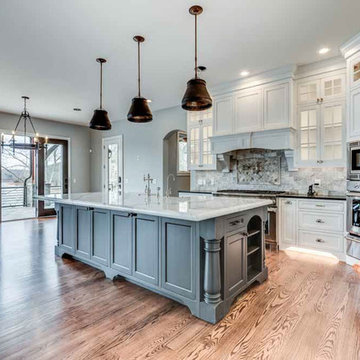
A welcome entry from the garage offers a mud bench & a drop zone.
Inspiration for a transitional laundry room remodel in Chicago
Inspiration for a transitional laundry room remodel in Chicago
Sponsored
Fredericksburg, OH

High Point Cabinets
Columbus' Experienced Custom Cabinet Builder | 4x Best of Houzz Winner
 design styles architecture
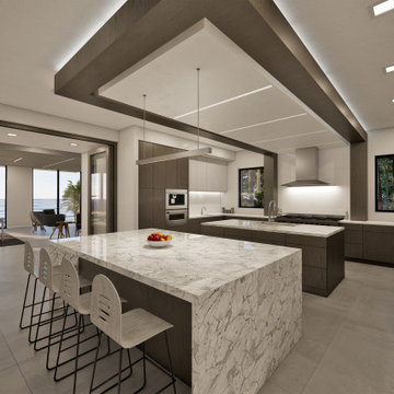
This spec home investor came to DSA with a unique challenge: to create a residence that could be sold for 8-10 million dollars on a 2-3 million dollar construction budget. The investor gave the design team complete creative control on the project, giving way to an opportunity for the team to pursue anything and everything as long as it fit in the construction budget. Out of this challenge was born a stunning modern/contemporary home that carries an atmosphere that is both luxurious and comfortable. The residence features a first floor owners’ suite, study, glass lined wine cellar, entertainment retreat, spacious great room, pool deck & lanai, bonus room, terrace, and five upstairs bedrooms. The lot chosen for the home sits on the beautiful St. Petersburg waterfront, and Designers made sure to take advantage of this at every angle of the home, creating sweeping views that flow between the exterior and interior spaces. The home boasts wide open spaces created by long-span trusses, and floor to ceiling glass and windows that promote natural light throughout the home. The living spaces in the home flow together as part of one contiguous interior space, reflecting a more casual and relaxed way of life.
 House of a Different Color
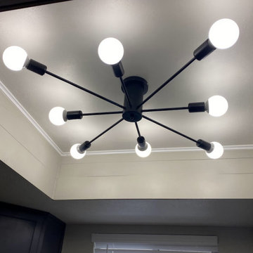
Shiplap was added to the tray ceiling and painted to match the walls for an additional design detail and to give the light fixture a more complete and finished surrounding.
Design consultation and advising for DIY/Budget Renovation.
Owner purchased this condo with a very cramped and dated kitchen and light fixtures, and early 2000s-era café paint colors.
Owner did a lot of the work himself or with friends to keep the budget down.
HDC advised on design details and paint colors, chose light fixtures (ceiling lights for kitchen and dining and arch floor lamp in living room). HDC also assisted with creating a new kitchen floor plan, which involved removing one wall, replacing existing tile and modifying flooring transition location, replacing all cabinetry except for the tall pantry cabinet, choosing cabinet paint, installing modern cabinet hardware, replacing laminate counters with a budget white quartz prefab counter, replacing appliances, sink, and faucet, and installing a low-cost peel & stick backsplash.
Due to budget constraints, we could not remove the entire wall between the kitchen and dining space to make the wall completely flush from the kitchen to dining area transition, but decided to relocate the refrigerator to that wall nonetheless, in order to improve sightlines and improve traffic flow and function for refrigerator access. We created a coffee/drinks bar where the original fridge was located. The owner decided to keep the existing water line that had serviced the ice maker in the fridge where it was previously located (and cap it temporarily). He plans to plumb it in the future to support a filtered drinking water line and auto-filling coffee maker to finish out the drink center.
Ultimately, we couldn't stretch the budget for a perfect layout, but we were still able to improve the function and open up the flow of this hub of the condo for better entertaining and more convenient homeowner use of the space.
 TKS Design Group
Download our free ebook, Creating the Ideal Kitchen. DOWNLOAD NOW
The homeowners built their traditional Colonial style home 17 years’ ago. It was in great shape but needed some updating. Over the years, their taste had drifted into a more contemporary realm, and they wanted our help to bridge the gap between traditional and modern.
We decided the layout of the kitchen worked well in the space and the cabinets were in good shape, so we opted to do a refresh with the kitchen. The original kitchen had blond maple cabinets and granite countertops. This was also a great opportunity to make some updates to the functionality that they were hoping to accomplish.
After re-finishing all the first floor wood floors with a gray stain, which helped to remove some of the red tones from the red oak, we painted the cabinetry Benjamin Moore “Repose Gray” a very soft light gray. The new countertops are hardworking quartz, and the waterfall countertop to the left of the sink gives a bit of the contemporary flavor.
We reworked the refrigerator wall to create more pantry storage and eliminated the double oven in favor of a single oven and a steam oven. The existing cooktop was replaced with a new range paired with a Venetian plaster hood above. The glossy finish from the hood is echoed in the pendant lights. A touch of gold in the lighting and hardware adds some contrast to the gray and white. A theme we repeated down to the smallest detail illustrated by the Jason Wu faucet by Brizo with its similar touches of white and gold (the arrival of which we eagerly awaited for months due to ripples in the supply chain – but worth it!).
The original breakfast room was pleasant enough with its windows looking into the backyard. Now with its colorful window treatments, new blue chairs and sculptural light fixture, this space flows seamlessly into the kitchen and gives more of a punch to the space.
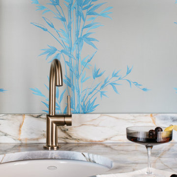
The original butler’s pantry was functional but was also starting to show its age. The new space was inspired by a wallpaper selection that our client had set aside as a possibility for a future project. It worked perfectly with our pallet and gave a fun eclectic vibe to this functional space. We eliminated some upper cabinets in favor of open shelving and painted the cabinetry in a high gloss finish, added a beautiful quartzite countertop and some statement lighting. The new room is anything but cookie cutter.
Next the mudroom. You can see a peek of the mudroom across the way from the butler’s pantry which got a facelift with new paint, tile floor, lighting and hardware. Simple updates but a dramatic change! The first floor powder room got the glam treatment with its own update of wainscoting, wallpaper, console sink, fixtures and artwork. A great little introduction to what’s to come in the rest of the home.
The whole first floor now flows together in a cohesive pallet of green and blue, reflects the homeowner’s desire for a more modern aesthetic, and feels like a thoughtful and intentional evolution. Our clients were wonderful to work with! Their style meshed perfectly with our brand aesthetic which created the opportunity for wonderful things to happen. We know they will enjoy their remodel for many years to come!
Photography by Margaret Rajic Photography
 LaMantia Design and Remodeling
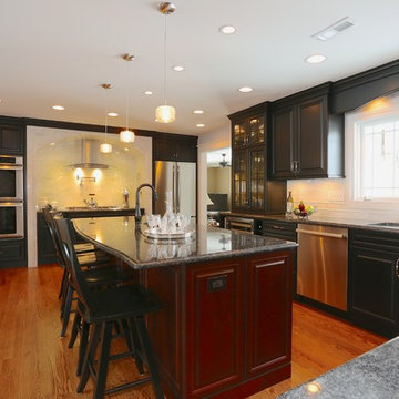
The home began life as an unassuming ranch on a large lot in Palos Heights, a southern suburb of Chicago. And then, several years ago, this quiet little home was purchased for the large property that it sat on by two people that love to garden and envisioned a dream.
Along with the yard, the quiet home was also in for a complete new life with it’s new people. Lifestyles today require homes to function differently than 50 years ago so the clients went about building-in new and repurposing original space. When all the dust settled from the large construction revisions the clients looked at their existing kitchen and decided it was now time to move this room to another level.
LaMantia kitchen designer, James Campbell, CKD, saw many opportunities to open the flow and enlarge the existing kitchen footprint. But, mostly, the drawings Campbell presented to the clients, played mainly into marrying the glorious outdoor space into the interior of the home. The original furnace room, sitting just behind the kitchen and abandoned during a previous construction, offered the possibility of additional kitchen square footage. Enlarging both the Family and Living Room entries into the kitchen played a significant part of the open flow Campbell was looking to achieve;widening these opening allowed clear views of both the front and back outside expanses of the home.

 TKS Design Group
Download our free ebook, Creating the Ideal Kitchen. DOWNLOAD NOW
The homeowners built their traditional Colonial style home 17 years’ ago. It was in great shape but needed some updating. Over the years, their taste had drifted into a more contemporary realm, and they wanted our help to bridge the gap between traditional and modern.
We decided the layout of the kitchen worked well in the space and the cabinets were in good shape, so we opted to do a refresh with the kitchen. The original kitchen had blond maple cabinets and granite countertops. This was also a great opportunity to make some updates to the functionality that they were hoping to accomplish.
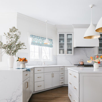
After re-finishing all the first floor wood floors with a gray stain, which helped to remove some of the red tones from the red oak, we painted the cabinetry Benjamin Moore “Repose Gray” a very soft light gray. The new countertops are hardworking quartz, and the waterfall countertop to the left of the sink gives a bit of the contemporary flavor.
We reworked the refrigerator wall to create more pantry storage and eliminated the double oven in favor of a single oven and a steam oven. The existing cooktop was replaced with a new range paired with a Venetian plaster hood above. The glossy finish from the hood is echoed in the pendant lights. A touch of gold in the lighting and hardware adds some contrast to the gray and white. A theme we repeated down to the smallest detail illustrated by the Jason Wu faucet by Brizo with its similar touches of white and gold (the arrival of which we eagerly awaited for months due to ripples in the supply chain – but worth it!).
The original breakfast room was pleasant enough with its windows looking into the backyard. Now with its colorful window treatments, new blue chairs and sculptural light fixture, this space flows seamlessly into the kitchen and gives more of a punch to the space.
The original butler’s pantry was functional but was also starting to show its age. The new space was inspired by a wallpaper selection that our client had set aside as a possibility for a future project. It worked perfectly with our pallet and gave a fun eclectic vibe to this functional space. We eliminated some upper cabinets in favor of open shelving and painted the cabinetry in a high gloss finish, added a beautiful quartzite countertop and some statement lighting. The new room is anything but cookie cutter.
Next the mudroom. You can see a peek of the mudroom across the way from the butler’s pantry which got a facelift with new paint, tile floor, lighting and hardware. Simple updates but a dramatic change! The first floor powder room got the glam treatment with its own update of wainscoting, wallpaper, console sink, fixtures and artwork. A great little introduction to what’s to come in the rest of the home.
The whole first floor now flows together in a cohesive pallet of green and blue, reflects the homeowner’s desire for a more modern aesthetic, and feels like a thoughtful and intentional evolution. Our clients were wonderful to work with! Their style meshed perfectly with our brand aesthetic which created the opportunity for wonderful things to happen. We know they will enjoy their remodel for many years to come!
Photography by Margaret Rajic Photography
 NOVA Custom Renovations
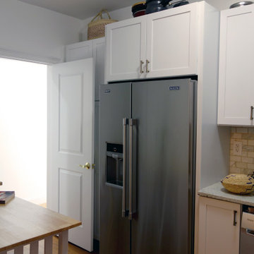
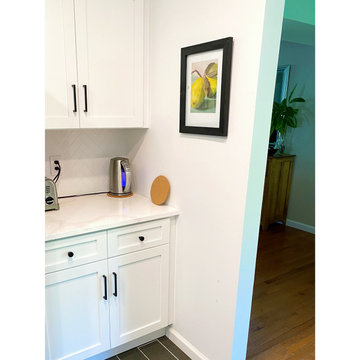
The only change in the layout of this kitchen renovation was to swap the position of the refrigerator, which used to be flush against this wall, both restricting full access to the refrigerator since the door couldn't be opened all the way, and blocking the flow of traffic into the kitchen from the dining room when the door was open. Now, the cabinet/counter alcove exists where the fridge once was, creating a much better use of the space, allowing for better for traffic flow in and out of the kitchen, and a more aesthetically pleasing design. And the best part is because the refrigerator only moved 36" to the left, no extra plumbing work was required to make this simple switch.
 Lars Remodeling & Design
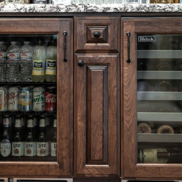
This project was Lars’ second time working with this wonderful Chula Vista family and when they contacted us with their ideas about what they wanted to accomplish in their home, we knew it was going to be special. The star of the show is this stunning kitchen with a massive island. Every detail was thought of and carefully crafted to blend seamlessly with the architecture of the home and how this family lives within it. Gorgeous off-white cabinetry paired with rich wood accents and flooring, custom made panels with intricate mirror detailing to conceal the SUBZERO/Wolf refrigerator and freezer, a built in wet bar to house an extensive whiskey collection, tile painstakingly set to capture each and every curve while flowing perfectly with the crown moulding, and a pantry that could easily rival The Home Edit stocked with every imaginable SUBZERO/Wolf countertop appliance and dual steam ovens. The large open concept space that flows into the living room was reconfigured to replace and center a large fireplace that features a direct-vent set up and stunning stone surround with custom built-ins flanking either side. New wood flooring throughout the downstairs features a classic herringbone pattern that gives special interest to a long hallway, while a new stair railing was custom designed with intricate detail to mirror an existing window design detail. The end result is stunning and we are so thrilled that this wonderful family will make memories in this home for years to come.
24