
Search results for "Focus wall" in Home Design Ideas
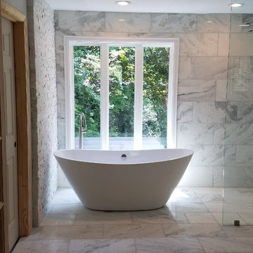
 JW Design LLC
Bathroom - large traditional master gray tile and stone tile marble floor and multicolored floor bathroom idea in Atlanta with white walls
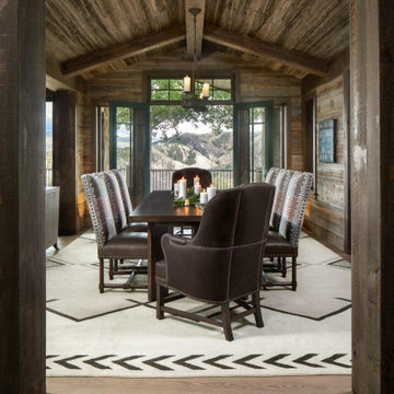
 Beth Levine Architect, Inc.
This design brought meaning and focus to the house by making the dining room into the heart of the home, like a quaint old cabin with which the new house grew around.
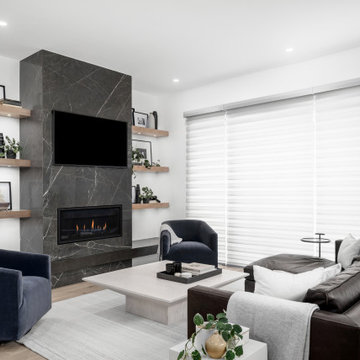
 Avid Interior Design Inc.
New build dreams always require a clear design vision and this 3,650 sf home exemplifies that. Our clients desired a stylish, modern aesthetic with timeless elements to create balance throughout their home. With our clients intention in mind, we achieved an open concept floor plan complimented by an eye-catching open riser staircase. Custom designed features are showcased throughout, combined with glass and stone elements, subtle wood tones, and hand selected finishes.
The entire home was designed with purpose and styled with carefully curated furnishings and decor that ties these complimenting elements together to achieve the end goal. At Avid Interior Design, our goal is to always take a highly conscious, detailed approach with our clients. With that focus for our Altadore project, we were able to create the desirable balance between timeless and modern, to make one more dream come true.
Find the right local pro for your project
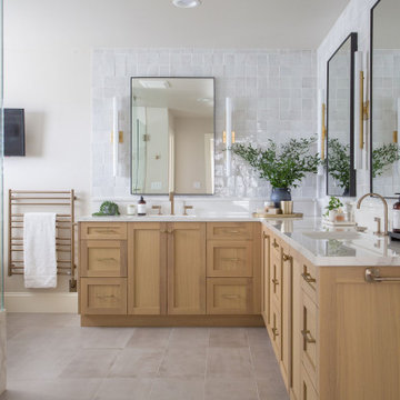
 Heiser Designs
For this home located in the Lakemont community of Bellevue, our clients wanted to totally revamp their master bathroom and main floor powder room. Our design plan focused on a classic traditional vibe with touches of modern accents throughout
 LBK Design Build
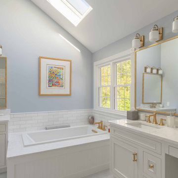
This design transforms the existing primary bathroom into a serene and timeless retreat. The vision focuses on light, balance, and refined simplicity. By emphasizing symmetry, natural materials, and soft tonal contrast, the space feels cohesive and elevated. The vaulted ceiling and natural daylight from the skylight inspired a soft, calming palette and subtle layering of textures. The new layout enhances functionality while creating a spa-like atmosphere centered on comfort and calm.
 TI Concepts, Corp | True Identity Concepts
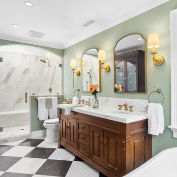
Our European-style whole home project moves from the kitchen and into the Primary Bathroom. The finish combine old-world charm with modern amenities. To complete the design-build, we focused on functional and decorative elements that honor the space's character while adding layers of warmth and texture to the designed spaces. An arched shower, custom linen unit, freestanding tub, and double vanity to the European-style of the home.
Photos by Joshua Reeves
Interior Design by TI Concepts Corp | True Identity Concepts
Design-Build by Old World Craftsmen LLC
 KrimsonHAUS
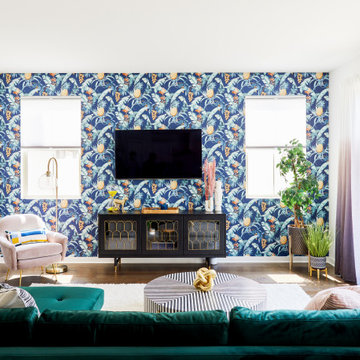
Keeping consistent with the theme we wanted to make sure this room was the showstopper. The focus of the room besides the green velvet sofa is the blue, green and gold pineapple wallpaper. Throughout the space we incorporated a mix of pattern, geometric shapes, and other whimsical pieces.

Sponsored
Columbus, OH

Structural Remodeling
Franklin County's Heavy Timber Specialists | Best of Houzz 2020!
 Advance Design Studio, Ltd.
Jackie and Sean loved the Algonquin neighborhood they lived in with the peaceful neighborhood and the close proximity to work and school. What they didn’t love was how outdated their home had become. With a cramped kitchen and an unused dining room, they decided a remodel was the perfect solution to their problem. They would be able to continue to live in the area they loved, while at the same time they could have the dream home they envisioned.
After a thorough search, Jackie came across Advance Design Studio. She was impressed by all of the positive reviews she saw on the internet and saw herself identifying with all of the project stories she saw on the website. Once they met with designer Scott Christensen and owner Todd Jurs, they knew Advance Design was the right company to make their dreams a reality.
The project consisted of four main areas: the kitchen/dining/powder room, the laundry room, the master bathroom, and the kid’s bathroom. They wanted to expand the kitchen into the seldom used dining room and add a large island for hosting parties and family gatherings. They also wanted new hardwood flooring throughout the first level. The laundry room needed to be more functional, and all three bathrooms were in dire need of updating.
The closed off kitchen was opened up to create a sweeping space between the new eating area and the much larger kitchen. A handsome dry bar complete with a beverage refrigerator and lighted glass door cabinetry makes an elegant transition across from a peninsula area filled with storage. An additional decorative cabinet lighting up elegant dishware through the mullioned glass sits directly across from the drybar.
An expansive island was critical to the kitchen plans. Jackie, Sean and Scott worked closely together to create just the right details for their design. They wanted the island to be functional in addition to being the centerpiece of the room. Added storage for the kid’s school supplies was hidden behind cabinet doors so the children could do their schoolwork right at the island, and a microwave drawer glides open with the touch of a finger hidden inconspicuously within the island space. The easy to care for Cambria Britannica Quartz island top with its sweeping grey and white marble look perched atop hand-carved Craftsman corbels was absolutely what they were hoping for, blending both beauty and function perfectly.
Adding a nice contrast to the brightness of the quartz and the white cabinetry, Kodiak - Leather granite countertops were used to balance the light and dark tones of the space. Dura Supreme Classic White painted cabinets grace the perimeter, while Maple Poppy Seed stained cabinets with a beautiful soft grey woodgrain were used in the beverage center and island. The two tones compliment the large space balancing it out nicely creating interest and elegance with the simple Craftsman style full overlay doors.
A deep warm Barnwood White Oak flooring was added throughout the lower level. The new floor brings additional contrast to the bright kitchen and provides unity with the now open floorplan as it rolls in to the foyer and family room. Final details like the show-stopping lunar like duo light fixtures complete the space and intermix expertly with crisscross details of the glass door mullions, the island bar seating and even accessories in the space.
The small cluttered laundry room needed more space and more storage. With a busy family it seemed to overflow daily and did not have anywhere to hide the families “in and out stuff.” Scott designed the new space with a stackable washer and dryer and much more efficiently organized cabinetry. Doing laundry is now (almost!) a pleasure and keeping everyone’s “stuff” hidden, but readily accessible is now a snap.
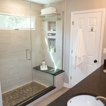
The master bath was not a place where the couple enjoyed spending time getting ready for their day. The tub almost never was used, so removing it made it possible to build an extra-large shower, replacing the small cramped cube of the previous shower they hated. Clean, horizontal lines softly draw your eye around the space with porcelain tile called Driftwood Sea spray. Full overlay cabinetry in a soft white vanity with double sinks makes getting ready for the day much more convenient for the busy couple.
Long floor planks made of porcelain tile mimic real hardwood floors in a soft grey to compliment the shower, but with the ease and care of a tile surface. Cambrian Black Granite counters with a matte finish and under mount porcelain sinks with handsome brushed chrome hardware complete the handsome space. A real bonus in any master bath; a custom built in storage nook was tucked in the corner of the space for linens and heavenly storage.
The kid’s bath was in sad shape because it was original to the house. To keep the budget in control, the tub which was in great condition was retained, but focus was on the new large brick style porcelain charcoal tile on the floor, crisp white new Craftsman style cabinetry with pretty furniture details on the corner base, a striking granite top with white under mount porcelain sinks and fresh hardware and faucets. Some beautiful soft grey wood mirrors to match mom and dads were custom sized and placed under new lighting, and 4 hooks were smartly arranged down the wall for kids’ towels.
This couple was determined not to move, and made their house their dream home. Not only does their home function greatly now, but Jackie says, “When the neighbors come to visit, they’re asking if they can “steal” the design”! The added functionality, elegance, and open floor plan were exactly what this family needed in order to stay.
Advance Design Studio, Joe Nowak
 Dawn Hearn Interior Design
Tre Dunham with Fine Focus Photography
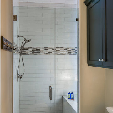
Walk-in shower - mid-sized transitional 3/4 white tile and subway tile mosaic tile floor and gray floor walk-in shower idea in Austin with shaker cabinets, gray cabinets, beige walls, a two-piece toilet and a hinged shower door
Walk-in shower - mid-sized transitional 3/4 white tile and subway tile mosaic tile floor and gray floor walk-in shower idea in Austin with shaker cabinets, gray cabinets, beige walls, a two-piece toilet and a hinged shower door
 S Squared Design, LLC
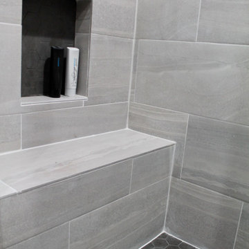
This bathroom was the final space to be designed for this client by me. We did space planning and furniture when they first moved in, a couple years later we did a full kitchen remodel and now we finally did the bathroom. This wasn't a full remodel so we kept some of the items that were in good condition and updated the rest. First thing we focused on was the shower, with some existing functional problems we made sure the incorporate storage and a bench for this walk in shower. That allowed space for bottles and a seat. With the existing vanity cabinet and counter tops staying I wanted to coordinate the dark counter with adding some dark elements elsewhere to tie they in together. We did a dark charcoal hex shower floor and also used that tile in the back of the niches. Since the shower was a dark place we added a light in shower and used a much lighter tile on the wall and bench. this tile was carried into the rest of the bathroom on the floor and the smaller version for the tub surround in a 2"x2" mosaic. The wall color before was dark and client loved it so we did a new dark grey but brightened the space with a white ceiling. New chrome faucets throughout to give a reflective element. This bathroom truly feels more relaxing for a bath or a quick shower!
 TVL Creative Ltd.
This project was not only full of many bathrooms but also many different aesthetics. The goals were fourfold, create a new master suite, update the basement bath, add a new powder bath and my favorite, make them all completely different aesthetics.
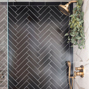
Primary Bath-This was originally a small 60SF full bath sandwiched in between closets and walls of built-in cabinetry that blossomed into a 130SF, five-piece primary suite. This room was to be focused on a transitional aesthetic that would be adorned with Calcutta gold marble, gold fixtures and matte black geometric tile arrangements.
Powder Bath-A new addition to the home leans more on the traditional side of the transitional movement using moody blues and greens accented with brass. A fun play was the asymmetry of the 3-light sconce brings the aesthetic more to the modern side of transitional. My favorite element in the space, however, is the green, pink black and white deco tile on the floor whose colors are reflected in the details of the Australian wallpaper.
Hall Bath-Looking to touch on the home's 70's roots, we went for a mid-mod fresh update. Black Calcutta floors, linear-stacked porcelain tile, mixed woods and strong black and white accents. The green tile may be the star but the matte white ribbed tiles in the shower and behind the vanity are the true unsung heroes.
 Renovisions
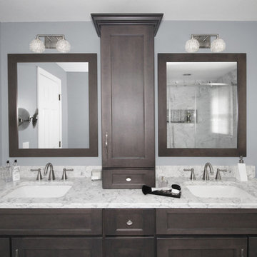
This master bath ‘Renovision’ came with three main requests from the homeowner: more storage, a larger shower and a luxurious look that feels like being at an upscale hotel. The Renovisions team accomplished these wishes and exceeded the clients expectations.
Request number 1: more storage. The existing closet was reconfigured to accommodate better storage for towels and bath supplies making it both functional and attractive. The custom built pull-out hamper was perfect. The long vanity and center tower offers much more cabinet space and drawer storage compared to what they had, especially with the increased vanity height.
Request number 2: A larger shower. Working within the existing footprint we were able to build a shower that is nearly a foot deeper as space was available. Creating a large rectangular cubby provides plenty of space for shampoos and soaps. The frameless sliding glass shower enclosure keeps the space open and airy while allowing the beautiful Carrera-look porcelain wall tiles to be the focus of this master bath.
Request number 3: a luxurious look. Turning their once boring, builder grade bathroom into an upscale hotel-like space was challenging, however, not a problem for the Renovisions team and their creative ways of resolving design snags along the way. Re-locating the doorway to the bathroom was one way to create a more spacious flow in and out of the space. Having the right design to start was half the battle – installing the beautiful products right the first time to ensure a proper fit and finish worthy of the upscale feel is the other half. The delicate tile detail in the shower cubby is the ‘jewelry’ in the room – the soft curves of this 2-tone wave design tile adds a dramatic feel and enlightened mood this client loves.
Overall, the homeowner was happy with every solution-based approach to all requests – their once dated builders bath is now bright, open and airy with a soft grey wall color adding to the soothing feel of this master bath.
 Vanguard Studio Inc.
Fine Focus Photography
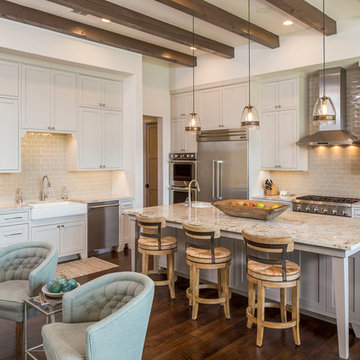
Inspiration for a large country l-shaped dark wood floor and brown floor eat-in kitchen remodel in Austin with a farmhouse sink, gray cabinets, granite countertops, beige backsplash, subway tile backsplash, stainless steel appliances, an island and shaker cabinets
Inspiration for a large country l-shaped dark wood floor and brown floor eat-in kitchen remodel in Austin with a farmhouse sink, gray cabinets, granite countertops, beige backsplash, subway tile backsplash, stainless steel appliances, an island and shaker cabinets

 Breathe Design Studio
Completed in 2015, this project incorporates a Scandinavian vibe to enhance the modern architecture and farmhouse details. The vision was to create a balanced and consistent design to reflect clean lines and subtle rustic details, which creates a calm sanctuary. The whole home is not based on a design aesthetic, but rather how someone wants to feel in a space, specifically the feeling of being cozy, calm, and clean. This home is an interpretation of modern design without focusing on one specific genre; it boasts a midcentury master bedroom, stark and minimal bathrooms, an office that doubles as a music den, and modern open concept on the first floor. It’s the winner of the 2017 design award from the Austin Chapter of the American Institute of Architects and has been on the Tribeza Home Tour; in addition to being published in numerous magazines such as on the cover of Austin Home as well as Dwell Magazine, the cover of Seasonal Living Magazine, Tribeza, Rue Daily, HGTV, Hunker Home, and other international publications.
Featured on Dwell!
https://www.dwell.com/article/sustainability-is-the-centerpiece-of-this-new-austin-development-071e1a55
 LOCKHART SUVER
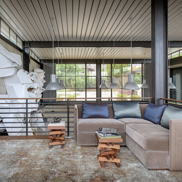
Trendy loft-style dark wood floor and brown floor family room photo in Seattle with gray walls
 Levy Art + Architecture
Open loft-like residence focused on indoor outdoor living.
Photography by Cesar Rubio
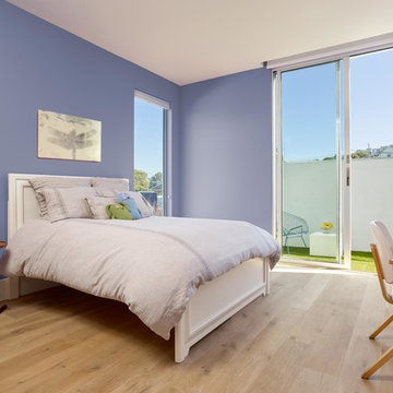
Inspiration for a mid-sized modern guest light wood floor bedroom remodel in San Francisco with purple walls and no fireplace
Inspiration for a mid-sized modern guest light wood floor bedroom remodel in San Francisco with purple walls and no fireplace
 Blue Horse Building & Design
Blue Horse Building + Design // Tre Dunham Fine Focus Photography
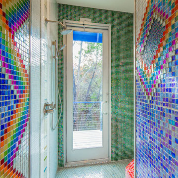
Inspiration for a mid-sized eclectic multicolored tile and glass tile ceramic tile doorless shower remodel in Austin with flat-panel cabinets, white cabinets, a one-piece toilet and multicolored walls
Inspiration for a mid-sized eclectic multicolored tile and glass tile ceramic tile doorless shower remodel in Austin with flat-panel cabinets, white cabinets, a one-piece toilet and multicolored walls
 TKS Design Group
Download our free ebook, Creating the Ideal Kitchen. DOWNLOAD NOW
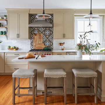
The homeowners came to us looking to update the kitchen in their historic 1897 home. The home had gone through an extensive renovation several years earlier that added a master bedroom suite and updates to the front façade. The kitchen however was not part of that update and a prior 1990’s update had left much to be desired. The client is an avid cook, and it was just not very functional for the family.
The original kitchen was very choppy and included a large eat in area that took up more than its fair share of the space. On the wish list was a place where the family could comfortably congregate, that was easy and to cook in, that feels lived in and in check with the rest of the home’s décor. They also wanted a space that was not cluttered and dark – a happy, light and airy room. A small powder room off the space also needed some attention so we set out to include that in the remodel as well.
See that arch in the neighboring dining room? The homeowner really wanted to make the opening to the dining room an arch to match, so we incorporated that into the design.
Another unfortunate eyesore was the state of the ceiling and soffits. Turns out it was just a series of shortcuts from the prior renovation, and we were surprised and delighted that we were easily able to flatten out almost the entire ceiling with a couple of little reworks.
Other changes we made were to add new windows that were appropriate to the new design, which included moving the sink window over slightly to give the work zone more breathing room. We also adjusted the height of the windows in what was previously the eat-in area that were too low for a countertop to work. We tried to keep an old island in the plan since it was a well-loved vintage find, but the tradeoff for the function of the new island was not worth it in the end. We hope the old found a new home, perhaps as a potting table.
Designed by: Susan Klimala, CKD, CBD
Photography by: Michael Kaskel
For more information on kitchen and bath design ideas go to: www.kitchenstudio-ge.com
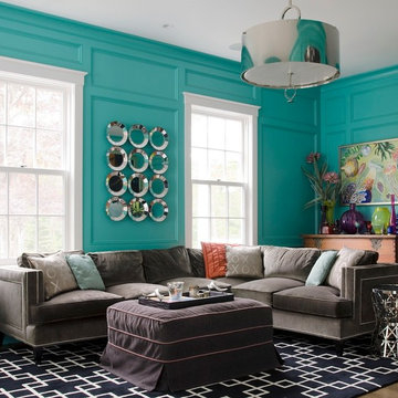
 OLSON LEWIS + Architects
Major gut renovation of this coastal estate preserved its basic layout while expanding the kitchen. A veranda and a pair of gazebos were also added to the home to maximize outdoor living and the water views. The interior merged the homeowners eclectic style with the traditional style of the home.
Photographer: James R. Salomon
Contractor: Carl Anderson, Anderson Contracting Services
 Foursquare Builders
Red Pants Studio
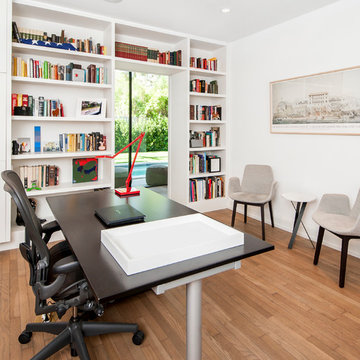
Home office - contemporary freestanding desk medium tone wood floor home office idea in Austin with white walls
Home office - contemporary freestanding desk medium tone wood floor home office idea in Austin with white walls
56