
Search results for "Founding stores" in Home Design Ideas
 DesignDot
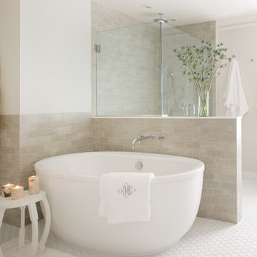
After photos of completely renovated master bathroom
Photo Credit: Jane Beiles
Example of a mid-sized transitional master beige tile and subway tile porcelain tile and white floor bathroom design in New York with shaker cabinets, dark wood cabinets, white walls, a trough sink, quartz countertops and a hinged shower door
Example of a mid-sized transitional master beige tile and subway tile porcelain tile and white floor bathroom design in New York with shaker cabinets, dark wood cabinets, white walls, a trough sink, quartz countertops and a hinged shower door
 Studio M Interiors
Scott Amundson Photography
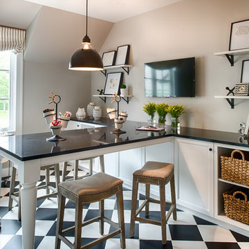
Example of a mid-sized classic built-in desk craft room design in Minneapolis with gray walls
Example of a mid-sized classic built-in desk craft room design in Minneapolis with gray walls
 Jennifer Gilmer Kitchen & Bath
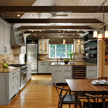
Design by #JGKB in McLean, Virginia.
Photography by Bob Narod.
Example of a large transitional l-shaped medium tone wood floor open concept kitchen design in DC Metro with recessed-panel cabinets, white cabinets, beige backsplash, stainless steel appliances, an island, an undermount sink, granite countertops and limestone backsplash
Example of a large transitional l-shaped medium tone wood floor open concept kitchen design in DC Metro with recessed-panel cabinets, white cabinets, beige backsplash, stainless steel appliances, an island, an undermount sink, granite countertops and limestone backsplash
Find the right local pro for your project
 Jinx McDonald Interior Designs
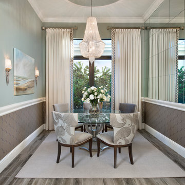
Example of a transitional enclosed dining room design in Tampa with green walls
 Laura Design Company
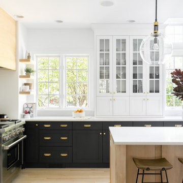
Kitchen - transitional l-shaped light wood floor and beige floor kitchen idea in Chicago with shaker cabinets, black cabinets, stainless steel appliances, an island and white countertops

 Thyme & Place Design LLC
When my client had to move from her company office to work at home, she set up in the dining room. Despite her best efforts, this was not the long-term solution she was looking for. My client realized she needed a dedicated space not on the main floor of the home. On one hand, having your office space right next to the kitchen is handy. On the other hand, it made separating work and home life was not that easy.
The house was a ranch. In essence, the basement would run entire length of the home. As we came down the steps, we entered a time capsule. The house was built in the 1950’s. The walls were covered with original knotty pine paneling. There was a wood burning fireplace and considering this was a basement, high ceilings. In addition, there was everything her family could not store at their own homes. As we wound though the space, I though “wow this has potential”, Eventually, after walking through the laundry room we came to a small nicely lit room. This would be the office.
My client looked at me and asked what I thought. Undoubtedly, I said, this can be a great workspace, but do you really want to walk through this basement and laundry to get here? Without reservation, my client said where do we start?
Once the design was in place, we started the renovation. The knotty pine paneling had to go. Specifically, to add some insulation and control the dampness and humidity. The laundry room wall was relocated to create a hallway to the office.
At the far end of the room, we designated a workout zone. Weights, mats, exercise bike and television are at the ready for morning or afternoon workouts. The space can be concealed by a folding screen for party time. Doors to an old closet under the stairs were relocated to the workout area for hidden storage. Now we had nice wall for a beautiful console and mirror for storage and serving during parties.
In order to add architectural details, we covered the old ugly support columns with simple recessed millwork panels. This detail created a visual division between the bar area and the seating area in front of the fireplace. The old red brick on the fireplace surround was replaced with stack stone. A mantle was made from reclaimed wood. Additional reclaimed wood floating shelves left and right of the fireplace provides decorative display while maintaining a rustic element balancing the copper end table and leather swivel rocker.
We found an amazing rug which tied all of the colors together further defining the gathering space. Russet and burnt orange became the accent color unifying each space. With a bit of whimsy, a rather unusual light fixture which looks like roots from a tree growing through the ceiling is a conversation piece.
The office space is quite and removed from the main part of the basement. There is a desk large enough for multiple screens, a small bookcase holding office supplies and a comfortable chair for conference calls. Because working from home requires many online meetings, we added a shiplap wall painted in Hale Navy to contrast with the orange fabric on the chair. We finished the décor with a painting from my client’s father. This is the background online visitors will see.
The last and best part of the renovation is the beautiful bar. My client is an avid collector of wine. She already had the EuroCave refrigerator, so I incorporated it into the design. The cabinets are painted Temptation Grey from Benjamin Moore. The counter tops are my favorite hard working quartzite Brown Fantasy. The backsplash is a combination of rustic wood and old tin ceiling like porcelain tiles. Together with the textures of the reclaimed wood and hide poofs balanced against the smooth finish of the cabinets, we created a comfortable luxury for relaxing.
There is ample storage for bottles, cans, glasses, and anything else you can think of for a great party. In addition to the wine storage, we incorporated a beverage refrigerator, an ice maker, and a sink. Floating shelves with integrated lighting illuminate the back bar. The raised height of the front bar provides the perfect wine tasting and paring spot. I especially love the pendant lights which look like wine glasses.
Finally, I selected carpet for the stairs and office. It is perfect for noise reduction. Meanwhile for the overall flooring, I specifically selected a high-performance vinyl plank floor. We often use this product as it is perfect to install on a concrete floor. It is soft to walk on, easy to clean and does not reduce the overall height of the space.
 KBK Interior Design
Wing Wong
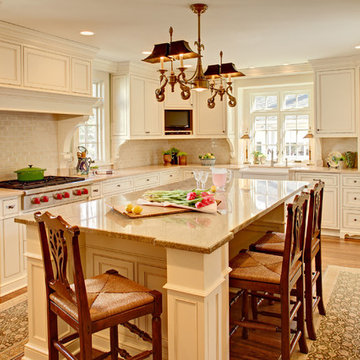
Large elegant l-shaped light wood floor and brown floor eat-in kitchen photo in New York with a farmhouse sink, white cabinets, granite countertops, beige backsplash, subway tile backsplash, paneled appliances, flat-panel cabinets and an island
Large elegant l-shaped light wood floor and brown floor eat-in kitchen photo in New York with a farmhouse sink, white cabinets, granite countertops, beige backsplash, subway tile backsplash, paneled appliances, flat-panel cabinets and an island
Sponsored
Columbus, OH

Hope Restoration & General Contracting
Columbus Design-Build, Kitchen & Bath Remodeling, Historic Renovations
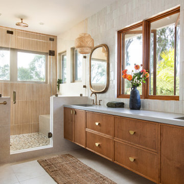
Transitional master white tile and ceramic tile porcelain tile, beige floor and double-sink bathroom photo in San Diego with shaker cabinets, brown cabinets, an integrated sink, a hinged shower door, gray countertops and a built-in vanity
 John Cole Architect
Brian Vanden Brink
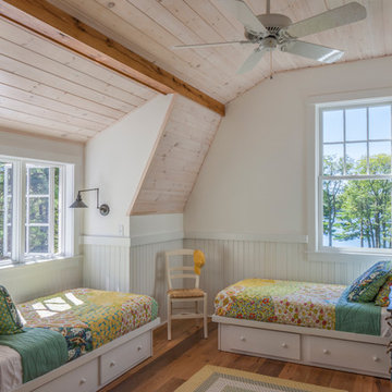
Farmhouse guest medium tone wood floor bedroom photo in Portland Maine with white walls
Farmhouse guest medium tone wood floor bedroom photo in Portland Maine with white walls
 Donna Elle Design
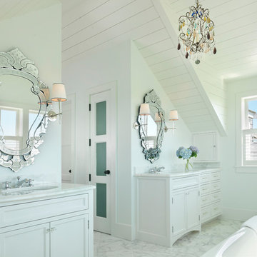
Master bath adorned in marble and mirror and glass for pure relaxation of all senses.
Inspiration for a coastal bathroom remodel in Boston with white cabinets
Inspiration for a coastal bathroom remodel in Boston with white cabinets
 Clean Design
Regan Wood Photography
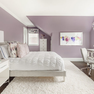
Inspiration for a transitional dark wood floor and brown floor bedroom remodel in New York with purple walls
Inspiration for a transitional dark wood floor and brown floor bedroom remodel in New York with purple walls
 Cook Design House
Emily Minton Redfield
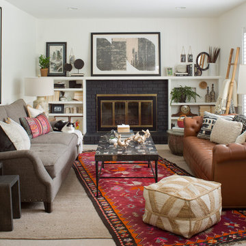
Example of an eclectic living room design in Denver with white walls and a brick fireplace
Example of an eclectic living room design in Denver with white walls and a brick fireplace
 Amy Kartheiser Design
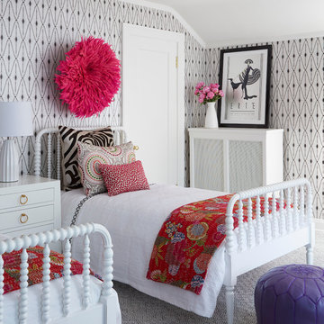
Kids' room - mid-sized transitional girl carpeted kids' room idea in Chicago with multicolored walls
Sponsored
Columbus, OH
Hope Restoration & General Contracting
Columbus Design-Build, Kitchen & Bath Remodeling, Historic Renovations
 JUMA architects
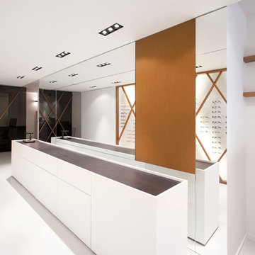
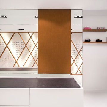
Optiek Herpol wanted to move to a better, more central location with plenty of parking space. A property that complied with these conditions was found on the Market in Deinze, and JUMA architects were subsequently asked to design a new interior for the store.
The property in question is very deep and narrow with little natural light entry. JUMA set to work despite these constraints in an attempt to transform these challenges into qualities.
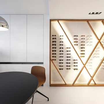
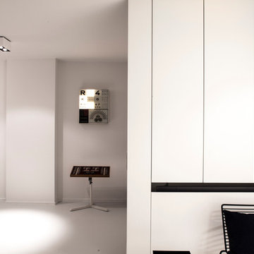
The architects positioned the sales counter right behind the shop window, so as to make optimum use of the available natural light. This also makes store activities visible from the outside, adding an extra element of attraction. At the narrowest section of the store, a large wall mirror was put in to visually double the space. The wall onto which the eyeglasses are displayed is located opposite the mirror and is literally the eye catcher in the store. A wooden lattice makes for an interesting play of diagonal lines behind which the glasses are presented. This unique concept animates the entire store without detracting from the fact that the glasses should remain the main focal point in the store. The workshop is located in the back, separated from the store by a wall in smoked grey glass. In this way, the optician can keep an eye on the store at all times.
The colour palette is predominantly white, to keep the interior as light as possible. As a counterpoint, warm wood accents are added. The chairs at the counter are upholstered in a colour that harmonizes perfectly with the wood.
Pictures © Thomas De Bruyne
 JUMA architects
Optiek Herpol wanted to move to a better, more central location with plenty of parking space. A property that complied with these conditions was found on the Market in Deinze, and JUMA architects were subsequently asked to design a new interior for the store.
The property in question is very deep and narrow with little natural light entry. JUMA set to work despite these constraints in an attempt to transform these challenges into qualities.
The architects positioned the sales counter right behind the shop window, so as to make optimum use of the available natural light. This also makes store activities visible from the outside, adding an extra element of attraction. At the narrowest section of the store, a large wall mirror was put in to visually double the space. The wall onto which the eyeglasses are displayed is located opposite the mirror and is literally the eye catcher in the store. A wooden lattice makes for an interesting play of diagonal lines behind which the glasses are presented. This unique concept animates the entire store without detracting from the fact that the glasses should remain the main focal point in the store. The workshop is located in the back, separated from the store by a wall in smoked grey glass. In this way, the optician can keep an eye on the store at all times.
The colour palette is predominantly white, to keep the interior as light as possible. As a counterpoint, warm wood accents are added. The chairs at the counter are upholstered in a colour that harmonizes perfectly with the wood.
Pictures © Thomas De Bruyne
 JUMA architects
Optiek Herpol wanted to move to a better, more central location with plenty of parking space. A property that complied with these conditions was found on the Market in Deinze, and JUMA architects were subsequently asked to design a new interior for the store.
The property in question is very deep and narrow with little natural light entry. JUMA set to work despite these constraints in an attempt to transform these challenges into qualities.
The architects positioned the sales counter right behind the shop window, so as to make optimum use of the available natural light. This also makes store activities visible from the outside, adding an extra element of attraction. At the narrowest section of the store, a large wall mirror was put in to visually double the space. The wall onto which the eyeglasses are displayed is located opposite the mirror and is literally the eye catcher in the store. A wooden lattice makes for an interesting play of diagonal lines behind which the glasses are presented. This unique concept animates the entire store without detracting from the fact that the glasses should remain the main focal point in the store. The workshop is located in the back, separated from the store by a wall in smoked grey glass. In this way, the optician can keep an eye on the store at all times.
The colour palette is predominantly white, to keep the interior as light as possible. As a counterpoint, warm wood accents are added. The chairs at the counter are upholstered in a colour that harmonizes perfectly with the wood.
Pictures © Thomas De Bruyne
Sponsored
Columbus, OH
Hope Restoration & General Contracting
Columbus Design-Build, Kitchen & Bath Remodeling, Historic Renovations
 JUMA architects
Optiek Herpol wanted to move to a better, more central location with plenty of parking space. A property that complied with these conditions was found on the Market in Deinze, and JUMA architects were subsequently asked to design a new interior for the store.
The property in question is very deep and narrow with little natural light entry. JUMA set to work despite these constraints in an attempt to transform these challenges into qualities.
The architects positioned the sales counter right behind the shop window, so as to make optimum use of the available natural light. This also makes store activities visible from the outside, adding an extra element of attraction. At the narrowest section of the store, a large wall mirror was put in to visually double the space. The wall onto which the eyeglasses are displayed is located opposite the mirror and is literally the eye catcher in the store. A wooden lattice makes for an interesting play of diagonal lines behind which the glasses are presented. This unique concept animates the entire store without detracting from the fact that the glasses should remain the main focal point in the store. The workshop is located in the back, separated from the store by a wall in smoked grey glass. In this way, the optician can keep an eye on the store at all times.
The colour palette is predominantly white, to keep the interior as light as possible. As a counterpoint, warm wood accents are added. The chairs at the counter are upholstered in a colour that harmonizes perfectly with the wood.
Pictures © Thomas De Bruyne
 PS & Daughters
Jaime Alvarez
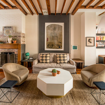
Large eclectic open concept dark wood floor and brown floor living room library photo in Philadelphia with a standard fireplace, a brick fireplace, white walls and a wall-mounted tv
Large eclectic open concept dark wood floor and brown floor living room library photo in Philadelphia with a standard fireplace, a brick fireplace, white walls and a wall-mounted tv
 Corynne Pless
Photo: Corynne Pless Photography © 2014 Houzz
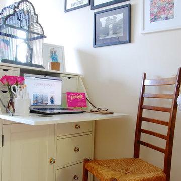
Home office - eclectic home office idea in New York
Home office - eclectic home office idea in New York
20