
Search results for "Functions built" in Home Design Ideas
 H2D Architecture + Design
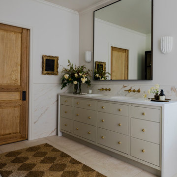
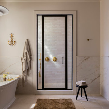
 H2D Architecture + Design developed a comprehensive vision for the renovation of this Bellevue residence, creating a cohesive master plan that can be implemented in phased construction to align with the homeowners' priorities, budget, and timeline. The first phase reimagined the primary suite, including a redesigned bathroom, reconfigured closet and bedroom. Strategic space planning enhanced the functionality and flow of each space while creating a serene, spa-inspired retreat tailored to the homeowners' lifestyle. Future phases will transform the home's main living areas through a complete reconfiguration of the kitchen, dining room, entry, and living room. The design will improve circulation, increase functionality, and create light-filled, beautifully connected spaces.
Architecture: H2D Architecture + Design
www.h2darchitects.com
Interiors: Kat Lawton Interiors
Photos by: John Granen

 Twelve Stones Designs, LLC
The owners of this kitchen had spent the money to upgrade the finishes in their kitchen upon building the home 12 years ago, but after living in the space for several years they realized how nonfunctional the layout really was. The (then) two preschool aged children had grown into busy, hungry teenagers with many friends who also liked to hang out at the house. So the family needed a more functional kitchen with better traffic flow, space for daily activities revolving around the kitchen at different times of day, and a kitchen that could accommodate cooking for and serving large groups. Furthermore, the dark, traditional finishes no longer reflected the homeowners’ style. They requested a brighter, more relaxed, coastal style that reflected their love of the seaside cities they like to visit.
Originally, the kitchen was U-shaped with a narrow island in the middle. The island created narrow aisles that bottle-necked at the dishwasher, refrigerator, and cooktop areas. There was a pass-through from the foyer into the kitchen, but the owners never liked that the pass-through was also located so close to the powder room. The awkward proximity was unappealing and made guests feel uncomfortable.
The kitchen’s storage was made up of lots of narrow cabinets, apothecary drawers, clipped corner units, and very few drawers. It lacked useful storage for the larger items the family used on a daily basis. And the kitchen’s only pantry was small closet that had only builder-grade, narrow shelving with no illumination to be able to see the contents inside.
Overall, the kitchen’s lighting plan was poorly executed. Only six recessed cans illuminated the entire kitchen and nook areas. The under cabinet lighting was not evenly distributed either. In fact, the builder had mis-placed the under cabinet lighting around the decorative pilasters which made for choppy, dark cubbies. Further, the builder didn’t include any lighting over the sink or the bar area, which meant whoever was doing the dishes was always in their own shadow. That, coupled with the steep overhang of the game room above made the bar area feel like a dim, cavernous space that wasn’t inviting or task oriented. The kitchen looked out into the main living space, but the raised bar and a narrow wall (which held the only large cabinet in the kitchen) created more of a barrier than a relationship to the living room or breakfast nook. In fact, one couldn’t even see the breakfast nook from the cooktop or sink areas due to its orientation. The raised bar top was too narrow to comfortably sit to either dine at or chat from due to the lack of knee space. The the homeowners confided that the kitchen felt more like a dark, dirty prison than place where the family, or their guests, wanted to gather and commune.
The clients' needs and desires were:
➢ to create a kitchen that would be a space the family loved to be in; to relate to the adjacent spaces all around, and to have better flow for entertaining large groups
➢ to remove the walls between the breakfast nook and living area and to be able to utilize the natural light from the windows in both those areas
➢ to incorporate a functional chopping block for prepping fresh food for home cooked meals, an island with a large sink and drain board, 2 pull out trash cans, and seating for at least the 2 teens to eat or do homework
➢ to design a kitchen and breakfast nook with an airy, coastal, relaxed vibe that blended with the rest of the house's coastal theme
➢ to integrate a layered lighting plan which would include ample general illumination, specific task lighting, decorative lighting, and lots of illuminated storage
➢ to design a kitchen with not only more storage for all the husband’s kitchen gadgets and collection of oils and spices, but smart storage, including a coffee/breakfast bar and a place to store and conceal the toaster oven and microwave
➢ to find a way to utilize the large open space between the kitchen, pantry area, and breakfast nook
Twelve Stones Designs achieved the owner's goals by:
➢ removing the walls between the kitchen and living room to allow the natural light to filter in from the adjacent rooms and to create a connection between the kitchen, nook, and living spaces for a sense of unity and communion
➢ removing the existing pantry and designing 3 large pantry style cabinets with LED tape lights and rollout drawers to house lots of kitchen appliances, gadgets, and tons of groceries. We also took the cabinets all the way up to the 9’ ceiling for additional storage for seasonal items and bulk storage.
➢ designing 2 islands - 1 with a gorgeous black walnut chopping block that houses a drawer for chopping and carving knives and a custom double pull out trash unit for point of use utilization - and 1 that houses the dishwasher, a large Blanco Gourmet sink with integrated drain board, woven baskets for fresh root vegetables and kitchen towels, plenty of drawer storage for kitchen items, and bar seating for up to 4 diners.
➢ closing off the space between the kitchen and the powder room to create a beautiful new private alcove for the powder room as well as adding some decorative storage. This also gave us space to include more tall storage near the new range for precision placement of the husband’s extensive oil and spice collection as well as a location for a combo-steam oven the wife wanted for baking and cooking healthy meals.
The project is enhanced functionally by:
➢ incorporated USB and standard receptacles for the kids’ laptops and phone charging in the large island
➢ designing the small island to include additional open shelving for items used on a daily basis such as a variety of bowls, plates, and colanders. This set up also works well for the husband who prefers to “plate” his dinners in restaurant-style fashion before presenting them to the table.
➢ the integration of specific storage units, such as double stacked cutlery drawers, a custom spice pull-out, a Kuerig coffee and tea pod drawer, and custom double stacked utensil drawers
➢ moving the refrigerator to the old oven location - this eliminated the bottle neck as well as created a better relationship to the eating table. It also utilizes the floor space between the pantry, nook, and kitchen
➢ creating a banquet style breakfast nook - this banquette seating not only doubles the amount of seating for large gatherings but it better utilizes the odd space between the kitchen and the previous nook area. It also helps to create a distinct pathway from the mudroom room through the pantry area, kitchen, nook, and living room.
➢ the coffee/breakfast bar area which includes the perfect location for the concealed microwave and toaster oven, convenient storage for the coffee pods and tea accoutrements. Roll-out drawers below also house the smoothie maker, hot water kettle, and a plethora of smoothie-making ingredients such as protein powders, smoothie additives, etc. Furthermore, the drawers below the Keurig house measuring utensil, cutlery, baking supplies and tupperware storage.
➢ incorporating lots of wide drawers and pullouts to accommodate large cookware.
➢ utilizing as much vertical space as possible by building storage to the ceiling which accommodates the family’s abundant amount of serving platters, baking sheets, bakeware, casserole dishes, and additional cutting boards.
The project is enhanced aesthetically by:
➢ new 5-piece Versailles pattern porcelain tile that now seamlessly joins the entire down stairs area together creating a bright, cohesiveness feeling instead of choppy separated spaces - it also adds a coastal feeling
➢ designing a cabinet to conceal the microwave and toaster oven
➢ the coastal influenced light fixtures over the nook table and island
➢ the sandy colors of the Langdon Cambria countertops. The swirling pattern and sparkling quartz pieces remind the homeowner of black-and-tan sandy beaches
➢ the striped banquet seating whose creamy white background and blue-green stripes were the inspiration for the cabinet and wall colors.
➢ All the interior doors were painted black to coordinate with the blacks and grays in the backsplash tile and countertop. This also adds a hint of tailored formality to an otherwise casual space.
➢ the use of WAC's Oculux small aperture LED units for the overhead lighting complimented with Diode LED strips for task lighting under the cabinets and inside the pantry and glass wall cabinets. All of the lighting applications are on separate dimmer switches.
Innovative uses of materials or construction methods by Realty Restoration LLC:
➢ Each 1-1/2” x 3” block of reclaimed end-grain black walnut that makes up the center island chopping block was hand milled and built in the shop. It was designed to look substantial and proportional to the surrounding elements, executed by creating the 4 inch tall top with a solid wood chamfered edge band.
➢ The metal doors on either side of the vent hood were also custom designed for this project and built in the Realty Restoration LLC shop. They are made 1x2, 11-gauge mild steel with ribbed glass. Weighing 60 lbs a piece, heavy duty cabinet hinges were added to support the weight of the door and keep them from sagging.
➢ Under-cabinet receptacles were added along the range wall in order to have a clean, uninterrupted backsplash.
Design obstacles to overcome:
➢ Because we were removing the demising walls between the kitchen and living room, we had to find a way to plumb and vent the new island. We did this by tunneling through the slab (the slab had post tension cables which prevented us from just trenching) to run a new wet vent through a nearby structural wall. We pulled the existing hot and cold lines between upper floor joists and ran them down the structural wall as well and up through a conduit in the tunnel.
➢ Since we were converting from wall overs to a gas range it allowed us to utilize the 220 feed for the wall ovens to provide a new sub panel for all the new kitchen circuits
➢ Due to framing deficiencies inherited from the original build there was a 1-1/2” differential in the floor-to-ceiling height over a 20 foot span; by utilizing the process of cutting and furring coupled with the crown moulding details on the cabinet elevations we were able to mask the problem and provide seamless transitions between the cabinet components.
Evidence of superior craftsmanship:
➢ uniquely designed, one-of-a-kind metal “X” end panels on the large island. The end panels were custom made in the Realty Restoration LLC shop and fitted to the exact dimensions of the island. The welding seams are completely indistinguishable - the posts look like they are cut from a single sheet of metal
➢ square metal posts on the small island were also custom made and designed to compliment and carry through the metal element s throughout the kitchen
➢ the beautiful, oversized end panels on the pantry cabinets which give the breakfast nook a tailored look
➢ integrating a large format 5 piece Versailles tile pattern to seamlessly flow from the existing spaces into the new kitchen space
➢ By constructing a custom cabinet that jogged around a corner we could not remodel (housing the entry way coat closet) we were able to camouflage the adjacent wall offset within the upper and lower cabinets. By designing around the existing jog in the structural walls we accomplished a few things: we were able to find the space to house, and hide, the microwave and toaster oven yet still have a clean cohesive appearance from the kitchen side. Additionally, the owners were able to keep their much needed coat closet and we didn’t have to increase the budget with unnecessary structural work.
 Wow Great Place
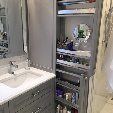
How cool is this? We designed a pull-out tower, in three sections, beside "her" sink, to give the homeowner handy access for her make-up and hair care routine. We even installed the mirror exactly for her height! The sides of the pull-out were done in metal, to maximize the interior width of the shelves, and we even customized it so that the widest items she wanted to store in here would fit on these shelves!
Find the right local pro for your project
 Bilotta Kitchen & Home
Despite its diamond-mullioned exterior, this stately home’s interior takes a more light-hearted approach to design. The Dove White inset cabinetry is classic, with recessed panel doors, a deep bevel inside profile and a matching hood. Streamlined brass cup pulls and knobs are timeless. Departing from the ubiquitous crown molding is a square top trim.
The layout supplies plenty of function: a paneled refrigerator; prep sink on the island; built-in microwave and second oven; built-in coffee maker; and a paneled wine refrigerator. Contrast is provided by the countertops and backsplash: honed black Jet Mist granite on the perimeter and a statement-making island top of exuberantly-patterned Arabescato Corchia Italian marble.
Flooring pays homage to terrazzo floors popular in the 70’s: “Geotzzo” tiles of inlaid gray and Bianco Dolomite marble. Field tiles in the breakfast area and cooking zone perimeter are a mix of small chips; feature tiles under the island have modern rectangular Bianco Dolomite shapes. Enameled metal pendants and maple stools and dining chairs add a mid-century Scandinavian touch. The turquoise on the table base is a delightful surprise.
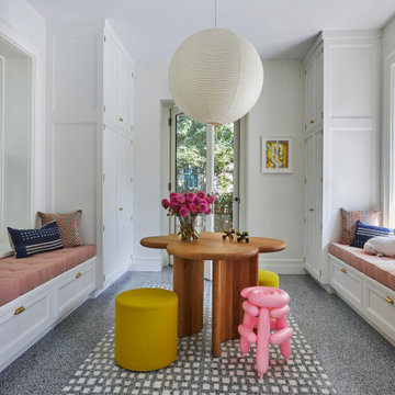
An adjacent pantry has tall storage, cozy window seats, a playful petal table, colorful upholstered ottomans and a whimsical “balloon animal” stool.
This kitchen was done in collaboration with Daniel Heighes Wismer and Greg Dufner of Dufner Heighes and Sarah Witkin of Bilotta Architecture. It is the personal kitchen of the CEO of Sandow Media, Erica Holborn. Click here to read the article on her home featured in Interior Designer Magazine.
Photographer: John Ellis
Description written by Paulette Gambacorta adapted for Houzz.
 Wow Great Place
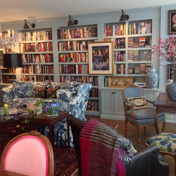
The sofa and wing chairs were slipcovered in Schumacher's iconic Chiang Mai Dragon fabric. This fabric was the leaping off point for the entire condo.
Built-in bookshelves house the extensive collection of hardcover books, and all the walls, doors, bookshelves were done in Farrow & Ball's Parma Gray. Another Schonbek chandelier is the icing on the cake over the coffee table.
Boston Functional Library Lights highlight the wall of built-ins.
 H2D Architecture + Design
H2D Architecture + Design developed a comprehensive vision for the renovation of this Bellevue residence, creating a cohesive master plan that can be implemented in phased construction to align with the homeowners' priorities, budget, and timeline. The first phase reimagined the primary suite, including a redesigned bathroom, reconfigured closet and bedroom. Strategic space planning enhanced the functionality and flow of each space while creating a serene, spa-inspired retreat tailored to the homeowners' lifestyle. Future phases will transform the home's main living areas through a complete reconfiguration of the kitchen, dining room, entry, and living room. The design will improve circulation, increase functionality, and create light-filled, beautifully connected spaces.
Architecture: H2D Architecture + Design
www.h2darchitects.com
Interiors: Kat Lawton Interiors
Photos by: John Granen
 Spaces Renewed
The mix of black and white take shape in this modern farmhouse style kitchen. With a timeless color scheme and high end finishes, this kitchen is perfect for large gatherings and entertaining family and friends. The connected dining space and eat in island offers abundant seating, as well as function and storage. The build in buffet area brings in variation, and adds a light and bright quality to the space. Floating shelves offer a softer look than full wall to wall upper cabinets. Classic grey toned porcelain tile give the look of wood without any of the maintenance or wear and tear issues. The classic grey marble backsplash in the baroque shape brings a custom and elegant dimension to the space.


 Fresh Photo House
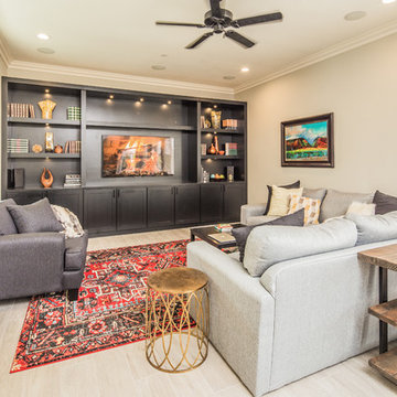
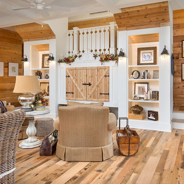
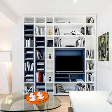
Living room - contemporary light wood floor and beige floor living room idea in London with white walls and a media wall
 Tara Fust Design
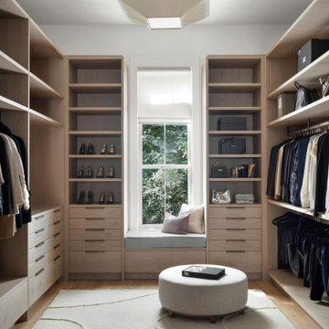
The primary closet was designed as a built-in millwork environment rather than a storage room. Cabinetry configuration, shelving rhythm, and drawer placement were resolved during the design selection phase to support daily use while maintaining visual order.
A central window seat introduces symmetry and natural light, creating a focal point that softens the linearity of the cabinetry walls. Open shelving, concealed drawers, and integrated hanging zones establish a clear organizational hierarchy, allowing function to remain seamless and visually quiet.
Material selection stays restrained — warm wood tones, soft textiles, and subtle hardware — reinforcing continuity with the home’s architectural palette. The result is a primary closet that reads as composed interior architecture: efficient, tailored, and scaled for routine without excess.
 Twelve Stones Designs, LLC
The owners of this kitchen had spent the money to upgrade the finishes in their kitchen upon building the home 12 years ago, but after living in the space for several years they realized how nonfunctional the layout really was. The (then) two preschool aged children had grown into busy, hungry teenagers with many friends who also liked to hang out at the house. So the family needed a more functional kitchen with better traffic flow, space for daily activities revolving around the kitchen at different times of day, and a kitchen that could accommodate cooking for and serving large groups. Furthermore, the dark, traditional finishes no longer reflected the homeowners’ style. They requested a brighter, more relaxed, coastal style that reflected their love of the seaside cities they like to visit.
Originally, the kitchen was U-shaped with a narrow island in the middle. The island created narrow aisles that bottle-necked at the dishwasher, refrigerator, and cooktop areas. There was a pass-through from the foyer into the kitchen, but the owners never liked that the pass-through was also located so close to the powder room. The awkward proximity was unappealing and made guests feel uncomfortable.
The kitchen’s storage was made up of lots of narrow cabinets, apothecary drawers, clipped corner units, and very few drawers. It lacked useful storage for the larger items the family used on a daily basis. And the kitchen’s only pantry was small closet that had only builder-grade, narrow shelving with no illumination to be able to see the contents inside.
Overall, the kitchen’s lighting plan was poorly executed. Only six recessed cans illuminated the entire kitchen and nook areas. The under cabinet lighting was not evenly distributed either. In fact, the builder had mis-placed the under cabinet lighting around the decorative pilasters which made for choppy, dark cubbies. Further, the builder didn’t include any lighting over the sink or the bar area, which meant whoever was doing the dishes was always in their own shadow. That, coupled with the steep overhang of the game room above made the bar area feel like a dim, cavernous space that wasn’t inviting or task oriented. The kitchen looked out into the main living space, but the raised bar and a narrow wall (which held the only large cabinet in the kitchen) created more of a barrier than a relationship to the living room or breakfast nook. In fact, one couldn’t even see the breakfast nook from the cooktop or sink areas due to its orientation. The raised bar top was too narrow to comfortably sit to either dine at or chat from due to the lack of knee space. The the homeowners confided that the kitchen felt more like a dark, dirty prison than place where the family, or their guests, wanted to gather and commune.
The clients' needs and desires were:
➢ to create a kitchen that would be a space the family loved to be in; to relate to the adjacent spaces all around, and to have better flow for entertaining large groups
➢ to remove the walls between the breakfast nook and living area and to be able to utilize the natural light from the windows in both those areas
➢ to incorporate a functional chopping block for prepping fresh food for home cooked meals, an island with a large sink and drain board, 2 pull out trash cans, and seating for at least the 2 teens to eat or do homework
➢ to design a kitchen and breakfast nook with an airy, coastal, relaxed vibe that blended with the rest of the house's coastal theme
➢ to integrate a layered lighting plan which would include ample general illumination, specific task lighting, decorative lighting, and lots of illuminated storage
➢ to design a kitchen with not only more storage for all the husband’s kitchen gadgets and collection of oils and spices, but smart storage, including a coffee/breakfast bar and a place to store and conceal the toaster oven and microwave
➢ to find a way to utilize the large open space between the kitchen, pantry area, and breakfast nook
Twelve Stones Designs achieved the owner's goals by:
➢ removing the walls between the kitchen and living room to allow the natural light to filter in from the adjacent rooms and to create a connection between the kitchen, nook, and living spaces for a sense of unity and communion
➢ removing the existing pantry and designing 3 large pantry style cabinets with LED tape lights and rollout drawers to house lots of kitchen appliances, gadgets, and tons of groceries. We also took the cabinets all the way up to the 9’ ceiling for additional storage for seasonal items and bulk storage.
➢ designing 2 islands - 1 with a gorgeous black walnut chopping block that houses a drawer for chopping and carving knives and a custom double pull out trash unit for point of use utilization - and 1 that houses the dishwasher, a large Blanco Gourmet sink with integrated drain board, woven baskets for fresh root vegetables and kitchen towels, plenty of drawer storage for kitchen items, and bar seating for up to 4 diners.
➢ closing off the space between the kitchen and the powder room to create a beautiful new private alcove for the powder room as well as adding some decorative storage. This also gave us space to include more tall storage near the new range for precision placement of the husband’s extensive oil and spice collection as well as a location for a combo-steam oven the wife wanted for baking and cooking healthy meals.
The project is enhanced functionally by:
➢ incorporated USB and standard receptacles for the kids’ laptops and phone charging in the large island
➢ designing the small island to include additional open shelving for items used on a daily basis such as a variety of bowls, plates, and colanders. This set up also works well for the husband who prefers to “plate” his dinners in restaurant-style fashion before presenting them to the table.
➢ the integration of specific storage units, such as double stacked cutlery drawers, a custom spice pull-out, a Kuerig coffee and tea pod drawer, and custom double stacked utensil drawers
➢ moving the refrigerator to the old oven location - this eliminated the bottle neck as well as created a better relationship to the eating table. It also utilizes the floor space between the pantry, nook, and kitchen
➢ creating a banquet style breakfast nook - this banquette seating not only doubles the amount of seating for large gatherings but it better utilizes the odd space between the kitchen and the previous nook area. It also helps to create a distinct pathway from the mudroom room through the pantry area, kitchen, nook, and living room.
➢ the coffee/breakfast bar area which includes the perfect location for the concealed microwave and toaster oven, convenient storage for the coffee pods and tea accoutrements. Roll-out drawers below also house the smoothie maker, hot water kettle, and a plethora of smoothie-making ingredients such as protein powders, smoothie additives, etc. Furthermore, the drawers below the Keurig house measuring utensil, cutlery, baking supplies and tupperware storage.
➢ incorporating lots of wide drawers and pullouts to accommodate large cookware.
➢ utilizing as much vertical space as possible by building storage to the ceiling which accommodates the family’s abundant amount of serving platters, baking sheets, bakeware, casserole dishes, and additional cutting boards.
The project is enhanced aesthetically by:
➢ new 5-piece Versailles pattern porcelain tile that now seamlessly joins the entire down stairs area together creating a bright, cohesiveness feeling instead of choppy separated spaces - it also adds a coastal feeling
➢ designing a cabinet to conceal the microwave and toaster oven
➢ the coastal influenced light fixtures over the nook table and island
➢ the sandy colors of the Langdon Cambria countertops. The swirling pattern and sparkling quartz pieces remind the homeowner of black-and-tan sandy beaches
➢ the striped banquet seating whose creamy white background and blue-green stripes were the inspiration for the cabinet and wall colors.
➢ All the interior doors were painted black to coordinate with the blacks and grays in the backsplash tile and countertop. This also adds a hint of tailored formality to an otherwise casual space.
➢ the use of WAC's Oculux small aperture LED units for the overhead lighting complimented with Diode LED strips for task lighting under the cabinets and inside the pantry and glass wall cabinets. All of the lighting applications are on separate dimmer switches.
Innovative uses of materials or construction methods by Realty Restoration LLC:
➢ Each 1-1/2” x 3” block of reclaimed end-grain black walnut that makes up the center island chopping block was hand milled and built in the shop. It was designed to look substantial and proportional to the surrounding elements, executed by creating the 4 inch tall top with a solid wood chamfered edge band.
➢ The metal doors on either side of the vent hood were also custom designed for this project and built in the Realty Restoration LLC shop. They are made 1x2, 11-gauge mild steel with ribbed glass. Weighing 60 lbs a piece, heavy duty cabinet hinges were added to support the weight of the door and keep them from sagging.
➢ Under-cabinet receptacles were added along the range wall in order to have a clean, uninterrupted backsplash.
Design obstacles to overcome:
➢ Because we were removing the demising walls between the kitchen and living room, we had to find a way to plumb and vent the new island. We did this by tunneling through the slab (the slab had post tension cables which prevented us from just trenching) to run a new wet vent through a nearby structural wall. We pulled the existing hot and cold lines between upper floor joists and ran them down the structural wall as well and up through a conduit in the tunnel.
➢ Since we were converting from wall overs to a gas range it allowed us to utilize the 220 feed for the wall ovens to provide a new sub panel for all the new kitchen circuits
➢ Due to framing deficiencies inherited from the original build there was a 1-1/2” differential in the floor-to-ceiling height over a 20 foot span; by utilizing the process of cutting and furring coupled with the crown moulding details on the cabinet elevations we were able to mask the problem and provide seamless transitions between the cabinet components.
Evidence of superior craftsmanship:
➢ uniquely designed, one-of-a-kind metal “X” end panels on the large island. The end panels were custom made in the Realty Restoration LLC shop and fitted to the exact dimensions of the island. The welding seams are completely indistinguishable - the posts look like they are cut from a single sheet of metal
➢ square metal posts on the small island were also custom made and designed to compliment and carry through the metal element s throughout the kitchen
➢ the beautiful, oversized end panels on the pantry cabinets which give the breakfast nook a tailored look
➢ integrating a large format 5 piece Versailles tile pattern to seamlessly flow from the existing spaces into the new kitchen space
➢ By constructing a custom cabinet that jogged around a corner we could not remodel (housing the entry way coat closet) we were able to camouflage the adjacent wall offset within the upper and lower cabinets. By designing around the existing jog in the structural walls we accomplished a few things: we were able to find the space to house, and hide, the microwave and toaster oven yet still have a clean cohesive appearance from the kitchen side. Additionally, the owners were able to keep their much needed coat closet and we didn’t have to increase the budget with unnecessary structural work.
 M.J. Whelan Construction
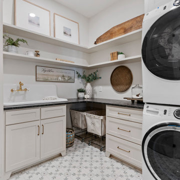
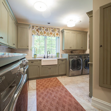
With the countless hours we spend in our laundry rooms, this space should be as functional and beautiful as possible. This space is located directly off the kitchen for convenience. Complete with “loads” of intricately detailed custom cabinetry in a classic beadboard style. Cabinets were custom painted in a sage green with light distressing and glazing giving a warm feel. This dream laundry/mud room features 2 washers and 2 dryers with cabinetry surrounds, a farm sink with granite countertops and a limestone backsplash. Several pullout laundry bins under a laundry chute and a pull-down ironing board were custom built. A large information unit was incorporated to meet the needs of our clients and include everything to keep a busy family organized. The one of a kind unit includes a corkboard, whiteboard, small cubbies, flip-out organizers, pencil trays and individual pullout. Built-in cubbies matching the cabinets with hooks are also a part of this laundry room design. Who said doing laundry had to be boring?
Hall Of Portraits
 Case Architects & Remodelers
Project Developer Mary Englert
Designer Kate Adams
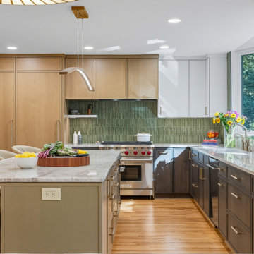
Large trendy l-shaped medium tone wood floor eat-in kitchen photo in DC Metro with green backsplash, an island and beige countertops
Large trendy l-shaped medium tone wood floor eat-in kitchen photo in DC Metro with green backsplash, an island and beige countertops

Sponsored
Delaware, OH

Buckeye Basements, Inc.
Central Ohio's Basement Finishing ExpertsBest Of Houzz '13-'21
 TVL Creative Ltd.
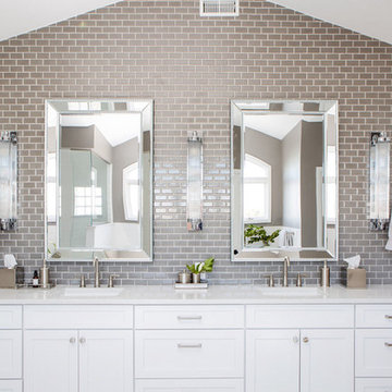
Our clients’ recently purchase home is set in a picturesque location in Golden, Colorado. With idyllic square footage for raising a family, it was almost just what they wanted. However, the 90’s interior furnishings and dated layout didn’t feel like home. So, they reached out to TVL Creative to help them get the place move-in ready and feeling more 'them.' The scope of work included an overhaul of the master bathroom, full-home paint scheme, lighting updates, and new staircase railings. The most profound transformation within our scope was the master bathroom renovation. This luxurious space, built by TVL’s own Team Angel, is a calming retreat with gorgeous detailing throughout. Every part of this bathroom was gutted and we worked to establish a new concept and functional layout that would better serve our clients. As part of the transformative design, a calming symmetry was created by marrying the new vanity design with the existing architecture of the room. A feature tile accentuates the symmetrical composition of vanity and vaulted ceiling: large beveled mirrors and linear sconces bring the eye upward. Custom built-ins flanking the master bathroom sinks were designed to provide ample organized storage for linens and toiletries. A make-up vanity accented by a full height mirror and coordinating pendant rounds out the custom built-ins. Opposite the vanity wall is the commode room, bathtub, and a large shower. In the bathtub nook, the sculptural form of the Elise tub by MTI Baths compliments the arc of the picture window above. The Kohler Archer tub filler adds transitional and classy styling to the area. A quartz-topped bench running the length of the back wall provides a perfect spot for a glass of wine near the bath, while doubling as a gorgeous and functional seat in the shower. The bench was also utilized to move the bathtub off of the exterior wall and reduce the amount of awkward-to-clean floor space. In the shower, the upgrades feel limitless. We relocated the valve controls to the entry half wall for easy on/off access. We also created functionals shower niches that are tucked out of view for handy storage without aesthetic compromise. The shower features a lovely three-dimensional diamond accent tile and is wrapped in frameless glass for added light entry. In general, the space is outfitted with other stunning features including Kohler Archer fixtures throughout, Feiss decorative lighting, Amerock hardware on all built-ins, and cabinetry from Waypoint Living Spaces. From bachelor pad to first family home, it's been a pleasure to work with our client over the years! We will especially cherish our time working with them this time around to make their new house feel more like home.
 Che Bella Interiors Design + Remodeling
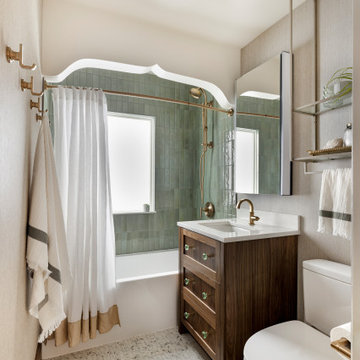
A small, charming bathroom remodel featuring a wood window in the shower, a misplaced sconce, and a cluttered vanity with a plea to add much needed function and storage while maintaining the room’s vintage charm.
Within the new design, the original arched detail, replicated in other places in the home, is preserved. Nearby, a newly added braided chevron recycled glass floor tile plays against the curves of the arch. Champagne brushed bronze fixtures contrast beautifully against wall tiles in varying shades of green laid vertically offering a handmade feel.
Giving a nod to the home’s treasured history, a custom walnut vanity with antique glass knobs ties into the bathroom’s original green glass doorknob, offering deeper storage while accommodating an elongated tub. Adding modern convenience, a new medicine cabinet with built in lighting and interior power hangs above the vanity. Adjacent to the cabinet, a custom designed hanging shelf and towel bar maximize space. As a final touch, woven wallpaper softens the room’s hard surfaces, and a sculptural alabaster stone ceiling light provides a touch of elegance, transforming the space with function while paying homage to the home’s historic origins.
Photo by Spacecrafting Photography
 Jane Vorbrodt
Photo: Jane Vorbrodt © 2015 Houzz
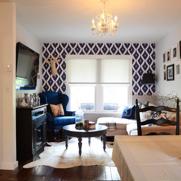
Living room - traditional living room idea in Vancouver
Living room - traditional living room idea in Vancouver
 The Brooklyn Studio
This Cobble Hill Brownstone for a family of five is a fun and captivating design, the perfect blend of the wife’s love of English country style and the husband’s preference for modern. The young power couple, her the co-founder of Maisonette and him an investor, have three children and a dog, requiring that all the surfaces, finishes and, materials used throughout the home are both beautiful and durable to make every room a carefree space the whole family can enjoy.
The primary design challenge for this project was creating both distinct places for the family to live their day to day lives and also a whole floor dedicated to formal entertainment. The clients entertain large dinners on a monthly basis as part of their profession. We solved this by adding an extension on the Garden and Parlor levels. This allowed the Garden level to function as the daily family operations center and the Parlor level to be party central. The kitchen on the garden level is large enough to dine in and accommodate a large catering crew.
On the parlor level, we created a large double parlor in the front of the house; this space is dedicated to cocktail hour and after-dinner drinks. The rear of the parlor is a spacious formal dining room that can seat up to 14 guests. The middle "library" space contains a bar and facilitates access to both the front and rear rooms; in this way, it can double as a staging area for the parties.
The remaining three floors are sleeping quarters for the family and frequent out of town guests. Designing a row house for private and public functions programmatically returns the building to a configuration in line with its original design.
This project was published in Architectural Digest.
Photography by Sam Frost

Sponsored
Fredericksburg, OH

High Point Cabinets
Columbus' Experienced Custom Cabinet Builder | 4x Best of Houzz Winner
 Villa Decor
Ashley Avila
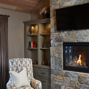
Mountain style master medium tone wood floor bedroom photo in Grand Rapids with beige walls, a standard fireplace and a stone fireplace
Mountain style master medium tone wood floor bedroom photo in Grand Rapids with beige walls, a standard fireplace and a stone fireplace
 Windhill+Co.
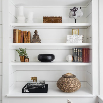
This Winchester home was love at first sight for this young family of four. The layout lacked function, had no master suite to speak of, an antiquated kitchen, non-existent connection to the outdoor living space and an absentee mud room… yes, true love. Windhill Builders to the rescue! Design and build a sanctuary that accommodates the daily, sometimes chaotic lifestyle of a busy family that provides practical function, exceptional finishes and pure comfort. We think the photos tell the story of this happy ending. Feast your eyes on the kitchen with its crisp, clean finishes and black accents that carry throughout the home. The Imperial Danby Honed Marble countertops, floating shelves, contrasting island painted in Benjamin Moore Timberwolfe add drama to this beautiful space. Flow around the kitchen, cozy family room, coffee & wine station, pantry, and work space all invite and connect you to the magnificent outdoor living room complete with gilded iron statement fixture. It’s irresistible! The master suite indulges with its dreamy slumber shades of grey, walk-in closet perfect for a princess and a glorious bath to wash away the day. Once an absentee mudroom, now steals the show with its black built-ins, gold leaf pendant lighting and unique cement tile. The picture-book New England front porch, adorned with rocking chairs provides the classic setting for ‘summering’ with a glass of cold lemonade.
Joyelle West Photography
 MAK Design + Build Inc.
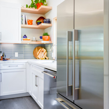
While open-concept kitchens seem to be all the rage, these days. This kitchen proves that you can have a U-shaped kitchen that is also modern, functional, and beautiful.
This kitchen doesn’t have a large footprint, but the combination of material choice and use of space help make it a great place to cook and entertain in. The cabinets are a white painted shaker, classic and clean, and while the maple elements on the island and window frames and the blue tile add some interest without overwhelming the space. The white built-out range hood and maple open shelving also help to make the upper level of cabinets seem light and easy on the eyes. The large maple-wrapped beam separating the kitchen from the living room perfectly ties the kitchen into the rest of the living space.
Some of the functional elements that help bring this space together are the cabinet accessories and the island with built-in storage. One of the issues with U-shaped kitchens is that the layout often creates two blind corner base cabinets which usually become black pits for kitchen items to get lost in. By installing a magic corner in one and a lazy susan in the other, we were able to maximize this kitchen’s functionality. Other features, like a built-in trash pullout and integrate LED lights throughout, help make this kitchen the perfect blend of form and function.
110