
Search results for "Functions split" in Home Design Ideas
 Klopf Architecture
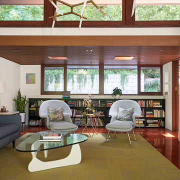
Nestled in the hills of Orinda, California, this 1951 residence is one of only seven extant homes, now known as “The Magnificent Seven”, designed by architect Olof Dahlstrand, a protégé of Frank Lloyd Wright. With its low-slung rooflines, natural materials, and deep integration with the sloping landscape, the home is a pristine example of mid-century modern design inspired by Wright’s organic principles. Over the years, prior homeowners have emphasized preservation, ensuring that the house remained relatively untouched. Each owner has respected the original architecture and stayed true to Dahlstrand’s intent. When a family of five—two college-aged sons and a middle school-aged daughter—acquired the property, they were captivated by its history, legacy of care, and architectural significance. While they appreciated Dahlstrand’s original vision, they also recognized the need to adapt the home for contemporary living while preserving its design integrity.
The remodel was conceived as a thoughtful response to the past—an effort to bring the house into the 21st century without compromising its soul. The primary mandate was to maintain architectural continuity while improving the functionality, comfort, and livability for a modern family. The design team—architects and contractor alike—worked with a shared reverence for the original architecture, allowing that mindset to guide even the most technical or pragmatic decisions.
A key objective was to increase natural light in the kitchen—a departure from Wrightian principles of enclosed, intimate cooking spaces—while maintaining the home’s architectural language. The kitchen was reconfigured to foster a stronger connection to adjacent living spaces while retaining the underlying concept of spatial separation. One of the most transformative architectural changes was the removal of a ridge beam that was originally planned to remain visible through the kitchen. During construction, the team collaborated on a better solution: a wide-flanged steel beam concealed within the roof envelope. This subtle move preserved the clean lines and ceiling continuity, a modern update carried out with utmost respect for the existing framework.
The home’s original powder room, previously accessible only through the kitchen, was relocated for better flow and privacy. A new powder room was carved out of former kitchen cabinetry—a narrow, interior space that could have felt dark and enclosed. To avoid this, the design extended the line of original transom windows into the new powder room and added a skylight above the vanity. The result is a bright and airy space that feels consistent with the rest of the home. Other updates included the installation of new solid-core interior doors with veneers carefully matched to the original mahogany, enhancing the continuity of the interiors. Even smaller decisions, such as placing the door knobs at 42 inches high, mirrored the original proportions. Every choice reflected a shared belief between the architect, contractor, and client: that new work should serve the integrity of the old.
The home’s extensive interior redwood millwork and paneling was meticulously restored. Where new materials were introduced—such as the replacement redwood soffit paneling—the contractor took pains to find finish nails that matched the original, rather than using modern equivalents. This level of craftsmanship and collaboration defined the project. It extended even to the detailing of a blind door to the new powder room, which had to disappear into the existing redwood board-and-batten wall. It was a team effort: the owner found a suitable handle, the architects devised the custom in-swing mechanism, and the contractor executed it so the door aligned precisely with the battens. Throughout, the homeowners were deeply engaged in the design process. One, a meticulous design enthusiast, focused on aesthetic integrity and historic detail. The other brought a practical and function-driven perspective, ensuring that new fixtures and materials would be durable and require minimal maintenance.
While the home’s location posed no major site challenges, sustainability was a key concern. The team upgraded the roof insulation, installed solar panels with battery storage, and added ductless mini-split cooling systems. Lighting was another area where modern technology was woven into a historic framework: new square LED fixtures echo the original custom perimeter soffit lights, maintaining the design language while offering advanced performance.
A planned expansion of a bedroom into suite with a bathroom had to be shelved due to budget constraints and the high cost of below-grade foundation work. Still, the team focused their efforts on making the most of the existing footprint, resolving constraints through design ingenuity rather than adding square footage. This renovation represents a collaborative achievement in preserving and evolving a historically significant home. Every decision was shaped by a shared ethos among clients, architects, and contractor: to maintain the home’s architectural soul while updating it for contemporary life. The result is a timeless modernist residence that continues Olof Dahlstrand’s legacy, remaining grounded in nature, craftsmanship, and human-scale design.
Klopf Architecture Team: John Klopf, AIA, Klara Kevane, Fernanda Bernardes
Interior Architectural Design: Klopf Architecture
Structural Engineer: Daniel Bastiao
Contractor: Don Larwood, Larwood Construction
Photography: Mariko Reed
Year Completed: 2022
 Schumacher Homes
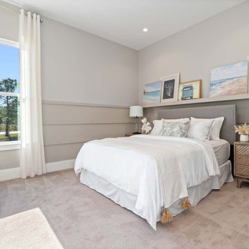
Built by Schumacher Homes, America's Largest Custom Home Builder, this stunning Bluffton Coastal in Hilton Head, South Carolina, effortlessly balances classic architectural details with coastal charm. Spanning a beautifully detailed 2,455 square feet, the open-concept layout is defined by prominent feature windows in the owner’s retreat, great room, and morning room that are strategically positioned to invite an abundance of natural light throughout the entire home. Designed for culinary enthusiasts and effortless home organization, the chef-ready kitchen boasts an incredibly large walk-in pantry with ample storage space. For those who love hosting family and friends, the layout includes an integrated covered porch that is conveniently accessible directly from the kitchen, creating a seamless transition and natural flow for indoor-outdoor entertaining.
A smart split-bedroom floor plan prioritizes rest and privacy, positioning the secondary bedrooms on the opposite side of the home where they share a highly functional Jack-and-Jill bath layout. Secluded from the rest of the main residence, the luxurious primary owner's retreat serves as a private, spa-like sanctuary. This deluxe suite features independent double walk-in closets and an enhanced primary bath beautifully appointed with a premium free-standing soak tub, offering the ultimate relaxing escape. Completing the coastal estate footprint, the property includes a detached garage featuring a fully converted bonus room above. This private studio functions as an independent detached guest apartment or premium home office, complete with its own full bathroom and dedicated workspace to provide long-term visitors with complete comfort and seclusion.
 Nakamoto Forestry
Project Overview:
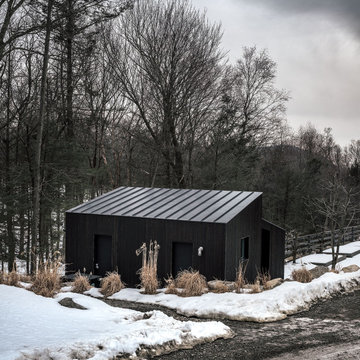
This intensively-designed small project by MQ Architecture expanded on a functional outbuilding to make something beautiful, matching the fantastic wooded location directly across the Hudson River from West Point.
From MQ Architecture:
“This project entitled a surgical demolition of an existing shed and the erection of a small ancillary building. The old structure housed the electrical and communications utilities of a large compound, and the new project had to preserve the location and function of all this equipment, therefore some walls and floor levels are set from the beginning.
The program required two different type of users, therefore we decided to split the building in two, allowing for a separate circulation for each group. The upper piece houses the electrical room and the team quarters, while the lower portion holds two individual restrooms for visitors.
The project sits in the middle of the forest therefore we chose charred wood to make it blend with the surrounding nature. On the other hand, the polycarbonate façade brings natural light and privacy to the interior. All floors are made of polished concrete for easy maintenance and a radiant slab keeps an optimal temperature during extreme winters.”
Product: Gendai 1×6 select grade shiplap
Prefinish: Black
Application: Residential – Exterior
SF: 1100SF
Designer: Miguel Quismondo (MQ Architecture)
Builder: Miguel Quismondo
Date: August 2018
Location: Garrison, NY
Find the right local pro for your project
 Kraft Custom Construction
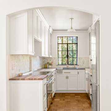
This condo remodel consisted of redoing the kitchen layout and design to maximize the small space, while adding built-in storage throughout the home for added functionality. The kitchen was inspired by art-deco design elements mixed with classic style. The white painted custom cabinetry against the darker granite and butcher block split top counters creates a multi-layer visual interest in this refreshed kitchen. The history of the condo was honored with elements like the parquet flooring, arched doorways, and picture crown molding. Specially curated apartment sized appliances were added to economize the space while still matching our clients style. In other areas of the home, unused small closets and shelving were replaced with custom built-ins that added need storage but also beautiful design elements, matching the rest of the remodel. The final result was a new space that modernized the home and added functionality for our clients, while respecting the previous historic design of the original condo.
 Gerarden Fabrication & Design
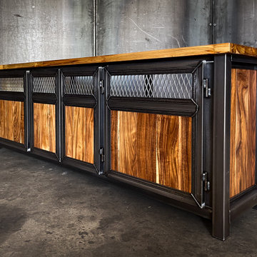
This expansive, custom-crafted industrial credenza makes a sophisticated statement by blending heavy-duty metalwork with the striking, swirling grain of rich solid wood. Grounded by a robust, welded dark steel skeleton frame, the piece is topped with a beautiful multi-toned wood countertop and matching side panels that bring organic warmth to the industrial structure.
The front facade is defined by a continuous bank of four identical, custom-fabricated cabinet doors. Each door boasts a highly unique split-panel design, featuring an upper section of industrial expanded metal mesh—perfect for media ventilation and remote functionality—paired with a lower section of solid wood. Every door is meticulously encased in a heavy, custom-welded steel frame, perfectly framing the premium exterior barrel hinges and emphasizing the robust, architectural craftsmanship of the piece.
 House to Home Solutions
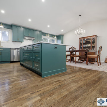
A modern transformation was in store for this abused split-level Rockville, MD home. A previous "renovation" created some non-functional spaces and odd transitions. At the center of the design was an antique chandelier that the homeowners acquired from an estate sale early in their marriage, so that challenge was integrating old and new into the shared space.
So many walls came down and one wall went up. This family now has not only an open and functional space, but it is dripping with luxury details like the custom cabinets in a glorious emerald green color from Benjamin Moore called "Gondola Ride", gold tone hardware and wall sconces, and a stunning Borghini Gold quartz counter from Emerstone that carries up to the backsplash.
Outlets hidden under the cabinets provide plenty of power for small appliances. The cabinetry is loaded with smart features like a trash and recycling center, deep pot storage, gigantic storage pantries flanking the refrigerator and a generous island that provides seating for 4 and hidden storage. Valence boxes create a home for the 3 gold scones that tie the kitchen and the dining buffer together. Dimmable led surface lights throughout provide ample illumination without detracting from the statement lighting in the room. The newly refinished hardwood floors complete the look.
 Gappsi
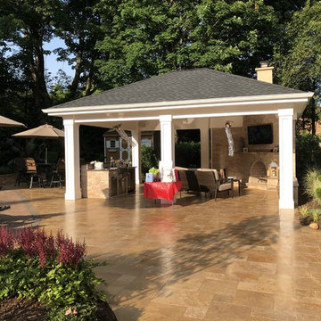
This 20x24 pavilion was designed and built by Gappsi in Dix Hills, NY. We built it with 6 columns, all wrapped with synthetic wood and Azek. This outdoor structure allows the homeowners to enjoy their backyard in both sunny and rainy days. The pavilion not only looks elegant, but it's also very functional and includes great amenities.
A wood burning fireplace is accompanied with a large screen TV and enough room for a comfortable couch area in front of it. Underneath the pavilion, we installed a bar island with a sink, storage cabinets, and refrigerator; and we installed an outdoor changing room with a shower. The adjacent area is already set up for a future outdoor spa to be placed also.
All white trim, moldings, and maintenance-free paneling were used to veneer columns and ceiling. The fireplace and bar island were veneered with tumbled split face travertine veneers to match the travertine french pattern sealed patio throughout the pavilion and surrounding area. Gappsi supplied all the materials used in this project.
https://www.youtube.com/watch?v=6iIGaMppAxg&feature=youtu.be

Sponsored
Columbus, OH

Structural Remodeling
Franklin County's Heavy Timber Specialists | Best of Houzz 2020!
 TVL Creative Ltd.
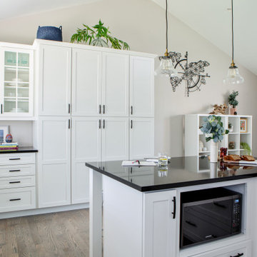
The Oak Street renovation has completely transformed the 70’s era split level home into a sophisticated modern oasis! By extending the kitchen into the existing dining room space, we’re able to maximize functionality and flow between the kitchen and new dining room area. By opening up the wall to create a large pass-through between kitchen and dining, we’ve created the perfect solution to visibly combine all areas and make an ideal design solution for entertaining while providing plenty of seating around the peninsula. High vaulted ceilings exaggerate the ceiling height and work beautifully with the tall cabinetry which brings the down the human scale of vertical space. Slick black Cambria Black quartz countertops and dark metal finishes provide high contrast against the white cabinets and create a high end look. A warm gray stained oak hardwood flooring adds warmth to the space keeping the overall look light and soft. It’s easy to see why this beautiful kitchen transformation has become the heart of the home with a new functional, modern design for the whole family.
 Interior Changes home design & consulting
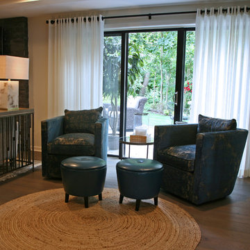
The end of the new living room has a nice place for morning coffee or evening coctails. There is direct view to the lake through the side doors and plenty of natural light from the outdoor patio. These two swivel chairs offer casual seating and a balance to an elongated room with three functions. Blue is the thread in this house, and here it gets repeated!
 Klopf Architecture
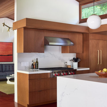
Nestled in the hills of Orinda, California, this 1951 residence is one of only seven extant homes, now known as “The Magnificent Seven”, designed by architect Olof Dahlstrand, a protégé of Frank Lloyd Wright. With its low-slung rooflines, natural materials, and deep integration with the sloping landscape, the home is a pristine example of mid-century modern design inspired by Wright’s organic principles. Over the years, prior homeowners have emphasized preservation, ensuring that the house remained relatively untouched. Each owner has respected the original architecture and stayed true to Dahlstrand’s intent. When a family of five—two college-aged sons and a middle school-aged daughter—acquired the property, they were captivated by its history, legacy of care, and architectural significance. While they appreciated Dahlstrand’s original vision, they also recognized the need to adapt the home for contemporary living while preserving its design integrity.
The remodel was conceived as a thoughtful response to the past—an effort to bring the house into the 21st century without compromising its soul. The primary mandate was to maintain architectural continuity while improving the functionality, comfort, and livability for a modern family. The design team—architects and contractor alike—worked with a shared reverence for the original architecture, allowing that mindset to guide even the most technical or pragmatic decisions.
A key objective was to increase natural light in the kitchen—a departure from Wrightian principles of enclosed, intimate cooking spaces—while maintaining the home’s architectural language. The kitchen was reconfigured to foster a stronger connection to adjacent living spaces while retaining the underlying concept of spatial separation. One of the most transformative architectural changes was the removal of a ridge beam that was originally planned to remain visible through the kitchen. During construction, the team collaborated on a better solution: a wide-flanged steel beam concealed within the roof envelope. This subtle move preserved the clean lines and ceiling continuity, a modern update carried out with utmost respect for the existing framework.
The home’s original powder room, previously accessible only through the kitchen, was relocated for better flow and privacy. A new powder room was carved out of former kitchen cabinetry—a narrow, interior space that could have felt dark and enclosed. To avoid this, the design extended the line of original transom windows into the new powder room and added a skylight above the vanity. The result is a bright and airy space that feels consistent with the rest of the home. Other updates included the installation of new solid-core interior doors with veneers carefully matched to the original mahogany, enhancing the continuity of the interiors. Even smaller decisions, such as placing the door knobs at 42 inches high, mirrored the original proportions. Every choice reflected a shared belief between the architect, contractor, and client: that new work should serve the integrity of the old.
The home’s extensive interior redwood millwork and paneling was meticulously restored. Where new materials were introduced—such as the replacement redwood soffit paneling—the contractor took pains to find finish nails that matched the original, rather than using modern equivalents. This level of craftsmanship and collaboration defined the project. It extended even to the detailing of a blind door to the new powder room, which had to disappear into the existing redwood board-and-batten wall. It was a team effort: the owner found a suitable handle, the architects devised the custom in-swing mechanism, and the contractor executed it so the door aligned precisely with the battens. Throughout, the homeowners were deeply engaged in the design process. One, a meticulous design enthusiast, focused on aesthetic integrity and historic detail. The other brought a practical and function-driven perspective, ensuring that new fixtures and materials would be durable and require minimal maintenance.
While the home’s location posed no major site challenges, sustainability was a key concern. The team upgraded the roof insulation, installed solar panels with battery storage, and added ductless mini-split cooling systems. Lighting was another area where modern technology was woven into a historic framework: new square LED fixtures echo the original custom perimeter soffit lights, maintaining the design language while offering advanced performance.
A planned expansion of a bedroom into suite with a bathroom had to be shelved due to budget constraints and the high cost of below-grade foundation work. Still, the team focused their efforts on making the most of the existing footprint, resolving constraints through design ingenuity rather than adding square footage. This renovation represents a collaborative achievement in preserving and evolving a historically significant home. Every decision was shaped by a shared ethos among clients, architects, and contractor: to maintain the home’s architectural soul while updating it for contemporary life. The result is a timeless modernist residence that continues Olof Dahlstrand’s legacy, remaining grounded in nature, craftsmanship, and human-scale design.
Klopf Architecture Team: John Klopf, AIA, Klara Kevane, Fernanda Bernardes
Interior Architectural Design: Klopf Architecture
Structural Engineer: Daniel Bastiao
Contractor: Don Larwood, Larwood Construction
Photography: Mariko Reed
Year Completed: 2022
 Carolina V. Gentry, RID
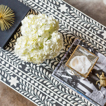
A jewel-box townhouse with a high/low approach gave our busy working couple a design-forward space, arousing a new sense of happiness and pride in their home. With a love for entertaining, our clients needed a space that would meet their functional needs and be a reflection of them. They brought on Pulp to create a vision that would functionally articulate their style. Our design team imagined this edgy concept with lots of unique style elements, texture, and contrast. Pulp mixed luxury items, such as the bone-inlay cocktail table and textual black croc wall covering, and offset them with more affordable whimsical touches, like individual framed feathers. Beth and Carolina pushed their tastes to the limit with unexpected touches, like the split face bookends and the teak hand chair, to add a quirky layer and graphic edge that our homeowners would come to fall in love with.
 House to Home Solutions
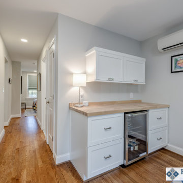
We were thrilled to partner with our clients in updating and renovating the entire main floor of their inviting Silver Spring home. Tucked away in one of the area’s most beautiful and historic neighborhoods this once ultra-traditional-style home is now the ideal blend of past and present. Knowing that we were not only bringing their space current but also creating a tailored in-law suite for their mother’s upcoming stay — we got right to work on our mission of removing all obstacles to this family’s vision.
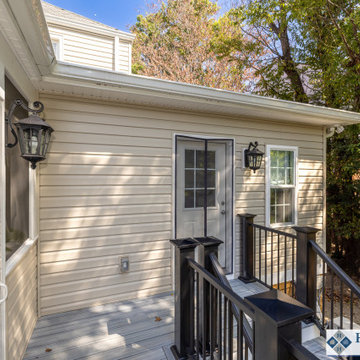
This comprehensive project includes a larger, more functional kitchen plus Great Room addition; in-law suite with bedroom, bathroom, kitchenette and living space; family room; and screened in porch / deck combination ideal for grilling, entertaining and enjoying the outdoors.
The expansive and open-layout-kitchen features Dura Supreme Shaker Cabinetry painted white and paired with glistening quartz counters. The space continues on and seamlessly opens up into the breezy Great Room and dining area.
The newly equipped Mini-Split HVAC System provides independent temperature control and the elegant Universal Design In-Law Bathroom ensures both safety and usability.
Hardwood flooring was installed and the existing flooring throughout was refinished to match — giving way to the smooth and continuous feel throughout the entire main level.
We are proud to have created and delivered this transitional redesign and remodel all while keeping a small footprint for the in-law suite and not losing any of the original space.
 House to Home Solutions
We were thrilled to partner with our clients in updating and renovating the entire main floor of their inviting Silver Spring home. Tucked away in one of the area’s most beautiful and historic neighborhoods this once ultra-traditional-style home is now the ideal blend of past and present. Knowing that we were not only bringing their space current but also creating a tailored in-law suite for their mother’s upcoming stay — we got right to work on our mission of removing all obstacles to this family’s vision.
This comprehensive project includes a larger, more functional kitchen plus Great Room addition; in-law suite with bedroom, bathroom, kitchenette and living space; family room; and screened in porch / deck combination ideal for grilling, entertaining and enjoying the outdoors.
The expansive and open-layout-kitchen features Dura Supreme Shaker Cabinetry painted white and paired with glistening quartz counters. The space continues on and seamlessly opens up into the breezy Great Room and dining area.
The newly equipped Mini-Split HVAC System provides independent temperature control and the elegant Universal Design In-Law Bathroom ensures both safety and usability.
Hardwood flooring was installed and the existing flooring throughout was refinished to match — giving way to the smooth and continuous feel throughout the entire main level.
We are proud to have created and delivered this transitional redesign and remodel all while keeping a small footprint for the in-law suite and not losing any of the original space.


 Stearns Design Build
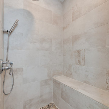
Before the remodel, this bathroom was not functional at all! It was a large space that felt very crowded, so our intention was to increase the size and maximize the space. Everything in this bathroom was cramped together and let’s not forget the awful phonebooth shower. (fingers crossed phonebooth showers stay in the past!) Collectively, we set out to re-envision a bathroom that is functional and relaxing.
In most cases, it’s difficult to accomplish everything on your wish list. By splitting up the double sinks and putting the shower in between the two, it made maneuvering around this bathroom much easier. Before this bathroom had a ton of wasted space and while it was a challenge; we were thrilled with the final design and outcome.
 Skill Construction & Design, LLC
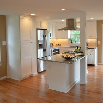
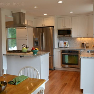
There are so many design elements to this kitchen, I almost don’t know where to start. Bright and airy with crisp clean white cabinets, the kitchen is open and welcoming. Still crisp but gently contrasting, the stainless steel appliance add depth amid the white. To keep this kitchen warm, natural oak covers the floors and a toasted wheat color washes the walls. And then there is the architectural elements. You know. That post and beam in the middle of the room. It’s the center of attention.
When you walk into a room your eyes roam around, establishing the size and shape of the room as your feet take you forward. From the front door of this home straight ahead you encountered this wall. The dining area to the right gives you a glimpse of things to come. Where there is a dining room you will usually find a kitchen.
The architecture of years gone by consistently hides the kitchen, the heart of the home, behind walls. I sympathize with my Mom, and all the other Moms, who have had to spend so much time tucked into a tight kitchen, away from the family. This wall had to go, but it was structural. We needed its support but not its bulk.
So we got rid of the bulk and only the bulk. Instead of a wall we have a post and beam, offering all of the structure we need. We could have installed a huge steel beam and reconfigure the joists to upset the beam, but why? The small beam and post add an incredible architectural element. It’s turning lemons into lemon, we simply made the most of what we had. It may be functional but it’s so fantastic. It looks like we created the effect just for the drama.
The original kitchen may have had a working triangle and some counter space, but it was fairly small, with each area only a step or two away. The dark cabinets made the space feel even smaller and the butcher block patterned laminate counter tops were very dated. The appliances were feeling their age as well, from a coil burner electric stove to a top freezer refrigerator. To keep this kitchen within its space, a half wall separated it from the dining area.
With the wall gone we borrowed some space from the living room and extended what was a U shaped kitchen into an L. At the living room window we start our new kitchen. We kept a small part of the wall to support the other end of our decorative beam. Sandwiched between a large pantry and our new French door refrigerator, the wall disappears. With our new open floor plan a sizable island was in order.
We split our cooking areas and installed a continuous grill gas cooktop into the island. A sleek island hood takes care of exhaust and adds an extra element to our architectural feature. Under the cooktop we added over-sized drawers for pots and pan storage. The frameless cabinets from New River Cabinetry are maple, painted white, with the Herndon door style. With the cooktop safely nestled into our island, we still had to add an oven.
We used the space where the old range sat for a large single oven of stainless steel and glass. If it worked for one, why not two? We created a home for a microwave in the wall cabinets. It’s perfect for heating leftovers so close to the refrigerator.
An important consideration for hot spots in your kitchen is landing zones. Each of our cooking areas have generous landing zones, one on each side of the cooktop and an entire counter area above or below the ovens, depending on which one you’re using.
We wanted to give the sink area more room so the half wall had to come out. We moved the trash and recycle cans into a cabinet, removed the heavy soffits and kept the sink under the window.
With that little bit of extra space we were able to add a larger cabinet above the dishwasher and slide it all down. This used to be where the carpeting met the vinyl floor, but all of it is gone. Long oak planks eliminate that final divide between the kitchen and the dining area, while adding visual length to the area. White wall cabinets on each side of the window reflect the sunlight for a brighter view.
With all of the darker cabinetry the backsplash walls had been painted white. Even still, there was a darkness in the corners and it wasn’t very exciting. We wanted to add visual interest and reflect the new under-cabinet lighting, eliminating the shadows in this corner.
With 1″x 2″ Arabescato Honed marble mosaics and those under-cabinet lights, we achieved the perfect balance. The marble has subtle swirls in gray and beige on a clean white background, but with the honed finish the light is softly reflected instead of glaring. For granite, we chose the soft gray tones of Luna Pearl. The speckles of gray and beige are a gentle contrast to the white cabinets and emulate the color of the stainless steel.
Between the carpet, red half wall, dark railing and dated light fixture, the dining area felt tired. Since the kitchen lacked sufficient storage, a large utility cabinet crowded the table space without adding any decorate elements.
Although it didn’t get any bigger, our dining area feels fresher and more open too. With the oak flooring joining the area to the rest of our space and the toasted wheat on the walls, the white table and chairs compliment the cabinetry while contrasting the warmer colors. We replaced the chandelier with recessed lighting and changed that railing too.
With our new open floor plan, we ended up with a fairly open area in between our foyer closet and the living room window. Not one to miss an opportunity, we filled the space with a multi-functional work space.
With the sunlight streaming in this bright corner works for anything this family needs.
There’s plenty of space for a chair under this large desk drawer. A closed cabinet below, glass doors above and lots of open shelving let you store and or showcase your belongings. We added a lite area at the top to keep away the darker corners.
The transformation is complete. This kitchen and all of its features are truly the center of attention in this home.
http://www.designsbyskill.com/
http://www.rjkconstructioninc.com/
 House to Home Solutions
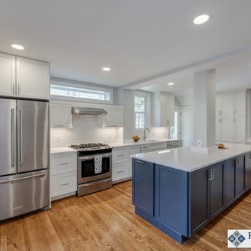
We were thrilled to partner with our clients in updating and renovating the entire main floor of their inviting Silver Spring home. Tucked away in one of the area’s most beautiful and historic neighborhoods this once ultra-traditional-style home is now the ideal blend of past and present. Knowing that we were not only bringing their space current but also creating a tailored in-law suite for their mother’s upcoming stay — we got right to work on our mission of removing all obstacles to this family’s vision.
This comprehensive project includes a larger, more functional kitchen plus Great Room addition; in-law suite with bedroom, bathroom, kitchenette and living space; family room; and screened in porch / deck combination ideal for grilling, entertaining and enjoying the outdoors.
The expansive and open-layout-kitchen features Dura Supreme Shaker Cabinetry painted white and paired with glistening quartz counters. The space continues on and seamlessly opens up into the breezy Great Room and dining area.
The newly equipped Mini-Split HVAC System provides independent temperature control and the elegant Universal Design In-Law Bathroom ensures both safety and usability.
Hardwood flooring was installed and the existing flooring throughout was refinished to match — giving way to the smooth and continuous feel throughout the entire main level.
We are proud to have created and delivered this transitional redesign and remodel all while keeping a small footprint for the in-law suite and not losing any of the original space.
 Skill Construction & Design, LLC
There are so many design elements to this kitchen, I almost don’t know where to start. Bright and airy with crisp clean white cabinets, the kitchen is open and welcoming. Still crisp but gently contrasting, the stainless steel appliance add depth amid the white. To keep this kitchen warm, natural oak covers the floors and a toasted wheat color washes the walls. And then there is the architectural elements. You know. That post and beam in the middle of the room. It’s the center of attention.
When you walk into a room your eyes roam around, establishing the size and shape of the room as your feet take you forward. From the front door of this home straight ahead you encountered this wall. The dining area to the right gives you a glimpse of things to come. Where there is a dining room you will usually find a kitchen.
The architecture of years gone by consistently hides the kitchen, the heart of the home, behind walls. I sympathize with my Mom, and all the other Moms, who have had to spend so much time tucked into a tight kitchen, away from the family. This wall had to go, but it was structural. We needed its support but not its bulk.
So we got rid of the bulk and only the bulk. Instead of a wall we have a post and beam, offering all of the structure we need. We could have installed a huge steel beam and reconfigure the joists to upset the beam, but why? The small beam and post add an incredible architectural element. It’s turning lemons into lemon, we simply made the most of what we had. It may be functional but it’s so fantastic. It looks like we created the effect just for the drama.
The original kitchen may have had a working triangle and some counter space, but it was fairly small, with each area only a step or two away. The dark cabinets made the space feel even smaller and the butcher block patterned laminate counter tops were very dated. The appliances were feeling their age as well, from a coil burner electric stove to a top freezer refrigerator. To keep this kitchen within its space, a half wall separated it from the dining area.
With the wall gone we borrowed some space from the living room and extended what was a U shaped kitchen into an L. At the living room window we start our new kitchen. We kept a small part of the wall to support the other end of our decorative beam. Sandwiched between a large pantry and our new French door refrigerator, the wall disappears. With our new open floor plan a sizable island was in order.
We split our cooking areas and installed a continuous grill gas cooktop into the island. A sleek island hood takes care of exhaust and adds an extra element to our architectural feature. Under the cooktop we added over-sized drawers for pots and pan storage. The frameless cabinets from New River Cabinetry are maple, painted white, with the Herndon door style. With the cooktop safely nestled into our island, we still had to add an oven.
We used the space where the old range sat for a large single oven of stainless steel and glass. If it worked for one, why not two? We created a home for a microwave in the wall cabinets. It’s perfect for heating leftovers so close to the refrigerator.
An important consideration for hot spots in your kitchen is landing zones. Each of our cooking areas have generous landing zones, one on each side of the cooktop and an entire counter area above or below the ovens, depending on which one you’re using.
We wanted to give the sink area more room so the half wall had to come out. We moved the trash and recycle cans into a cabinet, removed the heavy soffits and kept the sink under the window.
With that little bit of extra space we were able to add a larger cabinet above the dishwasher and slide it all down. This used to be where the carpeting met the vinyl floor, but all of it is gone. Long oak planks eliminate that final divide between the kitchen and the dining area, while adding visual length to the area. White wall cabinets on each side of the window reflect the sunlight for a brighter view.
With all of the darker cabinetry the backsplash walls had been painted white. Even still, there was a darkness in the corners and it wasn’t very exciting. We wanted to add visual interest and reflect the new under-cabinet lighting, eliminating the shadows in this corner.
With 1″x 2″ Arabescato Honed marble mosaics and those under-cabinet lights, we achieved the perfect balance. The marble has subtle swirls in gray and beige on a clean white background, but with the honed finish the light is softly reflected instead of glaring. For granite, we chose the soft gray tones of Luna Pearl. The speckles of gray and beige are a gentle contrast to the white cabinets and emulate the color of the stainless steel.
Between the carpet, red half wall, dark railing and dated light fixture, the dining area felt tired. Since the kitchen lacked sufficient storage, a large utility cabinet crowded the table space without adding any decorate elements.
Although it didn’t get any bigger, our dining area feels fresher and more open too. With the oak flooring joining the area to the rest of our space and the toasted wheat on the walls, the white table and chairs compliment the cabinetry while contrasting the warmer colors. We replaced the chandelier with recessed lighting and changed that railing too.
With our new open floor plan, we ended up with a fairly open area in between our foyer closet and the living room window. Not one to miss an opportunity, we filled the space with a multi-functional work space.
With the sunlight streaming in this bright corner works for anything this family needs.
There’s plenty of space for a chair under this large desk drawer. A closed cabinet below, glass doors above and lots of open shelving let you store and or showcase your belongings. We added a lite area at the top to keep away the darker corners.
The transformation is complete. This kitchen and all of its features are truly the center of attention in this home.
http://www.designsbyskill.com/
http://www.rjkconstructioninc.com/

 House to Home Solutions
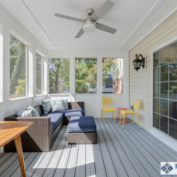
We were thrilled to partner with our clients in updating and renovating the entire main floor of their inviting Silver Spring home. Tucked away in one of the area’s most beautiful and historic neighborhoods this once ultra-traditional-style home is now the ideal blend of past and present. Knowing that we were not only bringing their space current but also creating a tailored in-law suite for their mother’s upcoming stay — we got right to work on our mission of removing all obstacles to this family’s vision.
This comprehensive project includes a larger, more functional kitchen plus Great Room addition; in-law suite with bedroom, bathroom, kitchenette and living space; family room; and screened in porch / deck combination ideal for grilling, entertaining and enjoying the outdoors.
The expansive and open-layout-kitchen features Dura Supreme Shaker Cabinetry painted white and paired with glistening quartz counters. The space continues on and seamlessly opens up into the breezy Great Room and dining area.
The newly equipped Mini-Split HVAC System provides independent temperature control and the elegant Universal Design In-Law Bathroom ensures both safety and usability.
Hardwood flooring was installed and the existing flooring throughout was refinished to match — giving way to the smooth and continuous feel throughout the entire main level.
We are proud to have created and delivered this transitional redesign and remodel all while keeping a small footprint for the in-law suite and not losing any of the original space.
 High Definition Home Remodeling, Inc
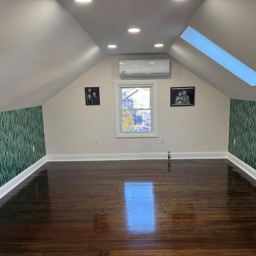
Completed attic home gym created as part of a comprehensive dormer and attic conversion. The finished space features dark-stained hardwood flooring, a large skylight, recessed LED lighting, a dedicated mini-split heating and cooling system, and decorative green accent wallpaper along the knee walls. Integrated low-profile access doors provide discreet storage while preserving the room’s clean, open layout and maximizing the functionality of the sloped attic ceiling.
 Architectural Collaborative
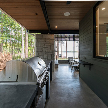
We designed this 3,162 square foot home for empty-nesters who love lake life. Functionally, the home accommodates multiple generations. Elderly in-laws stay for prolonged periods, and the homeowners are thinking ahead to their own aging in place. This required two master suites on the first floor. Accommodations were made for visiting children upstairs. Aside from the functional needs of the occupants, our clients desired a home which maximizes indoor connection to the lake, provides covered outdoor living, and is conducive to entertaining. Our concept celebrates the natural surroundings through materials, views, daylighting, and building massing.
We placed all main public living areas along the rear of the house to capitalize on the lake views while efficiently stacking the bedrooms and bathrooms in a two-story side wing. Secondary support spaces are integrated across the front of the house with the dramatic foyer. The front elevation, with painted green and natural wood siding and soffits, blends harmoniously with wooded surroundings. The lines and contrasting colors of the light granite wall and silver roofline draws attention toward the entry and through the house to the real focus: the water. The one-story roof over the garage and support spaces takes flight at the entry, wraps the two-story wing, turns, and soars again toward the lake as it approaches the rear patio. The granite wall extending from the entry through the interior living space is mirrored along the opposite end of the rear covered patio. These granite bookends direct focus to the lake.
30