
Search results for "Functions split" in Home Design Ideas
 TVL Creative Ltd.
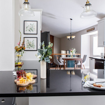
The Oak Street renovation has completely transformed the 70’s era split level home into a sophisticated modern oasis! By extending the kitchen into the existing dining room space, we’re able to maximize functionality and flow between the kitchen and new dining room area. By opening up the wall to create a large pass-through between kitchen and dining, we’ve created the perfect solution to visibly combine all areas and make an ideal design solution for entertaining while providing plenty of seating around the peninsula. High vaulted ceilings exaggerate the ceiling height and work beautifully with the tall cabinetry which brings the down the human scale of vertical space. Slick black Cambria Black quartz countertops and dark metal finishes provide high contrast against the white cabinets and create a high end look. A warm gray stained oak hardwood flooring adds warmth to the space keeping the overall look light and soft. It’s easy to see why this beautiful kitchen transformation has become the heart of the home with a new functional, modern design for the whole family.
 Beth Dotolo, ASID, RID, NCIDQ
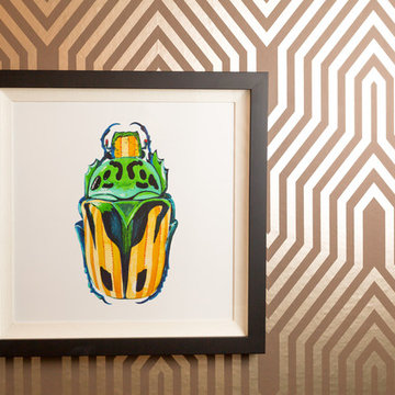
A jewel box townhouse with a high/low approach gave our busy working couple a design-forward space, arousing a new sense of happiness and pride in their home. With a love for entertaining, our clients needed a space that would meet their functional needs and be a reflection of them. They brought on Pulp to create a vision that would functionally articulate their style. Our design team imagined this edgy concept with lots of unique style elements, texture, and contrast. Pulp mixed luxury items, such as the bone-inlay cocktail table and textual black croc wall covering, and offset them with more affordable whimsical touches, like individual framed feathers. Beth and Carolina pushed their tastes to the limit with unexpected touches, like the split face bookends and the teak hand chair, to add a quirky layer and graphic edge that our homeowners would come to fall in love with.
 Skill Construction & Design, LLC
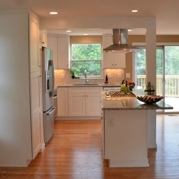
There are so many design elements to this kitchen, I almost don’t know where to start. Bright and airy with crisp clean white cabinets, the kitchen is open and welcoming. Still crisp but gently contrasting, the stainless steel appliance add depth amid the white. To keep this kitchen warm, natural oak covers the floors and a toasted wheat color washes the walls. And then there is the architectural elements. You know. That post and beam in the middle of the room. It’s the center of attention.
When you walk into a room your eyes roam around, establishing the size and shape of the room as your feet take you forward. From the front door of this home straight ahead you encountered this wall. The dining area to the right gives you a glimpse of things to come. Where there is a dining room you will usually find a kitchen.
The architecture of years gone by consistently hides the kitchen, the heart of the home, behind walls. I sympathize with my Mom, and all the other Moms, who have had to spend so much time tucked into a tight kitchen, away from the family. This wall had to go, but it was structural. We needed its support but not its bulk.
So we got rid of the bulk and only the bulk. Instead of a wall we have a post and beam, offering all of the structure we need. We could have installed a huge steel beam and reconfigure the joists to upset the beam, but why? The small beam and post add an incredible architectural element. It’s turning lemons into lemon, we simply made the most of what we had. It may be functional but it’s so fantastic. It looks like we created the effect just for the drama.
The original kitchen may have had a working triangle and some counter space, but it was fairly small, with each area only a step or two away. The dark cabinets made the space feel even smaller and the butcher block patterned laminate counter tops were very dated. The appliances were feeling their age as well, from a coil burner electric stove to a top freezer refrigerator. To keep this kitchen within its space, a half wall separated it from the dining area.
With the wall gone we borrowed some space from the living room and extended what was a U shaped kitchen into an L. At the living room window we start our new kitchen. We kept a small part of the wall to support the other end of our decorative beam. Sandwiched between a large pantry and our new French door refrigerator, the wall disappears. With our new open floor plan a sizable island was in order.
We split our cooking areas and installed a continuous grill gas cooktop into the island. A sleek island hood takes care of exhaust and adds an extra element to our architectural feature. Under the cooktop we added over-sized drawers for pots and pan storage. The frameless cabinets from New River Cabinetry are maple, painted white, with the Herndon door style. With the cooktop safely nestled into our island, we still had to add an oven.
We used the space where the old range sat for a large single oven of stainless steel and glass. If it worked for one, why not two? We created a home for a microwave in the wall cabinets. It’s perfect for heating leftovers so close to the refrigerator.
An important consideration for hot spots in your kitchen is landing zones. Each of our cooking areas have generous landing zones, one on each side of the cooktop and an entire counter area above or below the ovens, depending on which one you’re using.
We wanted to give the sink area more room so the half wall had to come out. We moved the trash and recycle cans into a cabinet, removed the heavy soffits and kept the sink under the window.
With that little bit of extra space we were able to add a larger cabinet above the dishwasher and slide it all down. This used to be where the carpeting met the vinyl floor, but all of it is gone. Long oak planks eliminate that final divide between the kitchen and the dining area, while adding visual length to the area. White wall cabinets on each side of the window reflect the sunlight for a brighter view.
With all of the darker cabinetry the backsplash walls had been painted white. Even still, there was a darkness in the corners and it wasn’t very exciting. We wanted to add visual interest and reflect the new under-cabinet lighting, eliminating the shadows in this corner.
With 1″x 2″ Arabescato Honed marble mosaics and those under-cabinet lights, we achieved the perfect balance. The marble has subtle swirls in gray and beige on a clean white background, but with the honed finish the light is softly reflected instead of glaring. For granite, we chose the soft gray tones of Luna Pearl. The speckles of gray and beige are a gentle contrast to the white cabinets and emulate the color of the stainless steel.
Between the carpet, red half wall, dark railing and dated light fixture, the dining area felt tired. Since the kitchen lacked sufficient storage, a large utility cabinet crowded the table space without adding any decorate elements.
Although it didn’t get any bigger, our dining area feels fresher and more open too. With the oak flooring joining the area to the rest of our space and the toasted wheat on the walls, the white table and chairs compliment the cabinetry while contrasting the warmer colors. We replaced the chandelier with recessed lighting and changed that railing too.
With our new open floor plan, we ended up with a fairly open area in between our foyer closet and the living room window. Not one to miss an opportunity, we filled the space with a multi-functional work space.
With the sunlight streaming in this bright corner works for anything this family needs.
There’s plenty of space for a chair under this large desk drawer. A closed cabinet below, glass doors above and lots of open shelving let you store and or showcase your belongings. We added a lite area at the top to keep away the darker corners.
The transformation is complete. This kitchen and all of its features are truly the center of attention in this home.
http://www.designsbyskill.com/
http://www.rjkconstructioninc.com/
Find the right local pro for your project
 Rockledge Design + Architecture
Part of a major renovation that touched all corners of a 120-year-old Bloomfield home, this project is full of style and charming Victorian details.
As an avid home cook, one of our client’s top priorities was maximizing storage throughout the space. To make the compact kitchen more functional, we removed a small peninsula containing the sink and dishwasher which was splitting the space in half. We also adjusted the size of the windows, bringing them above countertop height which allowed for a new “U-shaped” layout. What this room lacked in useable wall space was made up for in height — we took advantage of the generous 9-foot tall space, bringing the custom cabinetry all the way to the ceiling. Our client also opted for a slightly smaller Euro-style refrigerator, allowing for even more storage along that wall.
Central to the refrigerator, eco-friendly induction range, and farmhouse style sink, a hand carved antique Spanish work table provides the perfect prep zone, complete with an adjustable high-low fluted ceramic pendant above. A few other places where form meets function: a brass hanging rail along the range wall, a custom integral drainboard in the soapstone countertop, under cabinet lighting and hidden outlets, cushioned anti-fatigue Marmoleum sheet flooring, and a show-stopping gantry style faucet in a living unlacquered brass finish.
 TVL Creative Ltd.
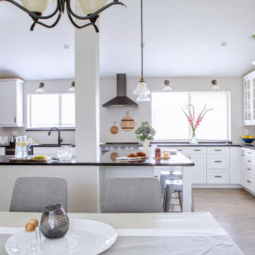
The Oak Street renovation has completely transformed the 70’s era split level home into a sophisticated modern oasis! By extending the kitchen into the existing dining room space, we’re able to maximize functionality and flow between the kitchen and new dining room area. By opening up the wall to create a large pass-through between kitchen and dining, we’ve created the perfect solution to visibly combine all areas and make an ideal design solution for entertaining while providing plenty of seating around the peninsula. High vaulted ceilings exaggerate the ceiling height and work beautifully with the tall cabinetry which brings the down the human scale of vertical space. Slick black Cambria Black quartz countertops and dark metal finishes provide high contrast against the white cabinets and create a high end look. A warm gray stained oak hardwood flooring adds warmth to the space keeping the overall look light and soft. It’s easy to see why this beautiful kitchen transformation has become the heart of the home with a new functional, modern design for the whole family.
 House to Home Solutions
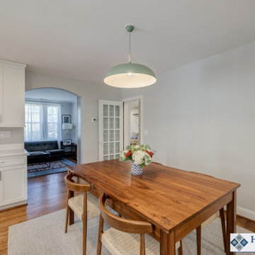
We were thrilled to partner with our clients in updating and renovating the entire main floor of their inviting Silver Spring home. Tucked away in one of the area’s most beautiful and historic neighborhoods this once ultra-traditional-style home is now the ideal blend of past and present. Knowing that we were not only bringing their space current but also creating a tailored in-law suite for their mother’s upcoming stay — we got right to work on our mission of removing all obstacles to this family’s vision.
This comprehensive project includes a larger, more functional kitchen plus Great Room addition; in-law suite with bedroom, bathroom, kitchenette and living space; family room; and screened in porch / deck combination ideal for grilling, entertaining and enjoying the outdoors.
The expansive and open-layout-kitchen features Dura Supreme Shaker Cabinetry painted white and paired with glistening quartz counters. The space continues on and seamlessly opens up into the breezy Great Room and dining area.
The newly equipped Mini-Split HVAC System provides independent temperature control and the elegant Universal Design In-Law Bathroom ensures both safety and usability.
Hardwood flooring was installed and the existing flooring throughout was refinished to match — giving way to the smooth and continuous feel throughout the entire main level.
We are proud to have created and delivered this transitional redesign and remodel all while keeping a small footprint for the in-law suite and not losing any of the original space.
 Skill Construction & Design, LLC
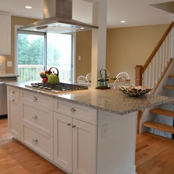
There are so many design elements to this kitchen, I almost don’t know where to start. Bright and airy with crisp clean white cabinets, the kitchen is open and welcoming. Still crisp but gently contrasting, the stainless steel appliance add depth amid the white. To keep this kitchen warm, natural oak covers the floors and a toasted wheat color washes the walls. And then there is the architectural elements. You know. That post and beam in the middle of the room. It’s the center of attention.
When you walk into a room your eyes roam around, establishing the size and shape of the room as your feet take you forward. From the front door of this home straight ahead you encountered this wall. The dining area to the right gives you a glimpse of things to come. Where there is a dining room you will usually find a kitchen.
The architecture of years gone by consistently hides the kitchen, the heart of the home, behind walls. I sympathize with my Mom, and all the other Moms, who have had to spend so much time tucked into a tight kitchen, away from the family. This wall had to go, but it was structural. We needed its support but not its bulk.
So we got rid of the bulk and only the bulk. Instead of a wall we have a post and beam, offering all of the structure we need. We could have installed a huge steel beam and reconfigure the joists to upset the beam, but why? The small beam and post add an incredible architectural element. It’s turning lemons into lemon, we simply made the most of what we had. It may be functional but it’s so fantastic. It looks like we created the effect just for the drama.
The original kitchen may have had a working triangle and some counter space, but it was fairly small, with each area only a step or two away. The dark cabinets made the space feel even smaller and the butcher block patterned laminate counter tops were very dated. The appliances were feeling their age as well, from a coil burner electric stove to a top freezer refrigerator. To keep this kitchen within its space, a half wall separated it from the dining area.
With the wall gone we borrowed some space from the living room and extended what was a U shaped kitchen into an L. At the living room window we start our new kitchen. We kept a small part of the wall to support the other end of our decorative beam. Sandwiched between a large pantry and our new French door refrigerator, the wall disappears. With our new open floor plan a sizable island was in order.
We split our cooking areas and installed a continuous grill gas cooktop into the island. A sleek island hood takes care of exhaust and adds an extra element to our architectural feature. Under the cooktop we added over-sized drawers for pots and pan storage. The frameless cabinets from New River Cabinetry are maple, painted white, with the Herndon door style. With the cooktop safely nestled into our island, we still had to add an oven.
We used the space where the old range sat for a large single oven of stainless steel and glass. If it worked for one, why not two? We created a home for a microwave in the wall cabinets. It’s perfect for heating leftovers so close to the refrigerator.
An important consideration for hot spots in your kitchen is landing zones. Each of our cooking areas have generous landing zones, one on each side of the cooktop and an entire counter area above or below the ovens, depending on which one you’re using.
We wanted to give the sink area more room so the half wall had to come out. We moved the trash and recycle cans into a cabinet, removed the heavy soffits and kept the sink under the window.
With that little bit of extra space we were able to add a larger cabinet above the dishwasher and slide it all down. This used to be where the carpeting met the vinyl floor, but all of it is gone. Long oak planks eliminate that final divide between the kitchen and the dining area, while adding visual length to the area. White wall cabinets on each side of the window reflect the sunlight for a brighter view.
With all of the darker cabinetry the backsplash walls had been painted white. Even still, there was a darkness in the corners and it wasn’t very exciting. We wanted to add visual interest and reflect the new under-cabinet lighting, eliminating the shadows in this corner.
With 1″x 2″ Arabescato Honed marble mosaics and those under-cabinet lights, we achieved the perfect balance. The marble has subtle swirls in gray and beige on a clean white background, but with the honed finish the light is softly reflected instead of glaring. For granite, we chose the soft gray tones of Luna Pearl. The speckles of gray and beige are a gentle contrast to the white cabinets and emulate the color of the stainless steel.
Between the carpet, red half wall, dark railing and dated light fixture, the dining area felt tired. Since the kitchen lacked sufficient storage, a large utility cabinet crowded the table space without adding any decorate elements.
Although it didn’t get any bigger, our dining area feels fresher and more open too. With the oak flooring joining the area to the rest of our space and the toasted wheat on the walls, the white table and chairs compliment the cabinetry while contrasting the warmer colors. We replaced the chandelier with recessed lighting and changed that railing too.
With our new open floor plan, we ended up with a fairly open area in between our foyer closet and the living room window. Not one to miss an opportunity, we filled the space with a multi-functional work space.
With the sunlight streaming in this bright corner works for anything this family needs.
There’s plenty of space for a chair under this large desk drawer. A closed cabinet below, glass doors above and lots of open shelving let you store and or showcase your belongings. We added a lite area at the top to keep away the darker corners.
The transformation is complete. This kitchen and all of its features are truly the center of attention in this home.
http://www.designsbyskill.com/
http://www.rjkconstructioninc.com/

Sponsored
Columbus, OH

Structural Remodeling
Franklin County's Heavy Timber Specialists | Best of Houzz 2020!
 Renz Construction
Heislen Designs
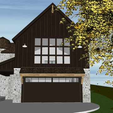
Amazing 2500 sq. ft. barn that will be constructed this spring. Matt has brought all the elements of rustic farm meets modern charm in this amazing functional space. This is going to be an amazing project! Keep checking for updates!
 Nancy Finneson | DeMane Design
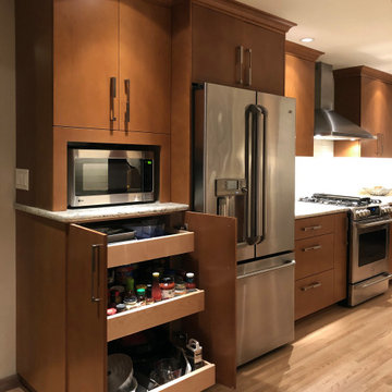
A kitchen remodel started with a big challenge. The homeowner wanted a more open usable space. The kitchen was cramped, dark and didn’t accommodate two people. The result is a beautiful kitchen that took clever space planning. There was a supporting wall in the way of their dreams of an open kitchen. The space was split into two small rooms. For various reasons putting in a supporting beam was not an option. This was a “make it work” challenge. The layout was key to making this kitchen function and also feel open. The wall was removed between the split rooms, but it was necessary to leave a post in place so frankly the ceiling wouldn’t collapse. Many scenarios were considered before the final plan went forward. The supporting post was united into the design. Between the post and the wall, an open cabinet was incorporated. The open shelves are perfect for displaying and quick access for the chef’s cookbooks.
 Rockledge Design + Architecture
Part of a major renovation that touched all corners of a 120-year-old Bloomfield home, this project is full of style and charming Victorian details.
As an avid home cook, one of our client’s top priorities was maximizing storage throughout the space. To make the compact kitchen more functional, we removed a small peninsula containing the sink and dishwasher which was splitting the space in half. We also adjusted the size of the windows, bringing them above countertop height which allowed for a new “U-shaped” layout. What this room lacked in useable wall space was made up for in height — we took advantage of the generous 9-foot tall space, bringing the custom cabinetry all the way to the ceiling. Our client also opted for a slightly smaller Euro-style refrigerator, allowing for even more storage along that wall.
Central to the refrigerator, eco-friendly induction range, and farmhouse style sink, a hand carved antique Spanish work table provides the perfect prep zone, complete with an adjustable high-low fluted ceramic pendant above. A few other places where form meets function: a brass hanging rail along the range wall, a custom integral drainboard in the soapstone countertop, under cabinet lighting and hidden outlets, cushioned anti-fatigue Marmoleum sheet flooring, and a show-stopping gantry style faucet in a living unlacquered brass finish.
 TVL Creative Ltd.
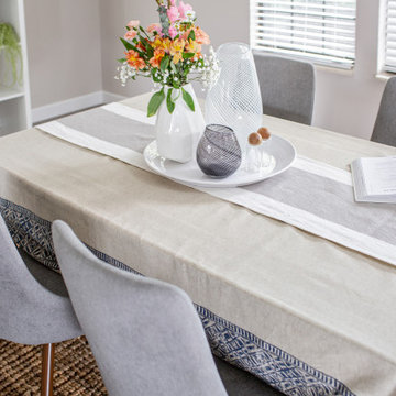
The Oak Street renovation has completely transformed the 70’s era split level home into a sophisticated modern oasis! By extending the kitchen into the existing dining room space, we’re able to maximize functionality and flow between the kitchen and new dining room area. By opening up the wall to create a large pass-through between kitchen and dining, we’ve created the perfect solution to visibly combine all areas and make an ideal design solution for entertaining while providing plenty of seating around the peninsula. High vaulted ceilings exaggerate the ceiling height and work beautifully with the tall cabinetry which brings the down the human scale of vertical space. Slick black Cambria Black quartz countertops and dark metal finishes provide high contrast against the white cabinets and create a high end look. A warm gray stained oak hardwood flooring adds warmth to the space keeping the overall look light and soft. It’s easy to see why this beautiful kitchen transformation has become the heart of the home with a new functional, modern design for the whole family.
 Rockledge Design + Architecture
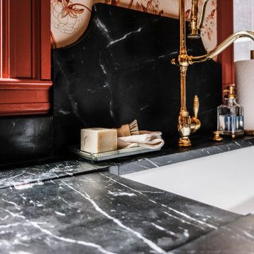
Part of a major renovation that touched all corners of a 120-year-old Bloomfield home, this project is full of style and charming Victorian details.
As an avid home cook, one of our client’s top priorities was maximizing storage throughout the space. To make the compact kitchen more functional, we removed a small peninsula containing the sink and dishwasher which was splitting the space in half. We also adjusted the size of the windows, bringing them above countertop height which allowed for a new “U-shaped” layout. What this room lacked in useable wall space was made up for in height — we took advantage of the generous 9-foot tall space, bringing the custom cabinetry all the way to the ceiling. Our client also opted for a slightly smaller Euro-style refrigerator, allowing for even more storage along that wall.
Central to the refrigerator, eco-friendly induction range, and farmhouse style sink, a hand carved antique Spanish work table provides the perfect prep zone, complete with an adjustable high-low fluted ceramic pendant above. A few other places where form meets function: a brass hanging rail along the range wall, a custom integral drainboard in the soapstone countertop, under cabinet lighting and hidden outlets, cushioned anti-fatigue Marmoleum sheet flooring, and a show-stopping gantry style faucet in a living unlacquered brass finish.
 Boyce Design + Build
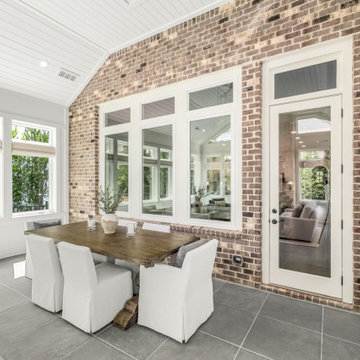
Contemporary style four-season sunroom addition can be used year-round for hosting family gatherings, entertaining friends, or relaxing with a good book while enjoying the inviting views of the landscaped backyard and outdoor patio area. The gable roof sunroom addition features trapezoid windows, a white vaulted tongue and groove ceiling and a blue gray porcelain paver floor tile from Landmark’s Frontier20 collection. A luxurious ventless fireplace, finished in a white split limestone veneer surround with a brown stained custom cedar floating mantle, functions as the focal point and blends in beautifully with the neutral color palette of the custom-built sunroom and chic designer furnishings. All the windows are custom fit with remote controlled smart window shades for energy efficiency and functionality.


 Carolina V. Gentry, RID
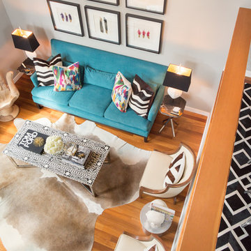
A jewel-box townhouse with a high/low approach gave our busy working couple a design-forward space, arousing a new sense of happiness and pride in their home. With a love for entertaining, our clients needed a space that would meet their functional needs and be a reflection of them. They brought on Pulp to create a vision that would functionally articulate their style. Our design team imagined this edgy concept with lots of unique style elements, texture, and contrast. Pulp mixed luxury items, such as the bone-inlay cocktail table and textual black croc wall covering, and offset them with more affordable whimsical touches, like individual framed feathers. Beth and Carolina pushed their tastes to the limit with unexpected touches, like the split face bookends and the teak hand chair, to add a quirky layer and graphic edge that our homeowners would come to fall in love with.
 F9 Productions Inc.
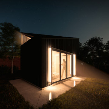
In an era when housing is becoming increasingly scarce, small structures are making a big difference. The Crystal ADU is one of them — a compact, beautifully detailed dwelling designed by F9 Productions to deliver both function and artistry within just 160 square feet.
The Idea
The client came to F9 with their own sketches — early ideas drawn from the fractured symmetry of natural crystals. They envisioned a minimalist refuge that was as expressive as it was efficient.
We took that spark and shaped it into a refined architectural statement: a simple rectangle capped by a striking, asymmetrical roof that catches the light like a cut gem.
Design and Craft
The defining detail — a roof so thin it appears almost weightless — demanded careful problem-solving. Standard framing would have compromised the delicate profile. Instead, our team engineered a custom edge detail that maintains the sleek form while ensuring structural integrity and energy performance.
This kind of precision is what transforms a small project into a showcase of design craft.
Inside the Space
Step inside, and the attention to detail continues.
Every square inch is intentional. Built-in cabinetry wraps the walls, and a fold-down Murphy bed disappears to reveal open living space. In the bathroom, clever storage niches and a tankless water heater make the most of every inch. A skylight above the shower floods the space with natural light — warm, private, and bright.
Efficiency in Every Sense
Compact living comes with natural advantages. The small volume of the Crystal ADU reduces energy use, while a ductless mini-split system maintains comfort year-round.
This simplicity makes the building both efficient and elegant — a perfect reflection of F9’s design philosophy: functional minimalism with a human touch.
The Result
The Crystal ADU shows that size doesn’t define quality — design does.
It’s a small footprint with a big message: that thoughtful architecture can solve real housing challenges while creating spaces people love to inhabit.
The future of housing may be smaller, but with projects like this, it’s infinitely brighter.
 Stearns Design Build
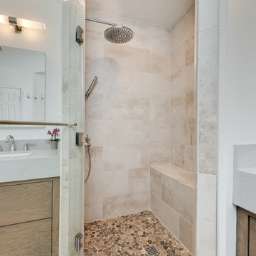
Before the remodel, this bathroom was not functional at all! It was a large space that felt very crowded, so our intention was to increase the size and maximize the space. Everything in this bathroom was cramped together and let’s not forget the awful phonebooth shower. (fingers crossed phonebooth showers stay in the past!) Collectively, we set out to re-envision a bathroom that is functional and relaxing.
In most cases, it’s difficult to accomplish everything on your wish list. By splitting up the double sinks and putting the shower in between the two, it made maneuvering around this bathroom much easier. Before this bathroom had a ton of wasted space and while it was a challenge; we were thrilled with the final design and outcome.
 User
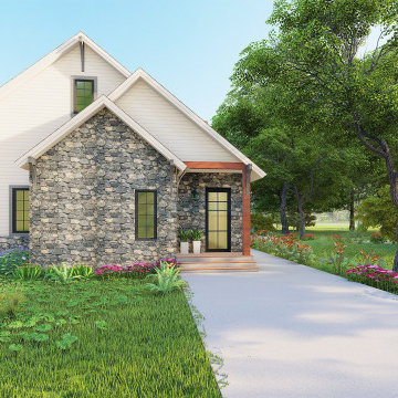
UserThis tiny cottage home is ideal for small bungalow house plans and craftsman house plans. It's a single-family home, or Duplex plan design, mainly used as a vacation/recreational & micro cottage.
This house plan 3 story has no garage. It’s a 3 bedrooms & 3 bathrooms apartment. A covered front porch designs to give a shaded entry for users. The main floor is completed with a master bedroom with a split master bath has a separate tub and shower. Design a patio idea for outdoor recreation space. Other functions of the main floor plan are living space is attached to the foyer, a dining utility area, and in the kitchen a butler's pantry idea with a breakfast nook design to feel luxurious. Upstairs there are another 2 bedrooms, a bath, a mezzanine, and a basement house plan, including a function area storage, media. The play flex room idea to provide homeowners with flexibility as their kid's needs, and a gym that is now important for our modern lifestyle.
It's safe, unique, and economical to build a house with 3 bedrooms that are suitable for users. This cottage house design is best for corner, narrow and view lots.

 Cynthia Prizant - Prizant Design, LLC
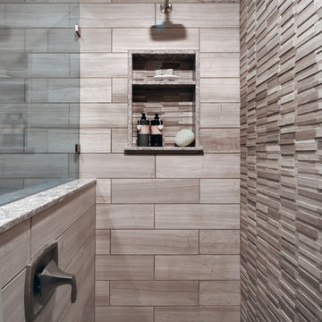
Beautiful, gray, linear mosaic tile is repeated in the shampoo niche to add artistic flair to this very functional, architectural feature.
Photo by Jeri Koegel
 House to Home Solutions
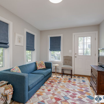
We were thrilled to partner with our clients in updating and renovating the entire main floor of their inviting Silver Spring home. Tucked away in one of the area’s most beautiful and historic neighborhoods this once ultra-traditional-style home is now the ideal blend of past and present. Knowing that we were not only bringing their space current but also creating a tailored in-law suite for their mother’s upcoming stay — we got right to work on our mission of removing all obstacles to this family’s vision.
This comprehensive project includes a larger, more functional kitchen plus Great Room addition; in-law suite with bedroom, bathroom, kitchenette and living space; family room; and screened in porch / deck combination ideal for grilling, entertaining and enjoying the outdoors.
The expansive and open-layout-kitchen features Dura Supreme Shaker Cabinetry painted white and paired with glistening quartz counters. The space continues on and seamlessly opens up into the breezy Great Room and dining area.
The newly equipped Mini-Split HVAC System provides independent temperature control and the elegant Universal Design In-Law Bathroom ensures both safety and usability.
Hardwood flooring was installed and the existing flooring throughout was refinished to match — giving way to the smooth and continuous feel throughout the entire main level.
We are proud to have created and delivered this transitional redesign and remodel all while keeping a small footprint for the in-law suite and not losing any of the original space.
 Skill Construction & Design, LLC
There are so many design elements to this kitchen, I almost don’t know where to start. Bright and airy with crisp clean white cabinets, the kitchen is open and welcoming. Still crisp but gently contrasting, the stainless steel appliance add depth amid the white. To keep this kitchen warm, natural oak covers the floors and a toasted wheat color washes the walls. And then there is the architectural elements. You know. That post and beam in the middle of the room. It’s the center of attention.
When you walk into a room your eyes roam around, establishing the size and shape of the room as your feet take you forward. From the front door of this home straight ahead you encountered this wall. The dining area to the right gives you a glimpse of things to come. Where there is a dining room you will usually find a kitchen.
The architecture of years gone by consistently hides the kitchen, the heart of the home, behind walls. I sympathize with my Mom, and all the other Moms, who have had to spend so much time tucked into a tight kitchen, away from the family. This wall had to go, but it was structural. We needed its support but not its bulk.
So we got rid of the bulk and only the bulk. Instead of a wall we have a post and beam, offering all of the structure we need. We could have installed a huge steel beam and reconfigure the joists to upset the beam, but why? The small beam and post add an incredible architectural element. It’s turning lemons into lemon, we simply made the most of what we had. It may be functional but it’s so fantastic. It looks like we created the effect just for the drama.
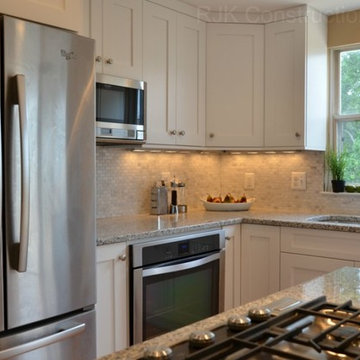
The original kitchen may have had a working triangle and some counter space, but it was fairly small, with each area only a step or two away. The dark cabinets made the space feel even smaller and the butcher block patterned laminate counter tops were very dated. The appliances were feeling their age as well, from a coil burner electric stove to a top freezer refrigerator. To keep this kitchen within its space, a half wall separated it from the dining area.
With the wall gone we borrowed some space from the living room and extended what was a U shaped kitchen into an L. At the living room window we start our new kitchen. We kept a small part of the wall to support the other end of our decorative beam. Sandwiched between a large pantry and our new French door refrigerator, the wall disappears. With our new open floor plan a sizable island was in order.
We split our cooking areas and installed a continuous grill gas cooktop into the island. A sleek island hood takes care of exhaust and adds an extra element to our architectural feature. Under the cooktop we added over-sized drawers for pots and pan storage. The frameless cabinets from New River Cabinetry are maple, painted white, with the Herndon door style. With the cooktop safely nestled into our island, we still had to add an oven.
We used the space where the old range sat for a large single oven of stainless steel and glass. If it worked for one, why not two? We created a home for a microwave in the wall cabinets. It’s perfect for heating leftovers so close to the refrigerator.
An important consideration for hot spots in your kitchen is landing zones. Each of our cooking areas have generous landing zones, one on each side of the cooktop and an entire counter area above or below the ovens, depending on which one you’re using.
We wanted to give the sink area more room so the half wall had to come out. We moved the trash and recycle cans into a cabinet, removed the heavy soffits and kept the sink under the window.
With that little bit of extra space we were able to add a larger cabinet above the dishwasher and slide it all down. This used to be where the carpeting met the vinyl floor, but all of it is gone. Long oak planks eliminate that final divide between the kitchen and the dining area, while adding visual length to the area. White wall cabinets on each side of the window reflect the sunlight for a brighter view.
With all of the darker cabinetry the backsplash walls had been painted white. Even still, there was a darkness in the corners and it wasn’t very exciting. We wanted to add visual interest and reflect the new under-cabinet lighting, eliminating the shadows in this corner.
With 1″x 2″ Arabescato Honed marble mosaics and those under-cabinet lights, we achieved the perfect balance. The marble has subtle swirls in gray and beige on a clean white background, but with the honed finish the light is softly reflected instead of glaring. For granite, we chose the soft gray tones of Luna Pearl. The speckles of gray and beige are a gentle contrast to the white cabinets and emulate the color of the stainless steel.
Between the carpet, red half wall, dark railing and dated light fixture, the dining area felt tired. Since the kitchen lacked sufficient storage, a large utility cabinet crowded the table space without adding any decorate elements.
Although it didn’t get any bigger, our dining area feels fresher and more open too. With the oak flooring joining the area to the rest of our space and the toasted wheat on the walls, the white table and chairs compliment the cabinetry while contrasting the warmer colors. We replaced the chandelier with recessed lighting and changed that railing too.
With our new open floor plan, we ended up with a fairly open area in between our foyer closet and the living room window. Not one to miss an opportunity, we filled the space with a multi-functional work space.
With the sunlight streaming in this bright corner works for anything this family needs.
There’s plenty of space for a chair under this large desk drawer. A closed cabinet below, glass doors above and lots of open shelving let you store and or showcase your belongings. We added a lite area at the top to keep away the darker corners.
The transformation is complete. This kitchen and all of its features are truly the center of attention in this home.
http://www.designsbyskill.com/
http://www.rjkconstructioninc.com/
32