
Search results for "Gestures" in Home Design Ideas
 Jill Lewis Architecture
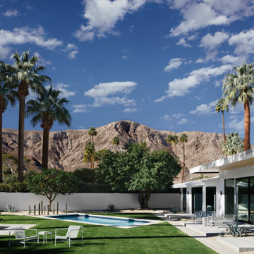
The goal for this mid-century home was to exploit the best features of the property, taking advantage of views, the dramatic light, the potential for an incredible indoor-outdoor experience and the mid-century bones of the house. When we first visited the property, I was struck by the potential for a beautiful mountain view that was currently cut off by a low ceiling height in the main living area. Raising the roof of the main living area became the largest gesture in our scope of work. The former chopped-up side entry and tiny kitchen were combined to make a long, generous kitchen and built-in banquette. The original rhombus-shaped pool was kept, restored and lined with Ann Sacks tiles. In the center of the action, we conceived a large floating desk surface suspended from a black metal screen to define the space and allow filtered light and views to pass between. The clients were drawn to clean lines, pared-down details and highly disciplined palettes of white, grey and matte black. We generally opted for deep, muted colors balanced with crisp white, adding textures to create patterns with the shifting daylight throughout the house. This soothing collection of finishes playing with light and shadow would achieve a peaceful and elegant home that would stand the test of time and honor the landscape of the surrounding area.
Photography: Douglas Friedman

 Amanda Martocchio Architecture
Photo credit Jane Beiles
Located on a beautiful property with a legacy of architectural and landscape innovation, this guest house was originally designed by the offices of Eliot Noyes and Alan Goldberg. Due to its age and expanded use as an in-law dwelling for extended stays, the 1200 sf structure required a renovation and small addition. While one objective was to make the structure function independently of the main house with its own access road, garage, and entrance, another objective was to knit the guest house into the architectural fabric of the property. New window openings deliberately frame landscape and architectural elements on the site, while exterior finishes borrow from that of the main house (cedar, zinc, field stone) bringing unity to the family compound. Inside, the use of lighter materials gives the simple, efficient spaces airiness.
A challenge was to find an interior design vocabulary which is both simple and clean, but not cold or uninteresting. A combination of rough slate, white washed oak, and high gloss lacquer cabinets provide interest and texture, but with their minimal detailing create a sense of calm.
 Mike Schaap Builders
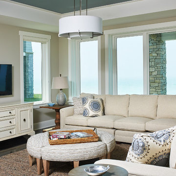
Captivated by South Haven’s natural charm and waterfront beauty, this storybook, waterfront abode is exceptionally true to its lakefront character.
Featuring over 3,600 square feet with five bedroom and three-and-a-half baths, the careful design of this open and charming layout paired with grand views from nearly every room, capture all the warmth and playfulness of lakefront living.
• A beach friendly fiber cement siding in a cheerful shade of blue blends seamlessly with the water backdrop, while contrasting white trim and darker blue window clad lend definition to the exterior.
• An impressive kitchen with stunning Ann Sachs tile backsplash, quartz countertops, richly stained bistro table and Viking Appliances overlook the generous, but clearly defined, living and dining rooms.
• Extensive built-ins with extra storage and workspace, such as a distinctive dining serving piece featuring quartz stone and a lake reflecting mirror, maximize space and make entertaining a breeze.
• Playful design elements like Thibaut wallpaper, braided hemp cabinet insets and white-washed European white oak floors complement the home’s coastal flair with nautical décor and warm hues.
• Fine finishes and rich trim details including wainscot, various painted ceilings, louvered doors on cabinetry, and fireplace surround with kitchen coordinating quartz stone, show off the intricate design gestures.
• Skillfully designed upstairs presents a restful master retreat with private balcony, two guest bedrooms, convenient laundry featuring sleek retractable doors and space maximizing built in bunk beds with ultra-clever steps that provide storage.
• The lower level’s extra guest quarters, additional laundry, full beach bath with top-to-bottom tiled shower, diligent kitchenette, beach-friendly stained concrete floors, outdoor shower that keeps sand at bay, and direct access to the sugary sands of Lake Michigan.
Photography by Ashley Avila
Find the right local pro for your project
 Bureau Namas
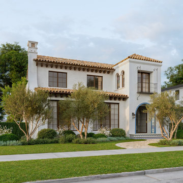
This residence was conceived from the idea of warmth—the feeling of belonging that transforms a house into a home. That sense is reflected in the way natural light fills each space, creating a gentle rhythm of shadow and brightness throughout the day.
Inspired by the legacy of Spanish Colonial Revival architecture in Southern California, the design balances tradition with contemporary living. White stucco walls, a hand-laid clay tile roof, and exposed wood beams anchor the home in its historical lineage, while wrought iron balconies and artisanal tilework lend depth and character. Recessed windows and arched thresholds further echo the architectural language that has long defined Los Angeles residential design.
More than a stylistic gesture, these elements are part of a larger mission: to create custom homes that honor history, celebrate materiality, and offer timeless spaces for modern families. Rising after the Palisades fires, this Mediterranean-inspired residence embodies resilience and renewal—an enduring example of timeless craftsmanship in California’s coastal landscape.
 AIA Pittsburgh
DESIGN + INNOVATION: Award of Excellence
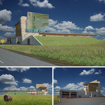
PROJECT: The Prairie House
CLIENT: Name Withheld
ARCHITECTURE FIRM: Fisher ARCHitecture
PHOTOGRAPHER: Fisher ARCHitecture
DESCRIPTION: Designed to relate directly to its location, the Prairie House recontextualizes Midwestern building motifs from the 1950s and ’60s, simultaneously old fashioned and tough yet ambiguously futuristic. Interior spaces are nestled in the ground, with earth sheltered construction protecting from high winds and variable temperatures that characterize this part of the country; rooms have a direct relationship with one of three partially enclosed courtyards that are carved from the solid mass of earth.
JURY COMMENTS: The interesting aspect of this project is the self-imposed exploration of contextualizing a Midwest site where there are only roads and cornfields. The iconographic images remind us of Venturi’s Learning from Las Vegas, from the large-scale billboard and letters to the symbolic buffalo on the renderings. The design gestures all seem responsive to its site both in terms of its cultural heritage and to its environmental realities.

 RoomService 360
Dakota Sideboard is an understated gesture of modern sophistication. Placing extreme emphasis on functional propensities, Dakota Sideboard is designed to address various height and width requirements as well as the need to incorporate luxurious wooden finishes in any environment.
Manufactured in Italy by Cattelan Italia and designed by Alessio Bassan, Dakota Sideboard features Canaletto walnut or burned oak facade with top in graphite painted acid etched extra clear glass and base in graphite steel. Dakota Sideboard is available in four sizes and two heights with the two higher versions featuring lower shelf.

 Andrew van Egmond - Designing garden and landscape
In this garden design, the dune character is defining. The house and garden are bordering the dunes of Katwijk. The space is defined by a large architectural gesture: a prominent terrace made of grey stone. The position of the terrace is in no logical relation to the house, resulting in an apparently random arrangement that allows them to integrate into the capricious dune landscape. Through the large ground level windows, this modern home integrates seamlessly into the garden and into the general landscape. The long, twisted plane naturally guides the eyes towards the point where the sun sets. Ideal for the house’s dwellers who can take a break from their busy lives can spend their afternoons enjoying the sun. Next to the terrace, the water element and the concrete figurehead come together in a composition that doesn’t affect the expression of the lush vegetation. On the contrary, the greenery and the designed elements are in harmony, enhancing each other’s qualities.
Photography:
Annie Beugel
Green constructor:
Spots hoveniers
Publicity:
* “Terra Architecture” magazine
* Chic Garden Concept
 Lincoln Lighthill Architect
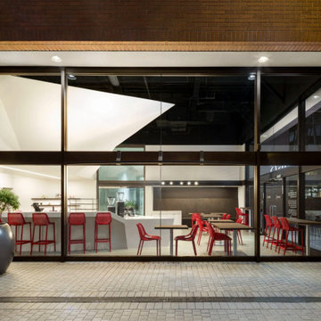
How do you make an impact within a familiar project typology? For our first cafe for Spro Coffee Lab, and their flagship location, we combined a long-held vision of a cafe with a faceted ceiling, their red & white material palette, and the building owner’s desire for an iconic street presence into a unified, minimalist language of angles and facets that extends throughout the cafe.
Overhead, a faceted soffit juts out dramatically over the service bar, the two objects mirroring each other’s footprints and satisfying Health Code requirements for a smooth, cleanable surface overhead. Concealing an egress corridor above that bisects the space, the soffit presents a bold visual gesture through the floor-to-ceiling glass walls of this corner space, beckoning passersby inside.
The service bar points toward the entry, with a minimalist espresso-tap system as the focal point, and angled sections branching off in both directions to create seating and service areas and direct customer flow.
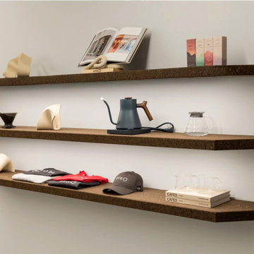
Throughout the space, surfaces customers interact with are clad in chocolate-colored cork, providing a highly textured, tactile contrast to the smooth, white primary materials and complementing the bronze window system, red logos, and customer seating. The unfinished cork is durable and stain-resistant, resilient to the touch, provides acoustic dampening, and is highly sustainable.
The result is a cafe that goes far beyond the project brief, creating a memorable experience and an iconic presence for the brand.
 Lincoln Lighthill Architect
How do you make an impact within a familiar project typology? For our first cafe for Spro Coffee Lab, and their flagship location, we combined a long-held vision of a cafe with a faceted ceiling, their red & white material palette, and the building owner’s desire for an iconic street presence into a unified, minimalist language of angles and facets that extends throughout the cafe.
Overhead, a faceted soffit juts out dramatically over the service bar, the two objects mirroring each other’s footprints and satisfying Health Code requirements for a smooth, cleanable surface overhead. Concealing an egress corridor above that bisects the space, the soffit presents a bold visual gesture through the floor-to-ceiling glass walls of this corner space, beckoning passersby inside.
The service bar points toward the entry, with a minimalist espresso-tap system as the focal point, and angled sections branching off in both directions to create seating and service areas and direct customer flow.
Throughout the space, surfaces customers interact with are clad in chocolate-colored cork, providing a highly textured, tactile contrast to the smooth, white primary materials and complementing the bronze window system, red logos, and customer seating. The unfinished cork is durable and stain-resistant, resilient to the touch, provides acoustic dampening, and is highly sustainable.
The result is a cafe that goes far beyond the project brief, creating a memorable experience and an iconic presence for the brand.
 TOMRUQUE
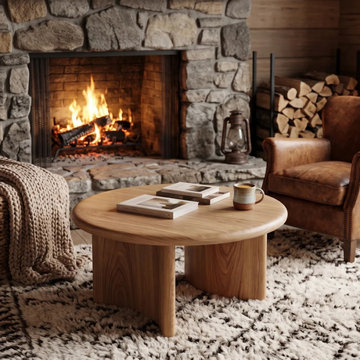
The Soren Round Coffee Table brings a quiet architectural presence to the living room. Handcrafted from 100% solid oak, its circular top sits on two broad, gently curved panel legs that give the piece a sculptural, almost carved appearance — solid without feeling heavy.
The design leans into oak's natural character: soft golden tones, visible grain movement, and a smooth matte finish that lets the material do the talking rather than added ornament. Rounded tabletop edges echo the curve of the base, tying the whole silhouette together as one continuous gesture rather than a top-and-legs assembly.
Soren works especially well in Scandinavian modern, organic modern, Japandi, and warm minimalist interiors, where a few well-proportioned pieces do more than a room full of accessories. Available in eleven diameters (16"–60") and four heights (14"–20"), it can anchor a compact apartment living room or hold its own in a larger open-plan space.
Every table is made to order in solid oak, so grain pattern and tone vary slightly from piece to piece — a reminder that it was shaped by hand, not stamped from a mold.
 Taragano Design and Build
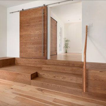
Taragano Design & Build completed this stair landing as part of a
whole house remodel in Contra Costa County, California.
Split level houses have a circulation problem at the level change.
The stair is usually enclosed, the landing is a dead corner, and
the two floors read as separate houses. Here the enclosure came out
and the stair was rebuilt as a wide open platform, so the level
change becomes part of the room rather than a passage through it.
Drawers were built into the step returns. On a stair that wide, the
carriage volume is substantial and it would otherwise be sealed
dead space. Putting storage there is the difference between an
architectural gesture and a piece of the house that earns its
footprint.
The sliding door lets the upper hall close off without a swing arc,
which matters at a landing where a hinged door would need clear
floor area the stair does not have.
Everything is rift white oak, including the treads, the risers, and
the door. Running one species across the stair and the flooring
means nothing announces where the millwork ends and the floor
begins.
Licensed general contractor, CSLB #1143420. Diamond Certified.
 Refine Design Architecture
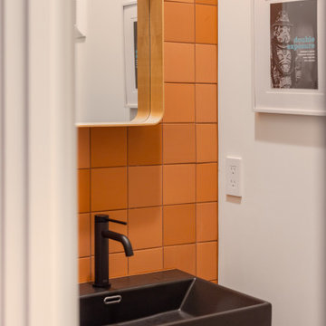
This compact powder room makes its argument through a single, fully committed material gesture. A floor-to-ceiling field of square terracotta-orange tile, set in a stacked-bond pattern with tight dark grout joints, defines the wet wall and reads as a continuous vertical plane against the surrounding soft-white surfaces. The tile is allowed to carry the whole room—no accent band, no transition—so the saturated color does the spatial work. Against it, a high-contrast palette of matte-black fixtures reinforces the discipline: a rectangular trough-style basin with a clean fascia and a single-lever black faucet, both reading as crisp dark volumes set off by the warm backdrop. A rounded-corner wood-framed mirror softens the orthogonal tile grid and the cool black fixtures with a note of warmth, its radiused profile a deliberate counterpoint to the square modules behind it. Glimpsed through the door jamb, the composition is intentionally tight and graphic—a small utilitarian space treated as an opportunity for bold material expression rather than neutrality.

 Robert Miller FAIA Architects
Images by Nic LeHoux
Designed as a home and studio for a photographer and his young family, Lightbox is located on a peninsula that extends south from British Columbia across the border to Point Roberts. The densely forested site lies beside a 180-acre park that overlooks the Strait of Georgia, the San Juan Islands and the Puget Sound.
Having experienced the world from under a black focusing cloth and large format camera lens, the photographer has a special fondness for simplicity and an appreciation of unique, genuine and well-crafted details.
The home was made decidedly modest, in size and means, with a building skin utilizing simple materials in a straightforward yet innovative configuration. The result is a structure crafted from affordable and common materials such as exposed wood two-bys that form the structural frame and directly support a prefabricated aluminum window system of standard glazing units uniformly sized to reduce the complexity and overall cost.
Accessed from the west on a sloped boardwalk that bisects its two contrasting forms, the house sits lightly on the land above the forest floor.
A south facing two-story glassy cage for living captures the sun and view as it celebrates the interplay of light and shadow in the forest. To the north, stairs are contained in a thin wooden box stained black with a traditional Finnish pine tar coating. Narrow apertures in the otherwise solid dark wooden wall sharply focus the vibrant cropped views of the old growth fir trees at the edge of the deep forest.
Lightbox is an uncomplicated yet powerful gesture that enables one to view the subtlety and beauty of the site while providing comfort and pleasure in the constantly changing light of the forest.
 Turner Design Firm
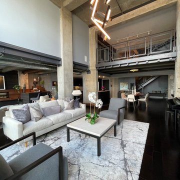
Organic Contemporary Design in an Industrial Setting… Organic Contemporary elements in an industrial building is a natural fit. Turner Design Firm designers Tessea McCrary and Jeanine Turner created a warm inviting home in the iconic Silo Point Luxury Condominiums.
Industrial Features Enhanced… Neutral stacked stone tiles work perfectly to enhance the original structural exposed steel beams. Our lighting selection were chosen to mimic the structural elements. Charred wood, natural walnut and steel-look tiles were all chosen as a gesture to the industrial era’s use of raw materials.
Creating a Cohesive Look with Furnishings and Accessories… Designer Tessea McCrary added luster with curated furnishings, fixtures and accessories. Her selections of color and texture using a pallet of cream, grey and walnut wood with a hint of blue and black created an updated classic contemporary look complimenting the industrial vide.
 TOMRUQUE
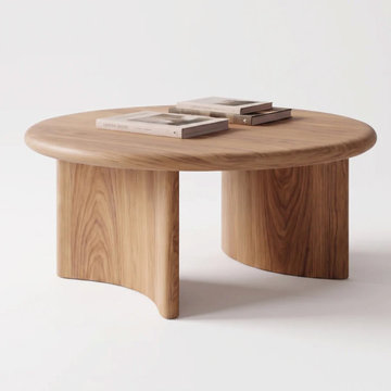
The Soren Round Coffee Table brings a quiet architectural presence to the living room. Handcrafted from 100% solid oak, its circular top sits on two broad, gently curved panel legs that give the piece a sculptural, almost carved appearance — solid without feeling heavy.
The design leans into oak's natural character: soft golden tones, visible grain movement, and a smooth matte finish that lets the material do the talking rather than added ornament. Rounded tabletop edges echo the curve of the base, tying the whole silhouette together as one continuous gesture rather than a top-and-legs assembly.
Soren works especially well in Scandinavian modern, organic modern, Japandi, and warm minimalist interiors, where a few well-proportioned pieces do more than a room full of accessories. Available in eleven diameters (16"–60") and four heights (14"–20"), it can anchor a compact apartment living room or hold its own in a larger open-plan space.
Every table is made to order in solid oak, so grain pattern and tone vary slightly from piece to piece — a reminder that it was shaped by hand, not stamped from a mold.
 Turner Design Firm
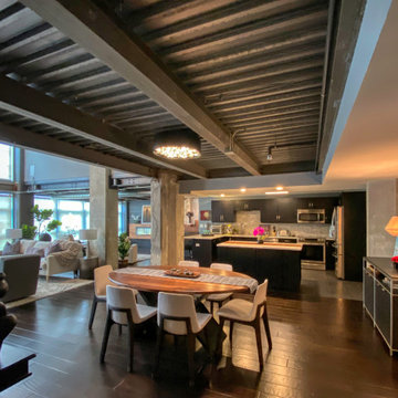
Organic Contemporary Design in an Industrial Setting… Organic Contemporary elements in an industrial building is a natural fit. Turner Design Firm designers Tessea McCrary and Jeanine Turner created a warm inviting home in the iconic Silo Point Luxury Condominiums.
Industrial Features Enhanced… Our lighting selection were chosen to mimic the structural elements. Charred wood, natural walnut and steel-look tiles were all chosen as a gesture to the industrial era’s use of raw materials.
Creating a Cohesive Look with Furnishings and Accessories… Designer Tessea McCrary added luster with curated furnishings, fixtures and accessories. Her selections of color and texture using a pallet of cream, grey and walnut wood with a hint of blue and black created an updated classic contemporary look complimenting the industrial vide.
 Ultimate Outdoor Design
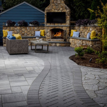
Some materials work like a signature in a design. They leave a lasting impression through subtle detail and structure. Holland Stone has that timeless quality, rooted in simplicity and strength.
Belgard Holland Stone is a classic rectangular paver that brings structure, rhythm, and versatility to any outdoor space. Its smooth finish and balanced scale allow for endless layout possibilities, from traditional running bond to striking herringbone patterns. Durable and dependable, it is ideal for walkways, driveways, borders, and decorative inlays.
Now picture a space where every path has purpose and every line creates movement. Whether leading to a fire feature or outlining a garden lounge, this paver turns simple geometry into timeless style. It is a design element that brings balance to complexity and order to creativity.
Great outdoor spaces are not always about grand gestures. Sometimes, they are built on the quiet strength of the details we choose to repeat, refine, and remember.
Let’s explore how this material can bring your outdoor story to life.
Schedule your consultation today: 516-522-8249

 Period Architecture Ltd.
Angle Eye Photography
Mudroom - large traditional mudroom idea in Philadelphia with beige walls
Mudroom - large traditional mudroom idea in Philadelphia with beige walls
 Lincoln Lighthill Architect
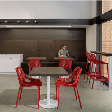
How do you make an impact within a familiar project typology? For our first cafe for Spro Coffee Lab, and their flagship location, we combined a long-held vision of a cafe with a faceted ceiling, their red & white material palette, and the building owner’s desire for an iconic street presence into a unified, minimalist language of angles and facets that extends throughout the cafe.
Overhead, a faceted soffit juts out dramatically over the service bar, the two objects mirroring each other’s footprints and satisfying Health Code requirements for a smooth, cleanable surface overhead. Concealing an egress corridor above that bisects the space, the soffit presents a bold visual gesture through the floor-to-ceiling glass walls of this corner space, beckoning passersby inside.
The service bar points toward the entry, with a minimalist espresso-tap system as the focal point, and angled sections branching off in both directions to create seating and service areas and direct customer flow.
Throughout the space, surfaces customers interact with are clad in chocolate-colored cork, providing a highly textured, tactile contrast to the smooth, white primary materials and complementing the bronze window system, red logos, and customer seating. The unfinished cork is durable and stain-resistant, resilient to the touch, provides acoustic dampening, and is highly sustainable.
The result is a cafe that goes far beyond the project brief, creating a memorable experience and an iconic presence for the brand.
 TOMRUQUE
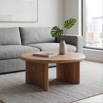
The Soren Round Coffee Table brings a quiet architectural presence to the living room. Handcrafted from 100% solid oak, its circular top sits on two broad, gently curved panel legs that give the piece a sculptural, almost carved appearance — solid without feeling heavy.
The design leans into oak's natural character: soft golden tones, visible grain movement, and a smooth matte finish that lets the material do the talking rather than added ornament. Rounded tabletop edges echo the curve of the base, tying the whole silhouette together as one continuous gesture rather than a top-and-legs assembly.
Soren works especially well in Scandinavian modern, organic modern, Japandi, and warm minimalist interiors, where a few well-proportioned pieces do more than a room full of accessories. Available in eleven diameters (16"–60") and four heights (14"–20"), it can anchor a compact apartment living room or hold its own in a larger open-plan space.
Every table is made to order in solid oak, so grain pattern and tone vary slightly from piece to piece — a reminder that it was shaped by hand, not stamped from a mold.
23