
Search results for "Gray zone" in Home Design Ideas

 Tracy Berman Interiors
Simplicity, Calming, Contemporary and easy to clean were all adjectives the home owners wanted to see in their new Master Bathroom remodel. A oversized Jacuzzi tub was removed to create a very large walk in shower with a wet and dry zone. Corner benches were added for seating along with a niche for toiletries. The new vanity has plenty of storage capacity. The chrome fixtures coordinate with the mirrors and vanity lights to create a contemporary and relaxing Master Bathroom.



Find the right local pro for your project

 Kitchens of Diablo
Elmwood Cabinetry in Dove White, Reclaimed Wood Shelves, Repose Gray paint from Sherwin Williams, Lattice Quartz Countertop, Rangetop, Drop Zone, Pantry Cabinet, Wood Hood
 Medallion Cabinetry
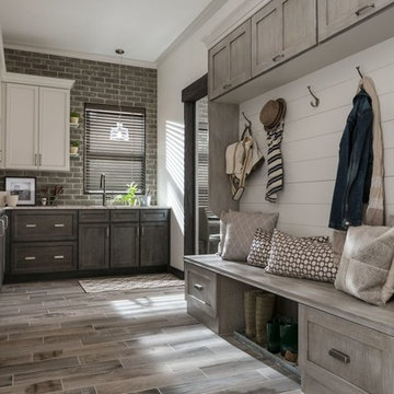
This culinary kitchen design has a transitional style and incorporates beautiful clean lines. The designer selected a beautiful combination of three different finishes from Medallion to create a well-designed and functional space to satisfy your inner chef. The custom designed kitchen island showcases our Greystone finish from the New Stoney Brooke Collection and creates defined cooking, cleaning, and prep zones within the overall space.
Medallion’s new Stoney Brooke Collection is uniquely textured in subtle shades of grays and browns. This unique finish is achieved by artfully brushing multiple glaze materials onto a stained surface. The varying shades of this glaze application create a subtle textural feel and appearance.
The component hood creates a function focal point and is finished in both Greystone and our new Irish Crème painted finish. The Irish Crème wall cabinetry coordinates beautifully with the Smoke stained base cabinets which provide a neutral backdrop for your culinary creations.
Extend the style and well-appropriated design of your kitchen into the pantry. Select coordinating cabinetry and specialized storage options to fit your culinary needs.
Find a Medallion Showroom near you today: http://www.medallioncabinetry.com/DealerLocator

 Medallion Cabinetry
This culinary kitchen design has a transitional style and incorporates beautiful clean lines. The designer selected a beautiful combination of three different finishes from Medallion to create a well-designed and functional space to satisfy your inner chef. The custom designed kitchen island showcases our Greystone finish from the New Stoney Brooke Collection and creates defined cooking, cleaning, and prep zones within the overall space.
Medallion’s new Stoney Brooke Collection is uniquely textured in subtle shades of grays and browns. This unique finish is achieved by artfully brushing multiple glaze materials onto a stained surface. The varying shades of this glaze application create a subtle textural feel and appearance.
The component hood creates a function focal point and is finished in both Greystone and our new Irish Crème painted finish. The Irish Crème wall cabinetry coordinates beautifully with the Smoke stained base cabinets which provide a neutral backdrop for your culinary creations.
Extend the style and well-appropriated design of your kitchen into the pantry. Select coordinating cabinetry and specialized storage options to fit your culinary needs.
Find a Medallion Showroom near you today: http://www.medallioncabinetry.com/DealerLocator


 Cornelius Homes, Inc.
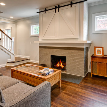
This is the lanai room where the owners spend their evenings. It has a white-washed wood ceiling with gray beams, a painted brick fireplace, gray wood-look plank tile flooring, a bar with onyx countertops in the distance with a bathroom off to the side, eating space, a sliding barn door that covers an opening into the butler's kitchen. There are sliding glass doors than can close this room off from the breakfast and kitchen area if the owners wish to open the sliding doors to the pool area on nice days. The heating/cooling for this room is zoned separately from the rest of the house. It's their favorite space! Photo by Paul Bonnichsen.

 Synergy Design & Construction
This side view of the waterfall island shows the beautiful Silestone “Calacatta Gold” engineered quartz against the Porcelanosa “Krono Grey” floor tile. To the left of the island, a tall dual-zone Sub-Zero wine storage unit provides ample storage to enjoy a relaxing glass of wine!

 Bartelt. The Remodeling Resource
The lower level features a wet bar with marble subway tile, leather-textured granite, and custom cabinetry. There are also beverage and wine refrigerators, perfect for entertaining.
Photo Credit: David Bader Photography


 TKS Design Group
Download our free ebook, Creating the Ideal Kitchen. DOWNLOAD NOW
This client was referred to us from a past client. They are a busy 2-career household with young children and enjoy entertaining friends and family in their home. They have a beautiful open concept home but unfortunately the kitchen was not fitting for the rest of the home. They were not quite sure what to do with the space. We talked about trying to refresh it or do more of a minor remodel, but in the end they decided a full gut would get them to where they wanted to be.
One problem was there was no place for guests to hang out other than the large and awkward banquette area. The brick wall and tiled hood area were feeling a bit dated and tired. The space was just not functional for their lifestyle. There was no prep space near the cooktop and no landing area for items coming out of the ovens or refrigerator, plus a big dead zone in the center of the room.
Banquettes, like the one they previously had in the space, are great for small spaces, but when they get really large like this one, it makes getting in and out of the seating area awkward and uncomfortable. Plus, there was room for a large table, so we eliminated the awkward built in.
We started by removing the faux brick wall between the kitchen and back entry. We relocated the entry to the garage over a couple feet in order to get every last inch out of the new kitchen. We also made the decision to close up the primary window that faced the pretty ho hum brick wall of the neighbor’s house. There was plenty of light coming in from the seating area, so we just didn’t feel the window was adding much to the room.
Construction went smoothy. There was a bit of rework with electrical, flooring and HVAC, but in the end, we think it was well worth it.
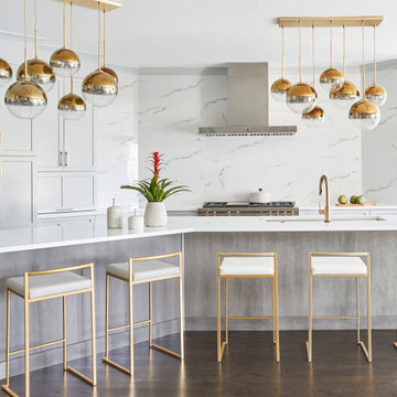
The clients really wanted a sleek contemporary look, and we originally had planned for a full height slab backsplash, but due to it’s size, it was a budget buster. Instead, we got creative and settled on large format porcelain tiles that have a similar feel but were a fraction of the cost. We made sure the wall was plumb and level so that the fit and finish would mimic that of slab material.
The final space was quite a change. A large prep sink sits directly across from the new pro-style range with plenty additional prep space on the large island. The refrigerator and ovens now have miles of landing space, and a nice tight work triangle makes cooking a breeze.
Since we wanted a more contemporary feel, not many wall cabinets were included. Instead, we outfitted some of the drawers for dish storage with a peg system. Two large pantries flanking the refrigerator hold baking supplies and small appliances. Large drawers by the cooktop hold pots and pans, and an appliance garage tucked away to the left of the range hides away miscellaneous items. The large island also houses a microwave drawer and tons of storage, most of which is drawers offering maximum convenience.
The island now seats 5-6 people comfortably along with the new table in the seating area which can seat up to 8. Entertaining will be a breeze in this space. With such a clean backdrop, we knew we would need some drama with the lighting, so we chose two sets of staggered pendants, which we adjusted for the right visual balance above the island.
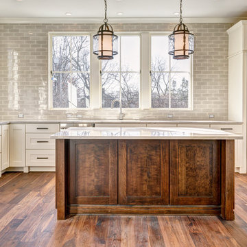
We also included a small coffee station to the right of the main kitchen, which helps keep the coffee clutter out of the kitchen proper. Two tones of complimentary gray are featured in this kitchen. The perimeter is a light gray that reads almost white. The island is a gray stain that adds some depth and interest with the visible wood texture. The countertops are clean white quartz, and the hardware, barstools and light fixtures add warm brass tones. I see lots of cooking and entertaining with family and friends in the near future in this bright and airy new space.
Designed by: Susan Klimala, CKD, CBD
Photography by: Michael Kaskel
For more information on kitchen and bath design ideas go to: www.kitchenstudio-ge.com
Sponsored
Columbus, OH

Hope Restoration & General Contracting
Columbus Design-Build, Kitchen & Bath Remodeling, Historic Renovations

 TKS Design Group
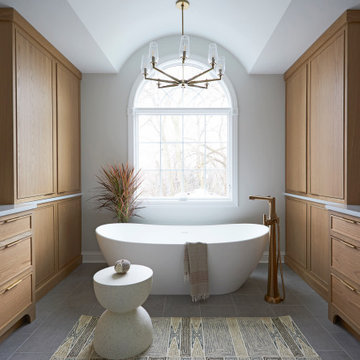
Several years ago, Jill and Brian remodeled their kitchen with TKS Design Group and recently decided it was time to look at a primary bath remodel.
Jill and Brian wanted a completely fresh start. We tweaked the layout slightly by reducing the size of the enormous tub deck and expanding the vanities and storage into the old tub deck zone as well as pushing a bit into the awkward carpeted dressing area. By doing so, we were able to substantially expand the existing footprint of the shower. We also relocated the French doors so that the bath would take advantage of the light brought in by the skylight in that area. A large arched window was replaced with a similar but cleaner lined version, and we removed the large bulkhead and columns to open the space. A simple freestanding tub now punctuates the area under the window and makes for a pleasing focal point. Subtle but significant changes.
We chose a neutral gray tile for the floor to ground the space, and then white oak cabinetry and gold finishes bring warmth to the pallet. The large shower features a mix of white and gray tile where an electronic valve system offers a bit of modern technology and customization to bring some luxury to the everyday. The bathroom remodel also features plenty of storage that keeps the everyday necessities tucked away. The result feels modern, airy and restful!
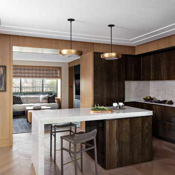
 Neumann & Rudy Architecture
## Spatial Composition & Architectural Volume
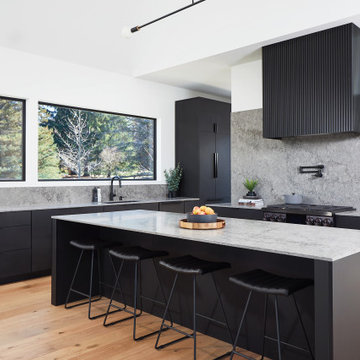
This is a kitchen conceived less as a service zone than as a precisely calibrated architectural volume, resolved through an L-configuration of full-height cabinetry that terminates against a monolithic island set on an intentional diagonal to the orthogonal grid of the herringbone flooring. The island's waterfall treatment — a slab returning to the floor in a single unbroken plane — functions as both a peninsular counter and a piece of quasi-sculptural infrastructure, its overhang generating a shallow banquette-adjacent seating zone without resorting to a conventional breakfast bar. Above, a coffered soffit executed in flush drywall with a continuous cove-lit reveal establishes a datum line that both compresses and defines the working core, while the adjacent tray ceiling reads as a distinct volume, spatially decoupling the kitchen from the living room beyond. That threshold is the composition's most disciplined gesture: a wide cased opening framed in mitered rift-cut oak paneling, its architrave articulated as a shadow-gapped reveal rather than applied trim, drawing a deep enfilade sightline through to the window wall, its Roman shades, and the mid-rise cityscape beyond. Millwork here performs structurally as well as visually — the oak-clad pilasters and the fluted, hand-carved textural panel at right operate as pseudo-columnar elements, organizing the plan into legible bays.
## Materiality, Color & Texture
The palette is constructed on a deliberate dialectic between two wood registers. The envelope employs a pale, quarter-sawn white oak with a honeyed, faintly amber undertone, its figure suppressed and its finish matte, functioning as a luminous neutral ground. Against this, the cabinetry deploys a deeply fumed or ebonized ash — likely a heavily lacquered, open-grain veneer — where the cathedral figuring is exaggerated into near-graphic striation and the high-gloss sheen produces a lacquered, almost Art Deco lustre. This contrast of value (blonde against bitter chocolate) and of sheen (matte against specular) is the project's principal tension. Mediating between them is the stone: a white quartzite or dolomitic marble with soft grey-taupe veining and a distinctly warm, cream-adjacent field, book-matched across the full-height backsplash and repeated on the island slab, its subtly honed surface refusing the glare of a polished finish. Metallic accents are restrained and consistently warm — satin brass on the pendant canopies and stool footrails, blackened bronze on the hardware, glazing frames, and the stools' slender tubular frames. Textiles introduce a low-frequency counterpoint: nubby bouclé upholstery on the sectional, a striated woven sheer at left, ikat-patterned cushions, and a tonal blue-grey geometric rug that supplies the only chromatic departure from the room's ochre-to-espresso spectrum.
## Lighting, Atmosphere & Style Profile
The lighting scheme is layered with unusual rigor. Daylight is admitted obliquely, filtered through the plaid-toned Roman shades of the adjacent living room, so the kitchen receives it secondhand — soft, directional, and already warmed. Artificial light works in three tiers: the recessed cove uplighting that grazes the soffit and dissolves the ceiling's edges; concealed under-cabinet illumination that renders the stone backsplash as a glowing plane; and the pair of spun-brass disc pendants suspended on slender blackened stems, whose downward-facing diffusers deliver a controlled pool of task light while their polished undersides register as small suns in the composition. The absence of visible downlight clutter is notable and disciplined. The resulting atmosphere is enveloping and low-glare — cosseting rather than clinical — with a distinctly residential, almost salon-like decorum reinforced by the framed genre painting hung casually on the oak paneling, a curatorial gesture that domesticates the kitchen decisively. Stylistically, the project reads as **Warm Modernist Luxe**, drawing on the vocabulary of high-craft European cabinetry and mid-century Milanese interiors: the grain-forward veneers, brass discs, and slender bronze seating carry a whisper of 1970s Italian sophistication, while the flush detailing, shadow-gap reveals, and rigorous suppression of ornament situate it firmly in contemporary practice. It is tailored rather than austere — a demonstration that minimalist discipline and material sensuality need not be adversaries.

 Performance Kitchens & Home
A granite-topped gray island faces the window-side sink and long preparation counter. Blue glass pendants define the seating area, while recessed-panel cabinet doors and drawers continue along the cleanup wall. Stainless steel refrigeration and the tall wine column sit at the end of the working layout.
Text us at (484) 278-1764 or call (215) 482-0700 to explore your kitchen, bathroom or home transformation today.
Sponsored
Columbus, OH
Hope Restoration & General Contracting
Columbus Design-Build, Kitchen & Bath Remodeling, Historic Renovations
 Performance Kitchens & Home
Original and finished kitchen images show the change in cabinet finish, counters and work zones. The comparison highlights the new gray recessed panel cabinetry, brighter surfaces and coordinated stainless steel appliances.
Text us at (484) 278-1764 or call (215) 482-0700 to explore your kitchen, bathroom or home transformation today.

 Just Basements
These elements are repeated again at the bar area where a bold backsplash and black fixtures link to the design of the bathroom, creating a consistent and fun feel throughout. The bar was designed to accommodate mixing up a post-workout smoothie or a post-hot tub evening beverage, and is oriented at the billiards area to create central focal point in the space. Conveniently adjacent to both the fitness area and the media zone it is only steps away for a snack.

8