
Search results for "Guidelines" in Home Design Ideas
 Advance Design Studio, Ltd.
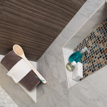
Mike and Anne of Barrington Hills desperately needed to update and renovate both their kid’s hall bath and guest bath, and in their 1980’s home each project presented a different set of unique challenges to overcome. When they set out to identify the right remodeling company to partner with, it was important to find a company that could help them to visualize design solutions for the bath renovations. When they came across Advance Design Studio’s website, they were immediately drawn to the solution-oriented remodeling process and the family friendly company.
They say they chose Advance Design because of the integrated approach of “Common Sense Remodeling”, making the design, project management and construction all happen in one place. When they met with Project Designer Michelle Lecinski, they knew they chose the right company. “Michelle’s excellent work on the initial designs made it easy to proceed with Advance Design Studio,” Mike said.
Like most homeowners anticipating a big renovation project, they had some healthy fears; with two bathrooms being remodeled at the same time they worried about timeframes and staying within budget. With the help of Michelle, and the “Common Sense” guidelines, they were confident that Advance Design would stay true, orchestrating all the moving parts to stay within both the estimated timeline and budget.
The guest bath offered the biggest design challenge. A dormer obstruction made the already cramped shower awkward to access. Mike and Anne also wanted the shower size to be expanded, making it more accommodating. Working with Advance’s construction expert DJ Yurik, Michelle relocated the shower concealing the original dormer and creating a larger, more comfortable and aesthetically pleasing guest shower.
The unsightly and not at all user-friendly closet was removed and replaced with elegant White Maple Dura Supreme cabinetry with much improved function featuring dual tall linen cabinets, a special makeup area and two sinks, providing a dual vanity which was extremely important for better guest use.
The Fossil Brown quartz countertop is in pleasing contrast to the white cabinetry, and coordinates nicely with the mocha porcelain tile gracing the shower for an accent. The decorative glazed turquoise tile backsplash, tile border, and bottle niche adds a taste of marine green to the room, while marble-looking porcelain tile makes guests feel they are staying in a 5-star hotel. Polished nickel Kohler plumbing fixtures were chosen to add a touch of sophistication. This renovated guest bath is comfortable and elegant, and Anne and Mike’s house guests may never want to leave!
“The end result was updated and restyled bathrooms that the client will enjoy and increase the value of their home,” Designer Michelle said.
The children’s hall bath had its own set of challenges. The current placement of the sink was not conducive to the best use of the existing space, nor did it allow for any visual interest, something Advance’s designers always work to achieve even within the tight confines of a small bath. Advance removed the linen closet and used the gain in wall space to create a dramatic focal point on the vanity wall. They also took additional space that wasn’t being used for new Storm Gray Dura Supreme tall built-in linen cabinets, creating functional storage space that the former bath lacked. A customized glass splash panel was created for the bath, and the high ceilings with skylights were accented with a custom-made track lighting fixture featuring industrial pipe and cage materials.
Authentic cement encaustic tile was used wall to wall surrounding the vanity to create a dramatic and interesting back drop for the new elegant and stately furniture-like double sink wall. Hand-made encaustic tile originated in Western Europe beginning in the 1850’s and reminded Mike and Anne of tile they had seen and loved from their travels overseas. Today, encaustic tile has made a re-appearance in today’s modern bath design with its wide array of appealing patterns and artistic use of color.
Oil rubbed bronze Kohler fixtures echo the black accents in the beautiful tile pattern and reflect the matte black of the unique lighting detail. Easy to maintain Blanca Arabescato Quartz countertops add practicality and natural beauty and compliments the warm wood porcelain tile floors. This handsome bath has generated praise from friends and family even before it’s complete unveiling as photos of the space leaked out on social media! It’s not only completely functional to use, but especially pretty to look at.
“Advance Design Studio did a terrific job for us. We really appreciated how easy it was to work with them on a complex project of the complete remodeling of two bathrooms. They very capably handled all the details from design, to project management, to construction. It is a great group of people to work with and we would welcome the opportunity to work with them again anytime,” Mike said.
 U.S. Green Building Council (USGBC)
LEED Certification Level: Platinum.
Builder: R & S Engineering & Construction.
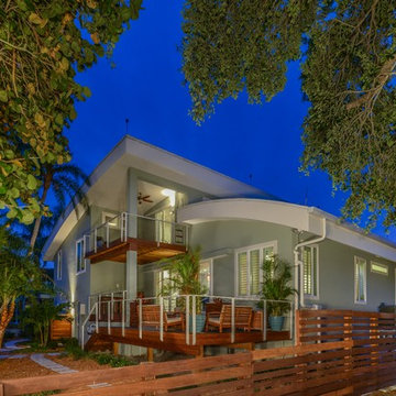
The Cavanaugh Residence is a contemporary split level with a split personality. Totally designed from the ground up to minimize impact and maximize energy and water efficiency, its beautiful facade belies its hard-working, high-producing systems, earning it a LEED Platinum score of 116.5, and a HERS rating of minus 22. The 2774 square foot home produces over 100 per cent of its power with a 10.8 kw pv system, and captures 100 per cent of its freshwater needs from the curved metal roofs through an engineered collection and purification system, stored in an integrated concrete cistern.
Constructed of locally made SIP panels on an infill waterfront lot, the home is oriented to maximize the production of the pv panels. Six inch SIP panels work together with a highly reflective, highly emmisive cool standing seam roof, icynene insulation in ceiling and floors, and carefully placed high efficiency windows and doors to create a tightly sealed environment. The 17-seer Trane heat pump variable speed compressors and TAM 7 air handlers, along with a whole house dehumidifier and fresh air intake provide a comfortable, clean indoor environment while using little energy. In the shoulder seasons, natural ventilation cools the home with fresh breezes drawn from lower windows in each room flowing through the curved ceilings to clerestory windows at the top of the house.
Natural daylighting, with windows placed in corners and high clerestories, bounce the abundant natural light so that the owners use the interior LED lighting primarily at night. Windows were sited to frame views of the neighboring park and water, and capture the light, but represent a very low percentage of glazing to wall to conserve energy.
Primarily native, xeriscaped turfless landscaping sips reclaimed water from its drip and bubbler irrigiation system, and requires little trimming or chemicals. Established trees, protected during construction, shade the home, FSC certified decks, and yard, providing a cool place to enjoy the outdoors at any time of the day, even in Florida's summer heat.
Rainwater is diverted from the bay through the engineered collection and filtration system to an integrated concrete cistern hidden beneath the decks. Abundant Florida rainwater supplies 100 per cent of the home's needs, including drinking, bathing, and cleaning. Naturally soft, the highly filtered and UV purified water requires no chemical treatment or water softener. Coupled with minimal hardscape and permeable drive and walkways, almost all ground water remains on the lot, and out of storm sewers and bay runoffs.
Designed as a forever home for this active retired couple, an open floor plan provides diagonal interior views along with great circulation space. Wide hallways and doors, curbless showers, an elevator, and extra blocking in the walls for grab rails insures the couple of being able to use their home even if physical disabilities arise.
The home's footprint is minimized by building over the conditioned crawlspace and over-sized garage, and the finished floor height, at least two feet above flood code requirements, significantly reduces insurance costs while maximizing storage space for camping and water sports equipment.
Materials, fixtures and appliances were carefully selected for energy and water efficiency, local production where possible, recycled content/recyclability, durability, and cost-effectiveness. The owners were very involved in vetting and materials selections, and assisted in just-in-time purchasing to minimize waste. Scrap materials were sorted daily for re-use elsewhere in the project (blocking, concrete forms, drywall scraps as acoustical insulation in interior walls, etc.), resulting in a tiny waste pile at the end of a dumpster-free project. Concrete waste was hauled to a local recycler to become road base, and extra useable materials were returned to the vendor or donated to Habitat Restore.
Cost-effective choices, and careful planning, saved significant dollars in construction cost as well as landfill space.
One of the biggest challenges was finding qualified subcontractors who would work within the guidelines. With the help of our LEED consultant and meetings and explanations, most subcontractors not only bought into the ideas readily, but offered up new ideas. Highly skilled and professional, the team of subs, LEED consultant, and contractor proved that LEED construction is excellent construction.
The team, the owners, and I also found that LEED construction makes great economic sense. Most materials (other than increased insulation and photovoltaic panels) cost no more, and sometimes less, than those employed in construction of a lesser standard. The owners have been living in the home for a year now, and are thrilled with the results. No power bill. No water bill. Extremely low insurance bill. Minimal ground maintenance. No fabric softener. Reduced use of soap, detergents, and shampoos and cleaning supplies. Less time cleaning with spot-free rainwater. Careful planning and materials selection brought the project in under budget, and the home operates at an extremely low cost, both to the homeowners, and the environment. Who wouldn't be thrilled?
 Dynia Architects
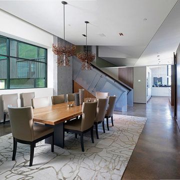
The central, public wing of this residence is elevated 4 feet above grade with a ceiling that rises to opposite corners – to the northwest for visual access to the mountain faces and to the south east for morning light. This is achieved by means of a diagonal valley extending from the southwest entry to the northeast family room. Offset in plan and section, two story, private wings extend north and south forming a ‘pinwheel’ plan which forms distinctly programmed garden spaces in each quadrant.
The exterior vocabulary creatively abides the traditional design guidelines of the subdivision, which required gable roofs and wood siding. Inside, the house is open and sleek, using concrete for shear walls and spatial divisions that allow the ceiling to freely sculpt the main space of the residence.
A.I.A Wyoming Chapter Design Award of Excellence 2017
Project Year: 2010
Find the right local pro for your project
 Envision Web
Stuart Wade, Envision Virtual Tours
Envision Virtual Tours and High Resolution Photography is your best choice to find just what you are looking for in the Ellijay, Ga. area .Ellijay, Georgia, known as the “Apple Capital” of Georgia, is located between the Ellijay and Cartecay Rivers where they join to make the Coosawattee River and is the county seat of Gilmer County, Georgia. The origin of the city’s name is not certain but thought to be the English derivative of an Indian word(s) meaning “many waters”, “place of green things” or “new ground”. Some histories say it may have been named for an Indian chief.
Inhabited for countless years by the Cherokee people indigenous to the North Georgia, the area was first mentioned as a village and trade center before the onslaught of white settlers inhabited the region. During the 1830’s both white settlers and Indians occupied Ellijay. During the original land lottery in 1832, Martin Scalf acquired the 160 acre lot where the town now stands. In 1833, Clemonds Quinland bought 10 acres from Scalf, retained one acre for himself and donated the rest of the purchase to the County. A plan for twenty town lots, streets and a public square was created and the streets were oriented to allow maximum sunlight exposure to the buildings.
Proceeds from lot sales were used to build a jail and courthouse and pay other city expenses. During this same year, Gilmer County was appropriated $800.00 from the State to build a school, and a three-acre lot was donated for the city cemetery. On December 29, l834, Ellijay was incorporated and designated as the County seat of Gilmer County. By 1837, the town had twenty dwellings, three stores and one attorney. Most of these early buildings were of log construction.
Many roads led to Ellijay by 1849. The population had grown to 150 by 1850 and the town at five stores. Some wood-frame buildings were being constructed at this time and in 1854, a new courthouse was built in the center of the square, replacing the earlier building. The County’s first newspaper was the Ellijay Courier, started in 1875, and during this time period, Ellijay was a stop on the stagecoach line. The railroad bridge over the Cartecay River was completed in 1884 and the town now had rail service.
With the arrival of the railroad and subsequent tracks to White Path, Ellijay began to grow much faster. Many hotels were constructed and land was donated for a depot east of town. More industries, such as a cheese factory and the Shippen Brothers Lumber Mill, located in Ellijay. By 1898, the city had expanded its limits in every direction and now included the depot.
By 1900, all the buildings on the town square were brick. This included the recently completed Hyatt Hotel. Most of the other buildings in town were still of log construction, but new wood-frame buildings were being built. The Shippen Brothers Lumber Company production was expanding and exporting their lumber to Europe. Within the next few decades, this company grew to be one of the largest employers in Ellijay, often with five to six million feet of lumber in the yard at one time.
The population of Ellijay grew to 659 by 1910, and began to acquire many new modern conveniences such as electric lights and power, a telephone company and many new businesses.
Then in 1912, a fire ravaged the city, destroying 23 buildings. As a result, many new buildings were constructed under new and stricter fire and safety guidelines. The population, however, decreased slightly at this time to 632 in 1920.
During the 1920’s the town’s population began to grow again and, by this time, apples were being shipped out of the county and new storage facilities were built. Chickens were also shipped to markets outside of Ellijay and Gilmer County.
From the mid 1930’s to 1950, Ellijay received much assistance from the Federal WPA Programs. The old courthouse was removed from the center of town square and the Hyatt Hotel was remodeled to be the new courthouse. A park was created on the site of the old courthouse and the streets around the square were paved. A new street was built at this time entering town from the northeast. Other new roads, bridges, sidewalks and gutters were constructed to improve the city. A school and gymnasium were also built and other structures improved.
This growth began to impact the city’s infrastructure and in the l950’s and l960’s, a period of upgrading water systems, roads, and power supplies began. New low-rent housing appeared in l960 and a new hospital was built in l957. Georgia Highway 5 was widened in l962, new buildings around the square replaced old ones and some were remodeled. In 1974, the hospital was enlarged.
Currently, Ellijay attracts tourists who love the small-town feel and friendly atmosphere. Hotels and restaurants, unique shops, antiques and art galleries lend their charms to those who visit. A new courthouse constructed to resemble the old one, new streetscaping, family-oriented downtown events and the beautification of the square have stepped up the social and economic activity and have made Ellijay a popular destination.


 Home At Last Decor
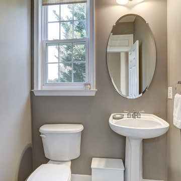
This house had bright yellow and orang walls when the homeowner decided to sell. Bruce & Tina Anderson/ REMAX, asked me to help the homeowner get this house updated and ready to put on the market for resale. Home At Last Decor gave the homeowner guidelines for paint color, furniture placement, and every detail about how to best stage the home within a modest budget. This house sold quickly and for a very good price! The paint color used were: Sherwin Williams 7507 Stone Lion + 7512 Pavilion Beige and Benjamin Moore 1495 October Mist
 DAPPLED EARTH– designs to nurture life!
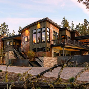
The owner's of this property love to garden. They wanted a beautiful landscape appropriate to the surrounding forest that is dog durable and easy to maintain. The North Rim design guidelines allow only specific plant species to be considered, in specific combinations, at specific rates. Dappled Earth developed planting combinations that massaged this criteria to create dramatic blocks of native blooms.
 Tom Curren Companies
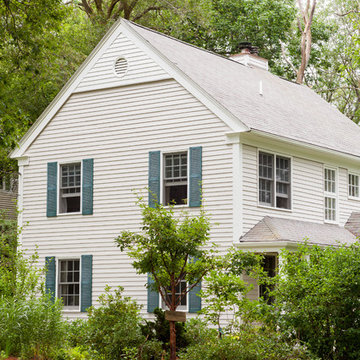
This home was washed, scraped, sanded and painted along the siding, trim and casings. EPA guidelines were followed during the set up at this client's home.

 Living Architecture
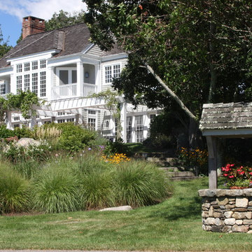
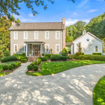
This Roswell residence was a full-service project, from site planning through architecture, landscape, and finishing details. The design was guided by the homeowner’s strong vision for historically accurate interiors and timeless character, which required careful attention to every element, from custom flooring to specialty finishes and architectural detailing. Collaboration was at the heart of this project. Working closely with the clients allowed us to tailor the home to their lifestyle while achieving the authenticity they were seeking. Special design touches and unique features were integrated throughout, creating a residence that feels both personal and enduring. While the corner lot and neighborhood guidelines required thoughtful planning and coordination with the city, these considerations became a backdrop to the overall design process. The result is a home that harmonizes with its setting, while standing out for its authenticity, craftsmanship, and charm.
 Advance Design Studio, Ltd.
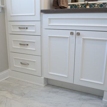
Mike and Anne of Barrington Hills desperately needed to update and renovate both their kid’s hall bath and guest bath, and in their 1980’s home each project presented a different set of unique challenges to overcome. When they set out to identify the right remodeling company to partner with, it was important to find a company that could help them to visualize design solutions for the bath renovations. When they came across Advance Design Studio’s website, they were immediately drawn to the solution-oriented remodeling process and the family friendly company.
They say they chose Advance Design because of the integrated approach of “Common Sense Remodeling”, making the design, project management and construction all happen in one place. When they met with Project Designer Michelle Lecinski, they knew they chose the right company. “Michelle’s excellent work on the initial designs made it easy to proceed with Advance Design Studio,” Mike said.
Like most homeowners anticipating a big renovation project, they had some healthy fears; with two bathrooms being remodeled at the same time they worried about timeframes and staying within budget. With the help of Michelle, and the “Common Sense” guidelines, they were confident that Advance Design would stay true, orchestrating all the moving parts to stay within both the estimated timeline and budget.
The guest bath offered the biggest design challenge. A dormer obstruction made the already cramped shower awkward to access. Mike and Anne also wanted the shower size to be expanded, making it more accommodating. Working with Advance’s construction expert DJ Yurik, Michelle relocated the shower concealing the original dormer and creating a larger, more comfortable and aesthetically pleasing guest shower.
The unsightly and not at all user-friendly closet was removed and replaced with elegant White Maple Dura Supreme cabinetry with much improved function featuring dual tall linen cabinets, a special makeup area and two sinks, providing a dual vanity which was extremely important for better guest use.
The Fossil Brown quartz countertop is in pleasing contrast to the white cabinetry, and coordinates nicely with the mocha porcelain tile gracing the shower for an accent. The decorative glazed turquoise tile backsplash, tile border, and bottle niche adds a taste of marine green to the room, while marble-looking porcelain tile makes guests feel they are staying in a 5-star hotel. Polished nickel Kohler plumbing fixtures were chosen to add a touch of sophistication. This renovated guest bath is comfortable and elegant, and Anne and Mike’s house guests may never want to leave!
“The end result was updated and restyled bathrooms that the client will enjoy and increase the value of their home,” Designer Michelle said.
The children’s hall bath had its own set of challenges. The current placement of the sink was not conducive to the best use of the existing space, nor did it allow for any visual interest, something Advance’s designers always work to achieve even within the tight confines of a small bath. Advance removed the linen closet and used the gain in wall space to create a dramatic focal point on the vanity wall. They also took additional space that wasn’t being used for new Storm Gray Dura Supreme tall built-in linen cabinets, creating functional storage space that the former bath lacked. A customized glass splash panel was created for the bath, and the high ceilings with skylights were accented with a custom-made track lighting fixture featuring industrial pipe and cage materials.
Authentic cement encaustic tile was used wall to wall surrounding the vanity to create a dramatic and interesting back drop for the new elegant and stately furniture-like double sink wall. Hand-made encaustic tile originated in Western Europe beginning in the 1850’s and reminded Mike and Anne of tile they had seen and loved from their travels overseas. Today, encaustic tile has made a re-appearance in today’s modern bath design with its wide array of appealing patterns and artistic use of color.
Oil rubbed bronze Kohler fixtures echo the black accents in the beautiful tile pattern and reflect the matte black of the unique lighting detail. Easy to maintain Blanca Arabescato Quartz countertops add practicality and natural beauty and compliments the warm wood porcelain tile floors. This handsome bath has generated praise from friends and family even before it’s complete unveiling as photos of the space leaked out on social media! It’s not only completely functional to use, but especially pretty to look at.
“Advance Design Studio did a terrific job for us. We really appreciated how easy it was to work with them on a complex project of the complete remodeling of two bathrooms. They very capably handled all the details from design, to project management, to construction. It is a great group of people to work with and we would welcome the opportunity to work with them again anytime,” Mike said.
 Shearon Design Collective
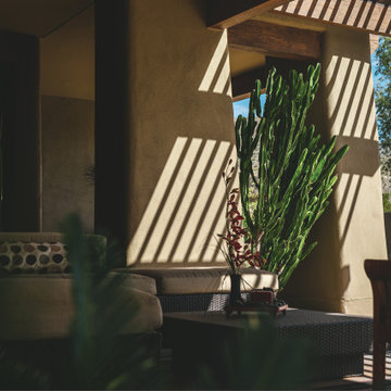
This project was driven by a commitment to sustainability and repurposing existing materials, seamlessly blending the old with the new while minimizing waste. The goal was to transform the backyard into a lush garden oasis with a low-water and low-maintenance design. Despite challenges posed by the property's proximity to the golf course and specific guidelines, a harmonious integration of desert plant life and low-water lush plants was achieved. Reusing existing materials and replacing natural grass with synthetic turf minimized water usage, while strategic plant placement utilized run-off water for sustainable irrigation. Navigating the constraints imposed by the Country Club, the project created a cohesive outdoor space and repurposed cobblestones to bridge the gap between the golf course and the rear of the property. This project achieved a balance between ecological consciousness and aesthetic beauty, allowing the garden oasis to coexist harmoniously with the golf course backdrop, providing the clients with a serene and vibrant landscape that aligns with their vision and respects the natural resources of the community.
 Metropolis Drafting and Construction Inc
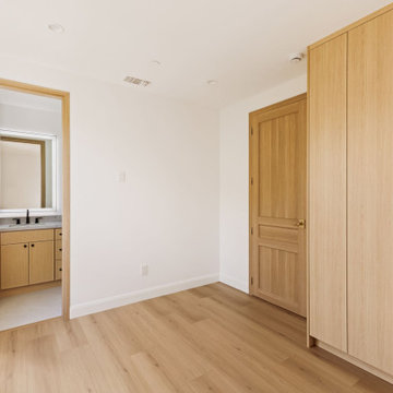
Today’s investment landscape in California features a surge in transforming single-family lots into vibrant multi-family residences, facilitated by recent SB9 and ADU laws. This project exemplifies how a modest 6,750-square-foot lot can accommodate a 1,500-square-foot primary home alongside a 2,500-square-foot duplex, seamlessly integrating design, functionality, and neighborhood aesthetics.
The primary residence underwent a meticulous interior transformation, evolving from a 3-bedroom, 1.5-bath layout into a spacious 4-bedroom, 2-bath home. Strategic reconfigurations centered around creating an expansive great room—an open-concept space adorned with vaulted ceilings—where the kitchen, dining, and living areas converge into a magnificent communal zone.
Exterior updates further distinguish the property. The front and side yards are enclosed with fencing and privacy hedges, linked by concrete pathways that enhance outdoor functionality while compensating for backyard space lost during renovations. The exterior façade was refreshed with darker tones, deliberately contrasting with the duplex to emphasize architectural separation.
Designed to preserve the suburban charm, the duplex visually mimics a single-family home from the street. Its facade creates an illusion of a two-story residence, maintaining harmony within the neighborhood fabric. The main unit, developed under SB9 guidelines, features three bedrooms and two bathrooms, with a luxurious parents’ suite situated upstairs. Downstairs, two bedrooms share a full bath, creating a balanced family-oriented layout.
The duplex’s interior boasts 9-foot ceilings throughout, elevating the sense of space and openness. The design thoughtfully places the kitchen at the front, inviting guests into the home, while stairs on the right lead to the private upstairs bedroom suite.
The ADU offers a two bedroom and two & half baths. the unit is accessible via a private side entrance with a dedicated walkway. Its layout includes a ground-floor living room, a galley kitchen, and a discreet powder room beneath the stairs, designed to contain guest traffic and maintain privacy upstairs. The upstairs bedrooms each feature luxurious bathrooms with expansive showers, adding an element of modern elegance.
Both units enjoy thoughtfully landscaped outdoor spaces—private patios, backyard areas, and gated front yards—creating welcoming environments for residents and visitors alike.
This project exemplifies innovative urban infill solutions, blending architectural elegance with legal compliance and community harmony—an inspiring blueprint for the future of residential development in California.
 User
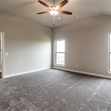
UserWhen you’re partnering with an experienced ADU contractor in La Habra Heights for a new ADU design & construction, it is quite possible to get the project delivered before schedule. It is because it has a team of specialized engineers & architects that help build a new dwelling unit from scratch, by following the construction guidelines.
Home and ADU Remodeling in La Habra Heights, CA - https://www.eleganteconstruction.com/
 Novell Design Build & Novella Outdoors
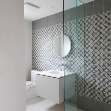
The renovation of our Renfrew Residence completely reimagined what we expected from a classic Vancouver Special home. We love transforming Vancouver Specials because they have a lot of versatility and great foundations! Our Renfrew Residence is a great example of how all the common modernizations of a Vancouver Special are even better with Design Build.
 Daniel Scerri Periti
We were approached with a request to design the furnishings for an existing ‘finished’ apartment. The intention was to move in relatively fast, and the property already had an existing marble floor, kitchen and bathrooms which had to be kept. The property also boasted a fantastic 270 degree view, seen from most of the apartment. The clients had a very important role in the completion of the project. They were very involved during the design process and through various decoration choices. The final design was kept as a rigid guideline when faced with picking out all the different elements.
Once clear of all previous furniture, the space felt cold and bare; so we immediately felt the need for warmth, and raw, natural elements and textures to complement the cold marble floor while visually tying in the design of the whole apartment together.
Since the existing kitchen had a touch of dark walnut stain, we felt this material was one we should add to the palette of materials to contest the stark materials. A raw cement finish was another material we felt would add an interesting contrast and could be used in a variety of ways, from cabinets to walls and ceilings, to tie up the design of various areas of the apartment.
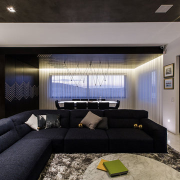
To warm up the living/dining area, keeping the existing marble floor but visually creating zones within the large living/dining area without hindering the flow, a dark timber custom-made soffit, continuous with a floor-to-ceiling drinks cabinet zones the dining area, giving it a degree of much-needed warmth.
The various windows with a stupendous 270 degree view needed to be visually tied together. This was done by introducing a continuous sheer [drape] which also doubled up as a sound-absorbing material along 2 of the 4 walls of the space.
A very large sofa was required to fill up the space correctly, also required for the size of the young family.
Services were integrated within the units and soffits, while a customized design in the corner between the kitchen and the living room took into consideration the viewpoints from the main areas to create a pantry without hindering the flow or views. A strategically placed floor-to-ceiling mirror doubles up the space and extends the view to the inner parts of the apartment.
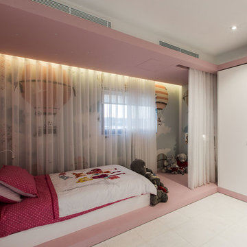
The daughter’s bedroom was a small challenge in itself, and a fun task, where we wanted to achieve the perception of a cozy niche with its own enclosed reading nook [for reading fairy tales], behind see-through curtains and a custom-ordered wall print sporting the girl’s favorite colors.
The sons’ bedroom had double the requirements in terms of space needed: more wardrobe, more homework desk space, a tv/play station area… “We combined a raised platform area between the boys’ beds to become an area with cushions where the kids can lay down and play, and face a hidden screen behind the homework desk’s sliding back panel for their play station”. The color of the homework desk was chosen in relation to the boys’ ages. A more masculine material palette was chosen for this room, in contrast to the light pastel palette of the girl’s bedroom. Again, this colour can easily be changed over time for a more mature look.
PROJECT DATA:
St. Paul’s Bay, Malta
DESIGN TEAM:
Perit Rebecca Zammit, Perit Daniel Scerri, Elyse Tonna
OTHER CREDITS:
Photography: Tonio Lombardi
Styling : TKS
 Daniel Scerri Periti
We were approached with a request to design the furnishings for an existing ‘finished’ apartment. The intention was to move in relatively fast, and the property already had an existing marble floor, kitchen and bathrooms which had to be kept. The property also boasted a fantastic 270 degree view, seen from most of the apartment. The clients had a very important role in the completion of the project. They were very involved during the design process and through various decoration choices. The final design was kept as a rigid guideline when faced with picking out all the different elements.
Once clear of all previous furniture, the space felt cold and bare; so we immediately felt the need for warmth, and raw, natural elements and textures to complement the cold marble floor while visually tying in the design of the whole apartment together.
Since the existing kitchen had a touch of dark walnut stain, we felt this material was one we should add to the palette of materials to contest the stark materials. A raw cement finish was another material we felt would add an interesting contrast and could be used in a variety of ways, from cabinets to walls and ceilings, to tie up the design of various areas of the apartment.
To warm up the living/dining area, keeping the existing marble floor but visually creating zones within the large living/dining area without hindering the flow, a dark timber custom-made soffit, continuous with a floor-to-ceiling drinks cabinet zones the dining area, giving it a degree of much-needed warmth.
The various windows with a stupendous 270 degree view needed to be visually tied together. This was done by introducing a continuous sheer [drape] which also doubled up as a sound-absorbing material along 2 of the 4 walls of the space.
A very large sofa was required to fill up the space correctly, also required for the size of the young family.
Services were integrated within the units and soffits, while a customized design in the corner between the kitchen and the living room took into consideration the viewpoints from the main areas to create a pantry without hindering the flow or views. A strategically placed floor-to-ceiling mirror doubles up the space and extends the view to the inner parts of the apartment.
The daughter’s bedroom was a small challenge in itself, and a fun task, where we wanted to achieve the perception of a cozy niche with its own enclosed reading nook [for reading fairy tales], behind see-through curtains and a custom-ordered wall print sporting the girl’s favorite colors.
The sons’ bedroom had double the requirements in terms of space needed: more wardrobe, more homework desk space, a tv/play station area… “We combined a raised platform area between the boys’ beds to become an area with cushions where the kids can lay down and play, and face a hidden screen behind the homework desk’s sliding back panel for their play station”. The color of the homework desk was chosen in relation to the boys’ ages. A more masculine material palette was chosen for this room, in contrast to the light pastel palette of the girl’s bedroom. Again, this colour can easily be changed over time for a more mature look.
PROJECT DATA:
St. Paul’s Bay, Malta
DESIGN TEAM:
Perit Rebecca Zammit, Perit Daniel Scerri, Elyse Tonna
OTHER CREDITS:
Photography: Tonio Lombardi
Styling : TKS
 Horvath Landscapes
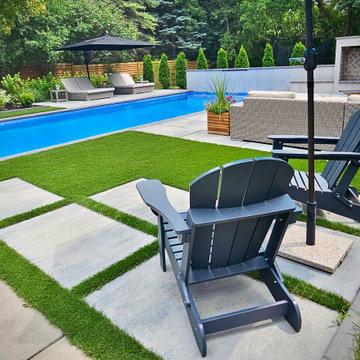
A ground-level view featuring Adirondack seating framed by large-format concrete slabs and artificial grass inlays, creating a comfortable poolside gathering area that is visually striking, durable, and compliant with Oak Ridges landscape coverage guidelines.
 Novell Design Build & Novella Outdoors
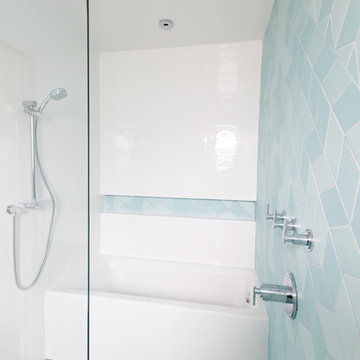
The renovation of our Renfrew Residence completely reimagined what we expected from a classic Vancouver Special home. We love transforming Vancouver Specials because they have a lot of versatility and great foundations! Our Renfrew Residence is a great example of how all the common modernizations of a Vancouver Special are even better with Design Build.
 Daniel Scerri Periti
We were approached with a request to design the furnishings for an existing ‘finished’ apartment. The intention was to move in relatively fast, and the property already had an existing marble floor, kitchen and bathrooms which had to be kept. The property also boasted a fantastic 270 degree view, seen from most of the apartment. The clients had a very important role in the completion of the project. They were very involved during the design process and through various decoration choices. The final design was kept as a rigid guideline when faced with picking out all the different elements.
Once clear of all previous furniture, the space felt cold and bare; so we immediately felt the need for warmth, and raw, natural elements and textures to complement the cold marble floor while visually tying in the design of the whole apartment together.
Since the existing kitchen had a touch of dark walnut stain, we felt this material was one we should add to the palette of materials to contest the stark materials. A raw cement finish was another material we felt would add an interesting contrast and could be used in a variety of ways, from cabinets to walls and ceilings, to tie up the design of various areas of the apartment.
To warm up the living/dining area, keeping the existing marble floor but visually creating zones within the large living/dining area without hindering the flow, a dark timber custom-made soffit, continuous with a floor-to-ceiling drinks cabinet zones the dining area, giving it a degree of much-needed warmth.
The various windows with a stupendous 270 degree view needed to be visually tied together. This was done by introducing a continuous sheer [drape] which also doubled up as a sound-absorbing material along 2 of the 4 walls of the space.
A very large sofa was required to fill up the space correctly, also required for the size of the young family.
Services were integrated within the units and soffits, while a customized design in the corner between the kitchen and the living room took into consideration the viewpoints from the main areas to create a pantry without hindering the flow or views. A strategically placed floor-to-ceiling mirror doubles up the space and extends the view to the inner parts of the apartment.
The daughter’s bedroom was a small challenge in itself, and a fun task, where we wanted to achieve the perception of a cozy niche with its own enclosed reading nook [for reading fairy tales], behind see-through curtains and a custom-ordered wall print sporting the girl’s favorite colors.
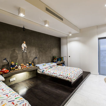
The sons’ bedroom had double the requirements in terms of space needed: more wardrobe, more homework desk space, a tv/play station area… “We combined a raised platform area between the boys’ beds to become an area with cushions where the kids can lay down and play, and face a hidden screen behind the homework desk’s sliding back panel for their play station”. The color of the homework desk was chosen in relation to the boys’ ages. A more masculine material palette was chosen for this room, in contrast to the light pastel palette of the girl’s bedroom. Again, this colour can easily be changed over time for a more mature look.
PROJECT DATA:
St. Paul’s Bay, Malta
DESIGN TEAM:
Perit Rebecca Zammit, Perit Daniel Scerri, Elyse Tonna
OTHER CREDITS:
Photography: Tonio Lombardi
Styling : TKS
33