
Search results for "Guidelines" in Home Design Ideas
 Moss Yaw Design studio
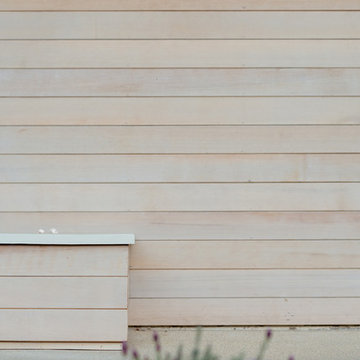
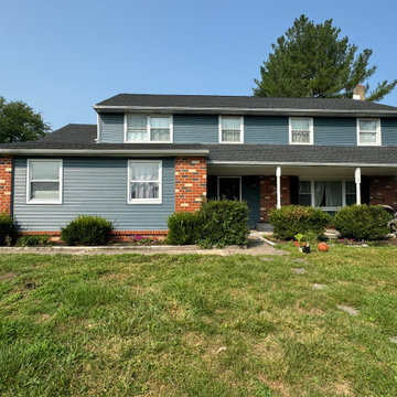
Engineered cedar siding creates beautiful gray-blue tones at the exterior of the home, while adding a textural element to activate the simple exterior design.
 Dynia Architects
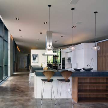
The central, public wing of this residence is elevated 4 feet above grade with a ceiling that rises to opposite corners – to the northwest for visual access to the mountain faces and to the south east for morning light. This is achieved by means of a diagonal valley extending from the southwest entry to the northeast family room. Offset in plan and section, two story, private wings extend north and south forming a ‘pinwheel’ plan which forms distinctly programmed garden spaces in each quadrant.
The exterior vocabulary creatively abides the traditional design guidelines of the subdivision, which required gable roofs and wood siding. Inside, the house is open and sleek, using concrete for shear walls and spatial divisions that allow the ceiling to freely sculpt the main space of the residence.
A.I.A Wyoming Chapter Design Award of Excellence 2017
Project Year: 2010

Find the right local pro for your project
 SURROUNDS Landscape Architecture + Construction
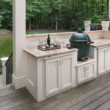
Our client desired a functional, tasteful, and improved environment to compliment their home. The overall goal was to create a landscape that was subtle and not overdone. The client was highly focused on their deck environment that would span across the rear of the house with an area for a Jacuzzi as well. A portion of the deck has a screened in porch due to the naturally buggy environment since the home is situated in the woods and a low area. A mosquito repellent injection system was incorporated into the irrigation system to help with the bug issue. We improved circulation of the driveway, increased the overall curb appeal of the entrance of the home, and created a scaled and proportional outdoor living environment for the clients to enjoy. The client has religious guidelines that needed to be adhered to with the overall function and design of the landscape, which included an arbor over the deck to support a Sukkah and a Green Egg smoker to cook Kosher foods. Two columns were added at the driveway entrance with lights to help define their driveway entrance since it's the end of a long pipe-stem. New light fixtures were also added to the rear of the house.
Our client desired multiple amenities with a limited budget, so everything had to be value engineered through the design and construction process. There is heavy deer pressure on the site, a mosquito issue, low site elevations, flat topography, poor soil, and overall poor drainage of the site. The original driveway was not sized appropriately and the front porch had structural issues, as well as leaked water onto the landing below. The septic tank was also situated close to the rear of the house and had to be contemplated during the design process.
Photography: Morgan Howarth. Landscape Architect: Howard Cohen, Surrounds Inc.
 TD Construction
TD Construction
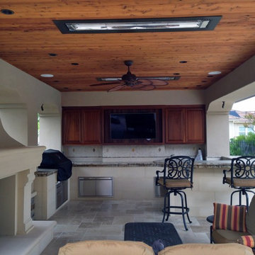
Mid-sized tuscan backyard stone patio kitchen photo in San Francisco with a gazebo
Mid-sized tuscan backyard stone patio kitchen photo in San Francisco with a gazebo
 Dynia Architects
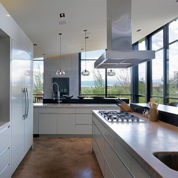
The central, public wing of this residence is elevated 4 feet above grade with a ceiling that rises to opposite corners – to the northwest for visual access to the mountain faces and to the south east for morning light. This is achieved by means of a diagonal valley extending from the southwest entry to the northeast family room. Offset in plan and section, two story, private wings extend north and south forming a ‘pinwheel’ plan which forms distinctly programmed garden spaces in each quadrant.
The exterior vocabulary creatively abides the traditional design guidelines of the subdivision, which required gable roofs and wood siding. Inside, the house is open and sleek, using concrete for shear walls and spatial divisions that allow the ceiling to freely sculpt the main space of the residence.
A.I.A Wyoming Chapter Design Award of Excellence 2017
Project Year: 2010
 TRE Architecture
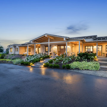
Situated on a gently sloping site in the heart of the Rancho Santa Fe Covenant, the El Camino del Norte Residence takes cues from the structural clarity and purposeful simplicity of California's mid-century modern architecture. Clean lines and generous overhangs frame views of the landscape while allowing the site's natural topography to shape the sequence of spaces and the home to perform naturally with Southern California's light and climate. The design reflects the client's active engagement with the outdoors, where inside and outside are in constant conversation.
Design Challenges
Rancho Santa Fe Art Jury approval - Material and massing refinements that honored covenant guidelines
Grade change - Strategic site planning that engages the sloping topography as an integral part of the design rather than a constraint to overcome.
Rancho Santa Fe Fire safety compliance - Material selection and site planning that absorbed code requirements into the architecture
 Dynia Architects
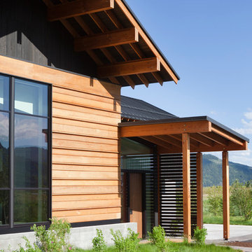
The central, public wing of this residence is elevated 4 feet above grade with a ceiling that rises to opposite corners – to the northwest for visual access to the mountain faces and to the south east for morning light. This is achieved by means of a diagonal valley extending from the southwest entry to the northeast family room. Offset in plan and section, two story, private wings extend north and south forming a ‘pinwheel’ plan which forms distinctly programmed garden spaces in each quadrant.
The exterior vocabulary creatively abides the traditional design guidelines of the subdivision, which required gable roofs and wood siding. Inside, the house is open and sleek, using concrete for shear walls and spatial divisions that allow the ceiling to freely sculpt the main space of the residence.
A.I.A Wyoming Chapter Design Award of Excellence 2017
Project Year: 2010
 Dynia Architects
The central, public wing of this residence is elevated 4 feet above grade with a ceiling that rises to opposite corners – to the northwest for visual access to the mountain faces and to the south east for morning light. This is achieved by means of a diagonal valley extending from the southwest entry to the northeast family room. Offset in plan and section, two story, private wings extend north and south forming a ‘pinwheel’ plan which forms distinctly programmed garden spaces in each quadrant.
The exterior vocabulary creatively abides the traditional design guidelines of the subdivision, which required gable roofs and wood siding. Inside, the house is open and sleek, using concrete for shear walls and spatial divisions that allow the ceiling to freely sculpt the main space of the residence.
A.I.A Wyoming Chapter Design Award of Excellence 2017
Project Year: 2010

 Novell Design Build & Novella Outdoors
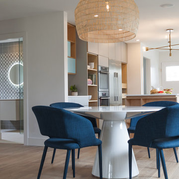
The renovation of our Renfrew Residence completely reimagined what we expected from a classic Vancouver Special home. The boxy shape of Vancouver Specials was a result of maximizing floor space under the zoning guidelines of their time. Builders in the 1960s and 1980s saw an opportunity and made the most of it! Today, renovating these homes are a common and rewarding project for Design Build firms. We love transforming Vancouver Specials because they have a lot of versatility and great foundations! Our Renfrew Residence is a great example of how all the common modernizations of a Vancouver Special are even better with Design Build.
To begin, we gave this home a more modern layout. We opened the walls upstairs, expanded the master bathroom, and gave the home an overall open feeling. In order to do so, we restructured and moved some of the walls.
 Phase One Design
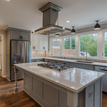
When designing this kitchen update and addition, Phase One had to keep function and style top of mind, all the time. The homeowners are masters in the kitchen and also wanted to highlight the great outdoors and the future location of their pool, so adding window banks were paramount, especially over the sink counter. The bathrooms renovations were hardly a second thought to the kitchen; one focuses on a large shower while the other, a stately bathtub, complete with frosted glass windows Stylistic details such as a bright red sliding door, and a hand selected fireplace mantle from the mountains were key indicators of the homeowners trend guidelines. Storage was also very important to the client and the home is now outfitted with 12.

 Tobin Dougherty Architects
This new 6400 s.f. two-story split-level home lifts upward and orients toward unobstructed views of Windy Hill. The deep overhanging flat roof design with a stepped fascia preserves the classic modern lines of the building while incorporating a Zero-Net Energy photovoltaic panel system. From start to finish, the construction is uniformly energy efficient and follows California Build It Green guidelines. Many sustainable finish materials are used on both the interior and exterior, including recycled old growth cedar and pre-fabricated concrete panel siding.
Photo by:
www.bernardandre.com
 Dynia Architects
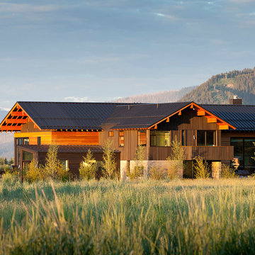
The central, public wing of this residence is elevated 4 feet above grade with a ceiling that rises to opposite corners – to the northwest for visual access to the mountain faces and to the south east for morning light. This is achieved by means of a diagonal valley extending from the southwest entry to the northeast family room. Offset in plan and section, two story, private wings extend north and south forming a ‘pinwheel’ plan which forms distinctly programmed garden spaces in each quadrant.
The exterior vocabulary creatively abides the traditional design guidelines of the subdivision, which required gable roofs and wood siding. Inside, the house is open and sleek, using concrete for shear walls and spatial divisions that allow the ceiling to freely sculpt the main space of the residence.
A.I.A Wyoming Chapter Design Award of Excellence 2017
Project Year: 2010
 Henrietta Heisler Interiors Inc
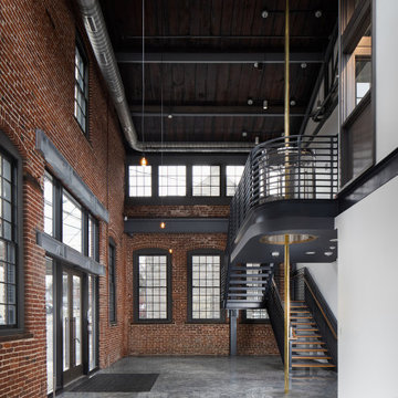
When transforming this large warehouse into the home base for a security company, it was important to maintain the historic integrity of the building, as well as take security considerations into account. Selections were made to stay within historic preservation guidelines, working around and with existing architectural elements. This led us to finding creative solutions for floor plans and furniture to fit around the original railroad track beams that cut through the walls, as well as fantastic light fixtures that worked around rafters and with the existing wiring. Utilizing what was available, the entry stairway steps were created from original wood beams that were salvaged.
The building was empty when the remodel began: gutted, and without a second floor. This blank slate allowed us to fully realize the vision of our client - a 50+ year veteran of the fire department - to reflect a connection with emergency responders, and to emanate confidence and safety. A firepole was installed in the lobby which is now complete with a retired fire truck.
 Mariana Pickering (Emu Building Science)
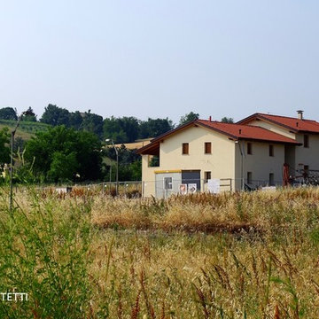
Single-family new construction in Albinea (RE), Italy, certified Class A by CasaClima Agency for high energy efficiency.
This single-family home was designed as part of an existing development plan near Albinea (in the province of Reggio Emilia), for which there were prescribed traditional design guidelines imposed. The architectural form, therefore, references a traditional Emilian farmhouse with a central "porta morta" area that acts as the entrance and stairwell. The color palette blends in with the surrounding hay fields, and the rear of the house offers decks and balconies overlooking the hills of the Reggiano Apennines.
Our challenge was to focus on the efficiency of the building envelope, without changing the orientation of the building. Despite the fact that the shorter side of the house is facing South and through careful design calculations and testing during construction, we were able to achieve Class A in the CasaClima rating scheme, one of the highest Italian certifications available.
This project is a joint development with Roverella SRL and is now for sale:
http://www.immobiliare.it/44731806-Vendita-Villa-via-Conte-6-Albinea.html
photo by Sara Salsi
 Mariana Pickering (Emu Building Science)
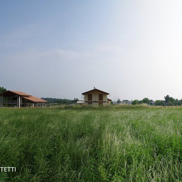
Single-family new construction in Albinea (RE), Italy, certified Class A by CasaClima Agency for high energy efficiency.
This single-family home was designed as part of an existing development plan near Albinea (in the province of Reggio Emilia), for which there were prescribed traditional design guidelines imposed. The architectural form, therefore, references a traditional Emilian farmhouse with a central "porta morta" area that acts as the entrance and stairwell. The color palette blends in with the surrounding hay fields, and the rear of the house offers decks and balconies overlooking the hills of the Reggiano Apennines.
Our challenge was to focus on the efficiency of the building envelope, without changing the orientation of the building. Despite the fact that the shorter side of the house is facing South and through careful design calculations and testing during construction, we were able to achieve Class A in the CasaClima rating scheme, one of the highest Italian certifications available.
This project is a joint development with Roverella SRL and is now for sale:
http://www.immobiliare.it/44731806-Vendita-Villa-via-Conte-6-Albinea.html
photo by Sara Salsi
 The Hands Of Sean Perry
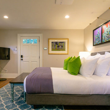
The owners of The Applewood Manor, a boutique bed and breakfast in Montford, reached out to The Hands of Sean Perry Co. in 2023 for another renovation project — this time, for their cozy Cortland Cottage space.
The team quickly got to work transforming the historic room to include all the comforts of a modern, boutique hotel-like experience, while still honoring all Historic Resources Commission guidelines. In the bath, they installed spa-quality heated flooring, a new Grohe faucet, and vibrant blue tile from Mediterranean Tile. Throughout the room, the crew laid new French Oak engineered hardwood flooring and added fresh, locally sourced wooden windowsills from Green River Woods for a more rustic feel.
With help from the owner and operator, who is an interior designer, the crew added pops of color throughout the room — painting the door a bold shade of red and hanging colorful modern artwork with a decidedly canine theme, honoring the owners’ beloved French bulldogs: Cleopatra, Pearl and Ziggy Stardust.
 Furniture Row
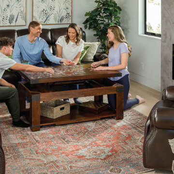
When designing your living room, start by measuring the space and recording the dimensions for future reference. Ensure a comfortable walkway by maintaining 30-36 inches of space throughout the room. Consider the room's purpose: will it be an entertainment zone or conversational area? This will help you determine the layout and furniture arrangement.
Creating an Entertainment Zone
For an entertainment zone, position seating around the - -TV for easy viewing.
Follow these guidelines:
- Distance between TV and primary sofa: 1 foot for every 8 inches of TV screen diameter
- Distance between seating pieces: 10-12 inches, with no piece further than 6 inches from the central coffee table
By considering these factors, you'll create a functional and comfortable living room space.
 Dynia Architects
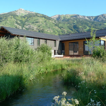
The central, public wing of this residence is elevated 4 feet above grade with a ceiling that rises to opposite corners – to the northwest for visual access to the mountain faces and to the south east for morning light. This is achieved by means of a diagonal valley extending from the southwest entry to the northeast family room. Offset in plan and section, two story, private wings extend north and south forming a ‘pinwheel’ plan which forms distinctly programmed garden spaces in each quadrant.
The exterior vocabulary creatively abides the traditional design guidelines of the subdivision, which required gable roofs and wood siding. Inside, the house is open and sleek, using concrete for shear walls and spatial divisions that allow the ceiling to freely sculpt the main space of the residence.
A.I.A Wyoming Chapter Design Award of Excellence 2017
Project Year: 2010
38