
Search results for "Guidelines" in Home Design Ideas
 Rachel Mathai Interior Design
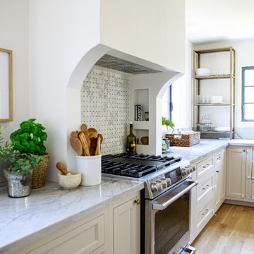
New construction kitchen design, part of a larger 900-square-foot home addition, seamlessly combines neutral tones with organic elements for a timeless aesthetic. The cabinetry is thoughtfully planned to meet National Kitchen and Bath Association storage guidelines, with all storage needs efficiently addressed in the lower cabinetry and a tall end cabinet, allowing for an open, airy feel in this compact kitchen. A plaster hood with integrated spice niches ensures everyday cooking essentials are always within reach. The highly durable quartzite countertops, featuring bold veining and a waterfall edge, highlight the natural beauty of the stone. A paneled fridge blends seamlessly into the design, while inset soft-close custom cabinetry in a light taupe hue, accented by antique brass hardware, adds a touch of character. Brass faucets and pendant lights introduce a subtle industrial flair, enhancing the bright, organic, and timeless feel of this beautiful kitchen.
 Shearon Design Collective
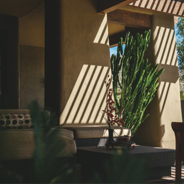
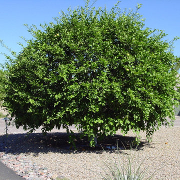
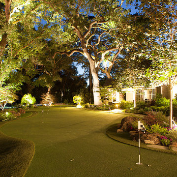
This project was driven by a commitment to sustainability and repurposing existing materials, seamlessly blending the old with the new while minimizing waste. The goal was to transform the backyard into a lush garden oasis with a low-water and low-maintenance design. Despite challenges posed by the property's proximity to the golf course and specific guidelines, a harmonious integration of desert plant life and low-water lush plants was achieved. Reusing existing materials and replacing natural grass with synthetic turf minimized water usage, while strategic plant placement utilized run-off water for sustainable irrigation. Navigating the constraints imposed by the Country Club, the project created a cohesive outdoor space and repurposed cobblestones to bridge the gap between the golf course and the rear of the property. This project achieved a balance between ecological consciousness and aesthetic beauty, allowing the garden oasis to coexist harmoniously with the golf course backdrop, providing the clients with a serene and vibrant landscape that aligns with their vision and respects the natural resources of the community.
 Shearon Design Collective
This project was driven by a commitment to sustainability and repurposing existing materials, seamlessly blending the old with the new while minimizing waste. The goal was to transform the backyard into a lush garden oasis with a low-water and low-maintenance design. Despite challenges posed by the property's proximity to the golf course and specific guidelines, a harmonious integration of desert plant life and low-water lush plants was achieved. Reusing existing materials and replacing natural grass with synthetic turf minimized water usage, while strategic plant placement utilized run-off water for sustainable irrigation. Navigating the constraints imposed by the Country Club, the project created a cohesive outdoor space and repurposed cobblestones to bridge the gap between the golf course and the rear of the property. This project achieved a balance between ecological consciousness and aesthetic beauty, allowing the garden oasis to coexist harmoniously with the golf course backdrop, providing the clients with a serene and vibrant landscape that aligns with their vision and respects the natural resources of the community.
Find the right local pro for your project
 Shearon Design Collective
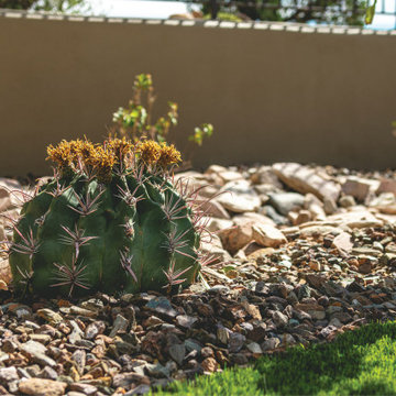
This project was driven by a commitment to sustainability and repurposing existing materials, seamlessly blending the old with the new while minimizing waste. The goal was to transform the backyard into a lush garden oasis with a low-water and low-maintenance design. Despite challenges posed by the property's proximity to the golf course and specific guidelines, a harmonious integration of desert plant life and low-water lush plants was achieved. Reusing existing materials and replacing natural grass with synthetic turf minimized water usage, while strategic plant placement utilized run-off water for sustainable irrigation. Navigating the constraints imposed by the Country Club, the project created a cohesive outdoor space and repurposed cobblestones to bridge the gap between the golf course and the rear of the property. This project achieved a balance between ecological consciousness and aesthetic beauty, allowing the garden oasis to coexist harmoniously with the golf course backdrop, providing the clients with a serene and vibrant landscape that aligns with their vision and respects the natural resources of the community.



 Bestbath
 https://bestbath.com/products/grab-bars/
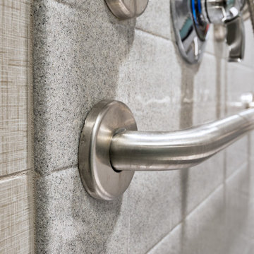
Bestbath grab bar commercial grab bar ada grab bar
grab bars
best bath systems grab bars
l shaped grab bar
best bath systems grab bars
shower grab bars
u shaped shower grab bar
best bath systems grab bars
best bath systems grab bars
cheap grab bars
u shaped grab bar
best grab bars
grab bar distributors
bathtub grab bars
ada grab bar mounting height
designer grab bars
great grabz grab bars
clear acrylic grab bar
mounting grab bars in fiberglass shower
commercial bathroom grab bars
elevator grab bars
tub grab bar
ada shower grab bar height
ada requirements for shower grab bars
grab bar com
bariatric grab bar requirements
tub with grab bars
ada restroom grab bar height
bathroom grab bar installation height
bariatric grab bars
shower grab bar height
shower grab bar replacement
bathtub grab bar replacement
ada compliant grab bar height
moen grab bars showers
ada grab bar height from floor
commercial grab bars
how high should a grab bar be in a shower
grab bars for shower and bath
bathroom grab bars canada
almond grab bars
grab bar dimensions
grab bar towel bar combo
safety first grab bar installation instructions
ada toilet grab bars
ada bathroom grab bar height
grab bar locations
how to install grab bars in drywall
stylish grab bars
corner grab bar
handicap bathroom grab bar height
ada toilet grab bar height
handicap grab bar code
wood safety grab bars
grab bars in tub
self adhesive grab bars
revit grab bars
designer grab bars bath
ada guidelines for tub grab bars
best shower grab bars
shower stall grab bars
grab bar placement
where to place grab bars in shower
install grab bar in fiberglass shower
ada grab bar requirements 2017
ada grab bar code
grab bars for tubs & showers
shower grab bars placement
residential grab bars
grab bars for door entry
grab bar towel holder
ada grab bar height at toilet
grab bar guys
safety grab bars for tubs
decorative shower grab bars
custom grab bars
designer grab bars for bathrooms
grab bar soap dish
towel bar grab bar combo
over the tub grab bar
floor mounted ada grab bars
anti ligature grab bars
bathtub grab bar height
ada shower grab bars
types of grab bars
grab bar sizes
fiberglass grab bar anchoring system kit
safety first grab bar
standard shower grab bar height
ada compliant shower grab bars
ada bathroom grab bar height requirements
grab bar towel rack combo
how to install grab bars in fiberglass shower
tub grab bar height
grab bar placement in walk in shower
grab bars for tubs and showers
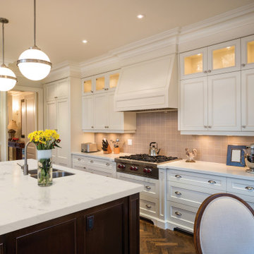
grab bar height
bathtub grab bar installation guidelines
grab bars for fiberglass tubs
bathroom grab bar code
flip up grab bars ada compliant
replacement grab bar for fiberglass shower
grab bar diameter
clear grab bars
designer grab bars for showers
ada roll in shower grab bars
handicap grab bars for fiberglass showers
 Novell Design Build & Novella Outdoors
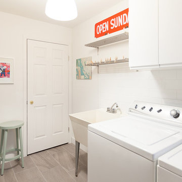
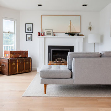
This project was an interior refurbishment of a Vancouver Special. The driving focus was a space which is clean and simple, in order to serve as a backdrop for the homeowners' modern living. The intention was to create a canvas to showcase the Owners' furniture, art and objects and have space for their growing family while staying budget conscious.
Photos by Laura Jaramillo
 Eldorado Stone
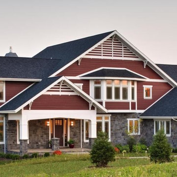
Across the country, builders and architects are embracing sustainable building and design practices more than ever before. The use of eco-friendly products and materials help to create living environments that are not only sensitive to nature, but still achieves the look and feel desired by the original design.
Eldorado Stone is proud to be part of a growing number of award-winning projects that have won the highest levels in sustainable building practices and products available today. Whether it’s a traditional or contemporary design, Eldorado’s versatility and appeal offers an authentic architectural statement while adding the warmth and texture that only stone can provide.
Studio26homes, a design/ build firm dedicated to creating highly efficient, healthy homes, recently completed a 4,700+ sf project in Orefield, PA. The private residence earned the Gold rating from the National Association of Home Builders’ (NAHB) National Green Building Guidelines certification program as the 19th certified project of any level in the country. To reach the gold standard, Orefield had to earn at least 395 points and ended up surpassing that requirement with a grand total of 542 points.
Studio26homes hadn’t used Eldorado Stone before this project and were pleased to find that Eldorado is not only passionate about what they do but also back up their products should any problems arise. The fact that Eldorado Stone is locally manufactured, offers low maintenance, is competitively priced, and features the geometric shape they were looking for provided further confirmation that this was the company to work with. They chose Eldorado’s Castle Stone and were originally going to only apply it onto the fireplace and chimney. However, because the product complemented the home’s shade of red, they chose to do a more dramatic application, which resulted in great satisfaction for both the team and the homeowners.
Eldorado Stone Profile Featured: Custom Castle Stone
Builder: studio26homes, Orefield, PA
Website: www.studio26homes.com
Architect: Alan Mascord Design Associates, Portland, OR
Website: www.mascord.com
Mason: CM Masonry, Allentown, PA
Website: www.cmmasonry.com
 Novell Design Build & Novella Outdoors
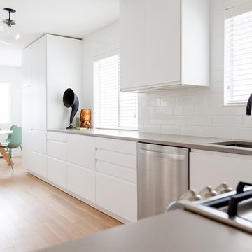
This project was an interior refurbishment of a Vancouver Special. The driving focus was a space which is clean and simple, in order to serve as a backdrop for the homeowners' modern living. The intention was to create a canvas to showcase the Owners' furniture, art and objects and have space for their growing family while staying budget conscious.
Photos by Laura Jaramillo
 Novell Design Build & Novella Outdoors
This project was an interior refurbishment of a Vancouver Special. The driving focus was a space which is clean and simple, in order to serve as a backdrop for the homeowners' modern living. The intention was to create a canvas to showcase the Owners' furniture, art and objects and have space for their growing family while staying budget conscious.
Photos by Laura Jaramillo
 Fernanda Zulzke Interiores
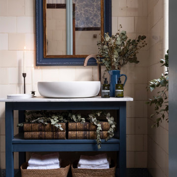
Fernanda Zulzke gifted São Paulo with an authentic experience by preserving the original 1920s tiles and architecture of the building. Many broken tiles were replaced, and missing ones were carefully sourced to breathe new life into a long-forgotten space. The floor tiles received the same care, though they posed an even greater challenge, as the original baseboard pieces could not be found even in the city’s largest tile archives. Beyond mere maintenance, the decoration aims to show visitors that history and its imperfections bring beauty, vitality, originality, and exclusivity to a space—a combination that can never be replicated, a luxury in its essence.
In the realm of restoration, the solid wood bathroom doors were personally tended to by Flávio Galli, a skilled designer and expert in raw materials, who followed the guidelines of the Parque da Água Branca manual. Four days of cleaning, sanding, and varnishing brought the doors back to life. In terms of carpentry, damaged baseboards and frames were crafted by Construverde using the building’s original wood—a true gift that Fernanda Zulzke was determined to offer the public and the park.
Completing the bathroom’s composition, imported wallpapers from Cordão Decor and a Roman curtain in cambric demonstrate the decorator’s ability to honor history while making bold, unexpected choices. Few can combine vintage, classic, and diverse colors and patterns in such a small space, transforming it into a light and fresh work of art, like the eucalyptus resting atop the marble and classic encyclopedias.
 Ambiance Furniture
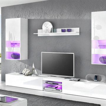
TV Stand Size Guide- Searching through an array of TV stand sizes doesn’t have to feel tricky. These tips make it easy to set up the perfect entertainment center, so that you can sit back, relax and enjoy the show – no matter what screen it’s playing on!
Step 1: Find the Actual Width of a TV
Step 2: Find the TV Stand Height
Step 3: Find the TV Stand Width
Expert Tip: The recommended TV viewing distance is about double your screen size. For example, if you have a 54-inch TV, place the TV and stand at least 108 inches from the viewing area.
Please note that because the size of the frame around the TV screen varies from manufacturer to manufacturer, the above chart is meant to be taken only as a general recommendation and not a strict guideline. Always use sound judgment when arranging TVs, TV stands and other heavy furniture items!
.
.
.
For more information and prices please call on:
Tel: +971 4 343 53 95
Interior Design / Sales Consultant:
Fathima: +971 56 938 23 63S
Soufiya: +971556327760
Retail Sales:
Haytham: +971 52 645 71 54
or Email us on info@ambiancefurnitures.com
Our Timings are:
Weekdays 09.30 AM to 9.00 PM
Fridays: 4.00 PM to 9.00 PM
Our Address: Umm Hurair Street, Karama
Dubai, UAE.
#2020 #ambiance #furniture #architecture #interiors #furnishings #sofa #home #decor #dubai #dubaifurniture #dubaifurniturecompany #creative #design #leathersofa #vintage #coffeetable #homedecor #vibes #aesthetic #mydubai #classic #classicfurniture #classicdesign #classicinteriors
 SkyWindows & Aluminum Products
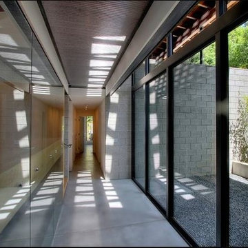
When a potential customer takes that first glimpse at a storefront, an initial impression is being formed and expectations are being set. Our work brings the added value that businesses require in order to showcase their products and increase their sales. The striking designs, that we are known for, are specifically created not only to be aesthetically pleasing, but to lure shoppers into your place of business.
Many individual business owners are unaware of the fact that creating the design that a potential customer sees from the street is an exact science when displaying products and constructing an eye catching visual presentation. We also understand that each business that we work with is unique when it comes to the way potential customers perceive that store. If a storefronts appearance is not constructed correctly, a potential customer may immediately dismiss that particular store as “unprofessional” or worse, they might not even register the presence of that store at all when it just blends into the background!
This is the main reason why we pride ourselves so highly on the work that we do for our clients. The professionals at our company understand the complex guidelines that dictate what attracts buyers with a perfect visual approach to a particular design. But, of course, the quality will also need to be superior so that fading and overall deterioration of that design will not become a detriment to the goals of a business owner. This is why we utilize only the best materials and exact construction standards that will allow a store owner’s exterior presentation to be visually pleasing to the eye for years to come.
Whether you need our assistance just to keep your store front from closing improperly or more extensive construction, we’re here to help you with all your business needs when it comes to the visual perception of your store.
 Zelaya Properties LLC
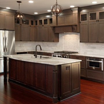
We used: Custom cherry cabinetry in Arts & Crafts Shaker style by Kabinart in Boulder and Espresso stains. Liberty Hardware Venetian bronze 1-1/2" cabinet knobs. KitchenAid Architect II Series 22 CF counter-depth French door refrigerator. KitchenAid Architect Series II 27" convection single wall oven. KitchenAid 36" 6-burner dual fuel freestanding commercial-style range. KitchenAid Architect II Series 24" dishwasher. Sharp Insight Pro Series 24" built-in microwave drawer (Model #KB6524PS). Crystorama Solaris 12" wide pendant lights in English bronze. Granite countertops in Brown Fantasy. 3"x6" polished marble backsplash.
Paint colors:
Walls: Glidden Silver Cloud 30YY 63/024
Ceilings/Trims/Doors: Glidden Swan White GLC23
Robert B. Narod Photography
 Novell Design Build & Novella Outdoors
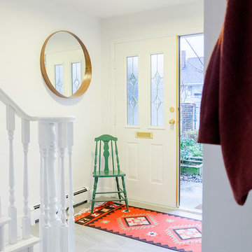
This project was an interior refurbishment of a Vancouver Special. The driving focus was a space which is clean and simple, in order to serve as a backdrop for the homeowners' modern living. The intention was to create a canvas to showcase the Owners' furniture, art and objects and have space for their growing family while staying budget conscious.
Photos by Laura Jaramillo
 Fernanda Zulzke Interiores
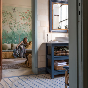
Fernanda Zulzke gifted São Paulo with an authentic experience by preserving the original 1920s tiles and architecture of the building. Many broken tiles were replaced, and missing ones were carefully sourced to breathe new life into a long-forgotten space. The floor tiles received the same care, though they posed an even greater challenge, as the original baseboard pieces could not be found even in the city’s largest tile archives. Beyond mere maintenance, the decoration aims to show visitors that history and its imperfections bring beauty, vitality, originality, and exclusivity to a space—a combination that can never be replicated, a luxury in its essence.
In the realm of restoration, the solid wood bathroom doors were personally tended to by Flávio Galli, a skilled designer and expert in raw materials, who followed the guidelines of the Parque da Água Branca manual. Four days of cleaning, sanding, and varnishing brought the doors back to life. In terms of carpentry, damaged baseboards and frames were crafted by Construverde using the building’s original wood—a true gift that Fernanda Zulzke was determined to offer the public and the park.
Completing the bathroom’s composition, imported wallpapers from Cordão Decor and a Roman curtain in cambric demonstrate the decorator’s ability to honor history while making bold, unexpected choices. Few can combine vintage, classic, and diverse colors and patterns in such a small space, transforming it into a light and fresh work of art, like the eucalyptus resting atop the marble and classic encyclopedias.
 Matt Fajkus Architecture
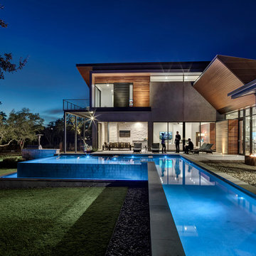
The Control/Shift House is perched on the high side of the site which takes advantage of the view to the southeast. A gradual descending path navigates the change in terrain from the street to the entry of the house. A series of low retaining walls/planter beds gather and release the earth upon the descent resulting in a fairly flat level for the house to sit on the top one third of the site. The entry axis is aligned with the celebrated stair volume and then re-centers on the actual entry axis once you approach the forecourt of the house.
The initial desire was for an “H” scheme house with common entertaining spaces bridging the gap between the more private spaces. After an investigation considering the site, program, and view, a key move was made: unfold the east wing of the “H” scheme to open all rooms to the southeast view resulting in a “T” scheme. The new derivation allows for both a swim pool which is on axis with the entry and main gathering space and a lap pool which occurs on the cross axis extending along the lengthy edge of the master suite, providing direct access for morning exercise and a view of the water throughout the day.
The Control/Shift House was derived from a clever way of following the “rules.” Strict HOA guidelines required very specific exterior massing restrictions which limits the lengths of unbroken elevations and promotes varying sizes of masses. The solution most often used in this neighborhood is one of addition - an aggregation of masses and program randomly attached to the inner core of the house which often results in a parasitic plan. The approach taken with the Control/Shift House was to push and pull program/massing to delineate and define the layout of the house. Massing is intentional and reiterated by the careful selection of materiality that tracks through the house. Voids and relief in the plan are a natural result of this method and allow for light and air to circulate throughout every space of the house, even into the most inner core.
Photography: Charles Davis Smith
 Guenther Designs & Consulting LLC
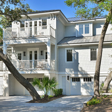
I was asked to design a new family home, for a lot that is third row back from the beach. As you can see the lot had numerous trees, all leaning in various directions, had to be accounted for. Besides the neighborhood restrictions the town, imposes even tighter guidelines on the mass and size of the building.
The collaberation with my client has ended up with thise lovely new home, just waiting for memories to be made.
Hee we can see the covered front porch with an open air second porch above. To help with the efficiency of the floor plan, due to site limitation, that fromt entry door is tucked around on the left side of the home.
We wanted a the home to have a "beachy" vibe to the architecture style. I incorporated a number of "low country architectural" design elements to provide the beach cottage feel. We used NuCedar shingle siding for ease of maintance and Hardie trim, for the some reason. The home owner choose a bronze standing seam metal roof to compliment the soft grey shingle color.
48