
Search results for "Hinders" in Home Design Ideas
 Daniel Scerri Periti
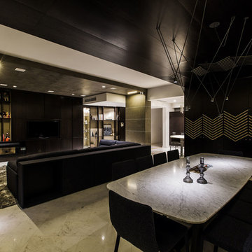
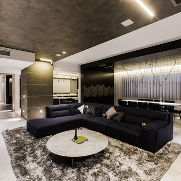
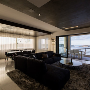
We were approached with a request to design the furnishings for an existing ‘finished’ apartment. The intention was to move in relatively fast, and the property already had an existing marble floor, kitchen and bathrooms which had to be kept. The property also boasted a fantastic 270 degree view, seen from most of the apartment. The clients had a very important role in the completion of the project. They were very involved during the design process and through various decoration choices. The final design was kept as a rigid guideline when faced with picking out all the different elements.
Once clear of all previous furniture, the space felt cold and bare; so we immediately felt the need for warmth, and raw, natural elements and textures to complement the cold marble floor while visually tying in the design of the whole apartment together.
Since the existing kitchen had a touch of dark walnut stain, we felt this material was one we should add to the palette of materials to contest the stark materials. A raw cement finish was another material we felt would add an interesting contrast and could be used in a variety of ways, from cabinets to walls and ceilings, to tie up the design of various areas of the apartment.
To warm up the living/dining area, keeping the existing marble floor but visually creating zones within the large living/dining area without hindering the flow, a dark timber custom-made soffit, continuous with a floor-to-ceiling drinks cabinet zones the dining area, giving it a degree of much-needed warmth.
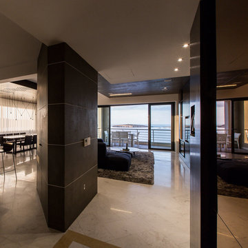
The various windows with a stupendous 270 degree view needed to be visually tied together. This was done by introducing a continuous sheer [drape] which also doubled up as a sound-absorbing material along 2 of the 4 walls of the space.
A very large sofa was required to fill up the space correctly, also required for the size of the young family.
Services were integrated within the units and soffits, while a customized design in the corner between the kitchen and the living room took into consideration the viewpoints from the main areas to create a pantry without hindering the flow or views. A strategically placed floor-to-ceiling mirror doubles up the space and extends the view to the inner parts of the apartment.
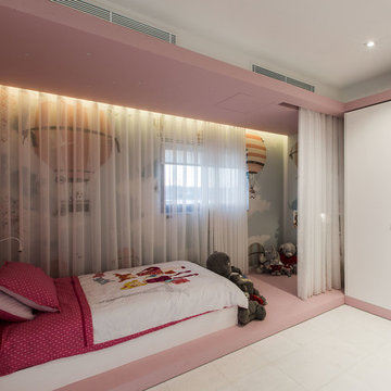
The daughter’s bedroom was a small challenge in itself, and a fun task, where we wanted to achieve the perception of a cozy niche with its own enclosed reading nook [for reading fairy tales], behind see-through curtains and a custom-ordered wall print sporting the girl’s favorite colors.
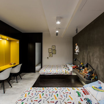
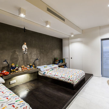
The sons’ bedroom had double the requirements in terms of space needed: more wardrobe, more homework desk space, a tv/play station area… “We combined a raised platform area between the boys’ beds to become an area with cushions where the kids can lay down and play, and face a hidden screen behind the homework desk’s sliding back panel for their play station”. The color of the homework desk was chosen in relation to the boys’ ages. A more masculine material palette was chosen for this room, in contrast to the light pastel palette of the girl’s bedroom. Again, this colour can easily be changed over time for a more mature look.
PROJECT DATA:
St. Paul’s Bay, Malta
DESIGN TEAM:
Perit Rebecca Zammit, Perit Daniel Scerri, Elyse Tonna
OTHER CREDITS:
Photography: Tonio Lombardi
Styling : TKS
 Daniel Scerri Periti
We were approached with a request to design the furnishings for an existing ‘finished’ apartment. The intention was to move in relatively fast, and the property already had an existing marble floor, kitchen and bathrooms which had to be kept. The property also boasted a fantastic 270 degree view, seen from most of the apartment. The clients had a very important role in the completion of the project. They were very involved during the design process and through various decoration choices. The final design was kept as a rigid guideline when faced with picking out all the different elements.
Once clear of all previous furniture, the space felt cold and bare; so we immediately felt the need for warmth, and raw, natural elements and textures to complement the cold marble floor while visually tying in the design of the whole apartment together.
Since the existing kitchen had a touch of dark walnut stain, we felt this material was one we should add to the palette of materials to contest the stark materials. A raw cement finish was another material we felt would add an interesting contrast and could be used in a variety of ways, from cabinets to walls and ceilings, to tie up the design of various areas of the apartment.
To warm up the living/dining area, keeping the existing marble floor but visually creating zones within the large living/dining area without hindering the flow, a dark timber custom-made soffit, continuous with a floor-to-ceiling drinks cabinet zones the dining area, giving it a degree of much-needed warmth.
The various windows with a stupendous 270 degree view needed to be visually tied together. This was done by introducing a continuous sheer [drape] which also doubled up as a sound-absorbing material along 2 of the 4 walls of the space.
A very large sofa was required to fill up the space correctly, also required for the size of the young family.
Services were integrated within the units and soffits, while a customized design in the corner between the kitchen and the living room took into consideration the viewpoints from the main areas to create a pantry without hindering the flow or views. A strategically placed floor-to-ceiling mirror doubles up the space and extends the view to the inner parts of the apartment.
The daughter’s bedroom was a small challenge in itself, and a fun task, where we wanted to achieve the perception of a cozy niche with its own enclosed reading nook [for reading fairy tales], behind see-through curtains and a custom-ordered wall print sporting the girl’s favorite colors.
The sons’ bedroom had double the requirements in terms of space needed: more wardrobe, more homework desk space, a tv/play station area… “We combined a raised platform area between the boys’ beds to become an area with cushions where the kids can lay down and play, and face a hidden screen behind the homework desk’s sliding back panel for their play station”. The color of the homework desk was chosen in relation to the boys’ ages. A more masculine material palette was chosen for this room, in contrast to the light pastel palette of the girl’s bedroom. Again, this colour can easily be changed over time for a more mature look.
PROJECT DATA:
St. Paul’s Bay, Malta
DESIGN TEAM:
Perit Rebecca Zammit, Perit Daniel Scerri, Elyse Tonna
OTHER CREDITS:
Photography: Tonio Lombardi
Styling : TKS
 Daniel Scerri Periti
We were approached with a request to design the furnishings for an existing ‘finished’ apartment. The intention was to move in relatively fast, and the property already had an existing marble floor, kitchen and bathrooms which had to be kept. The property also boasted a fantastic 270 degree view, seen from most of the apartment. The clients had a very important role in the completion of the project. They were very involved during the design process and through various decoration choices. The final design was kept as a rigid guideline when faced with picking out all the different elements.
Once clear of all previous furniture, the space felt cold and bare; so we immediately felt the need for warmth, and raw, natural elements and textures to complement the cold marble floor while visually tying in the design of the whole apartment together.
Since the existing kitchen had a touch of dark walnut stain, we felt this material was one we should add to the palette of materials to contest the stark materials. A raw cement finish was another material we felt would add an interesting contrast and could be used in a variety of ways, from cabinets to walls and ceilings, to tie up the design of various areas of the apartment.
To warm up the living/dining area, keeping the existing marble floor but visually creating zones within the large living/dining area without hindering the flow, a dark timber custom-made soffit, continuous with a floor-to-ceiling drinks cabinet zones the dining area, giving it a degree of much-needed warmth.
The various windows with a stupendous 270 degree view needed to be visually tied together. This was done by introducing a continuous sheer [drape] which also doubled up as a sound-absorbing material along 2 of the 4 walls of the space.
A very large sofa was required to fill up the space correctly, also required for the size of the young family.
Services were integrated within the units and soffits, while a customized design in the corner between the kitchen and the living room took into consideration the viewpoints from the main areas to create a pantry without hindering the flow or views. A strategically placed floor-to-ceiling mirror doubles up the space and extends the view to the inner parts of the apartment.
The daughter’s bedroom was a small challenge in itself, and a fun task, where we wanted to achieve the perception of a cozy niche with its own enclosed reading nook [for reading fairy tales], behind see-through curtains and a custom-ordered wall print sporting the girl’s favorite colors.
The sons’ bedroom had double the requirements in terms of space needed: more wardrobe, more homework desk space, a tv/play station area… “We combined a raised platform area between the boys’ beds to become an area with cushions where the kids can lay down and play, and face a hidden screen behind the homework desk’s sliding back panel for their play station”. The color of the homework desk was chosen in relation to the boys’ ages. A more masculine material palette was chosen for this room, in contrast to the light pastel palette of the girl’s bedroom. Again, this colour can easily be changed over time for a more mature look.
PROJECT DATA:
St. Paul’s Bay, Malta
DESIGN TEAM:
Perit Rebecca Zammit, Perit Daniel Scerri, Elyse Tonna
OTHER CREDITS:
Photography: Tonio Lombardi
Styling : TKS
Find the right local pro for your project
 Valentini Kids Furniture Brooklyn NY
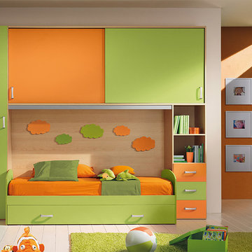
Italian Kids Bedroom Composition VV S027GO
Made in Italy
This amazing Italian kids bedroom furniture set becomes a great solution for those looking for top quality furniture with huge storage capabilities to adorn and organize the children`s bedroom. The bedroom set also works to not hinder the size of the room, using up only the smallest area of space required in the bedroom as to provide room for storage as well as plenty of room for your kids to play freely. All the pieces within this collection are made with a durable and easy to clean melamine on both sides, which is available in a variety of matt colors that can be mixed and matched to help add a happy and energetic vibe to the kids bedroom.
MATERIAL/CONSTRUCTION:
E1-Class ecological panels, which are produced exclusively trough a wood recycling production process
Bases 18 mm thick melamine
Back panels MDF 3 mm thickness
Doors 18 mm thick melamine
Front drawers 18 mm thick melamine
The starting price is for the composition that includes the following elements:
1 x Composition bridge loft (Reversible);
1 x Twin size platform Trundle or Storage bed ( fit US standard Twin size mattress 39" x 75");
Room/bed decorative accessories and the mattress are not included in the price.
Dimensions:
Composition bridge loft (Reversible): W112.2" x D21.3" x H93"
Twin bed Trundle or Storage internal dimensions W39" x D75" (US Standard)
Full bed Trundle or Storage internal dimensions W54" x D75" (US Standard)
 Daniel Scerri Periti
We were approached with a request to design the furnishings for an existing ‘finished’ apartment. The intention was to move in relatively fast, and the property already had an existing marble floor, kitchen and bathrooms which had to be kept. The property also boasted a fantastic 270 degree view, seen from most of the apartment. The clients had a very important role in the completion of the project. They were very involved during the design process and through various decoration choices. The final design was kept as a rigid guideline when faced with picking out all the different elements.
Once clear of all previous furniture, the space felt cold and bare; so we immediately felt the need for warmth, and raw, natural elements and textures to complement the cold marble floor while visually tying in the design of the whole apartment together.
Since the existing kitchen had a touch of dark walnut stain, we felt this material was one we should add to the palette of materials to contest the stark materials. A raw cement finish was another material we felt would add an interesting contrast and could be used in a variety of ways, from cabinets to walls and ceilings, to tie up the design of various areas of the apartment.
To warm up the living/dining area, keeping the existing marble floor but visually creating zones within the large living/dining area without hindering the flow, a dark timber custom-made soffit, continuous with a floor-to-ceiling drinks cabinet zones the dining area, giving it a degree of much-needed warmth.
The various windows with a stupendous 270 degree view needed to be visually tied together. This was done by introducing a continuous sheer [drape] which also doubled up as a sound-absorbing material along 2 of the 4 walls of the space.
A very large sofa was required to fill up the space correctly, also required for the size of the young family.
Services were integrated within the units and soffits, while a customized design in the corner between the kitchen and the living room took into consideration the viewpoints from the main areas to create a pantry without hindering the flow or views. A strategically placed floor-to-ceiling mirror doubles up the space and extends the view to the inner parts of the apartment.
The daughter’s bedroom was a small challenge in itself, and a fun task, where we wanted to achieve the perception of a cozy niche with its own enclosed reading nook [for reading fairy tales], behind see-through curtains and a custom-ordered wall print sporting the girl’s favorite colors.
The sons’ bedroom had double the requirements in terms of space needed: more wardrobe, more homework desk space, a tv/play station area… “We combined a raised platform area between the boys’ beds to become an area with cushions where the kids can lay down and play, and face a hidden screen behind the homework desk’s sliding back panel for their play station”. The color of the homework desk was chosen in relation to the boys’ ages. A more masculine material palette was chosen for this room, in contrast to the light pastel palette of the girl’s bedroom. Again, this colour can easily be changed over time for a more mature look.
PROJECT DATA:
St. Paul’s Bay, Malta
DESIGN TEAM:
Perit Rebecca Zammit, Perit Daniel Scerri, Elyse Tonna
OTHER CREDITS:
Photography: Tonio Lombardi
Styling : TKS
 Daniel Scerri Periti
We were approached with a request to design the furnishings for an existing ‘finished’ apartment. The intention was to move in relatively fast, and the property already had an existing marble floor, kitchen and bathrooms which had to be kept. The property also boasted a fantastic 270 degree view, seen from most of the apartment. The clients had a very important role in the completion of the project. They were very involved during the design process and through various decoration choices. The final design was kept as a rigid guideline when faced with picking out all the different elements.
Once clear of all previous furniture, the space felt cold and bare; so we immediately felt the need for warmth, and raw, natural elements and textures to complement the cold marble floor while visually tying in the design of the whole apartment together.
Since the existing kitchen had a touch of dark walnut stain, we felt this material was one we should add to the palette of materials to contest the stark materials. A raw cement finish was another material we felt would add an interesting contrast and could be used in a variety of ways, from cabinets to walls and ceilings, to tie up the design of various areas of the apartment.
To warm up the living/dining area, keeping the existing marble floor but visually creating zones within the large living/dining area without hindering the flow, a dark timber custom-made soffit, continuous with a floor-to-ceiling drinks cabinet zones the dining area, giving it a degree of much-needed warmth.
The various windows with a stupendous 270 degree view needed to be visually tied together. This was done by introducing a continuous sheer [drape] which also doubled up as a sound-absorbing material along 2 of the 4 walls of the space.
A very large sofa was required to fill up the space correctly, also required for the size of the young family.
Services were integrated within the units and soffits, while a customized design in the corner between the kitchen and the living room took into consideration the viewpoints from the main areas to create a pantry without hindering the flow or views. A strategically placed floor-to-ceiling mirror doubles up the space and extends the view to the inner parts of the apartment.
The daughter’s bedroom was a small challenge in itself, and a fun task, where we wanted to achieve the perception of a cozy niche with its own enclosed reading nook [for reading fairy tales], behind see-through curtains and a custom-ordered wall print sporting the girl’s favorite colors.
The sons’ bedroom had double the requirements in terms of space needed: more wardrobe, more homework desk space, a tv/play station area… “We combined a raised platform area between the boys’ beds to become an area with cushions where the kids can lay down and play, and face a hidden screen behind the homework desk’s sliding back panel for their play station”. The color of the homework desk was chosen in relation to the boys’ ages. A more masculine material palette was chosen for this room, in contrast to the light pastel palette of the girl’s bedroom. Again, this colour can easily be changed over time for a more mature look.
PROJECT DATA:
St. Paul’s Bay, Malta
DESIGN TEAM:
Perit Rebecca Zammit, Perit Daniel Scerri, Elyse Tonna
OTHER CREDITS:
Photography: Tonio Lombardi
Styling : TKS
 Daniel Scerri Periti
We were approached with a request to design the furnishings for an existing ‘finished’ apartment. The intention was to move in relatively fast, and the property already had an existing marble floor, kitchen and bathrooms which had to be kept. The property also boasted a fantastic 270 degree view, seen from most of the apartment. The clients had a very important role in the completion of the project. They were very involved during the design process and through various decoration choices. The final design was kept as a rigid guideline when faced with picking out all the different elements.
Once clear of all previous furniture, the space felt cold and bare; so we immediately felt the need for warmth, and raw, natural elements and textures to complement the cold marble floor while visually tying in the design of the whole apartment together.
Since the existing kitchen had a touch of dark walnut stain, we felt this material was one we should add to the palette of materials to contest the stark materials. A raw cement finish was another material we felt would add an interesting contrast and could be used in a variety of ways, from cabinets to walls and ceilings, to tie up the design of various areas of the apartment.
To warm up the living/dining area, keeping the existing marble floor but visually creating zones within the large living/dining area without hindering the flow, a dark timber custom-made soffit, continuous with a floor-to-ceiling drinks cabinet zones the dining area, giving it a degree of much-needed warmth.
The various windows with a stupendous 270 degree view needed to be visually tied together. This was done by introducing a continuous sheer [drape] which also doubled up as a sound-absorbing material along 2 of the 4 walls of the space.
A very large sofa was required to fill up the space correctly, also required for the size of the young family.
Services were integrated within the units and soffits, while a customized design in the corner between the kitchen and the living room took into consideration the viewpoints from the main areas to create a pantry without hindering the flow or views. A strategically placed floor-to-ceiling mirror doubles up the space and extends the view to the inner parts of the apartment.
The daughter’s bedroom was a small challenge in itself, and a fun task, where we wanted to achieve the perception of a cozy niche with its own enclosed reading nook [for reading fairy tales], behind see-through curtains and a custom-ordered wall print sporting the girl’s favorite colors.
The sons’ bedroom had double the requirements in terms of space needed: more wardrobe, more homework desk space, a tv/play station area… “We combined a raised platform area between the boys’ beds to become an area with cushions where the kids can lay down and play, and face a hidden screen behind the homework desk’s sliding back panel for their play station”. The color of the homework desk was chosen in relation to the boys’ ages. A more masculine material palette was chosen for this room, in contrast to the light pastel palette of the girl’s bedroom. Again, this colour can easily be changed over time for a more mature look.
PROJECT DATA:
St. Paul’s Bay, Malta
DESIGN TEAM:
Perit Rebecca Zammit, Perit Daniel Scerri, Elyse Tonna
OTHER CREDITS:
Photography: Tonio Lombardi
Styling : TKS
 Daniel Scerri Periti
We were approached with a request to design the furnishings for an existing ‘finished’ apartment. The intention was to move in relatively fast, and the property already had an existing marble floor, kitchen and bathrooms which had to be kept. The property also boasted a fantastic 270 degree view, seen from most of the apartment. The clients had a very important role in the completion of the project. They were very involved during the design process and through various decoration choices. The final design was kept as a rigid guideline when faced with picking out all the different elements.
Once clear of all previous furniture, the space felt cold and bare; so we immediately felt the need for warmth, and raw, natural elements and textures to complement the cold marble floor while visually tying in the design of the whole apartment together.
Since the existing kitchen had a touch of dark walnut stain, we felt this material was one we should add to the palette of materials to contest the stark materials. A raw cement finish was another material we felt would add an interesting contrast and could be used in a variety of ways, from cabinets to walls and ceilings, to tie up the design of various areas of the apartment.
To warm up the living/dining area, keeping the existing marble floor but visually creating zones within the large living/dining area without hindering the flow, a dark timber custom-made soffit, continuous with a floor-to-ceiling drinks cabinet zones the dining area, giving it a degree of much-needed warmth.
The various windows with a stupendous 270 degree view needed to be visually tied together. This was done by introducing a continuous sheer [drape] which also doubled up as a sound-absorbing material along 2 of the 4 walls of the space.
A very large sofa was required to fill up the space correctly, also required for the size of the young family.
Services were integrated within the units and soffits, while a customized design in the corner between the kitchen and the living room took into consideration the viewpoints from the main areas to create a pantry without hindering the flow or views. A strategically placed floor-to-ceiling mirror doubles up the space and extends the view to the inner parts of the apartment.
The daughter’s bedroom was a small challenge in itself, and a fun task, where we wanted to achieve the perception of a cozy niche with its own enclosed reading nook [for reading fairy tales], behind see-through curtains and a custom-ordered wall print sporting the girl’s favorite colors.
The sons’ bedroom had double the requirements in terms of space needed: more wardrobe, more homework desk space, a tv/play station area… “We combined a raised platform area between the boys’ beds to become an area with cushions where the kids can lay down and play, and face a hidden screen behind the homework desk’s sliding back panel for their play station”. The color of the homework desk was chosen in relation to the boys’ ages. A more masculine material palette was chosen for this room, in contrast to the light pastel palette of the girl’s bedroom. Again, this colour can easily be changed over time for a more mature look.
PROJECT DATA:
St. Paul’s Bay, Malta
DESIGN TEAM:
Perit Rebecca Zammit, Perit Daniel Scerri, Elyse Tonna
OTHER CREDITS:
Photography: Tonio Lombardi
Styling : TKS
 Schmidt Custom Builders
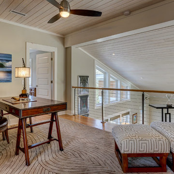
It's a house so close to the inlet, it appears to float. Skirted by water, this Inlet View home is built for a true waterman. This unique property was originally designed by a local architect–Haywood Newkirk, Sr–who was known for his modernistic renderings. As the neighborhood grew, views of the water were replaced with hindered scenes of bordering homes. To gain privacy, we called on another local architect, artist + surfer–Chip Hemmingway–whose industrial design can be viewed on distinctive properties such as the USS North Carolina Battleship + North Carolina Aquarium’s $26 million Jennette’s Pier facility in Nags Head. It would take another waterman's eye to imagine this space anew. With fresh blueprints, the front door took to a new face of the home + an additional 1500 square feet were appended by Schmidt Custom Builders to create an open-concept out of the old family property. The project began with a total gut. And to the bare structure, came new framing + exterior, all new wiring, roof, windows, flooring, insulation, custom cabinetry, granite countertops, luxurious lighting, furniture + landscaping. We hired on Jo Howell of Big Sky Design who worked with the homeowner to select the final touches to make this space feel like home. Outdoors is perhaps the grandest room of all which can be enjoyed plein air. Custom Ipe screens adorn the outdoor dining pavilion which now configure a private space between neighboring homes. Attached is a grand, open porch wrapped with stainless steal cable for a zero-obstruction view of a surfer's haven. || Photos by Mark Steelman
 Appliances Connection
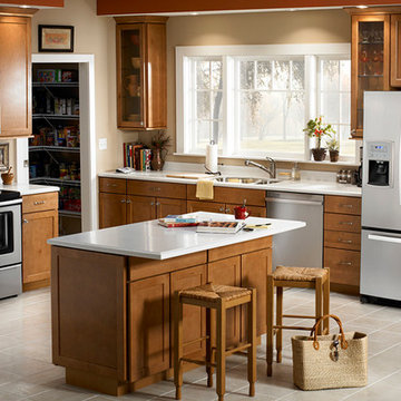
Since 1911, Whirlpool has been at the forefront of the home appliance industry. From its flagship washing machines, to stoves, ovens, refrigerators, and more, there isn't a category of home appliance Whirlpool hasn't revitalized and reinvented in its long and storied history. You don't need to be convinced; you're probably already a customer. You may already have a Whirlpool microwave, a Whirlpool dryer, a Whirlpool dishwasher, or even a Whirlpool grill. And since 1911, Whirlpool has been synonymous with quality. With one of the most advanced R&D departments in the modern world, Whirlpool has an unprecedented reputation for innovation, ease of use, quality of design, and accessibility, with intuitive interfaces that eliminate guesswork, and innovative features sense and adapt to your patterns of use and your needs, so that these appliances help you rather than hinder you, allowing you to run your home as you see fit. With QuietSpin technology, which uses six point suspension to reduce noise, your laundry will be so quiet you'll almost forget it's there, while Precision Dispense Ultra technology lets you load your laundry with enough detergent to last thirty-six washes, and then dispenses it as needed! Whirlpool makes an art of getting out of the way.
 Schmidt Custom Builders
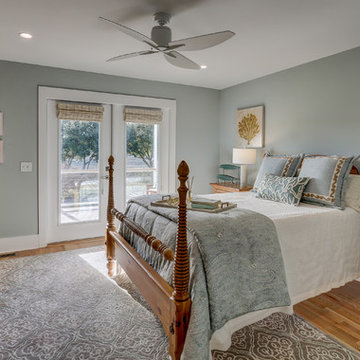
It's a house so close to the inlet, it appears to float. Skirted by water, this Inlet View home is built for a true waterman. This unique property was originally designed by a local architect–Haywood Newkirk, Sr–who was known for his modernistic renderings. As the neighborhood grew, views of the water were replaced with hindered scenes of bordering homes. To gain privacy, we called on another local architect, artist + surfer–Chip Hemmingway–whose industrial design can be viewed on distinctive properties such as the USS North Carolina Battleship + North Carolina Aquarium’s $26 million Jennette’s Pier facility in Nags Head. It would take another waterman's eye to imagine this space anew. With fresh blueprints, the front door took to a new face of the home + an additional 1500 square feet were appended by Schmidt Custom Builders to create an open-concept out of the old family property. The project began with a total gut. And to the bare structure, came new framing + exterior, all new wiring, roof, windows, flooring, insulation, custom cabinetry, granite countertops, luxurious lighting, furniture + landscaping. We hired on Jo Howell of Big Sky Design who worked with the homeowner to select the final touches to make this space feel like home. Outdoors is perhaps the grandest room of all which can be enjoyed plein air. Custom Ipe screens adorn the outdoor dining pavilion which now configure a private space between neighboring homes. Attached is a grand, open porch wrapped with stainless steal cable for a zero-obstruction view of a surfer's haven. || Photos by Mark Steelman
 Bilotta Kitchen & Home
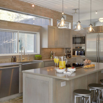
This kitchen project started when the homeowners came into Bilotta’s Mount Kisco showroom on a snowy day with nothing but a Bentwood chair made out of driftwood. They said all they wanted was for their kitchen to match it. So they got started with Bilotta’s Danielle Florie to put it all together. The couple lives in a large, sophisticated stone and wood home in the middle of the woods in Pound Ridge, dramatically situated on a hilltop overlooking a private pond. More modern than their neighbors’ homes, their house features walls of windows, steel beams and ceilings, with a large curved glass, two-story atrium entry. To complement the house, they wanted their kitchen to be rustic but still elegant and as open as the rest of the house. Danielle helped them select a frameless, shaker-style cabinet in rift cut white oak with a “Driftwood” stain and a charcoal glaze. They went with an L-shape design so as not to hinder the view to the spacious outdoors. The backsplash resembles driftwood but is actually a porcelain tile. And to remain clean and modern they went with a Caesarstone countertop with a square edge similar in color to the rest of the space. They opted for the more contemporary stainless steel appliances and apron front sink. The high ceilings and color selections for the space yielded a very open feeling with a lot of light coming from all directions. The builder was Allan J. Finn. Photo Credit: Peter Krupenye. Designer: Danielle Florie
 Daniel Scerri Periti
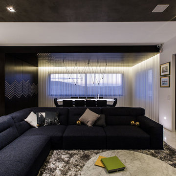
We were approached with a request to design the furnishings for an existing ‘finished’ apartment. The intention was to move in relatively fast, and the property already had an existing marble floor, kitchen and bathrooms which had to be kept. The property also boasted a fantastic 270 degree view, seen from most of the apartment. The clients had a very important role in the completion of the project. They were very involved during the design process and through various decoration choices. The final design was kept as a rigid guideline when faced with picking out all the different elements.
Once clear of all previous furniture, the space felt cold and bare; so we immediately felt the need for warmth, and raw, natural elements and textures to complement the cold marble floor while visually tying in the design of the whole apartment together.
Since the existing kitchen had a touch of dark walnut stain, we felt this material was one we should add to the palette of materials to contest the stark materials. A raw cement finish was another material we felt would add an interesting contrast and could be used in a variety of ways, from cabinets to walls and ceilings, to tie up the design of various areas of the apartment.
To warm up the living/dining area, keeping the existing marble floor but visually creating zones within the large living/dining area without hindering the flow, a dark timber custom-made soffit, continuous with a floor-to-ceiling drinks cabinet zones the dining area, giving it a degree of much-needed warmth.
The various windows with a stupendous 270 degree view needed to be visually tied together. This was done by introducing a continuous sheer [drape] which also doubled up as a sound-absorbing material along 2 of the 4 walls of the space.
A very large sofa was required to fill up the space correctly, also required for the size of the young family.
Services were integrated within the units and soffits, while a customized design in the corner between the kitchen and the living room took into consideration the viewpoints from the main areas to create a pantry without hindering the flow or views. A strategically placed floor-to-ceiling mirror doubles up the space and extends the view to the inner parts of the apartment.
The daughter’s bedroom was a small challenge in itself, and a fun task, where we wanted to achieve the perception of a cozy niche with its own enclosed reading nook [for reading fairy tales], behind see-through curtains and a custom-ordered wall print sporting the girl’s favorite colors.
The sons’ bedroom had double the requirements in terms of space needed: more wardrobe, more homework desk space, a tv/play station area… “We combined a raised platform area between the boys’ beds to become an area with cushions where the kids can lay down and play, and face a hidden screen behind the homework desk’s sliding back panel for their play station”. The color of the homework desk was chosen in relation to the boys’ ages. A more masculine material palette was chosen for this room, in contrast to the light pastel palette of the girl’s bedroom. Again, this colour can easily be changed over time for a more mature look.
PROJECT DATA:
St. Paul’s Bay, Malta
DESIGN TEAM:
Perit Rebecca Zammit, Perit Daniel Scerri, Elyse Tonna
OTHER CREDITS:
Photography: Tonio Lombardi
Styling : TKS
 Daniel Scerri Periti
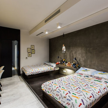
We were approached with a request to design the furnishings for an existing ‘finished’ apartment. The intention was to move in relatively fast, and the property already had an existing marble floor, kitchen and bathrooms which had to be kept. The property also boasted a fantastic 270 degree view, seen from most of the apartment. The clients had a very important role in the completion of the project. They were very involved during the design process and through various decoration choices. The final design was kept as a rigid guideline when faced with picking out all the different elements.
Once clear of all previous furniture, the space felt cold and bare; so we immediately felt the need for warmth, and raw, natural elements and textures to complement the cold marble floor while visually tying in the design of the whole apartment together.
Since the existing kitchen had a touch of dark walnut stain, we felt this material was one we should add to the palette of materials to contest the stark materials. A raw cement finish was another material we felt would add an interesting contrast and could be used in a variety of ways, from cabinets to walls and ceilings, to tie up the design of various areas of the apartment.
To warm up the living/dining area, keeping the existing marble floor but visually creating zones within the large living/dining area without hindering the flow, a dark timber custom-made soffit, continuous with a floor-to-ceiling drinks cabinet zones the dining area, giving it a degree of much-needed warmth.
The various windows with a stupendous 270 degree view needed to be visually tied together. This was done by introducing a continuous sheer [drape] which also doubled up as a sound-absorbing material along 2 of the 4 walls of the space.
A very large sofa was required to fill up the space correctly, also required for the size of the young family.
Services were integrated within the units and soffits, while a customized design in the corner between the kitchen and the living room took into consideration the viewpoints from the main areas to create a pantry without hindering the flow or views. A strategically placed floor-to-ceiling mirror doubles up the space and extends the view to the inner parts of the apartment.
The daughter’s bedroom was a small challenge in itself, and a fun task, where we wanted to achieve the perception of a cozy niche with its own enclosed reading nook [for reading fairy tales], behind see-through curtains and a custom-ordered wall print sporting the girl’s favorite colors.
The sons’ bedroom had double the requirements in terms of space needed: more wardrobe, more homework desk space, a tv/play station area… “We combined a raised platform area between the boys’ beds to become an area with cushions where the kids can lay down and play, and face a hidden screen behind the homework desk’s sliding back panel for their play station”. The color of the homework desk was chosen in relation to the boys’ ages. A more masculine material palette was chosen for this room, in contrast to the light pastel palette of the girl’s bedroom. Again, this colour can easily be changed over time for a more mature look.
PROJECT DATA:
St. Paul’s Bay, Malta
DESIGN TEAM:
Perit Rebecca Zammit, Perit Daniel Scerri, Elyse Tonna
OTHER CREDITS:
Photography: Tonio Lombardi
Styling : TKS
 Schmidt Custom Builders
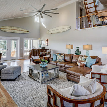
It's a house so close to the inlet, it appears to float. Skirted by water, this Inlet View home is built for a true waterman. This unique property was originally designed by a local architect–Haywood Newkirk, Sr–who was known for his modernistic renderings. As the neighborhood grew, views of the water were replaced with hindered scenes of bordering homes. To gain privacy, we called on another local architect, artist + surfer–Chip Hemmingway–whose industrial design can be viewed on distinctive properties such as the USS North Carolina Battleship + North Carolina Aquarium’s $26 million Jennette’s Pier facility in Nags Head. It would take another waterman's eye to imagine this space anew. With fresh blueprints, the front door took to a new face of the home + an additional 1500 square feet were appended by Schmidt Custom Builders to create an open-concept out of the old family property. The project began with a total gut. And to the bare structure, came new framing + exterior, all new wiring, roof, windows, flooring, insulation, custom cabinetry, granite countertops, luxurious lighting, furniture + landscaping. We hired on Jo Howell of Big Sky Design who worked with the homeowner to select the final touches to make this space feel like home. Outdoors is perhaps the grandest room of all which can be enjoyed plein air. Custom Ipe screens adorn the outdoor dining pavilion which now configure a private space between neighboring homes. Attached is a grand, open porch wrapped with stainless steal cable for a zero-obstruction view of a surfer's haven. || Photos by Mark Steelman
 Daniel Scerri Periti
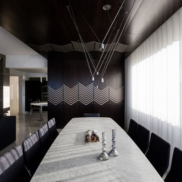
We were approached with a request to design the furnishings for an existing ‘finished’ apartment. The intention was to move in relatively fast, and the property already had an existing marble floor, kitchen and bathrooms which had to be kept. The property also boasted a fantastic 270 degree view, seen from most of the apartment. The clients had a very important role in the completion of the project. They were very involved during the design process and through various decoration choices. The final design was kept as a rigid guideline when faced with picking out all the different elements.
Once clear of all previous furniture, the space felt cold and bare; so we immediately felt the need for warmth, and raw, natural elements and textures to complement the cold marble floor while visually tying in the design of the whole apartment together.
Since the existing kitchen had a touch of dark walnut stain, we felt this material was one we should add to the palette of materials to contest the stark materials. A raw cement finish was another material we felt would add an interesting contrast and could be used in a variety of ways, from cabinets to walls and ceilings, to tie up the design of various areas of the apartment.
To warm up the living/dining area, keeping the existing marble floor but visually creating zones within the large living/dining area without hindering the flow, a dark timber custom-made soffit, continuous with a floor-to-ceiling drinks cabinet zones the dining area, giving it a degree of much-needed warmth.
The various windows with a stupendous 270 degree view needed to be visually tied together. This was done by introducing a continuous sheer [drape] which also doubled up as a sound-absorbing material along 2 of the 4 walls of the space.
A very large sofa was required to fill up the space correctly, also required for the size of the young family.
Services were integrated within the units and soffits, while a customized design in the corner between the kitchen and the living room took into consideration the viewpoints from the main areas to create a pantry without hindering the flow or views. A strategically placed floor-to-ceiling mirror doubles up the space and extends the view to the inner parts of the apartment.
The daughter’s bedroom was a small challenge in itself, and a fun task, where we wanted to achieve the perception of a cozy niche with its own enclosed reading nook [for reading fairy tales], behind see-through curtains and a custom-ordered wall print sporting the girl’s favorite colors.
The sons’ bedroom had double the requirements in terms of space needed: more wardrobe, more homework desk space, a tv/play station area… “We combined a raised platform area between the boys’ beds to become an area with cushions where the kids can lay down and play, and face a hidden screen behind the homework desk’s sliding back panel for their play station”. The color of the homework desk was chosen in relation to the boys’ ages. A more masculine material palette was chosen for this room, in contrast to the light pastel palette of the girl’s bedroom. Again, this colour can easily be changed over time for a more mature look.
PROJECT DATA:
St. Paul’s Bay, Malta
DESIGN TEAM:
Perit Rebecca Zammit, Perit Daniel Scerri, Elyse Tonna
OTHER CREDITS:
Photography: Tonio Lombardi
Styling : TKS
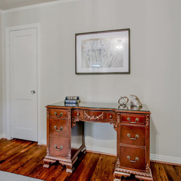
 Kay Cosby Interiors
Historic homes are a hidden gem, and when this client approached me about remodeling her family home in one of the oldest neighborhoods in Dallas I
knew we had a diamond in the rough. Under many layers of vinyl tile and plywood, the kitchen floors revealed pristine hardwoods waiting to be brought to life. An inefficient vintage kitchen had begun to break down and cramp the client's style and productivity. Mullioned windows obstructed the client's view
and hindered her from connecting with nature. The detail elements such as soft arches transitioning from room to room were lost in a sea of white. This beloved home had become something it wasn't meant to be. Our goal was to help it welcome friends and family with open arms and provide a casual atmosphere in which to love, laugh and relax. We needed to transform it all; floors, walls, kitchen and bedrooms. We left no stone unturned until we had the perfect collaboration of traditional family heirlooms mixed in with a modern palette. New brown stained floors, grey European style cabinets, white quartz counters, textured backsplash tile, mullion free vinyl windows and an open floorplan modernized this kitchen while staying true to its natural roots. Neutral gray walls collaborate with dark accents in the arches to define their detail. Reupholstering the furniture in patterned fabrics updated each room to span the spectrum of traditional to modern. The curated collection of family antiques finished in new hues and newly acquired pieces create a space unique to and adored by this client. Photos by Zack Lewis of Showcase Photographers
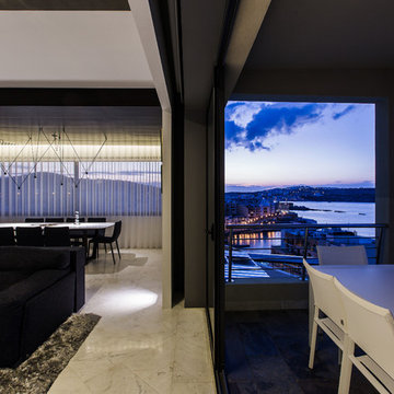 Daniel Scerri Periti
We were approached with a request to design the furnishings for an existing ‘finished’ apartment. The intention was to move in relatively fast, and the property already had an existing marble floor, kitchen and bathrooms which had to be kept. The property also boasted a fantastic 270 degree view, seen from most of the apartment. The clients had a very important role in the completion of the project. They were very involved during the design process and through various decoration choices. The final design was kept as a rigid guideline when faced with picking out all the different elements.
Once clear of all previous furniture, the space felt cold and bare; so we immediately felt the need for warmth, and raw, natural elements and textures to complement the cold marble floor while visually tying in the design of the whole apartment together.
Since the existing kitchen had a touch of dark walnut stain, we felt this material was one we should add to the palette of materials to contest the stark materials. A raw cement finish was another material we felt would add an interesting contrast and could be used in a variety of ways, from cabinets to walls and ceilings, to tie up the design of various areas of the apartment.
To warm up the living/dining area, keeping the existing marble floor but visually creating zones within the large living/dining area without hindering the flow, a dark timber custom-made soffit, continuous with a floor-to-ceiling drinks cabinet zones the dining area, giving it a degree of much-needed warmth.
The various windows with a stupendous 270 degree view needed to be visually tied together. This was done by introducing a continuous sheer [drape] which also doubled up as a sound-absorbing material along 2 of the 4 walls of the space.
A very large sofa was required to fill up the space correctly, also required for the size of the young family.
Services were integrated within the units and soffits, while a customized design in the corner between the kitchen and the living room took into consideration the viewpoints from the main areas to create a pantry without hindering the flow or views. A strategically placed floor-to-ceiling mirror doubles up the space and extends the view to the inner parts of the apartment.
The daughter’s bedroom was a small challenge in itself, and a fun task, where we wanted to achieve the perception of a cozy niche with its own enclosed reading nook [for reading fairy tales], behind see-through curtains and a custom-ordered wall print sporting the girl’s favorite colors.
The sons’ bedroom had double the requirements in terms of space needed: more wardrobe, more homework desk space, a tv/play station area… “We combined a raised platform area between the boys’ beds to become an area with cushions where the kids can lay down and play, and face a hidden screen behind the homework desk’s sliding back panel for their play station”. The color of the homework desk was chosen in relation to the boys’ ages. A more masculine material palette was chosen for this room, in contrast to the light pastel palette of the girl’s bedroom. Again, this colour can easily be changed over time for a more mature look.
PROJECT DATA:
St. Paul’s Bay, Malta
DESIGN TEAM:
Perit Rebecca Zammit, Perit Daniel Scerri, Elyse Tonna
OTHER CREDITS:
Photography: Tonio Lombardi
Styling : TKS
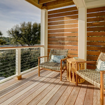 Schmidt Custom Builders
It's a house so close to the inlet, it appears to float. Skirted by water, this Inlet View home is built for a true waterman. This unique property was originally designed by a local architect–Haywood Newkirk, Sr–who was known for his modernistic renderings. As the neighborhood grew, views of the water were replaced with hindered scenes of bordering homes. To gain privacy, we called on another local architect, artist + surfer–Chip Hemmingway–whose industrial design can be viewed on distinctive properties such as the USS North Carolina Battleship + North Carolina Aquarium’s $26 million Jennette’s Pier facility in Nags Head. It would take another waterman's eye to imagine this space anew. With fresh blueprints, the front door took to a new face of the home + an additional 1500 square feet were appended by Schmidt Custom Builders to create an open-concept out of the old family property. The project began with a total gut. And to the bare structure, came new framing + exterior, all new wiring, roof, windows, flooring, insulation, custom cabinetry, granite countertops, luxurious lighting, furniture + landscaping. We hired on Jo Howell of Big Sky Design who worked with the homeowner to select the final touches to make this space feel like home. Outdoors is perhaps the grandest room of all which can be enjoyed plein air. Custom Ipe screens adorn the outdoor dining pavilion which now configure a private space between neighboring homes. Attached is a grand, open porch wrapped with stainless steal cable for a zero-obstruction view of a surfer's haven. || Photos by Mark Steelman
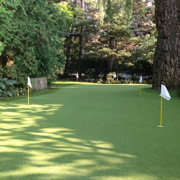
 Design Turf Inc.
A dream backyard with a beautifully configured golf green
Design ideas for a mid-sized modern landscaping in Toronto.
Design ideas for a mid-sized modern landscaping in Toronto.
16