
Search results for "Hinders" in Home Design Ideas
 Kitchen Design Concepts
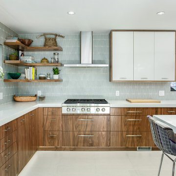
This 1950's kitchen hindered our client's cooking and bi-weekly entertaining and was inconsistent with the home's mid-century architecture. Additional key goals were to improve function for cooking and entertaining 6 to 12 people on a regular basis. Originally with only two entry points to the kitchen (from the entry/foyer and from the dining room) the kitchen wasn’t very open to the remainder of the home, or the living room at all. The door to the carport was never used and created a conflict with seating in the breakfast area. The new plans created larger openings to both rooms, and a third entry point directly into the living room. The “peninsula” manages the sight line between the kitchen and a large, brick fireplace while still creating an “island” effect in the kitchen and allowing seating on both sides. The television was also a “must have” utilizing it to watch cooking shows while prepping food, for news while getting ready for the day, and for background when entertaining.
Meticulously designed cabinets provide ample storage and ergonomically friendly appliance placement. Cabinets were previously laid out into two L-shaped spaces. On the “top” was the cooking area with a narrow pantry (read: scarce storage) and a water heater in the corner. On the “bottom” was a single 36” refrigerator/freezer, and sink. A peninsula separated the kitchen and breakfast room, truncating the entire space. We have now a clearly defined cool storage space spanning 60” width (over 150% more storage) and have separated the ovens and cooking surface to spread out prep/clean zones. True pantry storage was added, and a massive “peninsula” keeps seating for up to 6 comfortably, while still expanding the kitchen and gaining storage. The newly designed, oversized peninsula provides plentiful space for prepping and entertaining. Walnut paneling wraps the room making the kitchen a stunning showpiece.
 Kitchen Design Concepts
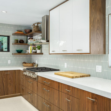
This 1950's kitchen hindered our client's cooking and bi-weekly entertaining and was inconsistent with the home's mid-century architecture. Additional key goals were to improve function for cooking and entertaining 6 to 12 people on a regular basis. Originally with only two entry points to the kitchen (from the entry/foyer and from the dining room) the kitchen wasn’t very open to the remainder of the home, or the living room at all. The door to the carport was never used and created a conflict with seating in the breakfast area. The new plans created larger openings to both rooms, and a third entry point directly into the living room. The “peninsula” manages the sight line between the kitchen and a large, brick fireplace while still creating an “island” effect in the kitchen and allowing seating on both sides. The television was also a “must have” utilizing it to watch cooking shows while prepping food, for news while getting ready for the day, and for background when entertaining.
Meticulously designed cabinets provide ample storage and ergonomically friendly appliance placement. Cabinets were previously laid out into two L-shaped spaces. On the “top” was the cooking area with a narrow pantry (read: scarce storage) and a water heater in the corner. On the “bottom” was a single 36” refrigerator/freezer, and sink. A peninsula separated the kitchen and breakfast room, truncating the entire space. We have now a clearly defined cool storage space spanning 60” width (over 150% more storage) and have separated the ovens and cooking surface to spread out prep/clean zones. True pantry storage was added, and a massive “peninsula” keeps seating for up to 6 comfortably, while still expanding the kitchen and gaining storage. The newly designed, oversized peninsula provides plentiful space for prepping and entertaining. Walnut paneling wraps the room making the kitchen a stunning showpiece.

 contact7524
This stained glass window was created as part of our signature Aspen Stained Glass line. These windows look beautiful in cottage style or contemporary homes and are a great way for outdoor enthusiasts to celebrate their love of nature. The textured appearance of the glass provides the homeowners with a high level of privacy and comfort.
Find the right local pro for your project
 Kitchen Design Concepts
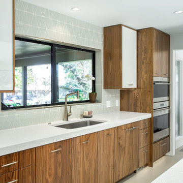
This 1950's kitchen hindered our client's cooking and bi-weekly entertaining and was inconsistent with the home's mid-century architecture. Additional key goals were to improve function for cooking and entertaining 6 to 12 people on a regular basis. Originally with only two entry points to the kitchen (from the entry/foyer and from the dining room) the kitchen wasn’t very open to the remainder of the home, or the living room at all. The door to the carport was never used and created a conflict with seating in the breakfast area. The new plans created larger openings to both rooms, and a third entry point directly into the living room. The “peninsula” manages the sight line between the kitchen and a large, brick fireplace while still creating an “island” effect in the kitchen and allowing seating on both sides. The television was also a “must have” utilizing it to watch cooking shows while prepping food, for news while getting ready for the day, and for background when entertaining.
Meticulously designed cabinets provide ample storage and ergonomically friendly appliance placement. Cabinets were previously laid out into two L-shaped spaces. On the “top” was the cooking area with a narrow pantry (read: scarce storage) and a water heater in the corner. On the “bottom” was a single 36” refrigerator/freezer, and sink. A peninsula separated the kitchen and breakfast room, truncating the entire space. We have now a clearly defined cool storage space spanning 60” width (over 150% more storage) and have separated the ovens and cooking surface to spread out prep/clean zones. True pantry storage was added, and a massive “peninsula” keeps seating for up to 6 comfortably, while still expanding the kitchen and gaining storage. The newly designed, oversized peninsula provides plentiful space for prepping and entertaining. Walnut paneling wraps the room making the kitchen a stunning showpiece.
 Kitchen Design Concepts
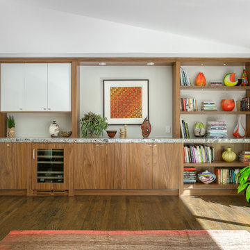
This 1950's kitchen hindered our client's cooking and bi-weekly entertaining and was inconsistent with the home's mid-century architecture. Additional key goals were to improve function for cooking and entertaining 6 to 12 people on a regular basis. Originally with only two entry points to the kitchen (from the entry/foyer and from the dining room) the kitchen wasn’t very open to the remainder of the home, or the living room at all. The door to the carport was never used and created a conflict with seating in the breakfast area. The new plans created larger openings to both rooms, and a third entry point directly into the living room. The “peninsula” manages the sight line between the kitchen and a large, brick fireplace while still creating an “island” effect in the kitchen and allowing seating on both sides. The television was also a “must have” utilizing it to watch cooking shows while prepping food, for news while getting ready for the day, and for background when entertaining.
Meticulously designed cabinets provide ample storage and ergonomically friendly appliance placement. Cabinets were previously laid out into two L-shaped spaces. On the “top” was the cooking area with a narrow pantry (read: scarce storage) and a water heater in the corner. On the “bottom” was a single 36” refrigerator/freezer, and sink. A peninsula separated the kitchen and breakfast room, truncating the entire space. We have now a clearly defined cool storage space spanning 60” width (over 150% more storage) and have separated the ovens and cooking surface to spread out prep/clean zones. True pantry storage was added, and a massive “peninsula” keeps seating for up to 6 comfortably, while still expanding the kitchen and gaining storage. The newly designed, oversized peninsula provides plentiful space for prepping and entertaining. Walnut paneling wraps the room making the kitchen a stunning showpiece.
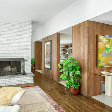 Kitchen Design Concepts
This 1950's kitchen hindered our client's cooking and bi-weekly entertaining and was inconsistent with the home's mid-century architecture. Additional key goals were to improve function for cooking and entertaining 6 to 12 people on a regular basis. Originally with only two entry points to the kitchen (from the entry/foyer and from the dining room) the kitchen wasn’t very open to the remainder of the home, or the living room at all. The door to the carport was never used and created a conflict with seating in the breakfast area. The new plans created larger openings to both rooms, and a third entry point directly into the living room. The “peninsula” manages the sight line between the kitchen and a large, brick fireplace while still creating an “island” effect in the kitchen and allowing seating on both sides. The television was also a “must have” utilizing it to watch cooking shows while prepping food, for news while getting ready for the day, and for background when entertaining.
Meticulously designed cabinets provide ample storage and ergonomically friendly appliance placement. Cabinets were previously laid out into two L-shaped spaces. On the “top” was the cooking area with a narrow pantry (read: scarce storage) and a water heater in the corner. On the “bottom” was a single 36” refrigerator/freezer, and sink. A peninsula separated the kitchen and breakfast room, truncating the entire space. We have now a clearly defined cool storage space spanning 60” width (over 150% more storage) and have separated the ovens and cooking surface to spread out prep/clean zones. True pantry storage was added, and a massive “peninsula” keeps seating for up to 6 comfortably, while still expanding the kitchen and gaining storage. The newly designed, oversized peninsula provides plentiful space for prepping and entertaining. Walnut paneling wraps the room making the kitchen a stunning showpiece.
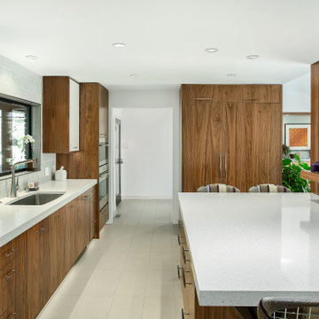 Kitchen Design Concepts
This 1950's kitchen hindered our client's cooking and bi-weekly entertaining and was inconsistent with the home's mid-century architecture. Additional key goals were to improve function for cooking and entertaining 6 to 12 people on a regular basis. Originally with only two entry points to the kitchen (from the entry/foyer and from the dining room) the kitchen wasn’t very open to the remainder of the home, or the living room at all. The door to the carport was never used and created a conflict with seating in the breakfast area. The new plans created larger openings to both rooms, and a third entry point directly into the living room. The “peninsula” manages the sight line between the kitchen and a large, brick fireplace while still creating an “island” effect in the kitchen and allowing seating on both sides. The television was also a “must have” utilizing it to watch cooking shows while prepping food, for news while getting ready for the day, and for background when entertaining.
Meticulously designed cabinets provide ample storage and ergonomically friendly appliance placement. Cabinets were previously laid out into two L-shaped spaces. On the “top” was the cooking area with a narrow pantry (read: scarce storage) and a water heater in the corner. On the “bottom” was a single 36” refrigerator/freezer, and sink. A peninsula separated the kitchen and breakfast room, truncating the entire space. We have now a clearly defined cool storage space spanning 60” width (over 150% more storage) and have separated the ovens and cooking surface to spread out prep/clean zones. True pantry storage was added, and a massive “peninsula” keeps seating for up to 6 comfortably, while still expanding the kitchen and gaining storage. The newly designed, oversized peninsula provides plentiful space for prepping and entertaining. Walnut paneling wraps the room making the kitchen a stunning showpiece.
 Kitchen Design Concepts
This 1950's kitchen hindered our client's cooking and bi-weekly entertaining and was inconsistent with the home's mid-century architecture. Additional key goals were to improve function for cooking and entertaining 6 to 12 people on a regular basis. Originally with only two entry points to the kitchen (from the entry/foyer and from the dining room) the kitchen wasn’t very open to the remainder of the home, or the living room at all. The door to the carport was never used and created a conflict with seating in the breakfast area. The new plans created larger openings to both rooms, and a third entry point directly into the living room. The “peninsula” manages the sight line between the kitchen and a large, brick fireplace while still creating an “island” effect in the kitchen and allowing seating on both sides. The television was also a “must have” utilizing it to watch cooking shows while prepping food, for news while getting ready for the day, and for background when entertaining.
Meticulously designed cabinets provide ample storage and ergonomically friendly appliance placement. Cabinets were previously laid out into two L-shaped spaces. On the “top” was the cooking area with a narrow pantry (read: scarce storage) and a water heater in the corner. On the “bottom” was a single 36” refrigerator/freezer, and sink. A peninsula separated the kitchen and breakfast room, truncating the entire space. We have now a clearly defined cool storage space spanning 60” width (over 150% more storage) and have separated the ovens and cooking surface to spread out prep/clean zones. True pantry storage was added, and a massive “peninsula” keeps seating for up to 6 comfortably, while still expanding the kitchen and gaining storage. The newly designed, oversized peninsula provides plentiful space for prepping and entertaining. Walnut paneling wraps the room making the kitchen a stunning showpiece.
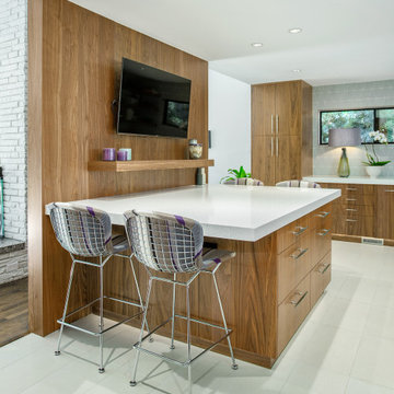 Kitchen Design Concepts
This 1950's kitchen hindered our client's cooking and bi-weekly entertaining and was inconsistent with the home's mid-century architecture. Additional key goals were to improve function for cooking and entertaining 6 to 12 people on a regular basis. Originally with only two entry points to the kitchen (from the entry/foyer and from the dining room) the kitchen wasn’t very open to the remainder of the home, or the living room at all. The door to the carport was never used and created a conflict with seating in the breakfast area. The new plans created larger openings to both rooms, and a third entry point directly into the living room. The “peninsula” manages the sight line between the kitchen and a large, brick fireplace while still creating an “island” effect in the kitchen and allowing seating on both sides. The television was also a “must have” utilizing it to watch cooking shows while prepping food, for news while getting ready for the day, and for background when entertaining.
Meticulously designed cabinets provide ample storage and ergonomically friendly appliance placement. Cabinets were previously laid out into two L-shaped spaces. On the “top” was the cooking area with a narrow pantry (read: scarce storage) and a water heater in the corner. On the “bottom” was a single 36” refrigerator/freezer, and sink. A peninsula separated the kitchen and breakfast room, truncating the entire space. We have now a clearly defined cool storage space spanning 60” width (over 150% more storage) and have separated the ovens and cooking surface to spread out prep/clean zones. True pantry storage was added, and a massive “peninsula” keeps seating for up to 6 comfortably, while still expanding the kitchen and gaining storage. The newly designed, oversized peninsula provides plentiful space for prepping and entertaining. Walnut paneling wraps the room making the kitchen a stunning showpiece.
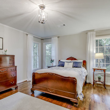
 Kay Cosby Interiors
Historic homes are a hidden gem, and when this client approached me about remodeling her family home in one of the oldest neighborhoods in Dallas I
knew we had a diamond in the rough. Under many layers of vinyl tile and plywood, the kitchen floors revealed pristine hardwoods waiting to be brought to life. An inefficient vintage kitchen had begun to break down and cramp the client's style and productivity. Mullioned windows obstructed the client's view
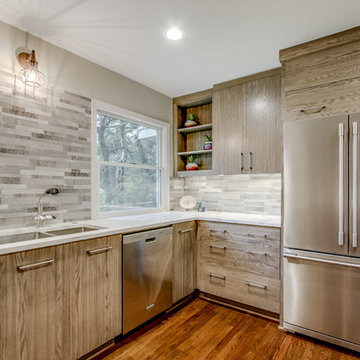
and hindered her from connecting with nature. The detail elements such as soft arches transitioning from room to room were lost in a sea of white. This beloved home had become something it wasn't meant to be. Our goal was to help it welcome friends and family with open arms and provide a casual atmosphere in which to love, laugh and relax. We needed to transform it all; floors, walls, kitchen and bedrooms. We left no stone unturned until we had the perfect collaboration of traditional family heirlooms mixed in with a modern palette. New brown stained floors, grey European style cabinets, white quartz counters, textured backsplash tile, mullion free vinyl windows and an open floorplan modernized this kitchen while staying true to its natural roots. Neutral gray walls collaborate with dark accents in the arches to define their detail. Reupholstering the furniture in patterned fabrics updated each room to span the spectrum of traditional to modern. The curated collection of family antiques finished in new hues and newly acquired pieces create a space unique to and adored by this client. Photos by Zack Lewis of Showcase Photographers
 Kay Cosby Interiors
Historic homes are a hidden gem, and when this client approached me about remodeling her family home in one of the oldest neighborhoods in Dallas I
knew we had a diamond in the rough. Under many layers of vinyl tile and plywood, the kitchen floors revealed pristine hardwoods waiting to be brought to life. An inefficient vintage kitchen had begun to break down and cramp the client's style and productivity. Mullioned windows obstructed the client's view
and hindered her from connecting with nature. The detail elements such as soft arches transitioning from room to room were lost in a sea of white. This beloved home had become something it wasn't meant to be. Our goal was to help it welcome friends and family with open arms and provide a casual atmosphere in which to love, laugh and relax. We needed to transform it all; floors, walls, kitchen and bedrooms. We left no stone unturned until we had the perfect collaboration of traditional family heirlooms mixed in with a modern palette. New brown stained floors, grey European style cabinets, white quartz counters, textured backsplash tile, mullion free vinyl windows and an open floorplan modernized this kitchen while staying true to its natural roots. Neutral gray walls collaborate with dark accents in the arches to define their detail. Reupholstering the furniture in patterned fabrics updated each room to span the spectrum of traditional to modern. The curated collection of family antiques finished in new hues and newly acquired pieces create a space unique to and adored by this client. Photos by Zack Lewis of Showcase Photographers


 Riverside Construction, LLC
Challenge
This Lafayette kitchen was dark and poorly-lit due to the unsightly soffits that hindered adequate lighting throughout the space. A bulky microwave cabinet impeded the homeowners’ ability to use the counter space below it, and the full range cooktop on the center island took up valuable prep space. Additional space was lost in an unused desk area that had no functional purpose. To make matters worse, a leaky appliance damaged their beautiful hardwood floors. Needless to say, these Lafayette homeowners were ready to remodel. With insurance check in hand, they contacted Riverside Construction to help them design and build a kitchen that would solve all of their functional challenges.
Solution
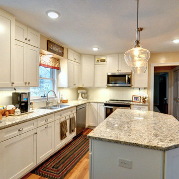
By removing the soffits, Riverside Construction was able to design the cabinets to reach all the way to the ceiling. This allowed for ample storage, and the ability for the homeowner to display her pretty dishes and other kitchen collectibles along one wall.
A non-removable pipe along the second wall and above the sink prohibited Riverside Construction from adding glass panels. However, we were still able to attach a standard cabinet door instead and preserve the seamless look that the homeowner was looking for.
The appliances were rearranged to make better use of the workspace and create better traffic flow.
Luckily, we were able to locate the same hardwood flooring that had been laid in their kitchen (not always feasible). This allowed us to repair the damaged wood and blend it seamlessly with the existing floor.
Although required by code, the homeowner didn’t like the outlets disrupting the visual appeal of the backsplash. She wanted Riverside Construction to figure out a way to hide all of the outlets. Our solution was to install power strips that mounted under the cabinets at a slight angle where the cabinet met the wall, making them less visible but still easily accessible.
Results
The homeowners were thrilled they didn’t need to pay for the cost of an entire new floor. They were also pleased with a beautiful new kitchen that met all of their needs exactly.
 Advance Design Studio, Ltd.
Richard and Monica of Huntley, IL, needed to make better use of their kitchen as well as more storage for pots, pans, and countertop appliances. Their space was laid out unconventionally, making cooking a challenge. A triangular nook held their refrigerator, hard-to-reach cabinets, and a cramped pantry. They needed to find a solution, so they searched Facebook for home remodeling companies in their area. Soon they found Advance Design Studio’s profile and were immediately impressed.
“Advance Design was the first and last studio I contacted,” Richard said.
Richard called Advance Design and felt an immediate connection with Project Designer Nicole. She was knowledgeable and thorough and offered many unique solutions to their kitchen layout problem.
A week later, Nicole came out to their home to meet the couple. They talked about their kitchen remodeling project and told Nicole what they wanted in their dream kitchen. Nicole saw that the kitchen had weird angles that hindered the cabinets you could use. She knew that designing a space that met both the client’s needs and dreams would be challenging.
Nicole worked with Richard and Monica to create an innovative design. When the couple came out to Advance Design Studio in Gilberts, they were blown away by the 3D illustrations Nicole showed them.
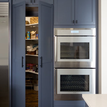
“I incorporated a hidden pantry cabinet to not only be a cool feature but also allowed me to square off the walls to gain more cabinet space,” Nicole said.
The hidden pantry added storage and squared off the strange triangular nook, creating a more traditional and functional kitchen layout. With the layout problems solved, they worked together to select materials. Richard and Monica wanted something brighter than their previous dark brown kitchen. They chose a combination of blue and white cabinetry with a white subway tile backsplash and white quartz countertops. The design was finalized, the materials were selected. It was time to begin construction.
One fear most homeowners have when beginning a home remodel is dust. Advance Design uses BuildClean HEPA filters to eliminate dust throughout the house while construction is going on. Project Manager Jason and his crew created temporary walls and cleaned up after every day of work.
“We were very impressed with how clean and organized the crew kept things while the remodeling process was underway,” Richard said.
The result is just what Richard and Monica envisioned when they began the process. Richard’s love for cooking can be explored through all-new Thermador appliances, featuring an easy-to-use induction cooktop, built-in double oven, and spacious refrigerator. Matte black hardware contrasts the bright white backsplash, countertops, and cabinets, while the stunning blue cabinets complement the dark hardwood floor and stainless-steel appliances. The dual pendant light fixtures over the reconfigured island are eye-catching and add necessary lighting.
This Huntley kitchen renovation turned out better than Richard and Monica hoped. Their experience with Advance Design’s Common Sense Remodeling process has them thinking about other projects they could do in the future.
Our award-winning design team would love to create a beautiful, functional, and spacious place for you and your family. With our “Common Sense Remodeling” approach, the process of renovating your home has never been easier. Contact us today at 847-665-1711 or schedule an appointment.

 Klopf Architecture
From Mid-Century Classic to the Present
An iconic design updated with comfort, function, and flow for today.
A Remodel That Balances Past and Present
What started as a desire to update a classic Eichler soon became an exploration of how Mid-Century Modern design can successfully evolve for today. The client, a tech professional with a passion for scuba diving and underwater photography, wanted a home that would both honor its original character and feel tailored to his daily life. A lifelong technology enthusiast, he still owns the very first Mac desktop he saved up for as a teenager working at Radio Shack, a detail that underscores his appreciation for design that melds function and form.
Honoring Separation While Expanding Possibility
Unlike many contemporary remodels where walls are opened up to create expansive living spaces, this project took a more restrained approach. The client valued the defined rooms of the original plan and wanted to preserve as much wall space as possible for displaying his large-format underwater photography. The emphasis was not on dramatic spatial reinvention, but on thoughtful refinements. Klopf Architecture shaped a gallery-like backdrop while also expanding the primary suite, modernizing materials and fixtures throughout the home, and improving the functionality and layout of the kitchen. The finished home feels at once timeless and renewed, an Eichler that continues to inspire while fully supporting the lifestyle of its present-day owner.
A major turning point came mid-design. The original project brief had not included an addition, but as the reconfiguration of the primary bedroom and bath unfolded, it became clear that an expansion was the best approach to achieve the client’s vision of a more spacious suite. Fortunately, the adjustment came at a stage when revisions were still manageable and was integrated seamlessly, showing how thoughtful course corrections can strengthen a project rather than hinder it.
Navigating Challenges With Precision
The design development included multiple conceptual rounds, balancing preservation with subtle expansion. During construction, an existing post previously thought to be load-bearing turned out not to be. The structural engineer was able to pivot quickly, and both the post and the cross beam that had been intended to replace it could be omitted, allowing the original rhythm of the Eichler beam bays to be preserved.
Sustainability was not just a checklist item, but a way to align the home with the client’s values of simplicity, efficiency, and long-term functionality. R-38 roof insulation reduced energy usage, solar panels with battery storage provided independence and resilience, and passive comfort strategies eliminated the need forenergy-intensive air conditioning. An electric vehicle charger and an on-demand hot water recirculation system (with call buttons as opposed to having constant circulation) add to the home’s long-term efficiency factors. Together, these moves created a home that is quieter, more comfortable, and better equipped for the future, qualities that supported the client’s pragmatic approach to design and living lightly.
Details That Respect the Eichler DNA
The remodel carries forward the Eichler’s original spirit while introducing new layers of modern livability. Originally, the house was approached along a deep, narrow walk, with the garage on one side and the house on the other, leaving the front door tucked far back within this chasm-like space. By pulling the entry forward, the design reshaped the arrival experience, creating a clearer threshold and a natural drop-off zone for bags, shoes, and keys. This shift also made room for a custom bench at the entry that extends seamlessly through the glass sidelight. The bench and drop-off zone now work together as a single, integrated sequence that supports everyday living while offering a tactile reminder of Eichler’s philosophy of connectedness.
At the client’s request, Klopf reintroduced a classic Eichler gesture by extending the exterior siding into the entry and living room. The detail reinforces a sense of indoor/outdoor continuity while providing a subtle architectural surface that allows the client’s photography to take visual precedence.
The signature concrete masonry wall at the front was reconstructed using blocks sourced to match the originals, now strengthened with rebar for seismic resilience while maintaining a private outdoor courtyard, visually extending the kitchen outward. A decorative trellis element, a detail borrowed from a neighboring Eichler, restores a familiar mid-century modern architectural motif. At the courtyard entry door, a custom etched glass sidelight with an ocean-themed design featuring kelp and jellyfish serves as a subtle homage to the client’s passion for deep-sea diving.
Landscaping became an integral part of the overall transformation. The homeowner engaged landscape architect Randi Johnsen of Third Nature Studio to shape a series of calm, inviting outdoor rooms that read as a natural extension of the interiors. While technically outside of the core construction scope, the landscape design proved central to achieving a sense of completeness and connectedness across the property. Such whole-property considerations often emerge as design ideas take shape, underscoring the importance of flexibility in planning and budgeting, as well as close collaboration among the design team starting early in the process.
The Value of Evolving Scope
As with many custom residential projects, the scope evolved during the design process. What began as a targeted remodel grew to include a new/expanded primary suite, a rebuilt CMU patio wall for strength and longevity, and a solar panel array and battery storage for energy resilience and carbon-reduction. Each thoughtful decision represented a conscious investment in the home’s performance and character, rather than a cost overrun.
The result was a project delivered on schedule, tailored precisely to the client’s lifestyle, and positioned to add long-term value both functionally and aesthetically. By embracing scope evolution as an opportunity rather than a challenge, and relying on good design paired with transparent communication, this remodel demonstrates how Eichler homes can be adapted for contemporary living without erasing their DNA.
Klopf Architecture project team: John Klopf, AIA, and Klara Kevane, Elise Webb and Nicholas LaNasa.
Contractor: Golden Cove Construction
Landscape Design: Third Nature Studio
Structural Engineer: Daniel Bastiao Design
Photography: ©2025 Mariko Reed
Year Completed: 2024
Location: Sunnyvale, CA
 Julia Katrine
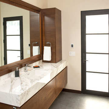
This clean, sleek, modern bathroom with a cement walk in shower is great for an after swim rinse-off or a spa-day like experience. Backlighting behind the large mirror sets a calm mood at night and adds a statement feature guests love.
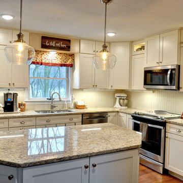 Riverside Construction, LLC
Challenge
This Lafayette kitchen was dark and poorly-lit due to the unsightly soffits that hindered adequate lighting throughout the space. A bulky microwave cabinet impeded the homeowners’ ability to use the counter space below it, and the full range cooktop on the center island took up valuable prep space. Additional space was lost in an unused desk area that had no functional purpose. To make matters worse, a leaky appliance damaged their beautiful hardwood floors. Needless to say, these Lafayette homeowners were ready to remodel. With insurance check in hand, they contacted Riverside Construction to help them design and build a kitchen that would solve all of their functional challenges.
Solution
By removing the soffits, Riverside Construction was able to design the cabinets to reach all the way to the ceiling. This allowed for ample storage, and the ability for the homeowner to display her pretty dishes and other kitchen collectibles along one wall.
A non-removable pipe along the second wall and above the sink prohibited Riverside Construction from adding glass panels. However, we were still able to attach a standard cabinet door instead and preserve the seamless look that the homeowner was looking for.
The appliances were rearranged to make better use of the workspace and create better traffic flow.
Luckily, we were able to locate the same hardwood flooring that had been laid in their kitchen (not always feasible). This allowed us to repair the damaged wood and blend it seamlessly with the existing floor.
Although required by code, the homeowner didn’t like the outlets disrupting the visual appeal of the backsplash. She wanted Riverside Construction to figure out a way to hide all of the outlets. Our solution was to install power strips that mounted under the cabinets at a slight angle where the cabinet met the wall, making them less visible but still easily accessible.
Results
The homeowners were thrilled they didn’t need to pay for the cost of an entire new floor. They were also pleased with a beautiful new kitchen that met all of their needs exactly.


 Drury Design
THE SETUP
Our journey began with a familiar face — Alicia had previously transformed the client’s mother’s home, establishing a trusted relationship that naturally led to this personal project. The client desired a kitchen that truly reflected her own style while facilitating seamless entertaining.
Design Vision:
The original kitchen, segregated from the dining area by a wall, hindered the flow of interaction and space. Our client envisioned a unified area where she could engage with guests in both the kitchen and dining room simultaneously. Moreover, the space lacked a central island, relying instead on a floorplan anchored by cabinetry in a u-shaped layout.
Design Objectives:
Open up the space for an airy design conducive to entertaining large gatherings
Modernize the kitchen to be both stylish and functional
Integrate the design with the home’s new black-framed windows and doors
Relocate the cooktop to a central position to enhance usability and interaction
Design Challenges:
Removing the wall between the kitchen and dining room would necessitate the rerouting of existing HVAC ductwork that services the upper floor
Limited pantry space in the existing kitchen
The existing u-shaped layout of the kitchen restricted functionality and storage options
Insufficient space for wine storage
The client desired a raised-furniture look for the island, but without showing a new downdraft vent
THE RENEWED SPACE
Design Solutions:
We added a second HVAC unit to the upper floor and rerouted the existing ductwork in that wall
Created tall pantry pullouts on either side of the fridge to maximize dry goods storage
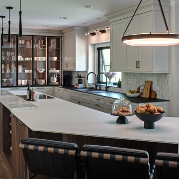
Designed a long island to facilitate cooking stations and dining moments
Created a stylish open display cabinet for wine
Engineered a dual-design island with a footed floating aesthetic on one side, and a full floor reach on the other to conceal the new downdraft ventilation.
Paired with the newly opened adjacent dining room featuring a wet bar, the kitchen has become a stylish and highly functional space for cooking and entertaining. Following a large baby shower hosted by the client (which seamlessly accommodated an 80-person gathering!), it is clear that the new design not only meets but exceeds the needs for hosting and everyday living. This project was a harmonious blend of the client’s vision and Alicia’s innovative design solutions, resulting in a kitchen that truly embodies personalized elegance and functionality.
 Drury Design
THE SETUP
Our journey began with a familiar face — Alicia had previously transformed the client’s mother’s home, establishing a trusted relationship that naturally led to this personal project. The client desired a kitchen that truly reflected her own style while facilitating seamless entertaining.
Design Vision:
The original kitchen, segregated from the dining area by a wall, hindered the flow of interaction and space. Our client envisioned a unified area where she could engage with guests in both the kitchen and dining room simultaneously. Moreover, the space lacked a central island, relying instead on a floorplan anchored by cabinetry in a u-shaped layout.
Design Objectives:
Open up the space for an airy design conducive to entertaining large gatherings
Modernize the kitchen to be both stylish and functional
Integrate the design with the home’s new black-framed windows and doors
Relocate the cooktop to a central position to enhance usability and interaction
Design Challenges:
Removing the wall between the kitchen and dining room would necessitate the rerouting of existing HVAC ductwork that services the upper floor
Limited pantry space in the existing kitchen
The existing u-shaped layout of the kitchen restricted functionality and storage options
Insufficient space for wine storage
The client desired a raised-furniture look for the island, but without showing a new downdraft vent
THE RENEWED SPACE
Design Solutions:
We added a second HVAC unit to the upper floor and rerouted the existing ductwork in that wall
Created tall pantry pullouts on either side of the fridge to maximize dry goods storage
Designed a long island to facilitate cooking stations and dining moments
Created a stylish open display cabinet for wine
Engineered a dual-design island with a footed floating aesthetic on one side, and a full floor reach on the other to conceal the new downdraft ventilation.
Paired with the newly opened adjacent dining room featuring a wet bar, the kitchen has become a stylish and highly functional space for cooking and entertaining. Following a large baby shower hosted by the client (which seamlessly accommodated an 80-person gathering!), it is clear that the new design not only meets but exceeds the needs for hosting and everyday living. This project was a harmonious blend of the client’s vision and Alicia’s innovative design solutions, resulting in a kitchen that truly embodies personalized elegance and functionality.
19