
Search results for "Hitting" in Home Design Ideas
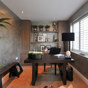
 50 Degrees North Architects
Overview
Extension and complete refurbishment.
The Brief
The existing house had very shallow rooms with a need for more depth throughout the property by extending into the rear garden which is large and south facing. We were to look at extending to the rear and to the end of the property, where we had redundant garden space, to maximise the footprint and yield a series of WOW factor spaces maximising the value of the house.
The brief requested 4 bedrooms plus a luxurious guest space with separate access; large, open plan living spaces with large kitchen/entertaining area, utility and larder; family bathroom space and a high specification ensuite to two bedrooms. In addition, we were to create balconies overlooking a beautiful garden and design a ‘kerb appeal’ frontage facing the sought-after street location.
Buildings of this age lend themselves to use of natural materials like handmade tiles, good quality bricks and external insulation/render systems with timber windows. We specified high quality materials to achieve a highly desirable look which has become a hit on Houzz.
Our Solution
One of our specialisms is the refurbishment and extension of detached 1930’s properties.
Taking the existing small rooms and lack of relationship to a large garden we added a double height rear extension to both ends of the plan and a new garage annex with guest suite.
We wanted to create a view of, and route to the garden from the front door and a series of living spaces to meet our client’s needs. The front of the building needed a fresh approach to the ordinary palette of materials and we re-glazed throughout working closely with a great build team.
 Treefrog Design
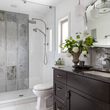
The new space feels light, airy and open exuding a tranquil sophistication. A relaxed, meditative atmosphere is achieved by combining glass tile, white walls, dark cabinets and a porcelain countertop.
 Artisans Landscape Inc
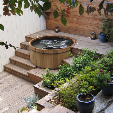
San Francisco hot tub, patio, and landscape designed and built by Artisans Landscape. For before/after pictures visit www.artisanslandscape.com/beforeafter.
Find the right local pro for your project

 Griffin Designs LLC
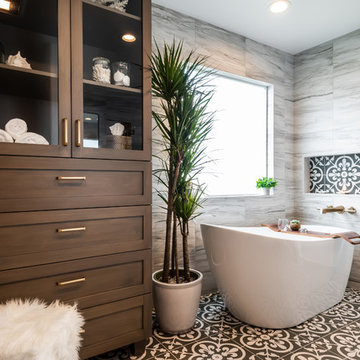
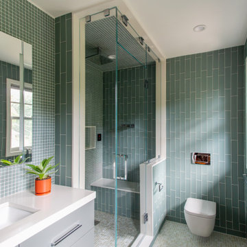
Smokey turquoise glass tiles cover this luxury bath with an interplay of stacked and gridded tile patterns that enhances the sophistication of the monochromatic palette.
Floor to ceiling glass panes define a breathtaking steam shower. Every detail takes the homeowner’s needs into account, including an in-wall waterfall element above the shower bench. Griffin Designs measured not only the space but also the seated homeowner to ensure a soothing stream of water that cascades onto the shoulders, hits just the right places, and melts away the stresses of the day.
Space conserving features such as the wall-hung toilet allowed for more flexibility in the layout. With more possibilities came more storage. Replacing the original pedestal sink, a bureau-style vanity spans four feet and offers six generously sized drawers. One drawer comes complete with outlets to discretely hide away accessories, like a hair dryer, while maximizing function. An additional recessed medicine cabinet measures almost six feet in height.
The comforts of this primary bath continue with radiant floor heating, a built-in towel warmer, and thoughtfully placed niches to hold all the bits and bobs in style.
 Michelle Salz-Smith, ASID, CID, NCIDQ
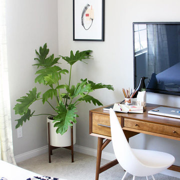
Modern Guest Bedroom design by Studio Surface for Design Milk founder Jaime Derringer.
Photo by Jaime Derringer.
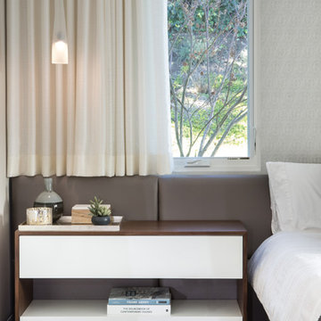
Bedroom - mid-sized mid-century modern carpeted bedroom idea in San Diego with gray walls and no fireplace
Bedroom - mid-sized mid-century modern carpeted bedroom idea in San Diego with gray walls and no fireplace
 Adrienne DeRosa
Adrienne DeRosa © 2014 Houzz Inc.
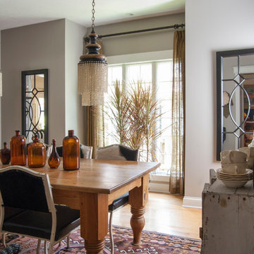
While the formal dining room takes on a different feeling than the living space, it maintains the same sense of curated detail. Jennifer goes on to explain, "When I decorate my home I don't feel I have a style. I believe what ever you put in your home is what you should love, and that way it creates its own style ... I've been collecting for so long that a lot of my treasures have come together because I love them and eventually it will all make sense. I don't like one 'way'; that's why all my rooms are different."
The dining table was found in an old flower shop. Originally it was a worktable with very tall legs, so Raymond and Jennifer cut them down to modify it for its current use. The chairs received Jennifer's creative touch as well. Purchased at a garage sale for $1 each, they are originally from an ice cream parlor in the basement of the historical Higbee's Company department store. Once she got them home, Jennifer reupholstered them with a cow-hide rug that she was no longer using.
Wall color: Modern Grey, Super Paint by Sherwin Williams
Photo: Adrienne DeRosa © 2014 Houzz

 Randy Angell Designs
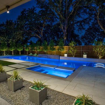
Pool fountain - mid-sized modern backyard rectangular pool fountain idea in Dallas with decking
 Jennifer M. Ramos
Photo: Jennifer M. Ramos © 2018 Houzz
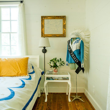
Example of a country medium tone wood floor and brown floor bedroom design in Austin with white walls
Example of a country medium tone wood floor and brown floor bedroom design in Austin with white walls
 TKS Design Group
Free ebook, Creating the Ideal Kitchen. DOWNLOAD NOW
Our clients came to us looking to do some updates to their new condo unit primarily in the kitchen and living room. The couple has a lifelong love of Arts and Crafts and Modernism, and are the co-founders of PrairieMod, an online retailer that offers timeless modern lifestyle through American made, handcrafted, and exclusively designed products. So, having such a design savvy client was super exciting for us, especially since the couple had many unique pieces of pottery and furniture to provide inspiration for the design.
The condo is a large, sunny top floor unit, with a large open feel. The existing kitchen was a peninsula which housed the sink, and they wanted to change that out to an island, relocating the new sink there as well. This can sometimes be tricky with all the plumbing for the building potentially running up through one stack. After consulting with our contractor team, it was determined that our plan would likely work and after confirmation at demo, we pushed on.
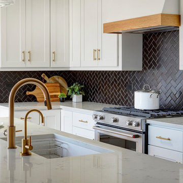
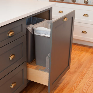
The new kitchen is a simple L-shaped space, featuring several storage devices for trash, trays dividers and roll out shelving. To keep the budget in check, we used semi-custom cabinetry, but added custom details including a shiplap hood with white oak detail that plays off the oak “X” endcaps at the island, as well as some of the couple’s existing white oak furniture. We also mixed metals with gold hardware and plumbing and matte black lighting that plays well with the unique black herringbone backsplash and metal barstools. New weathered oak flooring throughout the unit provides a nice soft backdrop for all the updates. We wanted to take the cabinets to the ceiling to obtain as much storage as possible, but an angled soffit on two of the walls provided a bit of a challenge. We asked our carpenter to field modify a few of the wall cabinets where necessary and now the space is truly custom.
Part of the project also included a new fireplace design including a custom mantle that houses a built-in sound bar and a Panasonic Frame TV, that doubles as hanging artwork when not in use. The TV is mounted flush to the wall, and there are different finishes for the frame available. The TV can display works of art or family photos while not in use. We repeated the black herringbone tile for the fireplace surround here and installed bookshelves on either side for storage and media components.
Designed by: Susan Klimala, CKD, CBD
Photography by: Michael Alan Kaskel
For more information on kitchen and bath design ideas go to: www.kitchenstudio-ge.com
 Board & Vellum
Photo by Tina Witherspoon.
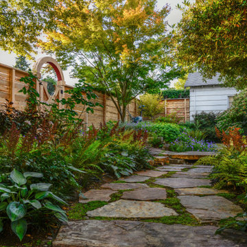
Inspiration for a mid-sized eclectic partial sun side yard stone walkway in Seattle.
Inspiration for a mid-sized eclectic partial sun side yard stone walkway in Seattle.



 Advance Design Studio, Ltd.
When this suburban family decided to renovate their kitchen, they knew that they wanted a little more space. Advance Design worked together with the homeowner to design a kitchen that would work for a large family who loved to gather regularly and always ended up in the kitchen! So the project began with extending out an exterior wall to accommodate a larger island and more moving-around space between the island and the perimeter cabinetry.
Style was important to the cook, who began collecting accessories and photos of the look she loved for months prior to the project design. She was drawn to the brightness of whites and grays, and the design accentuated this color palette brilliantly with the incorporation of a warm shade of brown woods that originated from a dining room table that was a family favorite. Classic gray and white cabinetry from Dura Supreme hits the mark creating a perfect balance between bright and subdued. Hints of gray appear in the bead board detail peeking just behind glass doors, and in the application of the handsome floating wood shelves between cabinets. White subway tile is made extra interesting with the application of dark gray grout lines causing it to be a subtle but noticeable detail worthy of attention.
Suede quartz Silestone graces the countertops with a soft matte hint of color that contrasts nicely with the presence of white painted cabinetry finished smartly with the brightness of a milky white farm sink. Old melds nicely with new, as antique bronze accents are sprinkled throughout hardware and fixtures, and work together unassumingly with the sleekness of stainless steel appliances.
The grace and timelessness of this sparkling new kitchen maintains the charm and character of a space that has seen generations past. And now this family will enjoy this new space for many more generations to come in the future with the help of the team at Advance Design Studio.
Dura Supreme Cabinetry
Photographer: Joe Nowak
 Urrutia Design
URRUTIA DESIGN
Photography by Matt Sartain
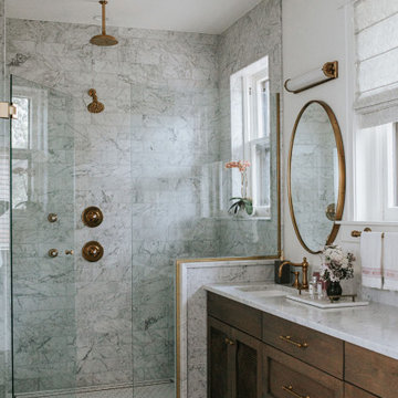
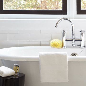
Inspiration for a large transitional master white tile and subway tile marble floor freestanding bathtub remodel in San Francisco with marble countertops and white walls
Inspiration for a large transitional master white tile and subway tile marble floor freestanding bathtub remodel in San Francisco with marble countertops and white walls
 Randy Angell Designs
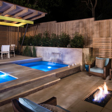
The planning phase of this modern retreat was an intense collaboration that took place over the course of more than two years. While the initial design concept exceeded the clients' expectations, it also exceeded their budget beyond the point of comfort.
The next several months were spent modifying the design, in attempts to lower the budget. Ultimately, the decision was made that they would hold off on the project until they could budget for the original design, rather than compromising the vision.
About a year later, we repeated that same process, which resulted in the same outcome. After another year-long hiatus, we met once again. We revisited design thoughts, each of us bringing to the table new ideas and options.
Each thought simply solidified the fact that the initial vision was absolutely what we all wanted to see come to fruition, and the decision was finally made to move forward.
The main challenge of the site was elevation. The Southeast corner of the lot stands 5'6" above the threshold of the rear door, while the Northeast corner dropped a full 2' below the threshold of the door.
The backyard was also long and narrow, sloping side-to-side and toward the house. The key to the design concept was to deftly place the project into the slope and utilize the elevation changes, without allowing them to dominate the yard, or overwhelm the senses.
The unseen challenge on this project came in the form of hitting every underground issue possible. We had to relocate the sewer main, the gas line, and the electrical service; and since rock was sitting about 6" below the surface, all of these had to be chiseled through many feet of dense rock, adding to our projected timeline and budget.
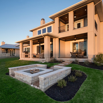
As you enter the space, your first stop is an outdoor living area. Smooth finished concrete, colored to match the 'Leuder' limestone coping, has a subtle saw-cut pattern aligned with the edges of the recessed fire pit.
In small spaces, it is important to consider a multi-purpose approach. So, the recessed fire pit has been fitted with an aluminum cover that allows our client to set up tables and chairs for entertaining, right over the top of the fire pit.
From here, it;s two steps up to the pool elevation, and the floating 'Leuder' limestone stepper pads that lead across the pool and hide the dam wall of the flush spa.
The main retaining wall to the Southeast is a poured concrete wall with an integrated sheer descent waterfall into the spa. To bring in some depth and texture, a 'Brownstone' ledgestone was used to face both the dropped beam on the pool, and the raised beam of the water feature wall.
The main water feature is comprised of five custom made stainless steel scuppers, supplied by a dedicated booster pump.
Colored concrete stepper pads lead to the 'Ipe' wood deck at the far end of the pool. The placement of this wood deck allowed us to minimize our use of retaining walls on the Northeast end of the yard, since it drops off over three feet below the elevation of the pool beam.
One of the most unique features on this project has to be the structure over the dining area. With a unique combination of steel and wood, the clean modern aesthetic of this structure creates a visual stamp in the space that standard structure could not accomplish.
4" steel posts, painted charcoal grey, are set on an angle, 4' into the bedrock, to anchor the structure. Steel I-beams painted in green-yellow color--aptly called "frolic"--act as the base to the hefty cedar rafters of the roof structure, which has a slight pitch toward the rear.
A hidden gutter on the back of the roof sends water down a copper rain chain, and into the drainage system. The backdrop for both this dining area , as well as the living area, is the horizontal screen panel, created with alternating sizes of cedar planks, stained to a calm hue of dove grey.

 Ryan Duebber Architect, LLC
Ross Van Pelt
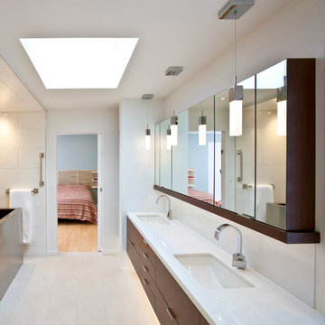
Mid-sized minimalist master white tile and porcelain tile japanese bathtub photo in Cincinnati with an undermount sink, flat-panel cabinets, dark wood cabinets, quartz countertops, a two-piece toilet and white walls
Mid-sized minimalist master white tile and porcelain tile japanese bathtub photo in Cincinnati with an undermount sink, flat-panel cabinets, dark wood cabinets, quartz countertops, a two-piece toilet and white walls
72