
Search results for "House accommodation" in Home Design Ideas
 Wilson Kelsey Design
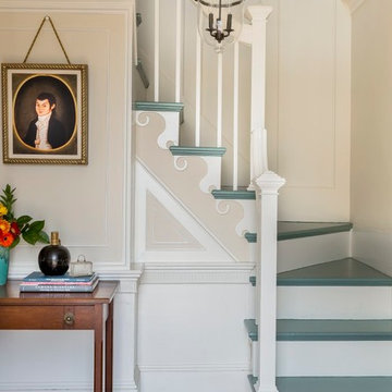
WKD’s design specialty in quality historic preservation ensured that the integrity of this home’s interior and exterior architecture was kept intact. The design mission was to preserve, restore and renovate the home in a manner that celebrated its heritage, while recognizing and accommodating today’s lifestyle and technology. Drawing from the home’s original details, WKD re-designed a friendly entry (including the exterior landscape approach) and kitchen area, integrating it into the existing hearth room. We also created a new stair to the second floor, eliminating the small, steep winding stair. New colors, wallpaper, furnishings and lighting make for a family friendly, welcoming home.
The project has been published several times. Click below to read:
October 2014 Northshore Magazine
Spring 2013 Kitchen Trends Magazine
Spring 2013 Bathroom Trends Magazine
Photographer: MIchael Lee
 Piper-Wind Architects, Inc.
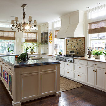
Our project involved a full interior remodel and exterior restoration to modernize the infrastructure and to accommodate the needs of a young family, but with the important focus on preserving the history of this 1920s Georgian revival home.
Our design included a single story kitchen addition, carefully designed to integrate with the existing exterior architectural detail of the structure, it being visible from public views. Conversely, to the rear private area of the house is an antithesis to traditional architecture, converting a little used north facing courtyard, surrounded on three sides by 2-story walls, and open to the north, into a modern glass enclosed double story “sunroom” which can be opened out to the patio beyond, making it now a fully functioning part of the house.
General Contractor Line Construction (restoration & kitchen addition)
Robert Montgomery Homes (sunroom)
Interior Design By owner
 Soucie Horner, Ltd.
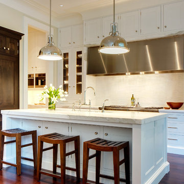
The clean, calm, restful interiors of this heart-of-the-city home are an antidote to urban living, and busy professional lives. As well, they’re an ode to enduring style that will accommodate the changing needs of the young family who lives here.
Photos by June Suthigoseeya
Find the right local pro for your project
 TVL Creative Ltd.
Our clients had just recently closed on their new house in Stapleton and were excited to transform it into their perfect forever home. They wanted to remodel the entire first floor to create a more open floor plan and develop a smoother flow through the house that better fit the needs of their family. The original layout consisted of several small rooms that just weren’t very functional, so we decided to remove the walls that were breaking up the space and restructure the first floor to create a wonderfully open feel.
After removing the existing walls, we rearranged their spaces to give them an office at the front of the house, a large living room, and a large dining room that connects seamlessly with the kitchen. We also wanted to center the foyer in the home and allow more light to travel through the first floor, so we replaced their existing doors with beautiful custom sliding doors to the back yard and a gorgeous walnut door with side lights to greet guests at the front of their home.
Living Room
Our clients wanted a living room that could accommodate an inviting sectional, a baby grand piano, and plenty of space for family game nights. So, we transformed what had been a small office and sitting room into a large open living room with custom wood columns. We wanted to avoid making the home feel too vast and monumental, so we designed custom beams and columns to define spaces and to make the house feel like a home. Aesthetically we wanted their home to be soft and inviting, so we utilized a neutral color palette with occasional accents of muted blues and greens.
Dining Room
Our clients were also looking for a large dining room that was open to the rest of the home and perfect for big family gatherings. So, we removed what had been a small family room and eat-in dining area to create a spacious dining room with a fireplace and bar. We added custom cabinetry to the bar area with open shelving for displaying and designed a custom surround for their fireplace that ties in with the wood work we designed for their living room. We brought in the tones and materiality from the kitchen to unite the spaces and added a mixed metal light fixture to bring the space together
Kitchen
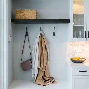
We wanted the kitchen to be a real show stopper and carry through the calm muted tones we were utilizing throughout their home. We reoriented the kitchen to allow for a big beautiful custom island and to give us the opportunity for a focal wall with cooktop and range hood. Their custom island was perfectly complimented with a dramatic quartz counter top and oversized pendants making it the real center of their home. Since they enter the kitchen first when coming from their detached garage, we included a small mud-room area right by the back door to catch everyone’s coats and shoes as they come in. We also created a new walk-in pantry with plenty of open storage and a fun chalkboard door for writing notes, recipes, and grocery lists.
Office
We transformed the original dining room into a handsome office at the front of the house. We designed custom walnut built-ins to house all of their books, and added glass french doors to give them a bit of privacy without making the space too closed off. We painted the room a deep muted blue to create a glimpse of rich color through the french doors
Powder Room
The powder room is a wonderful play on textures. We used a neutral palette with contrasting tones to create dramatic moments in this little space with accents of brushed gold.
Master Bathroom
The existing master bathroom had an awkward layout and outdated finishes, so we redesigned the space to create a clean layout with a dream worthy shower. We continued to use neutral tones that tie in with the rest of the home, but had fun playing with tile textures and patterns to create an eye-catching vanity. The wood-look tile planks along the floor provide a soft backdrop for their new free-standing bathtub and contrast beautifully with the deep ash finish on the cabinetry.
 Tamara Rene Designs
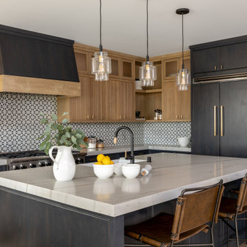
Kitchen - transitional l-shaped medium tone wood floor and brown floor kitchen idea in Orange County with a farmhouse sink, beaded inset cabinets, dark wood cabinets, multicolored backsplash, paneled appliances, an island and gray countertops
 MILLWORX
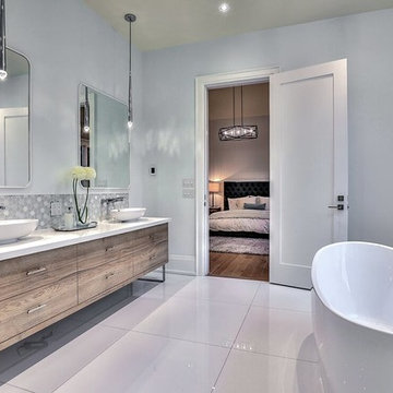
Large trendy master gray tile and ceramic tile ceramic tile and white floor freestanding bathtub photo in Toronto with flat-panel cabinets, medium tone wood cabinets, a two-piece toilet, white walls, a vessel sink, solid surface countertops and white countertops
 Studio Dearborn
A charming 1920s colonial had a dated dark kitchen that was not in keeping with the historic charm of the home. The owners, who adored British design, wanted a kitchen that was spacious and storage friendly, with the feel of a classic English kitchen. Designer Sarah Robertson of Studio Dearborn helped her client, while architect Greg Lewis redesigned the home to accommodate a larger kitchen, new primary bath, mudroom, and butlers pantry.
Photos Adam Macchia. For more information, you may visit our website at www.studiodearborn.com or email us at info@studiodearborn.com.
Sponsored
Delaware, OH

Buckeye Basements, Inc.
Central Ohio's Basement Finishing ExpertsBest Of Houzz '13-'21
 HR DESIGN DEPT
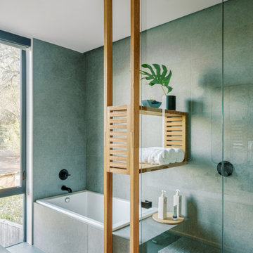
The Watonga residence was commissioned by a woman with a big heart for animal fostering. She wanted a house that felt private from the street but visually and physically connected to the backyard. The house needed to consider the typology and scale of the existing neighborhood, and it needed durable materials to accommodate little paws. Finally, it had to support an environmentally conscientious life. The house was intentionally placed on the short end of an irregularly shaped lot, allowing the living spaces to open up to a large native landscape and adjacent lot containing a significant tree grove. This siting allowed for a passive orientation where window walls face north and exposure to the south and west is minimal.
The interior is light-filled, capturing expansive landscape views of an established oak grove to the North and bayou views to the East. A carefully choreographed entry vestibule and screen shield create interior privacy from the street. A two-story volume fills the center of the home with warm, southern light. A palette of tile, Texas stone, and concrete are used for budget friendly durability. The house is derived from a simple diagram with utilitarian functions placed in the stone box and living in a minimal gabled roof that supports solar panel orientation and rainwater collection.
At its core, this home is designed for family, foster dogs, well-curated music, and Aggie game days.
 Malcolm Davis Architecture
Bruce Damonte
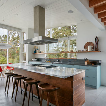
Example of a trendy galley concrete floor open concept kitchen design in San Francisco with an undermount sink, flat-panel cabinets, blue cabinets, an island, stainless steel countertops, gray backsplash, stone slab backsplash and stainless steel appliances
Example of a trendy galley concrete floor open concept kitchen design in San Francisco with an undermount sink, flat-panel cabinets, blue cabinets, an island, stainless steel countertops, gray backsplash, stone slab backsplash and stainless steel appliances
 Katie Hutchison Studio
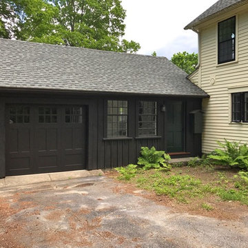
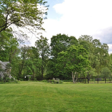
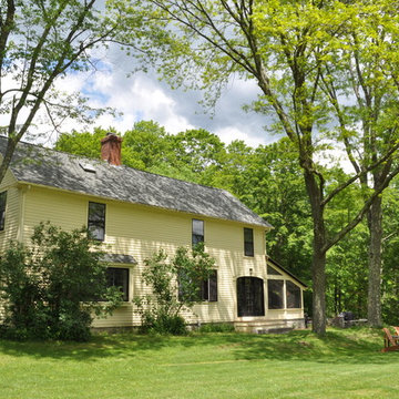
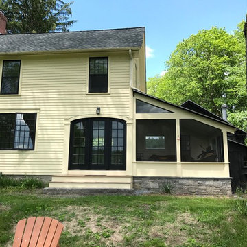
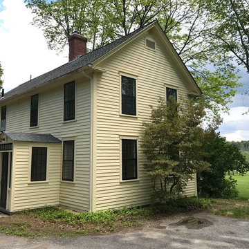
The new owners of this house in Harvard, Massachusetts loved its location and authentic Shaker characteristics, but weren’t fans of its curious layout. A dated first-floor full bathroom could only be accessed by going up a few steps to a landing, opening the bathroom door and then going down the same number of steps to enter the room. The dark kitchen faced the driveway to the north, rather than the bucolic backyard fields to the south. The dining space felt more like an enlarged hall and could only comfortably seat four. Upstairs, a den/office had a woefully low ceiling; the master bedroom had limited storage, and a sad full bathroom featured a cramped shower.
KHS proposed a number of changes to create an updated home where the owners could enjoy cooking, entertaining, and being connected to the outdoors from the first-floor living spaces, while also experiencing more inviting and more functional private spaces upstairs.
On the first floor, the primary change was to capture space that had been part of an upper-level screen porch and convert it to interior space. To make the interior expansion seamless, we raised the floor of the area that had been the upper-level porch, so it aligns with the main living level, and made sure there would be no soffits in the planes of the walls we removed. We also raised the floor of the remaining lower-level porch to reduce the number of steps required to circulate from it to the newly expanded interior. New patio door systems now fill the arched openings that used to be infilled with screen. The exterior interventions (which also included some new casement windows in the dining area) were designed to be subtle, while affording significant improvements on the interior. Additionally, the first-floor bathroom was reconfigured, shifting one of its walls to widen the dining space, and moving the entrance to the bathroom from the stair landing to the kitchen instead.
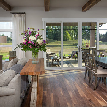
These changes (which involved significant structural interventions) resulted in a much more open space to accommodate a new kitchen with a view of the lush backyard and a new dining space defined by a new built-in banquette that comfortably seats six, and -- with the addition of a table extension -- up to eight people.
Upstairs in the den/office, replacing the low, board ceiling with a raised, plaster, tray ceiling that springs from above the original board-finish walls – newly painted a light color -- created a much more inviting, bright, and expansive space. Re-configuring the master bath to accommodate a larger shower and adding built-in storage cabinets in the master bedroom improved comfort and function. A new whole-house color palette rounds out the improvements.
Photos by Katie Hutchison
 Katie Hutchison Studio
The new owners of this house in Harvard, Massachusetts loved its location and authentic Shaker characteristics, but weren’t fans of its curious layout. A dated first-floor full bathroom could only be accessed by going up a few steps to a landing, opening the bathroom door and then going down the same number of steps to enter the room. The dark kitchen faced the driveway to the north, rather than the bucolic backyard fields to the south. The dining space felt more like an enlarged hall and could only comfortably seat four. Upstairs, a den/office had a woefully low ceiling; the master bedroom had limited storage, and a sad full bathroom featured a cramped shower.
KHS proposed a number of changes to create an updated home where the owners could enjoy cooking, entertaining, and being connected to the outdoors from the first-floor living spaces, while also experiencing more inviting and more functional private spaces upstairs.
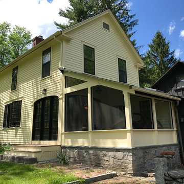
On the first floor, the primary change was to capture space that had been part of an upper-level screen porch and convert it to interior space. To make the interior expansion seamless, we raised the floor of the area that had been the upper-level porch, so it aligns with the main living level, and made sure there would be no soffits in the planes of the walls we removed. We also raised the floor of the remaining lower-level porch to reduce the number of steps required to circulate from it to the newly expanded interior. New patio door systems now fill the arched openings that used to be infilled with screen. The exterior interventions (which also included some new casement windows in the dining area) were designed to be subtle, while affording significant improvements on the interior. Additionally, the first-floor bathroom was reconfigured, shifting one of its walls to widen the dining space, and moving the entrance to the bathroom from the stair landing to the kitchen instead.
These changes (which involved significant structural interventions) resulted in a much more open space to accommodate a new kitchen with a view of the lush backyard and a new dining space defined by a new built-in banquette that comfortably seats six, and -- with the addition of a table extension -- up to eight people.
Upstairs in the den/office, replacing the low, board ceiling with a raised, plaster, tray ceiling that springs from above the original board-finish walls – newly painted a light color -- created a much more inviting, bright, and expansive space. Re-configuring the master bath to accommodate a larger shower and adding built-in storage cabinets in the master bedroom improved comfort and function. A new whole-house color palette rounds out the improvements.
Photos by Katie Hutchison
 Katie Hutchison Studio
The new owners of this house in Harvard, Massachusetts loved its location and authentic Shaker characteristics, but weren’t fans of its curious layout. A dated first-floor full bathroom could only be accessed by going up a few steps to a landing, opening the bathroom door and then going down the same number of steps to enter the room. The dark kitchen faced the driveway to the north, rather than the bucolic backyard fields to the south. The dining space felt more like an enlarged hall and could only comfortably seat four. Upstairs, a den/office had a woefully low ceiling; the master bedroom had limited storage, and a sad full bathroom featured a cramped shower.
KHS proposed a number of changes to create an updated home where the owners could enjoy cooking, entertaining, and being connected to the outdoors from the first-floor living spaces, while also experiencing more inviting and more functional private spaces upstairs.
On the first floor, the primary change was to capture space that had been part of an upper-level screen porch and convert it to interior space. To make the interior expansion seamless, we raised the floor of the area that had been the upper-level porch, so it aligns with the main living level, and made sure there would be no soffits in the planes of the walls we removed. We also raised the floor of the remaining lower-level porch to reduce the number of steps required to circulate from it to the newly expanded interior. New patio door systems now fill the arched openings that used to be infilled with screen. The exterior interventions (which also included some new casement windows in the dining area) were designed to be subtle, while affording significant improvements on the interior. Additionally, the first-floor bathroom was reconfigured, shifting one of its walls to widen the dining space, and moving the entrance to the bathroom from the stair landing to the kitchen instead.
These changes (which involved significant structural interventions) resulted in a much more open space to accommodate a new kitchen with a view of the lush backyard and a new dining space defined by a new built-in banquette that comfortably seats six, and -- with the addition of a table extension -- up to eight people.
Upstairs in the den/office, replacing the low, board ceiling with a raised, plaster, tray ceiling that springs from above the original board-finish walls – newly painted a light color -- created a much more inviting, bright, and expansive space. Re-configuring the master bath to accommodate a larger shower and adding built-in storage cabinets in the master bedroom improved comfort and function. A new whole-house color palette rounds out the improvements.
Photos by Katie Hutchison
 Katie Hutchison Studio
The new owners of this house in Harvard, Massachusetts loved its location and authentic Shaker characteristics, but weren’t fans of its curious layout. A dated first-floor full bathroom could only be accessed by going up a few steps to a landing, opening the bathroom door and then going down the same number of steps to enter the room. The dark kitchen faced the driveway to the north, rather than the bucolic backyard fields to the south. The dining space felt more like an enlarged hall and could only comfortably seat four. Upstairs, a den/office had a woefully low ceiling; the master bedroom had limited storage, and a sad full bathroom featured a cramped shower.
KHS proposed a number of changes to create an updated home where the owners could enjoy cooking, entertaining, and being connected to the outdoors from the first-floor living spaces, while also experiencing more inviting and more functional private spaces upstairs.
On the first floor, the primary change was to capture space that had been part of an upper-level screen porch and convert it to interior space. To make the interior expansion seamless, we raised the floor of the area that had been the upper-level porch, so it aligns with the main living level, and made sure there would be no soffits in the planes of the walls we removed. We also raised the floor of the remaining lower-level porch to reduce the number of steps required to circulate from it to the newly expanded interior. New patio door systems now fill the arched openings that used to be infilled with screen. The exterior interventions (which also included some new casement windows in the dining area) were designed to be subtle, while affording significant improvements on the interior. Additionally, the first-floor bathroom was reconfigured, shifting one of its walls to widen the dining space, and moving the entrance to the bathroom from the stair landing to the kitchen instead.
These changes (which involved significant structural interventions) resulted in a much more open space to accommodate a new kitchen with a view of the lush backyard and a new dining space defined by a new built-in banquette that comfortably seats six, and -- with the addition of a table extension -- up to eight people.
Upstairs in the den/office, replacing the low, board ceiling with a raised, plaster, tray ceiling that springs from above the original board-finish walls – newly painted a light color -- created a much more inviting, bright, and expansive space. Re-configuring the master bath to accommodate a larger shower and adding built-in storage cabinets in the master bedroom improved comfort and function. A new whole-house color palette rounds out the improvements.
Photos by Katie Hutchison

 Katie Hutchison Studio
The new owners of this house in Harvard, Massachusetts loved its location and authentic Shaker characteristics, but weren’t fans of its curious layout. A dated first-floor full bathroom could only be accessed by going up a few steps to a landing, opening the bathroom door and then going down the same number of steps to enter the room. The dark kitchen faced the driveway to the north, rather than the bucolic backyard fields to the south. The dining space felt more like an enlarged hall and could only comfortably seat four. Upstairs, a den/office had a woefully low ceiling; the master bedroom had limited storage, and a sad full bathroom featured a cramped shower.
KHS proposed a number of changes to create an updated home where the owners could enjoy cooking, entertaining, and being connected to the outdoors from the first-floor living spaces, while also experiencing more inviting and more functional private spaces upstairs.
On the first floor, the primary change was to capture space that had been part of an upper-level screen porch and convert it to interior space. To make the interior expansion seamless, we raised the floor of the area that had been the upper-level porch, so it aligns with the main living level, and made sure there would be no soffits in the planes of the walls we removed. We also raised the floor of the remaining lower-level porch to reduce the number of steps required to circulate from it to the newly expanded interior. New patio door systems now fill the arched openings that used to be infilled with screen. The exterior interventions (which also included some new casement windows in the dining area) were designed to be subtle, while affording significant improvements on the interior. Additionally, the first-floor bathroom was reconfigured, shifting one of its walls to widen the dining space, and moving the entrance to the bathroom from the stair landing to the kitchen instead.
These changes (which involved significant structural interventions) resulted in a much more open space to accommodate a new kitchen with a view of the lush backyard and a new dining space defined by a new built-in banquette that comfortably seats six, and -- with the addition of a table extension -- up to eight people.
Upstairs in the den/office, replacing the low, board ceiling with a raised, plaster, tray ceiling that springs from above the original board-finish walls – newly painted a light color -- created a much more inviting, bright, and expansive space. Re-configuring the master bath to accommodate a larger shower and adding built-in storage cabinets in the master bedroom improved comfort and function. A new whole-house color palette rounds out the improvements.
Photos by Katie Hutchison
 Katie Hutchison Studio
The new owners of this house in Harvard, Massachusetts loved its location and authentic Shaker characteristics, but weren’t fans of its curious layout. A dated first-floor full bathroom could only be accessed by going up a few steps to a landing, opening the bathroom door and then going down the same number of steps to enter the room. The dark kitchen faced the driveway to the north, rather than the bucolic backyard fields to the south. The dining space felt more like an enlarged hall and could only comfortably seat four. Upstairs, a den/office had a woefully low ceiling; the master bedroom had limited storage, and a sad full bathroom featured a cramped shower.
KHS proposed a number of changes to create an updated home where the owners could enjoy cooking, entertaining, and being connected to the outdoors from the first-floor living spaces, while also experiencing more inviting and more functional private spaces upstairs.
On the first floor, the primary change was to capture space that had been part of an upper-level screen porch and convert it to interior space. To make the interior expansion seamless, we raised the floor of the area that had been the upper-level porch, so it aligns with the main living level, and made sure there would be no soffits in the planes of the walls we removed. We also raised the floor of the remaining lower-level porch to reduce the number of steps required to circulate from it to the newly expanded interior. New patio door systems now fill the arched openings that used to be infilled with screen. The exterior interventions (which also included some new casement windows in the dining area) were designed to be subtle, while affording significant improvements on the interior. Additionally, the first-floor bathroom was reconfigured, shifting one of its walls to widen the dining space, and moving the entrance to the bathroom from the stair landing to the kitchen instead.
These changes (which involved significant structural interventions) resulted in a much more open space to accommodate a new kitchen with a view of the lush backyard and a new dining space defined by a new built-in banquette that comfortably seats six, and -- with the addition of a table extension -- up to eight people.
Upstairs in the den/office, replacing the low, board ceiling with a raised, plaster, tray ceiling that springs from above the original board-finish walls – newly painted a light color -- created a much more inviting, bright, and expansive space. Re-configuring the master bath to accommodate a larger shower and adding built-in storage cabinets in the master bedroom improved comfort and function. A new whole-house color palette rounds out the improvements.
Photso by Katie Hutchison

 Alair Homes Edmonton
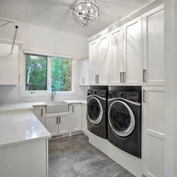
This Beautiful 5,931 sqft home renovation was completely transformed from a small farm bungalow. This house is situated on a ten-acre property with extensive farmland views with bright open spaces. Custom beam work was done on site to add the “rustic” element to many of the rooms, most specifically the bar area. Custom, site-built shelving and lockers were added throughout the house to accommodate the homeowner’s specific needs. Space saving barn doors add style and purpose to the walk-in closets in the ensuite, which includes walk-in shower, private toilet room, and free standing jet tub; things that were previously lacking. A “great room” was created on the main floor, utilizing the previously unusable living area, creating a space on the main floor big enough for the family to gather, and take full advantage of the beautiful scenery of the acreage.

 ZeroEnergy Design
OVERVIEW
Set into a mature Boston area neighborhood, this sophisticated 2900SF home offers efficient use of space, expression through form, and myriad of green features.
MULTI-GENERATIONAL LIVING
Designed to accommodate three family generations, paired living spaces on the first and second levels are architecturally expressed on the facade by window systems that wrap the front corners of the house. Included are two kitchens, two living areas, an office for two, and two master suites.
CURB APPEAL
The home includes both modern form and materials, using durable cedar and through-colored fiber cement siding, permeable parking with an electric charging station, and an acrylic overhang to shelter foot traffic from rain.
FEATURE STAIR
An open stair with resin treads and glass rails winds from the basement to the third floor, channeling natural light through all the home’s levels.
LEVEL ONE
The first floor kitchen opens to the living and dining space, offering a grand piano and wall of south facing glass. A master suite and private ‘home office for two’ complete the level.
LEVEL TWO
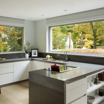
The second floor includes another open concept living, dining, and kitchen space, with kitchen sink views over the green roof. A full bath, bedroom and reading nook are perfect for the children.
LEVEL THREE
The third floor provides the second master suite, with separate sink and wardrobe area, plus a private roofdeck.
ENERGY
The super insulated home features air-tight construction, continuous exterior insulation, and triple-glazed windows. The walls and basement feature foam-free cavity & exterior insulation. On the rooftop, a solar electric system helps offset energy consumption.
WATER
Cisterns capture stormwater and connect to a drip irrigation system. Inside the home, consumption is limited with high efficiency fixtures and appliances.
TEAM
Architecture & Mechanical Design – ZeroEnergy Design
Contractor – Aedi Construction
Photos – Eric Roth Photography
 Paradise Found Construction
Keith and Amy loved their home in quiet Wake Forest neighborhood on a large corner lot on a cul-de-sac. Over time, Amy had developed allergic reactions to unknown allergens in their home. As her condition worsened, it became impossible for her to spend much time in the home, and they were forced to move out and find temporary housing accommodations.
After months of talking with other home improvement providers and indoor air “experts” and trying other solutions to no avail including having their HVAC ducting cleaned, they turned to Paradise Found Construction and our expertise and experience in transforming indoor environments in homes into healthy and clean living spaces. Because many of the improvements we undertook to create a cleaner environment also provided energy savings, we had our work certified under the 2012 National Green Building Standards (NGBS) and were award a Bronze level certification for the home.
We conducted a thorough investigation and testing regimen that included bringing in our team industry leading air quality and HVAC experts, we developed a comprehensive plan of action that would solve their “sick home syndrome”.
We removed all of the carpeting and pad from the home and thoroughly cleaned all surfaces and filtered the air with advanced HEPA filtration units. There were a few areas of mold in the crawl space which we mitigated as well. We thoroughly air sealed the home, paying particular attention to the ground level and attic floor system. Since the HVAC systems and ducting had become re-contaminated, we cleaned both units and all associated duct work.
To eliminate unhealthy air being drawn into the home from the crawl space, we completely sealed and conditioned the crawl. In order to provide a controlled entry point for clean fresh air into the home we installed an energy efficient stand-alone Energy Recovery Ventilator (ERV).
We installed wood flooring in all of the living areas that did not have wood flooring, and finished all of the flooring using a NO-VOC water-based floor finish. All of the painted surfaces of the home were sealed and painted with NO-VOC latex paint.
To further improve the energy performance of the home in addition to thoroughly air-sealing and sealing and conditioning the crawl space, we installed 100% LED lighting in the home. We improved the water efficiency of the home by installing low-flow EPA WaterSense rated toilets and shower heads, converted all of the bathroom and kitchen faucets to be more water efficient.
Upon completion, Amy and her family was able to move back into their cozy and clean “new home”, and are once again able to enjoy and be comfortable in their home.
26