
Search results for "House paint combinations" in Home Design Ideas
 Décor Aid
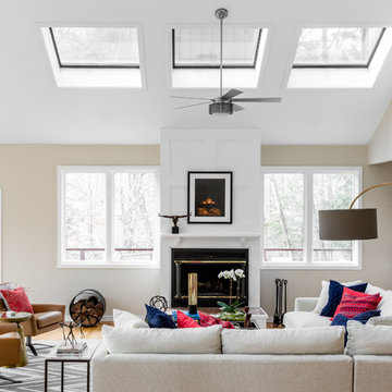
When an international client moved from Brazil to Stamford, Connecticut, they reached out to Decor Aid, and asked for our help in modernizing a recently purchased suburban home. The client felt that the house was too “cookie-cutter,” and wanted to transform their space into a highly individualized home for their energetic family of four.
In addition to giving the house a more updated and modern feel, the client wanted to use the interior design as an opportunity to segment and demarcate each area of the home. They requested that the downstairs area be transformed into a media room, where the whole family could hang out together. Both of the parents work from home, and so their office spaces had to be sequestered from the rest of the house, but conceived without any disruptive design elements. And as the husband is a photographer, he wanted to put his own artwork on display. So the furniture that we sourced had to balance the more traditional elements of the house, while also feeling cohesive with the husband’s bold, graphic, contemporary style of photography.
The first step in transforming this house was repainting the interior and exterior, which were originally done in outdated beige and taupe colors. To set the tone for a classically modern design scheme, we painted the exterior a charcoal grey, with a white trim, and repainted the door a crimson red. The home offices were placed in a quiet corner of the house, and outfitted with a similar color palette: grey walls, a white trim, and red accents, for a seamless transition between work space and home life.
The house is situated on the edge of a Connecticut forest, with clusters of maple, birch, and hemlock trees lining the property. So we installed white window treatments, to accentuate the natural surroundings, and to highlight the angular architecture of the home.
In the entryway, a bold, graphic print, and a thick-pile sheepskin rug set the tone for this modern, yet comfortable home. While the formal room was conceived with a high-contrast neutral palette and angular, contemporary furniture, the downstairs media area includes a spiral staircase, comfortable furniture, and patterned accent pillows, which creates a more relaxed atmosphere. Equipped with a television, a fully-stocked bar, and a variety of table games, the downstairs media area has something for everyone in this energetic young family.
 Bilotta Kitchen & Home
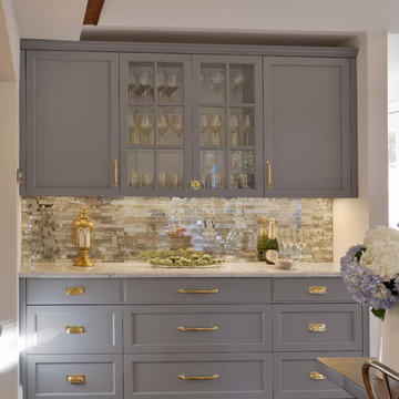
For this project, the entire kitchen was designed around the “must-have” Lacanche range in the stunning French Blue with brass trim. That was the client’s dream and everything had to be built to complement it. Bilotta senior designer, Randy O’Kane, CKD worked with Paul Benowitz and Dipti Shah of Benowitz Shah Architects to contemporize the kitchen while staying true to the original house which was designed in 1928 by regionally noted architect Franklin P. Hammond. The clients purchased the home over two years ago from the original owner. While the house has a magnificent architectural presence from the street, the basic systems, appointments, and most importantly, the layout and flow were inappropriately suited to contemporary living.
The new plan removed an outdated screened porch at the rear which was replaced with the new family room and moved the kitchen from a dark corner in the front of the house to the center. The visual connection from the kitchen through the family room is dramatic and gives direct access to the rear yard and patio. It was important that the island separating the kitchen from the family room have ample space to the left and right to facilitate traffic patterns, and interaction among family members. Hence vertical kitchen elements were placed primarily on existing interior walls. The cabinetry used was Bilotta’s private label, the Bilotta Collection – they selected beautiful, dramatic, yet subdued finishes for the meticulously handcrafted cabinetry. The double islands allow for the busy family to have a space for everything – the island closer to the range has seating and makes a perfect space for doing homework or crafts, or having breakfast or snacks. The second island has ample space for storage and books and acts as a staging area from the kitchen to the dinner table. The kitchen perimeter and both islands are painted in Benjamin Moore’s Paper White. The wall cabinets flanking the sink have wire mesh fronts in a statuary bronze – the insides of these cabinets are painted blue to match the range. The breakfast room cabinetry is Benjamin Moore’s Lampblack with the interiors of the glass cabinets painted in Paper White to match the kitchen. All countertops are Vermont White Quartzite from Eastern Stone. The backsplash is Artistic Tile’s Kyoto White and Kyoto Steel. The fireclay apron-front main sink is from Rohl while the smaller prep sink is from Linkasink. All faucets are from Waterstone in their antique pewter finish. The brass hardware is from Armac Martin and the pendants above the center island are from Circa Lighting. The appliances, aside from the range, are a mix of Sub-Zero, Thermador and Bosch with panels on everything.
 Ann Lowengart Interiors
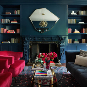
We juxtaposed bold colors and contemporary furnishings with the early twentieth-century interior architecture for this four-level Pacific Heights Edwardian. The home's showpiece is the living room, where the walls received a rich coat of blackened teal blue paint with a high gloss finish, while the high ceiling is painted off-white with violet undertones. Against this dramatic backdrop, we placed a streamlined sofa upholstered in an opulent navy velour and companioned it with a pair of modern lounge chairs covered in raspberry mohair. An artisanal wool and silk rug in indigo, wine, and smoke ties the space together.
Find the right local pro for your project
 Timberlake Custom Homes
Kurtis Miller - KM Pics
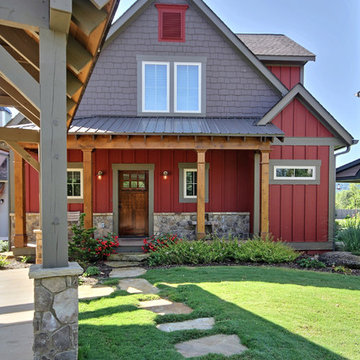
Inspiration for a mid-sized farmhouse red two-story mixed siding, board and batten and shingle gable roof remodel in Atlanta with a shingle roof
Inspiration for a mid-sized farmhouse red two-story mixed siding, board and batten and shingle gable roof remodel in Atlanta with a shingle roof
 Randy Angell Designs
The planning phase of this modern retreat was an intense collaboration that took place over the course of more than two years. While the initial design concept exceeded the clients' expectations, it also exceeded their budget beyond the point of comfort.
The next several months were spent modifying the design, in attempts to lower the budget. Ultimately, the decision was made that they would hold off on the project until they could budget for the original design, rather than compromising the vision.
About a year later, we repeated that same process, which resulted in the same outcome. After another year-long hiatus, we met once again. We revisited design thoughts, each of us bringing to the table new ideas and options.
Each thought simply solidified the fact that the initial vision was absolutely what we all wanted to see come to fruition, and the decision was finally made to move forward.
The main challenge of the site was elevation. The Southeast corner of the lot stands 5'6" above the threshold of the rear door, while the Northeast corner dropped a full 2' below the threshold of the door.
The backyard was also long and narrow, sloping side-to-side and toward the house. The key to the design concept was to deftly place the project into the slope and utilize the elevation changes, without allowing them to dominate the yard, or overwhelm the senses.
The unseen challenge on this project came in the form of hitting every underground issue possible. We had to relocate the sewer main, the gas line, and the electrical service; and since rock was sitting about 6" below the surface, all of these had to be chiseled through many feet of dense rock, adding to our projected timeline and budget.
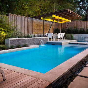
As you enter the space, your first stop is an outdoor living area. Smooth finished concrete, colored to match the 'Leuder' limestone coping, has a subtle saw-cut pattern aligned with the edges of the recessed fire pit.
In small spaces, it is important to consider a multi-purpose approach. So, the recessed fire pit has been fitted with an aluminum cover that allows our client to set up tables and chairs for entertaining, right over the top of the fire pit.
From here, it;s two steps up to the pool elevation, and the floating 'Leuder' limestone stepper pads that lead across the pool and hide the dam wall of the flush spa.
The main retaining wall to the Southeast is a poured concrete wall with an integrated sheer descent waterfall into the spa. To bring in some depth and texture, a 'Brownstone' ledgestone was used to face both the dropped beam on the pool, and the raised beam of the water feature wall.
The main water feature is comprised of five custom made stainless steel scuppers, supplied by a dedicated booster pump.
Colored concrete stepper pads lead to the 'Ipe' wood deck at the far end of the pool. The placement of this wood deck allowed us to minimize our use of retaining walls on the Northeast end of the yard, since it drops off over three feet below the elevation of the pool beam.
One of the most unique features on this project has to be the structure over the dining area. With a unique combination of steel and wood, the clean modern aesthetic of this structure creates a visual stamp in the space that standard structure could not accomplish.
4" steel posts, painted charcoal grey, are set on an angle, 4' into the bedrock, to anchor the structure. Steel I-beams painted in green-yellow color--aptly called "frolic"--act as the base to the hefty cedar rafters of the roof structure, which has a slight pitch toward the rear.
A hidden gutter on the back of the roof sends water down a copper rain chain, and into the drainage system. The backdrop for both this dining area , as well as the living area, is the horizontal screen panel, created with alternating sizes of cedar planks, stained to a calm hue of dove grey.
 Thyme & Place Design LLC
When my client had to move from her company office to work at home, she set up in the dining room. Despite her best efforts, this was not the long-term solution she was looking for. My client realized she needed a dedicated space not on the main floor of the home. On one hand, having your office space right next to the kitchen is handy. On the other hand, it made separating work and home life was not that easy.
The house was a ranch. In essence, the basement would run entire length of the home. As we came down the steps, we entered a time capsule. The house was built in the 1950’s. The walls were covered with original knotty pine paneling. There was a wood burning fireplace and considering this was a basement, high ceilings. In addition, there was everything her family could not store at their own homes. As we wound though the space, I though “wow this has potential”, Eventually, after walking through the laundry room we came to a small nicely lit room. This would be the office.
My client looked at me and asked what I thought. Undoubtedly, I said, this can be a great workspace, but do you really want to walk through this basement and laundry to get here? Without reservation, my client said where do we start?
Once the design was in place, we started the renovation. The knotty pine paneling had to go. Specifically, to add some insulation and control the dampness and humidity. The laundry room wall was relocated to create a hallway to the office.
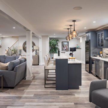
At the far end of the room, we designated a workout zone. Weights, mats, exercise bike and television are at the ready for morning or afternoon workouts. The space can be concealed by a folding screen for party time. Doors to an old closet under the stairs were relocated to the workout area for hidden storage. Now we had nice wall for a beautiful console and mirror for storage and serving during parties.
In order to add architectural details, we covered the old ugly support columns with simple recessed millwork panels. This detail created a visual division between the bar area and the seating area in front of the fireplace. The old red brick on the fireplace surround was replaced with stack stone. A mantle was made from reclaimed wood. Additional reclaimed wood floating shelves left and right of the fireplace provides decorative display while maintaining a rustic element balancing the copper end table and leather swivel rocker.
We found an amazing rug which tied all of the colors together further defining the gathering space. Russet and burnt orange became the accent color unifying each space. With a bit of whimsy, a rather unusual light fixture which looks like roots from a tree growing through the ceiling is a conversation piece.
The office space is quite and removed from the main part of the basement. There is a desk large enough for multiple screens, a small bookcase holding office supplies and a comfortable chair for conference calls. Because working from home requires many online meetings, we added a shiplap wall painted in Hale Navy to contrast with the orange fabric on the chair. We finished the décor with a painting from my client’s father. This is the background online visitors will see.
The last and best part of the renovation is the beautiful bar. My client is an avid collector of wine. She already had the EuroCave refrigerator, so I incorporated it into the design. The cabinets are painted Temptation Grey from Benjamin Moore. The counter tops are my favorite hard working quartzite Brown Fantasy. The backsplash is a combination of rustic wood and old tin ceiling like porcelain tiles. Together with the textures of the reclaimed wood and hide poofs balanced against the smooth finish of the cabinets, we created a comfortable luxury for relaxing.
There is ample storage for bottles, cans, glasses, and anything else you can think of for a great party. In addition to the wine storage, we incorporated a beverage refrigerator, an ice maker, and a sink. Floating shelves with integrated lighting illuminate the back bar. The raised height of the front bar provides the perfect wine tasting and paring spot. I especially love the pendant lights which look like wine glasses.
Finally, I selected carpet for the stairs and office. It is perfect for noise reduction. Meanwhile for the overall flooring, I specifically selected a high-performance vinyl plank floor. We often use this product as it is perfect to install on a concrete floor. It is soft to walk on, easy to clean and does not reduce the overall height of the space.
 Donald Lococo Architects
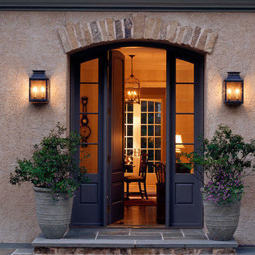
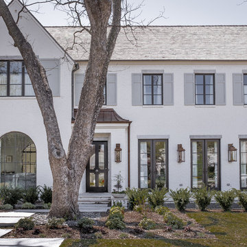
Situated in Kenwood, Maryland just outside of Washington, D.C., this whole-house renovation reinterprets a 1950s split-level into a rustic French country house. Published 3 times, The French country house plans for this renovation inform and guide the remodel. Short double-hung existing windows of various sizes on a 1950s brick front wall (see below) were replaced by straightforward openings along the front facade. By replacing them with a series of similar openings, the end result is a principled, simple elegance inspired by French country style homes. The rustic application of field stone arches and rough stucco are both inviting and enchanting, echoing French country interior design.
Elements of French country home decor complement the home. The traditional French country home design has been widely published, including features in Renovation Style and Maryland Life magazines, among others. One singular continuous walkway runs the entire length of the main front under each of the French doors, and a courtyard created by stucco walls and stone piers create an inner sanctum in the front yard. In the back of the property, added French gates lead to a newly constructed pavilion.


 Tamara Rosenbloom Design LLC
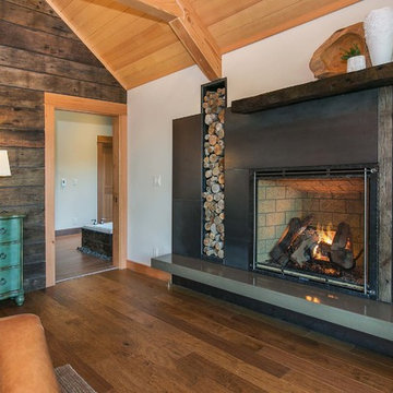
This exquisite master suite combines rough hewn reclaimed wood, custom milled reclaimed fir, VG fir, hot rolled steel, custom barn doors, stone, concrete counters and hearths and limestone plaster for a truly one of kind space. The suite's entrance hall showcases three gorgeous barn doors hand made from from reclaimed jarrah and fir. Behind one of the doors is the office, which was designed to precisely suit my clients' needs. The built in's house a small desk, Sub Zero undercounter refrigerator and Miele built in espresso machine. The leather swivel chairs, slate and iron end tables from a Montana artist and dual function ottomans keep the space very usable while still beautiful. The walls are painted in dry erase paint, allowing every square inch of wall space to be used for business strategizing and planning. The limestone plaster fireplace warms the space and brings another texture to the room. Through another barn door is the stunning 20' x 23' master bedroom. The VG fir beams have a channel routed in the top containing LED rope light, illuminating the soaring VG fir ceiling. The bronze chandelier from France is a free form shape, providing contrast to all the horizontal lines in the room. The show piece is definitely the 150 year old reclaimed jarrah wood used on the bed wall. The gray tones coordinate beautifully with all the warmth from the fir. We custom designed the panelized fireplace surround with inset wood storage in hot rolled steel. The cantilevered concrete hearth adds depth to the sleek steel. Opposite the bed is a fir 18' wide bifold door, allowing my outdoor-loving clients to feel as one with their gorgeous property. The final space is a dream bath suite, with sauna, steam shower, sunken tub, fireplace and custom vanities. The glazed wood vanities were designed with all drawers to maximize function. We topped the vanities with antique corbels and a reclaimed fir soffit and corner column for a dramatic design. The corner column houses spring loaded magnetic doors, hiding away all the bathroom necessities that require plugs. The concrete countertop on the vanities has integral sinks and a low profile contemporary design. The soaking tub is sunk into a bed of Mexican beach pebbles and clad in reclaimed jarrah and steel. The custom steel and tile fireplace is beautiful and warms the bathroom nicely on cool Pacific Northwest days.
www.cascadepromedia.com
 Advance Design Studio, Ltd.
The major kitchen renovation of this old country farmhouse was a task of love, one that had been planned for many years by these Barrington seasoned homeowners. After interviewing no less than five companies, the homeowners chose the design team at Advance Design Studio to make the transformation they had long planned for.
“They had an understanding of the right design for the space almost from the instant they walked in the room”, says Sharon Scott of the design team of Nicole Ryan at Todd Jurs at Advance Design Studio. “They were the only designers who laid out ideas in the first meeting at the house that we really loved”, she says. “It was obvious that they understood the house, and understood us - and from then on the decision to hire them literally made itself”.
The original kitchen had a dividing “wall” of cabinetry…that made the rather large space seem very small, and cut off the kitchen from the eating area that has a beautiful garden view completely hidden from the main kitchen. Circulation was poor, leaving family members on top of one another when entertaining family and friends.
The new kitchen design nearly doubles the kitchen size within the original space; opening it up completely and enjoying an expansive island containing a new Kohler Whitehaven Smart Divide farm sink, a dishwasher, and pull out double trash receptacle. The great new gathering space accommodates four pull out stools beckoning grandchildren and friends alike. Removing the range from the island and relocating it to create a dramatic “feature” wall, completely out of the way of guests; it is now crowned with a beautiful completely customized wood hood designed to ventilate much more efficiently than the original island range containing a limited downdraft system.
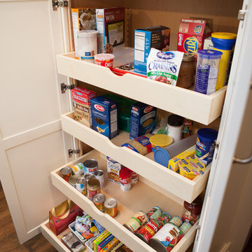
The much more efficient use of the space after removing a pantry closet made way for a fully functional “tall wall” housing a double oven and refrigerator, out of the way of guests. Removing the restrictive cabinetry wall now allowed for an expansive floor to ceiling pantry cabinet with full extension pull out shelving, and an elegant display area complete with a beautiful furniture detailed buffet.
Fitting perfectly into the farmhouse charm of the old estate, Medallion Silver Lancaster cabinetry was chosen in a soft white Maple Divinity paint finish lining the perimeter. The stunning island hints to this old home’s past with Medallion Gold’s Maple Devonshire style graced with a Carriage Black Heirloom painted finish. The rubbed off black paint finish reveals the soft wood tones beneath, mimicking furniture you’d see in your grandmother’s home that has lovingly been polished for years to reveal a soft, subtly rubbed-off sheen.
Counter tops reverse contrast with perimeter tops of black “Raven” granite possessing a subtle honed finish, and a shift to Quartz Difinity Viareggio - resembling white Carrera marble on the island. A simple herringbone detail completes the decorative range wall, and subtle porcelain subway tiles grace the backsplash throughout.
The design is finished off with crisp Thermador and Bosch stainless steel appliances, and bright brushed cup pull and handle combination hardware. A pull down Kohler Bellaria faucet makes cleanup a breeze, and soft under-cabinet LED lighting throughout makes every work surface shine softly, and highlights the cabinetry display area with grace.
One special detail was created to make the dramatic ceiling transition to a vaulted area above the breakfast nook extra special. A tongue and groove solid wood ceiling was hung above, and a subtle greenish-grey distressed paint finish was hand developed on site by the talented crew, complementing the new kitchen with a completely unique surface that appears as if it’s been there for many, many years. It’s just one standout feature in the amazing new space that is sure to be in every conversation as newcomers enjoy the newest best hangout in this old home renewed!
After 30 years of renovating homes, this now content homeowner sips a cup of tea enjoying her new garden view, and reminisces projects of past – and lastly reports their experience with Advance Design Studio culminating with their amazing new kitchen to be the most enjoyable and satisfying home experience yet.
Designer: Nicole Ryan
Photographer: Joe Nowak

 Emerick Architects
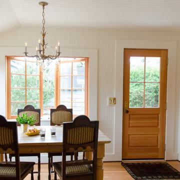
The new eating nook, situated in the SE corner of the house, comes to life with large casement windows that wrap around the table.
Beach style medium tone wood floor dining room photo in Portland with white walls
Beach style medium tone wood floor dining room photo in Portland with white walls
 Pu'uwai Design & Construction
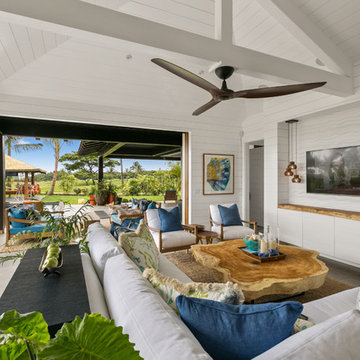
The living room has a built-in media niche. The cabinet doors are paneled in white to match the walls while the top is a natural live edge in Monkey Pod wood. The feature wall was highlighted by the use of modular arts in the same color as the walls but with a texture reminiscent of ripples on water. On either side of the TV hang a cluster of wooden pendants. The paneled walls and ceiling are painted white creating a seamless design. The teak glass sliding doors pocket into the walls creating an indoor-outdoor space. The great room is decorated in blues, greens and whites, with a jute rug on the floor, a solid log coffee table, slip covered white sofa, and custom blue and green throw pillows.
Sponsored
Delaware, OH

Buckeye Basements, Inc.
Central Ohio's Basement Finishing ExpertsBest Of Houzz '13-'21

 Wake Remodeling
Featured in 2016 Remodelers Home Tour
Our homeowners moved from The Windy City all the way to the land of the pines with dreams of a perfect home for their family. They found Wake Remodeling and together we made their dream a reality. We developed a strategy to utilize as much of their current resources as possible, while adding new features and design throughout the home. We completed a kitchen refacing with appliances, new paint, lighting, and gorgeous customer cabinetry.
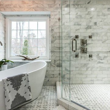
The master bathroom is a must see! We completely redesigned the bathroom with the homeowners' stellar taste in mind and created a haven for them to relax and rejuvenate. From the custom closets to the body spray shower system, the master bathroom makes a statement of elegance.

 Acorn Deck House Company
With a grand total of 1,247 square feet of living space, the Lincoln Deck House was designed to efficiently utilize every bit of its floor plan. This home features two bedrooms, two bathrooms, a two-car detached garage and boasts an impressive great room, whose soaring ceilings and walls of glass welcome the outside in to make the space feel one with nature.
 building Lab, inc.
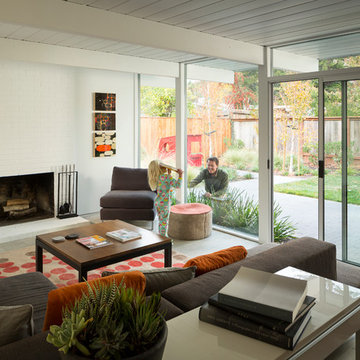
Eichler in Marinwood - In conjunction to the porous programmatic kitchen block as a connective element, the walls along the main corridor add to the sense of bringing outside in. The fin wall adjacent to the entry has been detailed to have the siding slip past the glass, while the living, kitchen and dining room are all connected by a walnut veneer feature wall running the length of the house. This wall also echoes the lush surroundings of lucas valley as well as the original mahogany plywood panels used within eichlers.
photo: scott hargis
Sponsored
Columbus, OH

Snider & Metcalf Interior Design, LTD
Leading Interior Designers in Columbus, Ohio & Ponte Vedra, Florida
 Our Town Plans
Our Town Plans
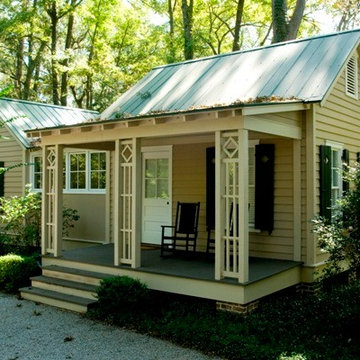
Example of a small classic yellow one-story exterior home design in Atlanta
Example of a small classic yellow one-story exterior home design in Atlanta
 ProTEK Painters
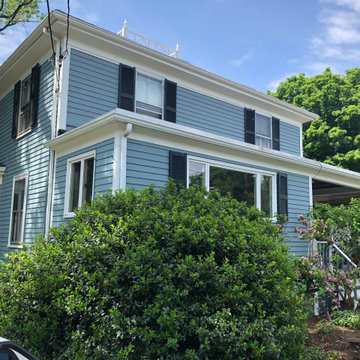
The homeowners of this mid-century New England style house in Newton chose a monochromatic color scheme for their exterior paint. They went with two different blues, light on the siding, and darker on the shutters, and a clean white for the trim and accents. This is a photo of the front of the house, which shows off the colors in their best light.
38