
Search results for "Identifies" in Home Design Ideas
 Balestri Architects
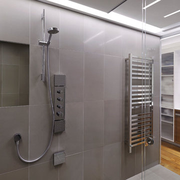
This project combines two existing studio apartments into a compact 800 sqft. live/work space for a young professional couple in the heart of Chelsea, New York.
The design required some creative space planning to meet the Owner’s requested program for an open plan solution with a private master bedroom suite and separate study that also allowed for entertaining small parties, including the ability to provide a sleeping space for guests.
The solution was to identify areas of overlap within the program that could be addressed with dual-function custom millwork pieces. A bar-stool counter at the open kitchen folds out to become a bench and dining table for formal entertaining. A custom desk folds down with a murphy bed to convert a private study into a guest bedroom area. A series of pocket door connecting the spaces provide both privacy to the master bedroom area when closed, and the option for a completely open layout when opened.
A carefully selected material palette brings a warm, tranquil feel to the space. Reclaimed teak floors run seamlessly through the main spaces to accentuate the open layout. Warm gray lacquered millwork, Centaurus granite slabs, and custom oxidized stainless steel details, give an elegant counterpoint to the natural teak floors. The master bedroom suite and study feature custom Afromosia millwork. The bathrooms are finished with cool toned ceramic tile, custom Afromosia vanities, and minimalist chrome fixtures. Custom LED lighting provides dynamic, energy efficient illumination throughout.
Photography: Mikiko Kikuyama
 Balestri Architects
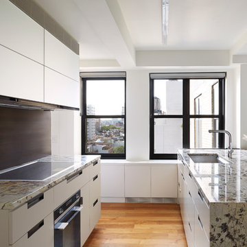
This project combines two existing studio apartments into a compact 800 sqft. live/work space for a young professional couple in the heart of Chelsea, New York.
The design required some creative space planning to meet the Owner’s requested program for an open plan solution with a private master bedroom suite and separate study that also allowed for entertaining small parties, including the ability to provide a sleeping space for guests.
The solution was to identify areas of overlap within the program that could be addressed with dual-function custom millwork pieces. A bar-stool counter at the open kitchen folds out to become a bench and dining table for formal entertaining. A custom desk folds down with a murphy bed to convert a private study into a guest bedroom area. A series of pocket door connecting the spaces provide both privacy to the master bedroom area when closed, and the option for a completely open layout when opened.
A carefully selected material palette brings a warm, tranquil feel to the space. Reclaimed teak floors run seamlessly through the main spaces to accentuate the open layout. Warm gray lacquered millwork, Centaurus granite slabs, and custom oxidized stainless steel details, give an elegant counterpoint to the natural teak floors. The master bedroom suite and study feature custom Afromosia millwork. The bathrooms are finished with cool toned ceramic tile, custom Afromosia vanities, and minimalist chrome fixtures. Custom LED lighting provides dynamic, energy efficient illumination throughout.
Photography: Mikiko Kikuyama
 Balestri Architects
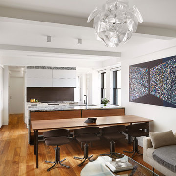
This project combines two existing studio apartments into a compact 800 sqft. live/work space for a young professional couple in the heart of Chelsea, New York.
The design required some creative space planning to meet the Owner’s requested program for an open plan solution with a private master bedroom suite and separate study that also allowed for entertaining small parties, including the ability to provide a sleeping space for guests.
The solution was to identify areas of overlap within the program that could be addressed with dual-function custom millwork pieces. A bar-stool counter at the open kitchen folds out to become a bench and dining table for formal entertaining. A custom desk folds down with a murphy bed to convert a private study into a guest bedroom area. A series of pocket door connecting the spaces provide both privacy to the master bedroom area when closed, and the option for a completely open layout when opened.
A carefully selected material palette brings a warm, tranquil feel to the space. Reclaimed teak floors run seamlessly through the main spaces to accentuate the open layout. Warm gray lacquered millwork, Centaurus granite slabs, and custom oxidized stainless steel details, give an elegant counterpoint to the natural teak floors. The master bedroom suite and study feature custom Afromosia millwork. The bathrooms are finished with cool toned ceramic tile, custom Afromosia vanities, and minimalist chrome fixtures. Custom LED lighting provides dynamic, energy efficient illumination throughout.
Photography: Mikiko Kikuyama
Find the right local pro for your project
 Karen Berkemeyer Home
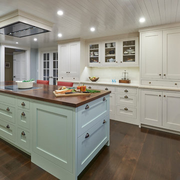
Wanting some of the familiarity of British country living, we deliberately incorporated details that echoed homeland into the design such as a ceramic farm sink. Amy designed the cabinetry using Signature Custom Cabinets, the construction is inset with a recessed panel door style. The simple shaker style door she modified with fuller stiles and rails to provide that country look and by alternating flush toe kicks and furniture legs also helped to achieve details and the country look the client was after. Adding subzero drawers at the end of the island offers quick access to snacks and drinks for the boys! The pretty green island was a color the client identified with her British roots. Bringing memories together with color really connects the homeowner personally to the space.
This distressed butternut island top with bread board ends is complete with natural wormholes, a true Raging River work of art. It really warms up the space and will patina further over time. The simplicity of the ultra modern Gaggenau induction cook top and sleek lines of the exhaust hood really allows that feature counter to take all the glory!
Lastly, the backsplash is crafted with textured, hand-made ceramic tiles that add a subtle bit of charm along with the warm touch of the antiqued brass cabinet hardware! Leaving the client with a beautiful and functional new kitchen.
 Homestead Doors, Inc.
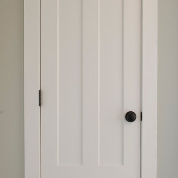
Door #10
FP3190
Flat 3 Panel Interior Door with Farmhouse Sticking
Solid Poplar stiles and rails
MDF panels
Painted White
1 x 4 door casing
1 x 6 baseboard
Bravura 336B door knob
Call us for a quote on your door project
419-684-9582
Visit https://www.door.cc
 Roomscapes Cabinetry and Design Center
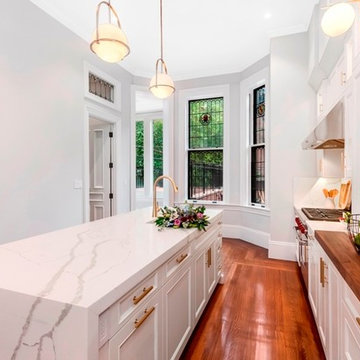
Reworking a classic Boston Brownstone today always involves updated kitchen and baths. And if possible, adding a powder room and flexible room that could function as a guest room or office on the main floor. This project did not have an owner and was being remarketed for sale. Creating an ideal space that prospective buyers would identify with requires the designer to research the target market for the home and detail/design spaces tailored to fit that niche.
Relocating the kitchen to the other side of the space provided for a guest/office.
Boston Red-brick chimney became the focal point of the new kitchen with closed door storage and walnut countertop and floating shelves. Keeping the line of sight to the original back metal bay-window with stained glass insert at the back of the unit complimented the crisp white cabinets and quartz stone tops
Removing a series of built-ins and bookcases to the right of the fireplace freed up space for a large built-in Subzero along with a wet bar and wine fridge
Mixing stainless steel appliances with brass faucets and light fixtures keep the space transitional
 Living with Lolo
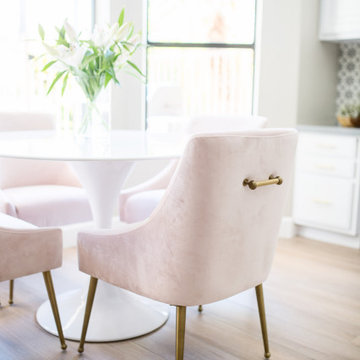
Dining Room in 45th Place | Budget-Friendly Kitchen Remodel in Phoenix, AZ |
Room Type: Kitchen Remodel |
Project Name: 45th Place |
Key Feature: A transitional kitchen remodel that proves smart material selections and a clear design vision can deliver a high-impact result without a luxury budget.
Challenge: The kitchen needed a full refresh but the project had real budget constraints. The challenge was making intentional material choices that looked elevated and cohesive without overspending, while still delivering the clean, transitional aesthetic the clients wanted.
Solution: Living with Lolo approached this as a design problem first, identifying where to invest and where to pull back without sacrificing the overall look. Budget-friendly materials were selected strategically so the finished kitchen felt intentional and designed rather than value-engineered. The result is a space that punches above its price point because the design thinking behind it was sound from the start.
Materials: Budget-conscious cabinetry, transitional hardware and fixtures, and durable countertop surfaces selected for both value and visual impact.
Budget: $30,000 to $75,000 |
Timeline: Completed approximately 2019, roughly 2 to 4 months from design through completion.
 Roomscapes Cabinetry and Design Center
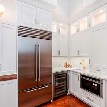
Reworking a classic Boston Brownstone today always involves updated kitchen and baths. And if possible, adding a powder room and flexible room that could function as a guest room or office on the main floor. This project did not have an owner and was being remarketed for sale. Creating an ideal space that prospective buyers would identify with requires the designer to research the target market for the home and detail/design spaces tailored to fit that niche.
Relocating the kitchen to the other side of the space provided for a guest/office.
Boston Red-brick chimney became the focal point of the new kitchen with closed door storage and walnut countertop and floating shelves. Keeping the line of sight to the original back metal bay-window with stained glass insert at the back of the unit complimented the crisp white cabinets and quartz stone tops
Removing a series of built-ins and bookcases to the right of the fireplace freed up space for a large built-in Subzero along with a wet bar and wine fridge
Mixing stainless steel appliances with brass faucets and light fixtures keep the space transitional
 HU-235072162
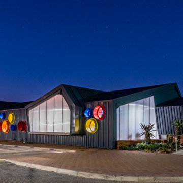
The site is located on the Mitchell House preparatory school campus in Polokwane. The client's brief
called for an early childhood development centre which would accommodate 122 learners and
requested that the building be evident of it's young and playful users.
Curiosity, wonder and intrigue would become defining criteria in an attempt to create a conducive
learning environment for young learners to grow, a building where children would be encouraged to
interact with their environment. The construction methodology of the building would remain apparent,
allowing its users to analyse the assembly of components.
Due to the age group of the users, the building would need to function semi-autonomously from the
rest of the school, while allowing for controlled interaction and inclusivity as is the norm for Mitchell
House. A linear plan which coincides with the developmental progress of the learners was identified
as the appropriate building typology. The spatial constraints of the site required this plan to be
moulded into the available space between the existing infrastructure, however the linear process was
maintained.
From the access-controlled reception and administration area one would move past the creative arts
and exhibition space towards the Northern wing where the youngest learners are taught. These would
share connected ablutions and storerooms between classes to enable fluid movement and
assistance throughout the teaching and service spaces. The East wing of the centre would house the
elder learners who would be in the process of being integrated with the fabric of the main school
campus. These classrooms include storage areas, however, have separate ablution facilities. The two
wings of the building surround a courtyard where play and interaction are in abundance.
 de-spec
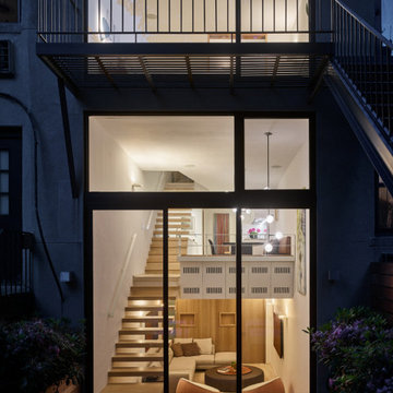
In this project, we identified the challenge of renovating a triplex as finding a way to integrate the stairs, so as to not take up the entire width of a narrow house, as well as to minimize the feeling of constantly having to run up and down to connect floors. This twelve-foot-wide townhouse consists of a cellar living room, a master bedroom suite on the upper floor, and a kitchen and dining area on the entry level. In trying to weave together these different floors, the aim of the project was to transform the stairs and steps into a fluid space that combines transition and rest.
The steps were designed to be integrated with the architecture, cantilevering from the wall and almost disappearing. The living room on the ground plane folds into the garden through steps and a full-window wall, effectively extending the garden into the living room. From the garden to the entry level, the stairs were transformed into a platform and space for meditation within the open-space living room, dining room and kitchen.
The introduction of a skylight midway through the length of the triplex permits natural light to flow to the back of the home, blending into the natural light coming in through the window facing the garden. The skylight also revealed a view of the trees hanging over the townhouse, framing the master bedroom suite from above and extending down with a view towards the garden.
 David Heide Design Studio
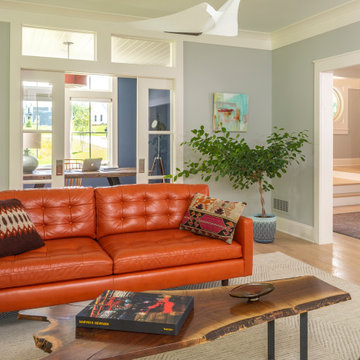
In coming to Minnesota from Iceland, the owners of Home 4 found themselves more than 3,000 miles away from home, hoping to build something new – literally and figuratively – that would feel like home for their family of five. They purchased a scenic piece of land in Rochester and identified a general idea of the spaces they would need, but they struggled with how to define a sense of character that would incorporate their culture and identity into the design. The architect-led design team was tasked with creating a house that would help establish the homeowners’ roots in a new country while still recalling familiar comforts of their heritage.
The result is a warm family home that combines elements of Nordic design with a touch of American farmhouse aesthetic. Gracious proportions, custom woodworking, and cheerful details create a welcoming atmosphere, while modern conveniences like a large mudroom and second-floor laundry help day-to-day life feel easy.
Around each corner, a new detail greets the eye, from the Lundie-inspired column at the staircase, to the double-heart detail inscribed in the woodwork, to the custom table designed for the breakfast nook. Each element is lovely individually, but experiencing the holistic effect as the details intentionally pair and play together helps to craft a house that feels like home.
Most important, the homeowners’ history, heritage, and hopes are melded together into a home that represents their family. Each unique element and carefully considered material combine to form a house that feels as if it could have belonged to this family for generations, even though it is brand new.
 Kimberlee Marie Interiors
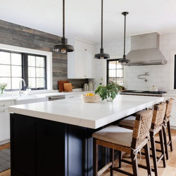
When our clients approached us about this project, they had a large vacant lot and a set of architectural plans in hand, and they needed our help to envision the interior of their dream home. As a busy family with young kids, they relied on KMI to help identify a design style that suited both of them and served their family's needs and lifestyle. One of the biggest challenges of the project was finding ways to blend their varying aesthetic desires, striking just the right balance between bright and cheery and rustic and moody. We also helped develop the exterior color scheme and material selections to ensure the interior and exterior of the home were cohesive and spoke to each other. With this project being a new build, there was not a square inch of the interior that KMI didn't touch.
In our material selections throughout the home, we sought to draw on the surrounding nature as an inspiration. The home is situated on a large lot with many large pine trees towering above. The goal was to bring some natural elements inside and make the house feel like it fits in its rustic setting. It was also a goal to create a home that felt inviting, warm, and durable enough to withstand all the life a busy family would throw at it. Slate tile floors, quartz countertops made to look like cement, rustic wood accent walls, and ceramic tiles in earthy tones are a few of the ways this was achieved.
There are so many things to love about this home, but we're especially proud of the way it all came together. The mix of materials, like iron, stone, and wood, helps give the home character and depth and adds warmth to some high-contrast black and white designs throughout the home. Anytime we do something truly unique and custom for a client, we also get a bit giddy, and the light fixture above the dining room table is a perfect example of that. A labor of love and the collaboration of design ideas between our client and us produced the one-of-a-kind fixture that perfectly fits this home. Bringing our client's dreams and visions to life is what we love most about being designers, and this project allowed us to do just that.
 Redecorating Vancouver
A modern home with an eclectic mix
My clients in this space were divided. They were split by competing aesthetics. There were Vietnamese art pieces with modern motifs and bold colours mixed with hand-crafted rustic tables and antique Canadiana. I quickly identified a lack of cohesion and an uncomfortable conversation area as the primary issues that were causing my clients stress.
A change was in order. We partitioned their large connected dining room, living and entryway areas using the existing furniture and floor covering. We were able to create several distinct and cohesive areas that each brought out the best of their contents. Each grouping now seemed natural and harmonious. Smooth international contemporary style and rustic heritage pieces now coexisted in the same space without causing my clients decorating headaches. To organize future projects and to summarize personalized decorating tips, Redecorating Vancouver provided them with a written Design Plan at the conclusion of the consultation.
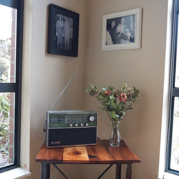
Family is important to me. I recognize that items in my clients' homes have unseen significance. In this instance, I was able to gather items to create a grand-parents nook to honour the couple's family. We took advantage of an heirloom antique radio that belonged to the client's grandfather and a meaningful handmade table. It is both pleasing to the eye and a daily reminder to the couple of who really matters in a home: the family that lives in it.
 de-spec
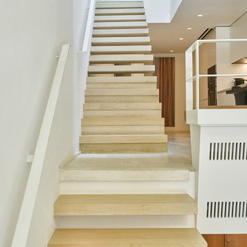
In this project, we identified the challenge of renovating a triplex as finding a way to integrate the stairs, so as to not take up the entire width of a narrow house, as well as to minimize the feeling of constantly having to run up and down to connect floors. This twelve-foot-wide townhouse consists of a cellar living room, a master bedroom suite on the upper floor, and a kitchen and dining area on the entry level. In trying to weave together these different floors, the aim of the project was to transform the stairs and steps into a fluid space that combines transition and rest.
The steps were designed to be integrated with the architecture, cantilevering from the wall and almost disappearing. The living room on the ground plane folds into the garden through steps and a full-window wall, effectively extending the garden into the living room. From the garden to the entry level, the stairs were transformed into a platform and space for meditation within the open-space living room, dining room and kitchen.
The introduction of a skylight midway through the length of the triplex permits natural light to flow to the back of the home, blending into the natural light coming in through the window facing the garden. The skylight also revealed a view of the trees hanging over the townhouse, framing the master bedroom suite from above and extending down with a view towards the garden.
 Redecorating Vancouver
A modern home with an eclectic mix
My clients in this space were divided. They were split by competing aesthetics. There were Vietnamese art pieces with modern motifs and bold colours mixed with hand-crafted rustic tables and antique Canadiana. I quickly identified a lack of cohesion and an uncomfortable conversation area as the primary issues that were causing my clients stress.
A change was in order. We partitioned their large connected dining room, living and entryway areas using the existing furniture and floor covering. We were able to create several distinct and cohesive areas that each brought out the best of their contents. Each grouping now seemed natural and harmonious. Smooth international contemporary style and rustic heritage pieces now coexisted in the same space without causing my clients decorating headaches. To organize future projects and to summarize personalized decorating tips, Redecorating Vancouver provided them with a written Design Plan at the conclusion of the consultation.
Family is important to me. I recognize that items in my clients' homes have unseen significance. In this instance, I was able to gather items to create a grand-parents nook to honour the couple's family. We took advantage of an heirloom antique radio that belonged to the client's grandfather and a meaningful handmade table. It is both pleasing to the eye and a daily reminder to the couple of who really matters in a home: the family that lives in it.
 Kimberlee Marie Interiors
When our clients approached us about this project, they had a large vacant lot and a set of architectural plans in hand, and they needed our help to envision the interior of their dream home. As a busy family with young kids, they relied on KMI to help identify a design style that suited both of them and served their family's needs and lifestyle. One of the biggest challenges of the project was finding ways to blend their varying aesthetic desires, striking just the right balance between bright and cheery and rustic and moody. We also helped develop the exterior color scheme and material selections to ensure the interior and exterior of the home were cohesive and spoke to each other. With this project being a new build, there was not a square inch of the interior that KMI didn't touch.
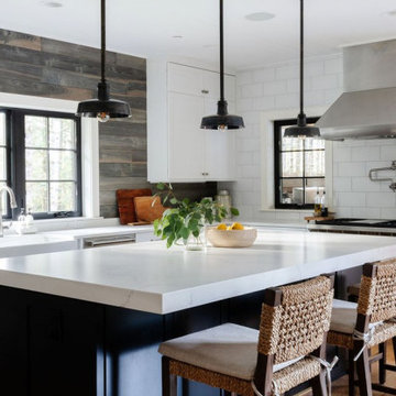
In our material selections throughout the home, we sought to draw on the surrounding nature as an inspiration. The home is situated on a large lot with many large pine trees towering above. The goal was to bring some natural elements inside and make the house feel like it fits in its rustic setting. It was also a goal to create a home that felt inviting, warm, and durable enough to withstand all the life a busy family would throw at it. Slate tile floors, quartz countertops made to look like cement, rustic wood accent walls, and ceramic tiles in earthy tones are a few of the ways this was achieved.
There are so many things to love about this home, but we're especially proud of the way it all came together. The mix of materials, like iron, stone, and wood, helps give the home character and depth and adds warmth to some high-contrast black and white designs throughout the home. Anytime we do something truly unique and custom for a client, we also get a bit giddy, and the light fixture above the dining room table is a perfect example of that. A labor of love and the collaboration of design ideas between our client and us produced the one-of-a-kind fixture that perfectly fits this home. Bringing our client's dreams and visions to life is what we love most about being designers, and this project allowed us to do just that.
 Old House Guy LLC
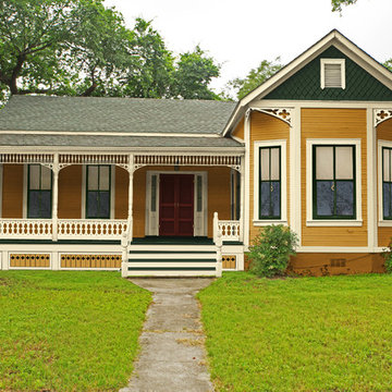
Here is that same home. All new features are in proportion to the architecture and correct for the period and style of the home. Bay windows replaced with original style to match others. Water table trim added, spandrels, brackets and a period porch skirt. These are the colors chosen by the homeowner.
 Roomscapes Cabinetry and Design Center
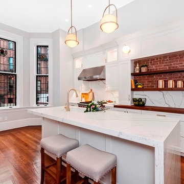
Reworking a classic Boston Brownstone today always involves updated kitchen and baths. And if possible, adding a powder room and flexible room that could function as a guest room or office on the main floor. This project did not have an owner and was being remarketed for sale. Creating an ideal space that prospective buyers would identify with requires the designer to research the target market for the home and detail/design spaces tailored to fit that niche.
Relocating the kitchen to the other side of the space provided for a guest/office.
Boston Red-brick chimney became the focal point of the new kitchen with closed door storage and walnut countertop and floating shelves. Keeping the line of sight to the original back metal bay-window with stained glass insert at the back of the unit complimented the crisp white cabinets and quartz stone tops
Removing a series of built-ins and bookcases to the right of the fireplace freed up space for a large built-in Subzero along with a wet bar and wine fridge
Mixing stainless steel appliances with brass faucets and light fixtures keep the space transitional
 HU-235072162
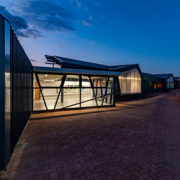
The site is located on the Mitchell House preparatory school campus in Polokwane. The client's brief
called for an early childhood development centre which would accommodate 122 learners and
requested that the building be evident of it's young and playful users.
Curiosity, wonder and intrigue would become defining criteria in an attempt to create a conducive
learning environment for young learners to grow, a building where children would be encouraged to
interact with their environment. The construction methodology of the building would remain apparent,
allowing its users to analyse the assembly of components.
Due to the age group of the users, the building would need to function semi-autonomously from the
rest of the school, while allowing for controlled interaction and inclusivity as is the norm for Mitchell
House. A linear plan which coincides with the developmental progress of the learners was identified
as the appropriate building typology. The spatial constraints of the site required this plan to be
moulded into the available space between the existing infrastructure, however the linear process was
maintained.
From the access-controlled reception and administration area one would move past the creative arts
and exhibition space towards the Northern wing where the youngest learners are taught. These would
share connected ablutions and storerooms between classes to enable fluid movement and
assistance throughout the teaching and service spaces. The East wing of the centre would house the
elder learners who would be in the process of being integrated with the fabric of the main school
campus. These classrooms include storage areas, however, have separate ablution facilities. The two
wings of the building surround a courtyard where play and interaction are in abundance.
 Equilibrium Interior Design Inc
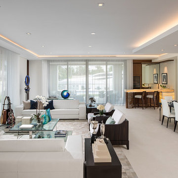
The living room, dining room, music area, and a bar are all located within a single large space. This open concept facilitates the flow while entertaining quests and allows for uninterrupted transition of events throughout the evening.
The ceiling coves cleverly hide linear a/c diffusers, hence you will not see them throughout the house. And the LED linear lighting and floating ceilings delineate different areas of the space. Large four-panel sliding glass doors on two walls open up this living and entertaining space to the outdoor living room, wrap around infinity lap pool, pool deck, and outside entertaining space. The large Mahogany sliding door panels open up the interior and outdoor spaces to one another and facilitate smooth/natural flow of the entertaining guests inside and out. Throughout the main living space, in lieu of traditional accessories, for this home, we opted to incorporate client’s unique memorabilia. They personalize the home and provide a unique approach to accessorizing. From helmets, trophies, custom sculptures, and racing car models, this home truly reflects the connection between owner’s life in the fast lane and the serenity of an escape.
Each time you visit the home, the subtle architectural details continuously attract. Quite possibly, it’s due to the tone-on-tone color scheme, simple-looking but complicated and engineered design, floating illuminated ceilings that give space a lot of interest without overpowering the rooms. It creates a background that changes throughout the day and creates a backdrop for Client’s possessions. As you move through this open floor plan home, large full height windows and doors and uninterrupted ceilings extend from inside to the outside and while they identify the various spaces they give you the illusion of openness between the interior and exterior world. Photography: Craig Denis
60