
Search results for "Identifies" in Home Design Ideas
 Griffith Indoor & Outdoor Living
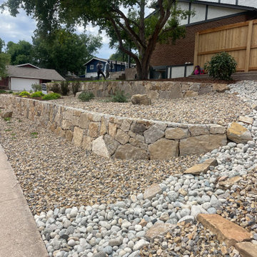
Griffith Designs partnered with repeat real estate investor clients to create custom landscape plans for multiple residential flip properties throughout the Denver area. Each design was tailored to the condition, architecture and resale goals of the individual home, giving investors a practical strategy for improving the property’s exterior appearance.
The landscape designs focused on high-impact curb-appeal improvements that could help each home make a stronger first impression on prospective buyers. Recommendations prioritized attractive, functional and market-ready updates while considering the investment objectives and scope of each property.
Because every renovation presented different opportunities, Griffith Designs adjusted the landscape plan to match the home, neighborhood and available budget. This flexible approach helped investors identify exterior improvements that supported the property’s overall transformation and resale presentation.
By returning to Griffith Designs for multiple Denver-area investment properties, these clients gained a trusted landscape-design partner who understood their process and priorities. The result was a series of strategic residential landscape plans created to enhance curb appeal, complement each renovated home and contribute to a polished, buyer-ready presentation.
 Kimberlee Marie Interiors
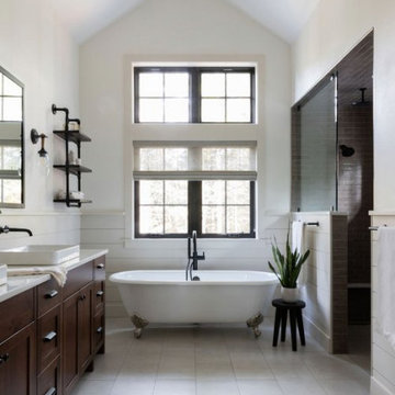
When our clients approached us about this project, they had a large vacant lot and a set of architectural plans in hand, and they needed our help to envision the interior of their dream home. As a busy family with young kids, they relied on KMI to help identify a design style that suited both of them and served their family's needs and lifestyle. One of the biggest challenges of the project was finding ways to blend their varying aesthetic desires, striking just the right balance between bright and cheery and rustic and moody. We also helped develop the exterior color scheme and material selections to ensure the interior and exterior of the home were cohesive and spoke to each other. With this project being a new build, there was not a square inch of the interior that KMI didn't touch.
In our material selections throughout the home, we sought to draw on the surrounding nature as an inspiration. The home is situated on a large lot with many large pine trees towering above. The goal was to bring some natural elements inside and make the house feel like it fits in its rustic setting. It was also a goal to create a home that felt inviting, warm, and durable enough to withstand all the life a busy family would throw at it. Slate tile floors, quartz countertops made to look like cement, rustic wood accent walls, and ceramic tiles in earthy tones are a few of the ways this was achieved.
There are so many things to love about this home, but we're especially proud of the way it all came together. The mix of materials, like iron, stone, and wood, helps give the home character and depth and adds warmth to some high-contrast black and white designs throughout the home. Anytime we do something truly unique and custom for a client, we also get a bit giddy, and the light fixture above the dining room table is a perfect example of that. A labor of love and the collaboration of design ideas between our client and us produced the one-of-a-kind fixture that perfectly fits this home. Bringing our client's dreams and visions to life is what we love most about being designers, and this project allowed us to do just that.
 HU-235072162
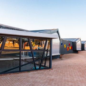
The site is located on the Mitchell House preparatory school campus in Polokwane. The client's brief
called for an early childhood development centre which would accommodate 122 learners and
requested that the building be evident of it's young and playful users.
Curiosity, wonder and intrigue would become defining criteria in an attempt to create a conducive
learning environment for young learners to grow, a building where children would be encouraged to
interact with their environment. The construction methodology of the building would remain apparent,
allowing its users to analyse the assembly of components.
Due to the age group of the users, the building would need to function semi-autonomously from the
rest of the school, while allowing for controlled interaction and inclusivity as is the norm for Mitchell
House. A linear plan which coincides with the developmental progress of the learners was identified
as the appropriate building typology. The spatial constraints of the site required this plan to be
moulded into the available space between the existing infrastructure, however the linear process was
maintained.
From the access-controlled reception and administration area one would move past the creative arts
and exhibition space towards the Northern wing where the youngest learners are taught. These would
share connected ablutions and storerooms between classes to enable fluid movement and
assistance throughout the teaching and service spaces. The East wing of the centre would house the
elder learners who would be in the process of being integrated with the fabric of the main school
campus. These classrooms include storage areas, however, have separate ablution facilities. The two
wings of the building surround a courtyard where play and interaction are in abundance.
Find the right local pro for your project
 A Designed Space
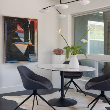
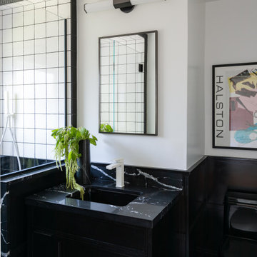
When our clients made the move from East to West coast, they wanted to bring parts of their past along with them. Blending New York style with the relaxed, coastal vibe of La Jolla’s Wind & Sea community offered a unique design challenge and opportunity.
From the outset, the bathrooms and kitchen were identified as the primary focus of this renovation. The aim was to weave the couple's distinctive style into the design while integrating modern touches.
As we explored these priorities, we found that increasing the square footage would not only expand their living space but also make room for the corner fireplace they had been dreaming of. This addition would enhance both the functionality and the ambiance of the home, aligning perfectly with their vision for a more spacious and cozy living environment.
The design approach embraced a contemporary aesthetic through simple black and white color blocking, complemented by unique fixtures and fittings. To create a balanced and inviting atmosphere, the design incorporated natural light by way of skylights and larger windows, which helped highlight the deep wood grain cabinetry. Whimsical art and furnishings further personalized the space, infusing it with character and warmth.
 A Designed Space
When our clients made the move from East to West coast, they wanted to bring parts of their past along with them. Blending New York style with the relaxed, coastal vibe of La Jolla’s Wind & Sea community offered a unique design challenge and opportunity.
From the outset, the bathrooms and kitchen were identified as the primary focus of this renovation. The aim was to weave the couple's distinctive style into the design while integrating modern touches.
As we explored these priorities, we found that increasing the square footage would not only expand their living space but also make room for the corner fireplace they had been dreaming of. This addition would enhance both the functionality and the ambiance of the home, aligning perfectly with their vision for a more spacious and cozy living environment.
The design approach embraced a contemporary aesthetic through simple black and white color blocking, complemented by unique fixtures and fittings. To create a balanced and inviting atmosphere, the design incorporated natural light by way of skylights and larger windows, which helped highlight the deep wood grain cabinetry. Whimsical art and furnishings further personalized the space, infusing it with character and warmth.
 de-spec
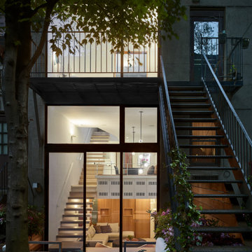
In this project, we identified the challenge of renovating a triplex as finding a way to integrate the stairs, so as to not take up the entire width of a narrow house, as well as to minimize the feeling of constantly having to run up and down to connect floors. This twelve-foot-wide townhouse consists of a cellar living room, a master bedroom suite on the upper floor, and a kitchen and dining area on the entry level. In trying to weave together these different floors, the aim of the project was to transform the stairs and steps into a fluid space that combines transition and rest.
The steps were designed to be integrated with the architecture, cantilevering from the wall and almost disappearing. The living room on the ground plane folds into the garden through steps and a full-window wall, effectively extending the garden into the living room. From the garden to the entry level, the stairs were transformed into a platform and space for meditation within the open-space living room, dining room and kitchen.
The introduction of a skylight midway through the length of the triplex permits natural light to flow to the back of the home, blending into the natural light coming in through the window facing the garden. The skylight also revealed a view of the trees hanging over the townhouse, framing the master bedroom suite from above and extending down with a view towards the garden.
 Normandy Remodeling
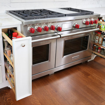
Custom spice racks flank the range. They were designed fit specific oils and spices in order to improve the overall cooking experience.
Mid-sized elegant u-shaped dark wood floor kitchen pantry photo in Chicago with an undermount sink, beaded inset cabinets, white cabinets, white backsplash, stone tile backsplash, stainless steel appliances, an island and quartz countertops
Mid-sized elegant u-shaped dark wood floor kitchen pantry photo in Chicago with an undermount sink, beaded inset cabinets, white cabinets, white backsplash, stone tile backsplash, stainless steel appliances, an island and quartz countertops
 Beautiful Habitat: Design & Decoration
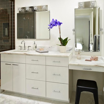
An elegant, modern, sexy master bathroom remodel. White gloss cabinets balance with the dark glass tiles in the shower for a sophisticated contrast.
Ron Ruscio Photography
 Ashton Renovations
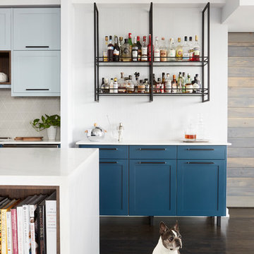
The original kitchen in this condominium was renovated arising from the need to replace Kitec plumbing. The work triangle remained generally the same, but numerous changes were made to improve the kitchen’s functionality, aesthetics, and lighting. Automation was also introduced. The goal was to design and build a modern contemporary functional kitchen with inspiring colours accented with textured wood features.
The functionality was improved with the addition of an under counter microwave, which freed up countertop space. Additional and improved storage was also created by incorporating under cabinet drawers throughout the kitchen, a bar area with open glass shelving above, and open shelving to the right of the seating area. Upper cabinet storage was as well increased with storage above the fridge.
Numerous lighting improvements were made including the addition of potlights. This was done by dropping the ceiling in the kitchen, which also created a visual division with the dining area. Automation was introduced as well into the space with HUE under cabinet lighting, and a touch faucet. The under cabinet lights are controlled by the Phillips Hue App that programs routines, scenes, and other settings.
The kitchen features painted Shaker cabinets accented by textured wood shelving. The countertop surfaces are quartz with waterfalls on both sides of the island, which is a focal point. Shapes are also strongly identified in the design with the use of triangular tiles in the backsplash along with rectangular upper cabinets, and appliance doors and drawers. The kitchen is made most unique though with the uplifting use of colour in the cabinets that make this a bright and cheerful space.
Aristea Photography
 Ashton Renovations
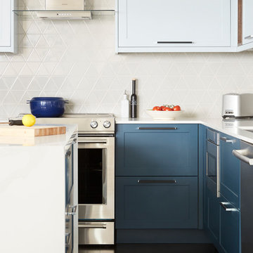
The original kitchen in this condominium was renovated arising from the need to replace Kitec plumbing. The work triangle remained generally the same, but numerous changes were made to improve the kitchen’s functionality, aesthetics, and lighting. Automation was also introduced. The goal was to design and build a modern contemporary functional kitchen with inspiring colours accented with textured wood features.
The functionality was improved with the addition of an under counter microwave, which freed up countertop space. Additional and improved storage was also created by incorporating under cabinet drawers throughout the kitchen, a bar area with open glass shelving above, and open shelving to the right of the seating area. Upper cabinet storage was as well increased with storage above the fridge.
Numerous lighting improvements were made including the addition of potlights. This was done by dropping the ceiling in the kitchen, which also created a visual division with the dining area. Automation was introduced as well into the space with HUE under cabinet lighting, and a touch faucet. The under cabinet lights are controlled by the Phillips Hue App that programs routines, scenes, and other settings.
The kitchen features painted Shaker cabinets accented by textured wood shelving. The countertop surfaces are quartz with waterfalls on both sides of the island, which is a focal point. Shapes are also strongly identified in the design with the use of triangular tiles in the backsplash along with rectangular upper cabinets, and appliance doors and drawers. The kitchen is made most unique though with the uplifting use of colour in the cabinets that make this a bright and cheerful space.
Aristea Photography
 HU-235072162
The site is located on the Mitchell House preparatory school campus in Polokwane. The client's brief
called for an early childhood development centre which would accommodate 122 learners and
requested that the building be evident of it's young and playful users.
Curiosity, wonder and intrigue would become defining criteria in an attempt to create a conducive
learning environment for young learners to grow, a building where children would be encouraged to
interact with their environment. The construction methodology of the building would remain apparent,
allowing its users to analyse the assembly of components.
Due to the age group of the users, the building would need to function semi-autonomously from the
rest of the school, while allowing for controlled interaction and inclusivity as is the norm for Mitchell
House. A linear plan which coincides with the developmental progress of the learners was identified
as the appropriate building typology. The spatial constraints of the site required this plan to be
moulded into the available space between the existing infrastructure, however the linear process was
maintained.
From the access-controlled reception and administration area one would move past the creative arts
and exhibition space towards the Northern wing where the youngest learners are taught. These would
share connected ablutions and storerooms between classes to enable fluid movement and
assistance throughout the teaching and service spaces. The East wing of the centre would house the
elder learners who would be in the process of being integrated with the fabric of the main school
campus. These classrooms include storage areas, however, have separate ablution facilities. The two
wings of the building surround a courtyard where play and interaction are in abundance.
 Kimberlee Marie Interiors
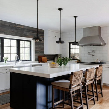
When our clients approached us about this project, they had a large vacant lot and a set of architectural plans in hand, and they needed our help to envision the interior of their dream home. As a busy family with young kids, they relied on KMI to help identify a design style that suited both of them and served their family's needs and lifestyle. One of the biggest challenges of the project was finding ways to blend their varying aesthetic desires, striking just the right balance between bright and cheery and rustic and moody. We also helped develop the exterior color scheme and material selections to ensure the interior and exterior of the home were cohesive and spoke to each other. With this project being a new build, there was not a square inch of the interior that KMI didn't touch.
In our material selections throughout the home, we sought to draw on the surrounding nature as an inspiration. The home is situated on a large lot with many large pine trees towering above. The goal was to bring some natural elements inside and make the house feel like it fits in its rustic setting. It was also a goal to create a home that felt inviting, warm, and durable enough to withstand all the life a busy family would throw at it. Slate tile floors, quartz countertops made to look like cement, rustic wood accent walls, and ceramic tiles in earthy tones are a few of the ways this was achieved.
There are so many things to love about this home, but we're especially proud of the way it all came together. The mix of materials, like iron, stone, and wood, helps give the home character and depth and adds warmth to some high-contrast black and white designs throughout the home. Anytime we do something truly unique and custom for a client, we also get a bit giddy, and the light fixture above the dining room table is a perfect example of that. A labor of love and the collaboration of design ideas between our client and us produced the one-of-a-kind fixture that perfectly fits this home. Bringing our client's dreams and visions to life is what we love most about being designers, and this project allowed us to do just that.
 Kimberlee Marie Interiors
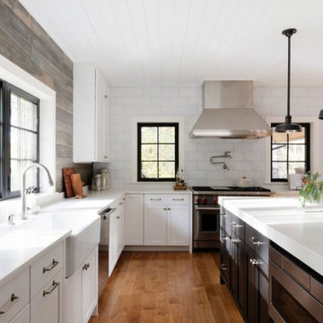
When our clients approached us about this project, they had a large vacant lot and a set of architectural plans in hand, and they needed our help to envision the interior of their dream home. As a busy family with young kids, they relied on KMI to help identify a design style that suited both of them and served their family's needs and lifestyle. One of the biggest challenges of the project was finding ways to blend their varying aesthetic desires, striking just the right balance between bright and cheery and rustic and moody. We also helped develop the exterior color scheme and material selections to ensure the interior and exterior of the home were cohesive and spoke to each other. With this project being a new build, there was not a square inch of the interior that KMI didn't touch.
In our material selections throughout the home, we sought to draw on the surrounding nature as an inspiration. The home is situated on a large lot with many large pine trees towering above. The goal was to bring some natural elements inside and make the house feel like it fits in its rustic setting. It was also a goal to create a home that felt inviting, warm, and durable enough to withstand all the life a busy family would throw at it. Slate tile floors, quartz countertops made to look like cement, rustic wood accent walls, and ceramic tiles in earthy tones are a few of the ways this was achieved.
There are so many things to love about this home, but we're especially proud of the way it all came together. The mix of materials, like iron, stone, and wood, helps give the home character and depth and adds warmth to some high-contrast black and white designs throughout the home. Anytime we do something truly unique and custom for a client, we also get a bit giddy, and the light fixture above the dining room table is a perfect example of that. A labor of love and the collaboration of design ideas between our client and us produced the one-of-a-kind fixture that perfectly fits this home. Bringing our client's dreams and visions to life is what we love most about being designers, and this project allowed us to do just that.
 ALVAREZ-DIAZ & VILLALON
Photography by Carlos Esteva.
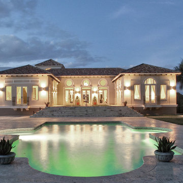
When this private client, a married couple, first approached Álvarez-Díaz & Villalón to build ‘the house of their dreams’ on the grounds of their sprawling family estate, the first challenge was to identify the exact location that would maximize the positive aspects of the topography while affording the most gracious views. Propped up on scaffolding, juggling digital cameras and folding ladders, the design team photographed the property from hundreds of angles before the ideal site was selected.
Once the site was selected, construction could begin.
The building’s foundation was raised slightly off the ground to disperse geothermal heat. In addition, the designers studied daily sunlight patterns and positioned the structure accordingly in order to warm the swimming pool during the cooler morning hours and illuminate the principal living quarters during the late afternoon. Finally, the main house was designed with functional balconies on all sides: each balcony meticulously planned ~ and precisely positioned ~ to
both optimize wind flow and frame the property’s most breath-taking views.
Stylistically, the goal was to create an authentic Spanish hacienda. Following Old World tradition, the house was anchored around a centralized interior patio
in the Moorish style: enclosed on three sides ~ yet
open on the fourth (similar to the Alcázar of Seville) ~ to reveal a reflecting pool ~ and mirror the water motif of the home’s magnificent marble fountain. A bell tower, horseshoe arches, a colonnaded,vineyard-style patio, and
ornamental Moorish mosaic tilework (“azulejos”) completed this picturesque portrait of a faraway fantasy world of castles, chivalry, and swordsplay, reminiscent of Medieval Spain.
Shortly after completion, this showcase home was showcased on the TVE Spanish television series Spaniards Around The World (Españoles Alrededor
Del Mundo) as a prime example of authentic Spanish architecture designed outside the peninsula. Not surprising. After all, the story of a fairy-tale retreat as
magical as this one deserves a happy ending.
 A Designed Space
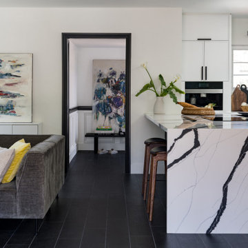
When our clients made the move from East to West coast, they wanted to bring parts of their past along with them. Blending New York style with the relaxed, coastal vibe of La Jolla’s Wind & Sea community offered a unique design challenge and opportunity.
From the outset, the bathrooms and kitchen were identified as the primary focus of this renovation. The aim was to weave the couple's distinctive style into the design while integrating modern touches.
As we explored these priorities, we found that increasing the square footage would not only expand their living space but also make room for the corner fireplace they had been dreaming of. This addition would enhance both the functionality and the ambiance of the home, aligning perfectly with their vision for a more spacious and cozy living environment.
The design approach embraced a contemporary aesthetic through simple black and white color blocking, complemented by unique fixtures and fittings. To create a balanced and inviting atmosphere, the design incorporated natural light by way of skylights and larger windows, which helped highlight the deep wood grain cabinetry. Whimsical art and furnishings further personalized the space, infusing it with character and warmth.
 de-spec
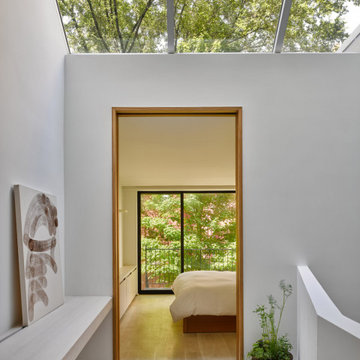
Skylight Frames the trees and Interior design magazine called their article 'tree house'.
In this project, we identified the challenge of renovating a triplex as finding a way to integrate the stairs, so as to not take up the entire width of a narrow house, as well as to minimize the feeling of constantly having to run up and down to connect floors. This twelve-foot-wide townhouse consists of a cellar living room, a master bedroom suite on the upper floor, and a kitchen and dining area on the entry level. In trying to weave together these different floors, the aim of the project was to transform the stairs and steps into a fluid space that combines transition and rest.
The steps were designed to be integrated with the architecture, cantilevering from the wall and almost disappearing. The living room on the ground plane folds into the garden through steps and a full-window wall, effectively extending the garden into the living room. From the garden to the entry level, the stairs were transformed into a platform and space for meditation within the open-space living room, dining room and kitchen.
The introduction of a skylight midway through the length of the triplex permits natural light to flow to the back of the home, blending into the natural light coming in through the window facing the garden. The skylight also revealed a view of the trees hanging over the townhouse, framing the master bedroom suite from above and extending down with a view towards the garden.
 A Designed Space
When our clients made the move from East to West coast, they wanted to bring parts of their past along with them. Blending New York style with the relaxed, coastal vibe of La Jolla’s Wind & Sea community offered a unique design challenge and opportunity.
From the outset, the bathrooms and kitchen were identified as the primary focus of this renovation. The aim was to weave the couple's distinctive style into the design while integrating modern touches.
As we explored these priorities, we found that increasing the square footage would not only expand their living space but also make room for the corner fireplace they had been dreaming of. This addition would enhance both the functionality and the ambiance of the home, aligning perfectly with their vision for a more spacious and cozy living environment.
The design approach embraced a contemporary aesthetic through simple black and white color blocking, complemented by unique fixtures and fittings. To create a balanced and inviting atmosphere, the design incorporated natural light by way of skylights and larger windows, which helped highlight the deep wood grain cabinetry. Whimsical art and furnishings further personalized the space, infusing it with character and warmth.
 A Designed Space
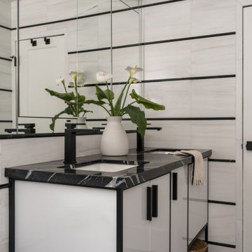
When our clients made the move from East to West coast, they wanted to bring parts of their past along with them. Blending New York style with the relaxed, coastal vibe of La Jolla’s Wind & Sea community offered a unique design challenge and opportunity.
From the outset, the bathrooms and kitchen were identified as the primary focus of this renovation. The aim was to weave the couple's distinctive style into the design while integrating modern touches.
As we explored these priorities, we found that increasing the square footage would not only expand their living space but also make room for the corner fireplace they had been dreaming of. This addition would enhance both the functionality and the ambiance of the home, aligning perfectly with their vision for a more spacious and cozy living environment.
The design approach embraced a contemporary aesthetic through simple black and white color blocking, complemented by unique fixtures and fittings. To create a balanced and inviting atmosphere, the design incorporated natural light by way of skylights and larger windows, which helped highlight the deep wood grain cabinetry. Whimsical art and furnishings further personalized the space, infusing it with character and warmth.
 Kimberlee Marie Interiors
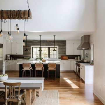
When our clients approached us about this project, they had a large vacant lot and a set of architectural plans in hand, and they needed our help to envision the interior of their dream home. As a busy family with young kids, they relied on KMI to help identify a design style that suited both of them and served their family's needs and lifestyle. One of the biggest challenges of the project was finding ways to blend their varying aesthetic desires, striking just the right balance between bright and cheery and rustic and moody. We also helped develop the exterior color scheme and material selections to ensure the interior and exterior of the home were cohesive and spoke to each other. With this project being a new build, there was not a square inch of the interior that KMI didn't touch.
In our material selections throughout the home, we sought to draw on the surrounding nature as an inspiration. The home is situated on a large lot with many large pine trees towering above. The goal was to bring some natural elements inside and make the house feel like it fits in its rustic setting. It was also a goal to create a home that felt inviting, warm, and durable enough to withstand all the life a busy family would throw at it. Slate tile floors, quartz countertops made to look like cement, rustic wood accent walls, and ceramic tiles in earthy tones are a few of the ways this was achieved.
There are so many things to love about this home, but we're especially proud of the way it all came together. The mix of materials, like iron, stone, and wood, helps give the home character and depth and adds warmth to some high-contrast black and white designs throughout the home. Anytime we do something truly unique and custom for a client, we also get a bit giddy, and the light fixture above the dining room table is a perfect example of that. A labor of love and the collaboration of design ideas between our client and us produced the one-of-a-kind fixture that perfectly fits this home. Bringing our client's dreams and visions to life is what we love most about being designers, and this project allowed us to do just that.
 Kimberlee Marie Interiors
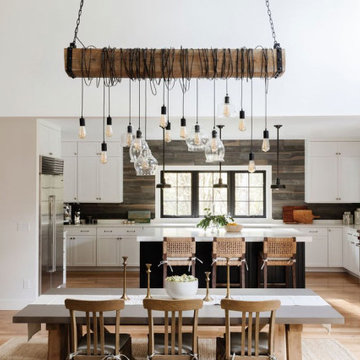
When our clients approached us about this project, they had a large vacant lot and a set of architectural plans in hand, and they needed our help to envision the interior of their dream home. As a busy family with young kids, they relied on KMI to help identify a design style that suited both of them and served their family's needs and lifestyle. One of the biggest challenges of the project was finding ways to blend their varying aesthetic desires, striking just the right balance between bright and cheery and rustic and moody. We also helped develop the exterior color scheme and material selections to ensure the interior and exterior of the home were cohesive and spoke to each other. With this project being a new build, there was not a square inch of the interior that KMI didn't touch.
In our material selections throughout the home, we sought to draw on the surrounding nature as an inspiration. The home is situated on a large lot with many large pine trees towering above. The goal was to bring some natural elements inside and make the house feel like it fits in its rustic setting. It was also a goal to create a home that felt inviting, warm, and durable enough to withstand all the life a busy family would throw at it. Slate tile floors, quartz countertops made to look like cement, rustic wood accent walls, and ceramic tiles in earthy tones are a few of the ways this was achieved.
There are so many things to love about this home, but we're especially proud of the way it all came together. The mix of materials, like iron, stone, and wood, helps give the home character and depth and adds warmth to some high-contrast black and white designs throughout the home. Anytime we do something truly unique and custom for a client, we also get a bit giddy, and the light fixture above the dining room table is a perfect example of that. A labor of love and the collaboration of design ideas between our client and us produced the one-of-a-kind fixture that perfectly fits this home. Bringing our client's dreams and visions to life is what we love most about being designers, and this project allowed us to do just that.
62