
Search results for "Illusion" in Home Design Ideas
 Novu Designs
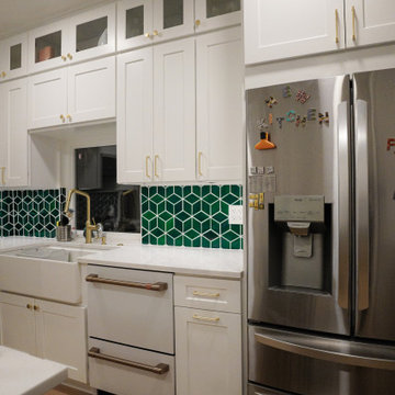
Our goal is to make your kitchen remodel as comfortable as possible. After establishing rapport with our client, we used our ingenuity to redesign and build their ideal kitchen in this stunning 10-foot-ceiling Brooklyn home. The warm tones of wood, quartz, and rich greens strike the ideal balance in creating this appealing design.
How did we achieve this look?
The Backsplash
Our client wanted a simple kitchen remodel in the shaker design, but she also wanted to include green. Initially, we proposed green cabinets to create a bold green look in the kitchen. The main objective was to incorporate our complimenting colors while keeping a feeling of lightness. After going through a number of ideas and 3D prototypes, installing as many cabinets as we could without overpowering the kitchen was our goal of optimizing space. We determined that the best way to brighten the space would be to install white shaker cabinets in addition to higher lumen recessed LED lighting. We decided that finding exquisite green backsplash tiles would be the best way to give it the desired green pop. After numerous searches, we came across a company called Mercury Mosaics.
While there were many green backsplash tiles to choose from, we opted for the mercury mosaics bluegrass diamond tiles. We loved these tiles because its created an illusion of cubes but at times, diamonds. The pattern is an art of illusion and its really gave us the personality we were looking for.
The Flooring of Choice
The flooring of choice was made by our client. We wanted the floors to feel soft and natural while capturing every bit of warmth to balance the whites and the greens and bring them together. While we could’ve opted for wood look tiles or luxury vinyl plank flooring, we ended up going with a premium slightly distressed white oak engineered hardwood flooring from Floor and Decor.
Accents
Although the flooring and the backsplash brought most of the kitchen together, we were still missing the cherry on top. The hardware and maybe something else?
We decided on thin profiled brushed brass hardware to give us that luxurious feel we were looking for every time we opened the cabinet. The cherry on top for us were the hand made quarter round oak shelves which really tied in the floors and cabinets together and gave us that final pop we were looking for. It truly added the perfect character for our client who is also a teen-fiction author of multiple books.

 Visbeen Architects
Imagine relaxing on one of two long verandas that define the front and back of this elegant yet easygoing Southern-style home. Ideal for a country getaway or seaside retreat, the exterior features custom columns, easy-care lap siding, an abundance of windows and porches and a metal roof.
One step inside, and it’s easy to see that Sunbreaker’s appeal doesn’t stop at the curb. Inside, a central main living space with a raised ceiling is open to the kitchen and upstairs balcony. Three sets of oversized French doors lead out onto a picturesque large porch. The triple French doors give the illusion of a wall of windows and take full advantage of views of the surrounding countryside or watery wonders.
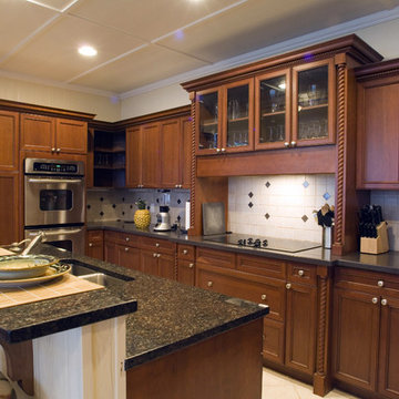
A central kitchen and dining area are located in the center of the home flanked by two identical wings. The upscale kitchen has granite countertops, classic dark wood cabinetry a two-tiered island and an overhead lounge/loft. Mirror images of each other, the wings contain two suites with bedroom, bath and private balcony. Upstairs, a common lounge unites two bunkrooms. Symmetry has never been so beautiful.
Imagine relaxing on one of two long verandas that define the front and back of this elegant yet easygoing Southern-style home. Ideal for a country getaway or seaside retreat, the exterior features custom columns, easy-care lap siding, an abundance of windows and porches and a metal roof.
One step inside, and it’s easy to see that Sunbreaker’s appeal doesn’t stop at the curb. Inside, a central main living space with a raised ceiling is open to the kitchen and upstairs balcony. Three sets of oversized French doors lead out onto a picturesque large porch. The triple French doors give the illusion of a wall of windows and take full advantage of views of the surrounding countryside or watery wonders.
A central kitchen and dining area are located in the center of the home flanked by two identical wings. The upscale kitchen has granite countertops, classic dark wood cabinetry a two-tiered island and an overhead lounge/loft. Mirror images of each other, the wings contain two suites with bedroom, bath and private balcony. Upstairs, a common lounge unites two bunkrooms. Symmetry has never been so beautiful.
Find the right local pro for your project
 The Myers Touch
In collaboration with the client’s architect, AR Design the layout of the kitchen was already in place. However, upon meeting the client it was clear she wanted a ‘wow’ island, symmetry in design and plenty of functional storage.
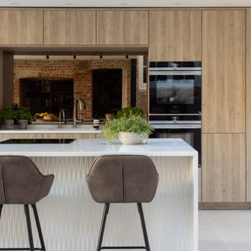
As well as a contemporary, family-friendly space it was also important the space that still respected the heritage of the house. The original walls of the property had many angled walls and featured some tight spaces, so careful consideration of SieMatic's cabinetry choices was given to ensure maximum functionality in those spaces. After much consideration, The Myers Touch specified SieMatic’s SC10 Cabinetry in a Provence Oak Laminate finish which was placed in a framed-style at the rear wall.
The same cabinetry was specified for under the island to create contrast with the new and original material features in the space. In order for the family to keep the kitchen uncluttered, careful planning of internal storage systems was considered in the form of using SieMatic’s internal Drawer boxes and their MultiMatic internal storage system which were used to store smaller items such as spices and sauces, as well whilst providing space for slide-out drawers and storage baskets.
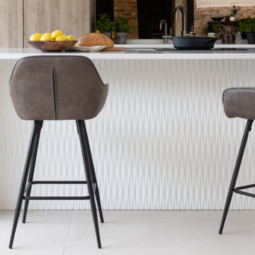
To ensure an elegant yet ‘wow’ factor central island, The Myers Touch combined contrasting textures by using 30mm Silestone Eternal Calacatta natural stone, polished worktops with ‘waterfall island’ edges and a Corian solid surface back panel. The distinctive geometric patterned Corian panel in Cameo White looks particularly spectacular at night when the owner's turn on the architectural-toned lighting under the island.
Appliances chosen for the island included a sophisticated Elica Illusion extractor hood so it could be totally integrated in the new architectural space without visual distraction, a Siemens iQ500 Induction Hob with touch-slide control and a Caple Under-counter Wine cabinet.
To maximise every inch of the new space, and to ensure the owners had a place for everything, The Myers Touch also used additional cabinetry and storage options in the island such as extra deep drawers to store saucepans, cutlery, and everyday crockery.
The eye-catching Antique-bronze mirrored splashback not only helps to provide the illusion of extra space, but reinforces family ‘togetherness’ as it reflects and links the rear of the kitchen ‘snug’ area where family members can sit and relax or work when not in the main kitchen extension area.
The original toned brickwork and 18th Century steel windows in the original part of the extension also helps to tell the story about the older part of the house which now juxtaposes to the new, contemporary kitchen living extension. A handy door was also included in the extension which leads to the garage on the main road for family convenience and over-flow storage.
Photography by Paul Craig (Reproduction of image by request only - joy@bakerpr.co.uk)
 The Myers Touch
In collaboration with the client’s architect, AR Design the layout of the kitchen was already in place. However, upon meeting the client it was clear she wanted a ‘wow’ island, symmetry in design and plenty of functional storage.
As well as a contemporary, family-friendly space it was also important the space that still respected the heritage of the house. The original walls of the property had many angled walls and featured some tight spaces, so careful consideration of SieMatic's cabinetry choices was given to ensure maximum functionality in those spaces. After much consideration, The Myers Touch specified SieMatic’s SC10 Cabinetry in a Provence Oak Laminate finish which was placed in a framed-style at the rear wall.
The same cabinetry was specified for under the island to create contrast with the new and original material features in the space. In order for the family to keep the kitchen uncluttered, careful planning of internal storage systems was considered in the form of using SieMatic’s internal Drawer boxes and their MultiMatic internal storage system which were used to store smaller items such as spices and sauces, as well whilst providing space for slide-out drawers and storage baskets.
To ensure an elegant yet ‘wow’ factor central island, The Myers Touch combined contrasting textures by using 30mm Silestone Eternal Calacatta natural stone, polished worktops with ‘waterfall island’ edges and a Corian solid surface back panel. The distinctive geometric patterned Corian panel in Cameo White looks particularly spectacular at night when the owner's turn on the architectural-toned lighting under the island.
Appliances chosen for the island included a sophisticated Elica Illusion extractor hood so it could be totally integrated in the new architectural space without visual distraction, a Siemens iQ500 Induction Hob with touch-slide control and a Caple Under-counter Wine cabinet.
To maximise every inch of the new space, and to ensure the owners had a place for everything, The Myers Touch also used additional cabinetry and storage options in the island such as extra deep drawers to store saucepans, cutlery, and everyday crockery.
The eye-catching Antique-bronze mirrored splashback not only helps to provide the illusion of extra space, but reinforces family ‘togetherness’ as it reflects and links the rear of the kitchen ‘snug’ area where family members can sit and relax or work when not in the main kitchen extension area.
The original toned brickwork and 18th Century steel windows in the original part of the extension also helps to tell the story about the older part of the house which now juxtaposes to the new, contemporary kitchen living extension. A handy door was also included in the extension which leads to the garage on the main road for family convenience and over-flow storage.
Photography by Paul Craig (Reproduction of image by request only - joy@bakerpr.co.uk)
 Novu Designs
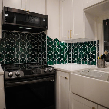
Our goal is to make your kitchen remodel as comfortable as possible. After establishing rapport with our client, we used our ingenuity to redesign and build their ideal kitchen in this stunning 10-foot-ceiling Brooklyn home. The warm tones of wood, quartz, and rich greens strike the ideal balance in creating this appealing design.
How did we achieve this look?
The Backsplash
Our client wanted a simple kitchen remodel in the shaker design, but she also wanted to include green. Initially, we proposed green cabinets to create a bold green look in the kitchen. The main objective was to incorporate our complimenting colors while keeping a feeling of lightness. After going through a number of ideas and 3D prototypes, installing as many cabinets as we could without overpowering the kitchen was our goal of optimizing space. We determined that the best way to brighten the space would be to install white shaker cabinets in addition to higher lumen recessed LED lighting. We decided that finding exquisite green backsplash tiles would be the best way to give it the desired green pop. After numerous searches, we came across a company called Mercury Mosaics.
While there were many green backsplash tiles to choose from, we opted for the mercury mosaics bluegrass diamond tiles. We loved these tiles because its created an illusion of cubes but at times, diamonds. The pattern is an art of illusion and its really gave us the personality we were looking for.
The Flooring of Choice
The flooring of choice was made by our client. We wanted the floors to feel soft and natural while capturing every bit of warmth to balance the whites and the greens and bring them together. While we could’ve opted for wood look tiles or luxury vinyl plank flooring, we ended up going with a premium slightly distressed white oak engineered hardwood flooring from Floor and Decor.
Accents
Although the flooring and the backsplash brought most of the kitchen together, we were still missing the cherry on top. The hardware and maybe something else?
We decided on thin profiled brushed brass hardware to give us that luxurious feel we were looking for every time we opened the cabinet. The cherry on top for us were the hand made quarter round oak shelves which really tied in the floors and cabinets together and gave us that final pop we were looking for. It truly added the perfect character for our client who is also a teen-fiction author of multiple books.
 Bilotta Kitchen & Home
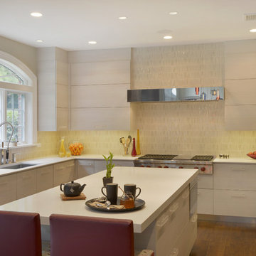
The homeowners wanted a sleek, contemporary kitchen that didn't feel cold, and still worked with the style of their classic, red brick colonial home. The design team, consisting of Bilotta senior designer, RitaLuisa Garcés and Billy Ceglia of Billy Ceglia Designs, opted for the warmth of traditional walnut cabinetry done in an exaggerated shaker style with ultra-thin stiles and rails and light textured laminate cabinets with distinct horizontal graining. The cabinetry they selected is Bilotta’s contemporary Artcraft line – European style cabinets manufactured in Canada. This combination of colors and textures helped solve another design issue: a long narrow space that opened directly into the family room. Cabinet colors and finishes helped to create the illusion of width in the space by situating the light cabinetry in an “L” across the rear wall and window wall of the space and “bookending” it with the full height walnut units that read more as paneling than cabinetry when viewed from the adjoining family room. The large simple island outfitted with Donghia counter stools, allows for an uninterrupted work space, storage of tabletop items, and also houses a “snack zone” for the client’s children with cabinetry and roll-outs for snacks, a microwave, and a beverage center all within easy reach, but outside of the main work area.
The custom stainless steel exhaust hood and handcrafted tile backsplash also add subtle visual interest to the space, reinforcing the idea that the back walls of the kitchen recede into the background creating the illusion of more space.
The centerpiece of the breakfast room is the multi light, hand blown chandelier from Niche Modern hanging above a blue lacquered breakfast table with stainless steel detailing and vintage Saarinen dining chairs. Together the components create a comfortable spot to dine, or just hang out.
Designers: RitaLuisa Garcés in collaboration with Billy Ceglia of Billy Ceglia Designs; Photo Credit: Peter Krupenye
 The Myers Touch
In collaboration with the client’s architect, AR Design the layout of the kitchen was already in place. However, upon meeting the client it was clear she wanted a ‘wow’ island, symmetry in design and plenty of functional storage.
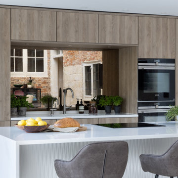
As well as a contemporary, family-friendly space it was also important the space that still respected the heritage of the house. The original walls of the property had many angled walls and featured some tight spaces, so careful consideration of SieMatic's cabinetry choices was given to ensure maximum functionality in those spaces. After much consideration, The Myers Touch specified SieMatic’s SC10 Cabinetry in a Provence Oak Laminate finish which was placed in a framed-style at the rear wall.
The same cabinetry was specified for under the island to create contrast with the new and original material features in the space. In order for the family to keep the kitchen uncluttered, careful planning of internal storage systems was considered in the form of using SieMatic’s internal Drawer boxes and their MultiMatic internal storage system which were used to store smaller items such as spices and sauces, as well whilst providing space for slide-out drawers and storage baskets.
To ensure an elegant yet ‘wow’ factor central island, The Myers Touch combined contrasting textures by using 30mm Silestone Eternal Calacatta natural stone, polished worktops with ‘waterfall island’ edges and a Corian solid surface back panel. The distinctive geometric patterned Corian panel in Cameo White looks particularly spectacular at night when the owner's turn on the architectural-toned lighting under the island.
Appliances chosen for the island included a sophisticated Elica Illusion extractor hood so it could be totally integrated in the new architectural space without visual distraction, a Siemens iQ500 Induction Hob with touch-slide control and a Caple Under-counter Wine cabinet.
To maximise every inch of the new space, and to ensure the owners had a place for everything, The Myers Touch also used additional cabinetry and storage options in the island such as extra deep drawers to store saucepans, cutlery, and everyday crockery.
The eye-catching Antique-bronze mirrored splashback not only helps to provide the illusion of extra space, but reinforces family ‘togetherness’ as it reflects and links the rear of the kitchen ‘snug’ area where family members can sit and relax or work when not in the main kitchen extension area.
The original toned brickwork and 18th Century steel windows in the original part of the extension also helps to tell the story about the older part of the house which now juxtaposes to the new, contemporary kitchen living extension. A handy door was also included in the extension which leads to the garage on the main road for family convenience and over-flow storage.
Photography by Paul Craig (Reproduction of image by request only - joy@bakerpr.co.uk)
 Bilotta Kitchen & Home
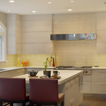
The homeowners wanted a sleek, contemporary kitchen that didn't feel cold, and still worked with the style of their classic, red brick colonial home. The design team, consisting of Bilotta senior designer, RitaLuisa Garcés and Billy Ceglia of Billy Ceglia Designs, opted for the warmth of traditional walnut cabinetry done in an exaggerated shaker style with ultra-thin stiles and rails and light textured laminate cabinets with distinct horizontal graining. The cabinetry they selected is Bilotta’s contemporary Artcraft line – European style cabinets manufactured in Canada. This combination of colors and textures helped solve another design issue: a long narrow space that opened directly into the family room. Cabinet colors and finishes helped to create the illusion of width in the space by situating the light cabinetry in an “L” across the rear wall and window wall of the space and “bookending” it with the full height walnut units that read more as paneling than cabinetry when viewed from the adjoining family room. The large simple island outfitted with Donghia counter stools, allows for an uninterrupted work space, storage of tabletop items, and also houses a “snack zone” for the client’s children with cabinetry and roll-outs for snacks, a microwave, and a beverage center all within easy reach, but outside of the main work area.
The custom stainless steel exhaust hood and handcrafted tile backsplash also add subtle visual interest to the space, reinforcing the idea that the back walls of the kitchen recede into the background creating the illusion of more space.
The centerpiece of the breakfast room is the multi light, hand blown chandelier from Niche Modern hanging above a blue lacquered breakfast table with stainless steel detailing and vintage Saarinen dining chairs. Together the components create a comfortable spot to dine, or just hang out.
Designers: RitaLuisa Garcés in collaboration with Billy Ceglia of Billy Ceglia Designs; Photo Credit: Peter Krupenye
 KDH Residential Designs
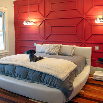
Example of a large minimalist master light wood floor and multicolored floor bedroom design in Charlotte with red walls
 Change Your Bathroom©
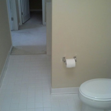
The goal of this project was to upgrade the builder grade finishes and create an ergonomic space that had a contemporary feel. This bathroom transformed from a standard, builder grade bathroom to a contemporary urban oasis. This was one of my favorite projects, I know I say that about most of my projects but this one really took an amazing transformation. By removing the walls surrounding the shower and relocating the toilet it visually opened up the space. Creating a deeper shower allowed for the tub to be incorporated into the wet area. Adding a LED panel in the back of the shower gave the illusion of a depth and created a unique storage ledge. A custom vanity keeps a clean front with different storage options and linear limestone draws the eye towards the stacked stone accent wall.
Houzz Write Up: https://www.houzz.com/magazine/inside-houzz-a-chopped-up-bathroom-goes-streamlined-and-swank-stsetivw-vs~27263720
The layout of this bathroom was opened up to get rid of the hallway effect, being only 7 foot wide, this bathroom needed all the width it could muster. Using light flooring in the form of natural lime stone 12x24 tiles with a linear pattern, it really draws the eye down the length of the room which is what we needed. Then, breaking up the space a little with the stone pebble flooring in the shower, this client enjoyed his time living in Japan and wanted to incorporate some of the elements that he appreciated while living there. The dark stacked stone feature wall behind the tub is the perfect backdrop for the LED panel, giving the illusion of a window and also creates a cool storage shelf for the tub. A narrow, but tasteful, oval freestanding tub fit effortlessly in the back of the shower. With a sloped floor, ensuring no standing water either in the shower floor or behind the tub, every thought went into engineering this Atlanta bathroom to last the test of time. With now adequate space in the shower, there was space for adjacent shower heads controlled by Kohler digital valves. A hand wand was added for use and convenience of cleaning as well. On the vanity are semi-vessel sinks which give the appearance of vessel sinks, but with the added benefit of a deeper, rounded basin to avoid splashing. Wall mounted faucets add sophistication as well as less cleaning maintenance over time. The custom vanity is streamlined with drawers, doors and a pull out for a can or hamper.
A wonderful project and equally wonderful client. I really enjoyed working with this client and the creative direction of this project.
Brushed nickel shower head with digital shower valve, freestanding bathtub, curbless shower with hidden shower drain, flat pebble shower floor, shelf over tub with LED lighting, gray vanity with drawer fronts, white square ceramic sinks, wall mount faucets and lighting under vanity. Hidden Drain shower system. Atlanta Bathroom.
 The Myers Touch
In collaboration with the client’s architect, AR Design the layout of the kitchen was already in place. However, upon meeting the client it was clear she wanted a ‘wow’ island, symmetry in design and plenty of functional storage.
As well as a contemporary, family-friendly space it was also important the space that still respected the heritage of the house. The original walls of the property had many angled walls and featured some tight spaces, so careful consideration of SieMatic's cabinetry choices was given to ensure maximum functionality in those spaces. After much consideration, The Myers Touch specified SieMatic’s SC10 Cabinetry in a Provence Oak Laminate finish which was placed in a framed-style at the rear wall.
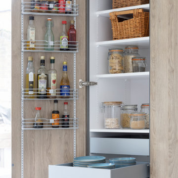
The same cabinetry was specified for under the island to create contrast with the new and original material features in the space. In order for the family to keep the kitchen uncluttered, careful planning of internal storage systems was considered in the form of using SieMatic’s internal Drawer boxes and their MultiMatic internal storage system which were used to store smaller items such as spices and sauces, as well whilst providing space for slide-out drawers and storage baskets.
To ensure an elegant yet ‘wow’ factor central island, The Myers Touch combined contrasting textures by using 30mm Silestone Eternal Calacatta natural stone, polished worktops with ‘waterfall island’ edges and a Corian solid surface back panel. The distinctive geometric patterned Corian panel in Cameo White looks particularly spectacular at night when the owner's turn on the architectural-toned lighting under the island.
Appliances chosen for the island included a sophisticated Elica Illusion extractor hood so it could be totally integrated in the new architectural space without visual distraction, a Siemens iQ500 Induction Hob with touch-slide control and a Caple Under-counter Wine cabinet.
To maximise every inch of the new space, and to ensure the owners had a place for everything, The Myers Touch also used additional cabinetry and storage options in the island such as extra deep drawers to store saucepans, cutlery, and everyday crockery.
The eye-catching Antique-bronze mirrored splashback not only helps to provide the illusion of extra space, but reinforces family ‘togetherness’ as it reflects and links the rear of the kitchen ‘snug’ area where family members can sit and relax or work when not in the main kitchen extension area.
The original toned brickwork and 18th Century steel windows in the original part of the extension also helps to tell the story about the older part of the house which now juxtaposes to the new, contemporary kitchen living extension. A handy door was also included in the extension which leads to the garage on the main road for family convenience and over-flow storage.
Photography by Paul Craig (Reproduction of image by request only - joy@bakerpr.co.uk)
 Gail Green
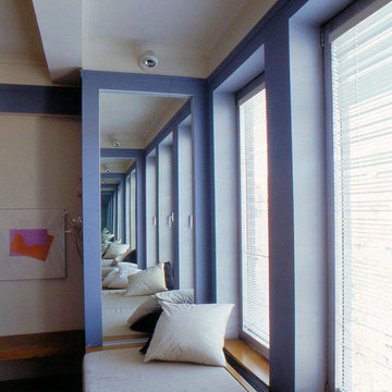
 At the other end of the large space is a stage-like curve setting the window seat above the rest of the room, much like a stage. This seat lies in the tradition of dramatic illusion created by a series of mirrors. Left and right of the seat, these mirrors reflect the actual view and give the impression of a full bay window, when, in fact, there is none. This illusion of a three-sided bay window is made more effective by making use of the natural light, coming in from the outside, as well as downlights situated above the mirrors.
 Bilotta Kitchen & Home
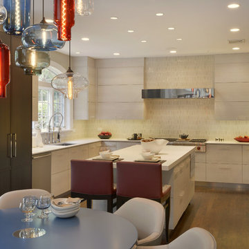
The homeowners wanted a sleek, contemporary kitchen that didn't feel cold, and still worked with the style of their classic, red brick colonial home. The design team, consisting of Bilotta senior designer, RitaLuisa Garcés and Billy Ceglia of Billy Ceglia Designs, opted for the warmth of traditional walnut cabinetry done in an exaggerated shaker style with ultra-thin stiles and rails and light textured laminate cabinets with distinct horizontal graining. The cabinetry they selected is Bilotta’s contemporary Artcraft line – European style cabinets manufactured in Canada. This combination of colors and textures helped solve another design issue: a long narrow space that opened directly into the family room. Cabinet colors and finishes helped to create the illusion of width in the space by situating the light cabinetry in an “L” across the rear wall and window wall of the space and “bookending” it with the full height walnut units that read more as paneling than cabinetry when viewed from the adjoining family room. The large simple island outfitted with Donghia counter stools, allows for an uninterrupted work space, storage of tabletop items, and also houses a “snack zone” for the client’s children with cabinetry and roll-outs for snacks, a microwave, and a beverage center all within easy reach, but outside of the main work area.
The custom stainless steel exhaust hood and handcrafted tile backsplash also add subtle visual interest to the space, reinforcing the idea that the back walls of the kitchen recede into the background creating the illusion of more space.
The centerpiece of the breakfast room is the multi light, hand blown chandelier from Niche Modern hanging above a blue lacquered breakfast table with stainless steel detailing and vintage Saarinen dining chairs. Together the components create a comfortable spot to dine, or just hang out.
Designers: RitaLuisa Garcés in collaboration with Billy Ceglia of Billy Ceglia Designs; Photo Credit: Peter Krupenye
 Dynamic Rugs Inc.
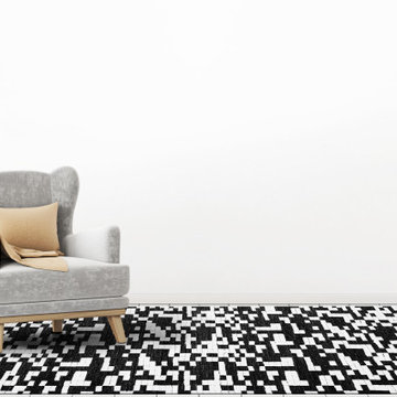
With geometric patterns that are reminiscent of an optical illusion, Verve rugs manage to be both stylishly modern and uniquely captivating. The blend of polypropylene with viscose allows the rugs to have firmness and durability without losing a subtle smoothness and sheen. The adherence to the use of black and white in the aesthetic allows Verve rugs to match any color scheme.
 Ikonic Epoxy & Surfaces
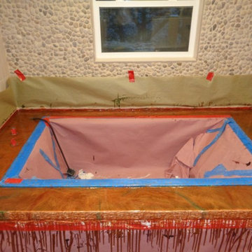
Masked bath tub surround with metal illusion epoxy overlay
Example of a trendy home design design in Denver
Example of a trendy home design design in Denver
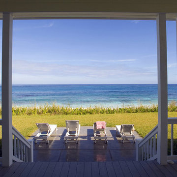 Visbeen Architects
Imagine relaxing on one of two long verandas that define the front and back of this elegant yet easygoing Southern-style home. Ideal for a country getaway or seaside retreat, the exterior features custom columns, easy-care lap siding, an abundance of windows and porches and a metal roof.
One step inside, and it’s easy to see that Sunbreaker’s appeal doesn’t stop at the curb. Inside, a central main living space with a raised ceiling is open to the kitchen and upstairs balcony. Three sets of oversized French doors lead out onto a picturesque large porch. The triple French doors give the illusion of a wall of windows and take full advantage of views of the surrounding countryside or watery wonders.
A central kitchen and dining area are located in the center of the home flanked by two identical wings. The upscale kitchen has granite countertops, classic dark wood cabinetry a two-tiered island and an overhead lounge/loft. Mirror images of each other, the wings contain two suites with bedroom, bath and private balcony. Upstairs, a common lounge unites two bunkrooms. Symmetry has never been so beautiful.
Imagine relaxing on one of two long verandas that define the front and back of this elegant yet easygoing Southern-style home. Ideal for a country getaway or seaside retreat, the exterior features custom columns, easy-care lap siding, an abundance of windows and porches and a metal roof.
One step inside, and it’s easy to see that Sunbreaker’s appeal doesn’t stop at the curb. Inside, a central main living space with a raised ceiling is open to the kitchen and upstairs balcony. Three sets of oversized French doors lead out onto a picturesque large porch. The triple French doors give the illusion of a wall of windows and take full advantage of views of the surrounding countryside or watery wonders.
A central kitchen and dining area are located in the center of the home flanked by two identical wings. The upscale kitchen has granite countertops, classic dark wood cabinetry a two-tiered island and an overhead lounge/loft. Mirror images of each other, the wings contain two suites with bedroom, bath and private balcony. Upstairs, a common lounge unites two bunkrooms. Symmetry has never been so beautiful.
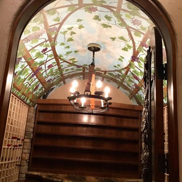
 Karen's Company
Paint Brand: Guiry’s Regal Select and Benjamin Moore Interior acrylic paint
Color: white, cream, blue, Greens, Reds, purples, brown, tan (different shades of all colors)
Special Techniques: Detailed brushwork, texturing, shading, fine intricate details, 3-D illusion
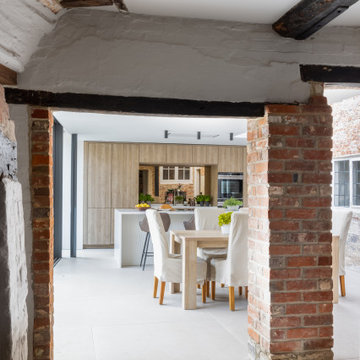 The Myers Touch
In collaboration with the client’s architect, AR Design the layout of the kitchen was already in place. However, upon meeting the client it was clear she wanted a ‘wow’ island, symmetry in design and plenty of functional storage.
As well as a contemporary, family-friendly space it was also important the space that still respected the heritage of the house. The original walls of the property had many angled walls and featured some tight spaces, so careful consideration of SieMatic's cabinetry choices was given to ensure maximum functionality in those spaces. After much consideration, The Myers Touch specified SieMatic’s SC10 Cabinetry in a Provence Oak Laminate finish which was placed in a framed-style at the rear wall.
The same cabinetry was specified for under the island to create contrast with the new and original material features in the space. In order for the family to keep the kitchen uncluttered, careful planning of internal storage systems was considered in the form of using SieMatic’s internal Drawer boxes and their MultiMatic internal storage system which were used to store smaller items such as spices and sauces, as well whilst providing space for slide-out drawers and storage baskets.
To ensure an elegant yet ‘wow’ factor central island, The Myers Touch combined contrasting textures by using 30mm Silestone Eternal Calacatta natural stone, polished worktops with ‘waterfall island’ edges and a Corian solid surface back panel. The distinctive geometric patterned Corian panel in Cameo White looks particularly spectacular at night when the owner's turn on the architectural-toned lighting under the island.
Appliances chosen for the island included a sophisticated Elica Illusion extractor hood so it could be totally integrated in the new architectural space without visual distraction, a Siemens iQ500 Induction Hob with touch-slide control and a Caple Under-counter Wine cabinet.
To maximise every inch of the new space, and to ensure the owners had a place for everything, The Myers Touch also used additional cabinetry and storage options in the island such as extra deep drawers to store saucepans, cutlery, and everyday crockery.
The eye-catching Antique-bronze mirrored splashback not only helps to provide the illusion of extra space, but reinforces family ‘togetherness’ as it reflects and links the rear of the kitchen ‘snug’ area where family members can sit and relax or work when not in the main kitchen extension area.
The original toned brickwork and 18th Century steel windows in the original part of the extension also helps to tell the story about the older part of the house which now juxtaposes to the new, contemporary kitchen living extension. A handy door was also included in the extension which leads to the garage on the main road for family convenience and over-flow storage.
Photography by Paul Craig (Reproduction of image by request only - joy@bakerpr.co.uk)
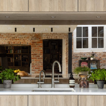 The Myers Touch
In collaboration with the client’s architect, AR Design the layout of the kitchen was already in place. However, upon meeting the client it was clear she wanted a ‘wow’ island, symmetry in design and plenty of functional storage.
As well as a contemporary, family-friendly space it was also important the space that still respected the heritage of the house. The original walls of the property had many angled walls and featured some tight spaces, so careful consideration of SieMatic's cabinetry choices was given to ensure maximum functionality in those spaces. After much consideration, The Myers Touch specified SieMatic’s SC10 Cabinetry in a Provence Oak Laminate finish which was placed in a framed-style at the rear wall.
The same cabinetry was specified for under the island to create contrast with the new and original material features in the space. In order for the family to keep the kitchen uncluttered, careful planning of internal storage systems was considered in the form of using SieMatic’s internal Drawer boxes and their MultiMatic internal storage system which were used to store smaller items such as spices and sauces, as well whilst providing space for slide-out drawers and storage baskets.
To ensure an elegant yet ‘wow’ factor central island, The Myers Touch combined contrasting textures by using 30mm Silestone Eternal Calacatta natural stone, polished worktops with ‘waterfall island’ edges and a Corian solid surface back panel. The distinctive geometric patterned Corian panel in Cameo White looks particularly spectacular at night when the owner's turn on the architectural-toned lighting under the island.
Appliances chosen for the island included a sophisticated Elica Illusion extractor hood so it could be totally integrated in the new architectural space without visual distraction, a Siemens iQ500 Induction Hob with touch-slide control and a Caple Under-counter Wine cabinet.
To maximise every inch of the new space, and to ensure the owners had a place for everything, The Myers Touch also used additional cabinetry and storage options in the island such as extra deep drawers to store saucepans, cutlery, and everyday crockery.
The eye-catching Antique-bronze mirrored splashback not only helps to provide the illusion of extra space, but reinforces family ‘togetherness’ as it reflects and links the rear of the kitchen ‘snug’ area where family members can sit and relax or work when not in the main kitchen extension area.
The original toned brickwork and 18th Century steel windows in the original part of the extension also helps to tell the story about the older part of the house which now juxtaposes to the new, contemporary kitchen living extension. A handy door was also included in the extension which leads to the garage on the main road for family convenience and over-flow storage.
Photography by Paul Craig (Reproduction of image by request only - joy@bakerpr.co.uk)
108