
Search results for "Immediately's digital" in Home Design Ideas
 birdRock Project Studio Inc.
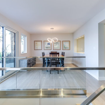
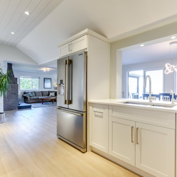
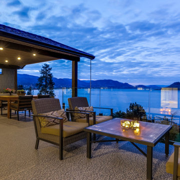
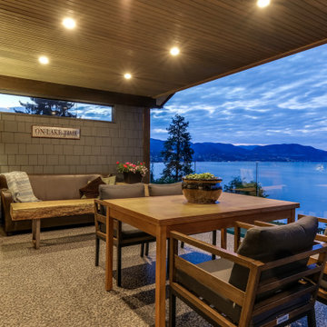
Ever heard some say “It has good bones?” Well, no one had ever said that about this house; it needed a major overhaul - “A TOTAL GUT.”
It’s saving grace was:
1. It’s enthusiastic new homeowners.
2. The expansive and gorgeous views of Okanagan Lake.
We were asked to assist our clients with big-picture-planning for their newest investment property.
Upon initial walk through of the home, it was immediately evident there were many previous ‘bandaid-type’ updates that it had gone through over the years.
This house was in prime need of an overhaul inside and out:
- multiple dropped Ceilings with layers of Plumbing add ons
- wall to wall Carpet
-a tired Bathtub directly inside the Master Bedroom
- a “dreaded” Corner Kitchen Sink
-multiple add ons involving three confusing front entry doors
Discovering what was previously done and the quandary of why these things were done is always so interesting to discover and can be very overwhelming for clients.
A big part of what we love most about Design is helping to propose new ideas to revitalize and improve all that has come before. It is one of the most challenging and rewarding parts of our work.
Our Renovation Strategy began in Layout Design for optimizing Interior & Exterior flow, moving into Concept & Style Planning, Millwork and Finish Selections.
We then created an ordered implementation sequence which would allow the homeowners to live on one floor while the other was being renovated Later they would move to the finished floor and renovate the remaining areas.
Once complete, the home quickly sold and we look forwards to assisting these happy investors on their next endeavour.
 birdRock Project Studio Inc.
Ever heard some say “It has good bones?” Well, no one had ever said that about this house; it needed a major overhaul - “A TOTAL GUT.”
It’s saving grace was:
1. It’s enthusiastic new homeowners.
2. The expansive and gorgeous views of Okanagan Lake.
We were asked to assist our clients with big-picture-planning for their newest investment property.
Upon initial walk through of the home, it was immediately evident there were many previous ‘bandaid-type’ updates that it had gone through over the years.
This house was in prime need of an overhaul inside and out:
- multiple dropped Ceilings with layers of Plumbing add ons
- wall to wall Carpet
-a tired Bathtub directly inside the Master Bedroom
- a “dreaded” Corner Kitchen Sink
-multiple add ons involving three confusing front entry doors
Discovering what was previously done and the quandary of why these things were done is always so interesting to discover and can be very overwhelming for clients.
A big part of what we love most about Design is helping to propose new ideas to revitalize and improve all that has come before. It is one of the most challenging and rewarding parts of our work.
Our Renovation Strategy began in Layout Design for optimizing Interior & Exterior flow, moving into Concept & Style Planning, Millwork and Finish Selections.
We then created an ordered implementation sequence which would allow the homeowners to live on one floor while the other was being renovated Later they would move to the finished floor and renovate the remaining areas.
Once complete, the home quickly sold and we look forwards to assisting these happy investors on their next endeavour.
 birdRock Project Studio Inc.
Ever heard some say “It has good bones?” Well, no one had ever said that about this house; it needed a major overhaul - “A TOTAL GUT.”
It’s saving grace was:
1. It’s enthusiastic new homeowners.
2. The expansive and gorgeous views of Okanagan Lake.
We were asked to assist our clients with big-picture-planning for their newest investment property.
Upon initial walk through of the home, it was immediately evident there were many previous ‘bandaid-type’ updates that it had gone through over the years.
This house was in prime need of an overhaul inside and out:
- multiple dropped Ceilings with layers of Plumbing add ons
- wall to wall Carpet
-a tired Bathtub directly inside the Master Bedroom
- a “dreaded” Corner Kitchen Sink
-multiple add ons involving three confusing front entry doors
Discovering what was previously done and the quandary of why these things were done is always so interesting to discover and can be very overwhelming for clients.
A big part of what we love most about Design is helping to propose new ideas to revitalize and improve all that has come before. It is one of the most challenging and rewarding parts of our work.
Our Renovation Strategy began in Layout Design for optimizing Interior & Exterior flow, moving into Concept & Style Planning, Millwork and Finish Selections.
We then created an ordered implementation sequence which would allow the homeowners to live on one floor while the other was being renovated Later they would move to the finished floor and renovate the remaining areas.
Once complete, the home quickly sold and we look forwards to assisting these happy investors on their next endeavour.
Find the right local pro for your project

 Anderson Design Center
This newly constructed home offers an expansive floor plan with spectacular views of the countryside through the many windows seen throughout the home. The foyer commands particular attention with its floating staircase and exquisite polished porcelain flooring. Continuing into the living area, wide-planked, antiqued maple flooring grounds the room, while custom Norwalk and Fairfield furniture sits atop Karastan rugs.
The kitchen is a chef’s dream come true with ample room to cook and entertain among the custom cabinets. Chisel-edge porcelain tile was installed in a random pattern, perfectly complimenting the Ash Gold granite countertops and tumbled travertine backsplash.
The master suite allows for a relaxing retreat with calming colors seen in the bedding, custom silk drapery, and cozy, hand-knotted Kalaty rug. Stepping into the master bath, the porcelain tile, soaker tub, and custom tiled shower create a peaceful oasis.
Kim Johnson, Interior Designer, enjoyed helping her clients select products from a variety of vendors to create a beautiful new home for this family. As always, we truly appreciate our clients and hope they enjoy many happy years in their new home.
Designer: Kim Johnson
Contractor: John Kavanaugh
Granite Countertops: Stoneworks
Cabinets: Mowdy Cabinetry
Photographer: Al Pursley, The Digital Studio

 Kelly Johnson Design
Alise O'brien Photography
Inspiration for a transitional living room remodel in St Louis
Inspiration for a transitional living room remodel in St Louis

 MHM LIVING
Our client came as a referral. They had seen a kitchen project we had completed where we opened up the kitchen to the living room. They were inspired to do the same in their kitchen. While they initially came to us looking to simply remove a wall to open up the space, in conversation it was clear we could help them really make the space function better for their family and entertaining. Ultimately they wanted to have an open bright space that was family friendly, great for entertaining and satisfied their love of cooking.
By far, the greatest challenge we faced with this project was removing the load bearing wall that started the conversation to begin with. This wall was supporting 2 stories and housed the majority of electricity and plumbing for the kitchen and bathrooms above.
Some of the key features are:
An island enlarged to the maximum size that the beautiful Calacatta Retro slab allowed. The island houses a Galley 5-foot prep station sink with two faucets, dishwasher, two beverage coolers, drawer microwave, trash disposal, and a charging station for all of the family’s digital devices, are all conveniently located in the island.
A vibrant tile from Porcelanosa is installed as the backsplash.
The butler pantry was transformed into a coffee and wine bar.
Installed Mocket pop-up outlets on the island that close flush to the island when not in use, but are easily accessible.
Sonos speakers discreetly concealed in the ceiling for music throughout the space.
The kitchen with dark colors and heavy gothic like style trim is gone, and a light, bright, kitchen with clean lines and an abundance of features has taken its place. The client is beyond delighted with the transformation of their kitchen and now combined living room space.
 Advance Design Studio, Ltd.
Mike and Anne of Barrington Hills desperately needed to update and renovate both their kid’s hall bath and guest bath, and in their 1980’s home each project presented a different set of unique challenges to overcome. When they set out to identify the right remodeling company to partner with, it was important to find a company that could help them to visualize design solutions for the bath renovations. When they came across Advance Design Studio’s website, they were immediately drawn to the solution-oriented remodeling process and the family friendly company.
They say they chose Advance Design because of the integrated approach of “Common Sense Remodeling”, making the design, project management and construction all happen in one place. When they met with Project Designer Michelle Lecinski, they knew they chose the right company. “Michelle’s excellent work on the initial designs made it easy to proceed with Advance Design Studio,” Mike said.
Like most homeowners anticipating a big renovation project, they had some healthy fears; with two bathrooms being remodeled at the same time they worried about timeframes and staying within budget. With the help of Michelle, and the “Common Sense” guidelines, they were confident that Advance Design would stay true, orchestrating all the moving parts to stay within both the estimated timeline and budget.
The guest bath offered the biggest design challenge. A dormer obstruction made the already cramped shower awkward to access. Mike and Anne also wanted the shower size to be expanded, making it more accommodating. Working with Advance’s construction expert DJ Yurik, Michelle relocated the shower concealing the original dormer and creating a larger, more comfortable and aesthetically pleasing guest shower.
The unsightly and not at all user-friendly closet was removed and replaced with elegant White Maple Dura Supreme cabinetry with much improved function featuring dual tall linen cabinets, a special makeup area and two sinks, providing a dual vanity which was extremely important for better guest use.
The Fossil Brown quartz countertop is in pleasing contrast to the white cabinetry, and coordinates nicely with the mocha porcelain tile gracing the shower for an accent. The decorative glazed turquoise tile backsplash, tile border, and bottle niche adds a taste of marine green to the room, while marble-looking porcelain tile makes guests feel they are staying in a 5-star hotel. Polished nickel Kohler plumbing fixtures were chosen to add a touch of sophistication. This renovated guest bath is comfortable and elegant, and Anne and Mike’s house guests may never want to leave!
“The end result was updated and restyled bathrooms that the client will enjoy and increase the value of their home,” Designer Michelle said.
The children’s hall bath had its own set of challenges. The current placement of the sink was not conducive to the best use of the existing space, nor did it allow for any visual interest, something Advance’s designers always work to achieve even within the tight confines of a small bath. Advance removed the linen closet and used the gain in wall space to create a dramatic focal point on the vanity wall. They also took additional space that wasn’t being used for new Storm Gray Dura Supreme tall built-in linen cabinets, creating functional storage space that the former bath lacked. A customized glass splash panel was created for the bath, and the high ceilings with skylights were accented with a custom-made track lighting fixture featuring industrial pipe and cage materials.
Authentic cement encaustic tile was used wall to wall surrounding the vanity to create a dramatic and interesting back drop for the new elegant and stately furniture-like double sink wall. Hand-made encaustic tile originated in Western Europe beginning in the 1850’s and reminded Mike and Anne of tile they had seen and loved from their travels overseas. Today, encaustic tile has made a re-appearance in today’s modern bath design with its wide array of appealing patterns and artistic use of color.
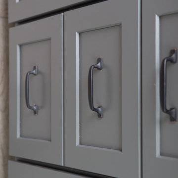
Oil rubbed bronze Kohler fixtures echo the black accents in the beautiful tile pattern and reflect the matte black of the unique lighting detail. Easy to maintain Blanca Arabescato Quartz countertops add practicality and natural beauty and compliments the warm wood porcelain tile floors. This handsome bath has generated praise from friends and family even before it’s complete unveiling as photos of the space leaked out on social media! It’s not only completely functional to use, but especially pretty to look at.
“Advance Design Studio did a terrific job for us. We really appreciated how easy it was to work with them on a complex project of the complete remodeling of two bathrooms. They very capably handled all the details from design, to project management, to construction. It is a great group of people to work with and we would welcome the opportunity to work with them again anytime,” Mike said.

 Dennis Hill Architect
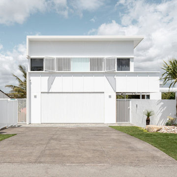
If you look closely, you can still find rare, curb-less, sand-fringed streets in and around Peregian Beach that serve as a reminder of the Sunshine Coast’s past - a time when life moved at a slower pace. Inspired by the humble fibro beach shacks of our history, Lorilet draws from an era when you could arrive home salty and sandy, toss your board aside, and sink into a depth of relaxation rarely achieved in today’s hectic world.
Lorilet is defined by the classic, simple geometry of the traditional "fibro shack." Clad in classic panels and punctuated by subtle accents of colour - a nod to vintage mid-century palettes - the home balances a solid structural presence with soft, textured materiality. From the street, the residence presents as a modest two-storey shack, intentionally disguising its true scale by nesting an entire level of function below street level.
Upon arrival, a turf-block path guides visitors toward the front gate and into the arrival court - a curated, light-filled space where a tiled pool and private alfresco redefine the coastal threshold. Here, the design intent becomes clear: Lorilet is an exploration of sightlines and seamless spatial flow. The home is configured to open entirely from the front courtyard, through the central core, to frame uninterrupted vistas of the western mountain ranges. One can sit by the pool and watch the sun set deep behind the distant ranges, looking straight through the heart of the home. While the primary open-plan living spaces remain uncluttered and intentionally simple, the hidden lower level steps down the site to accommodate three bedrooms, including a private guest suite that opens onto the rear garden. Tucked deep within this level, a wine cellar takes advantage of the natural thermal stability of the earth, providing the perfect environment for storage.
The uppermost level provides a private domain for work and contemplation. A dedicated office yields ocean views - a necessary distraction and a constant reminder of the surf - while the master suite features an integrated ensuite with sweeping views toward the western ranges. Concealed at the highest point of the structure, an elevated viewing platform offers a solitary vantage point to check the morning swell.
Through a focus on setting, occupation, and use, Lorilet explores a narrative of deep connection to both coastal history and its immediate natural environment.
 Pierre Jean-Baptiste Interiors
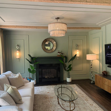
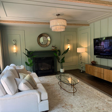
There’s something timeless about a traditional living room—its ability to feel both refined and deeply livable is what makes it such a lasting favorite. In this recent project, we set out to create a space that honored classic design principles while thoughtfully adapting to the realities of modern life—especially in a home shared with two large, beloved dogs.
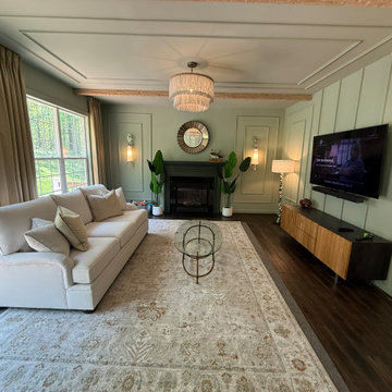
The foundation of the room begins with color. We selected Sherwin-Williams SW 7741 “Willow Tree” for both the walls and trim, creating a rich, enveloping tone that immediately establishes warmth and cohesion. By carrying the same hue across architectural elements, the space feels grounded and intentional, allowing texture and detail to take center stage rather than contrast alone.
To elevate the architecture, we introduced a series of custom ceiling beams that draw the eye upward and add a sense of structure and craftsmanship. These were complemented by wall and ceiling ogee molding, bringing in a layer of traditional ornamentation that feels both elegant and tailored. The subtle curves of the ogee profiles soften the room while reinforcing its classic character.
Lighting played a key role in enhancing both ambiance and functionality. We incorporated wall sconces to provide a warm, diffused glow in the evenings, creating a cozy and inviting atmosphere. These are balanced by crinkle metal floor lamps, which add a touch of modern texture and visual interest without straying from the overall aesthetic.
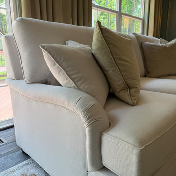
At the heart of the room sits a custom-designed sofa—arguably the most important piece in any living space. Given the homeowners’ lifestyle, durability was just as important as beauty. We upholstered the sofa in outdoor-grade Sunbrella fabric, a decision that ensures long-term performance without sacrificing style. The fabric resists wear, stains, and fading, making it an ideal solution for a home with pets while maintaining a polished, tailored look.
Layering was essential in completing the design. A generously sized 9' x 12' area rug anchors the seating arrangement, adding softness underfoot and defining the space. Decorative mirrors were strategically placed to reflect light and create depth, while faux plants introduce greenery without the maintenance—an ideal choice for busy households.
The result is a living room that feels elevated yet approachable, traditional yet practical. It’s a space designed not just to be admired, but to be lived in—where thoughtful material choices and timeless details come together to support both style and everyday life.
 Pierre Jean-Baptiste Interiors
There’s something timeless about a traditional living room—its ability to feel both refined and deeply livable is what makes it such a lasting favorite. In this recent project, we set out to create a space that honored classic design principles while thoughtfully adapting to the realities of modern life—especially in a home shared with two large, beloved dogs.
The foundation of the room begins with color. We selected Sherwin-Williams SW 7741 “Willow Tree” for both the walls and trim, creating a rich, enveloping tone that immediately establishes warmth and cohesion. By carrying the same hue across architectural elements, the space feels grounded and intentional, allowing texture and detail to take center stage rather than contrast alone.
To elevate the architecture, we introduced a series of custom ceiling beams that draw the eye upward and add a sense of structure and craftsmanship. These were complemented by wall and ceiling ogee molding, bringing in a layer of traditional ornamentation that feels both elegant and tailored. The subtle curves of the ogee profiles soften the room while reinforcing its classic character.
Lighting played a key role in enhancing both ambiance and functionality. We incorporated wall sconces to provide a warm, diffused glow in the evenings, creating a cozy and inviting atmosphere. These are balanced by crinkle metal floor lamps, which add a touch of modern texture and visual interest without straying from the overall aesthetic.
At the heart of the room sits a custom-designed sofa—arguably the most important piece in any living space. Given the homeowners’ lifestyle, durability was just as important as beauty. We upholstered the sofa in outdoor-grade Sunbrella fabric, a decision that ensures long-term performance without sacrificing style. The fabric resists wear, stains, and fading, making it an ideal solution for a home with pets while maintaining a polished, tailored look.
Layering was essential in completing the design. A generously sized 9' x 12' area rug anchors the seating arrangement, adding softness underfoot and defining the space. Decorative mirrors were strategically placed to reflect light and create depth, while faux plants introduce greenery without the maintenance—an ideal choice for busy households.
The result is a living room that feels elevated yet approachable, traditional yet practical. It’s a space designed not just to be admired, but to be lived in—where thoughtful material choices and timeless details come together to support both style and everyday life.
 Pierre Jean-Baptiste Interiors
There’s something timeless about a traditional living room—its ability to feel both refined and deeply livable is what makes it such a lasting favorite. In this recent project, we set out to create a space that honored classic design principles while thoughtfully adapting to the realities of modern life—especially in a home shared with two large, beloved dogs.
The foundation of the room begins with color. We selected Sherwin-Williams SW 7741 “Willow Tree” for both the walls and trim, creating a rich, enveloping tone that immediately establishes warmth and cohesion. By carrying the same hue across architectural elements, the space feels grounded and intentional, allowing texture and detail to take center stage rather than contrast alone.
To elevate the architecture, we introduced a series of custom ceiling beams that draw the eye upward and add a sense of structure and craftsmanship. These were complemented by wall and ceiling ogee molding, bringing in a layer of traditional ornamentation that feels both elegant and tailored. The subtle curves of the ogee profiles soften the room while reinforcing its classic character.
Lighting played a key role in enhancing both ambiance and functionality. We incorporated wall sconces to provide a warm, diffused glow in the evenings, creating a cozy and inviting atmosphere. These are balanced by crinkle metal floor lamps, which add a touch of modern texture and visual interest without straying from the overall aesthetic.
At the heart of the room sits a custom-designed sofa—arguably the most important piece in any living space. Given the homeowners’ lifestyle, durability was just as important as beauty. We upholstered the sofa in outdoor-grade Sunbrella fabric, a decision that ensures long-term performance without sacrificing style. The fabric resists wear, stains, and fading, making it an ideal solution for a home with pets while maintaining a polished, tailored look.
Layering was essential in completing the design. A generously sized 9' x 12' area rug anchors the seating arrangement, adding softness underfoot and defining the space. Decorative mirrors were strategically placed to reflect light and create depth, while faux plants introduce greenery without the maintenance—an ideal choice for busy households.
The result is a living room that feels elevated yet approachable, traditional yet practical. It’s a space designed not just to be admired, but to be lived in—where thoughtful material choices and timeless details come together to support both style and everyday life.
 Pierre Jean-Baptiste Interiors
There’s something timeless about a traditional living room—its ability to feel both refined and deeply livable is what makes it such a lasting favorite. In this recent project, we set out to create a space that honored classic design principles while thoughtfully adapting to the realities of modern life—especially in a home shared with two large, beloved dogs.
The foundation of the room begins with color. We selected Sherwin-Williams SW 7741 “Willow Tree” for both the walls and trim, creating a rich, enveloping tone that immediately establishes warmth and cohesion. By carrying the same hue across architectural elements, the space feels grounded and intentional, allowing texture and detail to take center stage rather than contrast alone.
To elevate the architecture, we introduced a series of custom ceiling beams that draw the eye upward and add a sense of structure and craftsmanship. These were complemented by wall and ceiling ogee molding, bringing in a layer of traditional ornamentation that feels both elegant and tailored. The subtle curves of the ogee profiles soften the room while reinforcing its classic character.
Lighting played a key role in enhancing both ambiance and functionality. We incorporated wall sconces to provide a warm, diffused glow in the evenings, creating a cozy and inviting atmosphere. These are balanced by crinkle metal floor lamps, which add a touch of modern texture and visual interest without straying from the overall aesthetic.
At the heart of the room sits a custom-designed sofa—arguably the most important piece in any living space. Given the homeowners’ lifestyle, durability was just as important as beauty. We upholstered the sofa in outdoor-grade Sunbrella fabric, a decision that ensures long-term performance without sacrificing style. The fabric resists wear, stains, and fading, making it an ideal solution for a home with pets while maintaining a polished, tailored look.
Layering was essential in completing the design. A generously sized 9' x 12' area rug anchors the seating arrangement, adding softness underfoot and defining the space. Decorative mirrors were strategically placed to reflect light and create depth, while faux plants introduce greenery without the maintenance—an ideal choice for busy households.
The result is a living room that feels elevated yet approachable, traditional yet practical. It’s a space designed not just to be admired, but to be lived in—where thoughtful material choices and timeless details come together to support both style and everyday life.
 birdRock Project Studio Inc.
Ever heard some say “It has good bones?” Well, no one had ever said that about this house; it needed a major overhaul - “A TOTAL GUT.”
It’s saving grace was:
1. It’s enthusiastic new homeowners.
2. The expansive and gorgeous views of Okanagan Lake.
We were asked to assist our clients with big-picture-planning for their newest investment property.
Upon initial walk through of the home, it was immediately evident there were many previous ‘bandaid-type’ updates that it had gone through over the years.
This house was in prime need of an overhaul inside and out:
- multiple dropped Ceilings with layers of Plumbing add ons
- wall to wall Carpet
-a tired Bathtub directly inside the Master Bedroom
- a “dreaded” Corner Kitchen Sink
-multiple add ons involving three confusing front entry doors
Discovering what was previously done and the quandary of why these things were done is always so interesting to discover and can be very overwhelming for clients.
A big part of what we love most about Design is helping to propose new ideas to revitalize and improve all that has come before. It is one of the most challenging and rewarding parts of our work.
Our Renovation Strategy began in Layout Design for optimizing Interior & Exterior flow, moving into Concept & Style Planning, Millwork and Finish Selections.
We then created an ordered implementation sequence which would allow the homeowners to live on one floor while the other was being renovated Later they would move to the finished floor and renovate the remaining areas.
Once complete, the home quickly sold and we look forwards to assisting these happy investors on their next endeavour.
Sponsored
Fredericksburg, OH

High Point Cabinets
Columbus' Experienced Custom Cabinet Builder | 4x Best of Houzz Winner

 Thomas Roszak Architecture, LLC
Photo credit: Scott McDonald @ Hedrich Blessing
7RR-Ecohome:
The design objective was to build a house for a couple recently married who both had kids from previous marriages. How to bridge two families together?
The design looks forward in terms of how people live today. The home is an experiment in transparency and solid form; removing borders and edges from outside to inside the house, and to really depict “flowing and endless space”. The house floor plan is derived by pushing and pulling the house’s form to maximize the backyard and minimize the public front yard while welcoming the sun in key rooms by rotating the house 45-degrees to true north. The angular form of the house is a result of the family’s program, the zoning rules, the lot’s attributes, and the sun’s path. We wanted to construct a house that is smart and efficient in terms of construction and energy, both in terms of the building and the user. We could tell a story of how the house is built in terms of the constructability, structure and enclosure, with a nod to Japanese wood construction in the method in which the siding is installed and the exposed interior beams are placed in the double height space. We engineered the house to be smart which not only looks modern but acts modern; every aspect of user control is simplified to a digital touch button, whether lights, shades, blinds, HVAC, communication, audio, video, or security. We developed a planning module based on a 6-foot square room size and a 6-foot wide connector called an interstitial space for hallways, bathrooms, stairs and mechanical, which keeps the rooms pure and uncluttered. The house is 6,200 SF of livable space, plus garage and basement gallery for a total of 9,200 SF. A large formal foyer celebrates the entry and opens up to the living, dining, kitchen and family rooms all focused on the rear garden. The east side of the second floor is the Master wing and a center bridge connects it to the kid’s wing on the west. Second floor terraces and sunscreens provide views and shade in this suburban setting. The playful mathematical grid of the house in the x, y and z axis also extends into the layout of the trees and hard-scapes, all centered on a suburban one-acre lot.
Many green attributes were designed into the home; Ipe wood sunscreens and window shades block out unwanted solar gain in summer, but allow winter sun in. Patio door and operable windows provide ample opportunity for natural ventilation throughout the open floor plan. Minimal windows on east and west sides to reduce heat loss in winter and unwanted gains in summer. Open floor plan and large window expanse reduces lighting demands and maximizes available daylight. Skylights provide natural light to the basement rooms. Durable, low-maintenance exterior materials include stone, ipe wood siding and decking, and concrete roof pavers. Design is based on a 2' planning grid to minimize construction waste. Basement foundation walls and slab are highly insulated. FSC-certified walnut wood flooring was used. Light colored concrete roof pavers to reduce cooling loads by as much as 15%. 2x6 framing allows for more insulation and energy savings. Super efficient windows have low-E argon gas filled units, and thermally insulated aluminum frames. Permeable brick and stone pavers reduce the site’s storm-water runoff. Countertops use recycled composite materials. Energy-Star rated furnaces and smart thermostats are located throughout the house to minimize duct runs and avoid energy loss. Energy-Star rated boiler that heats up both radiant floors and domestic hot water. Low-flow toilets and plumbing fixtures are used to conserve water usage. No VOC finish options and direct venting fireplaces maintain a high interior air quality. Smart home system controls lighting, HVAC, and shades to better manage energy use. Plumbing runs through interior walls reducing possibilities of heat loss and freezing problems. A large food pantry was placed next to kitchen to reduce trips to the grocery store. Home office reduces need for automobile transit and associated CO2 footprint. Plan allows for aging in place, with guest suite than can become the master suite, with no need to move as family members mature.
 Pierre Jean-Baptiste Interiors
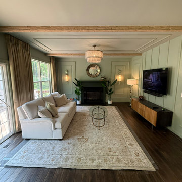
There’s something timeless about a traditional living room—its ability to feel both refined and deeply livable is what makes it such a lasting favorite. In this recent project, we set out to create a space that honored classic design principles while thoughtfully adapting to the realities of modern life—especially in a home shared with two large, beloved dogs.
The foundation of the room begins with color. We selected Sherwin-Williams SW 7741 “Willow Tree” for both the walls and trim, creating a rich, enveloping tone that immediately establishes warmth and cohesion. By carrying the same hue across architectural elements, the space feels grounded and intentional, allowing texture and detail to take center stage rather than contrast alone.
To elevate the architecture, we introduced a series of custom ceiling beams that draw the eye upward and add a sense of structure and craftsmanship. These were complemented by wall and ceiling ogee molding, bringing in a layer of traditional ornamentation that feels both elegant and tailored. The subtle curves of the ogee profiles soften the room while reinforcing its classic character.
Lighting played a key role in enhancing both ambiance and functionality. We incorporated wall sconces to provide a warm, diffused glow in the evenings, creating a cozy and inviting atmosphere. These are balanced by crinkle metal floor lamps, which add a touch of modern texture and visual interest without straying from the overall aesthetic.
At the heart of the room sits a custom-designed sofa—arguably the most important piece in any living space. Given the homeowners’ lifestyle, durability was just as important as beauty. We upholstered the sofa in outdoor-grade Sunbrella fabric, a decision that ensures long-term performance without sacrificing style. The fabric resists wear, stains, and fading, making it an ideal solution for a home with pets while maintaining a polished, tailored look.
Layering was essential in completing the design. A generously sized 9' x 12' area rug anchors the seating arrangement, adding softness underfoot and defining the space. Decorative mirrors were strategically placed to reflect light and create depth, while faux plants introduce greenery without the maintenance—an ideal choice for busy households.
The result is a living room that feels elevated yet approachable, traditional yet practical. It’s a space designed not just to be admired, but to be lived in—where thoughtful material choices and timeless details come together to support both style and everyday life.
 birdRock Project Studio Inc.
Ever heard some say “It has good bones?” Well, no one had ever said that about this house; it needed a major overhaul - “A TOTAL GUT.”
It’s saving grace was:
1. It’s enthusiastic new homeowners.
2. The expansive and gorgeous views of Okanagan Lake.
We were asked to assist our clients with big-picture-planning for their newest investment property.
Upon initial walk through of the home, it was immediately evident there were many previous ‘bandaid-type’ updates that it had gone through over the years.
This house was in prime need of an overhaul inside and out:
- multiple dropped Ceilings with layers of Plumbing add ons
- wall to wall Carpet
-a tired Bathtub directly inside the Master Bedroom
- a “dreaded” Corner Kitchen Sink
-multiple add ons involving three confusing front entry doors
Discovering what was previously done and the quandary of why these things were done is always so interesting to discover and can be very overwhelming for clients.
A big part of what we love most about Design is helping to propose new ideas to revitalize and improve all that has come before. It is one of the most challenging and rewarding parts of our work.
Our Renovation Strategy began in Layout Design for optimizing Interior & Exterior flow, moving into Concept & Style Planning, Millwork and Finish Selections.
We then created an ordered implementation sequence which would allow the homeowners to live on one floor while the other was being renovated Later they would move to the finished floor and renovate the remaining areas.
Once complete, the home quickly sold and we look forwards to assisting these happy investors on their next endeavour.
 Anderson Design Center
This newly constructed home offers an expansive floor plan with spectacular views of the countryside through the many windows seen throughout the home. The foyer commands particular attention with its floating staircase and exquisite polished porcelain flooring. Continuing into the living area, wide-planked, antiqued maple flooring grounds the room, while custom Norwalk and Fairfield furniture sits atop Karastan rugs.
The kitchen is a chef’s dream come true with ample room to cook and entertain among the custom cabinets. Chisel-edge porcelain tile was installed in a random pattern, perfectly complimenting the Ash Gold granite countertops and tumbled travertine backsplash.
The master suite allows for a relaxing retreat with calming colors seen in the bedding, custom silk drapery, and cozy, hand-knotted Kalaty rug. Stepping into the master bath, the porcelain tile, soaker tub, and custom tiled shower create a peaceful oasis.
Kim Johnson, Interior Designer, enjoyed helping her clients select products from a variety of vendors to create a beautiful new home for this family. As always, we truly appreciate our clients and hope they enjoy many happy years in their new home.
Designer: Kim Johnson
Contractor: John Kavanaugh
Granite Countertops: Stoneworks
Cabinets: Mowdy Cabinetry
Photographer: Al Pursley, The Digital Studio

 Jordan Design Build Group
When our clients purchased their Fairfax Station home at the beginning of the pandemic, the main living areas had already been updated. However, three bathrooms were still stuck in the1980s. We tackled the upstairs primary and hall bathrooms first to ensure our clients had a working bathroom while construction was underway. Once the upstairs renovations were completed, we moved on to the main level guest bathroom.
Primary Bathroom Transformation:
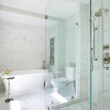
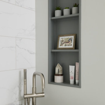
The old primary bathroom had a small dark shower stall, a basic alcove tub, and the original 40-year-old plumbing, vanities, and tile. We completely gutted the space and made some minor layout changes to maximize functionality and create a serene retreat complete with free-standing soaking tub and generous walk-in shower. Expanding the shower’s footprint and replacing the full-height walls with a glass surround opened up the space, making the entire bathroom feel larger and more airy. Marble shelves and a shaving ledge add convenience and style. A large double vanity provides ample storage and a full 7 feet of countertop space. Mixed metal finishes elevate the design, with soft gold accents and brushed nickel fixtures pairing perfectly with the classic gray vanity and muted marble tiles. We reconfigured the dressing area, added custom closet built-ins, and installed new carpet throughout to complete this tailored transformation.
Hall Bathroom Update:
The hall bathroom did not require any significant layout changes, but the dated fixtures and finishes all had to go. We wanted the new bathroom to feel both classic and fresh, so we opted for a polished finish palette, including sleek white subway tiles on the walls and marble-look hexagonal on the floor. A furniture-style vanity, in dark navy, was paired with a distinctive Carrara marble top and sleek chrome fixtures for a modern twist. The tub+shower combo features both a standard shower head and multi-function handheld for optimum flexibility – great for bathing children and pets alike. This renovation blended classic details with modern functionality, creating a bathroom that’s both timeless and fresh.
Guest Bathroom Update:
The home’s main level bathroom serves as both powder room and guest bathroom with 2 separate entrances. The in-swing door from the guest bedroom made the already narrow bathroom feel even more cramped. By installing a pocket door at the guest bedroom, we immediately improved the flow and usability of the space. The shower was upgraded with handcrafted white subway tile and contrasting grout, creating a clean, tailored look that elevates the room. Thoughtful details—like discreet grab bars and a handheld shower on a slide bar—make the space adaptable and comfortable for guests of all ages. A marble mosaic floor sets a refined backdrop for the freestanding black vanity, while the cross-bar handles offer a nod to the past on these modern-day fixtures.
 Jordan Design Build Group
When our clients purchased their Fairfax Station home at the beginning of the pandemic, the main living areas had already been updated. However, three bathrooms were still stuck in the1980s. We tackled the upstairs primary and hall bathrooms first to ensure our clients had a working bathroom while construction was underway. Once the upstairs renovations were completed, we moved on to the main level guest bathroom.
Primary Bathroom Transformation:
The old primary bathroom had a small dark shower stall, a basic alcove tub, and the original 40-year-old plumbing, vanities, and tile. We completely gutted the space and made some minor layout changes to maximize functionality and create a serene retreat complete with free-standing soaking tub and generous walk-in shower. Expanding the shower’s footprint and replacing the full-height walls with a glass surround opened up the space, making the entire bathroom feel larger and more airy. Marble shelves and a shaving ledge add convenience and style. A large double vanity provides ample storage and a full 7 feet of countertop space. Mixed metal finishes elevate the design, with soft gold accents and brushed nickel fixtures pairing perfectly with the classic gray vanity and muted marble tiles. We reconfigured the dressing area, added custom closet built-ins, and installed new carpet throughout to complete this tailored transformation.
Hall Bathroom Update:
The hall bathroom did not require any significant layout changes, but the dated fixtures and finishes all had to go. We wanted the new bathroom to feel both classic and fresh, so we opted for a polished finish palette, including sleek white subway tiles on the walls and marble-look hexagonal on the floor. A furniture-style vanity, in dark navy, was paired with a distinctive Carrara marble top and sleek chrome fixtures for a modern twist. The tub+shower combo features both a standard shower head and multi-function handheld for optimum flexibility – great for bathing children and pets alike. This renovation blended classic details with modern functionality, creating a bathroom that’s both timeless and fresh.
Guest Bathroom Update:
The home’s main level bathroom serves as both powder room and guest bathroom with 2 separate entrances. The in-swing door from the guest bedroom made the already narrow bathroom feel even more cramped. By installing a pocket door at the guest bedroom, we immediately improved the flow and usability of the space. The shower was upgraded with handcrafted white subway tile and contrasting grout, creating a clean, tailored look that elevates the room. Thoughtful details—like discreet grab bars and a handheld shower on a slide bar—make the space adaptable and comfortable for guests of all ages. A marble mosaic floor sets a refined backdrop for the freestanding black vanity, while the cross-bar handles offer a nod to the past on these modern-day fixtures.

 Roeser Home Remodeling
Older homes are filled with charm, but often the kitchen has been overlooked. Originally, it was a work area– not made for public view. Today it truly is the center of all that goes on in the family. Today’s active homeowners are no different. Although their children may be grown, cooking and baking are still considered top priorities. Storage and counter space were issues that needed to be addressed and being aware of the aging process of the kitchen, lighting also needed to be considered. Although the kitchen is only a 13’ X 13’ space, it had other challenges. A back staircase, three doorways, and a large window took away from the wall space, however the 9’ ceilings were an unused potential for storage. Choosing Wellborn’s Select Series Cabinets in a Maple with a sandstone slate finish brightened the space immediately. Stacking the cabinets and taking them all the way to the ceiling gave this homeowner more storage than ever imagined for items of occasional use. Under counter LED Tape lighting brightened the task areas of the kitchen without causing additional heat from too many lights. A new table light on a dimmer sets the right mood for dining and provides just enough additional lighting. Installing a Sharp, stainless steel, 24” microwave drawer freed up some counter space for prep work near the cooktop (a GE, stainless steel 30” gas cooktop with four burners) and next to the sink (a new Elkay Gourmet Double Bowl with aqua DVD). Also, adding a new Kohler Sensate kitchen faucet which is hands free, a Kohler contemporary soap/lotion dispenser and a new ISE 3/4 horsepower disposal– helps to make clean-up a breeze. A new GE dishwasher, a new Broan stainless steel 30” hood, and a new GE 30” double oven both standard oven sizes, not only allows our homeowner to cook dinner and dessert, but the stainless steel reflects light while adding a design element tying the cabinet hardware and light fixture into the overall look. The countertop is Caesarstone’s Dreamy Marfil and is always a bold statement for any size Kitchen. Mixing the backsplash tile up without appearing busy came together with the beautiful combination of Sandlewood polished Amafi 30cm from countertops to base cabinets and Jinsen Coffee Bone in a diamond pattern framed in the Sandlewood polish and a Amafi Pencil liner above the cooktop. The soft addition of a new six panel Pine door stained and finished to match the other doors within the home added to the overall beauty of this stunning kitchen.
167