
Search results for "Immediately's digital" in Home Design Ideas

 Décor Aid
When a young, hip couple from Hong Kong purchased a waterfront condominium in New Jersey, they reached out to Decor Aid for assistance in transforming their new space into a home away from home. The couple wanted the space to be modern, homey, and traditional, while also being wholly representative of their laid-back sensibility.
When the couple moved in, the walls of the apartment were painted dark green, with a grey trim. The effect was dark and somber, which was exactly what they did not want their apartment to feel like. So the first thing we did was repaint the walls, which immediately gave the space a lighter, airier feel, and set the tone for the neutral palette that would be incorporated throughout the space.
Besides a few pieces that the couple had brought with them from Hong Kong, there was no existing furniture to work with. The couple stressed that they wanted the option to entertain, but that they didn’t want the apartment to be designed like a party house. The dining room table perfectly captures the couple’s refined yet rustic aesthetic, but also has the ability to expand, and accommodate a few extra guests for a small dinner party.
The couple wanted their space to feel distinguished, but also wanted the apartment to feel young and hip. To offset the comfortable and neutral tones, brass elements were added throughout the apartment, which added a cohesive feel, without sacrificing the desired look. The final result is a comfortable, modern, and grown-up space that this vibrant young couple can now call home.

 TOC design & construction inc.
TOC design - Tania Scardellato
When my clients came to see me and announced their wonderful news that they were pregnant, but did not want to know the sex of the baby, I immediately decided to have the room in greys and yellows, we could always add accessories once the baby was born. This gorgeous, serene nursery for this very much Loved new baby would need to have all the necessary amenities and easily be converted into a regular bedroom. My Client had an image of elephants as the father grew up with bedtime stories of Babar.
The challenged was the size of the room only 94 sq. feet. And it would have to be transformed into a regular bedroom once the child was older. I was able to find high quality , beautiful classic furniture that also serves as double duty.
Once the child would be old enough the crib can transform into a queen bed, and the removable part of the changing table becomes a 6 drawer dresser. The paintable wall paper color can be changed as well as all accessories.
I believe in good quality furniture that can be passed down or converted. Yes it is more expensive but in the long run, classic pieces such as these can last a life time.
Created by the concept of elephant accessories and soft pastel colors. Soft texture wallpaper and loads of storage used in an elegant way, This nursery will stand the test of time from 1 month to 18 years .
One month before the birth of the child my clients found out they were getting a baby boy. He was born October 03, measuring 45cm and weighing 6.5 pounds. Congratulations guys and welcome to our world little Matteo

 Advance Design Studio, Ltd.
Karen and Chad of Tower Lakes, IL were tired of their unfinished basement functioning as nothing more than a storage area and depressing gym. They wanted to increase the livable square footage of their home with a cohesive finished basement design, while incorporating space for the kids and adults to hang out.
“We wanted to make sure that upon renovating the basement, that we can have a place where we can spend time and watch movies, but also entertain and showcase the wine collection that we have,” Karen said.
After a long search comparing many different remodeling companies, Karen and Chad found Advance Design Studio. They were drawn towards the unique “Common Sense Remodeling” process that simplifies the renovation experience into predictable steps focused on customer satisfaction.
“There are so many other design/build companies, who may not have transparency, or a focused process in mind and I think that is what separated Advance Design Studio from the rest,” Karen said.
Karen loved how designer Claudia Pop was able to take very high-level concepts, “non-negotiable items” and implement them in the initial 3D drawings. Claudia and Project Manager DJ Yurik kept the couple in constant communication through the project. “Claudia was very receptive to the ideas we had, but she was also very good at infusing her own points and thoughts, she was very responsive, and we had an open line of communication,” Karen said.
A very important part of the basement renovation for the couple was the home gym and sauna. The “high-end hotel” look and feel of the openly blended work out area is both highly functional and beautiful to look at. The home sauna gives them a place to relax after a long day of work or a tough workout. “The gym was a very important feature for us,” Karen said. “And I think (Advance Design) did a very great job in not only making the gym a functional area, but also an aesthetic point in our basement”.
An extremely unique wow-factor in this basement is the walk in glass wine cellar that elegantly displays Karen and Chad’s extensive wine collection. Immediate access to the stunning wet bar accompanies the wine cellar to make this basement a popular spot for friends and family.
The custom-built wine bar brings together two natural elements; Calacatta Vicenza Quartz and thick distressed Black Walnut. Sophisticated yet warm Graphite Dura Supreme cabinetry provides contrast to the soft beige walls and the Calacatta Gold backsplash. An undermount sink across from the bar in a matching Calacatta Vicenza Quartz countertop adds functionality and convenience to the bar, while identical distressed walnut floating shelves add an interesting design element and increased storage. Rich true brown Rustic Oak hardwood floors soften and warm the space drawing all the areas together.
Across from the bar is a comfortable living area perfect for the family to sit down at a watch a movie. A full bath completes this finished basement with a spacious walk-in shower, Cocoa Brown Dura Supreme vanity with Calacatta Vicenza Quartz countertop, a crisp white sink and a stainless-steel Voss faucet.
Advance Design’s Common Sense process gives clients the opportunity to walk through the basement renovation process one step at a time, in a completely predictable and controlled environment. “Everything was designed and built exactly how we envisioned it, and we are really enjoying it to it’s full potential,” Karen said.
Constantly striving for customer satisfaction, Advance Design’s success is heavily reliant upon happy clients referring their friends and family. “We definitely will and have recommended Advance Design Studio to friends who are looking to embark on a remodeling project small or large,” Karen exclaimed at the completion of her project.
Find the right local pro for your project

 TVL Creative Ltd.
This project was such an incredible design opportunity, and instilled inspiration and excitement at every turn! Our amazing clients came to us with the challenge of converting their beloved family home into a welcoming haven for all members of the family. At the time that we met our clients, they were struggling with the difficult personal decision of the fate of the home. Their father/father-in-law had passed away and their mother/mother-in-law had recently been admitted into a nursing facility and was fighting Alzheimer’s. Resistant to loss of the home now that both parents were out of it, our clients purchased the home to keep in in the family. Despite their permanent home currently being in New Jersey, these clients dedicated themselves to keeping and revitalizing the house. We were moved by the story and became immediately passionate about bringing this dream to life.
The home was built by the parents of our clients and was only ever owned by them, making this a truly special space to the family. Our goal was to revitalize the home and to bring new energy into every room without losing the special characteristics that were original to the home when it was built. In this way, we were able to develop a house that maintains its own unique personality while offering a space of welcoming neutrality for all members of the family to enjoy over time.
The renovation touched every part of the home: the exterior, foyer, kitchen, living room, sun room, garage, six bedrooms, three bathrooms, the laundry room, and everything in between. The focus was to develop a style that carried consistently from space to space, but allowed for unique expression in the small details in every room.
Starting at the entry, we renovated the front door and entry point to offer more presence and to bring more of the mid-century vibe to the home’s exterior. We integrated a new modern front door, cedar shingle accents, new exterior paint, and gorgeous contemporary house numbers that really allow the home to stand out. Just inside the entry, we renovated the foyer to create a playful entry point worthy of attention. Cement look tile adorns the foyer floor, and we’ve added new lighting and upgraded the entry coat storage.
Upon entering the home, one will immediately be captivated by the stunning kitchen just off the entry. We transformed this space in just about every way. While the footprint of the home ultimately remained almost identical, the aesthetics were completely turned on their head. We re-worked the kitchen to maximize storage and to create an informal dining area that is great for casual hosting or morning coffee.
We removed the entry to the garage that was once in the informal dining, and created a peninsula in its place that offers a unique division between the kitchen/informal dining and the formal dining and living areas. The simple light warm light gray cabinetry offers a bit of traditional elegance, along with the marble backsplash and quartz countertops. We extended the original wood flooring into the kitchen and stained all floors to match for a warmth that truly resonates through all spaces. We upgraded appliances, added lighting everywhere, and finished the space with some gorgeous mid century furniture pieces.
In the formal dining and living room, we really focused on maintaining the original marble fireplace as a focal point. We cleaned the marble, repaired the mortar, and refinished the original fireplace screen to give a new sleek look in black. We then integrated a new gas insert for modern heating and painted the upper portion in a rich navy blue; an accent that is carried through the home consistently as a nod to our client’s love of the color.
The former entry into the old covered porch is now an elegant glass door leading to a stunning finished sunroom. This room was completely upgraded as well. We wrapped the entire space in cozy white shiplap to keep a casual feel with brightness. We tiled the floor with large format concrete look tile, and painted the old brick fireplace a bright white. We installed a new gas burning unit, and integrated transitional style lighting to bring warmth and elegance into the space. The new black-frame windows are adorned with decorative shades that feature hand-sketched bird prints, and we’ve created a dedicated garden-ware “nook” for our client who loves to work in the yard. The far end of this space is completed with two oversized chaise loungers and overhead lights…the most perfect little reading nook!
Just off the dining room, we created an entirely new space to the home: a mudroom. The clients lacked this space and desperately needed a landing spot upon entering the home from the garage. We uniquely planned existing space in the garage to utilize for this purpose, and were able to create a small but functional entry point without losing the ability to park cars in the garage. This new space features cement-look tile, gorgeous deep brown cabinetry, and plenty of storage for all the small items one might need to store while moving in and out of the home.
The remainder of the upstairs level includes massive renovations to the guest hall bathroom and guest bedroom, upstairs master bed/bath suite, and a third bedroom that we converted into a home office for the client.
Some of the largest transformations were made in the basement, where unfinished space and lack of light were converted into gloriously lit, cozy, finished spaces. Our first task was to convert the massive basement living room into the new master bedroom for our clients. We removed existing built-ins, created an entirely new walk-in closet, painted the old brick fireplace, installed a new gas unit, added carpet, introduced new lighting, replaced windows, and upgraded every part of the aesthetic appearance. One of the most incredible features of this space is the custom double sliding barn door made by a Denver artisan. This space is truly a retreat for our clients!
We also completely transformed the laundry room, back storage room, basement master bathroom, and two bedrooms.
This home’s massive scope and ever-evolving challenges were thrilling and exciting to work with, and the result is absolutely amazing. At the end of the day, this home offers a look and feel that the clients love. Above all, though, the clients feel the spirit of their family home and have a welcoming environment for all members of the family to enjoy for years to come.

 Daniel Scerri Periti
We were approached with a request to design the furnishings for an existing ‘finished’ apartment. The intention was to move in relatively fast, and the property already had an existing marble floor, kitchen and bathrooms which had to be kept. The property also boasted a fantastic 270 degree view, seen from most of the apartment. The clients had a very important role in the completion of the project. They were very involved during the design process and through various decoration choices. The final design was kept as a rigid guideline when faced with picking out all the different elements.
Once clear of all previous furniture, the space felt cold and bare; so we immediately felt the need for warmth, and raw, natural elements and textures to complement the cold marble floor while visually tying in the design of the whole apartment together.
Since the existing kitchen had a touch of dark walnut stain, we felt this material was one we should add to the palette of materials to contest the stark materials. A raw cement finish was another material we felt would add an interesting contrast and could be used in a variety of ways, from cabinets to walls and ceilings, to tie up the design of various areas of the apartment.
To warm up the living/dining area, keeping the existing marble floor but visually creating zones within the large living/dining area without hindering the flow, a dark timber custom-made soffit, continuous with a floor-to-ceiling drinks cabinet zones the dining area, giving it a degree of much-needed warmth.
The various windows with a stupendous 270 degree view needed to be visually tied together. This was done by introducing a continuous sheer [drape] which also doubled up as a sound-absorbing material along 2 of the 4 walls of the space.
A very large sofa was required to fill up the space correctly, also required for the size of the young family.
Services were integrated within the units and soffits, while a customized design in the corner between the kitchen and the living room took into consideration the viewpoints from the main areas to create a pantry without hindering the flow or views. A strategically placed floor-to-ceiling mirror doubles up the space and extends the view to the inner parts of the apartment.
The daughter’s bedroom was a small challenge in itself, and a fun task, where we wanted to achieve the perception of a cozy niche with its own enclosed reading nook [for reading fairy tales], behind see-through curtains and a custom-ordered wall print sporting the girl’s favorite colors.
The sons’ bedroom had double the requirements in terms of space needed: more wardrobe, more homework desk space, a tv/play station area… “We combined a raised platform area between the boys’ beds to become an area with cushions where the kids can lay down and play, and face a hidden screen behind the homework desk’s sliding back panel for their play station”. The color of the homework desk was chosen in relation to the boys’ ages. A more masculine material palette was chosen for this room, in contrast to the light pastel palette of the girl’s bedroom. Again, this colour can easily be changed over time for a more mature look.
PROJECT DATA:
St. Paul’s Bay, Malta
DESIGN TEAM:
Perit Rebecca Zammit, Perit Daniel Scerri, Elyse Tonna
OTHER CREDITS:
Photography: Tonio Lombardi
Styling : TKS
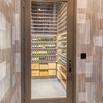
 Glenview Haus – Custom Doors & Wine Cellars
Beautiful wine collections need an equally beautiful display. Our customers located in the Streeterville area had an enormous collection, and we provided them with the added illusion of an enormous wine cellar! One of our favorite elements of this modern wine cellar is the mirrored ceiling. This is a creative trick to provide an infinite appearance that will elude to the idea of having hundreds of shelves! Each corner of this modern wine cellar is complemented by our different racking techniques. Our display shelves allow each bottle to have its own moment of appreciation, to create an artful look that is sure to impress.
When our client approached us with an idea of housing their extensive wine collection in their modern high rise residence, we were thrilled! After viewing their incredibly modern home, we realized that we could not provide them with a traditional wine cellar. We were presented with an exciting task of reimagining our traditional displays, to a clean and sleek modern design. As designers, maintaining the flow of a home is very important to us and our mission is to enhance the home’s existing features. From the wine cellar door to the ceiling, we were able to bring our A-game and create a complementary extension to our customer’s home. Our custom wine cellar door is equipped with a matching threshold, that holds all of the cold air in place. When you take a step inside, you are greeted from floor to ceiling with exquisite design. From our customer’s collectible storage boxes to 4 upward facing display shelves, you are immediately aware that this is a work of art. Each display shelf is adorned with its own light strip that further draws attention to the collectible wine bottles. As you glance up further, you see our storage shelves in full force. Playing off of the vast collection, we decided to install a mirrored ceiling. This design element allowed us to have some fun, and to further accentuate the large collection. This modern wine cellar is complete with a clear glass insulated Modern door that creates a temperature-controlled environment, conducive for preserving wine for decades. As designers, we were presented with a wonderful opportunity to showcase several of our strong suits. We were able to provide our client with a modern wine cellar, as well as an engineered, temperature-controlled environment.
From traditional to modern, we are able to provide your project with the upmost quality wine expertise and guidance. Unsure of where to start, but you just know that you want to? Give us a call or stop into our showroom and we can help provide you with all the necessary details that you will need to get inspired!
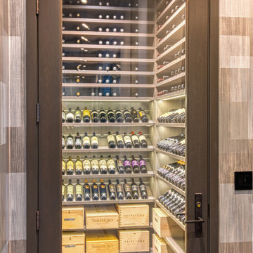 Glenview Haus – Custom Doors & Wine Cellars
Beautiful wine collections need an equally beautiful display. Our customers located in the Streeterville area had an enormous collection, and we provided them with the added illusion of an enormous wine cellar! One of our favorite elements of this modern wine cellar is the mirrored ceiling. This is a creative trick to provide an infinite appearance that will elude to the idea of having hundreds of shelves! Each corner of this modern wine cellar is complemented by our different racking techniques. Our display shelves allow each bottle to have its own moment of appreciation, to create an artful look that is sure to impress.
When our client approached us with an idea of housing their extensive wine collection in their modern high rise residence, we were thrilled! After viewing their incredibly modern home, we realized that we could not provide them with a traditional wine cellar. We were presented with an exciting task of reimagining our traditional displays, to a clean and sleek modern design. As designers, maintaining the flow of a home is very important to us and our mission is to enhance the home’s existing features. From the wine cellar door to the ceiling, we were able to bring our A-game and create a complementary extension to our customer’s home. Our custom wine cellar door is equipped with a matching threshold, that holds all of the cold air in place. When you take a step inside, you are greeted from floor to ceiling with exquisite design. From our customer’s collectible storage boxes to 4 upward facing display shelves, you are immediately aware that this is a work of art. Each display shelf is adorned with its own light strip that further draws attention to the collectible wine bottles. As you glance up further, you see our storage shelves in full force. Playing off of the vast collection, we decided to install a mirrored ceiling. This design element allowed us to have some fun, and to further accentuate the large collection. This modern wine cellar is complete with a clear glass insulated Modern door that creates a temperature-controlled environment, conducive for preserving wine for decades. As designers, we were presented with a wonderful opportunity to showcase several of our strong suits. We were able to provide our client with a modern wine cellar, as well as an engineered, temperature-controlled environment.
From traditional to modern, we are able to provide your project with the upmost quality wine expertise and guidance. Unsure of where to start, but you just know that you want to? Give us a call or stop into our showroom and we can help provide you with all the necessary details that you will need to get inspired!

Sponsored
Sunbury, OH

J.Holderby - Renovations
Franklin County's Leading General Contractors - 2X Best of Houzz!

 Artisan Kitchens and Baths
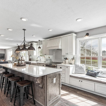
This recent remodel was a full gut down to the stubs and sub floors. The biggest challenge in the space was creating a single room from 2 separate areas. The original galley kitchen and a 1980’s add-on breakfast room. The breakfast room was cold and had old mechanicals emphasizing the need for a continuous space. The existing kitchen area was small, cramped and did not fit the lifestyle of the homeowners.
The homeowners wanted a hidden pantry for large and seasonal items as well as for food storage. I planned for a portion of the garage to be transformed to a full size, walk-in, hidden pantry that catered to the needs of the family.
Three of the most important design features include the hidden pantry, “other room” storage such as the mudroom seat and window bench, as well as the eat-in counter. Other notable design elements include glass cabinets, under-cabinet lighting, a message center and built-in under the counter appliances.
The coffee system is plumbed allowing for immediate hot coffee and specialty drinks at the touch of a button.
Dimensions: 27’X12’
Cabinetry: KEMPER
Flooring: MAPLE HARDWOOD with Radiant floor heat.
Countertops/Vanity Tops: Quartzite/MARBLE (Donna Sandra)
Sinks: BLANCO
Faucets: DELTA with Touch2o-technology.
Dishwasher: MIELE
Cooktop/Range: WOLF
Lighting: FEISS
Refrigerator: SUB-ZERO
Oven: WOLF
Plumbing Supplies: DELTA POT FILLER
Hardware: ATLAS
 Daniel Scerri Periti
We were approached with a request to design the furnishings for an existing ‘finished’ apartment. The intention was to move in relatively fast, and the property already had an existing marble floor, kitchen and bathrooms which had to be kept. The property also boasted a fantastic 270 degree view, seen from most of the apartment. The clients had a very important role in the completion of the project. They were very involved during the design process and through various decoration choices. The final design was kept as a rigid guideline when faced with picking out all the different elements.
Once clear of all previous furniture, the space felt cold and bare; so we immediately felt the need for warmth, and raw, natural elements and textures to complement the cold marble floor while visually tying in the design of the whole apartment together.
Since the existing kitchen had a touch of dark walnut stain, we felt this material was one we should add to the palette of materials to contest the stark materials. A raw cement finish was another material we felt would add an interesting contrast and could be used in a variety of ways, from cabinets to walls and ceilings, to tie up the design of various areas of the apartment.
To warm up the living/dining area, keeping the existing marble floor but visually creating zones within the large living/dining area without hindering the flow, a dark timber custom-made soffit, continuous with a floor-to-ceiling drinks cabinet zones the dining area, giving it a degree of much-needed warmth.
The various windows with a stupendous 270 degree view needed to be visually tied together. This was done by introducing a continuous sheer [drape] which also doubled up as a sound-absorbing material along 2 of the 4 walls of the space.
A very large sofa was required to fill up the space correctly, also required for the size of the young family.
Services were integrated within the units and soffits, while a customized design in the corner between the kitchen and the living room took into consideration the viewpoints from the main areas to create a pantry without hindering the flow or views. A strategically placed floor-to-ceiling mirror doubles up the space and extends the view to the inner parts of the apartment.
The daughter’s bedroom was a small challenge in itself, and a fun task, where we wanted to achieve the perception of a cozy niche with its own enclosed reading nook [for reading fairy tales], behind see-through curtains and a custom-ordered wall print sporting the girl’s favorite colors.
The sons’ bedroom had double the requirements in terms of space needed: more wardrobe, more homework desk space, a tv/play station area… “We combined a raised platform area between the boys’ beds to become an area with cushions where the kids can lay down and play, and face a hidden screen behind the homework desk’s sliding back panel for their play station”. The color of the homework desk was chosen in relation to the boys’ ages. A more masculine material palette was chosen for this room, in contrast to the light pastel palette of the girl’s bedroom. Again, this colour can easily be changed over time for a more mature look.
PROJECT DATA:
St. Paul’s Bay, Malta
DESIGN TEAM:
Perit Rebecca Zammit, Perit Daniel Scerri, Elyse Tonna
OTHER CREDITS:
Photography: Tonio Lombardi
Styling : TKS

Freestanding bathtub - huge southwestern master white tile and subway tile porcelain tile, black floor and double-sink freestanding bathtub idea in Houston with shaker cabinets, white cabinets, beige walls, an undermount sink, granite countertops, a hinged shower door, gray countertops and a built-in vanity
 Artisan Kitchens and Baths
This recent remodel was a full gut down to the stubs and sub floors. The biggest challenge in the space was creating a single room from 2 separate areas. The original galley kitchen and a 1980’s add-on breakfast room. The breakfast room was cold and had old mechanicals emphasizing the need for a continuous space. The existing kitchen area was small, cramped and did not fit the lifestyle of the homeowners.
The homeowners wanted a hidden pantry for large and seasonal items as well as for food storage. I planned for a portion of the garage to be transformed to a full size, walk-in, hidden pantry that catered to the needs of the family.
Three of the most important design features include the hidden pantry, “other room” storage such as the mudroom seat and window bench, as well as the eat-in counter. Other notable design elements include glass cabinets, under-cabinet lighting, a message center and built-in under the counter appliances.
The coffee system is plumbed allowing for immediate hot coffee and specialty drinks at the touch of a button.
Dimensions: 27’X12’
Cabinetry: KEMPER
Flooring: MAPLE HARDWOOD with Radiant floor heat.
Countertops/Vanity Tops: Quartzite/MARBLE (Donna Sandra)
Sinks: BLANCO
Faucets: DELTA with Touch2o-technology.
Dishwasher: MIELE
Cooktop/Range: WOLF
Lighting: FEISS
Refrigerator: SUB-ZERO
Oven: WOLF
Plumbing Supplies: DELTA POT FILLER
Hardware: ATLAS

 Hearthstone Inc
Richard Herman is in the hospitality business and owns several upscale hotels in Florida and in other states as well as cattle ranches in both Florida and Missouri. Their farm in Ocala is by farm their most unique. The property serves as a 4-H demonstration project for the purpose of children’s education. They have been working with the Academy Prep of St. Pete which is dedicated to inner-city youths that are selected on the basis of need and achievement. Wife Diane spends her time on the farm raising Gypsy Vanners, a diminutive draft horse named after the job they did in Eastern Europe, pulling the wagons (vans) for gypsies that wandered across the continent. On the Ocala farm, there are several mules with a unique profession.
Richard had visited the Hearthstone display at a Log & Timber Home Shows at the Orlando Convention Center many years ago. He was impressed that Hearthstone had stayed in touch with him over the years by mailings, invitations to shows, and periodic phone calls. When the time came to start serious consideration of the design of barn, Hearthstone responded promptly and professionally to Richard and Diane’s requests for information and a review of their ideas for their barn, which would serve as the centerpiece for their new farm.
They wanted a multipurpose facility that could accommodate an educational environment and a large hall suitable for the fundraising events for his charities. Richard wanted a barn that reflected the look and feel of barns built at the dawn of the 20th century. Besides the rustic chicken houses and vegetable gardens, they have completely renovated a 1020’s era farmhouse to be as historically correct as possible and serves as the entry to the farm.
“They very careful to feel us out, get comfortable with our capabilities, and be convinced that we could perform as promised,” said Project Manager John Ricketson of Hearthstone.
Design Process
There were some initial drawings that gave us a start on the basic shape and size of the barn. From there, it was a process of narrowing down the uses of each area and the spans that could be achieved. The barn was going to have the traditional “board & batten” exterior siding and a metal roof. There is a cantilevered ‘hay hood” on the north gable end above the large sliding barn doors that open into the foyer and horse stalls. The wings house a combination of areas, beginning with the large restrooms to accommodate crowds for events. Other parts of the wings have garage areas for the farm vehicles, feed room, tack room, wash rack, storage, offices, and smaller restrooms.
Keeping with the look and feel of the turn of the century, Hearthstone developed a process for giving the timbers a surface texture that mimicked the circular cuts of timbers that had just come out of an old sawmill. This was easier said than done. Randy Giles guided his millwright (Wolfgang) in designing a machine that would do this effectively.
The barn was delivered in October of 2014 and was erected over the course of two weeks, thanks to a hardworking crew (Eric Foster) and near-perfect weather. After the Hearthstone crew completed the erection and roof dry-in, it was time for the local carpenters to step up and install some light conventional framing on the gable ends before applying the roof fascia and exterior board & batten siding. Next came the big sliding barn doors, plumbing, electrical, heating, and cooling. Large rustic fixtures were hung from the great hall roof timbers.
Exterior
The board & batten siding was cypress and allowed to turn color naturally as rain hit it and the sun started working on it with UV rays. This method causes a much grayer look closer to the ground and less so where the roof overhang provides protection. The North end has some large limestone boulders and planters arranged around the pad with tall pampas grass. The planters provide casual seating before events and during outside receptions. The entire area was sodded with lush St. Augustine grass and split rail fences were added to enclose the barn area. The corrugated metal roof was a special order material that immediately rusted after being exposed to moisture. The layer of rust protects the metal from the elements.
Interior
The board & batten theme was carried throughout most of the interior with the timbers left natural to show off the circular saw texture. All of the tongue & groove decking was shipped in advance to allow the local painter to pre-stain it with a dark brown transparent stain that is a beautiful background to the light color Eastern White Pine timbers.
“Everything was unique in this project” said Project Manager John Ricketson. “The setting on a small demonstration farm close to Ocala, the multipurpose design, the circular saw texture on the timbers.”
The Hermans are very proud of their farm’s outcome. Richard sent a note to Randy Giles, owner of Hearthstone: “The Barn is fantastic, not a single problem, period. Next month, we have Jo Dee Messina coming in to help with a fundraiser for a local center for abused kids. Folks love the farm, ...... but that barn gets all of the attention. I would encourage you to use me as a reference for your sales team, feel free to extend my cell phone to any prospective purchasers.”
 TVL Creative Ltd.
This project was such an incredible design opportunity, and instilled inspiration and excitement at every turn! Our amazing clients came to us with the challenge of converting their beloved family home into a welcoming haven for all members of the family. At the time that we met our clients, they were struggling with the difficult personal decision of the fate of the home. Their father/father-in-law had passed away and their mother/mother-in-law had recently been admitted into a nursing facility and was fighting Alzheimer’s. Resistant to loss of the home now that both parents were out of it, our clients purchased the home to keep in in the family. Despite their permanent home currently being in New Jersey, these clients dedicated themselves to keeping and revitalizing the house. We were moved by the story and became immediately passionate about bringing this dream to life.
The home was built by the parents of our clients and was only ever owned by them, making this a truly special space to the family. Our goal was to revitalize the home and to bring new energy into every room without losing the special characteristics that were original to the home when it was built. In this way, we were able to develop a house that maintains its own unique personality while offering a space of welcoming neutrality for all members of the family to enjoy over time.
The renovation touched every part of the home: the exterior, foyer, kitchen, living room, sun room, garage, six bedrooms, three bathrooms, the laundry room, and everything in between. The focus was to develop a style that carried consistently from space to space, but allowed for unique expression in the small details in every room.
Starting at the entry, we renovated the front door and entry point to offer more presence and to bring more of the mid-century vibe to the home’s exterior. We integrated a new modern front door, cedar shingle accents, new exterior paint, and gorgeous contemporary house numbers that really allow the home to stand out. Just inside the entry, we renovated the foyer to create a playful entry point worthy of attention. Cement look tile adorns the foyer floor, and we’ve added new lighting and upgraded the entry coat storage.
Upon entering the home, one will immediately be captivated by the stunning kitchen just off the entry. We transformed this space in just about every way. While the footprint of the home ultimately remained almost identical, the aesthetics were completely turned on their head. We re-worked the kitchen to maximize storage and to create an informal dining area that is great for casual hosting or morning coffee.
We removed the entry to the garage that was once in the informal dining, and created a peninsula in its place that offers a unique division between the kitchen/informal dining and the formal dining and living areas. The simple light warm light gray cabinetry offers a bit of traditional elegance, along with the marble backsplash and quartz countertops. We extended the original wood flooring into the kitchen and stained all floors to match for a warmth that truly resonates through all spaces. We upgraded appliances, added lighting everywhere, and finished the space with some gorgeous mid century furniture pieces.
In the formal dining and living room, we really focused on maintaining the original marble fireplace as a focal point. We cleaned the marble, repaired the mortar, and refinished the original fireplace screen to give a new sleek look in black. We then integrated a new gas insert for modern heating and painted the upper portion in a rich navy blue; an accent that is carried through the home consistently as a nod to our client’s love of the color.
The former entry into the old covered porch is now an elegant glass door leading to a stunning finished sunroom. This room was completely upgraded as well. We wrapped the entire space in cozy white shiplap to keep a casual feel with brightness. We tiled the floor with large format concrete look tile, and painted the old brick fireplace a bright white. We installed a new gas burning unit, and integrated transitional style lighting to bring warmth and elegance into the space. The new black-frame windows are adorned with decorative shades that feature hand-sketched bird prints, and we’ve created a dedicated garden-ware “nook” for our client who loves to work in the yard. The far end of this space is completed with two oversized chaise loungers and overhead lights…the most perfect little reading nook!
Just off the dining room, we created an entirely new space to the home: a mudroom. The clients lacked this space and desperately needed a landing spot upon entering the home from the garage. We uniquely planned existing space in the garage to utilize for this purpose, and were able to create a small but functional entry point without losing the ability to park cars in the garage. This new space features cement-look tile, gorgeous deep brown cabinetry, and plenty of storage for all the small items one might need to store while moving in and out of the home.
The remainder of the upstairs level includes massive renovations to the guest hall bathroom and guest bedroom, upstairs master bed/bath suite, and a third bedroom that we converted into a home office for the client.
Some of the largest transformations were made in the basement, where unfinished space and lack of light were converted into gloriously lit, cozy, finished spaces. Our first task was to convert the massive basement living room into the new master bedroom for our clients. We removed existing built-ins, created an entirely new walk-in closet, painted the old brick fireplace, installed a new gas unit, added carpet, introduced new lighting, replaced windows, and upgraded every part of the aesthetic appearance. One of the most incredible features of this space is the custom double sliding barn door made by a Denver artisan. This space is truly a retreat for our clients!
We also completely transformed the laundry room, back storage room, basement master bathroom, and two bedrooms.
This home’s massive scope and ever-evolving challenges were thrilling and exciting to work with, and the result is absolutely amazing. At the end of the day, this home offers a look and feel that the clients love. Above all, though, the clients feel the spirit of their family home and have a welcoming environment for all members of the family to enjoy for years to come.
Sponsored
Sunbury, OH
J.Holderby - Renovations
Franklin County's Leading General Contractors - 2X Best of Houzz!
 TOC design & construction inc.
Designed by: TOC design - Tania Scardellato
Construction by : TOC design & Construction inc.
Pictures by: Mathieu Laflamme
Patricia and David came to me with a dilemma, they could not sell their small home situated In the heart of Westmount. The ground floor was poorly divided, the kitchen was so small and closed in, every room on the ground floor felt like a small cave. So they made the right decision and turned to professionals.
When I first spoke with Patricia over the phone I immediately had great feeling about her and her lovely husband David.
This couple knew what they wanted, they were well informed and opened to ideas and suggestions.
I came up with 3 preliminaries and from there designed a forth. Once they saw my Renderings I could see that spark in their eyes, That’s when I knew that we were all on the same page.
The architectural drawings where completed as well as the millwork shop drawings.
The estimates where accurate and all materials choices fit perfectly with their style.
We began Construction mid February . Patricia and David left for Florida but I did not want to leave them with any surprises during the construction stage, We Skyped every week and although we had some structural, electrical and plumbing issues. The project advanced nicely. As the weeks came to an end I could see How happy they were.
WE completed this extensive renovation in 8 weeks on time and under budget.
A+ to the TOC design & Construction inc. team
Once Patricia and David settled into their new space and after I staged it for them, I asked, “ so are you still planning on moving?” to no surprise they are staying and loving there new renovated ground floor.Mathieu Laflamme
 JL Interiors
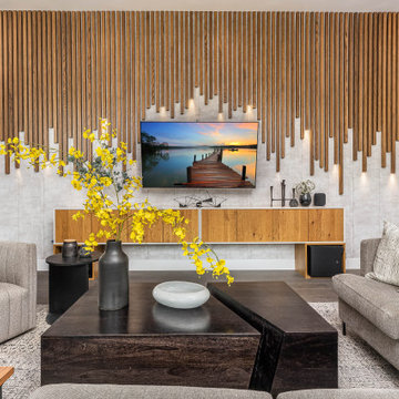
Open concept living. A creative way to incorporate lighting in the wood slats.
JL Interiors is a LA-based creative/diverse firm that specializes in residential interiors. JL Interiors empowers homeowners to design their dream home that they can be proud of! The design isn’t just about making things beautiful; it’s also about making things work beautifully. Contact us for a free consultation Hello@JLinteriors.design _ 310.390.6849_ www.JLinteriors.design
 TVL Creative Ltd.
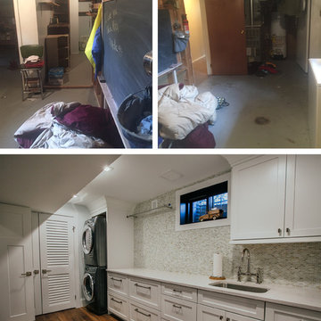
This project was such an incredible design opportunity, and instilled inspiration and excitement at every turn! Our amazing clients came to us with the challenge of converting their beloved family home into a welcoming haven for all members of the family. At the time that we met our clients, they were struggling with the difficult personal decision of the fate of the home. Their father/father-in-law had passed away and their mother/mother-in-law had recently been admitted into a nursing facility and was fighting Alzheimer’s. Resistant to loss of the home now that both parents were out of it, our clients purchased the home to keep in in the family. Despite their permanent home currently being in New Jersey, these clients dedicated themselves to keeping and revitalizing the house. We were moved by the story and became immediately passionate about bringing this dream to life.
The home was built by the parents of our clients and was only ever owned by them, making this a truly special space to the family. Our goal was to revitalize the home and to bring new energy into every room without losing the special characteristics that were original to the home when it was built. In this way, we were able to develop a house that maintains its own unique personality while offering a space of welcoming neutrality for all members of the family to enjoy over time.
The renovation touched every part of the home: the exterior, foyer, kitchen, living room, sun room, garage, six bedrooms, three bathrooms, the laundry room, and everything in between. The focus was to develop a style that carried consistently from space to space, but allowed for unique expression in the small details in every room.
Starting at the entry, we renovated the front door and entry point to offer more presence and to bring more of the mid-century vibe to the home’s exterior. We integrated a new modern front door, cedar shingle accents, new exterior paint, and gorgeous contemporary house numbers that really allow the home to stand out. Just inside the entry, we renovated the foyer to create a playful entry point worthy of attention. Cement look tile adorns the foyer floor, and we’ve added new lighting and upgraded the entry coat storage.
Upon entering the home, one will immediately be captivated by the stunning kitchen just off the entry. We transformed this space in just about every way. While the footprint of the home ultimately remained almost identical, the aesthetics were completely turned on their head. We re-worked the kitchen to maximize storage and to create an informal dining area that is great for casual hosting or morning coffee.
We removed the entry to the garage that was once in the informal dining, and created a peninsula in its place that offers a unique division between the kitchen/informal dining and the formal dining and living areas. The simple light warm light gray cabinetry offers a bit of traditional elegance, along with the marble backsplash and quartz countertops. We extended the original wood flooring into the kitchen and stained all floors to match for a warmth that truly resonates through all spaces. We upgraded appliances, added lighting everywhere, and finished the space with some gorgeous mid century furniture pieces.
In the formal dining and living room, we really focused on maintaining the original marble fireplace as a focal point. We cleaned the marble, repaired the mortar, and refinished the original fireplace screen to give a new sleek look in black. We then integrated a new gas insert for modern heating and painted the upper portion in a rich navy blue; an accent that is carried through the home consistently as a nod to our client’s love of the color.
The former entry into the old covered porch is now an elegant glass door leading to a stunning finished sunroom. This room was completely upgraded as well. We wrapped the entire space in cozy white shiplap to keep a casual feel with brightness. We tiled the floor with large format concrete look tile, and painted the old brick fireplace a bright white. We installed a new gas burning unit, and integrated transitional style lighting to bring warmth and elegance into the space. The new black-frame windows are adorned with decorative shades that feature hand-sketched bird prints, and we’ve created a dedicated garden-ware “nook” for our client who loves to work in the yard. The far end of this space is completed with two oversized chaise loungers and overhead lights…the most perfect little reading nook!
Just off the dining room, we created an entirely new space to the home: a mudroom. The clients lacked this space and desperately needed a landing spot upon entering the home from the garage. We uniquely planned existing space in the garage to utilize for this purpose, and were able to create a small but functional entry point without losing the ability to park cars in the garage. This new space features cement-look tile, gorgeous deep brown cabinetry, and plenty of storage for all the small items one might need to store while moving in and out of the home.
The remainder of the upstairs level includes massive renovations to the guest hall bathroom and guest bedroom, upstairs master bed/bath suite, and a third bedroom that we converted into a home office for the client.
Some of the largest transformations were made in the basement, where unfinished space and lack of light were converted into gloriously lit, cozy, finished spaces. Our first task was to convert the massive basement living room into the new master bedroom for our clients. We removed existing built-ins, created an entirely new walk-in closet, painted the old brick fireplace, installed a new gas unit, added carpet, introduced new lighting, replaced windows, and upgraded every part of the aesthetic appearance. One of the most incredible features of this space is the custom double sliding barn door made by a Denver artisan. This space is truly a retreat for our clients!
We also completely transformed the laundry room, back storage room, basement master bathroom, and two bedrooms.
This home’s massive scope and ever-evolving challenges were thrilling and exciting to work with, and the result is absolutely amazing. At the end of the day, this home offers a look and feel that the clients love. Above all, though, the clients feel the spirit of their family home and have a welcoming environment for all members of the family to enjoy for years to come.
 Daniel Scerri Periti
We were approached with a request to design the furnishings for an existing ‘finished’ apartment. The intention was to move in relatively fast, and the property already had an existing marble floor, kitchen and bathrooms which had to be kept. The property also boasted a fantastic 270 degree view, seen from most of the apartment. The clients had a very important role in the completion of the project. They were very involved during the design process and through various decoration choices. The final design was kept as a rigid guideline when faced with picking out all the different elements.
Once clear of all previous furniture, the space felt cold and bare; so we immediately felt the need for warmth, and raw, natural elements and textures to complement the cold marble floor while visually tying in the design of the whole apartment together.
Since the existing kitchen had a touch of dark walnut stain, we felt this material was one we should add to the palette of materials to contest the stark materials. A raw cement finish was another material we felt would add an interesting contrast and could be used in a variety of ways, from cabinets to walls and ceilings, to tie up the design of various areas of the apartment.
To warm up the living/dining area, keeping the existing marble floor but visually creating zones within the large living/dining area without hindering the flow, a dark timber custom-made soffit, continuous with a floor-to-ceiling drinks cabinet zones the dining area, giving it a degree of much-needed warmth.
The various windows with a stupendous 270 degree view needed to be visually tied together. This was done by introducing a continuous sheer [drape] which also doubled up as a sound-absorbing material along 2 of the 4 walls of the space.
A very large sofa was required to fill up the space correctly, also required for the size of the young family.
Services were integrated within the units and soffits, while a customized design in the corner between the kitchen and the living room took into consideration the viewpoints from the main areas to create a pantry without hindering the flow or views. A strategically placed floor-to-ceiling mirror doubles up the space and extends the view to the inner parts of the apartment.
The daughter’s bedroom was a small challenge in itself, and a fun task, where we wanted to achieve the perception of a cozy niche with its own enclosed reading nook [for reading fairy tales], behind see-through curtains and a custom-ordered wall print sporting the girl’s favorite colors.
The sons’ bedroom had double the requirements in terms of space needed: more wardrobe, more homework desk space, a tv/play station area… “We combined a raised platform area between the boys’ beds to become an area with cushions where the kids can lay down and play, and face a hidden screen behind the homework desk’s sliding back panel for their play station”. The color of the homework desk was chosen in relation to the boys’ ages. A more masculine material palette was chosen for this room, in contrast to the light pastel palette of the girl’s bedroom. Again, this colour can easily be changed over time for a more mature look.
PROJECT DATA:
St. Paul’s Bay, Malta
DESIGN TEAM:
Perit Rebecca Zammit, Perit Daniel Scerri, Elyse Tonna
OTHER CREDITS:
Photography: Tonio Lombardi
Styling : TKS


 Natural Stone Institute
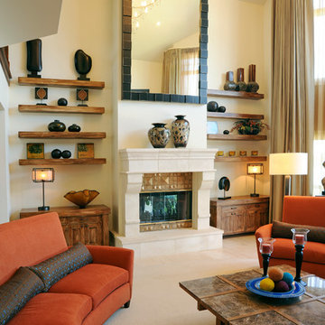
When United Marble Fabricators was hired by builders Adams & Beasley Associates to furnish, fabricate, and install all of the stone and tile in this unique two-story penthouse within the Four Seasons in Boston’s Back
Bay, the immediate focus of nearly all parties involved was more on the stunning views of Boston Common than of the stone and tile surfaces that would eventually adorn the kitchen and bathrooms. That entire focus,
however, would quickly shift to the meticulously designed first floor wet bar nestled into the corner of the two-story living room.
Lewis Interiors and Adams & Beasley Associates designed a wet bar that would attract attention, specifying ¾ inch Honey Onyx for the bar countertop and full-height backsplash. LED panels would be installed
behind the backsplash to illuminate the entire surface without creating
any “hot spots” traditionally associated with backlighting of natural stone.
As the design process evolved, it was decided that the originally specified
glass shelves with wood nosing would be replaced with PPG Starphire
ultra-clear glass that was to be rabbeted into the ¾ inch onyx backsplash
so that the floating shelves would appear to be glowing as they floated,
uninterrupted by moldings of any other materials.
The team first crafted and installed the backsplash, which was fabricated
from shop drawings, delivered to the 15th floor by elevator, and installed
prior to any base cabinetry. The countertops were fabricated with a 2 inch
mitered edge with an eased edge profile, and a 4 inch backsplash was
installed to meet the illuminated full-height backsplash.
The spirit of collaboration was alive and well on this project as the skilled
fabricators and installers of both stone and millwork worked interdependently
with the singular goal of a striking wet bar that would captivate any and
all guests of this stunning penthouse unit and rival the sweeping views of
Boston Common
 Daniel Scerri Periti
We were approached with a request to design the furnishings for an existing ‘finished’ apartment. The intention was to move in relatively fast, and the property already had an existing marble floor, kitchen and bathrooms which had to be kept. The property also boasted a fantastic 270 degree view, seen from most of the apartment. The clients had a very important role in the completion of the project. They were very involved during the design process and through various decoration choices. The final design was kept as a rigid guideline when faced with picking out all the different elements.
Once clear of all previous furniture, the space felt cold and bare; so we immediately felt the need for warmth, and raw, natural elements and textures to complement the cold marble floor while visually tying in the design of the whole apartment together.
Since the existing kitchen had a touch of dark walnut stain, we felt this material was one we should add to the palette of materials to contest the stark materials. A raw cement finish was another material we felt would add an interesting contrast and could be used in a variety of ways, from cabinets to walls and ceilings, to tie up the design of various areas of the apartment.
To warm up the living/dining area, keeping the existing marble floor but visually creating zones within the large living/dining area without hindering the flow, a dark timber custom-made soffit, continuous with a floor-to-ceiling drinks cabinet zones the dining area, giving it a degree of much-needed warmth.
The various windows with a stupendous 270 degree view needed to be visually tied together. This was done by introducing a continuous sheer [drape] which also doubled up as a sound-absorbing material along 2 of the 4 walls of the space.
A very large sofa was required to fill up the space correctly, also required for the size of the young family.
Services were integrated within the units and soffits, while a customized design in the corner between the kitchen and the living room took into consideration the viewpoints from the main areas to create a pantry without hindering the flow or views. A strategically placed floor-to-ceiling mirror doubles up the space and extends the view to the inner parts of the apartment.
The daughter’s bedroom was a small challenge in itself, and a fun task, where we wanted to achieve the perception of a cozy niche with its own enclosed reading nook [for reading fairy tales], behind see-through curtains and a custom-ordered wall print sporting the girl’s favorite colors.
The sons’ bedroom had double the requirements in terms of space needed: more wardrobe, more homework desk space, a tv/play station area… “We combined a raised platform area between the boys’ beds to become an area with cushions where the kids can lay down and play, and face a hidden screen behind the homework desk’s sliding back panel for their play station”. The color of the homework desk was chosen in relation to the boys’ ages. A more masculine material palette was chosen for this room, in contrast to the light pastel palette of the girl’s bedroom. Again, this colour can easily be changed over time for a more mature look.
PROJECT DATA:
St. Paul’s Bay, Malta
DESIGN TEAM:
Perit Rebecca Zammit, Perit Daniel Scerri, Elyse Tonna
OTHER CREDITS:
Photography: Tonio Lombardi
Styling : TKS
 Tile Doctor Ltd
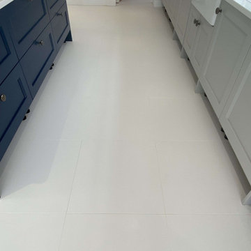
I was called out to clean a Porcelain tiled floor at a newly built property in Winwick near Huntingdon. The tiles were heavily marked with grout and dirt and were impossible to get clean. To make things worse the tiles were pale, almost white, in colour which made the staining more obvious. It was clear to me that the builder had not managed to polish off all the grout after tiling and this had now set hard on the surface.
This is a very common problem known as Grout Haze and fortunately there is a solution, in that it can be removed by giving the tiles a rinse with an acidic tile cleaner called Tile Doctor Grout Clean-up. To prove the point, I carried out a quick demonstration so the new owners could appreciate the difference.
I always like to test porcelain tiles for a reaction to acid prior to commencing work as acidic cleaners can have a negative effect on some types of polished porcelain however this one had a textured feel to it so there was no issue.
The test went well so having got the go head I began by first cleaning the tiles with a medium dilution of Tile Doctor Pro-Clean, this was left for about ten minutes before being worked into the tile with a black scrubbing pad fitted to a rotary machine. I also used a stiff brush along the grout lines to make sure the grout was as clean as the tile.
This process generates a lot of soiling which was then extracted using a truck mount machine. By Truck Mount I’m referring to a powerful cleaning machine that’s fitted into my van, it blasts the floor with hot water and then immediately extracts it using an equally powerful vacuum to grey tank in the vehicle, it’s incredibly effective and leaves very little water on the floor afterwards.
The next step was to tackle the grout haze and this is done as before by Acid Washing the floor using a dilution of Tile Doctor Grout Clean-up and scrubbing into the tile as before. Again, the resultant soils were extracted as before using the truck mount.
The floor was then speed dried using Dripods which are small horizontal fans designed to blow air downwards and ideal for drying carpets and hard floors. Once dry, a coat of Tile Doctor Ultra-Seal was applied, left to dry and any excess buffed away with a White pad.
The work was completed in one day and completely transformed the floor much to the delight of my customer who left the following message in a subsequent email:
“Thank you very much indeed, we are delighted with the floor.”
I’m pleased to say I have since returned to the neighbourhood and completed another identical grout removal job at a neighbour’s property who had the same issue with builder.
Tom Conlon
Cambridge Tile Doctor
171