
Search results for "Inadequately" in Home Design Ideas
 San Luis Kitchen Co.
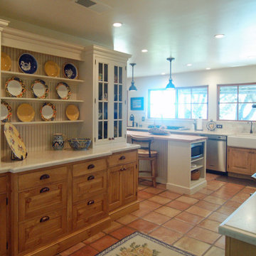
The owners of a charming home in the hills west of Paso Robles recently decided to remodel their not-so-charming kitchen. Referred to San Luis Kitchen by several of their friends, the homeowners visited our showroom and soon decided we were the best people to design a kitchen fitting the style of their home. We were delighted to get to work on the project right away.
When we arrived at the house, we found a small, cramped and out-dated kitchen. The ceiling was low, the cabinets old fashioned and painted a stark dead white, and the best view in the house was neglected in a seldom-used breakfast nook (sequestered behind the kitchen peninsula). This kitchen was also handicapped by white tile counters with dark grout, odd-sized and cluttered cabinets, and small ‘desk’ tacked on to the side of the oven cabinet. Due to a marked lack of counter space & inadequate storage the homeowner had resorted to keeping her small appliances on a little cart parked in the corner and the garbage was just sitting by the wall in full view of everything! On the plus side, the kitchen opened into a nice dining room and had beautiful saltillo tile floors.
Mrs. Homeowner loves to entertain and often hosts dinner parties for her friends. She enjoys visiting with her guests in the kitchen while putting the finishing touches on the evening’s meal. Sadly, her small kitchen really limited her interactions with her guests – she often felt left out of the mix at her own parties! This savvy homeowner dreamed big – a new kitchen that would accommodate multiple workstations, have space for guests to gather but not be in the way, and maybe a prettier transition from the kitchen to the dining (wine service area or hutch?) – while managing the remodel budget by reusing some of her major appliances and keeping (patching as needed) her existing floors.
Responding to the homeowner’s stated wish list and the opportunities presented by the home's setting and existing architecture, the designers at San Luis Kitchen decided to expand the kitchen into the breakfast nook using Wood-Mode cabinetry. This change allowed the work area to be reoriented to take advantage of the great view – we replaced the existing window and added another while moving the door to gain space. A second sink and set of refrigerator drawers (housing fresh fruits & veggies) were included for the convenience of this mainly vegetarian cook – her prep station. The clean-up area now boasts a farmhouse style single bowl sink – adding to the ‘cottage’ charm. We located a new gas cook-top between the two workstations for easy access from each. Also tucked in here is a pullout trash/recycle cabinet for convenience and additional drawers for storage.
Running parallel to the work counter we added a long butcher-block island with easy-to-access open shelves for the avid cook and seating for friendly guests placed just right to take in the view. A counter-top garage is used to hide excess small appliances. Glass door cabinets and open shelves are now available to display the owners beautiful dishware. The microwave was placed inconspicuously on the end of the island facing the refrigerator – easy access for guests (and extraneous family members) to help themselves to drinks and snacks while staying out of the cook’s way.
We also moved the pantry storage away from the dining room (putting it on the far wall and closer to the work triangle) and added a furniture-like hutch in its place allowing the more formal dining area to flow seamlessly into the up-beat work area of the kitchen. This space is now also home (opposite wall) to an under counter wine refrigerator, a liquor cabinet and pretty glass door wall cabinet for stemware storage – meeting Mr. Homeowner’s desire for a bar service area.
And then the aesthetic: an old-world style country cottage theme. The homeowners wanted the kitchen to have a warm feel while still loving the look of white cabinetry. San Luis Kitchen melded country-casual knotty pine base cabinets with vintage hand-brushed creamy white wall cabinets to create the desired cottage look. We also added bead board and mullioned glass doors for charm, used an inset doorstyle on the cabinets for authenticity, and mixed stone and wood counters to create an eclectic nuance in the space. All in all, the happy homeowners now boast a charming county cottage kitchen with plenty of space for entertaining their guests while creating gourmet meals to feed them.
 Wesdoesit.com
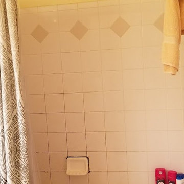
Mildew was a problem due to inadequate ventilation.
Outdated tiles and a badly stain tub were an eyesore.
Bathroom photo in Atlanta
Bathroom photo in Atlanta
 Deco Design
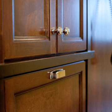
This area of the house enclosed a powder bath, entry closet and pantry closet for the kitchen and seperates the living room from the kitchen side of the main floor. The storage space for the pantry and closet were inadequate and boring so I decided to make them more interesting by making them look like armoires tucked into the wall and wrapped the walls with panels to match. Close up of pantry
photos by Kimball Ungerman
Find the right local pro for your project
 Renovisions
This kitchen had not been renovated since the salt box colonial house was built in the 1960’s. The new owner felt it was time for a complete refresh with some traditional details and adding in the owner’s contemporary tastes.
At initial observation, we determined the house had good bones; including high ceilings and abundant natural light from a double-hung window and three skylights overhead recently installed by our client. Mixing the homeowners desires required the skillful eyes of Cathy and Ed from Renovisions. The original kitchen had dark stained, worn cabinets, in-adequate lighting and a non-functional coat closet off the kitchen space. In order to achieve a true transitional look, Renovisions incorporated classic details with subtle, simple and cleaner line touches. For example, the backsplash mix of honed and polished 2” x 3” stone-look subway tile is outlined in brushed stainless steel strips creating an edgy feel, especially at the niche above the range. Removing the existing wall that shared the coat closet opened up the kitchen to allow adding an island for seating and entertaining guests.
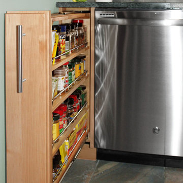
We chose natural maple, shaker style flat panel cabinetry with longer stainless steel pulls instead of knobs, keeping in line with the clients desire for a sleeker design. This kitchen had to be gutted to accommodate the new layout featuring an island with pull-out trash and recycling and deeper drawers for utensils. Spatial constraints were top of mind and incorporating a convection microwave above the slide-in range made the most sense. Our client was thrilled with the ability to bake, broil and microwave from GE’s advantium oven – how convenient! A custom pull-out cabinet was built for his extensive array of spices and oils. The sink base cabinet provides plenty of area for the large rectangular stainless steel sink, single-lever multi-sprayer faucet and matching filtered water dispenser faucet. The natural, yet sleek green soapstone countertop with distinct white veining created a dynamic visual and principal focal point for the now open space.
While oak wood flooring existed in the entire first floor, as an added element of color and interest we installed multi-color slate-look porcelain tiles in the kitchen area. We also installed a fully programmable floor heating system for those chilly New England days. Overall, out client was thrilled with his Mission Transition.
 Sturman Architects
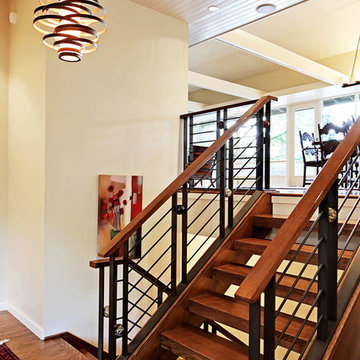
This project included the addition of a new entry, circulation space, powder room and office spaces. The addition fixed the inadequate flow of the house and the new stair and railing design was the focal point of the project. All bathrooms and kitchens were remodeled.
 Design Set Match
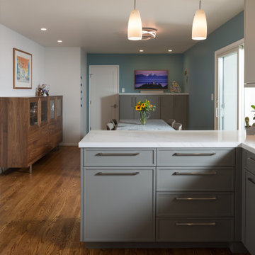
This kitchen included an odd-sized double-oven with shattered glass and appliance interference, wasted soffit space, inadequate lighting, and more. The client also faced issues with the laundry closet, storage, and countertops.
We addressed these concerns by adjusting the layout. Featured changes include an integrated micro-convection double-oven, a counter-depth refrigerator, the removal of soffits, an expanded cabinetry footprint, a built-in laundry, relocating the electrical panel, and adding solid-surface countertops.
Design elements include cabinet-mounted remote switches, a built-in wine refrigerator, two-tone cabinetry, all LED lighting, a pull-down swivel faucet, fully functional storage, and virtually seamless countertops.
These changes addressed all of the clients’ pain points and improved the kitchen’s functionality, efficiency, and aesthetic.
 Renovisions
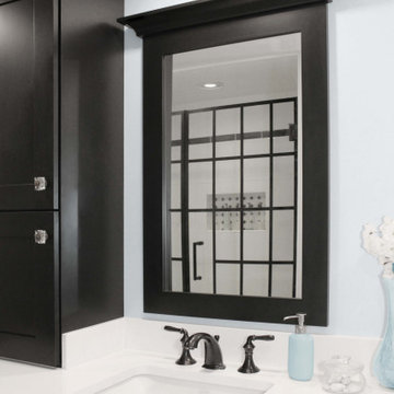
Perectly balanced, this dramatic black and white bathroom is a stunner. Thoughtful design was top of mind for these clients as they approached the Renovisions team to help narrow down their choices and bring it to life. Finding balance while mixing darker, heavier black finishes and lighter, white finishes was the task at hand and the goal was to create a modern look with an industrial/rustic feel.
The challenge on this project was incorporating all the desired elements and products in a tight spatial constraint of 9’ x 7.5’. The clients biggest concern in the old bathroom was inadequate storage, tired and under-utilized bathtub and they also needed an additional sink for their two daughters who often share this space. Renovisions recommended removing the wall between the shower and closet to gain additional floor space as you enter the bath, while providing wall space for the three towel bars.
Collaborating with the clients and searching to find the right fixtures paid off nicely. This newly remodeled Renovision accommodated two rectangular sinks, a walk-in shower with hand-held shower, wall-mounted shower head and two soft spray body jets. The oil-rubbed bronze fixtures not only provided a luxurious spa experience, but also added warmth and softness to the vintage feel. The glass shower enclosure is trimmed in a matte black grid that boasts an industrial aesthetic with retro feel while delivering modernistic function. It’s unique in appearance while allowing the chic white subway and black and white diamond tile to peek through.
The beautifully designed cabinetry in a matte black painted finish provides plenty of storage. This smart configuration included two banks of three drawers for toiletries and accessories, two towers with adjustable shelves for towels and two ‘garage’ doors for hair dryers.
Another unique design detail to capture attention was the black and white curvy geometric floor tile which plays off the straight lines of the cabinets and square grids of the shower enclosure.
The clients are thrilled with the results and their modern, high-contrast styled digs – a true customized relaxation sanctuary for the entire family.
 Design Tech Remodeling
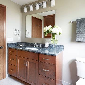
The lovely family of four had a small bathroom to share. Their shower was inadequate for the 6'4" homeowner. In order to provide them a more functional bathroom for them all, space was taken from one of the large bathrooms. We bumped the wall out a couple feet to provide these homeowner's with a large shower and linen cabinet storage space. They now have a beautiful transitional space that fits their needs. Initially the homeowner's were looking at a neutral beige palatte but fell in love with this grey color scheme. The grey, blue, and brown border tile helps pull all the colors together. The gorgeous Blue Pearl countertop provides a new element of color and complements the grey bathroom
Mike Kaskel
 VanAir Design
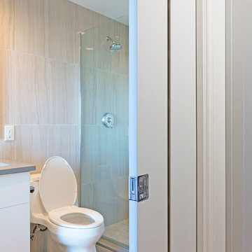
Inspiration for a small modern 3/4 beige tile and porcelain tile porcelain tile and beige floor alcove shower remodel in Vancouver with flat-panel cabinets, white cabinets, a two-piece toilet, beige walls, an undermount sink, granite countertops and a hinged shower door
 Sturman Architects
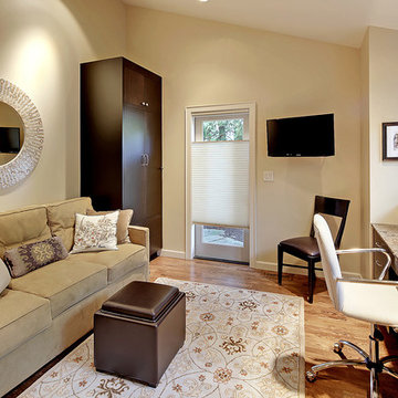
This project included the addition of a new entry, circulation space, powder room and office spaces. The addition fixed the inadequate flow of the house and the new stair and railing design was the focal point of the project. All bathrooms and kitchens were remodeled.
 SELECT KITCHEN & BATH
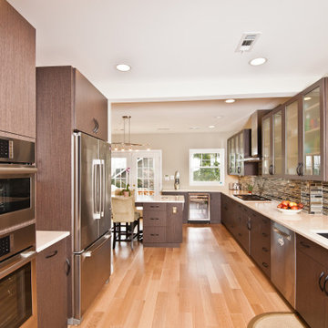
The existing kitchen was a small 7.5 x 11.5 area with inadequate heating and limited natural light, available through an awkward peninsula dividing the kitchen from a previous family room addition.
The design concept was to create a larger, brighter and more open space integrated with an outdoor deck (not shown) off the family room, creating a family and guest gathering space within the overall kitchen area.
The layout was centered around a large “island-table” with seating for seven; extensive countertop space and separate cooktop and ovens allow for family member participation in meal preparation.
The design theme was contemporary, with warm, muted colors and textures. Cabinets were an engineered veneer grey oak with slab door style and obscured glass in the upper cabinets. Countertops are neutral quartz, flooring a natural oak, 5” plank engineered hardwood.
 Finn Design Inc.
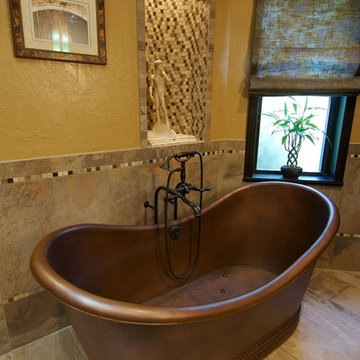
The 1987 home's master bathroom reflected that era, with a huge whirlpool tub, a laminate dual vanity, and mirrored walls. The clients wanted a renovation that captured an Old World style that reminded them of their time in Italy. We gave it a modern sensibility that made the space both practical and beautiful.
We removed the mirrors, tub and glass shower and created a spacious shower where the tub used to be. Inside the shower, we added two stone-covered benches and bronze- finished grab bars for safety; his/her niches for bath products; and a rainfall shower head, body sprays and a handheld massage shower on a slide. A copper air tub with traditional lines gives the room a focal point. Rearranging the space allowed us to fulfill the clients' request for separate his/her vanities.
The remote-controlled tub and shower functions are hidden by cabinetry. Inadequate fluorescent lights were replaced by LEDs and sconces with independent controls.
Large porcelain tiles are accented with glass, stone and porcelain mosaic. A faux-iron grille above the shower allows air circulation while adding to the Italian feel. Neutral quartz countertops with textured, reflective glass lavatories set off dark, custom hickory cabinetry that gives the clients the storage they wanted, up to the ceiling, including pull- out drawers, a robe closet and outlet-equipped cabinets. And a David statue looks on from a lighted, recessed display space.
 New England Design & Construction
This project enabled the client to stay in a thriving neighborhood that they loved by growing the size their 1836 home to accommodate the needs of a modern family. NEDC accomplished this by razing an existing inadequate second story that housed two bedrooms and constructing one and a half new stories above the existing first floor -- creating a four bedroom + Office/2.5 bath home from a 2 bedroom/1 bath home.
Photography by Jay Groccia at OnSite Studios
 Sturman Architects
This project included the addition of a new entry, circulation space, powder room and office spaces. The addition fixed the inadequate flow of the house and the new stair and railing design was the focal point of the project. All bathrooms and kitchens were remodeled.
 San Luis Kitchen Co.
The owners of a charming home in the hills west of Paso Robles recently decided to remodel their not-so-charming kitchen. Referred to San Luis Kitchen by several of their friends, the homeowners visited our showroom and soon decided we were the best people to design a kitchen fitting the style of their home. We were delighted to get to work on the project right away.
When we arrived at the house, we found a small, cramped and out-dated kitchen. The ceiling was low, the cabinets old fashioned and painted a stark dead white, and the best view in the house was neglected in a seldom-used breakfast nook (sequestered behind the kitchen peninsula). This kitchen was also handicapped by white tile counters with dark grout, odd-sized and cluttered cabinets, and small ‘desk’ tacked on to the side of the oven cabinet. Due to a marked lack of counter space & inadequate storage the homeowner had resorted to keeping her small appliances on a little cart parked in the corner and the garbage was just sitting by the wall in full view of everything! On the plus side, the kitchen opened into a nice dining room and had beautiful saltillo tile floors.
Mrs. Homeowner loves to entertain and often hosts dinner parties for her friends. She enjoys visiting with her guests in the kitchen while putting the finishing touches on the evening’s meal. Sadly, her small kitchen really limited her interactions with her guests – she often felt left out of the mix at her own parties! This savvy homeowner dreamed big – a new kitchen that would accommodate multiple workstations, have space for guests to gather but not be in the way, and maybe a prettier transition from the kitchen to the dining (wine service area or hutch?) – while managing the remodel budget by reusing some of her major appliances and keeping (patching as needed) her existing floors.
Responding to the homeowner’s stated wish list and the opportunities presented by the home's setting and existing architecture, the designers at San Luis Kitchen decided to expand the kitchen into the breakfast nook using Wood-Mode cabinetry. This change allowed the work area to be reoriented to take advantage of the great view – we replaced the existing window and added another while moving the door to gain space. A second sink and set of refrigerator drawers (housing fresh fruits & veggies) were included for the convenience of this mainly vegetarian cook – her prep station. The clean-up area now boasts a farmhouse style single bowl sink – adding to the ‘cottage’ charm. We located a new gas cook-top between the two workstations for easy access from each. Also tucked in here is a pullout trash/recycle cabinet for convenience and additional drawers for storage.
Running parallel to the work counter we added a long butcher-block island with easy-to-access open shelves for the avid cook and seating for friendly guests placed just right to take in the view. A counter-top garage is used to hide excess small appliances. Glass door cabinets and open shelves are now available to display the owners beautiful dishware. The microwave was placed inconspicuously on the end of the island facing the refrigerator – easy access for guests (and extraneous family members) to help themselves to drinks and snacks while staying out of the cook’s way.
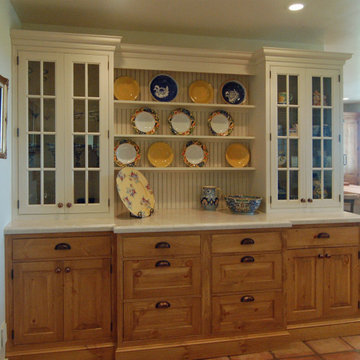
We also moved the pantry storage away from the dining room (putting it on the far wall and closer to the work triangle) and added a furniture-like hutch in its place allowing the more formal dining area to flow seamlessly into the up-beat work area of the kitchen. This space is now also home (opposite wall) to an under counter wine refrigerator, a liquor cabinet and pretty glass door wall cabinet for stemware storage – meeting Mr. Homeowner’s desire for a bar service area.
And then the aesthetic: an old-world style country cottage theme. The homeowners wanted the kitchen to have a warm feel while still loving the look of white cabinetry. San Luis Kitchen melded country-casual knotty pine base cabinets with vintage hand-brushed creamy white wall cabinets to create the desired cottage look. We also added bead board and mullioned glass doors for charm, used an inset doorstyle on the cabinets for authenticity, and mixed stone and wood counters to create an eclectic nuance in the space. All in all, the happy homeowners now boast a charming county cottage kitchen with plenty of space for entertaining their guests while creating gourmet meals to feed them.
 Sturman Architects
This project included the addition of a new entry, circulation space, powder room and office spaces. The addition fixed the inadequate flow of the house and the new stair and railing design was the focal point of the project. All bathrooms and kitchens were remodeled.
 Renovisions
Perectly balanced, this dramatic black and white bathroom is a stunner. Thoughtful design was top of mind for these clients as they approached the Renovisions team to help narrow down their choices and bring it to life. Finding balance while mixing darker, heavier black finishes and lighter, white finishes was the task at hand and the goal was to create a modern look with an industrial/rustic feel.
The challenge on this project was incorporating all the desired elements and products in a tight spatial constraint of 9’ x 7.5’. The clients biggest concern in the old bathroom was inadequate storage, tired and under-utilized bathtub and they also needed an additional sink for their two daughters who often share this space. Renovisions recommended removing the wall between the shower and closet to gain additional floor space as you enter the bath, while providing wall space for the three towel bars.
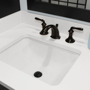
Collaborating with the clients and searching to find the right fixtures paid off nicely. This newly remodeled Renovision accommodated two rectangular sinks, a walk-in shower with hand-held shower, wall-mounted shower head and two soft spray body jets. The oil-rubbed bronze fixtures not only provided a luxurious spa experience, but also added warmth and softness to the vintage feel. The glass shower enclosure is trimmed in a matte black grid that boasts an industrial aesthetic with retro feel while delivering modernistic function. It’s unique in appearance while allowing the chic white subway and black and white diamond tile to peek through.
The beautifully designed cabinetry in a matte black painted finish provides plenty of storage. This smart configuration included two banks of three drawers for toiletries and accessories, two towers with adjustable shelves for towels and two ‘garage’ doors for hair dryers.
Another unique design detail to capture attention was the black and white curvy geometric floor tile which plays off the straight lines of the cabinets and square grids of the shower enclosure.
The clients are thrilled with the results and their modern, high-contrast styled digs – a true customized relaxation sanctuary for the entire family.
 MHM LIVING
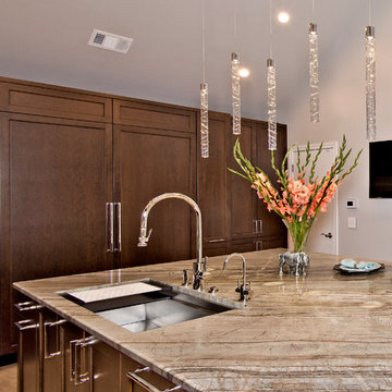
Previously the kitchen had a small fridge/freezer combo, inadequate working space and limited storage. Now two side by side 30” fridge and freezer units are built into the cabinet wall and then edged by pantry space creating an uninterrupted wall of storage that optimizes the storage space.
 Renovisions
This South Shore of Boston client approached the team of Renovisions to remodel her existing basement bathroom. This bath, with an outdated fiberglass shower stall was cracked and leaking into the concrete floor below. The room had inadequate storage, was dark and did not boost this home’s overall market value.
It was definitely time for a Renovision and the client was excited to get started! She was looking forward to sharing the new space with guests that stay at her home and use the bathroom often.
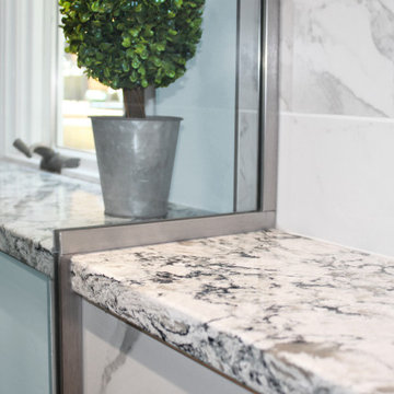
Working alongside this client was fun and productive as great design and product choices were selected together. In the design process, Renovisions presented a unique idea; using the basement foundation ledge for a shelf that ran into the shower area, gaining extra space for shampoos and soaps, eliminating the need for a niche. Another great idea was to implement a Grohe Smart Control valve which brings this shower experience to another level; they can choose ways to spray with the right degree of warmth. The stunning stream-lined shower trims in brushed nickel finish match the style and finish on the single-lever vanity faucet.
The contrasting dark grey, large format porcelain floor tile’s texture resembles a linen-look pattern the client requested while complimenting the darker veining in the quartz curb, shelf and vanity countertop.
The Carrera-look porcelain shower wall tiles boast no-maintenance and provides a clean, brighter appeal seen through the beautiful custom shower glass enclosure. We lightened up the bath with a light blue paint color which added a fresh look, giving the illusion of a bigger space.
As you can see, with the right colors, textures and accessories, we transformed this basement bath from Drab to Fab. The client was thrilled with her basement Renovision, a true Breath of Fresh Flair’!
 Byggmeister Inc
Photo by Jim Raycroft
When these homeowners first came to us in 2011, they had a list of major projects to adapt their Victorian home to the needs of their growing family. The first phase of work was a basement renovation to provide informal hang out space. The second was a garage. Finally they turned their attention to the master bedroom and bathroom.
FROM BALCONY TO BATHROOM
At one end of the suite was a cramped and outdated bathroom. At the other end was an underutilized, high-maintenance, exterior balcony. A leaky door to the balcony, as well as inadequate insulation and air-sealing and a poorly designed heating system, made the bedroom difficult to keep comfortable in the winter.
We chose to capture the old balcony as indoor space and relocate the bathroom to that end of the master suite. This strategy not only gave us the opportunity to install much better insulation and good, tight windows, it created enough new floor area that we were able to include a large walk-in shower, separate vanities, a toilet room, and a make-up counter in the new master bathroom.
ADAPTING AND UPDATING
The project allowed us to find a prominent place for an old leaded glass window sash that the homeowners had been hanging onto for several years in anticipation of this project.
The flow and layout of the master suite are now much better suited to a 21st century lifestyle. But best of all (to us, anyway), the homeowners report that the bathroom—where the old balcony had been—is now the most comfortable room in the house.
17