
Search results for "Inclusivity helps" in Home Design Ideas

 Kitchen Magic
The homeowners wanted a stylish new kitchen, inclusive of new cabinets, countertops and backsplash. They requested that we upgrade their builder’s grade cabinets to a brighter white kitchen. Acquire a whole new look with new cabinets in Madison style doors and drawer. Build quality, custom cabinets with a sophisticated look and feel. The creamy white Colourtone doors have Coffee glaze offset the stark white look beautifully. The new kitchen’s color and style design is inviting and enriches the home’s overall décor.
We created a kitchen showplace that the homeowners could be proud by incorporating design details that would make their kitchen unique
1. Installed new cabinets, doors, drawers, glass fronts, cabinet details, tile backsplash and flip open basement windows. Used light colors to brighten up the space.
2. Additions of interior storage and a custom wine rack to maximize storage and functionality. This would also assist while entertaining guests.
3. Stay within budget: The Designer’s strategy to install new cabinets while staying within budget would be challenge however, we gave them end- of-year discounts to help with the costs. We wanted to give the homeowners the beautiful kitchen they always wanted
Photographer: David Glasofer

 McCullough's Flooring
Gorgeous master bath finished with Dal-Tile's Fabrique porcelain tile in the color Noir Linen polished. Tile size is 12"x24" installed in a brick joint pattern. The floor boasts underfloor heating on a timed thermostat.
 Kitchen Magic
The homeowners wanted a stylish new kitchen, inclusive of new cabinets, countertops and backsplash. They requested that we upgrade their builder’s grade cabinets to a brighter white kitchen. Acquire a whole new look with new cabinets in Madison style doors and drawer. Build quality, custom cabinets with a sophisticated look and feel. The creamy white Colourtone doors have Coffee glaze offset the stark white look beautifully. The new kitchen’s color and style design is inviting and enriches the home’s overall décor.
We created a kitchen showplace that the homeowners could be proud by incorporating design details that would make their kitchen unique
1. Installed new cabinets, doors, drawers, glass fronts, cabinet details, tile backsplash and flip open basement windows. Used light colors to brighten up the space.
2. Additions of interior storage and a custom wine rack to maximize storage and functionality. This would also assist while entertaining guests.
3. Stay within budget: The Designer’s strategy to install new cabinets while staying within budget would be challenge however, we gave them end- of-year discounts to help with the costs. We wanted to give the homeowners the beautiful kitchen they always wanted
Photographer: David Glasofer
Find the right local pro for your project
 Bilotta Kitchen & Home
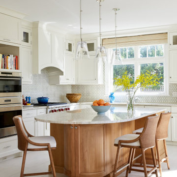
Your smile is not the only curve in the room when you enter this room. This open and airy traditional Atlantic Beach kitchen flaunts a beautiful curved island in natural cherry which is the focal point of the space. There are occasional times when a homeowner comes to the table with a vision from which the designer can draw his inspiration. Such was the case when Bilotta designer Goran Savic and Interior designer, Catherine Ebert’s mutual client announced that design and an expansive feeling should be prioritized over the prevailing “more storage” maxim. Although the kitchen was opened up to afford a view of the beautiful sculptural staircase, cabinetry was limited to a modest “L”-shaped footprint with an island. But not just any island: curved cabinetry in cherry that references the curves of the staircase and its cherry newel post and railing. While the rounded shape doesn’t contribute much to storage, it provides plenty of room for seating and definitely makes a strong design statement. More seating can be found in the comfy cushioned banquette (with storage drawers below). That’s a perfect spot to grab breakfast or even read a book. The unique piece here is the custom table at the banquette. Its beveled oval cherry base and double stainless-steel column supports are evocative of a luxury Art Deco yacht and echo the curved island. Goran utilized a number of space-enlarging visual devices as part of his design arsenal. Open shelving and glass upper sections on the wall cabinets prevent the frequent claustrophobic effect of all solid doors. Installing the wall cabinets higher than usual created a larger backsplash that helps offset the normal feeling of countertop clutter. Of course, nothing opens up a room like the inclusion of abundant natural light, but choice of materials also plays a huge role. Here we have a bleached stain on the wood floor, white cabinets, pale-colored countertops and backsplash tiles, and clear glass pendants, all of which enhance the airiness of this stunning new room.
 Jordan Design Build Group
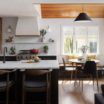
Expanding and updating the kitchen was our top priority – the new layout was designed to straddle the original house and the addition, creating work zones rather than the traditional work triangle. The modified galley layout more than doubled their countertop area and storage space. Extending the kitchen into the addition took full advantage of the vaulted ceilings and light-filled space. To improve flow and connectivity, we opened up a wall between the old kitchen and the front entry hall providing a straight path from front door to the new mudroom/drop zone and kitchen beyond. A door from the dining room into the kitchen was shifted to allow for a more generous kitchen.
The beautifully veined Calacatta Eiffel quartz counters and backsplash provide visual contrast with the black cabinetry and keep the space from feeling too heavy. A continuous ledge and floating shelves replace traditional uppers for a more open and modern feel. Stained wood is used throughout, from the bench top, to shelving, trim and custom millwork; it brings in a natural element and helps unite all of the spaces. A hood with a custom Venetian plaster finish is flanked by vintage inspired sconces and provides a stunning focal point in the room. A deep nook is home to a ‘bubble box’ that dispenses cold sparkling or still water on demand – the marble tile backsplash further differentiates this beverage zone. The brushed brass hardware stands out against the dark cabinets and adds a touch of warmth. With seating for three at the counter and the inclusion of a breakfast area banquette (with drawers), the home is ideal for family time and relaxed gatherings with friends.
 Jordan Design Build Group
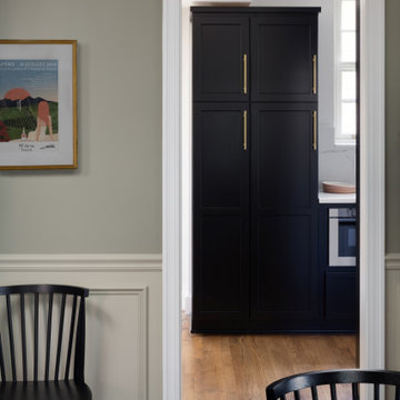
Expanding and updating the kitchen was our top priority – the new layout was designed to straddle the original house and the addition, creating work zones rather than the traditional work triangle. The modified galley layout more than doubled their countertop area and storage space. Extending the kitchen into the addition took full advantage of the vaulted ceilings and light-filled space. To improve flow and connectivity, we opened up a wall between the old kitchen and the front entry hall providing a straight path from front door to the new mudroom/drop zone and kitchen beyond. A door from the dining room into the kitchen was shifted to allow for a more generous kitchen.
The beautifully veined Calacatta Eiffel quartz counters and backsplash provide visual contrast with the black cabinetry and keep the space from feeling too heavy. A continuous ledge and floating shelves replace traditional uppers for a more open and modern feel. Stained wood is used throughout, from the bench top, to shelving, trim and custom millwork; it brings in a natural element and helps unite all of the spaces. A hood with a custom Venetian plaster finish is flanked by vintage inspired sconces and provides a stunning focal point in the room. A deep nook is home to a ‘bubble box’ that dispenses cold sparkling or still water on demand – the marble tile backsplash further differentiates this beverage zone. The brushed brass hardware stands out against the dark cabinets and adds a touch of warmth. With seating for three at the counter and the inclusion of a breakfast area banquette (with drawers), the home is ideal for family time and relaxed gatherings with friends.

 CairnsCraft Design & Remodel
Great spacious bathroom with lot of amenities.
Photographer: Jon Upson
Large elegant master beige tile and porcelain tile drop-in bathtub photo in San Diego with an undermount sink, raised-panel cabinets, medium tone wood cabinets, granite countertops, beige walls and a two-piece toilet
Large elegant master beige tile and porcelain tile drop-in bathtub photo in San Diego with an undermount sink, raised-panel cabinets, medium tone wood cabinets, granite countertops, beige walls and a two-piece toilet

Sponsored
Sunbury, OH

J.Holderby - Renovations
Franklin County's Leading General Contractors - 2X Best of Houzz!

 House of L
A 1927 colonial home in Shaker Heights, Ohio, received a breathtaking renovation that required extensive work, transforming it from a tucked away, utilitarian space, to an all-purpose gathering room, a role that most kitchens embrace in a home today. The scope of work changed over the course of the project, starting more minimalistically and then quickly becoming the main focus of the house's remodeling, resulting in a staircase being relocated and walls being torn down to create an inviting focal point to the home where family and friends could connect. The focus of the functionality was to allow for multiple prep areas with the inclusion of two islands and sinks, two eating areas (one for impromptu snacking and small meals of younger family members and friends on island no. two and a built-in bench seat for everyday meals in the immediate family). The kitchen was equipped with all Subzero and Wolf appliances, including a 48" range top with a 12" griddle, two double ovens, a 42" built-in side by side refrigerator and freezer, a microwave drawer on island no. one and a beverage center and icemaker in island no. two. The aesthetic feeling embraces the architectural feel of the home while adding a modern sensibility with the revamped layout and graphic elements that tie the color palette of whites, chocolate and charcoal. The cabinets were custom made and outfitted with beaded inset doors with a Shaker panel frame and finished in Benjamin Moore's OC-17 White Dove, a soft white that allowed for the kitchen to feel warm while still maintaining its brightness. Accents of walnut were added to create a sense of warmth, including a custom premium grade walnut countertop on island no. one from Brooks Custom and a TV cabinet with a doggie feeding station beneath. Bringing the cabinet line to the 8'6" ceiling height helps the room feel taller and bold light fixtures at the islands and eating area add detail to an otherwise simpler ceiling detail. The 1 1/4" countertops feature Calacatta Gold Marble with an ogee edge detail. Special touches on the interiors include secret storage panels, an appliance garage, breadbox, pull-out drawers behind the cabinet doors and all soft-close hinges and drawer glides. A kneading area was made as a part of island no. one for the homeowners' love of baking, complete with a stone top allowing for dough to stay cool. Baskets beneath store kitchen essentials that need air circulation. The room adjacent to the kitchen was converted to a hearth room (from a formal dining room) to extend the kitchen's living space and allow for a natural spillover for family and guests to spill into.
Jason Miller, Pixelate

 In Detail Interiors
Colorful and rich style
When a repeat client shows up on your doorstep with his third home to furnish and wants to start from scratch and go really bold, you just embrace him, scoot him right up to the resource room, and don’t ask questions! I mean, who does not love a client that embraces velvet, leather, silk and wallcoverings?
This lush, vibrant lounge space was all created from the want to really deep dive into something different, eclectic and more traveled. The original small, narrow, dimly lit room totally delivered on helping accomplish that mood. Mixing a little of that Ming dynasty-inspired strawberry red with a deep chocolate mohair on the sectional and cladding the room in a soft, amethyst woven wallcovering. We loved the interplay and “non-matchiness” that this space embraced.
Lighting and art were both about telling a story in this room – accenting conversational opportunities and an almost gallery-esque feel. Designating a more dynamic and unusual, sculptural feel – from the harder lines of the statement floor lamp in the living room across to the sprawling, slightly modern bloom of the dining area fixture.
Jewel of a space
The area rug had to ground the already bold furniture and lend itself to the darker wood floors, and a dusky green wool proved the ticket. We loved the almost pixelated pattern the hand-knotted wool lent to the overall design. A little hint of oxblood, chocolate and blue picked up in accents elsewhere, but the tone of almost jade really caught us about this piece.
Not enough can be said about the accent of a dining space either (which in terms of space planning was the only way to balance this long, narrow “hallway” of a room off the kitchen). Citron velvet on the low-profile chairs left the space feeling open, but fun for games and cocktail parties. Plus, the cerused wood dining table was a great complement – offering depth without a conflict to the existing flooring or nearby sectional.
Being able to view this space as a whole was very important to us! From the selection of sconces carried throughout (that wonky placement was existing and with so little opportunity to add cans we had to play up the new fixtures in a way that make them feel purposeful and desirable.), to the balance of color and temperature in each furniture grouping. Sometimes working floor to ceiling in an existing space can pose a lot of unique challenges when it comes to furnishing projects. However, we loved that the client embraced our drive to really punch up the visual feel of this living/dining combo. Also, we know the enjoyment he gets from the finished product is a testament to hunting for the right pieces, designing with unusual and luxe fabric combinations, and managing the inclusion of budget-friendly surprises that always balance a job well done.
What the client says
“From the moment that Cheryl arrived, I felt that she was definitely the designer that I needed to help facilitate & execute my vision for the space. I’m not the “cookie cutter” type, and I immediately realized that Cheryl had a knack for envisioning ideas that were unique, yet tasteful, timeless, and sophisticated.”
From its beginnings as a plain Jane envelope, this combination living/dining space becomes a study in texture and color!
 Kitchen Magic
The homeowners wanted a stylish new kitchen, inclusive of new cabinets, countertops and backsplash. They requested that we upgrade their builder’s grade cabinets to a brighter white kitchen. Acquire a whole new look with new cabinets in Madison style doors and drawer. Build quality, custom cabinets with a sophisticated look and feel. The creamy white Colourtone doors have Coffee glaze offset the stark white look beautifully. The new kitchen’s color and style design is inviting and enriches the home’s overall décor.
We created a kitchen showplace that the homeowners could be proud by incorporating design details that would make their kitchen unique
1. Installed new cabinets, doors, drawers, glass fronts, cabinet details, tile backsplash and flip open basement windows. Used light colors to brighten up the space.
2. Additions of interior storage and a custom wine rack to maximize storage and functionality. This would also assist while entertaining guests.
3. Stay within budget: The Designer’s strategy to install new cabinets while staying within budget would be challenge however, we gave them end- of-year discounts to help with the costs. We wanted to give the homeowners the beautiful kitchen they always wanted
Photographer: David Glasofer
 In Detail Interiors
Colorful and rich style
When a repeat client shows up on your doorstep with his third home to furnish and wants to start from scratch and go really bold, you just embrace him, scoot him right up to the resource room, and don’t ask questions! I mean, who does not love a client that embraces velvet, leather, silk and wallcoverings?
This lush, vibrant lounge space was all created from the want to really deep dive into something different, eclectic and more traveled. The original small, narrow, dimly lit room totally delivered on helping accomplish that mood. Mixing a little of that Ming dynasty-inspired strawberry red with a deep chocolate mohair on the sectional and cladding the room in a soft, amethyst woven wallcovering. We loved the interplay and “non-matchiness” that this space embraced.
Lighting and art were both about telling a story in this room – accenting conversational opportunities and an almost gallery-esque feel. Designating a more dynamic and unusual, sculptural feel – from the harder lines of the statement floor lamp in the living room across to the sprawling, slightly modern bloom of the dining area fixture.
Jewel of a space
The area rug had to ground the already bold furniture and lend itself to the darker wood floors, and a dusky green wool proved the ticket. We loved the almost pixelated pattern the hand-knotted wool lent to the overall design. A little hint of oxblood, chocolate and blue picked up in accents elsewhere, but the tone of almost jade really caught us about this piece.
Not enough can be said about the accent of a dining space either (which in terms of space planning was the only way to balance this long, narrow “hallway” of a room off the kitchen). Citron velvet on the low-profile chairs left the space feeling open, but fun for games and cocktail parties. Plus, the cerused wood dining table was a great complement – offering depth without a conflict to the existing flooring or nearby sectional.
Being able to view this space as a whole was very important to us! From the selection of sconces carried throughout (that wonky placement was existing and with so little opportunity to add cans we had to play up the new fixtures in a way that make them feel purposeful and desirable.), to the balance of color and temperature in each furniture grouping. Sometimes working floor to ceiling in an existing space can pose a lot of unique challenges when it comes to furnishing projects. However, we loved that the client embraced our drive to really punch up the visual feel of this living/dining combo. Also, we know the enjoyment he gets from the finished product is a testament to hunting for the right pieces, designing with unusual and luxe fabric combinations, and managing the inclusion of budget-friendly surprises that always balance a job well done.
What the client says
“From the moment that Cheryl arrived, I felt that she was definitely the designer that I needed to help facilitate & execute my vision for the space. I’m not the “cookie cutter” type, and I immediately realized that Cheryl had a knack for envisioning ideas that were unique, yet tasteful, timeless, and sophisticated.”
From its beginnings as a plain Jane envelope, this combination living/dining space becomes a study in texture and color!

 Design Platform
Second story was added to original 1917 brick single story home. New modern steel canopy over front porch to disguise the area of the addition. Cedar shake shingles on gable of second floor. Matching brick brought up to the second floor on the left. Photo by Jess Blackwell

 LandArt
This project was completed in conjunction with the construction of the home. The home’s architect was looking for someone who could design and build a new driveway, front entrance, walkways, patio, fencing, and plantings.
The gardens were designed for the homeowner who had a real appreciation for gardening and was looking for variety and colour. The plants are all perennials that are relatively low maintenance while offering a wide variety of colours, heights, shapes and textures. For the hardscape, we used a Mondrian slab interlock for the main features and added a natural stone border for architectural detail.
Sponsored
Columbus, OH

Hope Restoration & General Contracting
Columbus Design-Build, Kitchen & Bath Remodeling, Historic Renovations

 Spire North
Tucked away in the backwoods of Torch Lake, this home marries “rustic” with the sleek elegance of modern. The combination of wood, stone and metal textures embrace the charm of a classic farmhouse. Although this is not your average farmhouse. The home is outfitted with a high performing system that seamlessly works with the design and architecture.
The tall ceilings and windows allow ample natural light into the main room. Spire Integrated Systems installed Lutron QS Wireless motorized shades paired with Hartmann & Forbes windowcovers to offer privacy and block harsh light. The custom 18′ windowcover’s woven natural fabric complements the organic esthetics of the room. The shades are artfully concealed in the millwork when not in use.
Spire installed B&W in-ceiling speakers and Sonance invisible in-wall speakers to deliver ambient music that emanates throughout the space with no visual footprint. Spire also installed a Sonance Landscape Audio System so the homeowner can enjoy music outside.
Each system is easily controlled using Savant. Spire personalized the settings to the homeowner’s preference making controlling the home efficient and convenient.

 Cantoni Irvine
From the street, it’s an impeccably designed English manor. Once inside, the best of that same storied architecture seamlessly meshes with modernism. This blend of styles was exactly the vibe three-decades-running Houston homebuilder Chris Sims, founder and CEO of Sims Luxury Builders, wanted to convey with the $5.2 million show-home in Houston’s coveted Tanglewood neighborhood. “Our goal was to uniquely combine classic and Old World with clean and modern in both the architectural design as well as the interior finishes,” Chris says.
Their aesthetic inspiration is clearly evident in the 8,000-square-foot showcase home’s luxurious gourmet kitchen. It is an exercise in grey and white—and texture. To achieve their vision, the Sims turned to Cantoni. “We had a wonderful experience working with Cantoni several years ago on a client’s home, and were pleased to repeat that success on this project,” Chris says.
Cantoni designer Amy McFall, who was tasked with designing the kitchen, promptly took to the home’s beauty. Situated on a half-acre corner lot with majestic oak trees, it boasts simplistic and elegant interiors that allow the detailed architecture to shine. The kitchen opens directly to the family room, which holds a brick wall, beamed ceilings, and a light-and-bright stone fireplace. The generous space overlooks the outdoor pool. With such a large area to work with, “we needed to give the kitchen its own, intimate feel,” Amy says.
To that end, Amy integrated dark grey, high-gloss lacquer cabinetry from our Atelier Collection. by Aster Cucine with dark grey oak cabinetry, mixing finishes throughout to add depth and texture. Edginess came by way of custom, heavily veined Calacatta Viola marble on both the countertops and backsplash.
The Sims team, meanwhile, insured the layout lent itself to minimalism. “With the inclusion of the scullery and butler’s pantry in the design, we were able to minimize the storage needed in the kitchen itself,” Chris says. “This allowed for the clean, minimalist cabinetry, giving us the creative freedom to go darker with the cabinet color and really make a bold statement in the home.”
It was exactly the look they wanted—textural and interesting. “The juxtaposition of ultra-modern kitchen cabinetry and steel windows set against the textures of the wood floors, interior brick, and trim detailing throughout the downstairs provided a fresh take on blending classic and modern,” Chris says. “We’re thrilled with the result—it is showstopping.”
They were equally thrilled with the design process. “Amy was incredibly responsive, helpful and knowledgeable,” Chris says. “It was a pleasure working with her and the entire Cantoni team.”
Check out the kitchen featured in Modern Luxury Interiors Texas’ annual “Ode to Texas Real Estate” here.
 House of L
A 1927 colonial home in Shaker Heights, Ohio, received a breathtaking renovation that required extensive work, transforming it from a tucked away, utilitarian space, to an all-purpose gathering room, a role that most kitchens embrace in a home today. The scope of work changed over the course of the project, starting more minimalistically and then quickly becoming the main focus of the house's remodeling, resulting in a staircase being relocated and walls being torn down to create an inviting focal point to the home where family and friends could connect. The focus of the functionality was to allow for multiple prep areas with the inclusion of two islands and sinks, two eating areas (one for impromptu snacking and small meals of younger family members and friends on island no. two and a built-in bench seat for everyday meals in the immediate family). The kitchen was equipped with all Subzero and Wolf appliances, including a 48" range top with a 12" griddle, two double ovens, a 42" built-in side by side refrigerator and freezer, a microwave drawer on island no. one and a beverage center and icemaker in island no. two. The aesthetic feeling embraces the architectural feel of the home while adding a modern sensibility with the revamped layout and graphic elements that tie the color palette of whites, chocolate and charcoal. The cabinets were custom made and outfitted with beaded inset doors with a Shaker panel frame and finished in Benjamin Moore's OC-17 White Dove, a soft white that allowed for the kitchen to feel warm while still maintaining its brightness. Accents of walnut were added to create a sense of warmth, including a custom premium grade walnut countertop on island no. one from Brooks Custom and a TV cabinet with a doggie feeding station beneath. Bringing the cabinet line to the 8'6" ceiling height helps the room feel taller and bold light fixtures at the islands and eating area add detail to an otherwise simpler ceiling detail. The 1 1/4" countertops feature Calacatta Gold Marble with an ogee edge detail. Special touches on the interiors include secret storage panels, an appliance garage, breadbox, pull-out drawers behind the cabinet doors and all soft-close hinges and drawer glides. A kneading area was made as a part of island no. one for the homeowners' love of baking, complete with a stone top allowing for dough to stay cool. Baskets beneath store kitchen essentials that need air circulation. The room adjacent to the kitchen was converted to a hearth room (from a formal dining room) to extend the kitchen's living space and allow for a natural spillover for family and guests to spill into.
Jason Miller, Pixelate

 Complete Flooring
Chris Golden
Inspiration for a transitional carpeted living room remodel in Phoenix with beige walls, a standard fireplace and a tile fireplace
Inspiration for a transitional carpeted living room remodel in Phoenix with beige walls, a standard fireplace and a tile fireplace

 Clawson Architects, LLC
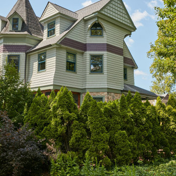
Built in 1884, this is the first house on Main Street one sees when exiting the train station. Its prominent corner location helps define the gateway to the town shopping district. Schematic design sessions for this period home’s renovation were already complete when the news was shared with the design team that one of the owners had been diagnosed with a progressive motor neuron disease.
The homeowners asked us to incorporate universal design features—including wheelchair access to every room on every level of the home—but were insistent that they did not want to create a home that looked or felt institutional.
Due to the home’s high visibility, it was important to the owners that the addition, including the elevator rise, be stylistically seamless and unobtrusive. This was achieved by applying existing character-defining features from the house such as octagonal massing, columned porches, steep roof slopes, and decorative shingle patterns. Complimentary architectural ornamentation was introduced to highlight the Queen Anne style and diminish the scale of the elevator rise. Interior and exterior access challenges were graciously overcome without sacrificing authentic period detailing.
The addition begins with exterior entry at ground level. A half stop down to the basement provides access to a “wheelchair wash/dog wash” station and game room. A half stop up brings the elevator to the first floor followed by traditional stops at the second floor and attic/owner’s suite.
Widened halls and doors make circulation via a wheelchair through the home achievable. Other universal design features and fixtures include the zero-entry shower in the owner’s and guest baths, French-door ovens, induction cooktop, touchless faucet, and refrigerator and freezer drawers. These make the home functional and comfortable for all members of the family.
In collaboration with a landscape architect, we also created a lush pocket of privacy on this very public lot. The new hardscaping creates access around the house, to the grill, fire pit, patio and driveway as well as to the town sidewalks making wheelchair inclusion both possible and effortless. Substantially complete Fall 2021.
 Kitchen Magic
The homeowners wanted a stylish new kitchen, inclusive of new cabinets, countertops and backsplash. They requested that we upgrade their builder’s grade cabinets to a brighter white kitchen. Acquire a whole new look with new cabinets in Madison style doors and drawer. Build quality, custom cabinets with a sophisticated look and feel. The creamy white Colourtone doors have Coffee glaze offset the stark white look beautifully. The new kitchen’s color and style design is inviting and enriches the home’s overall décor.
We created a kitchen showplace that the homeowners could be proud by incorporating design details that would make their kitchen unique
1. Installed new cabinets, doors, drawers, glass fronts, cabinet details, tile backsplash and flip open basement windows. Used light colors to brighten up the space.
2. Additions of interior storage and a custom wine rack to maximize storage and functionality. This would also assist while entertaining guests.
3. Stay within budget: The Designer’s strategy to install new cabinets while staying within budget would be challenge however, we gave them end- of-year discounts to help with the costs. We wanted to give the homeowners the beautiful kitchen they always wanted
Photographer: David Glasofer
 Cantoni Irvine
From the street, it’s an impeccably designed English manor. Once inside, the best of that same storied architecture seamlessly meshes with modernism. This blend of styles was exactly the vibe three-decades-running Houston homebuilder Chris Sims, founder and CEO of Sims Luxury Builders, wanted to convey with the $5.2 million show-home in Houston’s coveted Tanglewood neighborhood. “Our goal was to uniquely combine classic and Old World with clean and modern in both the architectural design as well as the interior finishes,” Chris says.
Their aesthetic inspiration is clearly evident in the 8,000-square-foot showcase home’s luxurious gourmet kitchen. It is an exercise in grey and white—and texture. To achieve their vision, the Sims turned to Cantoni. “We had a wonderful experience working with Cantoni several years ago on a client’s home, and were pleased to repeat that success on this project,” Chris says.
Cantoni designer Amy McFall, who was tasked with designing the kitchen, promptly took to the home’s beauty. Situated on a half-acre corner lot with majestic oak trees, it boasts simplistic and elegant interiors that allow the detailed architecture to shine. The kitchen opens directly to the family room, which holds a brick wall, beamed ceilings, and a light-and-bright stone fireplace. The generous space overlooks the outdoor pool. With such a large area to work with, “we needed to give the kitchen its own, intimate feel,” Amy says.
To that end, Amy integrated dark grey, high-gloss lacquer cabinetry from our Atelier Collection. by Aster Cucine with dark grey oak cabinetry, mixing finishes throughout to add depth and texture. Edginess came by way of custom, heavily veined Calacatta Viola marble on both the countertops and backsplash.
The Sims team, meanwhile, insured the layout lent itself to minimalism. “With the inclusion of the scullery and butler’s pantry in the design, we were able to minimize the storage needed in the kitchen itself,” Chris says. “This allowed for the clean, minimalist cabinetry, giving us the creative freedom to go darker with the cabinet color and really make a bold statement in the home.”
It was exactly the look they wanted—textural and interesting. “The juxtaposition of ultra-modern kitchen cabinetry and steel windows set against the textures of the wood floors, interior brick, and trim detailing throughout the downstairs provided a fresh take on blending classic and modern,” Chris says. “We’re thrilled with the result—it is showstopping.”
They were equally thrilled with the design process. “Amy was incredibly responsive, helpful and knowledgeable,” Chris says. “It was a pleasure working with her and the entire Cantoni team.”
Check out the kitchen featured in Modern Luxury Interiors Texas’ annual “Ode to Texas Real Estate” here.
9