
Search results for "Inefficient" in Home Design Ideas
 Albers Design LLC
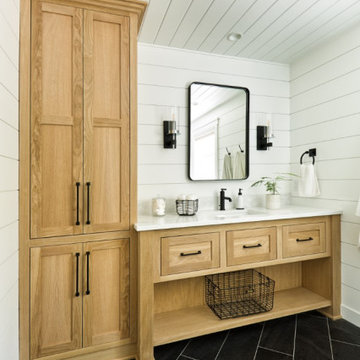
A previous client (Big Wood Lane) reached out to us to help design a remodel of a recently purchased on the south shore of Lake Minnetonka. The home had grown organically since its original construction in 1945. It had evolved over time to accommodate the needs of its numerous owners. Our client brought a new set of needs to the home that included a desire to make the lake home a comfortable destination for family and friends.
The project consisted of reconfiguring an outdated, inefficient kitchen, expansion of the bedroom wing to include individual bathrooms for bedrooms and redesign of the central stair guard rail.
The redesign of the kitchen included repositioning major appliances for greater efficiency, more seating at an enlarged island, a new pantry, and expanded views to the lake. The expansion of the bedroom wing included eliminating a three-season porch on top of the garage on the inland side of the home. The space above the garage roof was enclosed and turned into dedicated bathrooms for each bedroom. These bathrooms are accessible only from the bathrooms which provide privacy and convenience to visitors.
 LBK Design Build
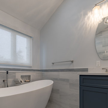
This Primary Suite renovation was designed to enhance both functionality and aesthetics, creating a luxurious yet practical retreat. The original floor plan presented several challenges, including inefficient space utilization, lack of storage, and outdated design elements that no longer met the homeowner’s needs. To address these concerns, the new layout was carefully planned to improve flow, maximize storage, and incorporate modern conveniences while maintaining a timeless appeal.
 Walczak Design And Build
What once felt dark, segmented, and inefficient is now a bright, connected, and highly functional first floor designed for real family living.
Our clients, Terry and Lou, came to us with a home that simply wasn’t keeping up with their growing family. The kitchen was cramped, with tight working lanes and limited light. The laundry room doubled as a powder room—yet functioned poorly as both. Sightlines between spaces were cut off, making it difficult to stay connected to their young children throughout the day. Across the board, the home felt dated and disconnected.
Through thoughtful planning and strategic structural changes, we reimagined the entire first floor to better support how this family truly lives.
We began by redefining the entry experience—creating a true foyer complete with a dedicated drop zone and custom cubby storage. This space now acts as a natural landing point, bringing order and intention to everyday comings and goings.
Adjacent to the new entry, we relocated and redesigned the laundry room. Now positioned exactly where it needs to be, it functions as a hardworking utility space with countertops for folding, a utility sink for immediate stain treatment, and the ability to be closed off—keeping daily life contained when needed.
Separating the previous shared function allowed us to carve out a distinct, personality-filled powder room. Wrapped in a bold wave-patterned wallpaper and grounded by a custom reeded oak vanity with warm brass accents, this space delivers a moment of delight and individuality within the home.
The kitchen transformation is where the impact is felt most deeply.
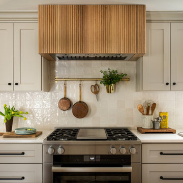
What was once a dark, restrictive layout has been opened into a spacious, highly efficient U-shaped kitchen with generous clearances and an oversized island for gathering. A thoughtful mix of painted cabinetry and rift white oak introduces warmth and balance, while the custom reeded hood becomes a sculptural focal point. Open shelving, integrated pantry storage, and layered lighting ensure the space is as functional as it is beautiful.
Beyond aesthetics, the redesign prioritizes flow—both in movement and in connection. Sightlines between the kitchen, dining, and living areas were intentionally opened, allowing for ease of interaction and visibility throughout the main living spaces.
To unify the home, existing hardwood floors were refinished and extended, creating continuity and a seamless visual experience from one space to the next.
The result is a home that feels lighter, more open, and deeply aligned with how this family lives day to day—designed not just to look beautiful, but to support everything from busy mornings to slow, shared evenings.
Find the right local pro for your project
 Custom Fireplace and Chimney Care
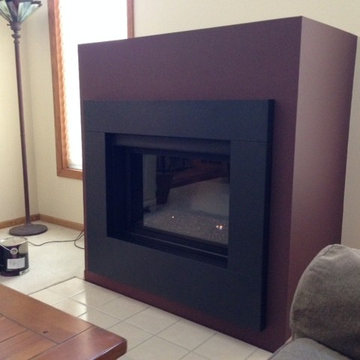
We installed this Regency HZ33 contemporary gas fireplace with glass surround. We removed an old inefficient gas fireplace. We redid the drywall and added new paint.
Picture by Joe C. Spoden Sr.
 Sharon Miyano Interior Design Studio
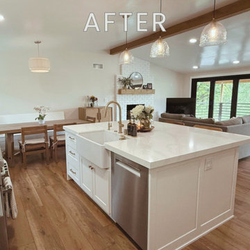
 The original kitchen was dark, inefficient, and disconnected from the way this family wanted to live. Through a complete redesign of the home's floor plan, the space was transformed into an open, light-filled, farmhouse kitchen designed for gathering and connection.
Every decision- from the new layout to the custom breakfast nook- was made with functionality, comfort, and family life in mind.
 Alair Homes Plano
This project is a Houzz Kitchen of the Week! Click below to read the full story!
https://www.houzz.com/ideabooks/116547325/list/kitchen-of-the-week-better-brighter-and-no-longer-basic
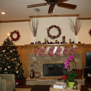
Our clients came to us wanting an elegant and functional kitchen and brighter living room. Their kitchen was dark and inefficient. The cabinets felt cluttered and the storage was there, but not functional for this family. They wanted all new finishes; especially new cabinets, but the floors were going to stay and be refinished. No wall relocation was needed but adding a door into the dining room to block the view from the front into the kitchen was discussed. They wanted to bring in more light somehow and preferably natural light. There was an unused sink in the butler’s pantry that they wanted capped, giving them more space and organized storage was a must! In their living room, they love their fireplace because it reminds her of her home in Colorado, so that definitely had to stay but everything else was left to the designers.
After all decisions were made, this gorgeous kitchen and living space came to life! It is bright, open and airy, just like our clients wanted. Soft White Shiloh cabinetry was installed with a contrasting Cocoa island. Honed Levantina Taj Mahal quartzite was a beautiful countertop for this space. Bedrosians Grace 4”x 12” wall tile in Panna was the backsplash throughout the kitchen. The stove wall is flanked with dark wooden shelves on either side of vent-a-hood creating a feature area to the cook area. A beautiful maple barn door with seeded baroque tempered glass inserts was installed to close off the pantry and giving them more room than a traditional door. The original wainscoting remained in the kitchen and living areas but was modified in the kitchen where the cabinets were slightly extended and painted white throughout. LED tape lighting was installed under the cabinets, LED lighting was also added to the top of the upper glass cabinets, in addition to the grow lights installed for their herbs. All of the light fixtures were updated to a timeless classic look and feel. Imbrie articulating wall sconces were installed over the kitchen window/sink and in the butler’s pantry and aged brass Hood classic globe pendants were hung over the island, really drawing your attention to the kitchen. The Alturas fixture from SeaGull Lighing now hangs in the center of the living room, where there was once an outdated ceiling fan. In the living room, the walls were painted white, while leaving the wood and stone fireplace, as requested, leaving an absolutely amazing contrast!
Design/Remodel by Hatfield Builders & Remodelers | Photography by Versatile Imaging

 Green Springs Landscape
To protect your yard, plants and trees from inefficient watering and drought, the irrigation system helps control the amount of water they actually need.
Depending on the plant, season, area and terrain the settings could vary.
Contact us at (800) 674-6191, email us at info@gslandscape.net or text us through any of our social networks.
We can evaluate your terrain and determine what is the best distribution. If you already have Sprinklers we can also provide maintenance, repair or upgrade.
 Creative Cabinets and Fine Finishes, LLC
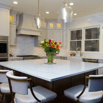
The clients embarked on this remodel with a primary goal: to brighten the kitchen and create a dynamic space for entertaining. The original kitchen was characterized by inefficient circulation, dim lighting, and an underutilized expansive floor plan. Our design strategy focused on incorporating organic design elements and refined finishes to enhance the space's brightness, spaciousness, and vibrancy.
 ALL Renovation & Design LLC
Mrs. Deighan loved to cook, but hated her kitchen.
It was nonfunctional, inefficient, and an eyesore.
The sink was in the corner under low cabinets. The awkwardly placed fridge made it impractical for the entire family to be working together.
And that was a big deal.
She wanted a beautiful place to cook and entertain.
Besides the cramped space, the old, brown plywood cabinets were falling apart.
Because the cabinets were low, under-cabinet lighting was useless.
The kitchen was dark.
The previous owners had updated the flooring, but only by putting uglier tiles over the old vinyl.
And the ceiling had a leak stain.
It was time for a big change.
The Deighan's called Amos from ALL Renovation & Design.
Amos’s many successful remodeling projects done for them over the years had forged a friendship that made him the obvious contractor of choice.
Amos sat down with them and asked them to make a dream kitchen list.
If budget were of no concern, what would the space look like?
Once the Deighan's had their list, Amos helped them to evaluate each investment, taking into consideration the age and value of the home.
Then Amos presented a plan that fit perfectly in the Deighan's budget.
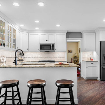
The basic U-shaped kitchen layout stayed the same.
Modern, creamy white custom cabinets replaced the dark plywood cabinets.
The fridge moved to make space for more cabinets.
The biggest challenge was moving the laundry room wall a few feet.
Moving it was necessary to add more space, but, since the wall was load-bearing, moving it required extra attention.
It was worth it.
Extra space allowed the counter to extend and the sink to move.
After the hard work ended, the reason for the transformation became reality.
Now “we can have the whole family in there comfortably and working together,” Mrs. Deighan said.
She loves her kitchen.
Especially the windowed cabinets that show off her fiestaware.
And when you see the beautiful St. Cecilia granite countertops, with Milstone Sari porcelain mosaic tile backsplash, maple flat-panel cabinets with under-cabinet lighting, and all new appliances including a double oven, you will see why she does.
 felipe_reyna
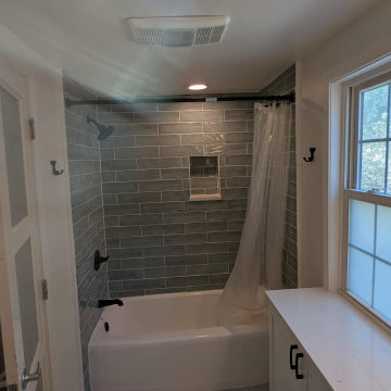
This bathroom remodel focused on improving both layout and functionality.
The original layout had the toilet positioned directly in front of the sink, making the space feel cramped and inefficient. We relocated the toilet to create a better flow and more practical use of space.
Scope of work included:
• Toilet relocation
• Bathtub refinishing
• All new drywall
• New vanity and cabinetry
• New tile throughout
• Plumbing modifications
By redesigning the layout and updating all finishes, the bathroom now feels open, modern, and significantly more functional.
Restoration Remodel specializes in bathroom remodeling and layout redesign in Kansas City.
 Stuart Kitchens Inc.
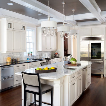
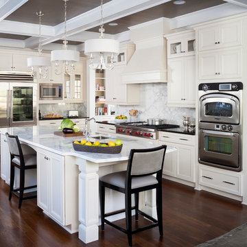
Although large and spacious the original kitchen did not meet the client's needs. The appliances were old and inefficient and the cabinets did not reflect the style of the home. The goal was to design the kitchen for more than one cook and include high-end appliances and stylish cabinetry and finishes. The new design allows for food preparation, cooking and storage areas. The professional style refrigerator allows access from both sides of the island. The microwave oven is beside the refrigerator for quick re-heats while the professional oven at the other end cooks food at remarkable speed. The range top becomes the command center. Plenty of space was allocated at the window at the end of the kitchen for a large table and chairs that overlook a beautiful backyard. A wet bar was located at the opposite end just outside the kitchen along with a walk-in pantry for additional storage. The kitchen is now completed in a traditional style with simple, but elegant, white painted cabinetry. White marble counter tops and back splashes are highlighted by elegant pendant lights above the island. Finally, this beautiful room is dramatized by a black coffered ceiling accented by lighting above the crown molding.
 TVL Creative Ltd.
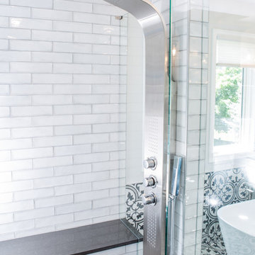
This project is an incredible transformation and the perfect example of successful style mixing! This client, and now a good friend of TVL (as they all become), is a wonderfully eclectic and adventurous one with immense interest in texture play, pops of color, and unique applications. Our scope in this home included a full kitchen renovation, main level powder room renovation, and a master bathroom overhaul. Taking just over a year to complete from the first design phases to final photos, this project was so insanely fun and packs an amazing amount of fun details and lively surprises. The original kitchen was large and fairly functional. However, the cabinetry was dated, the lighting was inefficient and frankly ugly, and the space was lacking personality in general. Our client desired maximized storage and a more personalized aesthetic. The existing cabinets were short and left the nice height of the space under-utilized. We integrated new gray shaker cabinets from Waypoint Living Spaces and ran them to the ceiling to really exaggerate the height of the space and to maximize usable storage as much as possible. The upper cabinets are glass and lit from within, offering display space or functional storage as the client needs. The central feature of this space is the large cobalt blue range from Viking as well as the custom made reclaimed wood range hood floating above. The backsplash along this entire wall is vertical slab of marble look quartz from Pental Surfaces. This matches the expanse of the same countertop that wraps the room. Flanking the range, we installed cobalt blue lantern penny tile from Merola Tile for a playful texture that adds visual interest and class to the entire room. We upgraded the lighting in the ceiling, under the cabinets, and within cabinets--we also installed accent sconces over each window on the sink wall to create cozy and functional illumination. The deep, textured front Whitehaven apron sink is a dramatic nod to the farmhouse aesthetic from KOHLER, and it's paired with the bold and industrial inspired Tournant faucet, also from Kohler. We finalized this space with other gorgeous appliances, a super sexy dining table and chair set from Room & Board, the Paxton dining light from Pottery Barn and a small bar area and pantry on the far end of the space. In the small powder room on the main level, we converted a drab builder-grade space into a super cute, rustic-inspired washroom. We utilized the Bonner vanity from Signature Hardware and paired this with the cute Ashfield faucet from Pfister. The most unique statements in this room include the water-drop light over the vanity from Shades Of Light, the copper-look porcelain floor tile from Pental Surfaces and the gorgeous Cashmere colored Tresham toilet from Kohler. Up in the master bathroom, elegance abounds. Using the same footprint, we upgraded everything in this space to reflect the client's desire for a more bright, patterned and pretty space. Starting at the entry, we installed a custom reclaimed plank barn door with bold large format hardware from Rustica Hardware. In the bathroom, the custom slate blue vanity from Tharp Cabinet Company is an eye catching statement piece. This is paired with gorgeous hardware from Amerock, vessel sinks from Kohler, and Purist faucets also from Kohler. We replaced the old built-in bathtub with a new freestanding soaker from Signature Hardware. The floor tile is a bold, graphic porcelain tile with a classic color scheme. The shower was upgraded with new tile and fixtures throughout: new clear glass, gorgeous distressed subway tile from the Castle line from TileBar, and a sophisticated shower panel from Vigo. We finalized the space with a small crystal chandelier and soft gray paint. This project is a stunning conversion and we are so thrilled that our client can enjoy these personalized spaces for years to come. Special thanks to the amazing Ian Burks of Burks Wurks Construction for bringing this to life!
 Synergy Design & Construction
Before: The original cabinet drawers were limited in both design and function. Storage was inefficient, leaving everyday items cluttered and difficult to access.
 Stuart Kitchens Inc.
Although large and spacious the original kitchen did not meet the client's needs. The appliances were old and inefficient and the cabinets did not reflect the style of the home. The goal was to design the kitchen for more than one cook and include high-end appliances and stylish cabinetry and finishes. The new design allows for food preparation, cooking and storage areas. The professional style refrigerator allows access from both sides of the island. The microwave oven is beside the refrigerator for quick re-heats while the professional oven at the other end cooks food at remarkable speed. The range top becomes the command center. Plenty of space was allocated at the window at the end of the kitchen for a large table and chairs that overlook a beautiful backyard. A wet bar was located at the opposite end just outside the kitchen along with a walk-in pantry for additional storage. The kitchen is now completed in a traditional style with simple, but elegant, white painted cabinetry. White marble counter tops and back splashes are highlighted by elegant pendant lights above the island. Finally, this beautiful room is dramatized by a black coffered ceiling accented by lighting above the crown molding.
Stacey Zarin Goldberg Photography
 Nova Remodeling Inc
This breathtaking kitchen remodel in Lakewood, WA transformed a dated, traditional space into a modern, high-end kitchen with stylish finishes and improved functionality.
Before:
Outdated oak cabinets with decorative trim.
Cluttered layout with inefficient storage.
Dark countertops and an old backsplash.
Basic lighting with minimal ambiance.
Limited workspace and outdated appliances.
The Remodel Process:
? Full kitchen demolition to create an open, functional layout.
? Custom two-tone cabinetry for a bold and modern contrast.
? Luxury finishes to bring elegance and durability.
? New high-end appliances, lighting, and fixtures to complete the transformation.
After – A Stunning Kitchen Makeover
✨ Elegant Two-Tone Cabinetry:
Upper cabinets: White shaker style for a bright, airy feel.
Lower cabinets & island: Bold black for a striking contrast.
Gold hardware for a touch of luxury.
✨ Upgraded Countertops & Backsplash:
White quartz countertops with subtle veining for a modern, high-end look.
Light subway tile backsplash to enhance brightness and depth.
✨ Improved Lighting & Fixtures:
Modern pendant lights over the island for style and ambiance.
Under-cabinet lighting & recessed lights for a well-lit workspace.
Gold pull-down faucet & deep sink for both function and aesthetics.
✨ High-End Appliances & Features:
Stainless steel refrigerator, oven, and range hood for a sleek, upgraded look.
Soft-close drawers & deep storage cabinets for optimal organization.
Spacious kitchen island for meal prep, entertaining, and extra storage.
The Final Result:
A timeless, elegant kitchen that blends functionality with modern sophistication. This remodel demonstrates expert craftsmanship, high-end finishes, and smart design, making it the perfect space for cooking, entertaining, and gathering.
? Location: Lakewood, WA
? Thinking of remodeling your kitchen? Contact Nova Remodeling Inc. today!
 Home Makeover AZ
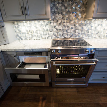
This Kitchen was inefficient before. The island was big and bulky, and created a huge traffic jam before.
By removing a big window where the refrigerator was, and adding a new access to the backyard, this kitchen completely opened up!
Paint color - Woodrow Wilson Putty - Valspar
Floors: Engineered hardwood
Backsplash: Gris Et Blanc Baroque - Dal Tile
Antique Mirror Panes: Mystic Antique Mirror Finish
Sink: Whitehaven Undermount Farmhouse Apron-Front Cast Iron 33 in. Single Basin Kitchen Sink in Thunder Grey
Faucet: Kohler Artifacts single-handle bar sink faucet with 13-1/16" swing spout
 Zola European Windows
This Boulder, Colorado remodel by fuentesdesign demonstrates the possibility of renewal in American suburbs, and Passive House design principles. Once an inefficient single story 1,000 square-foot ranch house with a forced air furnace, has been transformed into a two-story, solar powered 2500 square-foot three bedroom home ready for the next generation.
The new design for the home is modern with a sustainable theme, incorporating a palette of natural materials including; reclaimed wood finishes, FSC-certified pine Zola windows and doors, and natural earth and lime plasters that soften the interior and crisp contemporary exterior with a flavor of the west. A Ninety-percent efficient energy recovery fresh air ventilation system provides constant filtered fresh air to every room. The existing interior brick was removed and replaced with insulation. The remaining heating and cooling loads are easily met with the highest degree of comfort via a mini-split heat pump, the peak heat load has been cut by a factor of 4, despite the house doubling in size. During the coldest part of the Colorado winter, a wood stove for ambiance and low carbon back up heat creates a special place in both the living and kitchen area, and upstairs loft.
This ultra energy efficient home relies on extremely high levels of insulation, air-tight detailing and construction, and the implementation of high performance, custom made European windows and doors by Zola Windows. Zola’s ThermoPlus Clad line, which boasts R-11 triple glazing and is thermally broken with a layer of patented German Purenit®, was selected for the project. These windows also provide a seamless indoor/outdoor connection, with 9′ wide folding doors from the dining area and a matching 9′ wide custom countertop folding window that opens the kitchen up to a grassy court where mature trees provide shade and extend the living space during the summer months.
With air-tight construction, this home meets the Passive House Retrofit (EnerPHit) air-tightness standard of
 National Association of the Remodeling Industry
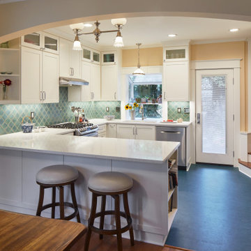
This home, built in 1902, has beautiful craftsmanship but the original kitchen was small, inefficient and disconnected from the rest of the home. Removing a wall between the kitchen and dining room, and eliminating the basement access from the kitchen space helped meet one of the key requirements for the clients, which was to be able to entertain friends and family. The new beam was concealed with an arch that mimics an existing arch in this home. Unique items such as the light fixture were repurposed in the new design as well.
 Corinthian Fine Homes
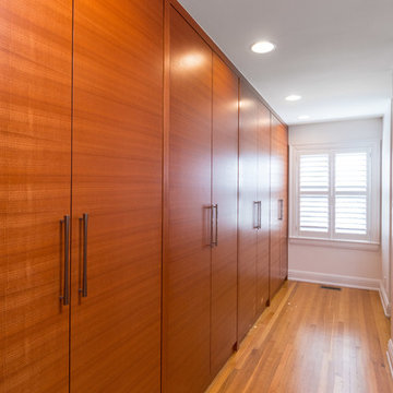
Our homeowner had worked with us in the past and asked us to design and renovate their 1980’s style master bathroom and closet into a modern oasis with a more functional layout. The original layout was chopped up and an inefficient use of space. Keeping the windows where they were, we simply swapped the vanity and the tub, and created an enclosed stool room. The shower was redesigned utilizing a gorgeous tile accent wall which was also utilized on the tub wall of the bathroom. A beautiful free-standing tub with modern tub filler were used to modernize the space and added a stunning focal point in the room. Two custom tall medicine cabinets were built to match the vanity and the closet cabinets for additional storage in the space with glass doors. The closet space was designed to match the bathroom cabinetry and provide closed storage without feeling narrow or enclosed. The outcome is a striking modern master suite that is not only functional but captures our homeowners’ great style.
 Above And Beyond Builders
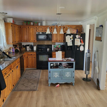
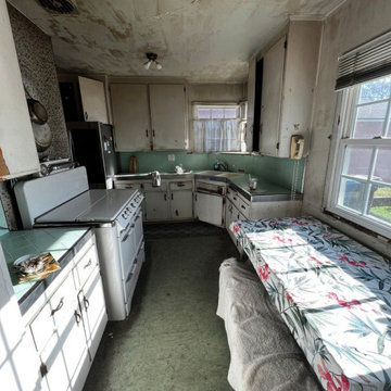
The original kitchen featured aging cabinets, outdated finishes, limited storage, and an inefficient layout. This is one of two before photos documenting the complete transformation.
53