
Search results for "Inefficient" in Home Design Ideas
 BMR BelMax Remodeling
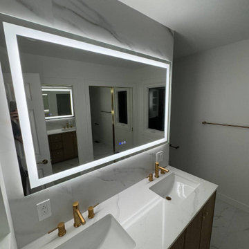
Master Bathroom Remodeling in Ambler, PA – A Complete Transformation by BMR Belmax Remodeling
At BMR Belmax Remodeling, we specialize in creating beautiful, functional, and luxurious bathroom spaces tailored to our clients’ needs. One of our most recent projects involved a master bathroom remodeling in Ambler, PA, where we completely reimagined the layout to maximize space, improve functionality, and enhance aesthetics. The result was a modern, spacious, and inviting master bathroom that perfectly suited the homeowner’s vision.
The Challenge: An Outdated and Divided Bathroom
The original master bathroom in Ambler, PA was divided into two separate rooms. One area housed a vanity and closet, while the other contained the shower and toilet. While functional, this layout felt cramped, disjointed, and inefficient. The homeowners wanted to merge these two spaces into a single, cohesive master bathroom that felt larger, more open, and more luxurious.
They envisioned a modern walk-in shower, enhanced storage, better lighting, and high-end finishes, all while improving the flow and accessibility of the space. Our team at BMR Belmax Remodeling worked closely with them to develop a design that addressed their needs and transformed their bathroom into a modern retreat.
The Transformation: A Unified & Modern Master Bathroom
Our approach to this bathroom renovation in Ambler, PA focused on space optimization, luxury finishes, and functionality. We combined the two separate rooms into one expansive master bathroom, making the space feel more open and elegant.
1. Layout Reconfiguration & Wall Removal
We removed the dividing wall between the shower and vanity area to open up the space and create a more seamless layout.
A new wall was built to expand the shower area, allowing for a larger and more comfortable walk-in shower.
The closet and vanity space were integrated into the main bathroom layout, eliminating the need for a separate entryway and making the space more efficient and accessible.
2. Walk-In Shower with Premium Features
A stunning walk-in shower with sleek glass doors was installed to give the bathroom a modern and luxurious look.
We used large-format tiles on the shower walls and flooring, creating a cohesive, stylish, and low-maintenance surface.
A built-in recessed niche with a custom tile shelf was added for practical storage while maintaining a clean and sophisticated design.
3. Vanity & Storage Enhancements
The old vanity was replaced with a sleek, modern vanity that provided ample storage and counter space.
We incorporated custom-built shelves on the left side of the vanity, offering additional storage without cluttering the design.
A lighted mirror was installed above the vanity, combining style and practicality while enhancing the overall lighting in the space.
4. Elegant Fixtures & Finishes
To add a touch of luxury, we installed gold-finished fixtures, including the showerhead, faucets, and cabinet handles, giving the bathroom a high-end, elegant feel.
A modern one-piece toilet was installed to complement the clean and minimalist design.
The bathroom’s neutral color palette and textured finishes created a calm and inviting atmosphere.
5. Enhanced Ventilation & Lighting
A new exhaust fan was installed to improve air circulation and moisture control, ensuring a comfortable and mold-free environment.
Additional task lighting and ambient lighting were carefully placed to make the bathroom bright, warm, and inviting.
The Result: A Stunning, Spacious, and Functional Master Bathroom
The completed master bathroom remodeling in Ambler, PA is now a spacious, modern retreat that perfectly blends style and functionality. By unifying the previously divided rooms, we created a flowing and open space that feels larger and more inviting. The walk-in shower, gold fixtures, and custom vanity elevate the aesthetics, while the recessed niche, built-in shelves, and enhanced lighting provide practicality and comfort.
The homeowner was thrilled with the transformation, noting how much brighter, more functional, and elegant the space now feels. They particularly loved how the layout reconfiguration made the space more open and efficient, as well as the luxurious finishes that added a high-end touch.
 Legacy Builders Group
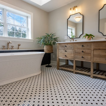
This Wyoming master bath felt confined with an
inefficient layout. Although the existing bathroom
was a good size, an awkwardly placed dividing
wall made it impossible for two people to be in
it at the same time.
Taking down the dividing wall made the room
feel much more open and allowed warm,
natural light to come in. To take advantage of
all that sunshine, an elegant soaking tub was
placed right by the window, along with a unique,
black subway tile and quartz tub ledge. Adding
contrast to the dark tile is a beautiful wood vanity
with ultra-convenient drawer storage. Gold
fi xtures bring warmth and luxury, and add a
perfect fi nishing touch to this spa-like retreat.
 Simmons and Company
French manor styling was the result of the client's love of all things French, down to the chandelier found in a little shop in Paris. The focus on a serious working kitchen required plenty of attention to detail while layering on the opulence. It's really a French pastry.
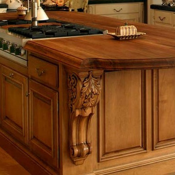
The teak butcher block island top provides a lifetime of food preparation. Not able to find a hood with the right proportions Simmons & Co. designed a custom stainless hood with the correct gentle curve. Authentic French hardware was plated in pewter to soften the hardware's impact. Generous pantry storage and the oven wall replaced an inefficient walk in pantry. A dust bin access to the central vacuum system is tucked into the toe kick under the pantry and an emphasis was placed on the toe kick designs to eliminate the typical awkward appliance toe kick resolutions. Note the paneled dishwasher door to the right and left of the sink. When closed, the dishwasher disappears entirely. For those chilly winter mornings in Lake Sherwood an authentic English coal fire basket adding both beauty and function with the tile selection and color coordination completing the "Interior Hardscape".
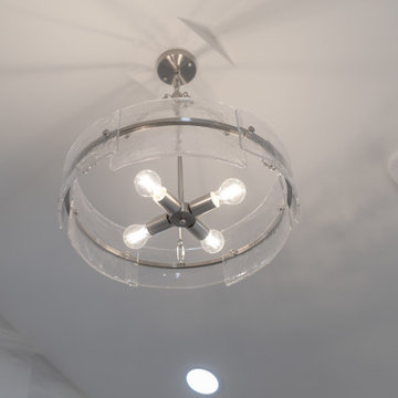
The chandelier is symbolic of the fun we all had working with a client whose shining spirit and creativity guided our goal of "doing the right thing" at each and every a decision. What a creative project should be all about. Oh, yes, the chandelier. Look closely to find old colanders, pie tins, tea cups and parts and pieces from and old working kitchen.
Find the right local pro for your project
 LBK Design Build
This Primary Suite renovation was designed to enhance both functionality and aesthetics, creating a luxurious yet practical retreat. The original floor plan presented several challenges, including inefficient space utilization, lack of storage, and outdated design elements that no longer met the homeowner’s needs. To address these concerns, the new layout was carefully planned to improve flow, maximize storage, and incorporate modern conveniences while maintaining a timeless appeal.
 TVL Creative Ltd.
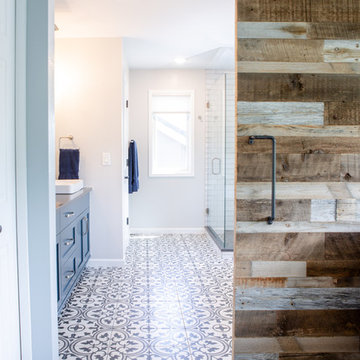
This project is an incredible transformation and the perfect example of successful style mixing! This client, and now a good friend of TVL (as they all become), is a wonderfully eclectic and adventurous one with immense interest in texture play, pops of color, and unique applications. Our scope in this home included a full kitchen renovation, main level powder room renovation, and a master bathroom overhaul. Taking just over a year to complete from the first design phases to final photos, this project was so insanely fun and packs an amazing amount of fun details and lively surprises. The original kitchen was large and fairly functional. However, the cabinetry was dated, the lighting was inefficient and frankly ugly, and the space was lacking personality in general. Our client desired maximized storage and a more personalized aesthetic. The existing cabinets were short and left the nice height of the space under-utilized. We integrated new gray shaker cabinets from Waypoint Living Spaces and ran them to the ceiling to really exaggerate the height of the space and to maximize usable storage as much as possible. The upper cabinets are glass and lit from within, offering display space or functional storage as the client needs. The central feature of this space is the large cobalt blue range from Viking as well as the custom made reclaimed wood range hood floating above. The backsplash along this entire wall is vertical slab of marble look quartz from Pental Surfaces. This matches the expanse of the same countertop that wraps the room. Flanking the range, we installed cobalt blue lantern penny tile from Merola Tile for a playful texture that adds visual interest and class to the entire room. We upgraded the lighting in the ceiling, under the cabinets, and within cabinets--we also installed accent sconces over each window on the sink wall to create cozy and functional illumination. The deep, textured front Whitehaven apron sink is a dramatic nod to the farmhouse aesthetic from KOHLER, and it's paired with the bold and industrial inspired Tournant faucet, also from Kohler. We finalized this space with other gorgeous appliances, a super sexy dining table and chair set from Room & Board, the Paxton dining light from Pottery Barn and a small bar area and pantry on the far end of the space. In the small powder room on the main level, we converted a drab builder-grade space into a super cute, rustic-inspired washroom. We utilized the Bonner vanity from Signature Hardware and paired this with the cute Ashfield faucet from Pfister. The most unique statements in this room include the water-drop light over the vanity from Shades Of Light, the copper-look porcelain floor tile from Pental Surfaces and the gorgeous Cashmere colored Tresham toilet from Kohler. Up in the master bathroom, elegance abounds. Using the same footprint, we upgraded everything in this space to reflect the client's desire for a more bright, patterned and pretty space. Starting at the entry, we installed a custom reclaimed plank barn door with bold large format hardware from Rustica Hardware. In the bathroom, the custom slate blue vanity from Tharp Cabinet Company is an eye catching statement piece. This is paired with gorgeous hardware from Amerock, vessel sinks from Kohler, and Purist faucets also from Kohler. We replaced the old built-in bathtub with a new freestanding soaker from Signature Hardware. The floor tile is a bold, graphic porcelain tile with a classic color scheme. The shower was upgraded with new tile and fixtures throughout: new clear glass, gorgeous distressed subway tile from the Castle line from TileBar, and a sophisticated shower panel from Vigo. We finalized the space with a small crystal chandelier and soft gray paint. This project is a stunning conversion and we are so thrilled that our client can enjoy these personalized spaces for years to come. Special thanks to the amazing Ian Burks of Burks Wurks Construction for bringing this to life!
 Tom Bassett-Dilley Architect, Ltd.
Photography by Natalie Marotta
Bungalows are lovable homes, but how can they be better? Along with many of our clients, we find that older (early 20th c.) homes have a lot of character and a comfortable scale, but are leaky, damp (especially in the basement), have fair to poor air quality, and use unconscionable amounts of fossil fuels to heat. The owners of this bungalow were ready to change that, and wanted to do so with minimal upfront carbon emissions as well.
The gut renovation included replacing the basement slab and providing capillary breaks and insulation continuously below grade. The brick structure was treated with a fluid-applied air and water barrier from the interior and insulated entirely with cellulose, a carbon-storing insulation. The roof used HFO-blown spray foam to provide sufficient insulation while allowing headroom for bedrooms, bathrooms, and laundry.
One great benefit of a full renovation is the possibility of reconfiguring spaces to suit the family’s lifestyle, and to make the best of indoor-outdoor connections. We opened up the main rooms on the first floor, creating a family gathering spot with a view to the back yard, and a spacious kitchen that supports the family’s commitment to cooking for healthy eating. The stair uses a north-facing skylight to bring light from above into the middle of the home, where it was previously dark.
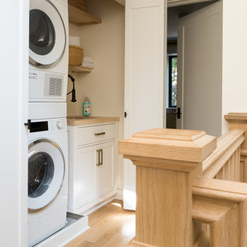
As a decarbonization retrofit, the inefficient furnace was replaced with two small ducted heat pump systems, water heating and clothes drying are powered by air-source heat pumps, and cooking uses an induction cooktop plus electric ovens. Energy recovery ventilation provides filtered fresh air continuous exhaust from the kitchen, baths, and laundry, and supplies fresh, highly filtered air to bedrooms and living spaces.
The Better Bungalow now makes sense for the 21st century–it now fits the owners’ life-patterns, is super comfortable, has great air quality, and uses a fraction of the energy it did before, greatly lowering the demand on the utility grid. In the near future, when solar PV is installed, it can achieve net zero or near net zero emissions, and with battery backup, can provide great resilience in the event of power outages.
 Synergy Design & Construction
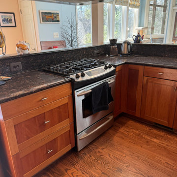
Before: A previous renovation had left an unsightly support column and outdated U-shaped island which created an inefficient layout that made both prep and entertaining a challenge. The range and prep sink were confined to this space, and a kitchen cart housed the microwave and cutlery, further cluttering the area.
 Ryann Reed Design Build
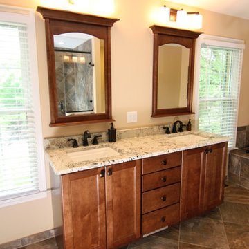
We transformed an inefficient walk-in closet/bathroom into a luxury master bathroom. The walk-in closet was relocated to another area. Our customers were looking for an open concept bathroom with lots of natural light but with some privacy. This beautiful master bathroom has a custom walk in shower with half walls for privacy. It also creates a nice hidden space for the toilet. Photographer: Ilona Kalimov
 Stuart Kitchens Inc.
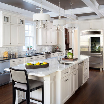
Although large and spacious the original kitchen did not meet the client's needs. The appliances were old and inefficient and the cabinets did not reflect the style of the home. The goal was to design the kitchen for more than one cook and include high-end appliances and stylish cabinetry and finishes. The new design allows for food preparation, cooking and storage areas. The professional style refrigerator allows access from both sides of the island. The microwave oven is beside the refrigerator for quick re-heats while the professional oven at the other end cooks food at remarkable speed. The range top becomes the command center. Plenty of space was allocated at the window at the end of the kitchen for a large table and chairs that overlook a beautiful backyard. A wet bar was located at the opposite end just outside the kitchen along with a walk-in pantry for additional storage. The kitchen is now completed in a traditional style with simple, but elegant, white painted cabinetry. White marble counter tops and back splashes are highlighted by elegant pendant lights above the island. Finally, this beautiful room is dramatized by a black coffered ceiling accented by lighting above the crown molding.
 Kay Cosby Interiors
Historic homes are a hidden gem, and when this client approached me about remodeling her family home in one of the oldest neighborhoods in Dallas I
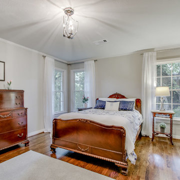
knew we had a diamond in the rough. Under many layers of vinyl tile and plywood, the kitchen floors revealed pristine hardwoods waiting to be brought to life. An inefficient vintage kitchen had begun to break down and cramp the client's style and productivity. Mullioned windows obstructed the client's view
and hindered her from connecting with nature. The detail elements such as soft arches transitioning from room to room were lost in a sea of white. This beloved home had become something it wasn't meant to be. Our goal was to help it welcome friends and family with open arms and provide a casual atmosphere in which to love, laugh and relax. We needed to transform it all; floors, walls, kitchen and bedrooms. We left no stone unturned until we had the perfect collaboration of traditional family heirlooms mixed in with a modern palette. New brown stained floors, grey European style cabinets, white quartz counters, textured backsplash tile, mullion free vinyl windows and an open floorplan modernized this kitchen while staying true to its natural roots. Neutral gray walls collaborate with dark accents in the arches to define their detail. Reupholstering the furniture in patterned fabrics updated each room to span the spectrum of traditional to modern. The curated collection of family antiques finished in new hues and newly acquired pieces create a space unique to and adored by this client. Photos by Zack Lewis of Showcase Photographers
 Better Builders
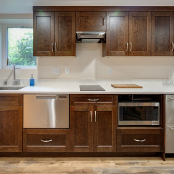
These homeowners approached us with a partially finished basement lacking a bathroom and an inefficient laundry area. One of the homeowners used the unconditioned, cold, and damp space as a home office, making it uncomfortable and impractical.
The goal was to create a fully functional and versatile living space by adding a full bathroom, a kitchenette, and a concealed laundry area. The space needed to be designed to serve the family’s daily needs, including accommodating their teenage son and functioning as potential rental income in the future.
Now considered an ADU (Accessory Dwelling Unit), the remodeled basement features a private entrance, bathroom, kitchenette, and bedroom, offering comfort, flexibility, and long-term value for the homeowners.
 Design Matters
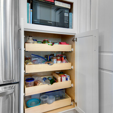
Combination White and Green Traditional Cabinetry with recessed panel and five piece drawer heads, Fireclay glazed ceramic tile back splash, and flamed black granite counters
 Synergy Design & Construction
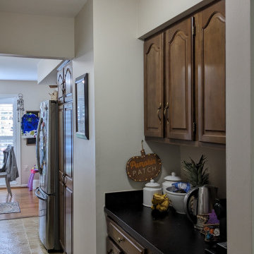
Before:The butler's pantry struggled with both form and function. Limited storage forced appliances and essentials to spill onto countertops, creating clutter and making the space feel cramped. The brown shaker-style cabinets, paired with outdated brassy hardware, lacked character and offered little in the way of organization or capacity. The homeowners dreamed of a space that was not only visually appealing but also highly functional, with enough storage to accommodate their growing needs. However, the simplistic design of the existing cabinetry fell short, leaving them frustrated with its inefficiency.
 TVL Creative Ltd.
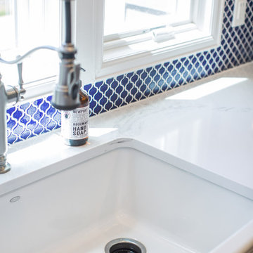
This project is an incredible transformation and the perfect example of successful style mixing! This client, and now a good friend of TVL (as they all become), is a wonderfully eclectic and adventurous one with immense interest in texture play, pops of color, and unique applications. Our scope in this home included a full kitchen renovation, main level powder room renovation, and a master bathroom overhaul. Taking just over a year to complete from the first design phases to final photos, this project was so insanely fun and packs an amazing amount of fun details and lively surprises. The original kitchen was large and fairly functional. However, the cabinetry was dated, the lighting was inefficient and frankly ugly, and the space was lacking personality in general. Our client desired maximized storage and a more personalized aesthetic. The existing cabinets were short and left the nice height of the space under-utilized. We integrated new gray shaker cabinets from Waypoint Living Spaces and ran them to the ceiling to really exaggerate the height of the space and to maximize usable storage as much as possible. The upper cabinets are glass and lit from within, offering display space or functional storage as the client needs. The central feature of this space is the large cobalt blue range from Viking as well as the custom made reclaimed wood range hood floating above. The backsplash along this entire wall is vertical slab of marble look quartz from Pental Surfaces. This matches the expanse of the same countertop that wraps the room. Flanking the range, we installed cobalt blue lantern penny tile from Merola Tile for a playful texture that adds visual interest and class to the entire room. We upgraded the lighting in the ceiling, under the cabinets, and within cabinets--we also installed accent sconces over each window on the sink wall to create cozy and functional illumination. The deep, textured front Whitehaven apron sink is a dramatic nod to the farmhouse aesthetic from KOHLER, and it's paired with the bold and industrial inspired Tournant faucet, also from Kohler. We finalized this space with other gorgeous appliances, a super sexy dining table and chair set from Room & Board, the Paxton dining light from Pottery Barn and a small bar area and pantry on the far end of the space. In the small powder room on the main level, we converted a drab builder-grade space into a super cute, rustic-inspired washroom. We utilized the Bonner vanity from Signature Hardware and paired this with the cute Ashfield faucet from Pfister. The most unique statements in this room include the water-drop light over the vanity from Shades Of Light, the copper-look porcelain floor tile from Pental Surfaces and the gorgeous Cashmere colored Tresham toilet from Kohler. Up in the master bathroom, elegance abounds. Using the same footprint, we upgraded everything in this space to reflect the client's desire for a more bright, patterned and pretty space. Starting at the entry, we installed a custom reclaimed plank barn door with bold large format hardware from Rustica Hardware. In the bathroom, the custom slate blue vanity from Tharp Cabinet Company is an eye catching statement piece. This is paired with gorgeous hardware from Amerock, vessel sinks from Kohler, and Purist faucets also from Kohler. We replaced the old built-in bathtub with a new freestanding soaker from Signature Hardware. The floor tile is a bold, graphic porcelain tile with a classic color scheme. The shower was upgraded with new tile and fixtures throughout: new clear glass, gorgeous distressed subway tile from the Castle line from TileBar, and a sophisticated shower panel from Vigo. We finalized the space with a small crystal chandelier and soft gray paint. This project is a stunning conversion and we are so thrilled that our client can enjoy these personalized spaces for years to come.
 ALL Renovation & Design LLC
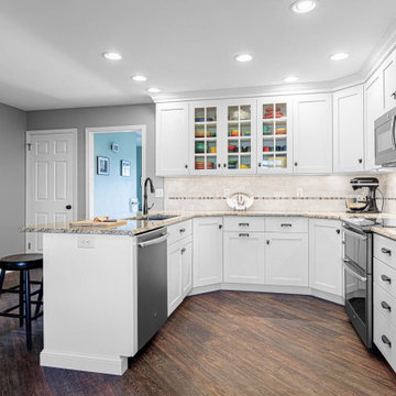
Mrs. Deighan loved to cook, but hated her kitchen.
It was nonfunctional, inefficient, and an eyesore.
The sink was in the corner under low cabinets. The awkwardly placed fridge made it impractical for the entire family to be working together.
And that was a big deal.
She wanted a beautiful place to cook and entertain.
Besides the cramped space, the old, brown plywood cabinets were falling apart.
Because the cabinets were low, under-cabinet lighting was useless.
The kitchen was dark.
The previous owners had updated the flooring, but only by putting uglier tiles over the old vinyl.
And the ceiling had a leak stain.
It was time for a big change.
The Deighan's called Amos from ALL Renovation & Design.
Amos’s many successful remodeling projects done for them over the years had forged a friendship that made him the obvious contractor of choice.
Amos sat down with them and asked them to make a dream kitchen list.
If budget were of no concern, what would the space look like?
Once the Deighan's had their list, Amos helped them to evaluate each investment, taking into consideration the age and value of the home.
Then Amos presented a plan that fit perfectly in the Deighan's budget.
The basic U-shaped kitchen layout stayed the same.
Modern, creamy white custom cabinets replaced the dark plywood cabinets.
The fridge moved to make space for more cabinets.
The biggest challenge was moving the laundry room wall a few feet.
Moving it was necessary to add more space, but, since the wall was load-bearing, moving it required extra attention.
It was worth it.
Extra space allowed the counter to extend and the sink to move.
After the hard work ended, the reason for the transformation became reality.
Now “we can have the whole family in there comfortably and working together,” Mrs. Deighan said.
She loves her kitchen.
Especially the windowed cabinets that show off her fiestaware.
And when you see the beautiful St. Cecilia granite countertops, with Milstone Sari porcelain mosaic tile backsplash, maple flat-panel cabinets with under-cabinet lighting, and all new appliances including a double oven, you will see why she does.
 Corinthian Fine Homes
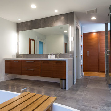
Our homeowner had worked with us in the past and asked us to design and renovate their 1980’s style master bathroom and closet into a modern oasis with a more functional layout. The original layout was chopped up and an inefficient use of space. Keeping the windows where they were, we simply swapped the vanity and the tub, and created an enclosed stool room. The shower was redesigned utilizing a gorgeous tile accent wall which was also utilized on the tub wall of the bathroom. A beautiful free-standing tub with modern tub filler were used to modernize the space and added a stunning focal point in the room. Two custom tall medicine cabinets were built to match the vanity and the closet cabinets for additional storage in the space with glass doors. The closet space was designed to match the bathroom cabinetry and provide closed storage without feeling narrow or enclosed. The outcome is a striking modern master suite that is not only functional but captures our homeowners’ great style.
 Legacy Builders Group
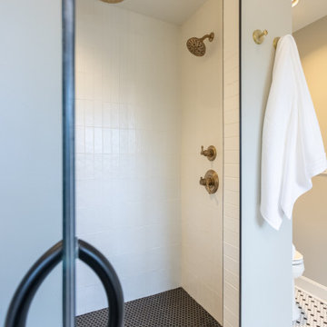
This Wyoming master bath felt confined with an
inefficient layout. Although the existing bathroom
was a good size, an awkwardly placed dividing
wall made it impossible for two people to be in
it at the same time.
Taking down the dividing wall made the room
feel much more open and allowed warm,
natural light to come in. To take advantage of
all that sunshine, an elegant soaking tub was
placed right by the window, along with a unique,
black subway tile and quartz tub ledge. Adding
contrast to the dark tile is a beautiful wood vanity
with ultra-convenient drawer storage. Gold
fi xtures bring warmth and luxury, and add a
perfect fi nishing touch to this spa-like retreat.
 Zola European Windows
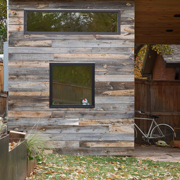
This Boulder, Colorado remodel by fuentesdesign demonstrates the possibility of renewal in American suburbs, and Passive House design principles. Once an inefficient single story 1,000 square-foot ranch house with a forced air furnace, has been transformed into a two-story, solar powered 2500 square-foot three bedroom home ready for the next generation.
The new design for the home is modern with a sustainable theme, incorporating a palette of natural materials including; reclaimed wood finishes, FSC-certified pine Zola windows and doors, and natural earth and lime plasters that soften the interior and crisp contemporary exterior with a flavor of the west. A Ninety-percent efficient energy recovery fresh air ventilation system provides constant filtered fresh air to every room. The existing interior brick was removed and replaced with insulation. The remaining heating and cooling loads are easily met with the highest degree of comfort via a mini-split heat pump, the peak heat load has been cut by a factor of 4, despite the house doubling in size. During the coldest part of the Colorado winter, a wood stove for ambiance and low carbon back up heat creates a special place in both the living and kitchen area, and upstairs loft.
This ultra energy efficient home relies on extremely high levels of insulation, air-tight detailing and construction, and the implementation of high performance, custom made European windows and doors by Zola Windows. Zola’s ThermoPlus Clad line, which boasts R-11 triple glazing and is thermally broken with a layer of patented German Purenit®, was selected for the project. These windows also provide a seamless indoor/outdoor connection, with 9′ wide folding doors from the dining area and a matching 9′ wide custom countertop folding window that opens the kitchen up to a grassy court where mature trees provide shade and extend the living space during the summer months.
With air-tight construction, this home meets the Passive House Retrofit (EnerPHit) air-tightness standard of
 Myers Constructs, Inc.
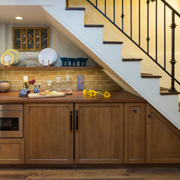
We recently took on an exciting whole-home renovation for this lovely historic Trinity in Center City Philadelphia. Originally built in the mid-1800s, the house footprint is just over 17’ x 13’. As is typical of this type of 3-story house, the kitchen is located in the basement, making this house four floors of occupied space with overall square footage totaling just under 900 square feet.
The homeowner felt the former kitchen was cramped, dimly lit, and inefficiently designed, and she was in search of help in bringing her artistic vision for the space to life, blending both old and new elements through an exciting mix of textures and character. High on her priority list was integrating her wonderful collection of objects gathered from her travels around the world.
We brought our design skills and construction experience to the team, working with the homeowner and the designer to develop a host of creative solutions, including the installation of an Indonesian screen as a sliding door covering a newly reconfigured utility area, which includes a new on-demand hot water heater, mounted next to a new electrical panel with ample room for service and access.
Other Noteworthy Features and Solutions
New crisp drywall blended with original masonry wall textures and original exposed beams
Custom-glazed adler wood cabinets, beautiful fusion Quartzite and custom cherry counters, and a copper sink were selected for a wonderful interplay of colors, textures, and Old World feel
Small-space efficiencies designed for real-size humans, including built-ins wherever possible, limited free-standing furniture, and no upper cabinets
Built-in storage and appliances under the counter (refrigerator, freezer, washer, dryer, and microwave drawer)
Additional multi-function storage under stairs
Extensive lighting plan with multiple sources and types of light to make this partially below-grade space feel bright and cheery
Enlarged window well to bring much more light into the space
Insulation added to create sound buffer from the floor above
 Kay Cosby Interiors
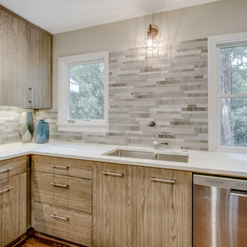
Historic homes are a hidden gem, and when this client approached me about remodeling her family home in one of the oldest neighborhoods in Dallas I
knew we had a diamond in the rough. Under many layers of vinyl tile and plywood, the kitchen floors revealed pristine hardwoods waiting to be brought to life. An inefficient vintage kitchen had begun to break down and cramp the client's style and productivity. Mullioned windows obstructed the client's view
and hindered her from connecting with nature. The detail elements such as soft arches transitioning from room to room were lost in a sea of white. This beloved home had become something it wasn't meant to be. Our goal was to help it welcome friends and family with open arms and provide a casual atmosphere in which to love, laugh and relax. We needed to transform it all; floors, walls, kitchen and bedrooms. We left no stone unturned until we had the perfect collaboration of traditional family heirlooms mixed in with a modern palette. New brown stained floors, grey European style cabinets, white quartz counters, textured backsplash tile, mullion free vinyl windows and an open floorplan modernized this kitchen while staying true to its natural roots. Neutral gray walls collaborate with dark accents in the arches to define their detail. Reupholstering the furniture in patterned fabrics updated each room to span the spectrum of traditional to modern. The curated collection of family antiques finished in new hues and newly acquired pieces create a space unique to and adored by this client. Photos by Zack Lewis of Showcase Photographers
52