
Search results for "Inefficient" in Home Design Ideas
 Tom Bassett-Dilley Architect, Ltd.
Photography by Natalie Marotta
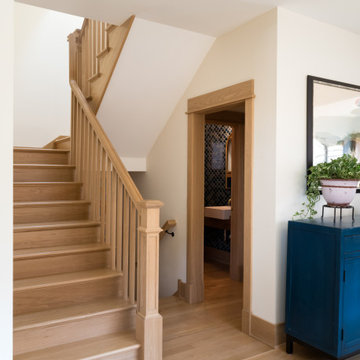
Bungalows are lovable homes, but how can they be better? Along with many of our clients, we find that older (early 20th c.) homes have a lot of character and a comfortable scale, but are leaky, damp (especially in the basement), have fair to poor air quality, and use unconscionable amounts of fossil fuels to heat. The owners of this bungalow were ready to change that, and wanted to do so with minimal upfront carbon emissions as well.
The gut renovation included replacing the basement slab and providing capillary breaks and insulation continuously below grade. The brick structure was treated with a fluid-applied air and water barrier from the interior and insulated entirely with cellulose, a carbon-storing insulation. The roof used HFO-blown spray foam to provide sufficient insulation while allowing headroom for bedrooms, bathrooms, and laundry.
One great benefit of a full renovation is the possibility of reconfiguring spaces to suit the family’s lifestyle, and to make the best of indoor-outdoor connections. We opened up the main rooms on the first floor, creating a family gathering spot with a view to the back yard, and a spacious kitchen that supports the family’s commitment to cooking for healthy eating. The stair uses a north-facing skylight to bring light from above into the middle of the home, where it was previously dark.
As a decarbonization retrofit, the inefficient furnace was replaced with two small ducted heat pump systems, water heating and clothes drying are powered by air-source heat pumps, and cooking uses an induction cooktop plus electric ovens. Energy recovery ventilation provides filtered fresh air continuous exhaust from the kitchen, baths, and laundry, and supplies fresh, highly filtered air to bedrooms and living spaces.
The Better Bungalow now makes sense for the 21st century–it now fits the owners’ life-patterns, is super comfortable, has great air quality, and uses a fraction of the energy it did before, greatly lowering the demand on the utility grid. In the near future, when solar PV is installed, it can achieve net zero or near net zero emissions, and with battery backup, can provide great resilience in the event of power outages.
 Kitchen & Bath Masters
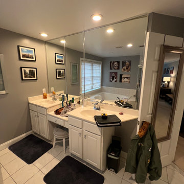
Before the renovation, the bathroom featured separate vanities with limited storage, a full mirrored wall, dated countertops, and an inefficient arrangement that divided the grooming areas.
 LBK Design Build
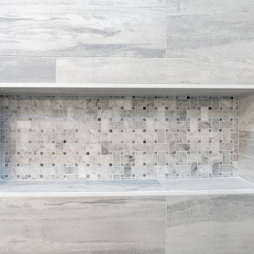
This Primary Suite renovation was designed to enhance both functionality and aesthetics, creating a luxurious yet practical retreat. The original floor plan presented several challenges, including inefficient space utilization, lack of storage, and outdated design elements that no longer met the homeowner’s needs. To address these concerns, the new layout was carefully planned to improve flow, maximize storage, and incorporate modern conveniences while maintaining a timeless appeal.
Find the right local pro for your project
 KCBR Design | Remodel
What was once an awkward and inefficient primary bathroom is now a space designed to truly function. The original doorway cut directly into the vanity, and a built in tub consumed valuable square footage, limiting both storage and circulation.
By relocating the entry and reworking the layout, we were able to create a more natural flow. An upgraded shower and a large double oak vanity with thoughtful storage solutions now anchor the space, making daily routines seamless. Heated terrazzo floors add comfort underfoot, while streamlined plumbing fixtures bring a clean, intentional finish to the design.
In the guest bathroom, we moved beyond purely functional and introduced color, pattern, and layered texture to create a space that feels personal and inviting.
Hearing our client share that this remodel has genuinely improved her quality of life is exactly why we do what we do. The result is a cohesive primary and guest bathroom renovation that balances beauty, comfort, and everyday function.
 Barbara Purdy - Purdy & Associates Design
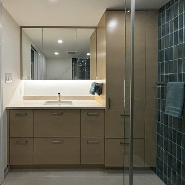
A dated ensuite bath and inefficient use of space gets a complete makeover with a large closet with mirrored doors to give the illusion of a larger space, and a brand new ensuite with a much more accessible with a glorious turquoise pottery look glazed porcelain tile and much improved storage. Perfect for aging in place at this Kanata condo.
 Advance Design Studio, Ltd.
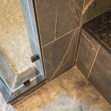
This primary bathroom was transformed from an underused, inefficient space into a luxurious retreat designed for everyday wellness. The homeowners wanted the feeling of a dark, relaxing, moody resort with the function of a private spa. Their favorite features of the new space include the steam shower, dual shower heads, sauna, cold plunge, benches, warm wood details, dramatic tile, and thoughtful lighting. Our design-build team guided the project from design through completed construction, creating a cohesive space that flows beautifully with the bedroom. The result is a high-performing wellness suite that the homeowners now use and enjoy daily.
 Mae Reedy Build + Design
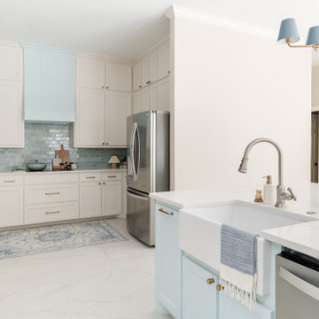
This transitional kitchen remodel transformed a dark, inefficient layout into a bright, functional space designed for everyday living and entertaining. A reimagined multifunctional island, ceiling-height cabinetry, soft blue accents, Bianco Mist quartz countertops, and custom storage solutions create a timeless kitchen that balances beauty with exceptional functionality.
 REHAU Windows and Doors
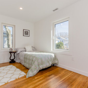
This renovation project was known as a “deep-energy retrofit” that turned an inefficient energy house with into a highly efficient structure. This was done with high-performance REHAU GENEO windows and doors. Learn more at na.rehau.com/windows.
 Robert Kutner Architect
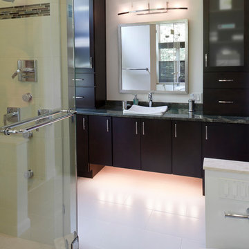
The clients are original owners of their contemporary home built in the early 80's'. Their master bath was inefficient with an oversized under-utilized tub with steps taking up 1/3 of the space and tall walls separating the vanity area from the enclosed shower, blocking potential views of the wooded lot. The new design maintained the original 8'x15' space with 10' ceilings. Interior walls were removed, a 54" corner whirlpool tub was installed adjacent to a 36" vanity and new windows with transoms replaced old drafty ones. New floating vanities with tall cabinets create the new ladies vanity area. The 3 sided, 2 person frameless shower enclosure is a highlight of the new space.
Photography by Curtis Martin
 Alli Rader Creative
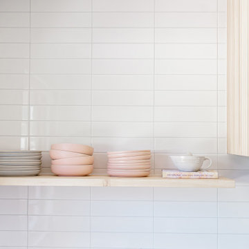
This 1963 brick home was given the opportunity for new life when a creative couple from Brooklyn took a chance and moved their life to Nashville! The kitchen went from a dreary, sad, barely functional room to an inspiring space to gather and entertain. Removing the wall between the living and kitchen opened up the previously choppy, inefficient layout to bring a sense of flow and ease to the home. We designed a custom island/dining table, seamlessly flowing from the terrazzo style quartz countertops into the solid maple table, complimented by the slat wood design on the range hood. We decided to go with a larger scale subway tile in a horizontal stacked pattern to keep the feel light, but also modern and timeless. The built-in matte black wall cabinetry brings a minimal but striking moment to balance the airiness of the other side of the kitchen, while providing ample storage for the pantry as well as a large bar for the cocktail aficionado couple. We incorporated some beautiful handmade pendants from Mexico and hung them at differing heights to accentuate the custom island. Now the space is modern, bright, textured, minimal and elevated. The clients are so pleased, and feel that this house can be a home for them to create and host and be.
 KCBR Design | Remodel
What was once an awkward and inefficient primary bathroom is now a space designed to truly function. The original doorway cut directly into the vanity, and a built in tub consumed valuable square footage, limiting both storage and circulation.
By relocating the entry and reworking the layout, we were able to create a more natural flow. An upgraded shower and a large double oak vanity with thoughtful storage solutions now anchor the space, making daily routines seamless. Heated terrazzo floors add comfort underfoot, while streamlined plumbing fixtures bring a clean, intentional finish to the design.
In the guest bathroom, we moved beyond purely functional and introduced color, pattern, and layered texture to create a space that feels personal and inviting.
Hearing our client share that this remodel has genuinely improved her quality of life is exactly why we do what we do. The result is a cohesive primary and guest bathroom renovation that balances beauty, comfort, and everyday function.
 AMS Fireplace, Inc.
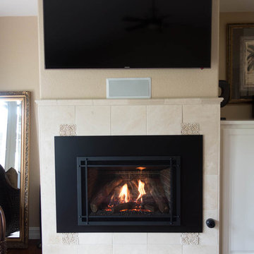
The Chaska 34 is a perfect fit for both your space and your lifestyle. With the traditional look and ease of a gas fireplace, it's the best of both worlds.
The Chaska 34 gas insert is completely airtight and is the perfect solution to your inefficient wood fireplace.
Why not have the reliability that you depend on and the look you love, all in one?
 Bohannon Design Team
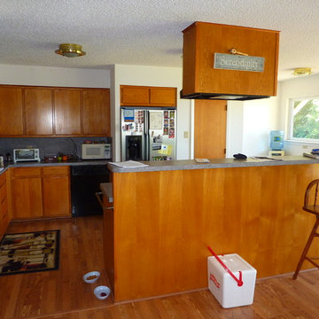
Original kitchen: Counter bar height made this kitchen feel closed-in and large vent hood obstructed the view. Poor appliance layout was frustrating and inefficient!
 Proctor Watts Cole Rutter
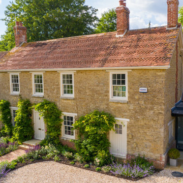
Extension, whole house refurbishment and barn conversion for a private client in Dorset. An inefficient and outdated farm house has been transformed into a low energy, modern family home. With sympathetic extensions as well as conversions of existing redundant out buildings, bringing them into use as part of the dwelling
 TVL Creative Ltd.
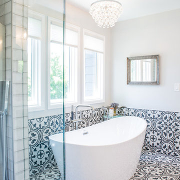
This project is an incredible transformation and the perfect example of successful style mixing! This client, and now a good friend of TVL (as they all become), is a wonderfully eclectic and adventurous one with immense interest in texture play, pops of color, and unique applications. Our scope in this home included a full kitchen renovation, main level powder room renovation, and a master bathroom overhaul. Taking just over a year to complete from the first design phases to final photos, this project was so insanely fun and packs an amazing amount of fun details and lively surprises. The original kitchen was large and fairly functional. However, the cabinetry was dated, the lighting was inefficient and frankly ugly, and the space was lacking personality in general. Our client desired maximized storage and a more personalized aesthetic. The existing cabinets were short and left the nice height of the space under-utilized. We integrated new gray shaker cabinets from Waypoint Living Spaces and ran them to the ceiling to really exaggerate the height of the space and to maximize usable storage as much as possible. The upper cabinets are glass and lit from within, offering display space or functional storage as the client needs. The central feature of this space is the large cobalt blue range from Viking as well as the custom made reclaimed wood range hood floating above. The backsplash along this entire wall is vertical slab of marble look quartz from Pental Surfaces. This matches the expanse of the same countertop that wraps the room. Flanking the range, we installed cobalt blue lantern penny tile from Merola Tile for a playful texture that adds visual interest and class to the entire room. We upgraded the lighting in the ceiling, under the cabinets, and within cabinets--we also installed accent sconces over each window on the sink wall to create cozy and functional illumination. The deep, textured front Whitehaven apron sink is a dramatic nod to the farmhouse aesthetic from KOHLER, and it's paired with the bold and industrial inspired Tournant faucet, also from Kohler. We finalized this space with other gorgeous appliances, a super sexy dining table and chair set from Room & Board, the Paxton dining light from Pottery Barn and a small bar area and pantry on the far end of the space. In the small powder room on the main level, we converted a drab builder-grade space into a super cute, rustic-inspired washroom. We utilized the Bonner vanity from Signature Hardware and paired this with the cute Ashfield faucet from Pfister. The most unique statements in this room include the water-drop light over the vanity from Shades Of Light, the copper-look porcelain floor tile from Pental Surfaces and the gorgeous Cashmere colored Tresham toilet from Kohler. Up in the master bathroom, elegance abounds. Using the same footprint, we upgraded everything in this space to reflect the client's desire for a more bright, patterned and pretty space. Starting at the entry, we installed a custom reclaimed plank barn door with bold large format hardware from Rustica Hardware. In the bathroom, the custom slate blue vanity from Tharp Cabinet Company is an eye catching statement piece. This is paired with gorgeous hardware from Amerock, vessel sinks from Kohler, and Purist faucets also from Kohler. We replaced the old built-in bathtub with a new freestanding soaker from Signature Hardware. The floor tile is a bold, graphic porcelain tile with a classic color scheme. The shower was upgraded with new tile and fixtures throughout: new clear glass, gorgeous distressed subway tile from the Castle line from TileBar, and a sophisticated shower panel from Vigo. We finalized the space with a small crystal chandelier and soft gray paint. This project is a stunning conversion and we are so thrilled that our client can enjoy these personalized spaces for years to come. Special thanks to the amazing Ian Burks of Burks Wurks Construction for bringing this to life!
 The Builder Spot
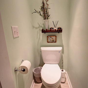
After photos of this master bathroom renovation. We took your standard 90s bathroom, with inefficient use of space and made it cleaner, brighter, and a little more modern.
 Sharon Miyano Interior Design Studio
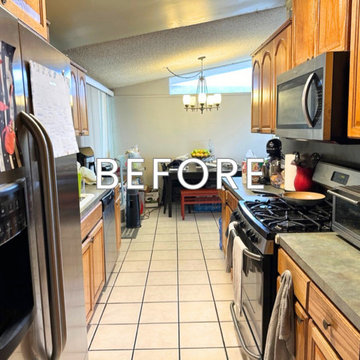
 The original kitchen was dark, inefficient, and disconnected from the way this family wanted to live. Through a complete redesign of the home's floor plan, the space was transformed into an open, light-filled, farmhouse kitchen designed for gathering and connection.
Every decision- from the new layout to the custom breakfast nook- was made with functionality, comfort, and family life in mind.
 KCBR Design | Remodel
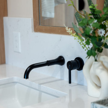
What was once an awkward and inefficient primary bathroom is now a space designed to truly function. The original doorway cut directly into the vanity, and a built in tub consumed valuable square footage, limiting both storage and circulation.
By relocating the entry and reworking the layout, we were able to create a more natural flow. An upgraded shower and a large double oak vanity with thoughtful storage solutions now anchor the space, making daily routines seamless. Heated terrazzo floors add comfort underfoot, while streamlined plumbing fixtures bring a clean, intentional finish to the design.
In the guest bathroom, we moved beyond purely functional and introduced color, pattern, and layered texture to create a space that feels personal and inviting.
Hearing our client share that this remodel has genuinely improved her quality of life is exactly why we do what we do. The result is a cohesive primary and guest bathroom renovation that balances beauty, comfort, and everyday function.
 TVL Creative Ltd.
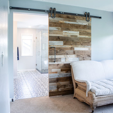
This project is an incredible transformation and the perfect example of successful style mixing! This client, and now a good friend of TVL (as they all become), is a wonderfully eclectic and adventurous one with immense interest in texture play, pops of color, and unique applications. Our scope in this home included a full kitchen renovation, main level powder room renovation, and a master bathroom overhaul. Taking just over a year to complete from the first design phases to final photos, this project was so insanely fun and packs an amazing amount of fun details and lively surprises. The original kitchen was large and fairly functional. However, the cabinetry was dated, the lighting was inefficient and frankly ugly, and the space was lacking personality in general. Our client desired maximized storage and a more personalized aesthetic. The existing cabinets were short and left the nice height of the space under-utilized. We integrated new gray shaker cabinets from Waypoint Living Spaces and ran them to the ceiling to really exaggerate the height of the space and to maximize usable storage as much as possible. The upper cabinets are glass and lit from within, offering display space or functional storage as the client needs. The central feature of this space is the large cobalt blue range from Viking as well as the custom made reclaimed wood range hood floating above. The backsplash along this entire wall is vertical slab of marble look quartz from Pental Surfaces. This matches the expanse of the same countertop that wraps the room. Flanking the range, we installed cobalt blue lantern penny tile from Merola Tile for a playful texture that adds visual interest and class to the entire room. We upgraded the lighting in the ceiling, under the cabinets, and within cabinets--we also installed accent sconces over each window on the sink wall to create cozy and functional illumination. The deep, textured front Whitehaven apron sink is a dramatic nod to the farmhouse aesthetic from KOHLER, and it's paired with the bold and industrial inspired Tournant faucet, also from Kohler. We finalized this space with other gorgeous appliances, a super sexy dining table and chair set from Room & Board, the Paxton dining light from Pottery Barn and a small bar area and pantry on the far end of the space. In the small powder room on the main level, we converted a drab builder-grade space into a super cute, rustic-inspired washroom. We utilized the Bonner vanity from Signature Hardware and paired this with the cute Ashfield faucet from Pfister. The most unique statements in this room include the water-drop light over the vanity from Shades Of Light, the copper-look porcelain floor tile from Pental Surfaces and the gorgeous Cashmere colored Tresham toilet from Kohler. Up in the master bathroom, elegance abounds. Using the same footprint, we upgraded everything in this space to reflect the client's desire for a more bright, patterned and pretty space. Starting at the entry, we installed a custom reclaimed plank barn door with bold large format hardware from Rustica Hardware. In the bathroom, the custom slate blue vanity from Tharp Cabinet Company is an eye catching statement piece. This is paired with gorgeous hardware from Amerock, vessel sinks from Kohler, and Purist faucets also from Kohler. We replaced the old built-in bathtub with a new freestanding soaker from Signature Hardware. The floor tile is a bold, graphic porcelain tile with a classic color scheme. The shower was upgraded with new tile and fixtures throughout: new clear glass, gorgeous distressed subway tile from the Castle line from TileBar, and a sophisticated shower panel from Vigo. We finalized the space with a small crystal chandelier and soft gray paint. This project is a stunning conversion and we are so thrilled that our client can enjoy these personalized spaces for years to come. Special thanks to the amazing Ian Burks of Burks Wurks Construction for bringing this to life!
 Castle Building & Remodeling
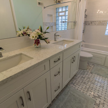
This South Minneapolis family bathroom was pretty groovy before Castle arrived! Old shiny wallpaper, outdated and crumbling tile and an inefficient floor plan were not serving this growing family any longer.
A new floor plan opened up the natural light to the entire bathroom and allowed a much-desired double vanity to be installed. The homeowners wanted direct access from their master bedroom as well, so a new door opening was created for easier access without disturbing the rest of the household.
A bright space was important to the homeowners, so a solar tube was installed with an integral bath fan. The old window was converted to more private glass block, and a wall of mirror was added to reflect natural light throughout the space and to make the space feel bigger. A fresh, transitional color scheme was chosen with timeless materials like marble and white.
50